More on Categorical Data
Visualizing the distribution of multiple categorical variables involves visualizing counts and proportions.
Distributions can be viewed as
- joint distributions;
- conditional distributions.
The most common approaches use variants of bar and area charts.
The resulting plots are often called mosaic plots.
Data Formats
Purely categorical data can be
- in raw form, one row per observation
- aggregated into counts for unique level combinations
- cross-tabulated
Data that includes categorical and numerical variables is usually in raw form.
countfromdplyrproduces aggregated data from raw data.as.data.frameconverts cross-tabulated data to aggregated form.
The notes on visualizing a categorical variable provide more details and examples.
Two Data Sets
Hair and Eye Color
The cross-tabulated data in HairEyeColor was used previously:
HairEyeColorDF <- as.data.frame(HairEyeColor)
head(HairEyeColorDF)
##    Hair   Eye  Sex Freq
## 1 Black Brown Male   32
## 2 Brown Brown Male   53
## 3   Red Brown Male   10
## 4 Blond Brown Male    3
## 5 Black  Blue Male   11
## 6 Brown  Blue Male   50
Marginal distributions of the variables:
grid.arrange(ggplot(HairEyeColorDF) + geom_col(aes(Sex, Freq)),
             ggplot(HairEyeColorDF) + geom_col(aes(Hair, Freq)),
             ggplot(HairEyeColorDF) + geom_col(aes(Eye, Freq)),
             nrow = 1)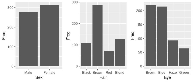
Arthritis Data
The vcd package includes the data frame Arthritis with several variables for 84 patients in a clinical trial for a treatment for rheumatoid arthritis.
- The
Improvedvariable is the response. - The predictors are
Treatment,Sex, andAge.
library(vcd)
head(Arthritis)
##   ID Treatment  Sex Age Improved
## 1 57   Treated Male  27     Some
## 2 46   Treated Male  29     None
## 3 77   Treated Male  30     None
## 4 17   Treated Male  32   Marked
## 5 36   Treated Male  46   Marked
## 6 23   Treated Male  58   Marked
Counts for the categorical predictors:
xtabs(~ Treatment + Sex, data = Arthritis)
##          Sex
## Treatment Female Male
##   Placebo     32   11
##   Treated     27   14
Age distribution:
library(lattice)
histogram(~ Age | Sex * Treatment, data = Arthritis)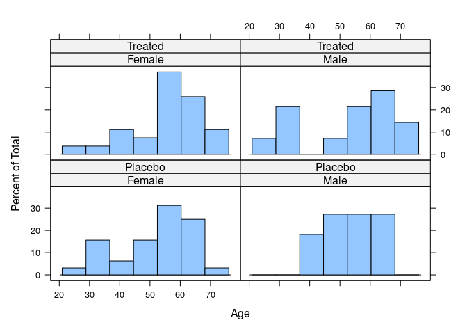
Bar Charts
Hair and Eye Color
Default bar charts show the individual count or joint proportions.
For the hair-eye color aggregated data counts:
ggplot(HairEyeColorDF) +
    geom_col(aes(Eye, Freq, fill = Sex)) +
    facet_wrap(~ Hair)
Joint proportions:
ggplot(mutate(HairEyeColorDF, Prop = Freq / sum(Freq))) +
    geom_col(aes(Eye, Prop, fill = Sex)) +
    facet_wrap(~ Hair)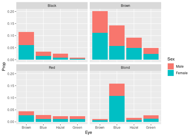
- Differing frequencies of the hair colors are visible.
- Conditional distributions of eye color within hair color are harder to compare.
Showing conditional distributions requires computing proportions within groups.
For the joint conditional distribution of sex and eye color given hair color:
peh <- mutate(group_by(HairEyeColorDF, Hair), Prop = Freq / sum(Freq))
ggplot(peh) +
    geom_col(aes(Eye, Prop, fill = Sex)) +
    facet_wrap(~ Hair)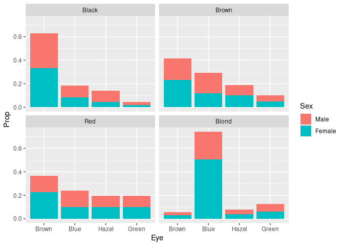
It is easier to compare the skewness of the eye color distributions for black, brown, and red hair.
Assessing the proportion of females or males withing the different groups is possible but challenging since it requires relative length comparisons.
To more clearly see the that the proportion of females among subjects with blond hair and blue eyes is higher than for other hair/eye color combinations we can look at the conditional distribution of sex given hair and eye color
pseh <- mutate(group_by(HairEyeColorDF, Hair, Eye), Prop = Freq / sum(Freq))
ggplot(pseh) +
    geom_col(aes(Eye, Prop, fill = Sex)) +
    facet_wrap(~ Hair, nrow = 1) +
    theme(axis.text.x = element_text(angle = 45, hjust = 1))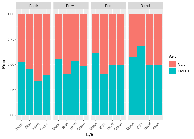
This plot can also be obtained as
ggplot(HairEyeColorDF) +
    geom_col(aes(Eye, Freq, fill = Sex), position = "fill") +
    facet_wrap(~ Hair, nrow = 1) +
    theme(axis.text.x = element_text(angle = 45, hjust = 1))
This visualization no longer shows the that some of the hair/eye color combinations are more common than others.
Arthritis Data
For the raw arthritis data, geom_bar computes the aggregate counts and produces a stacked bar chart by default:
p <- ggplot(Arthritis, aes(Sex, fill = Improved)) + facet_wrap(~ Treatment)
p + geom_bar()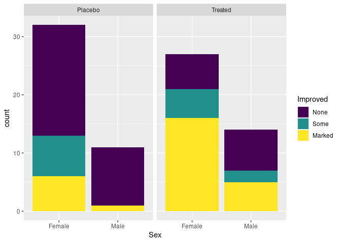
Specifying position = "dodge" produces a side-by-side plot:
p + geom_bar(position = "dodge")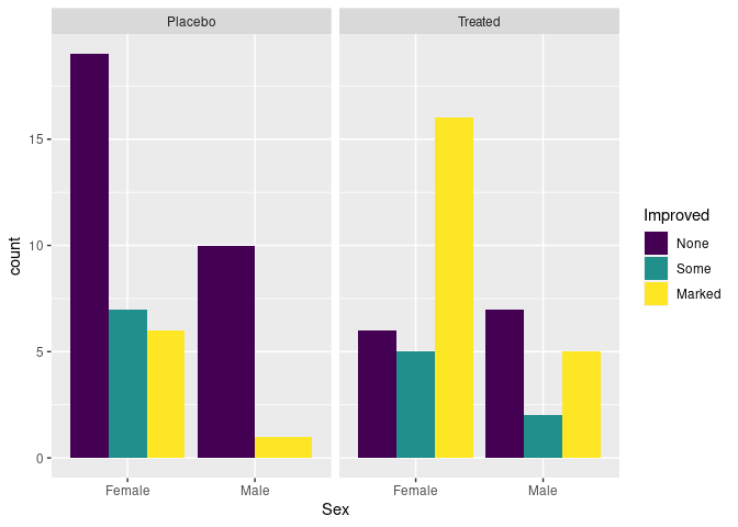
There are no cases of male patients on placebo reporting Some improvement, resulting in wider bars for the other options.
One way to produce a zero height bar:
- aggregate with
count, and - use
completefromtidyr
library(tidyr)
atsi <- count(Arthritis, Treatment, Sex, Improved)
atsi <- complete(atsi, Treatment, Sex, Improved, fill = list(n = 0))
ggplot(atsi, aes(Sex, n, fill = Improved)) +
    geom_col(position = "dodge") +
    facet_wrap(~ Treatment)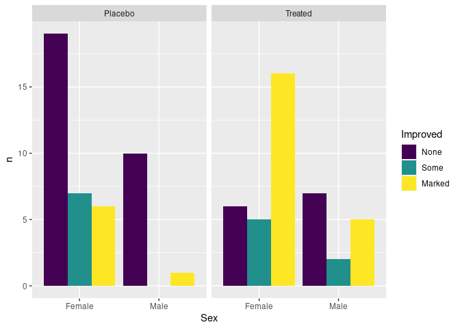
Showing conditional distributions instead of joint proportions:
patsi <- mutate(group_by(atsi, Treatment, Sex), prop = n / sum(n))
ggplot(patsi) +
    geom_col(aes(x = Sex, y = prop, fill = Improved),
             position = "dodge") +
    facet_wrap(~ Treatment)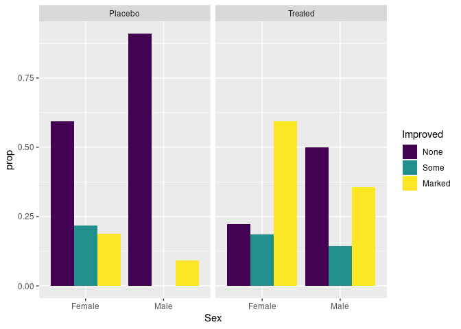
Stacked bar charts with height one are another option for make conditional distributions easier to compare:
p + geom_bar(position = "fill")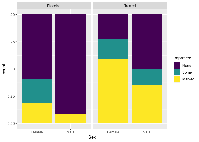
Ordering of variables affects which comparisons are easier.
- A researcher might want to emphasize the differential response among males and females.
- A patient might prefer to be able to focus on whether the treatment is effective for them:
ggplot(Arthritis, aes(Treatment, fill = Improved)) +
    geom_bar(position = "fill") +
    facet_wrap(~ Sex)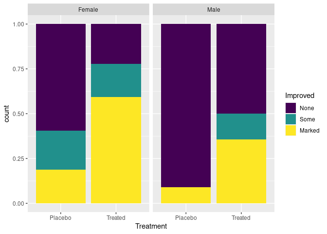
The stacked bar chart is effective for two categories, and a few more if they are ordered.
Providing a visual indication of uncertainty in the estimates is a challenge. The standard errors are around 0.1.
The proportions of each treatment group that are male or female could be encoded in the bar width.
The resulting plot is called a spine plot.
Neither
ggplot2norlatticeseem to make this easy.
Spine Plot
Spine plots are a special case of mosaic plots, and can be seen as a generalization of stacked bar plots.
The proportions for the categories of a predictor variable are encoded in the bar widths.
Spine plots are provided by the base graphics function
spineplotand thevcdfunctionspline.vcdplots are built on thegridgraphics system, likelatticeandggplot2graphics.The
ggmosaicpackage provides support for mosaic plots in theggplotframework.
Spine plots for the arthritis data using spineplot:
library(forcats)
Arth <- mutate(Arthritis, Improved = fct_rev(Improved))
ArthP <- filter(Arth, Treatment == "Placebo")
ArthT <- filter(Arth, Treatment == "Treated")
opar <- par(mfrow = c(1, 2))
spineplot(Improved ~ Sex, data = ArthP, main = "Placebo")
spineplot(Improved ~ Sex, data = ArthT, main = "Treatment")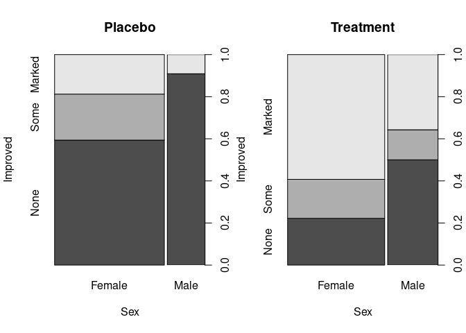
par(opar)spineplot can use raw data or cross-tabulated data:
spineplot(xtabs(Freq ~ Hair + Sex, HairEyeColorDF)[, 2 : 1])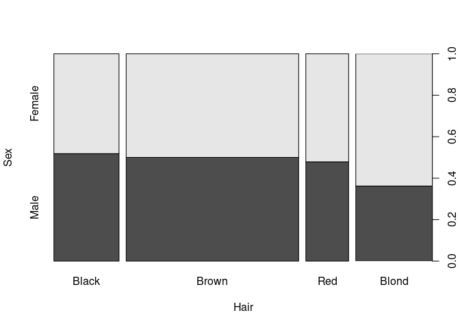
Using geom_mosaic from ggmosaic and the raw arthritis data:
library(ggmosaic)
ggplot(Arth) +
    geom_mosaic(aes(x = product(Sex), fill = Improved)) +
    facet_wrap(~ Treatment)
## Warning: The `scale_name` argument of `continuous_scale()` is deprecated as of ggplot2
## 3.5.0.
## This warning is displayed once every 8 hours.
## Call `lifecycle::last_lifecycle_warnings()` to see where this warning was
## generated.
## Warning: The `trans` argument of `continuous_scale()` is deprecated as of ggplot2 3.5.0.
## ℹ Please use the `transform` argument instead.
## This warning is displayed once every 8 hours.
## Call `lifecycle::last_lifecycle_warnings()` to see where this warning was
## generated.
## Warning: `unite_()` was deprecated in tidyr 1.2.0.
## ℹ Please use `unite()` instead.
## ℹ The deprecated feature was likely used in the ggmosaic package.
##   Please report the issue at <https://github.com/haleyjeppson/ggmosaic>.
## This warning is displayed once every 8 hours.
## Call `lifecycle::last_lifecycle_warnings()` to see where this warning was
## generated.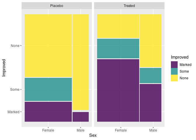
For aggregate counts use the weight aesthetic:
HDF <- mutate(HairEyeColorDF, Sex = fct_rev(Sex))
ggplot(HDF) +
    geom_mosaic(aes(weight = Freq, x = product(Hair), fill = Sex))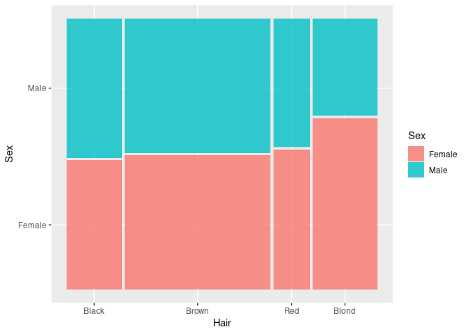
Doubledecker Plots
Doubledecker plots can be viewed as a generalization of spine plots to multiple predictors.
Package vcd provides the doubledecker function.
doubledecker(Improved ~ Treatment + Sex, data = Arthritis)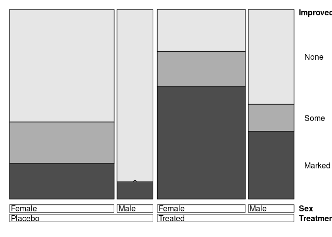
doubledecker(Improved ~ Sex + Treatment, data = Arthritis)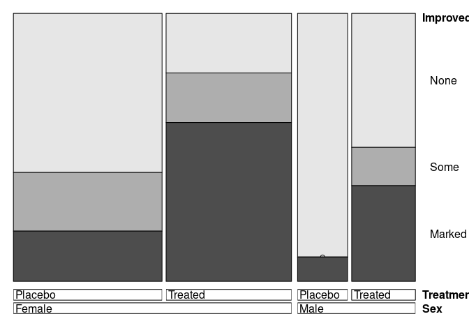
doubledecker also works with raw or cross-tabulated data:
doubledecker(xtabs(Freq ~ Hair + Eye + Sex, HairEyeColorDF))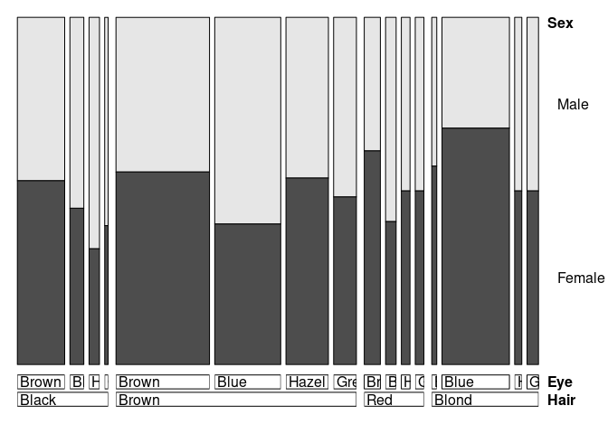
Using ggmosaic:
ggplot(Arth) +
    geom_mosaic(aes(x = product(Sex, Treatment), fill = Improved),
                divider = ddecker()) +
    theme(axis.text.x = element_text(angle = 15, hjust = 1))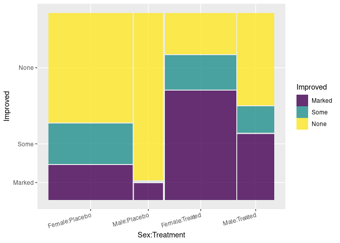
ggplot(Arth) +
    geom_mosaic(aes(x = product(Treatment, Sex), fill = Improved),
                divider = ddecker()) +
    theme(axis.text.x = element_text(angle = 15, hjust = 1))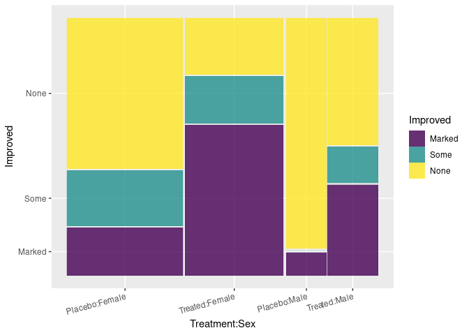
ggplot(HDF) +
    geom_mosaic(aes(weight = Freq, x = product(Eye, Hair), fill = Sex),
                divider = ddecker()) +
    theme(axis.text.x = element_text(angle = 35, hjust = 1))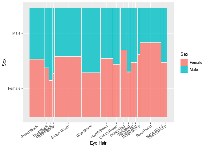
Mosaic Plots
Mosaic plots recursively partition the axes to represent counts of categorical variables as rectangles.
- Base graphics provides
mosaicplot; vcdprovidesmosaic.
A Mosaic plot for the predictors Sex and Treatment:
mosaicplot(~ Sex + Treatment, data = Arthritis)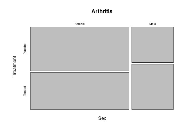
Adding Improved to the joint distribution:
vcd::mosaic(~ Sex + Treatment + Improved, data = Arthritis)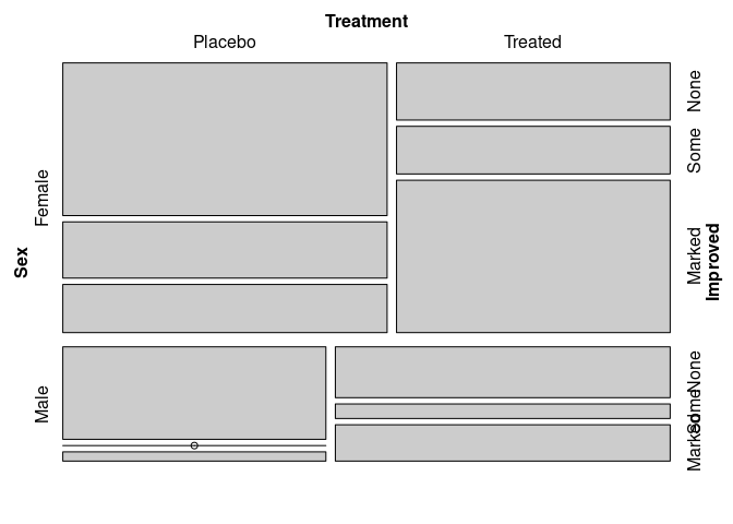
Identifying Improved as the response:
vcd::mosaic(Improved ~ Sex + Treatment, data = Arthritis)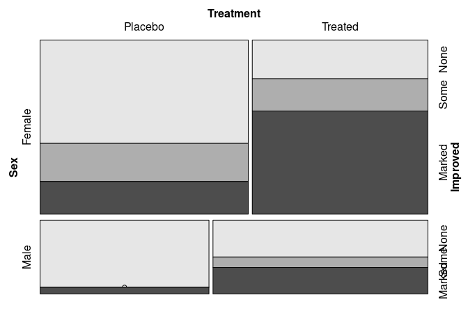
Matching the doubledecker plots:
vcd::mosaic(Improved ~ Treatment + Sex, data = Arthritis,
            split_vertical = c(TRUE, TRUE, FALSE))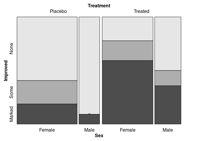
vcd::mosaic(Improved ~ Sex + Treatment, data = Arthritis,
            split_vertical = c(TRUE, TRUE, FALSE))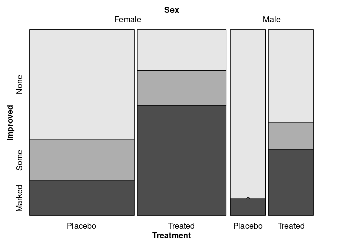
A mosaic plot for all bivariate marginals:
pairs(xtabs(~ Sex + Treatment + Improved, data = Arthritis))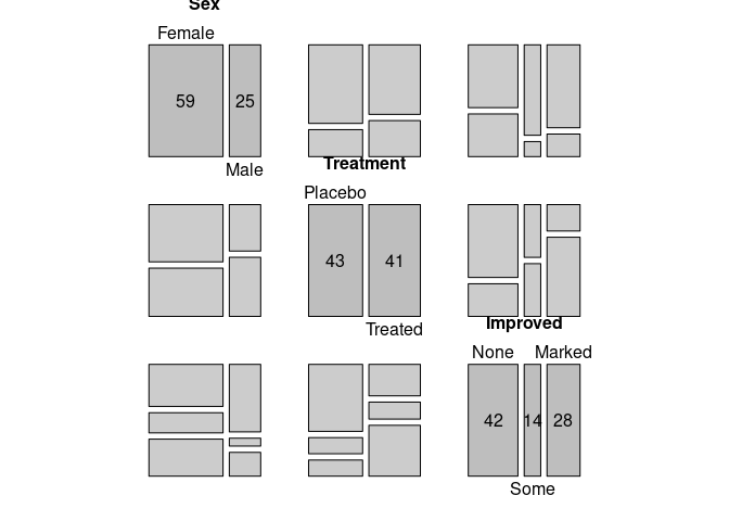
Spinograms and CD Plots
Spinograms and CD plots show the conditional distribution of a categorical variable given the value of a numeric variable.
Spinograms use the same binning as a histogram and then create a spine plot.
CD plots use a smoothing or density estimation approach.
A spinogram for Improved against Age:
spineplot(Improved ~ Age, data = ArthT)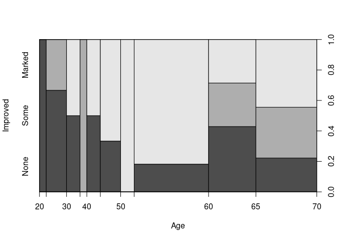
This is based on the histogram
hist(ArthT$Age, breaks = 13)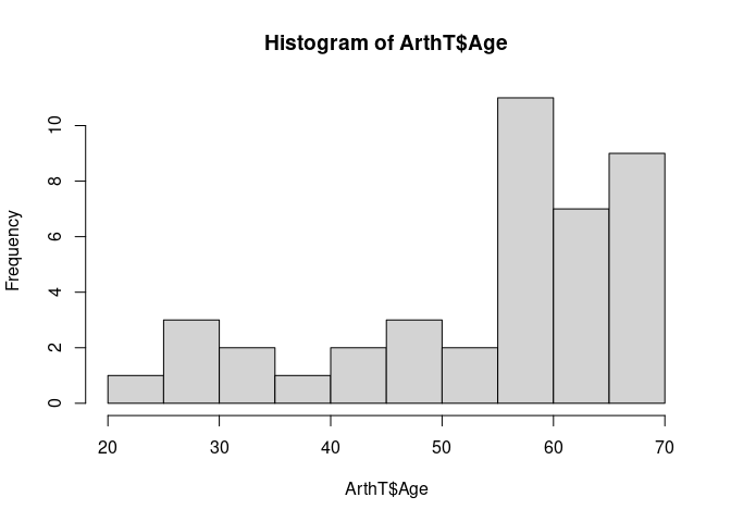
Spinograms for each level of Sex and Treated:
ArthTF <- filter(ArthT, Sex == "Female")
ArthTM <- filter(ArthT, Sex == "Male")
ArthPF <- filter(ArthP, Sex == "Female")
ArthPM <- filter(ArthP, Sex == "Male")

opar <- par(mfrow = c(2, 2))
spineplot(Improved ~ Age, data = ArthTM, main = "TM")
spineplot(Improved ~ Age, data = ArthTF, main = "TF")
spineplot(Improved ~ Age, data = ArthPM, main = "PM")
spineplot(Improved ~ Age, data = ArthPF, main = "PF")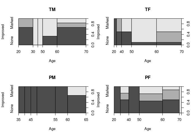
par(opar)CD plots estimate the conditional density of the x variable given the levels of y, weighted by the marginal proportions of y and use these to estimate cumulative probabilities.
The slice at a particular
xlevel visualizes the conditional distribution ofygivenxat that level.The
cd_plotfunction from thevcdpackage produces a CD plot usinggridgraphics.The
cdplotfunction from the base `graphics package provides the same plots using base graphics.
Analogous CD plots for the Arthritis data:
cd_plot(Improved ~ Age, data = ArthT)

cd_plot(Improved ~ Age, data = ArthTM, main = "TM")
cd_plot(Improved ~ Age, data = ArthTF, main = "TF")
cd_plot(Improved ~ Age, data = ArthPM, main = "PM")
cd_plot(Improved ~ Age, data = ArthPF, main = "PF")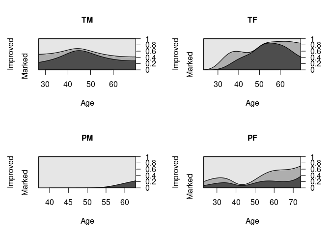
It may be helpful to consider an age grouping like
cut(Arthritis$Age, c(0, 40, 60, 100))This loses some information but may simplify the analysis.
This can also allow the reduction of data to cell counts to help with very large data sets.
Uncertainty Representation
Categorical data are often analyzed by fitting models representing conditional independence structures.
Plotting residuals from these models can help assess how well they fit.
mosaicsupports using color to represent magnitude of residuals for comparing to a simple independence model.
For the Arthritis data, assessing independence of Treatment and Improved produces:
vcd::mosaic(~ Treatment + Improved, data = Arthritis, gp = shading_max)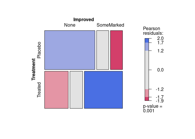
Another visualization of the residuals is the association plot produced by assoc:
assoc(~ Treatment + Improved, data = Arthritis, gp = shading_max)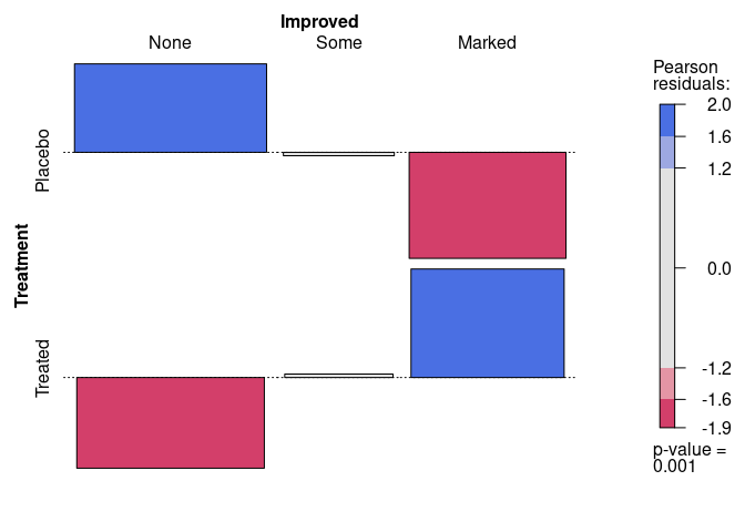
References
The vignette Residual-Based Shadings in vcd in the
vcdpackage.Zeileis, Achim, David Meyer, and Kurt Hornik. “Residual-based shadings for visualizing (conditional) independence.” Journal of Computational and Graphical Statistics 16, no. 3 (2007): 507-525.
Several other experimental mosaic plot implementations are available for ggplot.
Some Other Visualizations
Stream Graphs
Stream graphs are a generalization of stacked bar charts plotted against a numeric variable.
In some cases the origins of the bars are shifted to improve some aspect of the overall visualization.
An early example is the Baby Name Voyager.
A NY Times visualization of movie box office results is another example.
Some R implementation on GitHub:
ggTimeSeriesstreamgraph, which uses D3.
After installing streamgraph with
devtools::install_github("hrbrmstr/streamgraph")a stream graph for movie genres (these are not mutually exclusive):
library(streamgraph)
library(tidyverse)
genres <- c("Action", "Animation", "Comedy", "Drama", "Documentary", "Romance")
mymovies <- select(ggplot2movies::movies, year, one_of(genres))
mymovies_long <- gather(mymovies, genre, value, -year)
movie_counts <- count(mymovies_long, year, genre)
streamgraph(movie_counts, "genre", "n", "year")
## Warning in widget_html(name, package, id = x$id, style = css(width =
## validateCssUnit(sizeInfo$width), : streamgraph_html returned an object of class
## `list` instead of a `shiny.tag`.
## Warning: `bindFillRole()` only works on htmltools::tag() objects (e.g., div(),
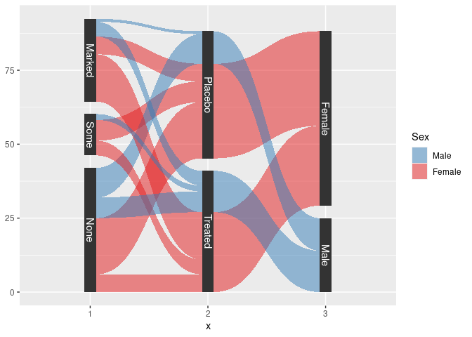
## p(), etc.), not objects of type 'list'.Alluvial plots
These are also known as
- parallel sets, or
- Sankey diagrams.
They can be viewed as a parallel coordinates plot for categorical data.
Using the alluvial package:
library(alluvial)
pal <- RColorBrewer::brewer.pal(2, "Set1")
## Warning in RColorBrewer::brewer.pal(2, "Set1"): minimal value for n is 3, returning requested palette with 3 different levels
with(HDF,
     alluvial(Hair, Eye, Sex, freq = Freq, col = pal[as.numeric(Sex)]))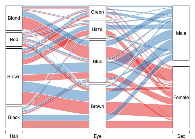
with(count(Arth, Improved, Treatment, Sex),
     alluvial(Improved, Treatment, Sex, freq = n, col = pal[as.numeric(Sex)]))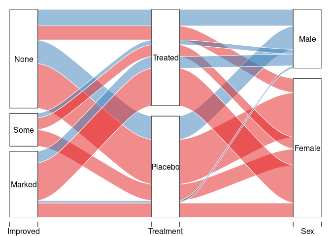
Using package ggforce:
library(ggforce)
sHDF <- gather_set_data(HDF, 1 : 3)
sHDF <- mutate(sHDF, x = fct_inorder(factor(x)))
ggplot(sHDF, aes(x, id = id, split = y, value = Freq)) +
    geom_parallel_sets(aes(fill = Sex), alpha = 0.5, axis.width = 0.1) +
    geom_parallel_sets_axes(axis.width = 0.1) +
    geom_parallel_sets_labels(colour = "white") +
    scale_fill_manual(values = c(Male = pal[2], Female = pal[1]))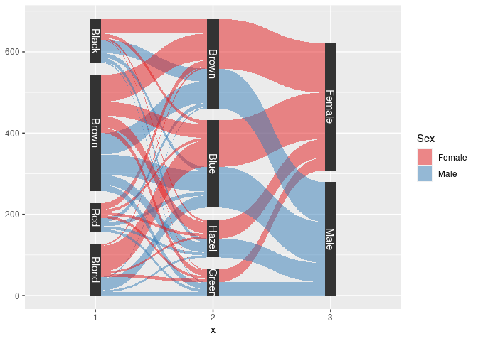
sArth <- mutate(Arth,
                Improved = factor(Improved, ordered = FALSE)) |>
    count(Improved, Treatment, Sex) |>
    gather_set_data(1 : 3)
sArth <- mutate(sArth, x = fct_inorder(factor(x)), Sex = fct_rev(Sex))
ggplot(sArth, aes(x, id = id, split = y, value = n)) +
    geom_parallel_sets(aes(fill = Sex), alpha = 0.5, axis.width = 0.1) +
    geom_parallel_sets_axes(axis.width = 0.1) +
    geom_parallel_sets_labels(colour = "white") +
    scale_fill_manual(values = c(Male = pal[2], Female = pal[1]))