Visualizing a Categorical Variable
Categorical Data
Categorical data can be
- nominal, qualitative
- ordinal
For visualization, the main difference is that ordinal data suggests a particular display order.
Purely categorical data can come in a range of formats. The most common are
- raw data: individual observations;
- aggregated data: counts for each unique combination of levels
- cross-tabulated data
Raw Data
Raw data for a survey of individuals that records hair color, eye color, and gender of 592 individuals might look like this:
head(raw)
##    Hair   Eye    Sex
## 1 Brown  Blue   Male
## 2 Brown Brown   Male
## 3 Brown Hazel   Male
## 4 Blond Green Female
## 5 Brown Brown Female
## 6 Brown Hazel   Male
Aggregated Data
One way to aggregate raw categorical data is to use count from dplyr:
library(dplyr)
agg <- count(raw, Hair, Eye, Sex)
head(agg)
##    Hair   Eye    Sex  n
## 1 Black Brown   Male 32
## 2 Black Brown Female 36
## 3 Black  Blue   Male 11
## 4 Black  Blue Female  9
## 5 Black Hazel   Male 10
## 6 Black Hazel Female  5
The count_ function from dplyr allows the variables to use to be read from the data:
agg <- count_(raw, names(raw))
## Warning: `count_()` was deprecated in dplyr 0.7.0.
## Please use `count()` instead.
## See vignette('programming') for more help
## This warning is displayed once every 8 hours.
## Call `lifecycle::last_lifecycle_warnings()` to see where this warning was generated.
head(agg)
##    Hair   Eye    Sex  n
## 1 Black Brown   Male 32
## 2 Black Brown Female 36
## 3 Black  Blue   Male 11
## 4 Black  Blue Female  9
## 5 Black Hazel   Male 10
## 6 Black Hazel Female  5
Cross-Tabulated Data
Cross-tabulated data can be produced from aggregate data using xtabs:
xtabs(n ~ Hair + Eye + Sex, data = agg)
## , , Sex = Male
##
##        Eye
## Hair    Brown Blue Hazel Green
##   Black    32   11    10     3
##   Brown    53   50    25    15
##   Red      10   10     7     7
##   Blond     3   30     5     8
##
## , , Sex = Female
##
##        Eye
## Hair    Brown Blue Hazel Green
##   Black    36    9     5     2
##   Brown    66   34    29    14
##   Red      16    7     7     7
##   Blond     4   64     5     8
Cross-tabulated data can be produced from raw data using table:
xtb <- table(raw)
xtb
## , , Sex = Male
##
##        Eye
## Hair    Brown Blue Hazel Green
##   Black    32   11    10     3
##   Brown    53   50    25    15
##   Red      10   10     7     7
##   Blond     3   30     5     8
##
## , , Sex = Female
##
##        Eye
## Hair    Brown Blue Hazel Green
##   Black    36    9     5     2
##   Brown    66   34    29    14
##   Red      16    7     7     7
##   Blond     4   64     5     8
Both raw and aggregate date in this example are in tidy form; the cross-tabulated date is not.
Cross-tabulated data on \(p\) variables is arranged in a \(p\)-way array.
The cross-tabulated data can be converted to the tidy aggregate form using
as.data.frame:
class(xtb)
## [1] "table"
head(as.data.frame(xtb))
##    Hair   Eye  Sex Freq
## 1 Black Brown Male   32
## 2 Brown Brown Male   53
## 3   Red Brown Male   10
## 4 Blond Brown Male    3
## 5 Black  Blue Male   11
## 6 Brown  Blue Male   50
The variable xtb corresponds to the data set HairEyeColor in the datasets package,
Working With Categorical Variables
Categorical variables are usually represented as:
- character vectors
- factors.
Some advantages of factors:
- more control over ordering of levels
- levels are preserved when forming subsets
Most plotting and modeling functions will convert character vectors to factors with levels ordered alphabetically.
Some standard R functions for working with factors include
factorcreates a factor from another type of variablelevelsreturns the levels of a factorreorderchanges level order to match another variablerelevelmoves a particular level to the first position as a base linedroplevelsremoves levels not in the variable.
The tidyverse package forcats adds some more tools, including
fct_inordercreates a factor with levels ordered by first appearancefct_infreqorders levels by decreasing frequencyfct_revreverses the levelsfct_recodechanges factor levelsfct_relevelmoves one or more levelsfct_cmerges two or more factors
Bar Charts For Frequencies
Basics
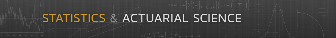
The bar chart is often used to show the frequencies of a categorical variable.
By default, geom_bar uses stat = "count" and maps its result to the y aesthetic. This is suitable for raw data:
ggplot(raw) + geom_bar(aes(x = Hair))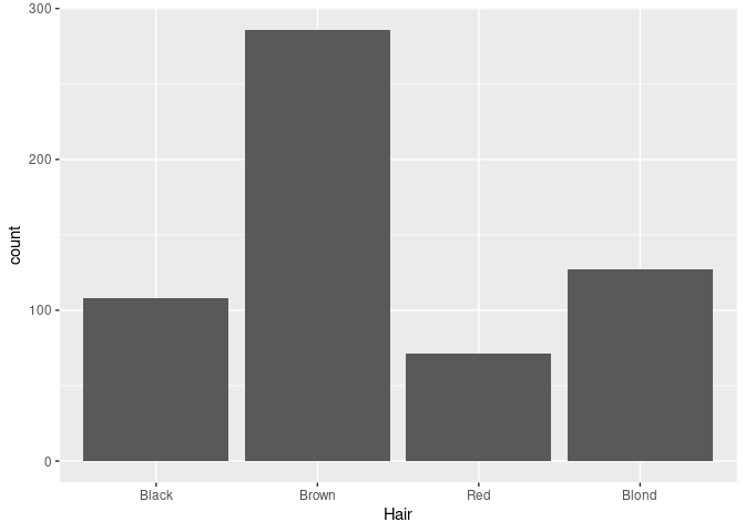
For a nominal variable it is often better to order the bars by decreasing frequency:
library(forcats)
ggplot(mutate(raw, Hair = fct_infreq(Hair))) + geom_bar(aes(x = Hair))
If the data have already been aggregated, then you need to specify stat = "identity" as well as the variable containing the counts as the y aesthetic:
ggplot(agg) + geom_bar(aes(x = Hair, y = n), stat = "identity")
An alternative is to use geom_col.
For aggregated data reordering can be based on the computed counts using
agg_ord <- mutate(agg, Hair = reorder(Hair, -n, sum))-nis used to order largest to smallest;- the default summary used by
reorderismean;sumis better here.
ggplot(agg_ord) + geom_col(aes(x = Hair, y = n))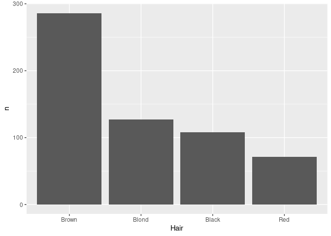
Adding a Grouping Variable
Mapping the Eye variable to fill in ggplot produces a stacked bar chart.
An alternative, specified with position = "dodge", is a side by side bar chart, or a clustered bar chart.
For the side by side chart in particular it may be useful to also reorder the Eye color levels.
ecols <- c(Brown = "brown2", Blue = "blue2",
           Hazel = "darkgoldenrod3", Green = "green4")
agg_ord <- mutate(agg,
                  Hair = reorder(Hair, -n, sum),
                  Eye = reorder(Eye, -n, sum))
p1 <- ggplot(agg_ord) +
    geom_col(aes(x = Hair, y = n, fill = Eye)) +
    scale_fill_manual(values = ecols)
p2 <- ggplot(agg_ord) +
    geom_col(aes(x = Hair, y = n, fill = Eye), position = "dodge") +
    scale_fill_manual(values = ecols)
grid.arrange(p1, p2, nrow = 1)
Faceting can be used to bring in additional variables:
p1 + facet_wrap(~ Sex)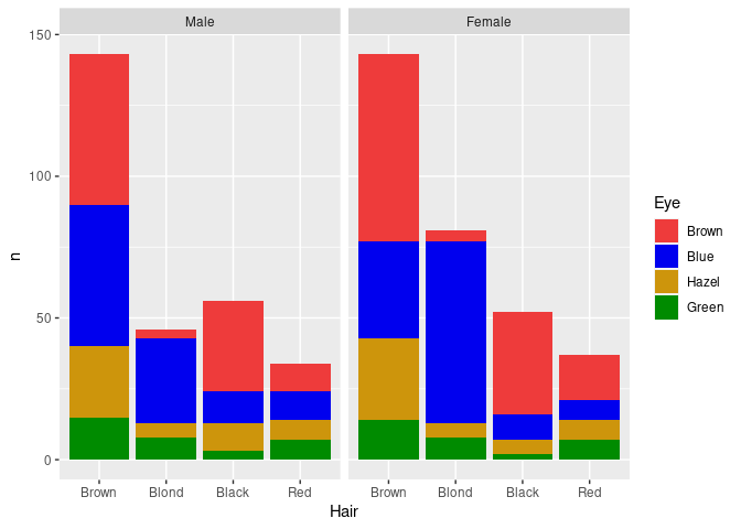
The counts shown here may not be the most relevant features for understanding the joint distributions of these variables.
Pie Charts and Doughnut Charts
Pie charts can be viewed as stacked bar charts in polar coordinates:
hcols <- c(Black = "black", Brown = "brown3",
           Red = "brown1", Blond = "lightgoldenrod1")
p1 <- ggplot(agg_ord) +
    geom_col(aes(x = 1, y = n, fill = Hair), position = "fill") +
    coord_polar(theta = "y") +
    scale_fill_manual(values = hcols)
p2 <- ggplot(agg_ord) +
    geom_col(aes(x = Hair, y = n, fill = Hair)) +
    scale_fill_manual(values = hcols)
grid.arrange(p1, p2, nrow = 1)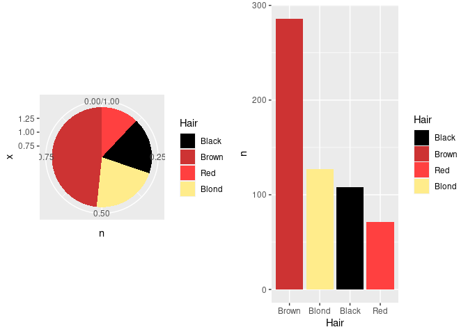
The axes and grid lines are not helpful for the pie chart and can be removed with some theme settings.
Using faceting we can also separately show the distributions for men and women:
p3 <- p1 + facet_wrap(~ Sex) +
    theme_bw() +
    theme(axis.title = element_blank(),
          axis.text = element_blank(),
          axis.ticks = element_blank(),
          panel.grid.major = element_blank(),
          panel.grid.minor = element_blank(),
          panel.border = element_blank())
p3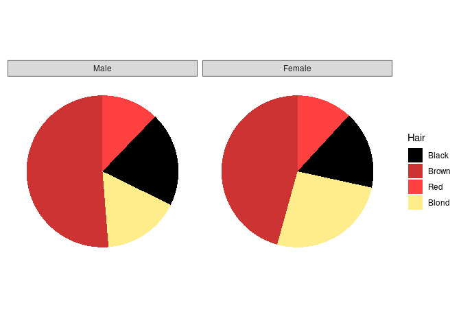
Doughnut charts are a variant that has recently become popular in the media:
p4 <- p3 + xlim(0, 1.5)
p4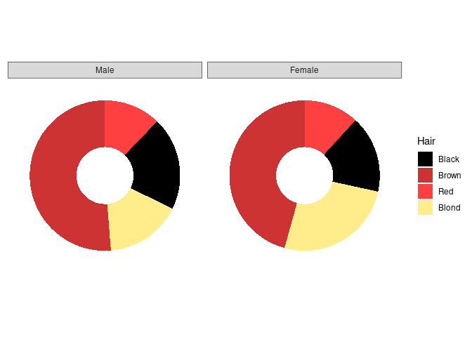
The center is often used for annotation:
p4 + geom_text(aes(x = 0, y = 0, label = Sex)) +
    theme(strip.background = element_blank(),
          strip.text = element_blank())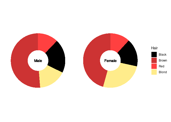
Some Notes
- Pie charts are effective for judging part/whole relationships.
- Pie charts are not very effective for comparing proportions.
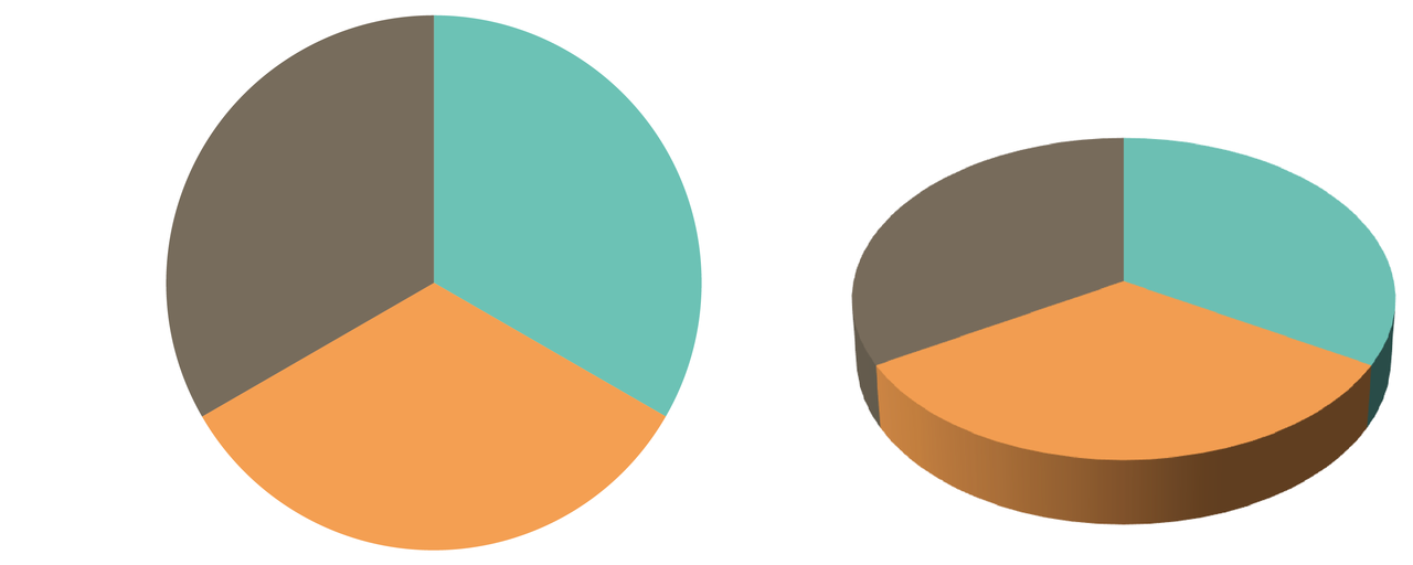
- 3D pie charts are popular and a very bad idea. An example (Fig. 6.61) from Andy Kirk’s book (2016), Data Visualization: A Handbook for Data Driven Design:
Stacked bar charts with equal heights are an alternative for representing part-whole relationhips:
ggplot(agg) +
    geom_col(aes(x = Sex, y = n, fill = Hair), position = "fill") +
    scale_fill_manual(values = hcols)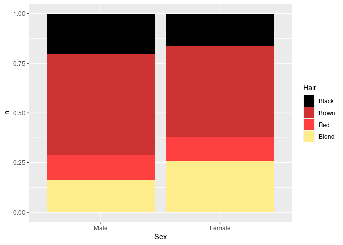
Another alternative is a waffle chart, sometimes also called a square pie chart.
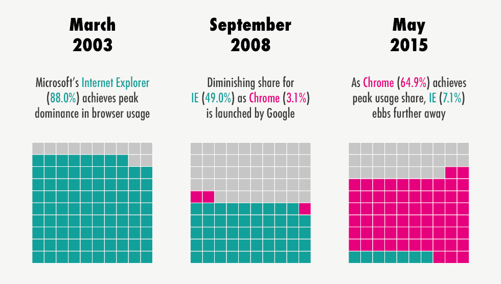
The waffle package is one R implementation of this idea.