Data Types
Many different kinds of data are shown on maps:
Points, location data.
Lines, routes, connections.
Area data, aggregates, rates.
Sampled surface data.
…
Map Types
There are many different kinds of maps:
Dot Maps
A dot map of violent crime locations in Houston.
racial dot map of the US.
Symbol Maps
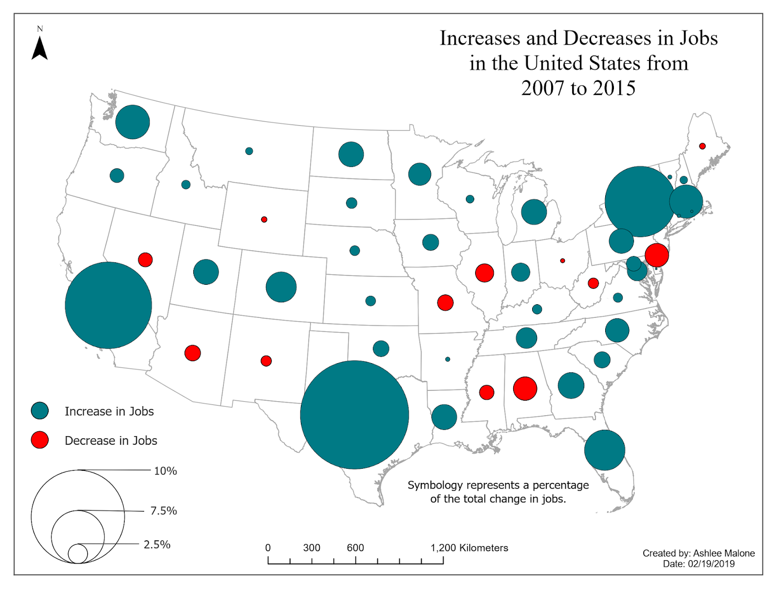
Increases and decreases in jobs.
Line Maps
Isopleth, Isarithmic, or Contour Maps
Density contours for Houston violent crime data:
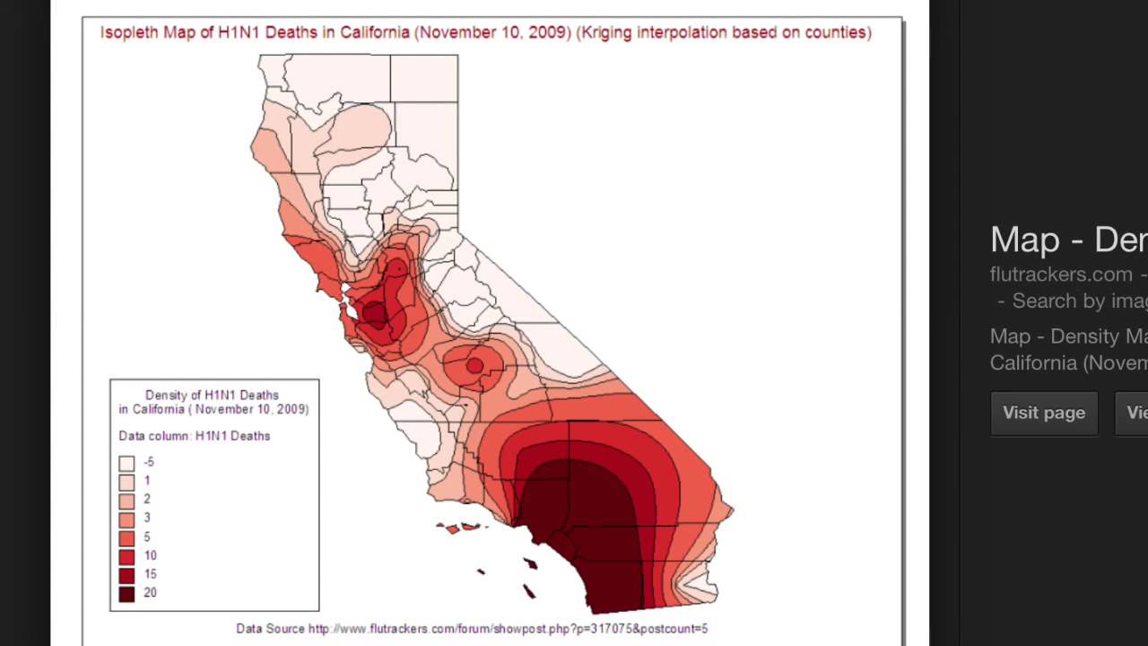
Bird flu deaths in California:
Choropleth Maps
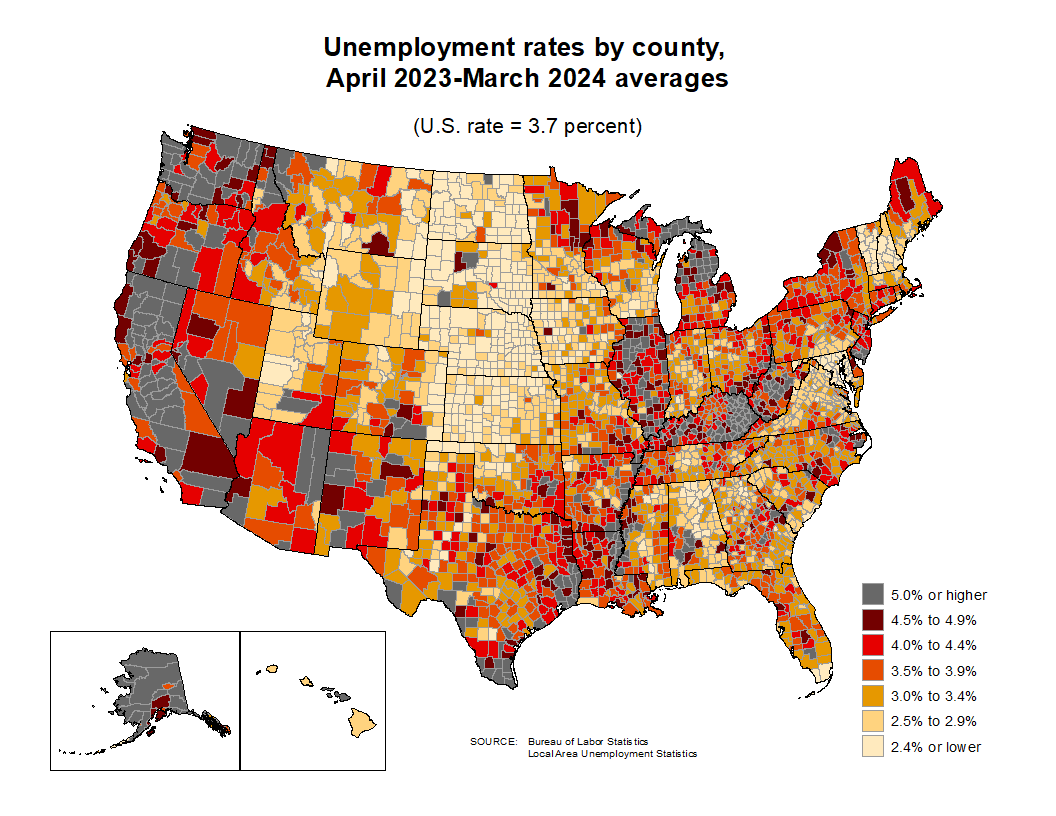
Unemployment rates by county and by state:
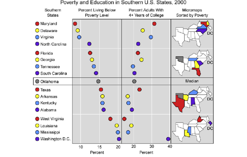
Linked Micromaps
Drawing Maps
At the simplest level drawing a map involves:
possibly loading a background image, such as terrain;
drawing or filling polygons that represent region boundaries;
adding points, lines, and other annotations.
But there are a number of complications:
you need to obtain the polygons representing the regions;
regions with several pieces;
holes in regions; lakes in islands in lakes;
projections for mapping spherical longitude/lattitude coordinates to a plane;
aspect ratio;
making sure map and annotation layers are consistent in their use of coordinates and aspect ratio;
connecting your data to the geographic features.
High level tools are available for creating some standard map types.
These tools usually have some limitations.
Creating maps directly, building on the things you have learned so far, gives more flexibility.
Basic Map Data
Basic map data consisting of latitude and longitude of points along borders is available in the maps package.
The ggplot2 function map_data accesses this data and reorganizes it into a data frame.
library(ggplot2)
gusa <- map_data("state")
head(gusa, 4)
##        long      lat group order  region subregion
## 1 -87.46201 30.38968     1     1 alabama      <NA>
## 2 -87.48493 30.37249     1     2 alabama      <NA>
## 3 -87.52503 30.37249     1     3 alabama      <NA>
## 4 -87.53076 30.33239     1     4 alabama      <NA>
The borders function in ggplot2 uses this data to create a simple outline map.
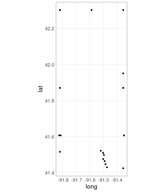
Borders data for Johnson and Linn Counties:
jl_bdr <- map_data("county", "iowa") |>
     filter(subregion %in% c("johnson", "linn"))
jl_bdr
##         long      lat group order region subregion
## 1  -91.34666 41.60819    52   531   iowa   johnson
## 2  -91.35239 41.42485    52   532   iowa   johnson
## 3  -91.47272 41.43058    52   533   iowa   johnson
## 4  -91.48417 41.44777    52   534   iowa   johnson
## 5  -91.48990 41.46495    52   535   iowa   johnson
## 6  -91.50136 41.47642    52   536   iowa   johnson
## 7  -91.49563 41.49934    52   537   iowa   johnson
## 8  -91.50136 41.51079    52   538   iowa   johnson
## 9  -91.51855 41.52225    52   539   iowa   johnson
## 10 -91.82221 41.51652    52   540   iowa   johnson
## 11 -91.81648 41.60819    52   541   iowa   johnson
## 12 -91.82794 41.60819    52   542   iowa   johnson
## 13 -91.82221 41.87175    52   543   iowa   johnson
## 14 -91.35239 41.87175    52   544   iowa   johnson
## 15 -91.34666 41.60819    52   545   iowa   johnson
## 16 -91.82221 42.30148    57   609   iowa      linn
## 17 -91.58730 42.30148    57   610   iowa      linn
## 18 -91.35239 42.30148    57   611   iowa      linn
## 19 -91.35239 41.95197    57   612   iowa      linn
## 20 -91.35239 41.87175    57   613   iowa      linn
## 21 -91.82221 41.87175    57   614   iowa      linn
## 22 -91.82221 42.30148    57   615   iowa      linn
Vertex locations:
ggplot(jl_bdr, aes(x = long,
                   y = lat)) +
    geom_point() +
    coord_map()
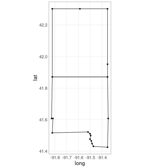
Add polygons:
ggplot(jl_bdr, aes(x = long,
                   y = lat,
                   group = subregion)) +
    geom_point() +
    geom_polygon(color = "black", fill = NA) +
    coord_map()
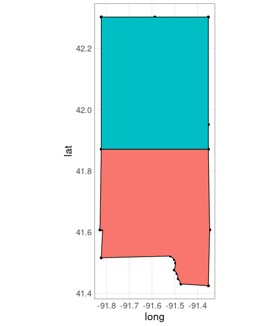
Fill polygons:
ggplot(jl_bdr, aes(x = long,
                   y = lat,
                   fill = subregion)) +
    geom_point() +
    geom_polygon(color = "black") +
    guides(fill = "none") +
    coord_map()
Simple polygon data along with geom_polygon() works reasonably well for many simple applications.
For more complex applications it is best to use special spatial data structures.
An approach becoming widely adopted in many open-source frameworks for working with spatial data is called simple features .
There are 63 regions in the state boundaries data because several states consist of disjoint regions.
A selection:
filter(gusa, region %in% c("massachusetts", "michigan", "virginia")) |>
    select(region, subregion) |>
    unique()
##             region         subregion
## 1    massachusetts martha's vineyard
## 37   massachusetts              main
## 257  massachusetts         nantucket
## 287       michigan             north
## 747       michigan             south
## 1117      virginia        chesapeake
## 1213      virginia      chincoteague
## 1228      virginia              main
The map can be drawn using geom_polygon:
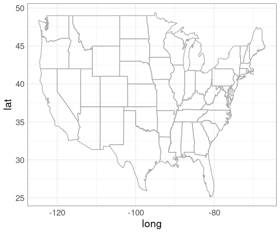
p_usa <- ggplot(gusa) +
geom_polygon(aes(x = long, y = lat,
group = group),
fill = NA,
color = "darkgrey")
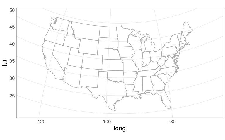
p_usaThis map looks odd since it is not using a sensible projection for converting the spherical longitude/latitude coordinates to a flat surface.
Projections
Longitude/latitude position points on a sphere; maps are drawn on a flat surface.
One degree of latitude corresponds to about 69 miles everywhere.
But one degree of longitude is shorter farther away from the equator.
In Iowa City, at latitude 41.6 degrees north, one degree of longitude corresponds to about
\[
69 \times \cos(41.6 / 90 \times \pi / 2) \approx
52
\]
miles.
A commonly used projection is the Mercator projection
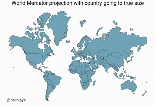
The Mercator projection is a cylindrical projection that preserves angles but distorts areas far away from the equator.
An illustration of the area distortion in the Mercator projection:
The Mercator projection is the default projection used by coord_map:
p_usa + coord_map()
Other projections can be specified instead.
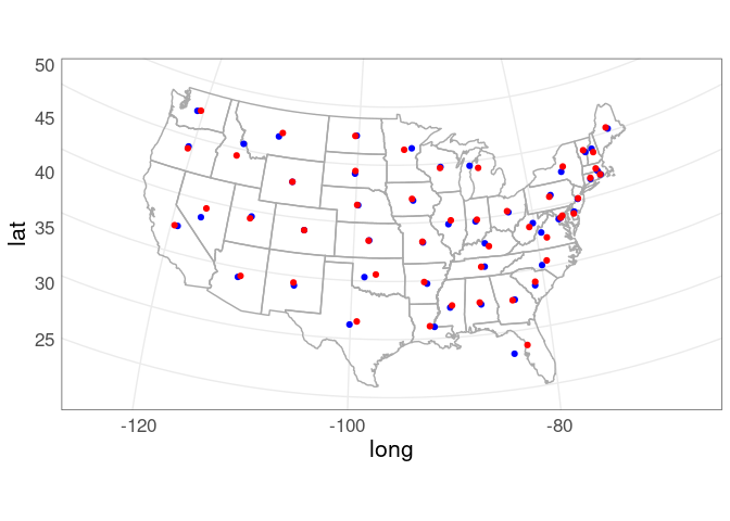
One alternative is The Bonne projection
p_usa +
    coord_map("bonne", parameters = 41.6)
The Bonne projection is an equal area projection that preserves shapes around a standard latitude but distorts farther away.
This preserves shapes at the latitude of Iowa City.
The projections applied with coord_map will be used in all layers.
Wind Turbines in Iowa
Data on wind turbines is available here .
A snapshot of the data is available locally .
The locations for Iowa can be shown on a map of Iowa county borders.
First, get the wind turbine data:
wtfile <- "uswtdb_v7_2_20241120.csv.gz"
if (! file.exists(wtfile))
    download.file(paste0("https://stat.uiowa.edu/~luke/data/", wtfile),
                  wtfile)
wind_turbines <- read.csv(wtfile)
wt_IA <- filter(wind_turbines,
                t_state == "IA") |>
    mutate(p_year =
               replace(p_year, p_year < 0, NA))
Next, get the map data:
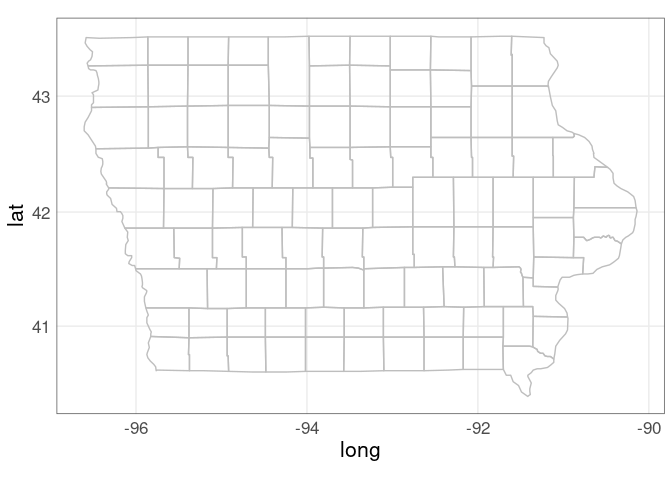
giowa <- map_data("county", "iowa")A map of iowa county borders:
p <- ggplot(giowa) +
    geom_polygon(
        aes(x = long, y = lat,
            group = group),
        fill = NA, color = "grey") +
    coord_map()
p
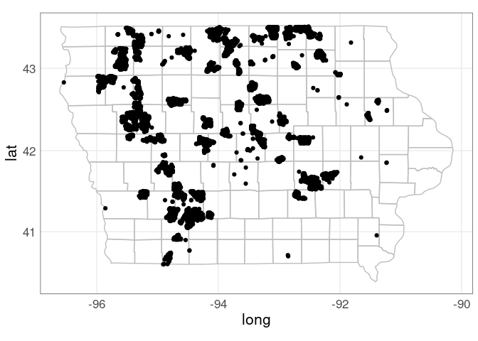
Add the wind turbine locations:
p +
    geom_point(aes(x = xlong, y = ylat),
               data = wt_IA)
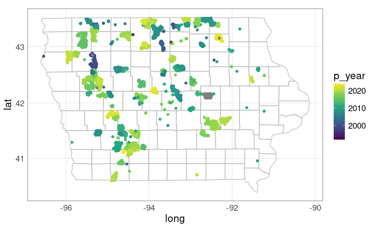
Use color to show the year of construction:
p +
    geom_point(aes(x = xlong, y = ylat,
                   color = p_year),
               data = wt_IA) +
    scale_color_viridis_c()
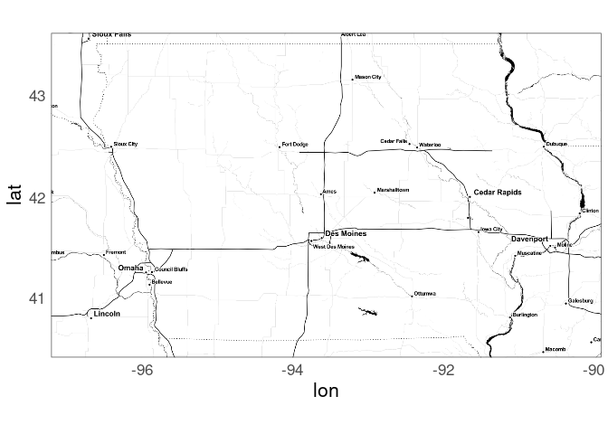
A background map showing features like terrain or city locations and major roads can often help.
Maps are available from various sources, with various restrictions and limitations.
Stamen maps are often a good option. Stamen maps are now hosted by Stadia Maps.
The ggmap package provides an interface for using Stamen maps.
A Stamen toner map background:
library(ggmap)
register_stadiamaps(StadiaKey, write = FALSE)
m <-
    get_stadiamap(
        c(-97.2, 40.4, -89.9, 43.6),
        zoom = 8,
        maptype = "stamen_toner")
ggmap(m)
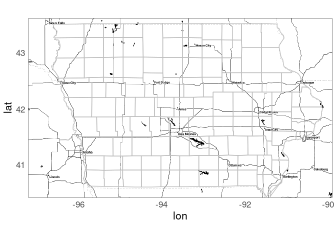
County borders with a Stamen map background:
ggmap(m) +
    geom_polygon(aes(x = long, y = lat,
                     group = group),
                 data = giowa,
                 fill = NA,
                 color = "grey")
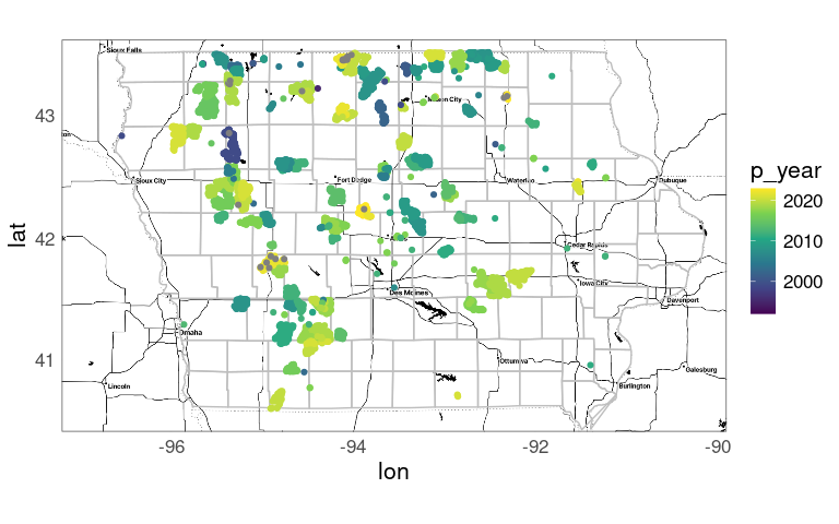
Add the wind turbine locations:
ggmap(m) +
    geom_polygon(aes(x = long, y = lat,
                     group = group),
                 data = giowa,
                 fill = NA,
                 color = "grey") +
    geom_point(aes(x = xlong, y = ylat,
                   color = p_year),
               data = wt_IA) +
    scale_color_viridis_c()
With other backgrounds it might be necessary to choose a different color palette.
County Population Data
The census bureau provides estimates of populations of US counties.
State and county level population counts can be visualized several ways, e.g.:
For a proportional symbol map we need to pick locations for the symbols.
First step: read the data.
readPEP <- function(fname) {
   read.csv(fname, encoding = "latin1") |>
        filter(COUNTY != 0) |> ## drop state totals
        mutate(FIPS = 1000 * STATE + COUNTY) |>
        select(FIPS, county = CTYNAME, state = STNAME,
               starts_with("POPESTIMATE")) |>
        pivot_longer(starts_with("POPESTIMATE"),
                     names_to = "year",
                     names_prefix = "POPESTIMATE",
                     values_to = "pop")
}

if (! file.exists("co-est2021-alldata.csv"))
    download.file("https://stat.uiowa.edu/~luke/data/co-est2021-alldata.csv",
                  "co-est2021-alldata.csv")

pep2021 <- readPEP("co-est2021-alldata.csv")
For the 2021 data:
head(pep2021)
## # A tibble: 6 × 5
##    FIPS county         state   year     pop
##   <dbl> <chr>          <chr>   <chr>  <int>
## 1  1001 Autauga County Alabama 2020   58877
## 2  1001 Autauga County Alabama 2021   59095
## 3  1003 Baldwin County Alabama 2020  233140
## 4  1003 Baldwin County Alabama 2021  239294
## 5  1005 Barbour County Alabama 2020   25180
## 6  1005 Barbour County Alabama 2021   24964
Counties and states are identified by name and also by FIPS code .
The final three digits identify the county within a state.
The leading one or two digits identify the state.
The FIPS code for Johnson County, IA is 19103.
Create a Proportional Symbol Map of State Populations
We will need:
Aggregate the county populations to the state level:
state_pops <- mutate(pep2021, state = tolower(state)) |>
    filter(year == 2021) |>
    group_by(state) |>
    summarize(pop = sum(pop, na.rm = TRUE)) |>
    ungroup()
Using tolower matches the case in the polygon data:
filter(gusa, region == "iowa") |> head(1)
##        long      lat group order region subregion
## 1 -91.22634 43.49895    14  3539   iowa      <NA>
An alternative would be to use the state FIPS code and the state.fips table.
Computing Centroids
Marks representing data values for a region are often placed at the region’s centroid , or centers of gravity.
A quick approximation to the centroids of the polygons is to compute the centers of their bounding rectangles.
state_centroids_quick <-
rename(gusa, state = region) |>
group_by(state) |>
summarize(x = mean(range(long)),
y = mean(range(lat)))
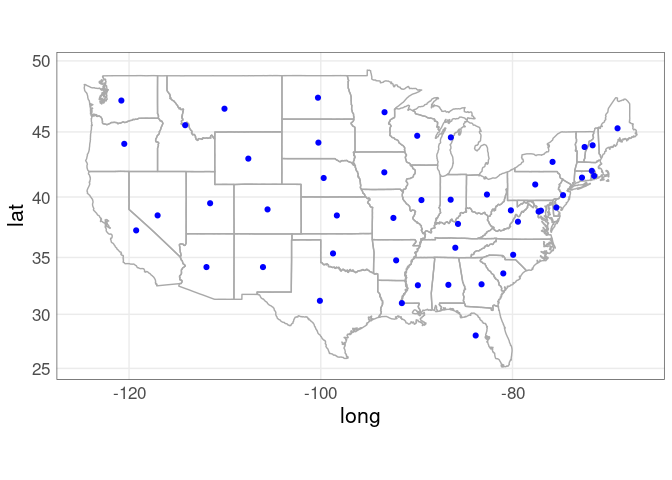
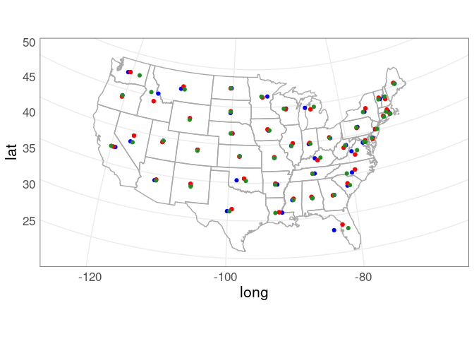
p_usa +
geom_point(aes(x, y),
data = state_centroids_quick,
color = "blue") +
coord_map()
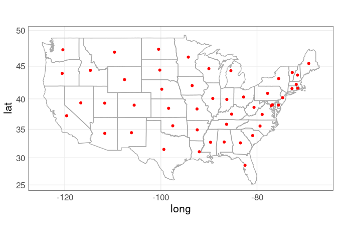
More sophisticated approaches to computing centroids are also available.
Using simple features sf package:
sf::sf_use_s2(FALSE)
state_centroids <-
    sf::st_as_sf(gusa,
                 coords = c("long", "lat"),
                 crs = 4326) |>
    group_by(region) |>
    summarize(do_union = FALSE) |>
    sf::st_cast("POLYGON") |>
    ungroup() |>
    sf::st_centroid() |>
    sf::as_Spatial() |>
    as.data.frame() |>
    rename(x = coords.x1, y = coords.x2, state = region)
sf::sf_use_s2(TRUE)
pp <- p_usa +
    geom_point(aes(x, y),
               data = state_centroids, color = "red")
pp + coord_map()
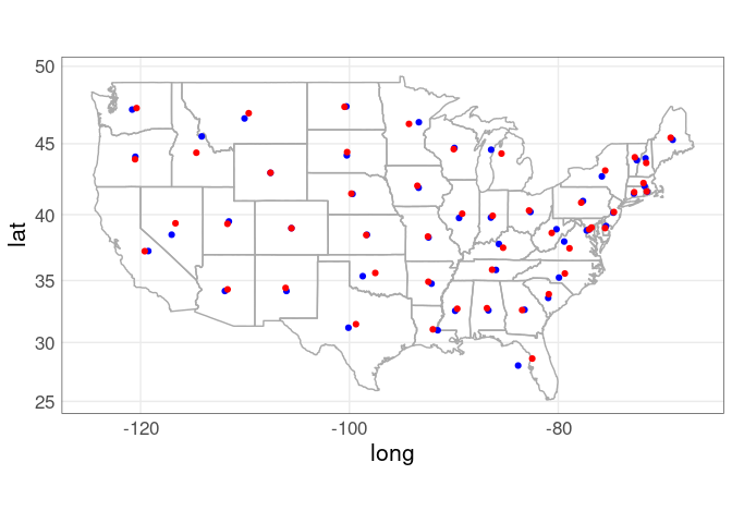
Comparing the two approaches:
p_usa +
    geom_point(aes(x, y),
               data = state_centroids_quick,
               color = "blue") +
    geom_point(aes(x, y),
               data = state_centroids,
               color = "red") +
    coord_map()
A projection specified with coord_map will be applied to all layers:
p_usa +
    geom_point(aes(x, y),
               data = state_centroids_quick,
               color = "blue") +
    geom_point(aes(x, y),
               data = state_centroids,
               color = "red") +
    coord_map("bonne", parameters = 41.6)
Centroids are not guaranteed to be inside a polygon.
A point on surface is computed in a way that is guaranteed to be inside.
sf::sf_use_s2(FALSE)
state_point_on_surface <-
    sf::st_as_sf(gusa,
                 coords = c("long", "lat"),
                 crs = 4326) |>
    group_by(region) |>
    summarize(do_union = FALSE) |>
    sf::st_cast("POLYGON") |>
    ungroup() |>
    sf::st_point_on_surface() |>
    sf::as_Spatial() |>
    as.data.frame() |>
    rename(x = coords.x1, y = coords.x2, state = region)
sf::sf_use_s2(TRUE)

p_usa +
    geom_point(aes(x, y), data = state_centroids_quick,
               color = "blue") +
    geom_point(aes(x, y), data = state_centroids,
               color = "red") +
    geom_point(aes(x, y), data = state_centroids,
               color = "red") +
    geom_point(aes(x, y), data = state_point_on_surface,
               color = "forestgreen") +
    coord_map("bonne", parameters = 41.6)
Symbol Plots of State Population
Merge in the centroid locations.
state_pops <- inner_join(state_pops, state_centroids, "state")
head(state_pops)
## # A tibble: 6 × 4
##   state            pop      x     y
##   <chr>          <int>  <dbl> <dbl>
## 1 alabama      5039877  -86.8  32.8
## 2 arizona      7276316 -112.   34.3
## 3 arkansas     3025891  -92.4  34.9
## 4 california  39237836 -120.   37.3
## 5 colorado     5812069 -106.   39.0
## 6 connecticut  3605597  -72.7  41.6
Using inner_join drops cases not included in the lower-48 map data.
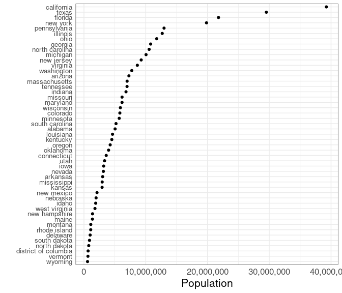
A dot plot:
ggplot(state_pops) +
    geom_point(aes(x = pop,
                   y = reorder(state, pop))) +
    labs(x = "Population", y = "") +
    theme(axis.text.y = element_text(size = 10)) +
    scale_x_continuous(labels = scales::comma)
The population distribution is heavily skewed; a color coding would need to account for this.
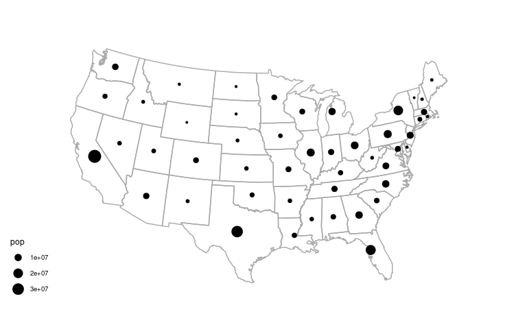
A proportional symbol map:
p_usa +
    geom_point(aes(x, y, size = pop),
               data = state_pops) +
    scale_size_area() +
    coord_map("bonne", parameters = 41.6) +
    ggthemes::theme_map()
With a fancier legend:
p_usa +
    geom_point(aes(x, y, size = pop),
               data = state_pops) +
    scale_size_area(
        labels = scales::label_comma(),
        breaks = c(5000000, 15000000, 30000000),
        max_size = 10,
        guide = legendry::guide_circles()
    ) +
    labs(size = "Population") +
    coord_map("bonne", parameters = 41.6) +
    ggthemes::theme_map() +
    theme(
        legend.text =
            element_text(size = rel(0.55)),
        legend.ticks =
            element_line(colour = "black",
                         linetype = "22"))
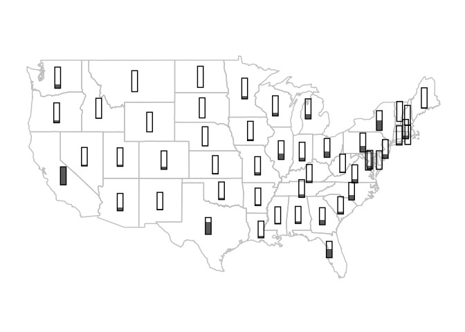
The thermometer symbol approach suggested by Cleveland and McGill (1984) can be emulated using geom_rect:
p_usa +
    geom_rect(aes(xmin = x - .4,
                  xmax = x + .4,
                  ymin = y - 1,
                  ymax = y + 2 * (pop / max(pop)) - 1),
              data = state_pops) +
    geom_rect(aes(xmin = x - .4,
                  xmax = x + .4,
                  ymin = y - 1,
                  ymax = y + 1),
              data = state_pops,
              fill = NA,
              color = "black") +
    coord_map() +
    ggthemes::theme_map()
To work well along the northeast this would need a strategy similar to the one used by ggrepel for preventing label overlap.
Choropleth Maps of State Population
A choropleth map needs to have the information for coloring all the pieces of a region.
This can be done by merging using left_join:
sp <- select(state_pops, region = state, pop)
gusa_pop <- left_join(gusa, sp, "region")
head(gusa_pop)
##        long      lat group order  region subregion     pop
## 1 -87.46201 30.38968     1     1 alabama      <NA> 5039877
## 2 -87.48493 30.37249     1     2 alabama      <NA> 5039877
## 3 -87.52503 30.37249     1     3 alabama      <NA> 5039877
## 4 -87.53076 30.33239     1     4 alabama      <NA> 5039877
## 5 -87.57087 30.32665     1     5 alabama      <NA> 5039877
## 6 -87.58806 30.32665     1     6 alabama      <NA> 5039877
A first attempt:
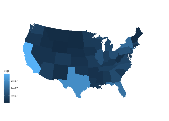
ggplot(gusa_pop) +
    geom_polygon(aes(long, lat,
                     group = group,
                     fill = pop)) +
    coord_map("bonne", parameters = 41.6) +
    ggthemes::theme_map()
This image is dominated by the fact that most state populations are small.
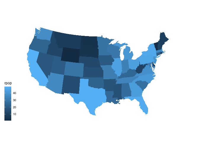
Showing population ranks, or percentile values, can help see the variation a bit better.
spr <- mutate(sp, rpop = rank(pop))gusa_rpop <- left_join(gusa, spr, "region")ggplot(gusa_rpop) +
geom_polygon(aes(long, lat,
group = group,
fill = rpop)) +
coord_map("bonne", parameters = 41.6) +
ggthemes::theme_map()
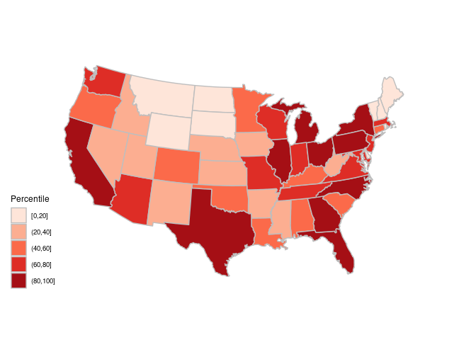
Using quintile bins instead of a continuous scale:
spr <-
    mutate(spr,
           pcls = cut_width(100 * percent_rank(pop),
                            width = 20,
                            center = 10))
gusa_rpop <- left_join(gusa, spr, "region")ggplot(gusa_rpop) +
geom_polygon(aes(long, lat,
group = group,
fill = pcls),
color = "grey") +
coord_map("bonne", parameters = 41.6) +
ggthemes::theme_map() +
scale_fill_brewer(palette = "Reds",
name = "Percentile")
Choropleth Maps of County Population
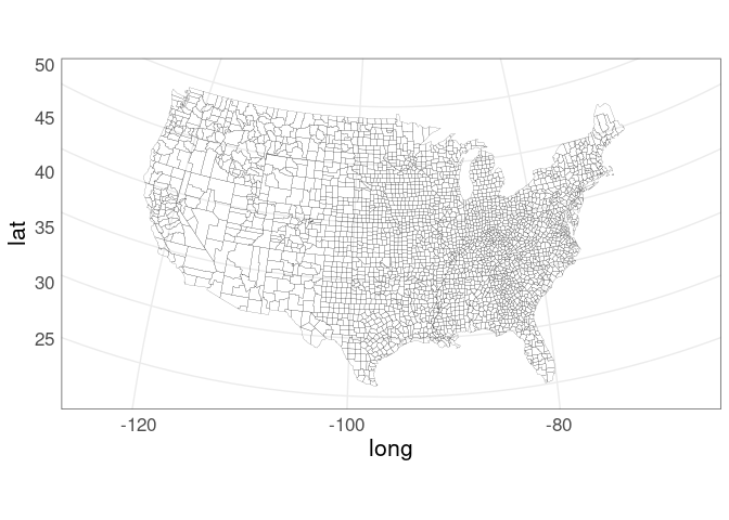
For a county-level ggplot map, first get the polygon data frame:
gcounty <- map_data("county")ggplot(gcounty) +
geom_polygon(aes(long, lat,
group = group),
fill = NA,
color = "black",
linewidth = 0.05) +
coord_map("bonne", parameters = 41.6)
We will again need to merge population data with the polygon data.
Using county name is challenging because of mismatches like this:
filter(gcounty, grepl("brien", subregion)) |> head(1)
##        long      lat group order region subregion
## 1 -95.86156 43.26404   825 26075   iowa    obrien
filter(pep2021, FIPS == 19141, year == 2021) |> as.data.frame()
##    FIPS         county state year   pop
## 1 19141 O'Brien County  Iowa 2021 14015
Another example:
filter(pep2021, state == "New Mexico") |> _$county[15:16]
## [1] "Doña Ana County" "Doña Ana County"
filter(gcounty, region == "new mexico") |> _$subregion |> unique() |> _[7]
## [1] "dona ana"
A better option is to match on FIPS county code.
The county.fips data frame in the maps package links the FIPS code to region names used by the map data in the maps package.
head(maps::county.fips, 4)
##   fips        polyname
## 1 1001 alabama,autauga
## 2 1003 alabama,baldwin
## 3 1005 alabama,barbour
## 4 1007    alabama,bibb
To attach the FIPS code to the polygons we first need to clean up the county.fips table a bit:
filter(maps::county.fips, grepl(":", polyname)) |> head(3)
##    fips                  polyname
## 1 12091     florida,okaloosa:main
## 2 12091     florida,okaloosa:spit
## 3 22099 louisiana,st martin:north
Remove the sub-county regions, remove duplicate rows, and split the polyname variable into region and subregion.
fipstab <-
    transmute(maps::county.fips, fips, county = sub(":.*", "", polyname)) |>
    unique() |>
    separate(county, c("region", "subregion"), sep = ",")
head(fipstab, 3)
##   fips  region subregion
## 1 1001 alabama   autauga
## 2 1003 alabama   baldwin
## 3 1005 alabama   barbour
Then use left_join to merge the FIPS code into the polygon data:
gcounty <- left_join(gcounty, fipstab, c("region", "subregion"))
head(gcounty)
##        long      lat group order  region subregion fips
## 1 -86.50517 32.34920     1     1 alabama   autauga 1001
## 2 -86.53382 32.35493     1     2 alabama   autauga 1001
## 3 -86.54527 32.36639     1     3 alabama   autauga 1001
## 4 -86.55673 32.37785     1     4 alabama   autauga 1001
## 5 -86.57966 32.38357     1     5 alabama   autauga 1001
## 6 -86.59111 32.37785     1     6 alabama   autauga 1001
Next, we need to pull together the data for the map, adding ranks and quintile bins.
cpop <- filter(pep2021, year == 2021) |>
    select(fips = FIPS, pop) |>
    mutate(rpop = rank(pop),
           pcls = cut_width(100 * percent_rank(pop),
                            width = 20, center = 10))
head(cpop)
## # A tibble: 6 × 4
##    fips    pop  rpop pcls
##   <dbl>  <int> <dbl> <fct>
## 1  1001  59095  2256 (60,80]
## 2  1003 239294  2855 (80,100]
## 3  1005  24964  1529 (40,60]
## 4  1007  22477  1446 (40,60]
## 5  1009  59041  2255 (60,80]
## 6  1011  10320   755 (20,40]
Now left join with the county map data:
gcounty_pop <- left_join(gcounty, cpop, "fips")County level population map using the default continuous color scale:
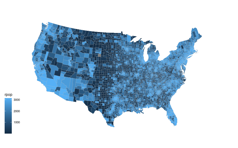
ggplot(gcounty_pop) +
    geom_polygon(aes(long, lat,
                     group = group,
                     fill = rpop),
                 color = "grey",
                 linewidth = 0.1) +
    coord_map("bonne", parameters = 41.6) +
    ggthemes::theme_map()
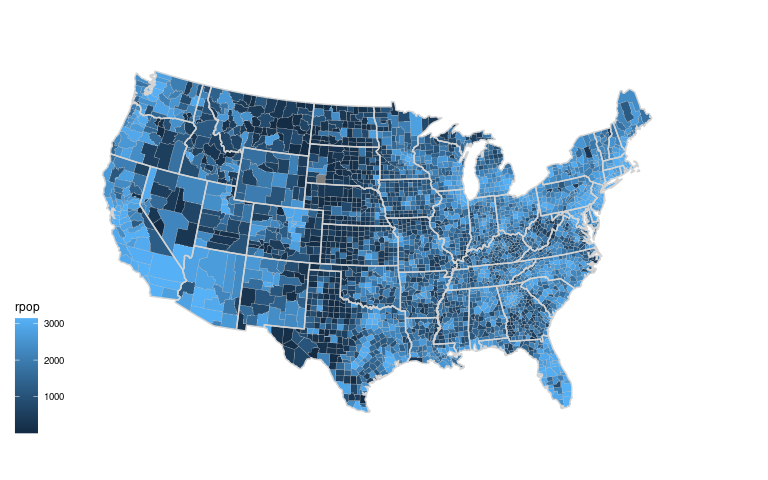
Adding state boundaries might help:
ggplot(gcounty_pop) +
    geom_polygon(aes(long, lat,
                     group = group,
                     fill = rpop),
                 color = "grey",
                 linewidth = 0.1) +
    geom_polygon(aes(long, lat,
                     group = group),
                 fill = NA,
                 data = gusa,
                 color = "lightgrey") +
    coord_map("bonne", parameters = 41.6) +
    ggthemes::theme_map()
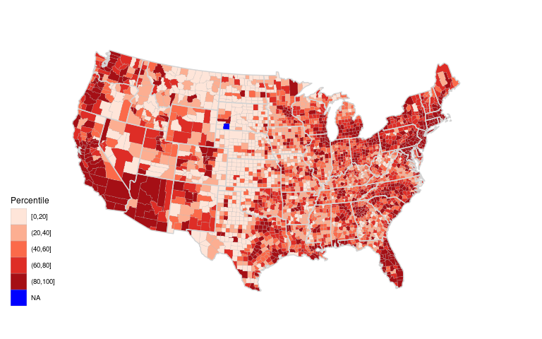
A discrete scale with a very different color to highlight the counties with missing information:
ggplot(gcounty_pop) +
    geom_polygon(aes(long, lat,
                     group = group,
                     fill = pcls),
                 color = "grey",
                 linewidth = 0.1) +
    geom_polygon(aes(long, lat,
                     group = group),
                 fill = NA,
                 data = gusa,
                 color = "lightgrey") +
    coord_map("bonne", parameters = 41.6) +
    ggthemes::theme_map() +
    scale_fill_brewer(palette = "Reds",
                      na.value = "blue",
                      name = "Percentile")
Why is there a missing value in South Dakota?
Check whether fipstab provides a FIPS code for every county in the map data:
gcounty_regions <-
    select(gcounty, region, subregion) |>
    unique()
anti_join(gcounty_regions, fipstab, c("region", "subregion"))
##         region     subregion
## 1 south dakota oglala lakota
There is also a fipstab entry without map data:
anti_join(fipstab, gcounty_regions, c("region", "subregion"))
##    fips       region subregion
## 1 46113 south dakota   shannon
Shannon County SD was renamed Oglala Lakota County in 2015.
It was also given a new FIPS code .
The pep2021 entry shows the correct FIPS code:
filter(pep2021,
       year == 2021,
       state == "South Dakota",
       grepl("Oglala", county))
## # A tibble: 1 × 5
##    FIPS county               state        year    pop
##   <dbl> <chr>                <chr>        <chr> <int>
## 1 46102 Oglala Lakota County South Dakota 2021  13586
Add an entry with the FIPS code and subregion name matching the map data:
fipstab <-
    rbind(fipstab,
          data.frame(fips = 46102,
                     region = "south dakota",
                     subregion = "oglala lakota"))
Fix up the data:
gcounty <- map_data("county")
gcounty <- left_join(gcounty,
                     fipstab,
                     c("region", "subregion"))
gcounty_pop <- left_join(gcounty, cpop, "fips")
Redraw the plot:
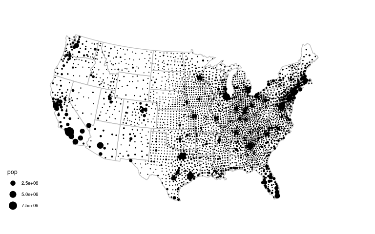
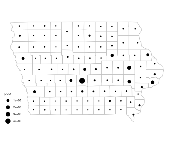
A County Population Symbol Map
A symbol map can also be used to show the county populations.
We again need centroids; approximate county centroids should do.
county_centroids <-
    group_by(gcounty, fips) |>
    summarize(x = mean(range(long)), y = mean(range(lat)))
Merge the population values into the centroids data:
county_pops <- select(cpop, pop, fips)
county_pops <- inner_join(county_pops, county_centroids, "fips")
A proportional symbol map of county populations:
ggplot(gcounty) +
    geom_polygon(aes(long, lat,
                     group = group),
                 fill = NA,
                 col = "grey",
                 data = gusa) +
    geom_point(aes(x, y, size = pop),
               data = county_pops) +
    scale_size_area() +
    coord_map("bonne", parameters = 41.6) +
    ggthemes::theme_map()
Jittering might be helpful to remove the very regular grid patters in the center.
Comparing Populations in 2010 and 2021
One possible way to compare spatial data for several time periods is to use a faceted display with one map for each period.
With many periods using animation is also an option.
This can work well when there is a substantial amount of change; an example used to be available here .
A similar example using some state-level data from the CDC :
A faceted display may not work as well when the changes are more subtle.
To bin the county population data by quintiles we can use the 2021 values.
ncls <- 6
cls <- quantile(filter(pep2021, year == 2021)$pop,
                seq(0, 1, len = ncls))
To merge the binned population data into the polygon data we can create a data frame with binned population variables for the two time frames.
This will allow a cleaner merge in terms of handling counties with missing data.
After selecting the years and the variables we need, we add the binned population and then pivot to a wider form with one row per county:
cpop <-
    bind_rows(filter(pep2019, year == 2010),
              filter(pep2021, year == 2021)) |>
    transmute(fips = FIPS,
              year,
              pcls = cut(pop, cls, include.lowest = TRUE)) |>
    pivot_wider(values_from = c("pcls"),
                names_from = "year",
                names_prefix = "pcls")
head(cpop)
## # A tibble: 6 × 3
##    fips pcls2010            pcls2021
##   <dbl> <fct>               <fct>
## 1  1001 (3.68e+04,9.71e+04] (3.68e+04,9.71e+04]
## 2  1003 (9.71e+04,9.83e+06] (9.71e+04,9.83e+06]
## 3  1005 (1.87e+04,3.68e+04] (1.87e+04,3.68e+04]
## 4  1007 (1.87e+04,3.68e+04] (1.87e+04,3.68e+04]
## 5  1009 (3.68e+04,9.71e+04] (3.68e+04,9.71e+04]
## 6  1011 (8.7e+03,1.87e+04]  (8.7e+03,1.87e+04]
This data can now be merged with the polygon data.
gcounty_pop <- left_join(gcounty, cpop, "fips")To create a faceted display with ggplot we need the data in tidy form.
gcounty_pop_long <-
    pivot_longer(gcounty_pop, starts_with("pcls"),
                 names_to = "year",
                 names_prefix = "pcls",
                 values_to = "pcls") |>
    mutate(year = as.integer(year))
An alternative would be to create two layers and show them in separate facets.
ggplot(gcounty_pop_long) +
    geom_polygon(aes(long, lat, group = group, fill = pcls),
                 color = "grey", linewidth = 0.1) +
    geom_polygon(aes(long, lat, group = group),
                 fill = NA, data = gusa, color = "lightgrey") +
    coord_map("bonne", parameters = 41.6) +
    ggthemes::theme_map() +
    scale_fill_brewer(palette = "Reds", na.value = "blue") +
    facet_wrap(~ year, ncol = 2) +
    theme(legend.position = "right")
Since the changes are quite subtle a side-by-side display does not work very well.
A more effective approach in this case is to plot the relative changes.
This is also a (somewhat) more appropriate use of a choropleth map.
Start by adding percent changes to the data.
cpop <-
    bind_rows(filter(pep2019, year == 2010),
              filter(pep2021, year == 2021)) |>
    select(fips = FIPS, pop, year) |>
    pivot_wider(values_from = "pop",
                names_from = "year", names_prefix = "pop") |>
    mutate(pchange = 100 * (pop2021 - pop2010) / pop2010)
gcounty_pop <- left_join(gcounty, cpop, "fips")
A binned version of the percent changes will also be useful.
bins <- c(-Inf, -20, -10, -5, 5, 10, 20, Inf)
cpop <- mutate(cpop, cpchange = cut(pchange, bins, ordered_result = TRUE))
gcounty_pop <- left_join(gcounty, cpop, "fips")
Using a continuous scale with the default palette:
pcounty <- ggplot(gcounty_pop) +
coord_map("bonne", parameters = 41.6) + ggthemes::theme_map()
state_layer <- geom_polygon(aes(long, lat, group = group),
fill = NA, data = gusa, color = "lightgrey")
county_cont <- geom_polygon(aes(long, lat, group = group, fill = pchange),
color = "grey", linewidth = 0.1)
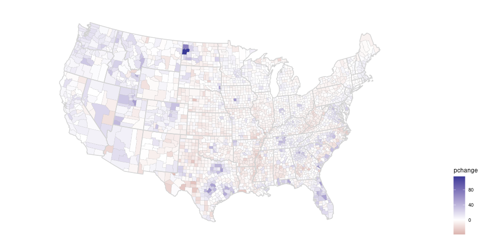
pcounty + county_cont + state_layer + theme(legend.position = "right")
Using a simple diverging palette:
pcounty +
    county_cont +
    state_layer +
    scale_fill_gradient2() +
    theme(legend.position = "right")
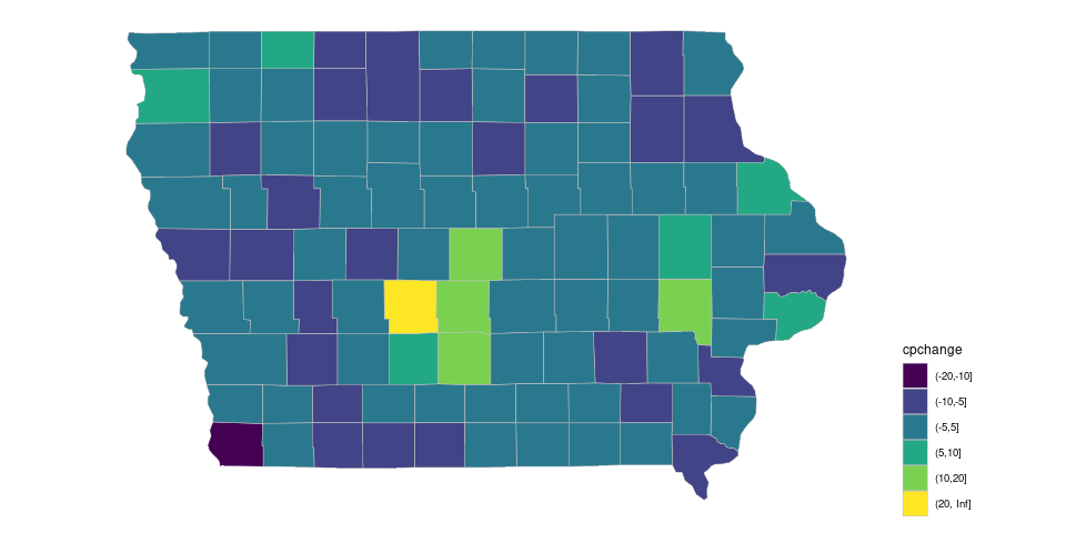
For the binned version the default ordered discrete color palette produces:
county_disc <- geom_polygon(aes(long, lat, group = group, fill = cpchange),
                            color = "grey", linewidth = 0.1)

pcounty + county_disc + state_layer + theme(legend.position = "right")
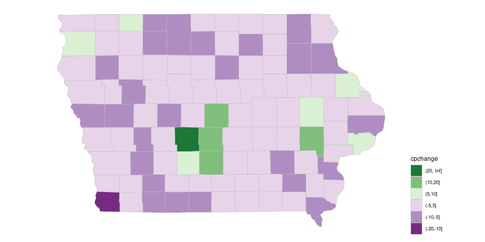
A diverging palette allows increases and decreases to be seen.
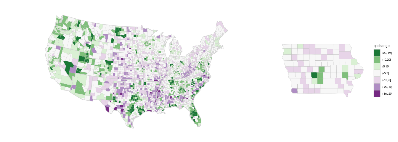
Using the PRGn palette from ColorBrewer:
(p_dvrg_48 <-
     pcounty +
     county_disc +
     state_layer +
     scale_fill_brewer(palette = "PRGn",
                       na.value = "red",
                       guide = guide_legend(reverse = TRUE))) +
    theme(legend.position = "right")
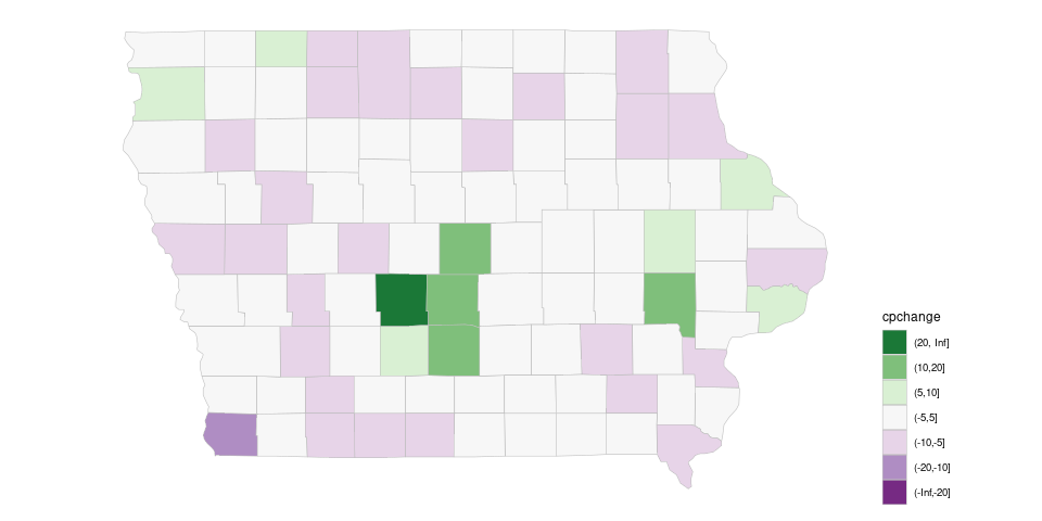
Focusing on Iowa
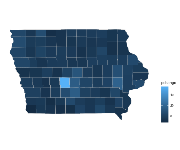
The default continuous palette produces
piowa <- ggplot(filter(gcounty_pop, region == "iowa")) +
    coord_map() + ggthemes::theme_map()
pc_cont_iowa <- geom_polygon(aes(long, lat, group = group, fill = pchange),
                             color = "grey", linewidth = 0.2)
piowa + pc_cont_iowa + theme(legend.position = "right")
Aside: Iowa has 99 counties, which seems a peculiar number.
It used to have 100:
With the default ordered discrete palette:
## show.legend = TRUE is needed to make drop = FALSE work later
pc_disc_iowa <- geom_polygon(aes(long, lat, group = group, fill = cpchange),
                             color = "grey", linewidth = 0.2,
                             show.legend = TRUE)
piowa + pc_disc_iowa + theme(legend.position = "right")
Using the PRGn palette, for example, will by default adjust the palette to the levels present in the data, and Iowa does not have counties in all the bins:
piowa +
    pc_disc_iowa +
    scale_fill_brewer(palette = "PRGn",
                      guide = guide_legend(reverse = TRUE)) +
    theme(legend.position = "right")
Two issues:
Adding drop = FALSE to the palette specification preserves the encoding from the full map:
pc_disc_iowa <- geom_polygon(aes(long, lat,
                                 group = group, fill = cpchange),
                             color = "grey", linewidth = 0.2,
                             show.legend = TRUE)
(p_dvrg_iowa <-
     piowa +
     pc_disc_iowa +
     scale_fill_brewer(palette = "PRGn",
                       drop = FALSE,
                       guide = guide_legend(reverse = TRUE))) +
    theme(legend.position = "right")
For drop = FALSE to work properly you currently also need to specify show.legend = TRUE in the polygon layer.
Matching the national map would be particularly important for showing the two together:
library(patchwork)
(p_dvrg_48 + guides(fill = "none")) + p_dvrg_iowa +
    plot_layout(guides = "collect", widths = c(3, 1))
Some Notes on Choropleth Maps
Choropleth maps are very popular, in part because of their visual appeal.
But they do have to be used with care.
Choropleth maps are good for showing rates or counts per unit of area, such as
They also work well for measurements that may vary little across a region, as well as for some demographic summaries, such as
average winter temperature in a state or county;
average level of summer humidity in a state or county.
average age of population in a state or county.
Choropleth maps should generally not be used for counts, such as number of cases of a disease, since the result is usually just a map of population size.
Proportional symbol maps are usually a better choice for showing counts, such as population sizes, in a geographic contexts
Choropleth maps can be used to show proportional counts, or counts per area, but need to be used with care.
Changes in counts by one or two can cause large changes in proportions when population sizes are small.
County level choropleth maps of cancer rates, for example, can change a lot with one additional case in a county with a small population.
When proportions are shown but total counts are what really matters, there is a tendency for viewers to let the area supply the denominator.
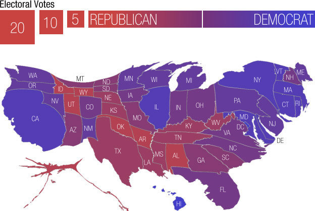
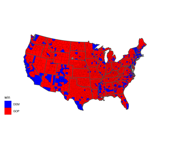
An example is provided by a choropleth map that has been used to show county level results for the 2016 presidential election.
A map showing which of the two major parties received a plurality in each county:
if (! file.exists("US_County_Level_Presidential_Results_08-16.csv")) {
    download.file("https://stat.uiowa.edu/~luke/data/US_County_Level_Presidential_Results_08-16.csv", ## nolint
                  "US_County_Level_Presidential_Results_08-16.csv")
}

pres <- read.csv("US_County_Level_Presidential_Results_08-16.csv") |>
    mutate(fips = fips_code,
           p = dem_2016 / (dem_2016 + gop_2016),
           win = ifelse(p > 0.5, "DEM", "GOP"))

gcounty_pres <- left_join(gcounty, pres, "fips")

ggplot(gcounty_pres, aes(long, lat, group = group, fill = win)) +
    geom_polygon(col = "black", linewidth = 0.05) +
    geom_polygon(aes(long, lat, group = group),
                 fill = NA, color = "grey30", linewidth = 0.5, data = gusa) +
    coord_map("bonne", parameters = 41.6) +
    ggthemes::theme_map() +
    scale_fill_manual(values = c(DEM = "blue", GOP = "red"))
There are many internet posts about a map like this, for example here and here .
To a casual viewer this gives the impression of an overwhelming GOP win.
But many of the red counties have very small populations.
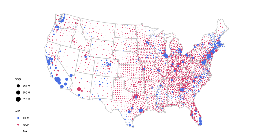
A proportional symbol map more accurately reflects the results, which were very close with a majority of the popular vote going to the Democrat’s candidate:
county_pres <- left_join(county_pops, pres, "fips")

ggplot(gcounty) +
    geom_polygon(aes(long, lat, group = group), fill = NA, col = "grey",
                 data = gusa) +
    geom_point(aes(x, y, size = pop, color = win), data = county_pres) +
    scale_size_area(labels = scales::label_number(scale = 1e-6,
                                                  suffix = " M",
                                                  trim = FALSE)) +
    ## scale_color_manual(values = c(DEM = "blue", GOP = "red")) +
    colorspace::scale_color_discrete_diverging(palette = "Blue-Red 2") +
    coord_map("bonne", parameters = 41.6) +
    ggthemes::theme_map()
## Warning: Removed 1 row containing missing values or values outside the scale range
## (`geom_point()`).
Isopleth Map of Population Density
While populations do tend to cluster in cities, they are not entirely clustered at county centroids.
Other quantities, such as temperatures, may be measured at discrete points but vary smoothly across a region.
Isopleth maps show the contours of a smooth surface.
For populations, it is sometimes useful to estimate and visualize a population density surface.
To estimate the population density we can use the county centroids weighted by the county population values.
The function kde2d from the MASS package can be used to compute kernel density estimates, but does not support the use of weights.
A simple modification that does support weights is available here .
By default, kde2d estimates the density on a grid over the range of the two variables.
source(here::here("kde2d.R"))
ds <- with(county_pops, kde2d(x, y, weights = pop))
str(ds)
## List of 3
##  $ x: num [1:25] -124 -122 -119 -117 -115 ...
##  $ y: num [1:25] 25.5 26.4 27.4 28.4 29.4 ...
##  $ z: num [1:25, 1:25] 1.25e-12 2.46e-11 4.12e-10 5.76e-09 3.76e-08 ...
This result can be converted to a data frame using broom::tidy.
dsdf <- broom::tidy(ds) |>
    rename(Lon = x, Lat = y, dens = z)
head(dsdf, 3)
## # A tibble: 3 × 3
##     Lon   Lat     dens
##   <dbl> <dbl>    <dbl>
## 1 -124.  25.5 1.25e-12
## 2 -122.  25.5 2.46e-11
## 3 -119.  25.5 4.12e-10
A plot of the contours:
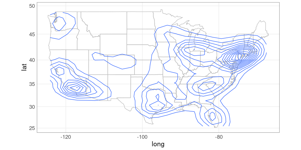
ggplot(gusa) +
    geom_polygon(aes(long, lat, group = group),
                 fill = NA,
                 color = "grey") +
    geom_contour(aes(Lon, Lat, z = dens),
                 data = dsdf) +
    coord_map()
To produce contours that work better when filled, it is useful to increase the number of grid points and enlarge the range.
ds <- with(county_pops,
           kde2d(x, y, weights = pop,
                 n = 50,
                 lims = c(-130, -60, 20, 50)))
dsdf <- broom::tidy(ds) |>
    rename(Lon = x, Lat = y, dens = z)
pusa <- ggplot(gusa) +
    geom_polygon(aes(long, lat, group = group),
                 fill = NA,
                 color = "grey") +
    coord_map()
pusa +
    geom_contour(aes(Lon, Lat, z = dens),
                 data = dsdf)
A filled contour version can be created using stat_contour and fill = after_stat(level).
pusa +
    stat_contour(aes(Lon, Lat, z = dens,
                     fill = after_stat(level)),
                 data = dsdf,
                 geom = "polygon",
                 alpha = 0.2)
To focus on Iowa we need subsets of the populations data and the map data:
iowa_pops <- filter(county_pops,
                    fips %/% 1000 == 19)
giowa <- filter(gcounty,
                fips %/% 1000 == 19)
A proportional symbols plot for the Iowa county populations:
iowa_base <- ggplot(giowa) +
    geom_polygon(aes(long, lat,
                     group = group),
                 fill = NA,
                 col = "grey") +
    coord_map()

iowa_base +
    geom_point(aes(x, y,
                   size = pop),
               data = iowa_pops) +
    scale_size_area() +
    ggthemes::theme_map()
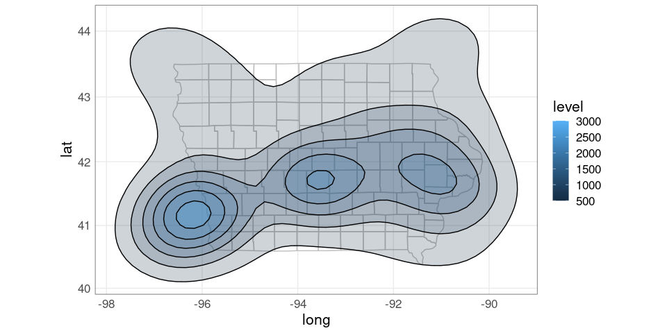
For a density plot it is useful to expand the populations used to include nearby large cities, such as Omaha.
iowa_pops <- filter(county_pops, x > -97 & x < -90 & y > 40 & y < 44)Density estimates can then be computed for the expanded Iowa data.
dsi <- with(iowa_pops, kde2d(x, y, weights = pop,
                             n = 50, lims = c(-98, -89, 40, 44.5)))
dsidf <- broom::tidy(dsi) |>
    rename(Lon = x, Lat = y, dens = z)
A simple contour map:
ggplot(giowa) +
    geom_polygon(aes(long, lat,
                     group = group),
                 fill = NA,
                 color = "grey") +
    geom_contour(aes(Lon, Lat, z = dens),
                 color = "blue",
                 na.rm = TRUE,
                 data = dsidf) +
    coord_map()
A filled contour map
pdiowa <- ggplot(giowa) +
geom_polygon(aes(long, lat, group = group),
fill = NA,
color = "grey") +
stat_contour(aes(Lon, Lat, z = dens,
fill = after_stat(level)),
color = "black",
alpha = 0.2,
na.rm = TRUE,
data = dsidf,
geom = "polygon")
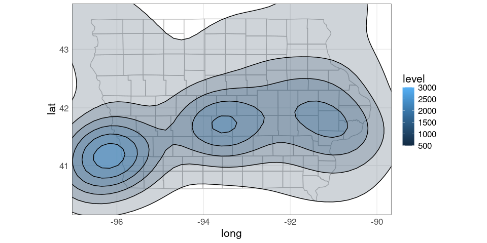
pdiowa + coord_map()
Using xlim and ylim arguments to coord_map to trim the range:
pdiowa +
    coord_map(xlim = c(-96.7, -90),
              ylim = c(40.3, 43.6))
It would be nice to be able to only show the density regions within Iowa.
This is challenging to do working with polygons.
Simple Features allow this sort of computation, and much more.
LS0tCnRpdGxlOiAiTWFwcyBhbmQgR2VvZ3JhcGhpY2FsIERhdGEiCm91dHB1dDoKICBodG1sX2RvY3VtZW50OgogICAgdG9jOiB5ZXMKICAgIGNvZGVfZm9sZGluZzogc2hvdwogICAgY29kZV9kb3dubG9hZDogdHJ1ZQotLS0KCjxsaW5rIHJlbD0ic3R5bGVzaGVldCIgaHJlZj0ic3RhdDQ1ODAuY3NzIiB0eXBlPSJ0ZXh0L2NzcyIgLz4KPHN0eWxlIHR5cGU9InRleHQvY3NzIj4gLnJlbWFyay1jb2RlIHsgZm9udC1zaXplOiA4NSU7IH0gPC9zdHlsZT4KCmBgYHtyIHNldHVwLCBpbmNsdWRlID0gRkFMU0V9CnNvdXJjZShoZXJlOjpoZXJlKCJzZXR1cC5SIikpCm9wdGlvbnMoaHRtbHRvb2xzLmRpci52ZXJzaW9uID0gRkFMU0UpCmxpYnJhcnkoZ2dwbG90MikKa25pdHI6Om9wdHNfY2h1bmskc2V0KGNvbGxhcHNlID0gVFJVRSwgZmlnLmFsaWduID0gImNlbnRlciIsCiAgICAgICAgICAgICAgICAgICAgICBmaWcuaGVpZ2h0ID0gNSwgZmlnLndpZHRoID0gNikKbGlicmFyeShsYXR0aWNlKQpsaWJyYXJ5KHRpZHl2ZXJzZSkKdGhlbWVfc2V0KHRoZW1lX21pbmltYWwoKSArCiAgICAgICAgICB0aGVtZSh0ZXh0ID0gZWxlbWVudF90ZXh0KHNpemUgPSAxNikpICsKICAgICAgICAgIHRoZW1lKHBhbmVsLmJvcmRlciA9IGVsZW1lbnRfcmVjdChjb2xvciA9ICJncmV5MzAiLCBmaWxsID0gTkEpKSkKc2V0LnNlZWQoMTIzNDUpCmBgYAoKCiMjIERhdGEgVHlwZXMKCk1hbnkgZGlmZmVyZW50IGtpbmRzIG9mIGRhdGEgYXJlIHNob3duIG9uIG1hcHM6CgoqIFBvaW50cywgbG9jYXRpb24gZGF0YS4KCiogTGluZXMsIHJvdXRlcywgY29ubmVjdGlvbnMuCgoqIEFyZWEgZGF0YSwgYWdncmVnYXRlcywgcmF0ZXMuCgoqIFNhbXBsZWQgc3VyZmFjZSBkYXRhLgoKKiAuLi4KCgojIyBNYXAgVHlwZXMKClRoZXJlIGFyZSBtYW55IGRpZmZlcmVudCBraW5kcyBvZiBtYXBzOgoKKiBEb3QgbWFwcwoKKiBTeW1ib2wgbWFwcwoKKiBMaW5lIG1hcHMKCiogQ2hvcm9wbGV0aCBtYXBzCgoqIENhcnRvZ3JhbXMgYW5kIHRpbGVkIG1hcHMKCiogTGlua2VkIG1pY3JvbWFwcwoKKiAuLi4KCgojIyMgRG90IE1hcHMKCiogQSBkb3QgbWFwIG9mIHZpb2xlbnQgY3JpbWUgbG9jYXRpb25zIGluIEhvdXN0b24uCgo8IS0tCiFbXShodHRwczovL2dpdGh1Yi5jb20vZGthaGxlL2dnbWFwL3Jhdy9tYXN0ZXIvdG9vbHMvUkVBRE1FLXFtcGxvdC0xLnBuZyktLT4KYGBge3IsIGVjaG8gPSBGQUxTRSwgb3V0LndpZHRoID0gMzAwfQprbml0cjo6aW5jbHVkZV9ncmFwaGljcyhJTUcoImhvdXN0b24tY3JpbWUtZG90cy5wbmciKSkKYGBgCjwhLS0gRGF0YSBmcmFtZSBgY3JpbWVgIGZyb20gYGdnbWFwYC4KT3JpZ2luYWwgZGF0YSBmcm9tIEhvdXN0b24gUEQuIC0tPgo8IS0tICogQSBbcmFjaWFsIGRvdCBtYXBdKGh0dHBzOi8vZGVtb2dyYXBoaWNzLnZpcmdpbmlhLmVkdS9Eb3RNYXAvKSBvZiB0aGUKVVMuIC0tPgoqIEEgW3JhY2lhbCBkb3QgbWFwXShodHRwczovL2FsbC1vZi11cy5iZW5zY2htaWR0Lm9yZy8pIG9mIHRoZQpVUy4KCiogR3VuIHZpb2xlbmNlIGluIEFtZXJpY2EKICBbYXJ0aWNsZV0oaHR0cHM6Ly93d3cudGhlZ3VhcmRpYW4uY29tL3VzLW5ld3MvbmctaW50ZXJhY3RpdmUvMjAxNy9qYW4vMDkvc3BlY2lhbC1yZXBvcnQtZml4aW5nLWd1bi12aW9sZW5jZS1pbi1hbWVyaWNhKQogIGluIHRoZSBHdWFyZGlhbi4KCiogW0RvdCBkZW5zaXR5IG1hcHNdKGh0dHBzOi8vd3d3LmF4aXNtYXBzLmNvbS9ndWlkZS9kb3QtZGVuc2l0eSkuCgoqIFtCaXJkIG1pZ3JhdGlvbiBwYXR0ZXJuc10oaHR0cHM6Ly93ZWIuYXJjaGl2ZS5vcmcvd2ViLzIwMjAwMjI4MTEwNDEyL2h0dHBzOi8vd3d3LmNhbmFkaWFuZ2VvZ3JhcGhpYy5jYS9hcnRpY2xlL21lc21lcml6aW5nLW1hcC1zaG93cy1iaXJkLW1pZ3JhdGlvbnMtdGhyb3VnaG91dC15ZWFyKS4KCjwhLS0KKiBbQ29tbWVudHMgb24gdGhlIEp1bmsgQ2hhcnRzIGJsb2ddKAogIGh0dHBzOi8vanVua2NoYXJ0cy50eXBlcGFkLmNvbS9qdW5rX2NoYXJ0cy8yMDE4LzA0L2hvZy13aWxkLWFib3V0LWRvdC1tYXBzLmh0bWwpCiAgIG9uIGRvdCBtYXBzLgotLT4KCgojIyMgU3ltYm9sIE1hcHMKCjwhLS0gaHR0cDovL2FzaG1hbG9uZS5ibG9nc3BvdC5jb20vMjAxOS8wMi9wcm9wb3J0aW9uYWwtYml2YXJpYXRlLWNob3JvcGxldGguaHRtbCAtLT4KKiBJbmNyZWFzZXMgYW5kIGRlY3JlYXNlcyBpbiBqb2JzLgoKYGBge3IsIGVjaG8gPSBGQUxTRSwgb3V0LndpZHRoID0gNTAwfQprbml0cjo6aW5jbHVkZV9ncmFwaGljcyhJTUcoIkpvYnMucG5nIikpCmBgYAoKKiBbSG93IHRoZSBVUyBnZW5lcmF0ZWQKICBlbGVjdHJpY2l0eV0oaHR0cHM6Ly93d3cud2FzaGluZ3RvbnBvc3QuY29tL2dyYXBoaWNzL25hdGlvbmFsL3Bvd2VyLXBsYW50cy8/dXRtX3Rlcm09LjUwNmVmNmYwM2Q3YykuCgoqIFtHcmFkdWF0ZWQgYW5kIHByb3BvcnRpb25hbCBzeW1ib2wKICAgICAgIG1hcHNdKGh0dHBzOi8vZ2lzZ2VvZ3JhcGh5LmNvbS9kb3QtZGlzdHJpYnV0aW9uLWdyYWR1YXRlZC1zeW1ib2xzLXByb3BvcnRpb25hbC1zeW1ib2wtbWFwcy8pLiA8IS0tCiAgICAgICBpbWcvZ3JhZHN5bXMuanBlZyAtLT4KCgojIyMgTGluZSBNYXBzCgoqIFtNYXBwaW5nIGNvbm5lY3Rpb25zIHdpdGggZ3JlYXQgY2lyY2xlc10oaHR0cHM6Ly9mbG93aW5nZGF0YS5jb20vMjAxMS8wNS8xMS9ob3ctdG8tbWFwLWNvbm5lY3Rpb25zLXdpdGgtZ3JlYXQtY2lyY2xlcy8pLgoKIVtdKGh0dHBzOi8vaTEud3AuY29tL2Zsb3dpbmdkYXRhLmNvbS93cC1jb250ZW50L3VwbG9hZHMvMjAxMS8wNS80LWFpcmxpbmUtY29sb3IuanBnP3c9NTc1JnNzbD0xKQoKKiBbQWlybGluZSByb3V0ZSBtYXBzXShodHRwczovL3d3dy5haXJsaW5lcm91dGVtYXBzLmNvbS8pLgoKKiBbV2luZCBtYXBzXShodHRwOi8vaGludC5mbS93aW5kLykuCgoKIyMjIElzb3BsZXRoLCBJc2FyaXRobWljLCBvciBDb250b3VyIE1hcHMKCiogRGVuc2l0eSBjb250b3VycyBmb3IgSG91c3RvbiB2aW9sZW50IGNyaW1lIGRhdGE6Cgo8IS0tIEltYWdlOgpodHRwczovL2dpdGh1Yi5jb20vZGthaGxlL2dnbWFwL3Jhdy9tYXN0ZXIvdG9vbHMvUkVBRE1FLXN0eWxpbmctMS5wbmcgLS0+CmBgYHtyLCBlY2hvID0gRkFMU0UsIG91dC53aWR0aCA9IDQwMH0Ka25pdHI6OmluY2x1ZGVfZ3JhcGhpY3MoSU1HKCJob3VzdG9uLWNyaW1lLWRlbnNpdHkucG5nIikpCmBgYAoKKiBCaXJkIGZsdSBkZWF0aHMgaW4gQ2FsaWZvcm5pYToKYGBge3IsIGVjaG8gPSBGQUxTRSwgb3V0LndpZHRoID0gNjAwfQprbml0cjo6aW5jbHVkZV9ncmFwaGljcygiaHR0cHM6Ly9pLnl0aW1nLmNvbS92aS9VWW1KQ2pQWlA1QS9tYXhyZXNkZWZhdWx0LmpwZyIpCmBgYAoKCiMjIyBDaG9yb3BsZXRoIE1hcHMKCiogVW5lbXBsb3ltZW50IHJhdGVzIGJ5IGNvdW50eSBhbmQgYnkgc3RhdGU6CgpgYGB7ciwgZWNobyA9IEZBTFNFLCBvdXQud2lkdGggPSA1MDB9CmtuaXRyOjppbmNsdWRlX2dyYXBoaWNzKCJodHRwczovL3d3dy5ibHMuZ292L3dlYi9tZXRyby90d21jb3J0LmdpZiIpCiMja25pdHI6OmluY2x1ZGVfZ3JhcGhpY3MoImh0dHBzOi8vd3d3LmJscy5nb3Yvd2ViL2xhdXMvbXN0cnRjcjEuZ2lmIikKa25pdHI6OmluY2x1ZGVfZ3JhcGhpY3MoSU1HKCJtc3RydGNyMS0wOC0yMDIzLmdpZiIpKQpgYGAKCiogW09waW5pb25zIG9uIGNsaW1hdGUKY2hhbmdlXShodHRwczovL3d3dy5ueXRpbWVzLmNvbS9pbnRlcmFjdGl2ZS8yMDE3LzAzLzIxL2NsaW1hdGUvaG93LWFtZXJpY2Fucy10aGluay1hYm91dC1jbGltYXRlLWNoYW5nZS1pbi1zaXgtbWFwcy5odG1sP19yPTApCgoqIFtSaXNlIGluIGhlYWx0aCBpbnN1cmFuY2UgY292ZXJhZ2UgdW5kZXIgdGhlCkFDQV0oaHR0cHM6Ly93d3cubnByLm9yZy9zZWN0aW9ucy9oZWFsdGgtc2hvdHMvMjAxNy8wNC8xNC81MjI5NTY5MzkvbWFwcy1zaG93LWEtZHJhbWF0aWMtcmlzZS1oZWFsdGgtaW4taW5zdXJhbmNlLWNvdmVyYWdlLXVuZGVyLWFjYSkKZnJvbSBOUFIuCgoKIyMjIENhcnRvZ3JhbXMgYW5kIFRpbGVkIE1hcHMKCiogQW4KW2ludHJvZHVjdGlvbl0oaHR0cDovL2Jsb2cuYXBwcy5ucHIub3JnLzIwMTUvMDUvMTEvaGV4LXRpbGUtbWFwcy5odG1sKQpmcm9tIHRoZSBOUFIgYmxvZy4KCmBgYHtyLCBlY2hvID0gRkFMU0UsIG91dC53aWR0aCA9IDM1MH0KIyMgbm9saW50IHN0YXJ0CmtuaXRyOjppbmNsdWRlX2dyYXBoaWNzKCJodHRwOi8vYmxvZy5hcHBzLm5wci5vcmcvaW1nL3Bvc3RzLzIwMTUtMDUtMTEtaGV4LXRpbGUtbWFwcy9zcXVhcmUtdGlsZXMucG5nIikKa25pdHI6OmluY2x1ZGVfZ3JhcGhpY3MoImh0dHA6Ly9ibG9nLmFwcHMubnByLm9yZy9pbWcvcG9zdHMvMjAxNS0wNS0xMS1oZXgtdGlsZS1tYXBzL2hleC10aWxlcy5wbmciKQprbml0cjo6aW5jbHVkZV9ncmFwaGljcygiaHR0cDovL2Jsb2cuYXBwcy5ucHIub3JnL2ltZy9wb3N0cy8yMDE1LTA1LTExLWhleC10aWxlLW1hcHMvY2FydG9ncmFtLmpwZyIpCiMjIG5vbGludCBlbmQKYGBgCgoqIE9uZSBhcHByb2FjaCB0byBbY2FydG9ncmFtcyBpbgpSXShodHRwOi8vc3RhZmYubWF0aC5zdS5zZS9ob2VobGUvYmxvZy8yMDE2LzEwLzEwL2NhcnRvZ3JhbXMuaHRtbCkuCgoKIyMjIExpbmtlZCBNaWNyb21hcHMKCiogUG92ZXJ0eSBhbmQgZWR1Y2F0aW9uLgo8IS0tIGh0dHBzOi8vd3d3LnJlc2VhcmNoZ2F0ZS5uZXQvZmlndXJlL0EtbGlua2VkLW1pY3JvbWFwLXJlZGlzcGxheS1vZi1wb3ZlcnR5LWFuZC1jb2xsZWdlLWVkdWNhdGlvbi1kYXRhLWZyb20tRmlnLTEtd2l0aC1tYXBzX2ZpZzJfMjI4MTAxMTQ0IC0tPgoKYGBge3IsIGVjaG8gPSBGQUxTRSwgb3V0LndpZHRoID0gNjUwfQprbml0cjo6aW5jbHVkZV9ncmFwaGljcyhJTUcoImxpbmtlZC1taWNyb21hcC1wb3ZlcnR5LWVkdWNhdGlvbi5wbmciKSkKYGBgCgo8IS0tICogQSBbRDMgYXBwcm9hY2hdKGh0dHA6Ly9ibC5vY2tzLm9yZy9qYXp6aWRvL3Jhdy81OTYyMjc3LykuIC0tPgoKCiMjIERyYXdpbmcgTWFwcwoKQXQgdGhlIHNpbXBsZXN0IGxldmVsIGRyYXdpbmcgYSBtYXAgaW52b2x2ZXM6CgoqIHBvc3NpYmx5IGxvYWRpbmcgYSBiYWNrZ3JvdW5kIGltYWdlLCBzdWNoIGFzIHRlcnJhaW47CgoqIGRyYXdpbmcgb3IgZmlsbGluZyBwb2x5Z29ucyB0aGF0IHJlcHJlc2VudCByZWdpb24gYm91bmRhcmllczsKCiogYWRkaW5nIHBvaW50cywgbGluZXMsIGFuZCBvdGhlciBhbm5vdGF0aW9ucy4KCkJ1dCB0aGVyZSBhcmUgYSBudW1iZXIgb2YgY29tcGxpY2F0aW9uczoKCiogeW91IG5lZWQgdG8gb2J0YWluIHRoZSBwb2x5Z29ucyByZXByZXNlbnRpbmcgdGhlIHJlZ2lvbnM7CgoqIHJlZ2lvbnMgd2l0aCBzZXZlcmFsIHBpZWNlczsKCiogaG9sZXMgaW4gcmVnaW9uczsgbGFrZXMgaW4gaXNsYW5kcyBpbiBsYWtlczsKCiogcHJvamVjdGlvbnMgZm9yIG1hcHBpbmcgc3BoZXJpY2FsIGxvbmdpdHVkZS9sYXR0aXR1ZGUgY29vcmRpbmF0ZXMgdG8KICBhIHBsYW5lOwoKKiBhc3BlY3QgcmF0aW87CgoqIG1ha2luZyBzdXJlIG1hcCBhbmQgYW5ub3RhdGlvbiBsYXllcnMgYXJlIGNvbnNpc3RlbnQgaW4gdGhlaXIgdXNlIG9mCiAgY29vcmRpbmF0ZXMgYW5kIGFzcGVjdCByYXRpbzsKCiogY29ubmVjdGluZyB5b3VyIGRhdGEgdG8gdGhlIGdlb2dyYXBoaWMgZmVhdHVyZXMuCgpIaWdoIGxldmVsIHRvb2xzIGFyZSBhdmFpbGFibGUgZm9yIGNyZWF0aW5nIHNvbWUgc3RhbmRhcmQgbWFwIHR5cGVzLgoKVGhlc2UgdG9vbHMgdXN1YWxseSBoYXZlIHNvbWUgbGltaXRhdGlvbnMuCgpDcmVhdGluZyBtYXBzIGRpcmVjdGx5LCBidWlsZGluZyBvbiB0aGUgdGhpbmdzIHlvdSBoYXZlIGxlYXJuZWQgc28KZmFyLCBnaXZlcyBtb3JlIGZsZXhpYmlsaXR5LgoKCiMjIEJhc2ljIE1hcCBEYXRhCgpCYXNpYyBtYXAgZGF0YSBjb25zaXN0aW5nIG9mIGxhdGl0dWRlIGFuZCBsb25naXR1ZGUgb2YgcG9pbnRzIGFsb25nIGJvcmRlcnMKaXMgYXZhaWxhYmxlIGluIHRoZSBgbWFwc2AgcGFja2FnZS4KClRoZSBgZ2dwbG90MmAgZnVuY3Rpb24gYG1hcF9kYXRhYCBhY2Nlc3NlcyB0aGlzIGRhdGEgYW5kIHJlb3JnYW5pemVzCml0IGludG8gYSBkYXRhIGZyYW1lLgoKYGBge3J9CmxpYnJhcnkoZ2dwbG90MikKZ3VzYSA8LSBtYXBfZGF0YSgic3RhdGUiKQpoZWFkKGd1c2EsIDQpCmBgYAoKVGhlIGBib3JkZXJzYCBmdW5jdGlvbiBpbiBgZ2dwbG90MmAgdXNlcyB0aGlzIGRhdGEgdG8gY3JlYXRlIGEgc2ltcGxlCm91dGxpbmUgbWFwLgoKQm9yZGVycyBkYXRhIGZvciBKb2huc29uIGFuZCBMaW5uIENvdW50aWVzOgoKYGBge3J9CmpsX2JkciA8LSBtYXBfZGF0YSgiY291bnR5IiwgImlvd2EiKSB8PgogICAgIGZpbHRlcihzdWJyZWdpb24gJWluJSBjKCJqb2huc29uIiwgImxpbm4iKSkKamxfYmRyCmBgYAoKVmVydGV4IGxvY2F0aW9uczoKCmBgYHtyLCBqbC1iZHItcG9pbnRzLCBldmFsID0gRkFMU0V9CmdncGxvdChqbF9iZHIsIGFlcyh4ID0gbG9uZywKICAgICAgICAgICAgICAgICAgIHkgPSBsYXQpKSArCiAgICBnZW9tX3BvaW50KCkgKwogICAgY29vcmRfbWFwKCkKYGBgCmBgYHtyLCBqbC1iZHItcG9pbnRzLCBlY2hvID0gRkFMU0UsIGZpZy5oZWlnaHQgPSA3fQpgYGAKCkFkZCBwb2x5Z29uczoKCmBgYHtyLCBqbC1iZHItcG9seSwgZXZhbCA9IEZBTFNFfQpnZ3Bsb3QoamxfYmRyLCBhZXMoeCA9IGxvbmcsCiAgICAgICAgICAgICAgICAgICB5ID0gbGF0LAogICAgICAgICAgICAgICAgICAgZ3JvdXAgPSBzdWJyZWdpb24pKSArCiAgICBnZW9tX3BvaW50KCkgKwogICAgZ2VvbV9wb2x5Z29uKGNvbG9yID0gImJsYWNrIiwgZmlsbCA9IE5BKSArCiAgICBjb29yZF9tYXAoKQpgYGAKYGBge3IsIGpsLWJkci1wb2x5LCBlY2hvID0gRkFMU0UsIGZpZy5oZWlnaHQgPSA3fQpgYGAKCkZpbGwgcG9seWdvbnM6CgpgYGB7ciwgamwtYmRyLWZpbGwsIGV2YWwgPSBGQUxTRX0KZ2dwbG90KGpsX2JkciwgYWVzKHggPSBsb25nLAogICAgICAgICAgICAgICAgICAgeSA9IGxhdCwKICAgICAgICAgICAgICAgICAgIGZpbGwgPSBzdWJyZWdpb24pKSArCiAgICBnZW9tX3BvaW50KCkgKwogICAgZ2VvbV9wb2x5Z29uKGNvbG9yID0gImJsYWNrIikgKwogICAgZ3VpZGVzKGZpbGwgPSAibm9uZSIpICsKICAgIGNvb3JkX21hcCgpCmBgYApgYGB7ciwgamwtYmRyLWZpbGwsIGVjaG8gPSBGQUxTRSwgZmlnLmhlaWdodCA9IDd9CmBgYAoKU2ltcGxlIHBvbHlnb24gZGF0YSBhbG9uZyB3aXRoIGBnZW9tX3BvbHlnb24oKWAgd29ya3MgcmVhc29uYWJseSB3ZWxsCmZvciBtYW55IHNpbXBsZSBhcHBsaWNhdGlvbnMuCgpGb3IgbW9yZSBjb21wbGV4IGFwcGxpY2F0aW9ucyBpdCBpcyBiZXN0IHRvIHVzZSBzcGVjaWFsIHNwYXRpYWwgZGF0YSBzdHJ1Y3R1cmVzLgoKQW4gYXBwcm9hY2ggYmVjb21pbmcgd2lkZWx5IGFkb3B0ZWQgaW4gbWFueSBvcGVuLXNvdXJjZSBmcmFtZXdvcmtzIGZvcgp3b3JraW5nIHdpdGggc3BhdGlhbCBkYXRhIGlzIGNhbGxlZCBbc2ltcGxlCmZlYXR1cmVzXShtYXBzMi5odG1sI3NpbXBsZS1mZWF0dXJlcykuCgpUaGVyZSBhcmUgYHIgbWF4KGd1c2EkZ3JvdXApYCByZWdpb25zIGluIHRoZSBzdGF0ZSBib3VuZGFyaWVzIGRhdGEKYmVjYXVzZSBzZXZlcmFsIHN0YXRlcyBjb25zaXN0IG9mIGRpc2pvaW50IHJlZ2lvbnMuCgpBIHNlbGVjdGlvbjoKCmBgYHtyfQpmaWx0ZXIoZ3VzYSwgcmVnaW9uICVpbiUgYygibWFzc2FjaHVzZXR0cyIsICJtaWNoaWdhbiIsICJ2aXJnaW5pYSIpKSB8PgogICAgc2VsZWN0KHJlZ2lvbiwgc3VicmVnaW9uKSB8PgogICAgdW5pcXVlKCkKYGBgCgpUaGUgbWFwIGNhbiBiZSBkcmF3biB1c2luZyBgZ2VvbV9wb2x5Z29uYDoKCmBgYHtyIHN0YXRlcy1tYXAsIGVjaG8gPSBGQUxTRX0KcF91c2EgPC0gZ2dwbG90KGd1c2EpICsKICAgIGdlb21fcG9seWdvbihhZXMoeCA9IGxvbmcsIHkgPSBsYXQsCiAgICAgICAgICAgICAgICAgICAgIGdyb3VwID0gZ3JvdXApLAogICAgICAgICAgICAgICAgIGZpbGwgPSBOQSwKICAgICAgICAgICAgICAgICBjb2xvciA9ICJkYXJrZ3JleSIpCnBfdXNhCmBgYAoKYGBge3Igc3RhdGVzLW1hcCwgZXZhbCA9IEZBTFNFfQpgYGAKClRoaXMgbWFwIGxvb2tzIG9kZCBzaW5jZSBpdCBpcyBub3QgdXNpbmcgYSBzZW5zaWJsZSBfcHJvamVjdGlvbl8gZm9yCmNvbnZlcnRpbmcgdGhlIHNwaGVyaWNhbCBsb25naXR1ZGUvbGF0aXR1ZGUgY29vcmRpbmF0ZXMgdG8gYSBmbGF0CnN1cmZhY2UuCgoKIyMgUHJvamVjdGlvbnMKCkxvbmdpdHVkZS9sYXRpdHVkZSBwb3NpdGlvbiBwb2ludHMgb24gYSBzcGhlcmU7IG1hcHMgYXJlIGRyYXduIG9uIGEKZmxhdCBzdXJmYWNlLgoKT25lIGRlZ3JlZSBvZiBsYXRpdHVkZSBjb3JyZXNwb25kcyB0byBhYm91dCA2OSBtaWxlcyBldmVyeXdoZXJlLgoKQnV0IG9uZSBkZWdyZWUgb2YgbG9uZ2l0dWRlIGlzIHNob3J0ZXIgZmFydGhlciBhd2F5IGZyb20gdGhlIGVxdWF0b3IuCgpJbiBJb3dhIENpdHksIGF0IGxhdGl0dWRlIDQxLjYgZGVncmVlcyBub3J0aCwgb25lIGRlZ3JlZSBvZiBsb25naXR1ZGUKY29ycmVzcG9uZHMgdG8gYWJvdXQKCiQkCiAgICA2OSBcdGltZXMgXGNvcyg0MS42IC8gOTAgXHRpbWVzIFxwaSAvIDIpIFxhcHByb3gKICAgIGByIHJvdW5kKDY5ICogY29zKDQxLjYgLyA5MCAqIHBpIC8gMikpYAokJAoKbWlsZXMuCgpBIGNvbW1vbmx5IHVzZWQgcHJvamVjdGlvbiBpcyB0aGUgW19NZXJjYXRvcgpwcm9qZWN0aW9uX10oaHR0cHM6Ly9lbi53aWtpcGVkaWEub3JnL3dpa2kvTWVyY2F0b3JfcHJvamVjdGlvbikuCgpUaGUgTWVyY2F0b3IgcHJvamVjdGlvbiBpcyBhIGN5bGluZHJpY2FsIHByb2plY3Rpb24gdGhhdCBwcmVzZXJ2ZXMKYW5nbGVzIGJ1dCBkaXN0b3J0cyBhcmVhcyBmYXIgYXdheSBmcm9tIHRoZSBlcXVhdG9yLgoKQW4gaWxsdXN0cmF0aW9uIG9mIHRoZSBhcmVhIGRpc3RvcnRpb24gaW4gdGhlIE1lcmNhdG9yIHByb2plY3Rpb246Cgo8IS0tIGh0dHBzOi8vdGVub3IuY29tL3ZpZXcvbWVyY2F0b3ItdnMtdHJ1ZS13b3JsZC1tYXAtdHJ1ZS1jb3V0cnktc2l6ZS1vcmlnaW5hbC13b3JsZC1tYXAtd29ybGQtbWFwLXJlYWwtd29ybGQtc2hyaW5rLWdpZi0xNzExODU0OSAtLT4KCmBgYHtyLCBlY2hvID0gRkFMU0UsIG91dC53aWR0aCA9IDY1MH0Ka25pdHI6OmluY2x1ZGVfZ3JhcGhpY3MoSU1HKCJtZXJjYXRvci10cnVlLXNpemUuZ2lmIikpCmBgYAoKVGhlIE1lcmNhdG9yIHByb2plY3Rpb24gaXMgdGhlIGRlZmF1bHQgcHJvamVjdGlvbiB1c2VkIGJ5IGBjb29yZF9tYXBgOgoKYGBge3IsIGZpZy53aWR0aCA9IDh9CnBfdXNhICsgY29vcmRfbWFwKCkKYGBgCgpPdGhlciBwcm9qZWN0aW9ucyBjYW4gYmUgc3BlY2lmaWVkIGluc3RlYWQuCgpPbmUgYWx0ZXJuYXRpdmUgaXMgVGhlIFtfQm9ubmUKcHJvamVjdGlvbl9dKGh0dHBzOi8vZW4ud2lraXBlZGlhLm9yZy93aWtpL0Jvbm5lX3Byb2plY3Rpb24pLgoKYGBge3IsIGZpZy53aWR0aCA9IDh9CnBfdXNhICsKICAgIGNvb3JkX21hcCgiYm9ubmUiLCBwYXJhbWV0ZXJzID0gNDEuNikKYGBgCgpUaGUgQm9ubmUgcHJvamVjdGlvbiBpcyBhbiBlcXVhbCBhcmVhIHByb2plY3Rpb24gdGhhdCBwcmVzZXJ2ZXMgc2hhcGVzCmFyb3VuZCBhIHN0YW5kYXJkIGxhdGl0dWRlIGJ1dCBkaXN0b3J0cyBmYXJ0aGVyIGF3YXkuCgpUaGlzIHByZXNlcnZlcyBzaGFwZXMgYXQgdGhlIGxhdGl0dWRlIG9mIElvd2EgQ2l0eS4KClRoZSBwcm9qZWN0aW9ucyBhcHBsaWVkIHdpdGggYGNvb3JkX21hcGAgd2lsbCBiZSB1c2VkIGluIGFsbCBsYXllcnMuCgoKIyMgV2luZCBUdXJiaW5lcyBpbiBJb3dhCgpEYXRhIG9uIHdpbmQgdHVyYmluZXMgaXMgYXZhaWxhYmxlCltoZXJlXShodHRwczovL2VlcnNjbWFwLnVzZ3MuZ292L3Vzd3RkYi9kYXRhLykuCgpBIHNuYXBzaG90IG9mIHRoZSBkYXRhIGlzIGF2YWlsYWJsZQpbbG9jYWxseV0oaHR0cHM6Ly9zdGF0LnVpb3dhLmVkdS9+bHVrZS9kYXRhL3Vzd3RkYl92N18yXzIwMjQxMTIwLmNzdi5neikuCgpUaGUgbG9jYXRpb25zIGZvciBJb3dhIGNhbiBiZSBzaG93biBvbiBhIG1hcCBvZiBJb3dhIGNvdW50eSBib3JkZXJzLgoKRmlyc3QsIGdldCB0aGUgd2luZCB0dXJiaW5lIGRhdGE6CgpgYGB7cn0Kd3RmaWxlIDwtICJ1c3d0ZGJfdjdfMl8yMDI0MTEyMC5jc3YuZ3oiCmlmICghIGZpbGUuZXhpc3RzKHd0ZmlsZSkpCiAgICBkb3dubG9hZC5maWxlKHBhc3RlMCgiaHR0cHM6Ly9zdGF0LnVpb3dhLmVkdS9+bHVrZS9kYXRhLyIsIHd0ZmlsZSksCiAgICAgICAgICAgICAgICAgIHd0ZmlsZSkKd2luZF90dXJiaW5lcyA8LSByZWFkLmNzdih3dGZpbGUpCnd0X0lBIDwtIGZpbHRlcih3aW5kX3R1cmJpbmVzLAogICAgICAgICAgICAgICAgdF9zdGF0ZSA9PSAiSUEiKSB8PgogICAgbXV0YXRlKHBfeWVhciA9CiAgICAgICAgICAgICAgIHJlcGxhY2UocF95ZWFyLCBwX3llYXIgPCAwLCBOQSkpCmBgYAoKTmV4dCwgZ2V0IHRoZSBtYXAgZGF0YToKCmBgYHtyfQpnaW93YSA8LSBtYXBfZGF0YSgiY291bnR5IiwgImlvd2EiKQpgYGAKCkEgbWFwIG9mIGlvd2EgY291bnR5IGJvcmRlcnM6CgpgYGB7ciB3aW5kLXR1cmJpbmVzLTEsIGV2YWwgPSBGQUxTRX0KcCA8LSBnZ3Bsb3QoZ2lvd2EpICsKICAgIGdlb21fcG9seWdvbigKICAgICAgICBhZXMoeCA9IGxvbmcsIHkgPSBsYXQsCiAgICAgICAgICAgIGdyb3VwID0gZ3JvdXApLAogICAgICAgIGZpbGwgPSBOQSwgY29sb3IgPSAiZ3JleSIpICsKICAgIGNvb3JkX21hcCgpCnAKYGBgCgpgYGB7ciB3aW5kLXR1cmJpbmVzLTEsIGVjaG8gPSBGQUxTRSwgZmlnLndpZHRoID0gN30KYGBgCgpBZGQgdGhlIHdpbmQgdHVyYmluZSBsb2NhdGlvbnM6CgpgYGB7ciB3aW5kLXR1cmJpbmVzLTIsIGV2YWwgPSBGQUxTRX0KcCArCiAgICBnZW9tX3BvaW50KGFlcyh4ID0geGxvbmcsIHkgPSB5bGF0KSwKICAgICAgICAgICAgICAgZGF0YSA9IHd0X0lBKQpgYGAKYGBge3Igd2luZC10dXJiaW5lcy0yLCBlY2hvID0gRkFMU0UsIGZpZy53aWR0aCA9IDd9CmBgYAoKVXNlIGNvbG9yIHRvIHNob3cgdGhlIHllYXIgb2YgY29uc3RydWN0aW9uOgoKYGBge3Igd2luZC10dXJiaW5lcy0zLCBldmFsID0gRkFMU0V9CnAgKwogICAgZ2VvbV9wb2ludChhZXMoeCA9IHhsb25nLCB5ID0geWxhdCwKICAgICAgICAgICAgICAgICAgIGNvbG9yID0gcF95ZWFyKSwKICAgICAgICAgICAgICAgZGF0YSA9IHd0X0lBKSArCiAgICBzY2FsZV9jb2xvcl92aXJpZGlzX2MoKQpgYGAKYGBge3Igd2luZC10dXJiaW5lcy0zLCBlY2hvID0gRkFMU0UsIGZpZy53aWR0aCA9IDh9CmBgYAoKQSBiYWNrZ3JvdW5kIG1hcCBzaG93aW5nIGZlYXR1cmVzIGxpa2UgdGVycmFpbiBvciBjaXR5IGxvY2F0aW9ucyBhbmQKbWFqb3Igcm9hZHMgY2FuIG9mdGVuIGhlbHAuCgpNYXBzIGFyZSBhdmFpbGFibGUgZnJvbSB2YXJpb3VzIHNvdXJjZXMsIHdpdGggdmFyaW91cyByZXN0cmljdGlvbnMgYW5kCmxpbWl0YXRpb25zLgoKW1N0YW1lbiBtYXBzXShodHRwczovL3N0YW1lbi5jb20vb3Blbi1zb3VyY2UvKSBhcmUgb2Z0ZW4gYSBnb29kIG9wdGlvbi4KU3RhbWVuIG1hcHMgYXJlIG5vdyBob3N0ZWQgYnkgU3RhZGlhIE1hcHMuCgpUaGUgYGdnbWFwYCBwYWNrYWdlIHByb3ZpZGVzIGFuIGludGVyZmFjZSBmb3IgdXNpbmcgU3RhbWVuIG1hcHMuCgpBIFN0YW1lbiBfdG9uZXJfIG1hcCBiYWNrZ3JvdW5kOgoKYGBge3IsIGluY2x1ZGUgPSBGQUxTRX0Ka2V5cyA8LSBhcy5kYXRhLmZyYW1lKHJlYWQuZGNmKGhlcmU6OmhlcmUoIi4uL0FQSUtFWVMiKSkpClN0YWRpYUtleSA8LSBrZXlzJGtleVttYXRjaCgiU3RhZGlhIiwga2V5cyRuYW1lKV0KYGBgCgpgYGB7ciB3aW5kLXN0YW1lbi0xLCBldmFsID0gRkFMU0V9CmxpYnJhcnkoZ2dtYXApCnJlZ2lzdGVyX3N0YWRpYW1hcHMoU3RhZGlhS2V5LCB3cml0ZSA9IEZBTFNFKQptIDwtCiAgICBnZXRfc3RhZGlhbWFwKAogICAgICAgIGMoLTk3LjIsIDQwLjQsIC04OS45LCA0My42KSwKICAgICAgICB6b29tID0gOCwKICAgICAgICBtYXB0eXBlID0gInN0YW1lbl90b25lciIpCmdnbWFwKG0pCmBgYAoKYGBge3Igd2luZC1zdGFtZW4tMSwgZWNobyA9IEZBTFNFLCBtZXNzYWdlID0gRkFMU0UsIGNhY2hlID0gVFJVRSwgZmlnLndpZHRoID0gN30KYGBgCgpDb3VudHkgYm9yZGVycyB3aXRoIGEgW1N0YW1lbiBtYXBdKGh0dHBzOi8vc3RhbWVuLmNvbS9vcGVuLXNvdXJjZS8pCmJhY2tncm91bmQ6CgpgYGB7ciB3aW5kLXN0YW1lbi0yLCBldmFsID0gRkFMU0V9CmdnbWFwKG0pICsKICAgIGdlb21fcG9seWdvbihhZXMoeCA9IGxvbmcsIHkgPSBsYXQsCiAgICAgICAgICAgICAgICAgICAgIGdyb3VwID0gZ3JvdXApLAogICAgICAgICAgICAgICAgIGRhdGEgPSBnaW93YSwKICAgICAgICAgICAgICAgICBmaWxsID0gTkEsCiAgICAgICAgICAgICAgICAgY29sb3IgPSAiZ3JleSIpCmBgYApgYGB7ciB3aW5kLXN0YW1lbi0yLCBlY2hvID0gRkFMU0UsIG1lc3NhZ2UgPSBGQUxTRSwgY2FjaGUgPSBUUlVFLCBmaWcud2lkdGggPSA3fQpgYGAKCkFkZCB0aGUgd2luZCB0dXJiaW5lIGxvY2F0aW9uczoKCmBgYHtyIHdpbmQtc3RhbWVuLTMsIGV2YWwgPSBGQUxTRX0KZ2dtYXAobSkgKwogICAgZ2VvbV9wb2x5Z29uKGFlcyh4ID0gbG9uZywgeSA9IGxhdCwKICAgICAgICAgICAgICAgICAgICAgZ3JvdXAgPSBncm91cCksCiAgICAgICAgICAgICAgICAgZGF0YSA9IGdpb3dhLAogICAgICAgICAgICAgICAgIGZpbGwgPSBOQSwKICAgICAgICAgICAgICAgICBjb2xvciA9ICJncmV5IikgKwogICAgZ2VvbV9wb2ludChhZXMoeCA9IHhsb25nLCB5ID0geWxhdCwKICAgICAgICAgICAgICAgICAgIGNvbG9yID0gcF95ZWFyKSwKICAgICAgICAgICAgICAgZGF0YSA9IHd0X0lBKSArCiAgICBzY2FsZV9jb2xvcl92aXJpZGlzX2MoKQpgYGAKYGBge3Igd2luZC1zdGFtZW4tMywgZWNobyA9IEZBTFNFLCBtZXNzYWdlID0gRkFMU0UsIGNhY2hlID0gVFJVRSwgZmlnLndpZHRoID0gOH0KYGBgCgpXaXRoIG90aGVyIGJhY2tncm91bmRzIGl0IG1pZ2h0IGJlIG5lY2Vzc2FyeSB0byBjaG9vc2UgYSBkaWZmZXJlbnQKY29sb3IgcGFsZXR0ZS4KCgojIyBDb3VudHkgUG9wdWxhdGlvbiBEYXRhCgo8IS0tCk9sZCBjc3YgZGF0YSBtYXkgYmUgaGVyZToKaHR0cHM6Ly93d3cuY2Vuc3VzLmdvdi9wcm9ncmFtcy1zdXJ2ZXlzL3BvcGVzdC5odG1sCmh0dHBzOi8vd3d3LmNlbnN1cy5nb3YvcHJvZ3JhbXMtc3VydmV5cy9wb3Blc3QvZGF0YS90YWJsZXMuaHRtbAoKVGhleSBzZWVtIHRvIHdhbnQgeW91IHRvIHVzZSBBUEkgZm9yIG5ldyBzdHVmZi4KQSBjb3VwbGUgb2YgUiBwYWNrYWdlcyBkbyB0aGF0LgoKVGhlIDIwMjAtMjAyMSBkYXRhIHNlZW1zIHRvIGJlIGhlcmU6Cmh0dHBzOi8vd3d3Mi5jZW5zdXMuZ292L3Byb2dyYW1zLXN1cnZleXMvcG9wZXN0L2RhdGFzZXRzLzIwMjAtMjAyMS9jb3VudGllcy90b3RhbHMvY28tZXN0MjAyMS1hbGxkYXRhLmNzdgoKVGhlIDIwMjAtMjAyNCBudW1iZXJzIHNlZW0gdG8gYmUgaGVyZSAoZm9yIG5vdyAuLi4pOgpodHRwczovL3d3dzIuY2Vuc3VzLmdvdi9wcm9ncmFtcy1zdXJ2ZXlzL3BvcGVzdC9kYXRhc2V0cy8yMDIwLTIwMjQvY291bnRpZXMvdG90YWxzL2NvLWVzdDIwMjQtYWxsZGF0YS5jc3YKCkJ1dCB1c2luZyBudW1iZXJzIGFmdGVyIDIwMjEgaXMgY29tcGxpY2F0ZWQgYmVjYXVzZSBvZiBDb25uZWN0aWN1dDoKaHR0cHM6Ly93d3cuZmVkZXJhbHJlZ2lzdGVyLmdvdi9kb2N1bWVudHMvMjAyMi8wNi8wNi8yMDIyLTEyMDYzL2NoYW5nZS10by1jb3VudHktZXF1aXZhbGVudHMtaW4tdGhlLXN0YXRlLW9mLWNvbm5lY3RpY3V0Ci0tPgoKVGhlIGNlbnN1cyBidXJlYXUgcHJvdmlkZXMgW2VzdGltYXRlc10oaHR0cHM6Ly9kYXRhLmNlbnN1cy5nb3YvKQpvZiBwb3B1bGF0aW9ucyBvZiBVUyBjb3VudGllcy4KCiogRXN0aW1hdGVzIGFyZSBhdmFpbGFibGUgaW4gc2V2ZXJhbCBmb3JtYXRzLCBpbmNsdWRpbmcgQ1NWLgoKKiBUaGUgQ1NWIGZpbGUgZm9yIDIwMjAtMjAyMSBpcyBhdmFpbGFibGUgYXQKCiAgPGh0dHBzOi8vc3RhdC51aW93YS5lZHUvfmx1a2UvZGF0YS9jby1lc3QyMDIxLWFsbGRhdGEuY3N2Pi4KCiogVGhlIHppcC1jb21wcmVzc2VkIENTViBmaWxlIGZvciAyMDEwLTIwMTkgaXMgYXZhaWxhYmxlIGF0CgogIDxodHRwczovL3N0YXQudWlvd2EuZWR1L35sdWtlL2RhdGEvY28tZXN0MjAxOS1hbGxkYXRhLnppcD4uCgpTdGF0ZSBhbmQgY291bnR5IGxldmVsIHBvcHVsYXRpb24gY291bnRzIGNhbiBiZSB2aXN1YWxpemVkIHNldmVyYWwgd2F5cywgZS5nLjoKCiogcHJvcG9ydGlvbmFsIHN5bWJvbCBtYXBzOwoKKiBjaG9yb3BsZXRoIG1hcHMgKGEgY29tbW9uIGNob2ljZSwgYnV0IG5vdCBhIGdvb2Qgb25lISkuCgpGb3IgYSBwcm9wb3J0aW9uYWwgc3ltYm9sIG1hcCB3ZSBuZWVkIHRvIHBpY2sgbG9jYXRpb25zIGZvciB0aGUgc3ltYm9scy4KCkZpcnN0IHN0ZXA6IHJlYWQgdGhlIGRhdGEuCgo8IS0tICMjIG5vbGludCBzdGFydDogb2JqZWN0X3VzYWdlIC0tPgpgYGB7ciwgY2xhc3Muc291cmNlID0gImZvbGQtaGlkZSJ9CnJlYWRQRVAgPC0gZnVuY3Rpb24oZm5hbWUpIHsKICAgcmVhZC5jc3YoZm5hbWUsIGVuY29kaW5nID0gImxhdGluMSIpIHw+CiAgICAgICAgZmlsdGVyKENPVU5UWSAhPSAwKSB8PiAjIyBkcm9wIHN0YXRlIHRvdGFscwogICAgICAgIG11dGF0ZShGSVBTID0gMTAwMCAqIFNUQVRFICsgQ09VTlRZKSB8PgogICAgICAgIHNlbGVjdChGSVBTLCBjb3VudHkgPSBDVFlOQU1FLCBzdGF0ZSA9IFNUTkFNRSwKICAgICAgICAgICAgICAgc3RhcnRzX3dpdGgoIlBPUEVTVElNQVRFIikpIHw+CiAgICAgICAgcGl2b3RfbG9uZ2VyKHN0YXJ0c193aXRoKCJQT1BFU1RJTUFURSIpLAogICAgICAgICAgICAgICAgICAgICBuYW1lc190byA9ICJ5ZWFyIiwKICAgICAgICAgICAgICAgICAgICAgbmFtZXNfcHJlZml4ID0gIlBPUEVTVElNQVRFIiwKICAgICAgICAgICAgICAgICAgICAgdmFsdWVzX3RvID0gInBvcCIpCn0KCmlmICghIGZpbGUuZXhpc3RzKCJjby1lc3QyMDIxLWFsbGRhdGEuY3N2IikpCiAgICBkb3dubG9hZC5maWxlKCJodHRwczovL3N0YXQudWlvd2EuZWR1L35sdWtlL2RhdGEvY28tZXN0MjAyMS1hbGxkYXRhLmNzdiIsCiAgICAgICAgICAgICAgICAgICJjby1lc3QyMDIxLWFsbGRhdGEuY3N2IikKCnBlcDIwMjEgPC0gcmVhZFBFUCgiY28tZXN0MjAyMS1hbGxkYXRhLmNzdiIpCmBgYAo8IS0tICMjIG5vbGludCBlbmQgLS0+CgpgYGB7ciByZWFkLXBlcDIwMTksIGluY2x1ZGUgPSBGQUxTRX0KaWYgKCEgZmlsZS5leGlzdHMoImNvLWVzdDIwMTktYWxsZGF0YS56aXAiKSkgewogICAgZG93bmxvYWQuZmlsZSgiaHR0cHM6Ly9zdGF0LnVpb3dhLmVkdS9+bHVrZS9kYXRhL2NvLWVzdDIwMTktYWxsZGF0YS56aXAiLAogICAgICAgICAgICAgICAgICAiY28tZXN0MjAxOS1hbGxkYXRhLnppcCIpCiAgICB1bnppcCgiY28tZXN0MjAxOS1hbGxkYXRhLnppcCIpCn0KCnBlcDIwMTkgPC0gcmVhZFBFUCgiY28tZXN0MjAxOS1hbGxkYXRhLmNzdiIpCiMjIG1pZ2h0IGJlIGdvb2QgdG8gdXNlIENFTlNVUzIwMTBQT1AiCmBgYAoKRm9yIHRoZSAyMDIxIGRhdGE6CgpgYGB7cn0KaGVhZChwZXAyMDIxKQpgYGAKCkNvdW50aWVzIGFuZCBzdGF0ZXMgYXJlIGlkZW50aWZpZWQgYnkgbmFtZSBhbmQgYWxzbyBieSBbRklQUwpjb2RlXShodHRwczovL2VuLndpa2lwZWRpYS5vcmcvd2lraS9GSVBTX2NvdW50eV9jb2RlKS4KClRoZSBmaW5hbCB0aHJlZSBkaWdpdHMgaWRlbnRpZnkgdGhlIGNvdW50eSB3aXRoaW4gYSBzdGF0ZS4KClRoZSBsZWFkaW5nIG9uZSBvciB0d28gZGlnaXRzIGlkZW50aWZ5IHRoZSBzdGF0ZS4KClRoZSBGSVBTIGNvZGUgZm9yIEpvaG5zb24gQ291bnR5LCBJQSBpcyAxOTEwMy4KCgojIyBDcmVhdGUgYSBQcm9wb3J0aW9uYWwgU3ltYm9sIE1hcCBvZiBTdGF0ZSBQb3B1bGF0aW9ucwoKV2Ugd2lsbCBuZWVkOgoKKiBTdGF0ZSBwb3B1bGF0aW9uIGNvdW50cy4KCiogTG9jYXRpb25zIGZvciBzeW1ib2xzIHRvIHJlcHJlc2VudCB0aGVzZSBjb3VudHMuCgpBZ2dyZWdhdGUgdGhlIGNvdW50eSBwb3B1bGF0aW9ucyB0byB0aGUgc3RhdGUgbGV2ZWw6CgpgYGB7cn0Kc3RhdGVfcG9wcyA8LSBtdXRhdGUocGVwMjAyMSwgc3RhdGUgPSB0b2xvd2VyKHN0YXRlKSkgfD4KICAgIGZpbHRlcih5ZWFyID09IDIwMjEpIHw+CiAgICBncm91cF9ieShzdGF0ZSkgfD4KICAgIHN1bW1hcml6ZShwb3AgPSBzdW0ocG9wLCBuYS5ybSA9IFRSVUUpKSB8PgogICAgdW5ncm91cCgpCmBgYAoKVXNpbmcgYHRvbG93ZXJgIG1hdGNoZXMgdGhlIGNhc2UgaW4gdGhlIHBvbHlnb24gZGF0YToKCmBgYHtyfQpmaWx0ZXIoZ3VzYSwgcmVnaW9uID09ICJpb3dhIikgfD4gaGVhZCgxKQpgYGAKCkFuIGFsdGVybmF0aXZlIHdvdWxkIGJlIHRvIHVzZSB0aGUgc3RhdGUgRklQUyBjb2RlIGFuZCB0aGUKYHN0YXRlLmZpcHNgIHRhYmxlLgoKCiMjIENvbXB1dGluZyBDZW50cm9pZHMKCk1hcmtzIHJlcHJlc2VudGluZyBkYXRhIHZhbHVlcyBmb3IgYSByZWdpb24gYXJlIG9mdGVuIHBsYWNlZCBhdCB0aGUKcmVnaW9uJ3MgX2NlbnRyb2lkXywgb3IgY2VudGVycyBvZiBncmF2aXR5LgoKQSBxdWljayBhcHByb3hpbWF0aW9uIHRvIHRoZSBjZW50cm9pZHMgb2YgdGhlIHBvbHlnb25zIGlzIHRvIGNvbXB1dGUKdGhlIGNlbnRlcnMgb2YgdGhlaXIgYm91bmRpbmcgcmVjdGFuZ2xlcy4KCmBgYHtyIHF1aWNrX2NlbnRyb2lkcywgZXZhbCA9IEZBTFNFfQpzdGF0ZV9jZW50cm9pZHNfcXVpY2sgPC0KICAgIHJlbmFtZShndXNhLCBzdGF0ZSA9IHJlZ2lvbikgfD4KICAgIGdyb3VwX2J5KHN0YXRlKSB8PgogICAgc3VtbWFyaXplKHggPSBtZWFuKHJhbmdlKGxvbmcpKSwKICAgICAgICAgICAgICB5ID0gbWVhbihyYW5nZShsYXQpKSkKcF91c2EgKwogICAgZ2VvbV9wb2ludChhZXMoeCwgeSksCiAgICAgICAgICAgICAgIGRhdGEgPSBzdGF0ZV9jZW50cm9pZHNfcXVpY2ssCiAgICAgICAgICAgICAgIGNvbG9yID0gImJsdWUiKSArCiAgICBjb29yZF9tYXAoKQpgYGAKYGBge3IgcXVpY2tfY2VudHJvaWRzLCBlY2hvID0gRkFMU0UsIGZpZy53aWR0aCA9IDd9CmBgYAoKTW9yZSBzb3BoaXN0aWNhdGVkIGFwcHJvYWNoZXMgdG8gY29tcHV0aW5nIGNlbnRyb2lkcyBhcmUgYWxzbwphdmFpbGFibGUuCgpVc2luZyBbX3NpbXBsZSBmZWF0dXJlc19dKCNzaW1wbGUtZmVhdHVyZXMpIGFuZCB0aGUgYHNmYCBwYWNrYWdlOgoKYGBge3Igc2YtY2VudHJvaWRzLCBldmFsID0gRkFMU0V9CnNmOjpzZl91c2VfczIoRkFMU0UpCnN0YXRlX2NlbnRyb2lkcyA8LQogICAgc2Y6OnN0X2FzX3NmKGd1c2EsCiAgICAgICAgICAgICAgICAgY29vcmRzID0gYygibG9uZyIsICJsYXQiKSwKICAgICAgICAgICAgICAgICBjcnMgPSA0MzI2KSB8PgogICAgZ3JvdXBfYnkocmVnaW9uKSB8PgogICAgc3VtbWFyaXplKGRvX3VuaW9uID0gRkFMU0UpIHw+CiAgICBzZjo6c3RfY2FzdCgiUE9MWUdPTiIpIHw+CiAgICB1bmdyb3VwKCkgfD4KICAgIHNmOjpzdF9jZW50cm9pZCgpIHw+CiAgICBzZjo6YXNfU3BhdGlhbCgpIHw+CiAgICBhcy5kYXRhLmZyYW1lKCkgfD4KICAgIHJlbmFtZSh4ID0gY29vcmRzLngxLCB5ID0gY29vcmRzLngyLCBzdGF0ZSA9IHJlZ2lvbikKc2Y6OnNmX3VzZV9zMihUUlVFKQpwcCA8LSBwX3VzYSArCiAgICBnZW9tX3BvaW50KGFlcyh4LCB5KSwKICAgICAgICAgICAgICAgZGF0YSA9IHN0YXRlX2NlbnRyb2lkcywgY29sb3IgPSAicmVkIikKcHAgKyBjb29yZF9tYXAoKQpgYGAKYGBge3Igc2YtY2VudHJvaWRzLCBlY2hvID0gRkFMU0UsIG1lc3NhZ2UgPSBGQUxTRSwgd2FybmluZyA9IEZBTFNFLCBmaWcud2lkdGggPSA3fQpgYGAKCkNvbXBhcmluZyB0aGUgdHdvIGFwcHJvYWNoZXM6CgpgYGB7ciBib3RoLWNlbnRyb2lkcywgZXZhbCA9IEZBTFNFfQpwX3VzYSArCiAgICBnZW9tX3BvaW50KGFlcyh4LCB5KSwKICAgICAgICAgICAgICAgZGF0YSA9IHN0YXRlX2NlbnRyb2lkc19xdWljaywKICAgICAgICAgICAgICAgY29sb3IgPSAiYmx1ZSIpICsKICAgIGdlb21fcG9pbnQoYWVzKHgsIHkpLAogICAgICAgICAgICAgICBkYXRhID0gc3RhdGVfY2VudHJvaWRzLAogICAgICAgICAgICAgICBjb2xvciA9ICJyZWQiKSArCiAgICBjb29yZF9tYXAoKQpgYGAKYGBge3IgYm90aC1jZW50cm9pZHMsIGVjaG8gPSBGQUxTRSwgZmlnLndpZHRoID0gN30KYGBgCgpBIHByb2plY3Rpb24gc3BlY2lmaWVkIHdpdGggYGNvb3JkX21hcGAgd2lsbCBiZSBhcHBsaWVkIHRvIGFsbCBsYXllcnM6CgpgYGB7ciBib25uZS1jZW50cm9pZHMsIGV2YWwgPSBGQUxTRX0KcF91c2EgKwogICAgZ2VvbV9wb2ludChhZXMoeCwgeSksCiAgICAgICAgICAgICAgIGRhdGEgPSBzdGF0ZV9jZW50cm9pZHNfcXVpY2ssCiAgICAgICAgICAgICAgIGNvbG9yID0gImJsdWUiKSArCiAgICBnZW9tX3BvaW50KGFlcyh4LCB5KSwKICAgICAgICAgICAgICAgZGF0YSA9IHN0YXRlX2NlbnRyb2lkcywKICAgICAgICAgICAgICAgY29sb3IgPSAicmVkIikgKwogICAgY29vcmRfbWFwKCJib25uZSIsIHBhcmFtZXRlcnMgPSA0MS42KQpgYGAKYGBge3IgYm9ubmUtY2VudHJvaWRzLCBlY2hvID0gRkFMU0UsIGZpZy53aWR0aCA9IDd9CmBgYAoKQ2VudHJvaWRzIGFyZSBub3QgZ3VhcmFudGVlZCB0byBiZSBpbnNpZGUgYSBwb2x5Z29uLgoKQSBfcG9pbnQgb24gc3VyZmFjZV8gaXMgY29tcHV0ZWQgaW4gYSB3YXkgdGhhdCBpcyBndWFyYW50ZWVkIHRvIGJlIGluc2lkZS4KCmBgYHtyIHBvaW50LW9uLXN1cmZhY2UsIGV2YWwgPSBGQUxTRX0Kc2Y6OnNmX3VzZV9zMihGQUxTRSkKc3RhdGVfcG9pbnRfb25fc3VyZmFjZSA8LQogICAgc2Y6OnN0X2FzX3NmKGd1c2EsCiAgICAgICAgICAgICAgICAgY29vcmRzID0gYygibG9uZyIsICJsYXQiKSwKICAgICAgICAgICAgICAgICBjcnMgPSA0MzI2KSB8PgogICAgZ3JvdXBfYnkocmVnaW9uKSB8PgogICAgc3VtbWFyaXplKGRvX3VuaW9uID0gRkFMU0UpIHw+CiAgICBzZjo6c3RfY2FzdCgiUE9MWUdPTiIpIHw+CiAgICB1bmdyb3VwKCkgfD4KICAgIHNmOjpzdF9wb2ludF9vbl9zdXJmYWNlKCkgfD4KICAgIHNmOjphc19TcGF0aWFsKCkgfD4KICAgIGFzLmRhdGEuZnJhbWUoKSB8PgogICAgcmVuYW1lKHggPSBjb29yZHMueDEsIHkgPSBjb29yZHMueDIsIHN0YXRlID0gcmVnaW9uKQpzZjo6c2ZfdXNlX3MyKFRSVUUpCgpwX3VzYSArCiAgICBnZW9tX3BvaW50KGFlcyh4LCB5KSwgZGF0YSA9IHN0YXRlX2NlbnRyb2lkc19xdWljaywKICAgICAgICAgICAgICAgY29sb3IgPSAiYmx1ZSIpICsKICAgIGdlb21fcG9pbnQoYWVzKHgsIHkpLCBkYXRhID0gc3RhdGVfY2VudHJvaWRzLAogICAgICAgICAgICAgICBjb2xvciA9ICJyZWQiKSArCiAgICBnZW9tX3BvaW50KGFlcyh4LCB5KSwgZGF0YSA9IHN0YXRlX2NlbnRyb2lkcywKICAgICAgICAgICAgICAgY29sb3IgPSAicmVkIikgKwogICAgZ2VvbV9wb2ludChhZXMoeCwgeSksIGRhdGEgPSBzdGF0ZV9wb2ludF9vbl9zdXJmYWNlLAogICAgICAgICAgICAgICBjb2xvciA9ICJmb3Jlc3RncmVlbiIpICsKICAgIGNvb3JkX21hcCgiYm9ubmUiLCBwYXJhbWV0ZXJzID0gNDEuNikKYGBgCgpgYGB7ciBwb2ludC1vbi1zdXJmYWNlLCBlY2hvID0gRkFMU0UsIHdhcm5pbmcgPSBGQUxTRSwgbWVzc2FnZSA9IEZBTFNFLCBmaWcud2lkdGggPSA3fQpgYGAKCgojIyBTeW1ib2wgUGxvdHMgb2YgU3RhdGUgUG9wdWxhdGlvbgoKTWVyZ2UgaW4gdGhlIGNlbnRyb2lkIGxvY2F0aW9ucy4KCmBgYHtyfQpzdGF0ZV9wb3BzIDwtIGlubmVyX2pvaW4oc3RhdGVfcG9wcywgc3RhdGVfY2VudHJvaWRzLCAic3RhdGUiKQpoZWFkKHN0YXRlX3BvcHMpCmBgYAoKVXNpbmcgYGlubmVyX2pvaW5gIGRyb3BzIGNhc2VzIG5vdCBpbmNsdWRlZCBpbiB0aGUgbG93ZXItNDggbWFwIGRhdGEuCgpBIGRvdCBwbG90OgoKYGBge3Igc3BvcC1kb3QsIGVjaG8gPSBGQUxTRSwgZmlnLmhlaWdodCA9IDYsIGZpZy53aWR0aCA9IDd9CmBgYAoKYGBge3Igc3BvcC1kb3QsIGV2YWwgPSBGQUxTRX0KZ2dwbG90KHN0YXRlX3BvcHMpICsKICAgIGdlb21fcG9pbnQoYWVzKHggPSBwb3AsCiAgICAgICAgICAgICAgICAgICB5ID0gcmVvcmRlcihzdGF0ZSwgcG9wKSkpICsKICAgIGxhYnMoeCA9ICJQb3B1bGF0aW9uIiwgeSA9ICIiKSArCiAgICB0aGVtZShheGlzLnRleHQueSA9IGVsZW1lbnRfdGV4dChzaXplID0gMTApKSArCiAgICBzY2FsZV94X2NvbnRpbnVvdXMobGFiZWxzID0gc2NhbGVzOjpjb21tYSkKYGBgCgpUaGUgcG9wdWxhdGlvbiBkaXN0cmlidXRpb24gaXMgaGVhdmlseSBza2V3ZWQ7IGEgY29sb3IgY29kaW5nIHdvdWxkCm5lZWQgdG8gYWNjb3VudCBmb3IgdGhpcy4KCkEgcHJvcG9ydGlvbmFsIHN5bWJvbCBtYXA6CgpgYGB7ciBzcG9wLXN5bSwgZXZhbCA9IEZBTFNFfQpwX3VzYSArCiAgICBnZW9tX3BvaW50KGFlcyh4LCB5LCBzaXplID0gcG9wKSwKICAgICAgICAgICAgICAgZGF0YSA9IHN0YXRlX3BvcHMpICsKICAgIHNjYWxlX3NpemVfYXJlYSgpICsKICAgIGNvb3JkX21hcCgiYm9ubmUiLCBwYXJhbWV0ZXJzID0gNDEuNikgKwogICAgZ2d0aGVtZXM6OnRoZW1lX21hcCgpCmBgYApgYGB7ciBzcG9wLXN5bSwgZWNobyA9IEZBTFNFLCBmaWcud2lkdGggPSA4fQpgYGAKCldpdGggYSBmYW5jaWVyIGxlZ2VuZDoKCmBgYHtyIHNwb3Atc3ltLWxlZ2VuZHJ5LCBldmFsID0gRkFMU0V9CnBfdXNhICsKICAgIGdlb21fcG9pbnQoYWVzKHgsIHksIHNpemUgPSBwb3ApLAogICAgICAgICAgICAgICBkYXRhID0gc3RhdGVfcG9wcykgKwogICAgc2NhbGVfc2l6ZV9hcmVhKAogICAgICAgIGxhYmVscyA9IHNjYWxlczo6bGFiZWxfY29tbWEoKSwKICAgICAgICBicmVha3MgPSBjKDUwMDAwMDAsIDE1MDAwMDAwLCAzMDAwMDAwMCksCiAgICAgICAgbWF4X3NpemUgPSAxMCwKICAgICAgICBndWlkZSA9IGxlZ2VuZHJ5OjpndWlkZV9jaXJjbGVzKCkKICAgICkgKwogICAgbGFicyhzaXplID0gIlBvcHVsYXRpb24iKSArCiAgICBjb29yZF9tYXAoImJvbm5lIiwgcGFyYW1ldGVycyA9IDQxLjYpICsKICAgIGdndGhlbWVzOjp0aGVtZV9tYXAoKSArCiAgICB0aGVtZSgKICAgICAgICBsZWdlbmQudGV4dCA9CiAgICAgICAgICAgIGVsZW1lbnRfdGV4dChzaXplID0gcmVsKDAuNTUpKSwKICAgICAgICBsZWdlbmQudGlja3MgPQogICAgICAgICAgICBlbGVtZW50X2xpbmUoY29sb3VyID0gImJsYWNrIiwKICAgICAgICAgICAgICAgICAgICAgICAgIGxpbmV0eXBlID0gIjIyIikpCmBgYAoKYGBge3Igc3BvcC1zeW0tbGVnZW5kcnksIGVjaG8gPSBGQUxTRSwgZmlnLndpZHRoID0gOH0KYGBgCgpUaGUgdGhlcm1vbWV0ZXIgc3ltYm9sIGFwcHJvYWNoIHN1Z2dlc3RlZCBieSBDbGV2ZWxhbmQgYW5kIE1jR2lsbAooMTk4NCkgY2FuIGJlIGVtdWxhdGVkIHVzaW5nIGBnZW9tX3JlY3RgOgoKYGBge3Igc3BvcC10aGVybSwgZXZhbCA9IEZBTFNFfQpwX3VzYSArCiAgICBnZW9tX3JlY3QoYWVzKHhtaW4gPSB4IC0gLjQsCiAgICAgICAgICAgICAgICAgIHhtYXggPSB4ICsgLjQsCiAgICAgICAgICAgICAgICAgIHltaW4gPSB5IC0gMSwKICAgICAgICAgICAgICAgICAgeW1heCA9IHkgKyAyICogKHBvcCAvIG1heChwb3ApKSAtIDEpLAogICAgICAgICAgICAgIGRhdGEgPSBzdGF0ZV9wb3BzKSArCiAgICBnZW9tX3JlY3QoYWVzKHhtaW4gPSB4IC0gLjQsCiAgICAgICAgICAgICAgICAgIHhtYXggPSB4ICsgLjQsCiAgICAgICAgICAgICAgICAgIHltaW4gPSB5IC0gMSwKICAgICAgICAgICAgICAgICAgeW1heCA9IHkgKyAxKSwKICAgICAgICAgICAgICBkYXRhID0gc3RhdGVfcG9wcywKICAgICAgICAgICAgICBmaWxsID0gTkEsCiAgICAgICAgICAgICAgY29sb3IgPSAiYmxhY2siKSArCiAgICBjb29yZF9tYXAoKSArCiAgICBnZ3RoZW1lczo6dGhlbWVfbWFwKCkKYGBgCgpgYGB7ciBzcG9wLXRoZXJtLCBlY2hvID0gRkFMU0UsIGZpZy53aWR0aCA9IDd9CmBgYAoKVG8gd29yayB3ZWxsIGFsb25nIHRoZSBub3J0aGVhc3QgdGhpcyB3b3VsZCBuZWVkIGEgc3RyYXRlZ3kgc2ltaWxhciB0bwp0aGUgb25lIHVzZWQgYnkgYGdncmVwZWxgIGZvciBwcmV2ZW50aW5nIGxhYmVsIG92ZXJsYXAuCgoKIyMgQ2hvcm9wbGV0aCBNYXBzIG9mIFN0YXRlIFBvcHVsYXRpb24KCkEgY2hvcm9wbGV0aCBtYXAgbmVlZHMgdG8gaGF2ZSB0aGUgaW5mb3JtYXRpb24gZm9yIGNvbG9yaW5nIGFsbCB0aGUKcGllY2VzIG9mIGEgcmVnaW9uLgoKVGhpcyBjYW4gYmUgZG9uZSBieSBtZXJnaW5nIHVzaW5nIGBsZWZ0X2pvaW5gOgoKYGBge3J9CnNwIDwtIHNlbGVjdChzdGF0ZV9wb3BzLCByZWdpb24gPSBzdGF0ZSwgcG9wKQpndXNhX3BvcCA8LSBsZWZ0X2pvaW4oZ3VzYSwgc3AsICJyZWdpb24iKQpoZWFkKGd1c2FfcG9wKQpgYGAKCkEgZmlyc3QgYXR0ZW1wdDoKCmBgYHtyIHNwb3AtY2hvcm8tMSwgZXZhbCA9IEZBTFNFfQpnZ3Bsb3QoZ3VzYV9wb3ApICsKICAgIGdlb21fcG9seWdvbihhZXMobG9uZywgbGF0LAogICAgICAgICAgICAgICAgICAgICBncm91cCA9IGdyb3VwLAogICAgICAgICAgICAgICAgICAgICBmaWxsID0gcG9wKSkgKwogICAgY29vcmRfbWFwKCJib25uZSIsIHBhcmFtZXRlcnMgPSA0MS42KSArCiAgICBnZ3RoZW1lczo6dGhlbWVfbWFwKCkKYGBgCgpgYGB7ciBzcG9wLWNob3JvLTEsIGVjaG8gPSBGQUxTRSwgZmlnLndpZHRoID0gN30KYGBgCgpUaGlzIGltYWdlIGlzIGRvbWluYXRlZCBieSB0aGUgZmFjdCB0aGF0IG1vc3Qgc3RhdGUgcG9wdWxhdGlvbnMgYXJlIHNtYWxsLgoKU2hvd2luZyBwb3B1bGF0aW9uIHJhbmtzLCBvciBwZXJjZW50aWxlIHZhbHVlcywgY2FuIGhlbHAgc2VlIHRoZQp2YXJpYXRpb24gYSBiaXQgYmV0dGVyLgoKYGBge3J9CnNwciA8LSBtdXRhdGUoc3AsIHJwb3AgPSByYW5rKHBvcCkpCmBgYAoKYGBge3J9Cmd1c2FfcnBvcCA8LSBsZWZ0X2pvaW4oZ3VzYSwgc3ByLCAicmVnaW9uIikKYGBgCgpgYGB7ciBzcG9wLWNob3JvLTIsIGV2YWwgPSBGQUxTRX0KZ2dwbG90KGd1c2FfcnBvcCkgKwogICAgZ2VvbV9wb2x5Z29uKGFlcyhsb25nLCBsYXQsCiAgICAgICAgICAgICAgICAgICAgIGdyb3VwID0gZ3JvdXAsCiAgICAgICAgICAgICAgICAgICAgIGZpbGwgPSBycG9wKSkgKwogICAgY29vcmRfbWFwKCJib25uZSIsIHBhcmFtZXRlcnMgPSA0MS42KSArCiAgICBnZ3RoZW1lczo6dGhlbWVfbWFwKCkKYGBgCgpgYGB7ciBzcG9wLWNob3JvLTIsIGVjaG8gPSBGQUxTRSwgZmlnLndpZHRoID0gN30KYGBgCgpVc2luZyBxdWludGlsZSBiaW5zIGluc3RlYWQgb2YgYSBjb250aW51b3VzIHNjYWxlOgoKYGBge3J9CnNwciA8LQogICAgbXV0YXRlKHNwciwKICAgICAgICAgICBwY2xzID0gY3V0X3dpZHRoKDEwMCAqIHBlcmNlbnRfcmFuayhwb3ApLAogICAgICAgICAgICAgICAgICAgICAgICAgICAgd2lkdGggPSAyMCwKICAgICAgICAgICAgICAgICAgICAgICAgICAgIGNlbnRlciA9IDEwKSkKYGBgCgpgYGB7cn0KZ3VzYV9ycG9wIDwtIGxlZnRfam9pbihndXNhLCBzcHIsICJyZWdpb24iKQpgYGAKCmBgYHtyIHNwb3AtY2hvcm8tMywgZXZhbCA9IEZBTFNFfQpnZ3Bsb3QoZ3VzYV9ycG9wKSArCiAgICBnZW9tX3BvbHlnb24oYWVzKGxvbmcsIGxhdCwKICAgICAgICAgICAgICAgICAgICAgZ3JvdXAgPSBncm91cCwKICAgICAgICAgICAgICAgICAgICAgZmlsbCA9IHBjbHMpLAogICAgICAgICAgICAgICAgIGNvbG9yID0gImdyZXkiKSArCiAgICBjb29yZF9tYXAoImJvbm5lIiwgcGFyYW1ldGVycyA9IDQxLjYpICsKICAgIGdndGhlbWVzOjp0aGVtZV9tYXAoKSArCiAgICBzY2FsZV9maWxsX2JyZXdlcihwYWxldHRlID0gIlJlZHMiLAogICAgICAgICAgICAgICAgICAgICAgbmFtZSA9ICJQZXJjZW50aWxlIikKYGBgCgpgYGB7ciBzcG9wLWNob3JvLTMsIGVjaG8gPSBGQUxTRSwgZmlnLndpZHRoID0gN30KYGBgCgoKIyMgQ2hvcm9wbGV0aCBNYXBzIG9mIENvdW50eSBQb3B1bGF0aW9uCgpGb3IgYSBjb3VudHktbGV2ZWwgYGdncGxvdGAgbWFwLCBmaXJzdCBnZXQgdGhlIHBvbHlnb24gZGF0YSBmcmFtZToKCmBgYHtyfQpnY291bnR5IDwtIG1hcF9kYXRhKCJjb3VudHkiKQpgYGAKCmBgYHtyIHVzYS1jb3VudGllcywgZXZhbCA9IEZBTFNFfQpnZ3Bsb3QoZ2NvdW50eSkgKwogICAgZ2VvbV9wb2x5Z29uKGFlcyhsb25nLCBsYXQsCiAgICAgICAgICAgICAgICAgICAgIGdyb3VwID0gZ3JvdXApLAogICAgICAgICAgICAgICAgIGZpbGwgPSBOQSwKICAgICAgICAgICAgICAgICBjb2xvciA9ICJibGFjayIsCiAgICAgICAgICAgICAgICAgbGluZXdpZHRoID0gMC4wNSkgKwogICAgY29vcmRfbWFwKCJib25uZSIsIHBhcmFtZXRlcnMgPSA0MS42KQpgYGAKCmBgYHtyIHVzYS1jb3VudGllcywgZWNobyA9IEZBTFNFLCBmaWcud2lkdGggPSA3fQpgYGAKCldlIHdpbGwgYWdhaW4gbmVlZCB0byBtZXJnZSBwb3B1bGF0aW9uIGRhdGEgd2l0aCB0aGUgcG9seWdvbiBkYXRhLgoKVXNpbmcgY291bnR5IG5hbWUgaXMgY2hhbGxlbmdpbmcgYmVjYXVzZSBvZiBtaXNtYXRjaGVzIGxpa2UgdGhpczoKCmBgYHtyfQpmaWx0ZXIoZ2NvdW50eSwgZ3JlcGwoImJyaWVuIiwgc3VicmVnaW9uKSkgfD4gaGVhZCgxKQpmaWx0ZXIocGVwMjAyMSwgRklQUyA9PSAxOTE0MSwgeWVhciA9PSAyMDIxKSB8PiBhcy5kYXRhLmZyYW1lKCkKYGBgCgpBbm90aGVyIGV4YW1wbGU6CgpgYGB7cn0KZmlsdGVyKHBlcDIwMjEsIHN0YXRlID09ICJOZXcgTWV4aWNvIikgfD4gXyRjb3VudHlbMTU6MTZdCmZpbHRlcihnY291bnR5LCByZWdpb24gPT0gIm5ldyBtZXhpY28iKSB8PiBfJHN1YnJlZ2lvbiB8PiB1bmlxdWUoKSB8PiBfWzddCmBgYAoKQSBiZXR0ZXIgb3B0aW9uIGlzIHRvIG1hdGNoIG9uCltGSVBTXShodHRwczovL2VuLndpa2lwZWRpYS5vcmcvd2lraS9GSVBTX2NvdW50eV9jb2RlKSBjb3VudHkgY29kZS4KClRoZSBgY291bnR5LmZpcHNgIGRhdGEgZnJhbWUgaW4gdGhlIGBtYXBzYCBwYWNrYWdlIGxpbmtzIHRoZSBGSVBTIGNvZGUKdG8gcmVnaW9uIG5hbWVzIHVzZWQgYnkgdGhlIG1hcCBkYXRhIGluIHRoZSBgbWFwc2AgcGFja2FnZS4KCmBgYHtyfQpoZWFkKG1hcHM6OmNvdW50eS5maXBzLCA0KQpgYGAKClRvIGF0dGFjaCB0aGUgRklQUyBjb2RlIHRvIHRoZSBwb2x5Z29ucyB3ZSBmaXJzdCBuZWVkIHRvIGNsZWFuIHVwIHRoZQpgY291bnR5LmZpcHNgIHRhYmxlIGEgYml0OgoKYGBge3J9CmZpbHRlcihtYXBzOjpjb3VudHkuZmlwcywgZ3JlcGwoIjoiLCBwb2x5bmFtZSkpIHw+IGhlYWQoMykKYGBgCgpSZW1vdmUgdGhlIHN1Yi1jb3VudHkgcmVnaW9ucywgcmVtb3ZlIGR1cGxpY2F0ZSByb3dzLCBhbmQgc3BsaXQgdGhlCmBwb2x5bmFtZWAgdmFyaWFibGUgaW50byBgcmVnaW9uYCBhbmQgYHN1YnJlZ2lvbmAuCgpgYGB7cn0KZmlwc3RhYiA8LQogICAgdHJhbnNtdXRlKG1hcHM6OmNvdW50eS5maXBzLCBmaXBzLCBjb3VudHkgPSBzdWIoIjouKiIsICIiLCBwb2x5bmFtZSkpIHw+CiAgICB1bmlxdWUoKSB8PgogICAgc2VwYXJhdGUoY291bnR5LCBjKCJyZWdpb24iLCAic3VicmVnaW9uIiksIHNlcCA9ICIsIikKaGVhZChmaXBzdGFiLCAzKQpgYGAKClRoZW4gdXNlIGBsZWZ0X2pvaW5gIHRvIG1lcmdlIHRoZSBGSVBTIGNvZGUgaW50byB0aGUgcG9seWdvbiBkYXRhOgoKYGBge3J9Cmdjb3VudHkgPC0gbGVmdF9qb2luKGdjb3VudHksIGZpcHN0YWIsIGMoInJlZ2lvbiIsICJzdWJyZWdpb24iKSkKaGVhZChnY291bnR5KQpgYGAKCk5leHQsIHdlIG5lZWQgdG8gcHVsbCB0b2dldGhlciB0aGUgZGF0YSBmb3IgdGhlIG1hcCwgYWRkaW5nIHJhbmtzIGFuZApxdWludGlsZSBiaW5zLgoKYGBge3J9CmNwb3AgPC0gZmlsdGVyKHBlcDIwMjEsIHllYXIgPT0gMjAyMSkgfD4KICAgIHNlbGVjdChmaXBzID0gRklQUywgcG9wKSB8PgogICAgbXV0YXRlKHJwb3AgPSByYW5rKHBvcCksCiAgICAgICAgICAgcGNscyA9IGN1dF93aWR0aCgxMDAgKiBwZXJjZW50X3JhbmsocG9wKSwKICAgICAgICAgICAgICAgICAgICAgICAgICAgIHdpZHRoID0gMjAsIGNlbnRlciA9IDEwKSkKaGVhZChjcG9wKQpgYGAKCk5vdyBsZWZ0IGpvaW4gd2l0aCB0aGUgY291bnR5IG1hcCBkYXRhOgoKYGBge3J9Cmdjb3VudHlfcG9wIDwtIGxlZnRfam9pbihnY291bnR5LCBjcG9wLCAiZmlwcyIpCmBgYAoKQ291bnR5IGxldmVsIHBvcHVsYXRpb24gbWFwIHVzaW5nIHRoZSBkZWZhdWx0IGNvbnRpbnVvdXMgY29sb3Igc2NhbGU6CgpgYGB7ciBjcG9wLWRmbHQtMSwgZXZhbCA9IEZBTFNFfQpnZ3Bsb3QoZ2NvdW50eV9wb3ApICsKICAgIGdlb21fcG9seWdvbihhZXMobG9uZywgbGF0LAogICAgICAgICAgICAgICAgICAgICBncm91cCA9IGdyb3VwLAogICAgICAgICAgICAgICAgICAgICBmaWxsID0gcnBvcCksCiAgICAgICAgICAgICAgICAgY29sb3IgPSAiZ3JleSIsCiAgICAgICAgICAgICAgICAgbGluZXdpZHRoID0gMC4xKSArCiAgICBjb29yZF9tYXAoImJvbm5lIiwgcGFyYW1ldGVycyA9IDQxLjYpICsKICAgIGdndGhlbWVzOjp0aGVtZV9tYXAoKQpgYGAKYGBge3IgY3BvcC1kZmx0LTEsIGVjaG8gPSBGQUxTRSwgZmlnLndpZHRoID0gOH0KYGBgCgpBZGRpbmcgc3RhdGUgYm91bmRhcmllcyBtaWdodCBoZWxwOgoKYGBge3IgY3BvcC1kZmx0LTIsIGV2YWwgPSBGQUxTRX0KZ2dwbG90KGdjb3VudHlfcG9wKSArCiAgICBnZW9tX3BvbHlnb24oYWVzKGxvbmcsIGxhdCwKICAgICAgICAgICAgICAgICAgICAgZ3JvdXAgPSBncm91cCwKICAgICAgICAgICAgICAgICAgICAgZmlsbCA9IHJwb3ApLAogICAgICAgICAgICAgICAgIGNvbG9yID0gImdyZXkiLAogICAgICAgICAgICAgICAgIGxpbmV3aWR0aCA9IDAuMSkgKwogICAgZ2VvbV9wb2x5Z29uKGFlcyhsb25nLCBsYXQsCiAgICAgICAgICAgICAgICAgICAgIGdyb3VwID0gZ3JvdXApLAogICAgICAgICAgICAgICAgIGZpbGwgPSBOQSwKICAgICAgICAgICAgICAgICBkYXRhID0gZ3VzYSwKICAgICAgICAgICAgICAgICBjb2xvciA9ICJsaWdodGdyZXkiKSArCiAgICBjb29yZF9tYXAoImJvbm5lIiwgcGFyYW1ldGVycyA9IDQxLjYpICsKICAgIGdndGhlbWVzOjp0aGVtZV9tYXAoKQpgYGAKYGBge3IgY3BvcC1kZmx0LTIsIGVjaG8gPSBGQUxTRSwgZmlnLndpZHRoID0gOH0KYGBgCgpBIGRpc2NyZXRlIHNjYWxlIHdpdGggYSB2ZXJ5IGRpZmZlcmVudCBjb2xvciB0byBoaWdobGlnaHQgdGhlIGNvdW50aWVzCndpdGggbWlzc2luZyBpbmZvcm1hdGlvbjoKCmBgYHtyIGNwb3AtcmVkcywgZXZhbCA9IEZBTFNFfQpnZ3Bsb3QoZ2NvdW50eV9wb3ApICsKICAgIGdlb21fcG9seWdvbihhZXMobG9uZywgbGF0LAogICAgICAgICAgICAgICAgICAgICBncm91cCA9IGdyb3VwLAogICAgICAgICAgICAgICAgICAgICBmaWxsID0gcGNscyksCiAgICAgICAgICAgICAgICAgY29sb3IgPSAiZ3JleSIsCiAgICAgICAgICAgICAgICAgbGluZXdpZHRoID0gMC4xKSArCiAgICBnZW9tX3BvbHlnb24oYWVzKGxvbmcsIGxhdCwKICAgICAgICAgICAgICAgICAgICAgZ3JvdXAgPSBncm91cCksCiAgICAgICAgICAgICAgICAgZmlsbCA9IE5BLAogICAgICAgICAgICAgICAgIGRhdGEgPSBndXNhLAogICAgICAgICAgICAgICAgIGNvbG9yID0gImxpZ2h0Z3JleSIpICsKICAgIGNvb3JkX21hcCgiYm9ubmUiLCBwYXJhbWV0ZXJzID0gNDEuNikgKwogICAgZ2d0aGVtZXM6OnRoZW1lX21hcCgpICsKICAgIHNjYWxlX2ZpbGxfYnJld2VyKHBhbGV0dGUgPSAiUmVkcyIsCiAgICAgICAgICAgICAgICAgICAgICBuYS52YWx1ZSA9ICJibHVlIiwKICAgICAgICAgICAgICAgICAgICAgIG5hbWUgPSAiUGVyY2VudGlsZSIpCmBgYAoKYGBge3IgY3BvcC1yZWRzLCBlY2hvID0gRkFMU0UsIGZpZy53aWR0aCA9IDh9CmBgYAoKYGBge3IsIGluY2x1ZGUgPSBGQUxTRX0KbmFfcG9wcyA8LSBmaWx0ZXIoZ2NvdW50eV9wb3AsIGlzLm5hKHBvcCkpIHw+CiAgICBzZWxlY3QocmVnaW9uLCBzdWJyZWdpb24pIHw+CiAgICB1bmlxdWUoKQpzdG9waWZub3QoCiAgICBucm93KG5hX3BvcHMpID09IDEgfHwKICAgICEgaWRlbnRpY2FsKG5hX3BvcHMkc3VicmVnaW9uLCAib2dsYWxhIGxha290YSIpKQpgYGAKCldoeSBpcyB0aGVyZSBhIG1pc3NpbmcgdmFsdWUgaW4gU291dGggRGFrb3RhPwoKQ2hlY2sgd2hldGhlciBgZmlwc3RhYmAgcHJvdmlkZXMgYSBGSVBTIGNvZGUgZm9yIGV2ZXJ5IGNvdW50eSBpbiB0aGUKbWFwIGRhdGE6CgpgYGB7cn0KZ2NvdW50eV9yZWdpb25zIDwtCiAgICBzZWxlY3QoZ2NvdW50eSwgcmVnaW9uLCBzdWJyZWdpb24pIHw+CiAgICB1bmlxdWUoKQphbnRpX2pvaW4oZ2NvdW50eV9yZWdpb25zLCBmaXBzdGFiLCBjKCJyZWdpb24iLCAic3VicmVnaW9uIikpCmBgYAoKVGhlcmUgaXMgYWxzbyBhIGBmaXBzdGFiYCBlbnRyeSB3aXRob3V0IG1hcCBkYXRhOgoKYGBge3J9CmFudGlfam9pbihmaXBzdGFiLCBnY291bnR5X3JlZ2lvbnMsIGMoInJlZ2lvbiIsICJzdWJyZWdpb24iKSkKYGBgCgpTaGFubm9uIENvdW50eSBTRCB3YXMgcmVuYW1lZCBbT2dsYWxhIExha290YQpDb3VudHldKGh0dHBzOi8vZW4ud2lraXBlZGlhLm9yZy93aWtpL09nbGFsYV9MYWtvdGFfQ291bnR5LF9Tb3V0aF9EYWtvdGEpCmluIDIwMTUuCgpJdCB3YXMgYWxzbyBnaXZlbiBhIFtuZXcgRklQUwpjb2RlXShodHRwczovL3d3dy5jZW5zdXMuZ292L3Byb2dyYW1zLXN1cnZleXMvZ2VvZ3JhcGh5L3RlY2huaWNhbC1kb2N1bWVudGF0aW9uL2NvdW50eS1jaGFuZ2VzLmh0bWwpLgoKPCEtLSBUaGUgbWFwIGRhdGEgdHJpZXMgdG8gcmVmbGVjdCB0aGlzIGJ1dCBnZXRzIHRoZSBzcGVsbGluZyB3cm9uZy4KdGhpcyBpcyBmaXhlZCBub3c7IGNvdW50eS5maXBzIGlzIG5vdCBmaXhlZCB5ZXQgLS0+CgpUaGUgYHBlcDIwMjFgIGVudHJ5IHNob3dzIHRoZSBjb3JyZWN0IEZJUFMgY29kZTogCgpgYGB7ciwgd2FybmluZyA9IEZBTFNFfQpmaWx0ZXIocGVwMjAyMSwKICAgICAgIHllYXIgPT0gMjAyMSwKICAgICAgIHN0YXRlID09ICJTb3V0aCBEYWtvdGEiLAogICAgICAgZ3JlcGwoIk9nbGFsYSIsIGNvdW50eSkpCmBgYAoKQWRkIGFuIGVudHJ5IHdpdGggdGhlIEZJUFMgY29kZSBhbmQgc3VicmVnaW9uIG5hbWUgbWF0Y2hpbmcgdGhlIG1hcCBkYXRhOgoKYGBge3J9CmZpcHN0YWIgPC0KICAgIHJiaW5kKGZpcHN0YWIsCiAgICAgICAgICBkYXRhLmZyYW1lKGZpcHMgPSA0NjEwMiwKICAgICAgICAgICAgICAgICAgICAgcmVnaW9uID0gInNvdXRoIGRha290YSIsCiAgICAgICAgICAgICAgICAgICAgIHN1YnJlZ2lvbiA9ICJvZ2xhbGEgbGFrb3RhIikpCmBgYAoKRml4IHVwIHRoZSBkYXRhOgoKYGBge3J9Cmdjb3VudHkgPC0gbWFwX2RhdGEoImNvdW50eSIpCmdjb3VudHkgPC0gbGVmdF9qb2luKGdjb3VudHksCiAgICAgICAgICAgICAgICAgICAgIGZpcHN0YWIsCiAgICAgICAgICAgICAgICAgICAgIGMoInJlZ2lvbiIsICJzdWJyZWdpb24iKSkKZ2NvdW50eV9wb3AgPC0gbGVmdF9qb2luKGdjb3VudHksIGNwb3AsICJmaXBzIikKYGBgCgpSZWRyYXcgdGhlIHBsb3Q6Cgo8IS0tICMjIG5vbGludCBzdGFydCAtLT4KYGBge3IsIGVjaG8gPSBGQUxTRSwgZmlnLndpZHRoID0gOH0KPDxjcG9wLXJlZHM+PgpgYGAKPCEtLSAjIyBub2xpbnQgZW5kIC0tPgoKCiMjIEEgQ291bnR5IFBvcHVsYXRpb24gU3ltYm9sIE1hcAoKQSBzeW1ib2wgbWFwIGNhbiBhbHNvIGJlIHVzZWQgdG8gc2hvdyB0aGUgY291bnR5IHBvcHVsYXRpb25zLgoKV2UgYWdhaW4gbmVlZCBjZW50cm9pZHM7IGFwcHJveGltYXRlIGNvdW50eSBjZW50cm9pZHMgc2hvdWxkIGRvLgoKYGBge3J9CmNvdW50eV9jZW50cm9pZHMgPC0KICAgIGdyb3VwX2J5KGdjb3VudHksIGZpcHMpIHw+CiAgICBzdW1tYXJpemUoeCA9IG1lYW4ocmFuZ2UobG9uZykpLCB5ID0gbWVhbihyYW5nZShsYXQpKSkKYGBgCgpNZXJnZSB0aGUgcG9wdWxhdGlvbiB2YWx1ZXMgaW50byB0aGUgY2VudHJvaWRzIGRhdGE6CgpgYGB7cn0KY291bnR5X3BvcHMgPC0gc2VsZWN0KGNwb3AsIHBvcCwgZmlwcykKY291bnR5X3BvcHMgPC0gaW5uZXJfam9pbihjb3VudHlfcG9wcywgY291bnR5X2NlbnRyb2lkcywgImZpcHMiKQpgYGAKCkEgcHJvcG9ydGlvbmFsIHN5bWJvbCBtYXAgb2YgY291bnR5IHBvcHVsYXRpb25zOgoKYGBge3IgY3BvcC1zeW1zLCBldmFsID0gRkFMU0V9CmdncGxvdChnY291bnR5KSArCiAgICBnZW9tX3BvbHlnb24oYWVzKGxvbmcsIGxhdCwKICAgICAgICAgICAgICAgICAgICAgZ3JvdXAgPSBncm91cCksCiAgICAgICAgICAgICAgICAgZmlsbCA9IE5BLAogICAgICAgICAgICAgICAgIGNvbCA9ICJncmV5IiwKICAgICAgICAgICAgICAgICBkYXRhID0gZ3VzYSkgKwogICAgZ2VvbV9wb2ludChhZXMoeCwgeSwgc2l6ZSA9IHBvcCksCiAgICAgICAgICAgICAgIGRhdGEgPSBjb3VudHlfcG9wcykgKwogICAgc2NhbGVfc2l6ZV9hcmVhKCkgKwogICAgY29vcmRfbWFwKCJib25uZSIsIHBhcmFtZXRlcnMgPSA0MS42KSArCiAgICBnZ3RoZW1lczo6dGhlbWVfbWFwKCkKYGBgCmBgYHtyIGNwb3Atc3ltcywgZWNobyA9IEZBTFNFLCBmaWcud2lkdGggPSA4fQpgYGAKCkppdHRlcmluZyBtaWdodCBiZSBoZWxwZnVsIHRvIHJlbW92ZSB0aGUgdmVyeSByZWd1bGFyIGdyaWQgcGF0dGVycyBpbgp0aGUgY2VudGVyLgoKCiMjIENvbXBhcmluZyBQb3B1bGF0aW9ucyBpbiAyMDEwIGFuZCAyMDIxCgpPbmUgcG9zc2libGUgd2F5IHRvIGNvbXBhcmUgc3BhdGlhbCBkYXRhIGZvciBzZXZlcmFsIHRpbWUgcGVyaW9kcyBpcwp0byB1c2UgYSBmYWNldGVkIGRpc3BsYXkgd2l0aCBvbmUgbWFwIGZvciBlYWNoIHBlcmlvZC4KCldpdGggbWFueSBwZXJpb2RzIHVzaW5nIGFuaW1hdGlvbiBpcyBhbHNvIGFuIG9wdGlvbi4KClRoaXMgY2FuIHdvcmsgd2VsbCB3aGVuIHRoZXJlIGlzIGEgc3Vic3RhbnRpYWwgYW1vdW50IG9mIGNoYW5nZTsgYW4KZXhhbXBsZSB1c2VkIHRvIGJlIGF2YWlsYWJsZQo8IS0tIGh0dHBzOi8vcHJvamVjdHMuZml2ZXRoaXJ0eWVpZ2h0LmNvbS9tb3J0YWxpdHktcmF0ZXMtdW5pdGVkLXN0YXRlcy9jYXJkaW92YXNjdWxhcjIvIzE5ODAgLS0+CltoZXJlXShodHRwczovL3dlYi5hcmNoaXZlLm9yZy93ZWIvMjAyNDA0MTAwNTE1MDgvaHR0cHM6Ly9wcm9qZWN0cy5maXZldGhpcnR5ZWlnaHQuY29tL21vcnRhbGl0eS1yYXRlcy11bml0ZWQtc3RhdGVzL2NhcmRpb3Zhc2N1bGFyMi8jMTk4MCkuCjwhLS0gYWx0ZXJuYXRpdmU6Cmh0dHBzOi8vb2JzZXJ2YWJsZWhxLmNvbS9Ac2xvcHAvdGltZXNlcmllcy11cy1jb3VudHktY2hvcm9wbGV0aC10ZW1wbGF0ZQpodHRwczovL3JhaG9zYmFjaC5naXRodWIuaW8vMjAxOC0xMC0yNy1kM1VuZW1wbG95bWVudENob3JvcGxldGgvCmh0dHBzOi8vZ2hkeC5oZWFsdGhkYXRhLm9yZy9yZWNvcmQvaWhtZS1kYXRhL3VuaXRlZC1zdGF0ZXMtbW9ydGFsaXR5LXJhdGVzLWNvdW50eS0xOTgwLTIwMTQKaHR0cHM6Ly93d3cuY2RjLmdvdi9uY2hzL3ByZXNzcm9vbS9zb3NtYXAvaGVhcnRfZGlzZWFzZV9tb3J0YWxpdHkvaGVhcnRfZGlzZWFzZS5odG0KLS0+CgpBICBzaW1pbGFyIGV4YW1wbGUgdXNpbmcgc29tZSBzdGF0ZS1sZXZlbCBkYXRhIGZyb20gdGhlCltDRENdKGh0dHBzOi8vd3d3LmNkYy5nb3YvbmNocy9wcmVzc3Jvb20vc3RhdHNfb2ZfdGhlX3N0YXRlcy5odG0pOgoKYGBge3IsIGVjaG8gPSBGQUxTRSwgZmlnLndpZHRoID0gMTJ9CmNkY0RhdGEgPC0gZnVuY3Rpb24obmFtZSkgewogICAgaWYgKCEgZmlsZS5leGlzdHMobmFtZSkpCiAgICAgICAgZG93bmxvYWQuZmlsZShwYXN0ZTAoImh0dHBzOi8vc3RhdC51aW93YS5lZHUvfmx1a2UvZGF0YS9jZGMvIiwgbmFtZSksCiAgICAgICAgICAgICAgICAgICAgIG5hbWUpCiAgICByZWFkLmNzdihuYW1lKQp9CmRoIDwtIGNkY0RhdGEoImhlYXJ0LWRlYXRocy5jc3YiKQpkYyA8LSBjZGNEYXRhKCJjYW5jZXItZGVhdGhzLmNzdiIpCmQgPC0gcmJpbmQobXV0YXRlKGRoLCBEID0gIkhlYXJ0IERpc2Vhc2UiKSwgbXV0YXRlKGRjLCBEID0gIkNhbmNlciIpKQoKbSA8LSBtYXBfZGF0YSgic3RhdGUiKQptIDwtIG11dGF0ZShtLCBhYmIgPSBzdGF0ZS5hYmJbbWF0Y2gobSRyZWdpb24sIHRvbG93ZXIoc3RhdGUubmFtZSkpXSkKbSA8LSBtdXRhdGUobSwgYWJiID0gaWZlbHNlKGlzLm5hKGFiYiksICJEQyIsIGFiYikpCm1tIDwtIGxlZnRfam9pbihtLCBzZWxlY3QoZCwgWUVBUiwgUkFURSwgYWJiID0gU1RBVEUsIEQpLCAiYWJiIiwKICAgICAgICAgICAgICAgIHJlbGF0aW9uc2hpcCA9ICJtYW55LXRvLW1hbnkiKQoKZ2dwbG90KGZpbHRlcihtbSwgWUVBUiAlaW4lIGMoMjAyMiwgMjAwNSkpLAogICAgICAgYWVzKGxvbmcsIGxhdCwgZmlsbCA9IGN1dF9udW1iZXIoUkFURSwgNiksIGdyb3VwID0gZ3JvdXApKSArCiAgICBnZW9tX3BvbHlnb24oKSArCiAgICBmYWNldF9ncmlkKEQgfiBZRUFSKSArCiAgICBzY2FsZV9maWxsX2JyZXdlcihwYWxldHRlID0gIlJlZHMiKSArCiAgICBsYWJzKGZpbGwgPSAiUmF0ZSIpICsgCiAgICBjb29yZF9tYXAoKSArCiAgICB0aGVtZV9taW5pbWFsKCkgKwogICAgdGhlbWUoYXhpcy5saW5lID0gZWxlbWVudF9ibGFuaygpLCBheGlzLnRleHQgPSBlbGVtZW50X2JsYW5rKCksIAogICAgICAgICAgYXhpcy50aWNrcyA9IGVsZW1lbnRfYmxhbmsoKSwgYXhpcy50aXRsZSA9IGVsZW1lbnRfYmxhbmsoKSwgCiAgICAgICAgICBwYW5lbC5iYWNrZ3JvdW5kID0gZWxlbWVudF9ibGFuaygpLAogICAgICAgICAgcGFuZWwuYm9yZGVyID0gZWxlbWVudF9ibGFuaygpLAogICAgICAgICAgcGFuZWwuZ3JpZCA9IGVsZW1lbnRfYmxhbmsoKSwKICAgICAgICAgIHBhbmVsLnNwYWNpbmcgPSB1bml0KDAsICJsaW5lcyIpLAogICAgICAgICAgcGxvdC5iYWNrZ3JvdW5kID0gZWxlbWVudF9ibGFuaygpKQoKYGBgCgpBIGZhY2V0ZWQgZGlzcGxheSBtYXkgbm90IHdvcmsgYXMgd2VsbCB3aGVuIHRoZSBjaGFuZ2VzIGFyZSBtb3JlCnN1YnRsZS4KClRvIGJpbiB0aGUgY291bnR5IHBvcHVsYXRpb24gZGF0YSBieSBxdWludGlsZXMgd2UgY2FuIHVzZSB0aGUgMjAyMSB2YWx1ZXMuCgpgYGB7cn0KbmNscyA8LSA2CmNscyA8LSBxdWFudGlsZShmaWx0ZXIocGVwMjAyMSwgeWVhciA9PSAyMDIxKSRwb3AsCiAgICAgICAgICAgICAgICBzZXEoMCwgMSwgbGVuID0gbmNscykpCmBgYAoKVG8gbWVyZ2UgdGhlIGJpbm5lZCBwb3B1bGF0aW9uIGRhdGEgaW50byB0aGUgcG9seWdvbiBkYXRhIHdlIGNhbgpjcmVhdGUgYSBkYXRhIGZyYW1lIHdpdGggYmlubmVkIHBvcHVsYXRpb24gdmFyaWFibGVzIGZvciB0aGUgdHdvIHRpbWUKZnJhbWVzLgoKVGhpcyB3aWxsIGFsbG93IGEgY2xlYW5lciBtZXJnZSBpbiB0ZXJtcyBvZiBoYW5kbGluZyBjb3VudGllcyB3aXRoCm1pc3NpbmcgZGF0YS4KCkFmdGVyIHNlbGVjdGluZyB0aGUgeWVhcnMgYW5kIHRoZSB2YXJpYWJsZXMgd2UgbmVlZCwgd2UgYWRkIHRoZSBiaW5uZWQKcG9wdWxhdGlvbiBhbmQgdGhlbiBwaXZvdCB0byBhIHdpZGVyIGZvcm0gd2l0aCBvbmUgcm93IHBlciBjb3VudHk6CgpgYGB7cn0KY3BvcCA8LQogICAgYmluZF9yb3dzKGZpbHRlcihwZXAyMDE5LCB5ZWFyID09IDIwMTApLAogICAgICAgICAgICAgIGZpbHRlcihwZXAyMDIxLCB5ZWFyID09IDIwMjEpKSB8PgogICAgdHJhbnNtdXRlKGZpcHMgPSBGSVBTLAogICAgICAgICAgICAgIHllYXIsCiAgICAgICAgICAgICAgcGNscyA9IGN1dChwb3AsIGNscywgaW5jbHVkZS5sb3dlc3QgPSBUUlVFKSkgfD4KICAgIHBpdm90X3dpZGVyKHZhbHVlc19mcm9tID0gYygicGNscyIpLAogICAgICAgICAgICAgICAgbmFtZXNfZnJvbSA9ICJ5ZWFyIiwKICAgICAgICAgICAgICAgIG5hbWVzX3ByZWZpeCA9ICJwY2xzIikKaGVhZChjcG9wKQpgYGAKClRoaXMgZGF0YSBjYW4gbm93IGJlIG1lcmdlZCB3aXRoIHRoZSBwb2x5Z29uIGRhdGEuCgpgYGB7cn0KZ2NvdW50eV9wb3AgPC0gbGVmdF9qb2luKGdjb3VudHksIGNwb3AsICJmaXBzIikKYGBgCgpUbyBjcmVhdGUgYSBmYWNldGVkIGRpc3BsYXkgd2l0aCBgZ2dwbG90YCB3ZSBuZWVkIHRoZSBkYXRhIGluIF90aWR5Xwpmb3JtLgoKYGBge3J9Cmdjb3VudHlfcG9wX2xvbmcgPC0KICAgIHBpdm90X2xvbmdlcihnY291bnR5X3BvcCwgc3RhcnRzX3dpdGgoInBjbHMiKSwKICAgICAgICAgICAgICAgICBuYW1lc190byA9ICJ5ZWFyIiwKICAgICAgICAgICAgICAgICBuYW1lc19wcmVmaXggPSAicGNscyIsCiAgICAgICAgICAgICAgICAgdmFsdWVzX3RvID0gInBjbHMiKSB8PgogICAgbXV0YXRlKHllYXIgPSBhcy5pbnRlZ2VyKHllYXIpKQpgYGAKCkFuIGFsdGVybmF0aXZlIHdvdWxkIGJlIHRvIGNyZWF0ZSB0d28gbGF5ZXJzIGFuZCBzaG93IHRoZW0gaW4gc2VwYXJhdGUKZmFjZXRzLgoKYGBge3IsIGZpZy53aWR0aCA9IDE0LCBmaWcuaGVpZ2h0ID0gNSwgY2xhc3Muc291cmNlID0gImZvbGQtaGlkZSJ9CmdncGxvdChnY291bnR5X3BvcF9sb25nKSArCiAgICBnZW9tX3BvbHlnb24oYWVzKGxvbmcsIGxhdCwgZ3JvdXAgPSBncm91cCwgZmlsbCA9IHBjbHMpLAogICAgICAgICAgICAgICAgIGNvbG9yID0gImdyZXkiLCBsaW5ld2lkdGggPSAwLjEpICsKICAgIGdlb21fcG9seWdvbihhZXMobG9uZywgbGF0LCBncm91cCA9IGdyb3VwKSwKICAgICAgICAgICAgICAgICBmaWxsID0gTkEsIGRhdGEgPSBndXNhLCBjb2xvciA9ICJsaWdodGdyZXkiKSArCiAgICBjb29yZF9tYXAoImJvbm5lIiwgcGFyYW1ldGVycyA9IDQxLjYpICsKICAgIGdndGhlbWVzOjp0aGVtZV9tYXAoKSArCiAgICBzY2FsZV9maWxsX2JyZXdlcihwYWxldHRlID0gIlJlZHMiLCBuYS52YWx1ZSA9ICJibHVlIikgKwogICAgZmFjZXRfd3JhcCh+IHllYXIsIG5jb2wgPSAyKSArCiAgICB0aGVtZShsZWdlbmQucG9zaXRpb24gPSAicmlnaHQiKQpgYGAKClNpbmNlIHRoZSBjaGFuZ2VzIGFyZSBxdWl0ZSBzdWJ0bGUgYSBzaWRlLWJ5LXNpZGUgZGlzcGxheSBkb2VzIG5vdAp3b3JrIHZlcnkgd2VsbC4KCkEgbW9yZSBlZmZlY3RpdmUgYXBwcm9hY2ggaW4gdGhpcyBjYXNlIGlzIHRvIHBsb3QgdGhlIHJlbGF0aXZlIGNoYW5nZXMuCgpUaGlzIGlzIGFsc28gYSAoc29tZXdoYXQpIG1vcmUgYXBwcm9wcmlhdGUgdXNlIG9mIGEgY2hvcm9wbGV0aCBtYXAuCgpTdGFydCBieSBhZGRpbmcgcGVyY2VudCBjaGFuZ2VzIHRvIHRoZSBkYXRhLgoKYGBge3J9CmNwb3AgPC0KICAgIGJpbmRfcm93cyhmaWx0ZXIocGVwMjAxOSwgeWVhciA9PSAyMDEwKSwKICAgICAgICAgICAgICBmaWx0ZXIocGVwMjAyMSwgeWVhciA9PSAyMDIxKSkgfD4KICAgIHNlbGVjdChmaXBzID0gRklQUywgcG9wLCB5ZWFyKSB8PgogICAgcGl2b3Rfd2lkZXIodmFsdWVzX2Zyb20gPSAicG9wIiwKICAgICAgICAgICAgICAgIG5hbWVzX2Zyb20gPSAieWVhciIsIG5hbWVzX3ByZWZpeCA9ICJwb3AiKSB8PgogICAgbXV0YXRlKHBjaGFuZ2UgPSAxMDAgKiAocG9wMjAyMSAtIHBvcDIwMTApIC8gcG9wMjAxMCkKZ2NvdW50eV9wb3AgPC0gbGVmdF9qb2luKGdjb3VudHksIGNwb3AsICJmaXBzIikKYGBgCgpBIGJpbm5lZCB2ZXJzaW9uIG9mIHRoZSBwZXJjZW50IGNoYW5nZXMgd2lsbCBhbHNvIGJlIHVzZWZ1bC4KCmBgYHtyfQpiaW5zIDwtIGMoLUluZiwgLTIwLCAtMTAsIC01LCA1LCAxMCwgMjAsIEluZikKY3BvcCA8LSBtdXRhdGUoY3BvcCwgY3BjaGFuZ2UgPSBjdXQocGNoYW5nZSwgYmlucywgb3JkZXJlZF9yZXN1bHQgPSBUUlVFKSkKZ2NvdW50eV9wb3AgPC0gbGVmdF9qb2luKGdjb3VudHksIGNwb3AsICJmaXBzIikKYGBgCgpVc2luZyBhIGNvbnRpbnVvdXMgc2NhbGUgd2l0aCB0aGUgZGVmYXVsdCBwYWxldHRlOgoKYGBge3IsIGZpZy53aWR0aCA9IDEwLCBjbGFzcy5zb3VyY2UgPSAiZm9sZC1oaWRlIn0KcGNvdW50eSA8LSBnZ3Bsb3QoZ2NvdW50eV9wb3ApICsKICAgIGNvb3JkX21hcCgiYm9ubmUiLCBwYXJhbWV0ZXJzID0gNDEuNikgKyBnZ3RoZW1lczo6dGhlbWVfbWFwKCkKc3RhdGVfbGF5ZXIgPC0gZ2VvbV9wb2x5Z29uKGFlcyhsb25nLCBsYXQsIGdyb3VwID0gZ3JvdXApLAogICAgICAgICAgICAgICAgICAgICAgICAgICAgZmlsbCA9IE5BLCBkYXRhID0gZ3VzYSwgY29sb3IgPSAibGlnaHRncmV5IikKY291bnR5X2NvbnQgPC0gZ2VvbV9wb2x5Z29uKGFlcyhsb25nLCBsYXQsIGdyb3VwID0gZ3JvdXAsIGZpbGwgPSBwY2hhbmdlKSwKICAgICAgICAgICAgICAgICAgICAgICAgICAgIGNvbG9yID0gImdyZXkiLCBsaW5ld2lkdGggPSAwLjEpCgpwY291bnR5ICsgY291bnR5X2NvbnQgKyBzdGF0ZV9sYXllciArIHRoZW1lKGxlZ2VuZC5wb3NpdGlvbiA9ICJyaWdodCIpCmBgYAoKVXNpbmcgYSBzaW1wbGUgZGl2ZXJnaW5nIHBhbGV0dGU6CgpgYGB7ciwgZmlnLndpZHRoID0gMTAsIGNsYXNzLnNvdXJjZSA9ICJmb2xkLWhpZGUifQpwY291bnR5ICsKICAgIGNvdW50eV9jb250ICsKICAgIHN0YXRlX2xheWVyICsKICAgIHNjYWxlX2ZpbGxfZ3JhZGllbnQyKCkgKwogICAgdGhlbWUobGVnZW5kLnBvc2l0aW9uID0gInJpZ2h0IikKYGBgCgpGb3IgdGhlIGJpbm5lZCB2ZXJzaW9uIHRoZSBkZWZhdWx0IG9yZGVyZWQgZGlzY3JldGUgY29sb3IgcGFsZXR0ZSBwcm9kdWNlczoKCmBgYHtyLCBmaWcud2lkdGggPSAxMCwgY2xhc3Muc291cmNlID0gImZvbGQtaGlkZSJ9CmNvdW50eV9kaXNjIDwtIGdlb21fcG9seWdvbihhZXMobG9uZywgbGF0LCBncm91cCA9IGdyb3VwLCBmaWxsID0gY3BjaGFuZ2UpLAogICAgICAgICAgICAgICAgICAgICAgICAgICAgY29sb3IgPSAiZ3JleSIsIGxpbmV3aWR0aCA9IDAuMSkKCnBjb3VudHkgKyBjb3VudHlfZGlzYyArIHN0YXRlX2xheWVyICsgdGhlbWUobGVnZW5kLnBvc2l0aW9uID0gInJpZ2h0IikKYGBgCgpBIGRpdmVyZ2luZyBwYWxldHRlIGFsbG93cyBpbmNyZWFzZXMgYW5kIGRlY3JlYXNlcyB0byBiZSBzZWVuLgoKVXNpbmcgdGhlIGBQUkduYCBwYWxldHRlIGZyb20gYENvbG9yQnJld2VyYDoKCmBgYHtyLCBmaWcud2lkdGggPSAxMCwgY2xhc3Muc291cmNlID0gImZvbGQtaGlkZSJ9CihwX2R2cmdfNDggPC0KICAgICBwY291bnR5ICsKICAgICBjb3VudHlfZGlzYyArCiAgICAgc3RhdGVfbGF5ZXIgKwogICAgIHNjYWxlX2ZpbGxfYnJld2VyKHBhbGV0dGUgPSAiUFJHbiIsCiAgICAgICAgICAgICAgICAgICAgICAgbmEudmFsdWUgPSAicmVkIiwKICAgICAgICAgICAgICAgICAgICAgICBndWlkZSA9IGd1aWRlX2xlZ2VuZChyZXZlcnNlID0gVFJVRSkpKSArCiAgICB0aGVtZShsZWdlbmQucG9zaXRpb24gPSAicmlnaHQiKQpgYGAKCgojIyBGb2N1c2luZyBvbiBJb3dhCgpUaGUgZGVmYXVsdCBjb250aW51b3VzIHBhbGV0dGUgcHJvZHVjZXMKCmBgYHtyIGNwb3AtaW93YS1jb250LCBldmFsID0gRkFMU0UsIGNsYXNzLnNvdXJjZSA9ICJmb2xkLWhpZGUifQpwaW93YSA8LSBnZ3Bsb3QoZmlsdGVyKGdjb3VudHlfcG9wLCByZWdpb24gPT0gImlvd2EiKSkgKwogICAgY29vcmRfbWFwKCkgKyBnZ3RoZW1lczo6dGhlbWVfbWFwKCkKcGNfY29udF9pb3dhIDwtIGdlb21fcG9seWdvbihhZXMobG9uZywgbGF0LCBncm91cCA9IGdyb3VwLCBmaWxsID0gcGNoYW5nZSksCiAgICAgICAgICAgICAgICAgICAgICAgICAgICAgY29sb3IgPSAiZ3JleSIsIGxpbmV3aWR0aCA9IDAuMikKcGlvd2EgKyBwY19jb250X2lvd2EgKyB0aGVtZShsZWdlbmQucG9zaXRpb24gPSAicmlnaHQiKQpgYGAKYGBge3IgY3BvcC1pb3dhLWNvbnQsIGVjaG8gPSBGQUxTRX0KYGBgCgo8ZGl2IGNsYXNzID0gImFsZXJ0IGFsZXJ0LWluZm8iPgpBc2lkZTogSW93YSBoYXMgOTkgY291bnRpZXMsIHdoaWNoIHNlZW1zIGEgcGVjdWxpYXIgbnVtYmVyLgoKSXQgdXNlZCB0byBoYXZlIDEwMDoKCiogW0tvc3N1dGggY291bnR5XShodHRwczovL2VuLndpa2lwZWRpYS5vcmcvd2lraS9Lb3NzdXRoX0NvdW50eSxfSW93YSkKCiogW0JhbmNyb2Z0IGNvdW50eV0oaHR0cHM6Ly9lbi53aWtpcGVkaWEub3JnL3dpa2kvQmFuY3JvZnRfQ291bnR5LF9Jb3dhKQo8L2Rpdj4KCldpdGggdGhlIGRlZmF1bHQgb3JkZXJlZCBkaXNjcmV0ZSBwYWxldHRlOgoKYGBge3IsIGZpZy53aWR0aCA9IDEwLCBjbGFzcy5zb3VyY2UgPSAiZm9sZC1oaWRlIn0KIyMgc2hvdy5sZWdlbmQgPSBUUlVFIGlzIG5lZWRlZCB0byBtYWtlIGRyb3AgPSBGQUxTRSB3b3JrIGxhdGVyCnBjX2Rpc2NfaW93YSA8LSBnZW9tX3BvbHlnb24oYWVzKGxvbmcsIGxhdCwgZ3JvdXAgPSBncm91cCwgZmlsbCA9IGNwY2hhbmdlKSwKICAgICAgICAgICAgICAgICAgICAgICAgICAgICBjb2xvciA9ICJncmV5IiwgbGluZXdpZHRoID0gMC4yLAogICAgICAgICAgICAgICAgICAgICAgICAgICAgIHNob3cubGVnZW5kID0gVFJVRSkKcGlvd2EgKyBwY19kaXNjX2lvd2EgKyB0aGVtZShsZWdlbmQucG9zaXRpb24gPSAicmlnaHQiKQpgYGAKClVzaW5nIHRoZSBgUFJHbmAgcGFsZXR0ZSwgZm9yIGV4YW1wbGUsIHdpbGwgYnkgZGVmYXVsdCBhZGp1c3QgdGhlCnBhbGV0dGUgdG8gdGhlIGxldmVscyBwcmVzZW50IGluIHRoZSBkYXRhLCBhbmQgSW93YSBkb2VzIG5vdCBoYXZlCmNvdW50aWVzIGluIGFsbCB0aGUgYmluczoKCmBgYHtyLCBmaWcud2lkdGggPSAxMCwgY2xhc3Muc291cmNlID0gImZvbGQtaGlkZSJ9CnBpb3dhICsKICAgIHBjX2Rpc2NfaW93YSArCiAgICBzY2FsZV9maWxsX2JyZXdlcihwYWxldHRlID0gIlBSR24iLAogICAgICAgICAgICAgICAgICAgICAgZ3VpZGUgPSBndWlkZV9sZWdlbmQocmV2ZXJzZSA9IFRSVUUpKSArCiAgICB0aGVtZShsZWdlbmQucG9zaXRpb24gPSAicmlnaHQiKQpgYGAKClR3byBpc3N1ZXM6CgoqIFRoZSBjb2xvciBjb2RpbmcgZG9lcyBub3QgbWF0Y2ggdGhlIGNvZGluZyBmb3IgdGhlIG5hdGlvbmFsIG1hcC4KCiogVGhlIG5ldXRyYWwgY29sb3IgaXMgbm90IHBvc2l0aW9uZWQgYXQgdGhlIHplcm8gbGV2ZWwuCgpBZGRpbmcgYGRyb3AgPSBGQUxTRWAgdG8gdGhlIHBhbGV0dGUgc3BlY2lmaWNhdGlvbiBwcmVzZXJ2ZXMgdGhlCmVuY29kaW5nIGZyb20gdGhlIGZ1bGwgbWFwOgoKYGBge3IsIGZpZy53aWR0aCA9IDEwLCBjbGFzcy5zb3VyY2UgPSAiZm9sZC1oaWRlIn0KcGNfZGlzY19pb3dhIDwtIGdlb21fcG9seWdvbihhZXMobG9uZywgbGF0LAogICAgICAgICAgICAgICAgICAgICAgICAgICAgICAgICBncm91cCA9IGdyb3VwLCBmaWxsID0gY3BjaGFuZ2UpLAogICAgICAgICAgICAgICAgICAgICAgICAgICAgIGNvbG9yID0gImdyZXkiLCBsaW5ld2lkdGggPSAwLjIsCiAgICAgICAgICAgICAgICAgICAgICAgICAgICAgc2hvdy5sZWdlbmQgPSBUUlVFKQoocF9kdnJnX2lvd2EgPC0KICAgICBwaW93YSArCiAgICAgcGNfZGlzY19pb3dhICsKICAgICBzY2FsZV9maWxsX2JyZXdlcihwYWxldHRlID0gIlBSR24iLAogICAgICAgICAgICAgICAgICAgICAgIGRyb3AgPSBGQUxTRSwKICAgICAgICAgICAgICAgICAgICAgICBndWlkZSA9IGd1aWRlX2xlZ2VuZChyZXZlcnNlID0gVFJVRSkpKSArCiAgICB0aGVtZShsZWdlbmQucG9zaXRpb24gPSAicmlnaHQiKQpgYGAKCkZvciBgZHJvcCA9IEZBTFNFYCB0byB3b3JrIHByb3Blcmx5IHlvdSBjdXJyZW50bHkgYWxzbyBuZWVkIHRvIHNwZWNpZnkKYHNob3cubGVnZW5kID0gVFJVRWAgaW4gdGhlIHBvbHlnb24gbGF5ZXIuCgpNYXRjaGluZyB0aGUgbmF0aW9uYWwgbWFwIHdvdWxkIGJlIHBhcnRpY3VsYXJseSBpbXBvcnRhbnQgZm9yIHNob3dpbmcKdGhlIHR3byB0b2dldGhlcjoKCmBgYHtyLCBmaWcud2lkdGggPSAxNCwgY2xhc3Muc291cmNlID0gImZvbGQtaGlkZSJ9CmxpYnJhcnkocGF0Y2h3b3JrKQoocF9kdnJnXzQ4ICsgZ3VpZGVzKGZpbGwgPSAibm9uZSIpKSArIHBfZHZyZ19pb3dhICsKICAgIHBsb3RfbGF5b3V0KGd1aWRlcyA9ICJjb2xsZWN0Iiwgd2lkdGhzID0gYygzLCAxKSkKYGBgCgoKIyMgU29tZSBOb3RlcyBvbiBDaG9yb3BsZXRoIE1hcHMKCkNob3JvcGxldGggbWFwcyBhcmUgdmVyeSBwb3B1bGFyLCBpbiBwYXJ0IGJlY2F1c2Ugb2YgdGhlaXIgdmlzdWFsIGFwcGVhbC4KCkJ1dCB0aGV5IGRvIGhhdmUgdG8gYmUgdXNlZCB3aXRoIGNhcmUuCgpDaG9yb3BsZXRoIG1hcHMgYXJlIGdvb2QgZm9yIHNob3dpbmcgcmF0ZXMgb3IgY291bnRzIHBlciB1bml0IG9mCmFyZWEsIHN1Y2ggYXMKCiogYW1vdW50IG9mIHJhaW5mYWxsIHBlciBzcXVhcmUgbWV0ZXI7CgoqIHBlcmNlbnRhZ2Ugb2YgYSByZWdpb24gY292ZXJlZCBieSBmb3Jlc3QuCgpUaGV5IGFsc28gd29yayB3ZWxsIGZvciBtZWFzdXJlbWVudHMgdGhhdCBtYXkgdmFyeSBsaXR0bGUgYWNyb3NzIGEgcmVnaW9uLAphcyB3ZWxsIGFzIGZvciBzb21lIGRlbW9ncmFwaGljIHN1bW1hcmllcywgIHN1Y2ggYXMKCiogYXZlcmFnZSB3aW50ZXIgdGVtcGVyYXR1cmUgaW4gYSBzdGF0ZSBvciBjb3VudHk7CgoqIGF2ZXJhZ2UgbGV2ZWwgb2Ygc3VtbWVyIGh1bWlkaXR5IGluIGEgc3RhdGUgb3IgY291bnR5LgoKKiBhdmVyYWdlIGFnZSBvZiBwb3B1bGF0aW9uIGluIGEgc3RhdGUgb3IgY291bnR5LgoKQ2hvcm9wbGV0aCBtYXBzIHNob3VsZCBnZW5lcmFsbHkgX25vdF8gYmUgdXNlZCBmb3IgY291bnRzLCBzdWNoIGFzCm51bWJlciBvZiBjYXNlcyBvZiBhIGRpc2Vhc2UsIHNpbmNlIHRoZSByZXN1bHQgaXMgdXN1YWxseSBqdXN0IGEgbWFwCm9mIHBvcHVsYXRpb24gc2l6ZS4KClByb3BvcnRpb25hbCBzeW1ib2wgbWFwcyBhcmUgdXN1YWxseSBhIGJldHRlciBjaG9pY2UgZm9yIHNob3dpbmcKY291bnRzLCBzdWNoIGFzIHBvcHVsYXRpb24gc2l6ZXMsIGluIGEgZ2VvZ3JhcGhpYyBjb250ZXh0cwoKQ2hvcm9wbGV0aCBtYXBzIGNhbiBiZSB1c2VkIHRvIHNob3cgcHJvcG9ydGlvbmFsIGNvdW50cywgb3IgY291bnRzIHBlcgphcmVhLCBidXQgbmVlZCB0byBiZSB1c2VkIHdpdGggY2FyZS4KCiogQ2hhbmdlcyBpbiBjb3VudHMgYnkgb25lIG9yIHR3byBjYW4gY2F1c2UgbGFyZ2UgY2hhbmdlcyBpbgogIHByb3BvcnRpb25zIHdoZW4gcG9wdWxhdGlvbiBzaXplcyBhcmUgc21hbGwuCgoqIENvdW50eSBsZXZlbCBjaG9yb3BsZXRoIG1hcHMgb2YgY2FuY2VyIHJhdGVzLCBmb3IgZXhhbXBsZSwgY2FuCiAgY2hhbmdlIGEgbG90IHdpdGggb25lIGFkZGl0aW9uYWwgY2FzZSBpbiBhIGNvdW50eSB3aXRoIGEgc21hbGwKICBwb3B1bGF0aW9uLgoKKiBXaGVuIHByb3BvcnRpb25zIGFyZSBzaG93biBidXQgdG90YWwgY291bnRzIGFyZSB3aGF0IHJlYWxseSBtYXR0ZXJzLAogIHRoZXJlIGlzIGEgdGVuZGVuY3kgZm9yIHZpZXdlcnMgdG8gbGV0IHRoZSBhcmVhIHN1cHBseSB0aGUKICBkZW5vbWluYXRvci4KCkFuIGV4YW1wbGUgaXMgcHJvdmlkZWQgYnkgYSBjaG9yb3BsZXRoIG1hcCB0aGF0IGhhcyBiZWVuIHVzZWQgdG8gc2hvdwpjb3VudHkgbGV2ZWwgcmVzdWx0cyBmb3IgdGhlIDIwMTYgcHJlc2lkZW50aWFsIGVsZWN0aW9uLgoKPCEtLQpodHRwczovL3d3dy5jb3JlNzcuY29tL3Bvc3RzLzkwNzcxL0EtR3JlYXQtRXhhbXBsZS1vZi1CZXR0ZXItRGF0YS1WaXN1YWxpemF0aW9uLVRoaXMtVm90aW5nLU1hcC1HSUYKaHR0cHM6Ly9zdGVtbG91bmdlLmNvbS9tdWRkeS1hbWVyaWNhLWNvbG9yLWJhbGFuY2luZy10cnVtcHMtZWxlY3Rpb24tbWFwLWluZm9ncmFwaGljLwotLT4KCkEgbWFwIHNob3dpbmcgd2hpY2ggb2YgdGhlIHR3byBtYWpvciBwYXJ0aWVzIHJlY2VpdmVkIGEgcGx1cmFsaXR5IGluCmVhY2ggY291bnR5OgoKPCEtLSBvcmlnaW5hbCBkYXRhIHNvdXJjZToKaHR0cHM6Ly9yYXcuZ2l0aHVidXNlcmNvbnRlbnQuY29tL3Rvbm1jZy9VU19Db3VudHlfTGV2ZWxfRWxlY3Rpb25fUmVzdWx0c18wOC0xNi9tYXN0ZXIvVVNfQ291bnR5X0xldmVsX1ByZXNpZGVudGlhbF9SZXN1bHRzXzA4LTE2LmNzdgotLT4KYGBge3IgdHJ1bXAtbWFwLCBldmFsID0gRkFMU0UsIGNsYXNzLnNvdXJjZSA9ICJmb2xkLWhpZGUifQppZiAoISBmaWxlLmV4aXN0cygiVVNfQ291bnR5X0xldmVsX1ByZXNpZGVudGlhbF9SZXN1bHRzXzA4LTE2LmNzdiIpKSB7CiAgICBkb3dubG9hZC5maWxlKCJodHRwczovL3N0YXQudWlvd2EuZWR1L35sdWtlL2RhdGEvVVNfQ291bnR5X0xldmVsX1ByZXNpZGVudGlhbF9SZXN1bHRzXzA4LTE2LmNzdiIsICMjIG5vbGludAogICAgICAgICAgICAgICAgICAiVVNfQ291bnR5X0xldmVsX1ByZXNpZGVudGlhbF9SZXN1bHRzXzA4LTE2LmNzdiIpCn0KCnByZXMgPC0gcmVhZC5jc3YoIlVTX0NvdW50eV9MZXZlbF9QcmVzaWRlbnRpYWxfUmVzdWx0c18wOC0xNi5jc3YiKSB8PgogICAgbXV0YXRlKGZpcHMgPSBmaXBzX2NvZGUsCiAgICAgICAgICAgcCA9IGRlbV8yMDE2IC8gKGRlbV8yMDE2ICsgZ29wXzIwMTYpLAogICAgICAgICAgIHdpbiA9IGlmZWxzZShwID4gMC41LCAiREVNIiwgIkdPUCIpKQoKZ2NvdW50eV9wcmVzIDwtIGxlZnRfam9pbihnY291bnR5LCBwcmVzLCAiZmlwcyIpCgpnZ3Bsb3QoZ2NvdW50eV9wcmVzLCBhZXMobG9uZywgbGF0LCBncm91cCA9IGdyb3VwLCBmaWxsID0gd2luKSkgKwogICAgZ2VvbV9wb2x5Z29uKGNvbCA9ICJibGFjayIsIGxpbmV3aWR0aCA9IDAuMDUpICsKICAgIGdlb21fcG9seWdvbihhZXMobG9uZywgbGF0LCBncm91cCA9IGdyb3VwKSwKICAgICAgICAgICAgICAgICBmaWxsID0gTkEsIGNvbG9yID0gImdyZXkzMCIsIGxpbmV3aWR0aCA9IDAuNSwgZGF0YSA9IGd1c2EpICsKICAgIGNvb3JkX21hcCgiYm9ubmUiLCBwYXJhbWV0ZXJzID0gNDEuNikgKwogICAgZ2d0aGVtZXM6OnRoZW1lX21hcCgpICsKICAgIHNjYWxlX2ZpbGxfbWFudWFsKHZhbHVlcyA9IGMoREVNID0gImJsdWUiLCBHT1AgPSAicmVkIikpCmBgYApgYGB7ciB0cnVtcC1tYXAsIGVjaG8gPSBGQUxTRX0KYGBgCgpUaGVyZSBhcmUgbWFueSBpbnRlcm5ldCBwb3N0cyBhYm91dCBhIG1hcCBsaWtlIHRoaXMsIGZvciBleGFtcGxlCltoZXJlXShodHRwczovL3d3dy5jb3JlNzcuY29tL3Bvc3RzLzkwNzcxLykgYW5kCltoZXJlXShodHRwczovL3N0ZW1sb3VuZ2UuY29tL211ZGR5LWFtZXJpY2EtY29sb3ItYmFsYW5jaW5nLXRydW1wcy1lbGVjdGlvbi1tYXAtaW5mb2dyYXBoaWMvKS4KClRvIGEgY2FzdWFsIHZpZXdlciB0aGlzIGdpdmVzIHRoZSBpbXByZXNzaW9uIG9mIGFuIG92ZXJ3aGVsbWluZyBHT1Agd2luLgoKQnV0IG1hbnkgb2YgdGhlIHJlZCBjb3VudGllcyBoYXZlIHZlcnkgc21hbGwgcG9wdWxhdGlvbnMuCgpBIHByb3BvcnRpb25hbCBzeW1ib2wgbWFwIG1vcmUgYWNjdXJhdGVseSByZWZsZWN0cyB0aGUgcmVzdWx0cywgd2hpY2gKd2VyZSB2ZXJ5IGNsb3NlIHdpdGggYSBtYWpvcml0eSBvZiB0aGUgcG9wdWxhciB2b3RlIGdvaW5nIHRvIHRoZQpEZW1vY3JhdCdzIGNhbmRpZGF0ZToKCmBgYHtyLCBmaWcud2lkdGggPSAxMCwgY2xhc3Muc291cmNlID0gImZvbGQtaGlkZSJ9CmNvdW50eV9wcmVzIDwtIGxlZnRfam9pbihjb3VudHlfcG9wcywgcHJlcywgImZpcHMiKQoKZ2dwbG90KGdjb3VudHkpICsKICAgIGdlb21fcG9seWdvbihhZXMobG9uZywgbGF0LCBncm91cCA9IGdyb3VwKSwgZmlsbCA9IE5BLCBjb2wgPSAiZ3JleSIsCiAgICAgICAgICAgICAgICAgZGF0YSA9IGd1c2EpICsKICAgIGdlb21fcG9pbnQoYWVzKHgsIHksIHNpemUgPSBwb3AsIGNvbG9yID0gd2luKSwgZGF0YSA9IGNvdW50eV9wcmVzKSArCiAgICBzY2FsZV9zaXplX2FyZWEobGFiZWxzID0gc2NhbGVzOjpsYWJlbF9udW1iZXIoc2NhbGUgPSAxZS02LAogICAgICAgICAgICAgICAgICAgICAgICAgICAgICAgICAgICAgICAgICAgICAgICAgIHN1ZmZpeCA9ICIgTSIsCiAgICAgICAgICAgICAgICAgICAgICAgICAgICAgICAgICAgICAgICAgICAgICAgICAgdHJpbSA9IEZBTFNFKSkgKwogICAgIyMgc2NhbGVfY29sb3JfbWFudWFsKHZhbHVlcyA9IGMoREVNID0gImJsdWUiLCBHT1AgPSAicmVkIikpICsKICAgIGNvbG9yc3BhY2U6OnNjYWxlX2NvbG9yX2Rpc2NyZXRlX2RpdmVyZ2luZyhwYWxldHRlID0gIkJsdWUtUmVkIDIiKSArCiAgICBjb29yZF9tYXAoImJvbm5lIiwgcGFyYW1ldGVycyA9IDQxLjYpICsKICAgIGdndGhlbWVzOjp0aGVtZV9tYXAoKQpgYGAKCmBgYHtyLCBldmFsID0gRkFMU0UsIGluY2x1ZGUgPSBGQUxTRX0KIyMgQ29udGludW91cyB2YXJpYW50cwpnZ3Bsb3QoZ2NvdW50eV9wcmVzLCBhZXMobG9uZywgbGF0LCBncm91cCA9IGdyb3VwLCBmaWxsID0gcCkpICsKICAgIGdlb21fcG9seWdvbigpICsKICAgIGNvb3JkX21hcCgiYm9ubmUiLCBwYXJhbWV0ZXJzID0gNDEuNikgKwogICAgZ2d0aGVtZXM6OnRoZW1lX21hcCgpICsKICAgICMjIHNjYWxlX2ZpbGxfZ3JhZGllbnQyKGxvdyA9ICJyZWQiLCBoaWdoID0gImJsdWUiLCBtaWRwb2ludCA9IDAuNSkKICAgIGNvbG9yc3BhY2U6OnNjYWxlX2ZpbGxfY29udGludW91c19kaXZlcmdpbmcocGFsZXR0ZSA9ICJCbHVlLVJlZCAyIiwKICAgICAgICAgICAgICAgICAgICAgICAgICAgICAgICAgICAgICAgICAgICAgICAgbWlkID0gMC41LCByZXYgPSBUUlVFKQoKZ2dwbG90KGdjb3VudHkpICsKICAgIGdlb21fcG9seWdvbihhZXMobG9uZywgbGF0LCBncm91cCA9IGdyb3VwKSwgZmlsbCA9IE5BLCBjb2wgPSAiZ3JleSIsCiAgICAgICAgICAgICAgICAgZGF0YSA9IGd1c2EpICsKICAgIGdlb21fcG9pbnQoYWVzKHgsIHksIHNpemUgPSBwb3AsIGNvbG9yID0gcCksIGRhdGEgPSBjb3VudHlfcHJlcykgKwogICAgc2NhbGVfc2l6ZV9hcmVhKCkgKwogICAgY29sb3JzcGFjZTo6c2NhbGVfY29sb3JfY29udGludW91c19kaXZlcmdpbmcocGFsZXR0ZSA9ICJCbHVlLVJlZCAyIiwKICAgICAgICAgICAgICAgICAgICAgICAgICAgICAgICAgICAgICAgICAgICAgICAgIG1pZCA9IDAuNSwgcmV2ID0gVFJVRSkgKwogICAgIyMgc2NhbGVfY29sb3JfZ3JhZGllbnQyKGxvdyA9ICJyZWQiLCBoaWdoID0gImJsdWUiLCBtaWRwb2ludCA9IDAuNSkgKwogICAgY29vcmRfbWFwKCJib25uZSIsIHBhcmFtZXRlcnMgPSA0MS42KSArCiAgICBnZ3RoZW1lczo6dGhlbWVfbWFwKCkKYGBgCgpgYGB7ciwgZXZhbCA9IEZBTFNFLCBpbmNsdWRlID0gRkFMU0V9CiMjIGFwcHJveGltYXRpb24gdG8gYSBiaXZhcmlhdGUgcGFsZXR0ZSB1c2luZyBhbHBoYQojIyBhbG9uZyB0aGUgbGluZXMgb2YgdGhlICdtdWRkeScgbGluawptdXRhdGUoZ2NvdW50eV9wcmVzLCBydm90ZXMgPSByYW5rKGRlbV8yMDE2ICsgZ29wXzIwMTYpKSB8PgogICAgZ2dwbG90KGFlcyhsb25nLCBsYXQsIGdyb3VwID0gZ3JvdXAsIGZpbGwgPSBwLCBhbHBoYSA9IHJ2b3RlcykpICsKICAgIGdlb21fcG9seWdvbigpICsKICAgIHNjYWxlX2ZpbGxfZ3JhZGllbnQyKG1pZHBvaW50ID0gMC41LCBtaWQgPSAiZ3JleSIpICsKICAgIGNvb3JkX21hcCgpICsKICAgIHNjYWxlX2FscGhhKHJhbmdlID0gYygwLjEsIDEpKQpgYGAKCgojIyBJc29wbGV0aCBNYXAgb2YgUG9wdWxhdGlvbiBEZW5zaXR5CgpXaGlsZSBwb3B1bGF0aW9ucyBkbyB0ZW5kIHRvIGNsdXN0ZXIgaW4gY2l0aWVzLCB0aGV5IGFyZSBub3QgZW50aXJlbHkKY2x1c3RlcmVkIGF0IGNvdW50eSBjZW50cm9pZHMuCgpPdGhlciBxdWFudGl0aWVzLCBzdWNoIGFzIHRlbXBlcmF0dXJlcywgbWF5IGJlIG1lYXN1cmVkIGF0IGRpc2NyZXRlCnBvaW50cyBidXQgdmFyeSBzbW9vdGhseSBhY3Jvc3MgYSByZWdpb24uCgpJc29wbGV0aCBtYXBzIHNob3cgdGhlIGNvbnRvdXJzIG9mIGEgc21vb3RoIHN1cmZhY2UuCgpGb3IgcG9wdWxhdGlvbnMsIGl0IGlzIHNvbWV0aW1lcyB1c2VmdWwgdG8gZXN0aW1hdGUgYW5kIHZpc3VhbGl6ZSBhCnBvcHVsYXRpb24gZGVuc2l0eSBzdXJmYWNlLgoKVG8gZXN0aW1hdGUgdGhlIHBvcHVsYXRpb24gZGVuc2l0eSB3ZSBjYW4gdXNlIHRoZSBjb3VudHkgY2VudHJvaWRzCndlaWdodGVkIGJ5IHRoZSBjb3VudHkgcG9wdWxhdGlvbiB2YWx1ZXMuCgpUaGUgZnVuY3Rpb24gYGtkZTJkYCBmcm9tIHRoZSBgTUFTU2AgcGFja2FnZSBjYW4gYmUgdXNlZCB0byBjb21wdXRlCmtlcm5lbCBkZW5zaXR5IGVzdGltYXRlcywgYnV0IGRvZXMgbm90IHN1cHBvcnQgdGhlIHVzZSBvZiB3ZWlnaHRzLgoKQSBzaW1wbGUgbW9kaWZpY2F0aW9uIHRoYXQgZG9lcyBzdXBwb3J0IHdlaWdodHMgaXMgYXZhaWxhYmxlCltoZXJlXShodHRwczovL3N0YXQudWlvd2EuZWR1L35sdWtlL2NsYXNzZXMvU1RBVDQ1ODAva2RlMmQuUikuCgpCeSBkZWZhdWx0LCBga2RlMmRgIGVzdGltYXRlcyB0aGUgZGVuc2l0eSBvbiBhIGdyaWQgb3ZlciB0aGUgcmFuZ2Ugb2YKdGhlIHR3byB2YXJpYWJsZXMuCgpgYGB7cn0Kc291cmNlKGhlcmU6OmhlcmUoImtkZTJkLlIiKSkKZHMgPC0gd2l0aChjb3VudHlfcG9wcywga2RlMmQoeCwgeSwgd2VpZ2h0cyA9IHBvcCkpCnN0cihkcykKYGBgCgpUaGlzIHJlc3VsdCBjYW4gYmUgY29udmVydGVkIHRvIGEgZGF0YSBmcmFtZSB1c2luZyBgYnJvb206OnRpZHlgLgoKYGBge3IsIHdhcm5pbmcgPSBGQUxTRX0KZHNkZiA8LSBicm9vbTo6dGlkeShkcykgfD4KICAgIHJlbmFtZShMb24gPSB4LCBMYXQgPSB5LCBkZW5zID0geikKaGVhZChkc2RmLCAzKQpgYGAKCkEgcGxvdCBvZiB0aGUgY29udG91cnM6CgpgYGB7ciwgZmlnLndpZHRoID0gMTAsIGNsYXNzLnNvdXJjZSA9ICJmb2xkLWhpZGUifQpnZ3Bsb3QoZ3VzYSkgKwogICAgZ2VvbV9wb2x5Z29uKGFlcyhsb25nLCBsYXQsIGdyb3VwID0gZ3JvdXApLAogICAgICAgICAgICAgICAgIGZpbGwgPSBOQSwKICAgICAgICAgICAgICAgICBjb2xvciA9ICJncmV5IikgKwogICAgZ2VvbV9jb250b3VyKGFlcyhMb24sIExhdCwgeiA9IGRlbnMpLAogICAgICAgICAgICAgICAgIGRhdGEgPSBkc2RmKSArCiAgICBjb29yZF9tYXAoKQpgYGAKClRvIHByb2R1Y2UgY29udG91cnMgdGhhdCB3b3JrIGJldHRlciB3aGVuIGZpbGxlZCwgaXQgaXMgdXNlZnVsIHRvCmluY3JlYXNlIHRoZSBudW1iZXIgb2YgZ3JpZCBwb2ludHMgYW5kIGVubGFyZ2UgdGhlIHJhbmdlLgoKYGBge3IsIGZpZy53aWR0aCA9IDEwLCBjbGFzcy5zb3VyY2UgPSAiZm9sZC1oaWRlIn0KZHMgPC0gd2l0aChjb3VudHlfcG9wcywKICAgICAgICAgICBrZGUyZCh4LCB5LCB3ZWlnaHRzID0gcG9wLAogICAgICAgICAgICAgICAgIG4gPSA1MCwKICAgICAgICAgICAgICAgICBsaW1zID0gYygtMTMwLCAtNjAsIDIwLCA1MCkpKQpkc2RmIDwtIGJyb29tOjp0aWR5KGRzKSB8PgogICAgcmVuYW1lKExvbiA9IHgsIExhdCA9IHksIGRlbnMgPSB6KQpwdXNhIDwtIGdncGxvdChndXNhKSArCiAgICBnZW9tX3BvbHlnb24oYWVzKGxvbmcsIGxhdCwgZ3JvdXAgPSBncm91cCksCiAgICAgICAgICAgICAgICAgZmlsbCA9IE5BLAogICAgICAgICAgICAgICAgIGNvbG9yID0gImdyZXkiKSArCiAgICBjb29yZF9tYXAoKQpwdXNhICsKICAgIGdlb21fY29udG91cihhZXMoTG9uLCBMYXQsIHogPSBkZW5zKSwKICAgICAgICAgICAgICAgICBkYXRhID0gZHNkZikKYGBgCgpBIGZpbGxlZCBjb250b3VyIHZlcnNpb24gY2FuIGJlIGNyZWF0ZWQgdXNpbmcgYHN0YXRfY29udG91cmAgYW5kCmBmaWxsID0gYWZ0ZXJfc3RhdChsZXZlbClgLgoKYGBge3IsIGZpZy53aWR0aCA9IDEwLCBjbGFzcy5zb3VyY2UgPSAiZm9sZC1oaWRlIn0KcHVzYSArCiAgICBzdGF0X2NvbnRvdXIoYWVzKExvbiwgTGF0LCB6ID0gZGVucywKICAgICAgICAgICAgICAgICAgICAgZmlsbCA9IGFmdGVyX3N0YXQobGV2ZWwpKSwKICAgICAgICAgICAgICAgICBkYXRhID0gZHNkZiwKICAgICAgICAgICAgICAgICBnZW9tID0gInBvbHlnb24iLAogICAgICAgICAgICAgICAgIGFscGhhID0gMC4yKQpgYGAKClRvIGZvY3VzIG9uIElvd2Egd2UgbmVlZCBzdWJzZXRzIG9mIHRoZSBwb3B1bGF0aW9ucyBkYXRhIGFuZCB0aGUgbWFwIGRhdGE6CgpgYGB7cn0KaW93YV9wb3BzIDwtIGZpbHRlcihjb3VudHlfcG9wcywKICAgICAgICAgICAgICAgICAgICBmaXBzICUvJSAxMDAwID09IDE5KQpnaW93YSA8LSBmaWx0ZXIoZ2NvdW50eSwKICAgICAgICAgICAgICAgIGZpcHMgJS8lIDEwMDAgPT0gMTkpCmBgYAoKQSBwcm9wb3J0aW9uYWwgc3ltYm9scyBwbG90IGZvciB0aGUgSW93YSBjb3VudHkgcG9wdWxhdGlvbnM6CgpgYGB7ciwgY2xhc3Muc291cmNlID0gImZvbGQtaGlkZSJ9Cmlvd2FfYmFzZSA8LSBnZ3Bsb3QoZ2lvd2EpICsKICAgIGdlb21fcG9seWdvbihhZXMobG9uZywgbGF0LAogICAgICAgICAgICAgICAgICAgICBncm91cCA9IGdyb3VwKSwKICAgICAgICAgICAgICAgICBmaWxsID0gTkEsCiAgICAgICAgICAgICAgICAgY29sID0gImdyZXkiKSArCiAgICBjb29yZF9tYXAoKQoKaW93YV9iYXNlICsKICAgIGdlb21fcG9pbnQoYWVzKHgsIHksCiAgICAgICAgICAgICAgICAgICBzaXplID0gcG9wKSwKICAgICAgICAgICAgICAgZGF0YSA9IGlvd2FfcG9wcykgKwogICAgc2NhbGVfc2l6ZV9hcmVhKCkgKwogICAgZ2d0aGVtZXM6OnRoZW1lX21hcCgpCmBgYAoKRm9yIGEgZGVuc2l0eSBwbG90IGl0IGlzIHVzZWZ1bCB0byBleHBhbmQgdGhlIHBvcHVsYXRpb25zIHVzZWQgdG8KaW5jbHVkZSBuZWFyYnkgbGFyZ2UgY2l0aWVzLCBzdWNoIGFzIE9tYWhhLgoKYGBge3J9Cmlvd2FfcG9wcyA8LSBmaWx0ZXIoY291bnR5X3BvcHMsIHggPiAtOTcgJiB4IDwgLTkwICYgeSA+IDQwICYgeSA8IDQ0KQpgYGAKCkRlbnNpdHkgZXN0aW1hdGVzIGNhbiB0aGVuIGJlIGNvbXB1dGVkIGZvciB0aGUgZXhwYW5kZWQgSW93YSBkYXRhLgoKYGBge3IsIHdhcm5pbmcgPSBGQUxTRX0KZHNpIDwtIHdpdGgoaW93YV9wb3BzLCBrZGUyZCh4LCB5LCB3ZWlnaHRzID0gcG9wLAogICAgICAgICAgICAgICAgICAgICAgICAgICAgIG4gPSA1MCwgbGltcyA9IGMoLTk4LCAtODksIDQwLCA0NC41KSkpCmRzaWRmIDwtIGJyb29tOjp0aWR5KGRzaSkgfD4KICAgIHJlbmFtZShMb24gPSB4LCBMYXQgPSB5LCBkZW5zID0geikKYGBgCgpBIHNpbXBsZSBjb250b3VyIG1hcDoKCmBgYHtyLCBmaWcud2lkdGggPSAxMCwgY2xhc3Muc291cmNlID0gImZvbGQtaGlkZSJ9CmdncGxvdChnaW93YSkgKwogICAgZ2VvbV9wb2x5Z29uKGFlcyhsb25nLCBsYXQsCiAgICAgICAgICAgICAgICAgICAgIGdyb3VwID0gZ3JvdXApLAogICAgICAgICAgICAgICAgIGZpbGwgPSBOQSwKICAgICAgICAgICAgICAgICBjb2xvciA9ICJncmV5IikgKwogICAgZ2VvbV9jb250b3VyKGFlcyhMb24sIExhdCwgeiA9IGRlbnMpLAogICAgICAgICAgICAgICAgIGNvbG9yID0gImJsdWUiLAogICAgICAgICAgICAgICAgIG5hLnJtID0gVFJVRSwKICAgICAgICAgICAgICAgICBkYXRhID0gZHNpZGYpICsKICAgIGNvb3JkX21hcCgpCmBgYAoKQSBmaWxsZWQgY29udG91ciBtYXAKCmBgYHtyLCBmaWcud2lkdGggPSAxMCwgY2xhc3Muc291cmNlID0gImZvbGQtaGlkZSJ9CnBkaW93YSA8LSBnZ3Bsb3QoZ2lvd2EpICsKICAgIGdlb21fcG9seWdvbihhZXMobG9uZywgbGF0LCBncm91cCA9IGdyb3VwKSwKICAgICAgICAgICAgICAgICBmaWxsID0gTkEsCiAgICAgICAgICAgICAgICAgY29sb3IgPSAiZ3JleSIpICsKICAgIHN0YXRfY29udG91cihhZXMoTG9uLCBMYXQsIHogPSBkZW5zLAogICAgICAgICAgICAgICAgICAgICBmaWxsID0gYWZ0ZXJfc3RhdChsZXZlbCkpLAogICAgICAgICAgICAgICAgIGNvbG9yID0gImJsYWNrIiwKICAgICAgICAgICAgICAgICBhbHBoYSA9IDAuMiwKICAgICAgICAgICAgICAgICBuYS5ybSA9IFRSVUUsCiAgICAgICAgICAgICAgICAgZGF0YSA9IGRzaWRmLAogICAgICAgICAgICAgICAgIGdlb20gPSAicG9seWdvbiIpCnBkaW93YSArIGNvb3JkX21hcCgpCmBgYAoKVXNpbmcgYHhsaW1gIGFuZCBgeWxpbWAgYXJndW1lbnRzIHRvIGBjb29yZF9tYXBgIHRvIHRyaW0gdGhlIHJhbmdlOgoKYGBge3IsIGZpZy53aWR0aCA9IDEwLCBjbGFzcy5zb3VyY2UgPSAiZm9sZC1oaWRlIn0KcGRpb3dhICsKICAgIGNvb3JkX21hcCh4bGltID0gYygtOTYuNywgLTkwKSwKICAgICAgICAgICAgICB5bGltID0gYyg0MC4zLCA0My42KSkKYGBgCgpJdCB3b3VsZCBiZSBuaWNlIHRvIGJlIGFibGUgdG8gb25seSBzaG93IHRoZSBkZW5zaXR5IHJlZ2lvbnMgd2l0aGluIElvd2EuCgpUaGlzIGlzIGNoYWxsZW5naW5nIHRvIGRvIHdvcmtpbmcgd2l0aCBwb2x5Z29ucy4KCl9TaW1wbGUgRmVhdHVyZXNfIGFsbG93IHRoaXMgc29ydCBvZiBjb21wdXRhdGlvbiwgYW5kIG11Y2ggbW9yZS4KCg==

 * A racial dot map of the US.