Data Visualization and Data Technologies
Basics
Objectives
Learn how to effecitvely use visualization for
- exploring and understanding data
- communicating and explaining insights
Learn how to use data technologies for
- acquiring data
- cleaning data
- organizing data
Learn how to do this in ways that are
- reproducible
- reusable
- shareable
Topics
Data visualization
- some history of visualization
- learning the basic graph types
- how to create basic graphs in R
- human perception, and how it affects visualization
- using understanding of perception to guide evaluation and design
- dynamic and interactive visualizations
Data technologies
- basic data types
- reshaping and transforming data
- aggregating and summarizing data
- merging several data sets
- regular expressions for cleaning data
- harvesting data from the web
Reproducible research and collaboration
- literate programming and data analysis
- version control for collaboration
Recommended Text Books
Kieran Healy (2018) Data Visualization: A practical introduction, Princeton
Paul Murrell (2009). Introduction to Data Technologies, Chapman & Hall/CRC.
Hadley Wickham, Mine Çetinkaya-Rundel, and Garrett Grolemund (2023), R for Data Science (2nd Edition), O’Reilly.
Claus O. Wilke (2019) Fundamentals of Data Visualization, O’Reilly, Inc. (Book source on GitHub; supporting materials on GitHub)
Prerequisites
An introductory statistics course.
A regression course.
Strongly recommended: Prior exposure to basic use of statistical programming software, such as R or SAS, as obtained from a regression course.
Assessment
Quizzes
- Short quizzes will be posted on ICON after most lectures.
Homework
- Homework assignments will be due approximately once a week.
- You will typically submit your work by pushing it to your GitLab repository by 5:00 PM on the due date.
- Your homework solutions should be written as reports, using proper sentences and paragraphs to present your results.
Project
- You will do a project developing a visual analysis of a data set of your choosing.
- You can work on your own or in a group of up to three students.
- Your project should represent about 10 hours of work for each student.
- A one page proposal for your project is due on Monday, March 24.
- A final report on your project is due on Friday, May 9.
- Your project may be shared with the class through the class web page.
Your grade will be based on quizzes (10%), homework (70%) and the project (20%).
Tools
We will be using
- R for computing and graphics
- R Markdown for creating reproducible reports.
gitand the UI GitLab service for revision control and submitting work.
You will need an editor or IDE; you can use
- RStudio for editing and more
- any other editor or IDE
To access these tools you can
- use the UI IDAS RStudio Notebook Server,
- use the CLAS Linux systems via the FastX remote desktop,
- or install your own on your computer
For help installing your own a good place to start is https://happygitwithr.com/
First Steps: Do This Today!
Visit the UI GitLab site at https://research-git.uiowa.edu and log in with your HawkID.
Make sure you can access the UI IDAS Rstudio Notebook Server with your HawkID and password.
The server is available at
https://notebooks.hpc.uiowa.edu/spring2025-stat-4580-0001/hub/home.
If you cannot log into the RStudio server, please let your TA or me know immediately.
Make sure you are able to log into the CLAS Linux systems with your HawkID and password.
- The easiest way is to use the FastX client at https://fastx.divms.uiowa.edu.
- If you cannot log into the CLAS workstations, please let your TA or me know immediately.
Look at the brief introduction to git or the beginning of https://happygitwithr.com to see what git is about and how to get started with it.
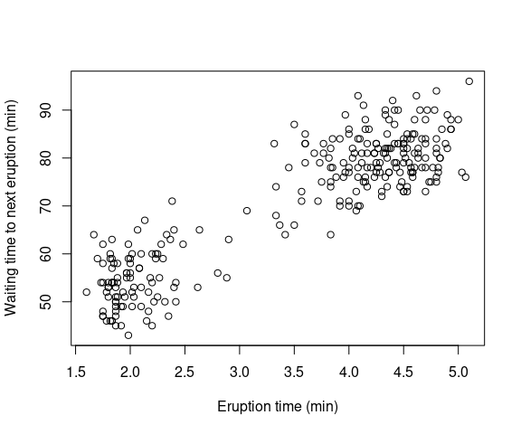
Make sure you have access to R and try someting like this:
with(faithful,
     plot(eruptions, waiting,
          xlab = "Eruption time (min)",
          ylab = "Waiting time to next eruption (min)"))
The result is a plot that looks like this:
Getting Set Up
Log into the UI GitLab site at https://research-git.uiowa.edu to get your GitLab account activated.
Decide where you want to work:
- UI IDAS RStudio Notebook Server
- FastX for accessing the CLAS Linux systems via the web interface or the desktop client.
- Your own computer.
Setup needed for IDAS RStudio Server:
- If you are registered then you should have an account now. If you add the course late you should have an account within a day.
- Introduce yourself to Git.
Setup needed for CLAS Linux:
- Install the desktop client if you want to use it. Otherwise, use the web interface.
- Your account will be set up automatically the first time you log in.
- Introduce yourself to Git.
Setting up your own computer: (A good resource for help with this is https://happygitwithr.com):
Install the current version of R.
- You might have older versions from other courses (e.g. from Anaconda).
- You will need to add packages as we go along.
Install RStudio if you want to use it (highly recommended).
Install Git.
Even if you decide to use your own computer you should make sure you can use the RStudio server or CLAS systems as a backup.
Some Examples
Life Expectancy in the Americas in 2007
The data is from the GapMinder project.
library(dplyr)
library(ggplot2)
library(gapminder)
le_am_2007 <- filter(gapminder, year == 2007, continent == "Americas") |>
    mutate(country = reorder(country, lifeExp))
knitr::kable(select(le_am_2007, country, lifeExp),
             col.names = c("Country", "Life Expectancy (years)"),
             digits = 1, format = "html") |>
    kableExtra::kable_styling(bootstrap_options = "striped",
                              full_width = FALSE,
                              font_size = 14) |>
kableExtra::scroll_box(height = "300px", width = "75%")| Country | Life Expectancy (years) |
|---|---|
| Argentina | 75.3 |
| Bolivia | 65.6 |
| Brazil | 72.4 |
| Canada | 80.7 |
| Chile | 78.6 |
| Colombia | 72.9 |
| Costa Rica | 78.8 |
| Cuba | 78.3 |
| Dominican Republic | 72.2 |
| Ecuador | 75.0 |
| El Salvador | 71.9 |
| Guatemala | 70.3 |
| Haiti | 60.9 |
| Honduras | 70.2 |
| Jamaica | 72.6 |
| Mexico | 76.2 |
| Nicaragua | 72.9 |
| Panama | 75.5 |
| Paraguay | 71.8 |
| Peru | 71.4 |
| Puerto Rico | 78.7 |
| Trinidad and Tobago | 69.8 |
| United States | 78.2 |
| Uruguay | 76.4 |
| Venezuela | 73.7 |
A dot plot:
thm <- theme_minimal() + theme(text = element_text(size = 16))
ggplot(le_am_2007, aes(y = country, x = lifeExp)) +
    geom_point(fill = "lightblue") +
    labs(x = "Life Expectancy (years)", y = NULL) +
    thm + ggtitle("Dot Plot")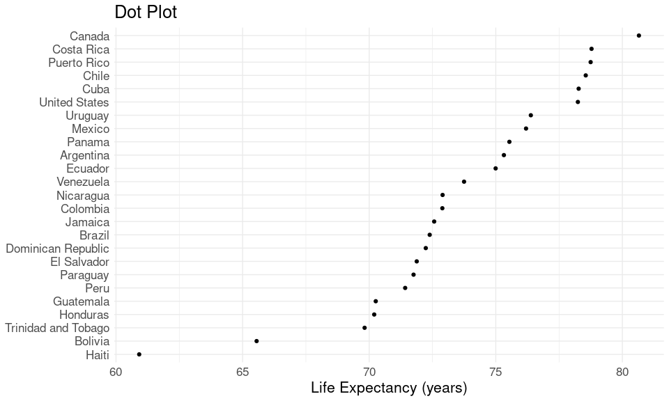
A bar chart:
ggplot(le_am_2007, aes(x = lifeExp, y = country)) +
    geom_col(fill = "lightblue") +
    labs(x = "Life Expectancy (years)", y = NULL) +
    thm + ggtitle("Bar Chart")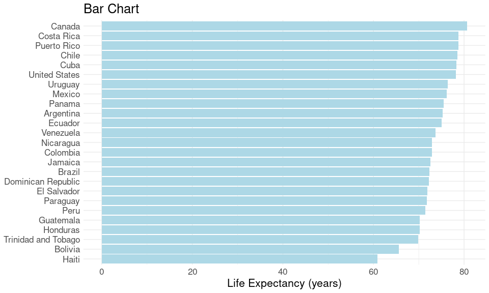
Another (bad!) bar chart:
baseline <- 60
ticks <- c(0, 10, 20, 30)
ggplot(le_am_2007, aes(x = lifeExp - baseline, y = country)) +
    geom_col(fill = "lightblue") +
    labs(x = "Life Expectancy (years)", y = NULL) +
    scale_x_continuous(breaks = ticks, labels = ticks + baseline) +
    thm + ggtitle("Another Bar Chart")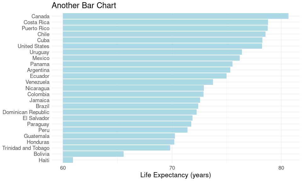
We will look at:
How to create these views using code that makes them easily reproducible.
How to assess their advantages and disadvantages as visual representations of the data
A data set with more variables for more countries and years is available in the gapminder R package.
Data preparation steps:
Filter the larger data set down to the countries and year we want.
Select the country name and life expectancy variables.
We will look at how to carry out these steps with reproducible code.
Yearly Snowfall in Iowa City
How did the winter of 2018/9 compare to other years?
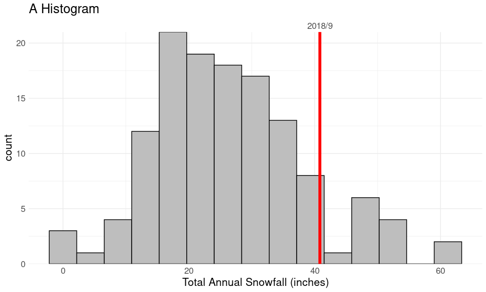
The data are available from a NOAA web serice API as a CSV file.
## # A tibble: 6 × 34
##    year month element VALUE1 VALUE2 VALUE3 VALUE4 VALUE5 VALUE6 VALUE7 VALUE8
##   <int> <int> <chr>    <int>  <int>  <int>  <int>  <int>  <int>  <int>  <int>
## 1  1893     1 TMAX       -17    -28   -150    -44    -17   -106    -56    -67
## 2  1893     1 TMIN       -67   -161   -233   -156   -156   -206   -111   -211
## 3  1893     1 PRCP         0      0      0     64      0     38      0      0
## 4  1893     1 SNOW         0      0      0     64      0     38      0      0
## 5  1893     2 TMAX        11    -56   -106   -122     33     28   -161    -94
## 6  1893     2 TMIN      -233   -206   -217   -267   -122   -211   -256   -278
## # ℹ 23 more variables: VALUE9 <int>, VALUE10 <int>, VALUE11 <int>,
## #   VALUE12 <int>, VALUE13 <int>, VALUE14 <int>, VALUE15 <int>, VALUE16 <int>,
## #   VALUE17 <int>, VALUE18 <int>, VALUE19 <int>, VALUE20 <int>, VALUE21 <int>,
## #   VALUE22 <int>, VALUE23 <int>, VALUE24 <int>, VALUE25 <int>, VALUE26 <int>,
## #   VALUE27 <int>, VALUE28 <int>, VALUE29 <int>, VALUE30 <int>, VALUE31 <int>
Data preparation steps:
Read in the CSV file.
Reshape the data to have columns
date,TMAX,TMIN,SNOWandPRCP.Filter out bogus dates created by the original format.
Convert units to more standard (American) ones (e.g. milimeters to inches).
…
Code is available here.
Internet Adoption Across the World
An example from Wilke (2019) with World Bank data.
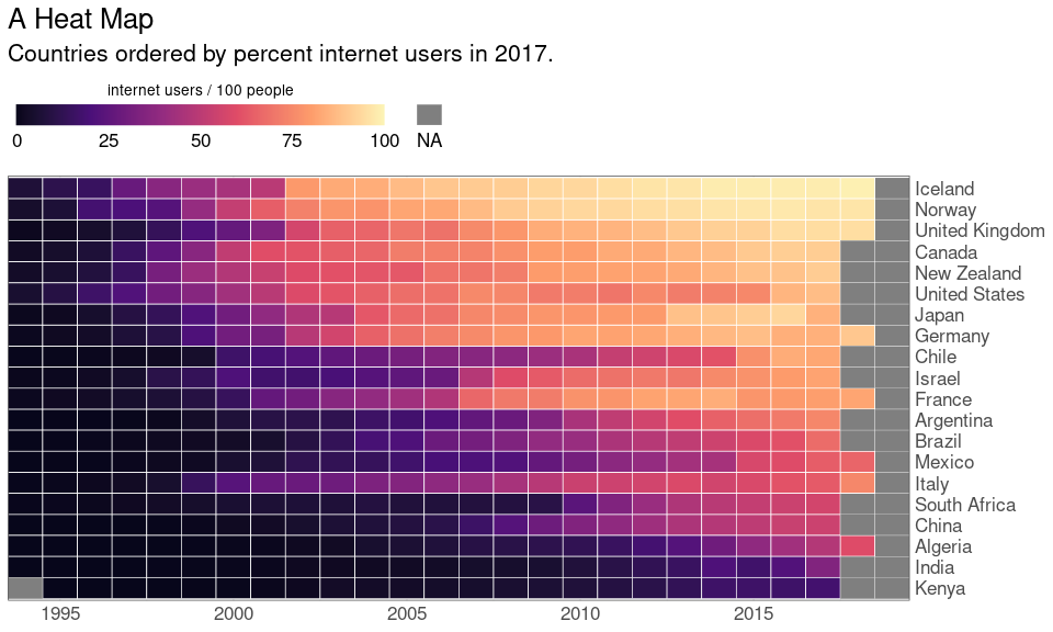
The data are available in several formats (CSV, XML, Excel).
## # A tibble: 6 × 65
##   Country.Name Country.Code Indicator.Name      Indicator.Code X1960 X1961 X1962
##   <chr>        <chr>        <chr>               <chr>          <int> <lgl> <lgl>
## 1 Aruba        ABW          Individuals using … IT.NET.USER.ZS    NA NA    NA
## 2 Afghanistan  AFG          Individuals using … IT.NET.USER.ZS    NA NA    NA
## 3 Angola       AGO          Individuals using … IT.NET.USER.ZS    NA NA    NA
## 4 Albania      ALB          Individuals using … IT.NET.USER.ZS    NA NA    NA
## 5 Andorra      AND          Individuals using … IT.NET.USER.ZS    NA NA    NA
## 6 Arab World   ARB          Individuals using … IT.NET.USER.ZS    NA NA    NA
## # ℹ 58 more variables: X1963 <lgl>, X1964 <lgl>, X1965 <int>, X1966 <lgl>,
## #   X1967 <lgl>, X1968 <lgl>, X1969 <lgl>, X1970 <int>, X1971 <lgl>,
## #   X1972 <lgl>, X1973 <lgl>, X1974 <lgl>, X1975 <int>, X1976 <int>,
## #   X1977 <int>, X1978 <int>, X1979 <int>, X1980 <int>, X1981 <int>,
## #   X1982 <int>, X1983 <int>, X1984 <int>, X1985 <int>, X1986 <int>,
## #   X1987 <int>, X1988 <int>, X1989 <int>, X1990 <dbl>, X1991 <dbl>,
## #   X1992 <dbl>, X1993 <dbl>, X1994 <dbl>, X1995 <dbl>, X1996 <dbl>, …
Data preparation:
Read in the data.
Filter down to the countries we want.
Reshape to have columns
country,year, andusers.…
Code is available here.
Iowa Wind Turbines
Data is available from the U.S. Wind Turbine Database.
library(sf)
data(US_counties_geoms, package = "dviz.supp")
wtfile <- "uswtdb_v7_2_20241120.csv.gz"
if (! file.exists(wtfile))
    download.file(paste0("https://stat.uiowa.edu/~luke/data/", wtfile), wtfile)
wind_turbines <- read.csv(wtfile)

sf_wt <- st_as_sf(wind_turbines, coords = c("xlong", "ylat"), crs = 4326)
sf_wt_IA <- filter(sf_wt, t_state == "IA")
sf_wt_IA <- mutate(sf_wt_IA,
                   p_year = ifelse(p_year > 0, p_year, NA),
                   year = cut(p_year,
                              breaks = c(0, 2005, 2010, 2015, 2020, Inf),
                              labels = c("before 2005", "2005-2009",
                                         "2010-2014", "2015-2020",
                                         "2021 and later"),
                              right = FALSE))

ggplot(filter(US_counties_geoms$lower48, STATEFP == 19)) +
    geom_sf() +
    geom_sf(data = sf_wt_IA, aes(fill = year),
            shape = 21, color = "black", stroke = 0.25) +
    scale_fill_viridis_d(direction = -1, na.value = "red") +
    ggthemes::theme_map() +
    ggtitle("A Map") +
    theme(legend.background = element_rect(fill = "transparent"),
          plot.title = element_text(size = 16))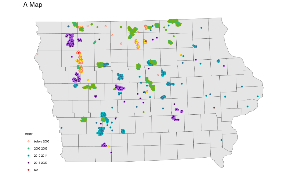
There are two data sets:
Shape information for drawing the map.
Data on individual wind turbines.
Data preparation:
Read in the data.
Match up the projection used for the map and location data.
…
Iowa Population in 2010
data(US_census, package = "dviz.supp")
uscounties <- mutate(US_counties_geoms$lower48,
                     FIPS = as.numeric(paste0(STATEFP, COUNTYFP)))
uscounties <- left_join(uscounties,
                        select(US_census, FIPS, pop2010),
                        "FIPS")
## old-style crs object detected; please recreate object with a recent sf::st_crs()
ggplot(filter(uscounties, STATEFP == 19)) +
    geom_sf(aes(fill = pop2010)) +
    scale_fill_viridis_c(direction = -1, trans = "log10",
                         labels = scales::comma) +
    ggtitle("A Choropleth Map") +
    ggthemes::theme_map() +
    theme(legend.background = element_rect(fill = "transparent"),
          plot.title = element_text(size = 16))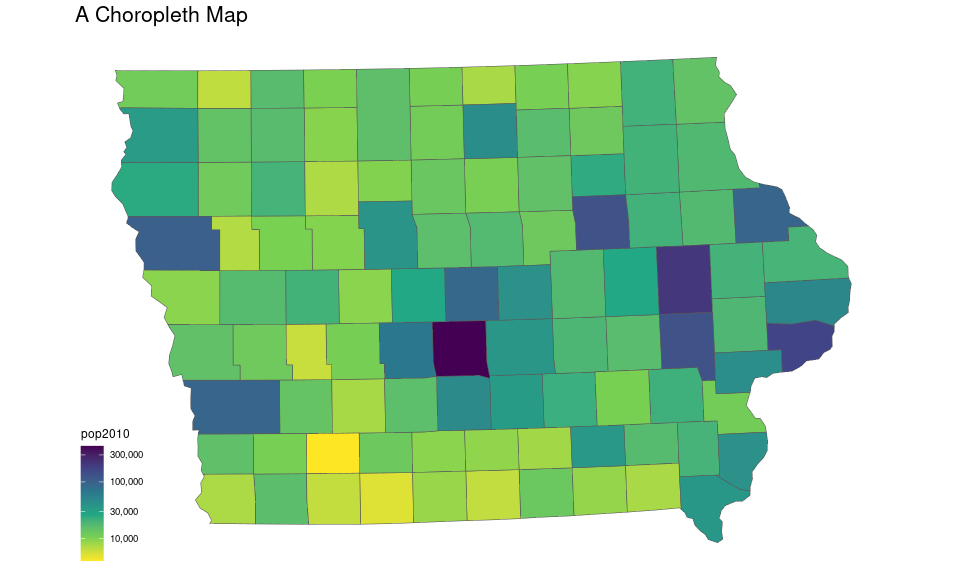
Again there are two data sets:
Shape data for drawing the map.
County population data from the 2010 census.
Data preparation:
…
Merge or join the population data with the shape data.
…
Reproducibility
Reproducible Reports and Analyses
Preparing a report on a data analysis project usually involves
reading the data
wrangling the data into usable form
visualizing, summarizing, and modeling
writing a report that includes your results
To make your work reproducible for someone else, or for you when the data changes, it is best to use code for the entire workflow.
R Markdown is one technology that supports this.
Tools for Reproducibility
R Markdown files contain report text along with code to produce numerical and graphical results.
Tools are available to
convert an R Markdown file into a PDF or HTML report;
extract the code used to produce the computational and graphical results.
This page was generated from the R Markdown file intro.Rmd.
You will be creating R Markdown files like this for your homework and project.
Some R Markdown tutorials:
R Markdown: The Definitive Guide by Yihui Xie is a book-length presentation.
The R Markdown Home Page has a link to a tutorial.
Code
Code for the Iowa City Snowfall Example
Read the data:
library(tidyverse)
library(lubridate)
if (! file.exists(here("ic_noaa.csv.gz")))
    download.file("http://www.stat.uiowa.edu/~luke/data/ic_noaa.csv.gz",
                  here("ic_noaa.csv.gz"))
ic_data_raw <- as_tibble(read.csv(here("ic_noaa.csv.gz"), head = TRUE))
Reshape from (very) wide to (too) long:
ic_data <- select(ic_data_raw, year, month, element, starts_with("VALUE"))
ic_data <- pivot_longer(ic_data,
                        names_to = "day",
                        values_to = "value", c(VALUE1 : VALUE31))
Extract the day as a number:
ic_data <- mutate(ic_data, day = as.integer(sub("VALUE", "", day)))Reshape from too long to tidy with one row per day, keeping only the primary variables:
corevars <- c("TMAX", "TMIN", "PRCP", "SNOW", "SNWD")
ic_data <- filter(ic_data, element %in% corevars)
ic_data <- pivot_wider(ic_data, names_from = "element", values_from = "value")
Add a date variable for plotting and to help get rid of bogus days:
ic_data <- mutate(ic_data, date = lubridate::make_date(year, month, day))
ic_data <- filter(ic_data, ! is.na(date))
Make units more standard (American):
mm2in <- function(x) x / 25.4
C2F <- function(x) 32 + 1.8 * x
ic_data <- transmute(ic_data, year, month, day, date,
                     PRCP = mm2in(PRCP / 10),
                     SNOW = mm2in(SNOW),
                     SNWD = mm2in(SNWD),
                     TMIN = C2F(TMIN / 10),
                     TMAX = C2F(TMAX / 10))
Add a Month factor with abbreviated levels:
ic_data <- mutate(ic_data,
                  Month = lubridate::month(month, label = TRUE, abbr = TRUE))
Associate January through June with the winter starting in the previous year:
ic_data <- mutate(ic_data, wyear = ifelse(month <= 6, year - 1, year))Compute the winter totals and the total for the 2018/9 winter:
ic_snow <- group_by(ic_data, wyear) |>
    summarize(snow = sum(SNOW, na.rm = TRUE))
ic_snow_2018 <- filter(ic_snow, wyear == 2018)$snow
Create the histogram and show the 2018/9 total:
ggplot(ic_snow) +
    geom_histogram(aes(x = snow), bins = 15, fill = "grey", color = "black") +
    geom_vline(xintercept = ic_snow_2018, color = "red", size = 2) +
    scale_x_continuous(name = "Total Annual Snowfall (inches)",
                       sec.axis = dup_axis(name = NULL,
                                           breaks = ic_snow_2018,
                                           labels = "2018/9")) +
    scale_y_continuous(expand = expansion(0, 0)) +
    ggtitle("A Histogram") +
    theme_minimal() +
    theme(text = element_text(size = 16))
Code for the Internet Example
From code for the Visualizing amounts chapter in Claus Wilke’s Fundamentals of Data Visualization.
Reading in the data:
base_url <- "http://api.worldbank.org/v2/en/indicator/"
if (file.exists("internet.xls")) {
    ## if we have to go with Excel
    ## xls_url <- paste0(base_url, "IT.NET.USER.ZS?downloadformat=excel")
    ## download.file(xls_url, "internet.xls")
    internet_raw <- readxl::read_xls("internet.xls",
                                     skip = 2, .name_repair = "universal")
    names(internet_raw) <- sub("\\.\\.\\.", "X", names(internet_raw))
} else {
    csvfile <- here("internet.csv")
    if (! file.exists(csvfile)) {
        csv_url <- paste0(base_url, "IT.NET.USER.ZS?downloadformat=csv")
        download.file(csv_url, "internet.zip")
        unzip("internet.zip")
        file.rename("API_IT.NET.USER.ZS_DS2_en_csv_v2_2255007.csv",
                    csvfile)
    }

    internet_raw <- read.csv(csvfile, skip = 4)
}
Reshape to longer format:
internet <- select(internet_raw, country = Country.Name, matches("X.+"))
internet <- pivot_longer(internet, -country,
                         names_to = "year", values_to = "users")
internet <- mutate(internet, year = as.integer(sub("X", "", year)))
Select some countries to include in the plot:
country_list <- c("United States", "China", "India", "Japan", "Algeria",
                  "Brazil", "Germany", "France", "United Kingdom", "Italy",
                  "New Zealand", "Canada", "Mexico", "Chile", "Argentina",
                  "Norway", "South Africa", "Kenya", "Israel", "Iceland")

internet_short <- filter(internet, country %in% country_list)
## internet_short <- mutate(internet_short,
##                          users = ifelse(is.na(users), 0, users))
Get ordering by 2017 levels:
intr17 <- filter(internet_short, year == 2017)
levs <- arrange(intr17, users)$country
The basic plot:
p_inet <- ggplot(filter(internet_short, year > 1993),
                 aes(x = year,
                     y = factor(country, levs),
                     fill = users)) +
    geom_tile(color = "white", size = 0.25)
Adjust color palette and guide:
p_inet <- p_inet +
    scale_fill_viridis_c(
        option = "A", begin = 0.05, end = 0.98,
        limits = c(0, 100),
        name = "internet users / 100 people",
        guide = guide_colorbar(
            direction = "horizontal",
            label.position = "bottom",
            title.position = "top",
            ticks = FALSE,
            barwidth = grid::unit(3.5, "in"),
            barheight = grid::unit(0.2, "in"),
            order = 1))
Adjust x and y scales:
p_inet <- p_inet +
    scale_x_continuous(expand = c(0, 0), name = NULL) +
    scale_y_discrete(name = NULL, position = "right")
Add layer for NA values:
p_inet <- p_inet +
    ggnewscale::new_scale_fill() +
    geom_tile(data = filter(internet_short, year > 1993, is.na(users)),
              aes(fill = "NA"), color = "white") +
    scale_fill_manual(values = "grey50") +
    guides(fill = guide_legend(title = "",
                               label.position = "bottom",
                               title.position = "top",
                               keyheight = grid::unit(0.2, "in"),
                               keywidth = grid::unit(0.2, "in"),
                               order = 2))
Final plot with title and theme adjustments:
p_inet +
    ggtitle("A Heat Map",
            "Countries ordered by percent internet users in 2017.") +
    theme(text = element_text(size = 16)) +
    theme(axis.line = element_blank(),
          axis.ticks = element_blank(),
          axis.ticks.length = grid::unit(1, "pt"),
          legend.position = "top",
          legend.justification = "left",
          legend.title = element_text(size = 12 * 12 / 14,
                                      hjust = 0.5)
          )