Many single samples are actually collected over time. The precipitation data set used above is an example of this kind of data. In some cases it is reasonable to assume that the observations are independent of one another, but in other cases it is not. One way to check the data for some form of serial correlation or trend is to plot the observations against time, or against the order in which they were obtained. I will use the plot-points function to produce a scatterplot of the precipitation data versus time. The plot-points function is called as
(plot-points x-variable y-variable)Our y-variable will be precipitation, the variable we defined earlier. As our x-variable we would like to use a sequence of integers from 1 to 30. We could type these in ourselves, but there is an easier way. The function iseq, short for integer-sequence, generates a list of consecutive integers between two specified values. The general form for a call to this function is
(iseq start end).To generate the sequence we need we use
(iseq 1 30).Thus to generate the scatter plot we type
> (plot-points (iseq 1 30) precipitation)
#<Object: 3423466, prototype = SCATTERPLOT-PROTO>
>
and the result will look like Figure 4.
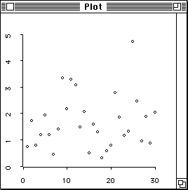
Figure 4: Scatterplot of precipitation levels against
time.
There does not appear to be much of a pattern to the data; an independence assumption may be reasonable.
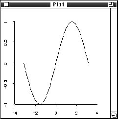
Sometimes it is easier to see temporal patterns in a plot if the points are connected by lines. Try the above command with plot-points replaced by plot-lines.
The plot-lines function can also be used to
construct graphs of functions. Suppose you would like a plot of
 from
from  to
to  . The constant
  is predefined as
the variable pi . You can construct a list of n
equally spaced real numbers between a and b using the expression
is predefined as
the variable pi . You can construct a list of n
equally spaced real numbers between a and b using the expression
(rseq a b n).Thus to draw the plot of
 using 50 equally spaced points type
> (plot-lines (rseq (- pi) pi 50) (sin (rseq (- pi) pi 50)))
#<Object: 3423466, prototype = SCATTERPLOT-PROTO>
>
The plot should look like Figure 5.
Scatterplots are of course particularly useful for examining the relationship between two numerical observations taken on the same subject. Devore and Peck [11, Exercise 2.33,] give data for HC and CO emission recorded for 46 automobiles. The results can be placed in two variables, hc and co, and these variable can then be plotted against one another with the plot-points function:
> (def hc (list .5 .46 .41 .44 .72 .83 .38 .60 .83 .34 .37 .87
                .65 .48 .51 .47 .56 .51 .57 .36 .52 .58 .47 .65
                .41 .39 .55 .64 .38 .50 .73 .57 .41 1.02 1.10 .43
                .41 .41 .52 .70 .52 .51 .49 .61 .46 .55))
HC
> (def co (list 5.01 8.60 4.95 7.51 14.59 11.53 5.21 9.62 15.13
                3.95 4.12 19.00 11.20 3.45 4.10 4.74 5.36 5.69
                6.02 2.03 6.78 6.02 5.22 14.67 4.42 7.24 12.30
                7.98 4.10 12.10 14.97 5.04 3.38 23.53 22.92 3.81
                1.85 2.26 4.29 14.93 6.35 5.79 4.62 8.43 3.99 7.47))
CO
> (plot-points hc co)
#<Object: 3423466, prototype = SCATTERPLOT-PROTO>
>
The resulting plot is shown in Figure 6.
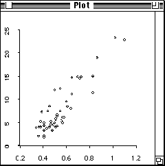
Figure 6: Plot of HC against CO.
 .
.