Visualizing Three or More Numeric Variables
A static graph is two-dimensional.
Showing a third dimension is a challenge.
For statistical data three dimensions is not particularly special.
But we can take advantage of our ability to perceive three-dimensional structure.
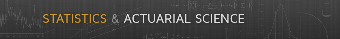
Soil Resistivity Data
Data from Cleveland’s Visualizing Data book contains measurements of soil resistivity of an agricultural field along a roughly rectangular grid.
Using functions from the lattice package we can view the locations at which measurements were taken and a perspective plot of the 3D point cloud:
soil <- read.table("soil.dat")
p <- cloud(resistivity ~ easting * northing, pch = ".", data = soil)
s <- xyplot(northing ~ easting, pch = ".", aspect = 2.44, data = soil)
print(s, split = c(1, 1, 2, 1), more = TRUE)
print(p, split = c(2, 1, 2, 1))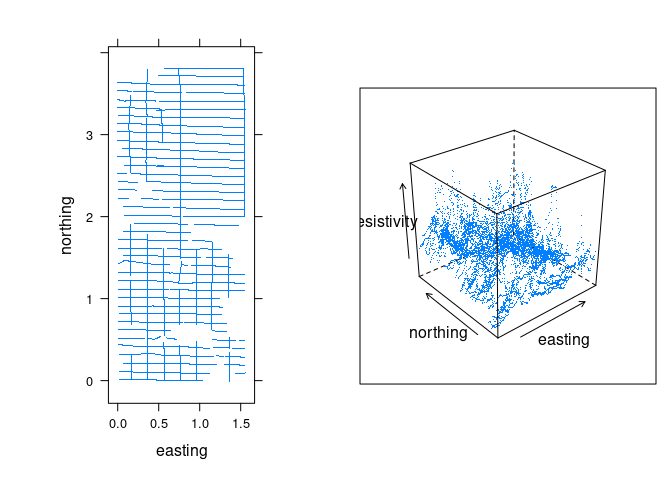
The data is quite noisy but there is some structure.
The viewing angle and distance for the point cloud can be adjusted.
Conditioning Plots (Coplots)
One way to try to get a handle on higher dimensional data is to try to fix values of some variables and visualize the values of others in 2D.
This can be done with
interactive tools;
small multiples with trellis displays or faceting.
A conditioning plot, or coplot:
Shows a collection of plots of two variables for different settings of one or more additional variables, the conditioning variables.
For ordered conditioning variables the plots are arranged in a way that reflects the order.
When a conditioning variable is numeric, or ordered categorical with many levels, the values of the conditioning variable are grouped into bins.
A useful strategy is to allow the bins to overlap somewhat.
- Trellis/lattice plots support this with the concept of a shingle.
- This does not seem easy to do with
ggplot.
A lattice plot of resistivity against northing conditioned on easting:
xyplot(resistivity ~ northing | equal.count(easting), data = soil)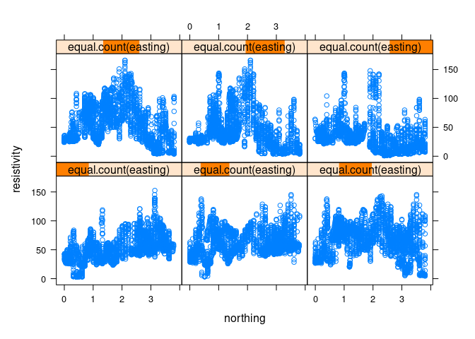
equal.count produces a shingle:
str(equal.count(soil$easting))
##  'shingle' num [1:8641] 0.016 0.0252 0.0345 0.0437 0.0529 0.0621 0.0714 0.0806 0.0898 0.0991 ...
##  - attr(*, "levels")=List of 6
##   ..$ : num [1:2] -0.00405 0.39615
##   ..$ : num [1:2] 0.235 0.584
##   ..$ : num [1:2] 0.396 0.795
##   ..$ : num [1:2] 0.584 1.027
##   ..$ : num [1:2] 0.795 1.273
##   ..$ : num [1:2] 1.03 1.56
## ..- attr(*, "class")= chr "shingleLevel"- The default number of intervals in 6.
- The intervals used are highlighted in the title bars.
- The intervals are chosen to contain approximately equal numbers of observations.
- By default, the intervals overlap by 50%.
- The intervals are computed by
co.intervals; the amount of overlap is controlled by theoverlapargument.
Using smaller points to reduce over-plotting:
xyplot(resistivity ~ northing | equal.count(easting), data = soil, cex = 0.2)
A larger number of intervals can be specified as a second argument to equal.bins:
xyplot(resistivity ~ northing | equal.count(easting, 12), data = soil,
       cex = 0.2)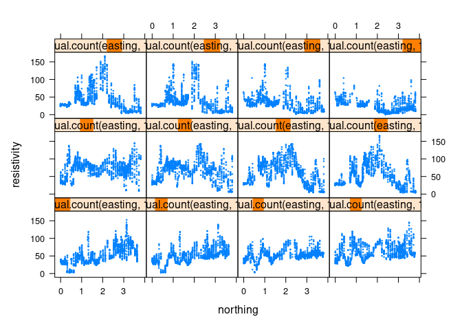
Coplot Variations
To help see the signal we can add a smooth, by default computed using the loess smoother. This can be done with a type specification that includes the string "smooth":
xyplot(resistivity ~ northing | equal.count(easting, 12), data = soil,
       cex = 0.2, type = c("p", "smooth"))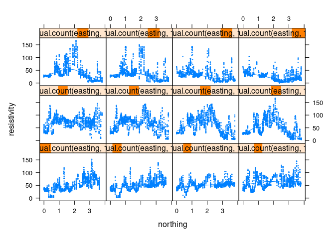
The smooth is hard to see. Some options:
- Omit the data and only show the smooth.
- Show the data in a less intense color, such as gray.
- Use a contrasting color for the smooth curves.
- Show the data using alpha blending.
Color adjustments can be accomplished with the col and col.line arguments; the line width can be adjusted with lwd. For a thicker red line:
xyplot(resistivity ~ northing | equal.count(easting, 12), data = soil,
       cex = 0.2, type = c("p", "smooth"), col.line = "red", lwd = 2)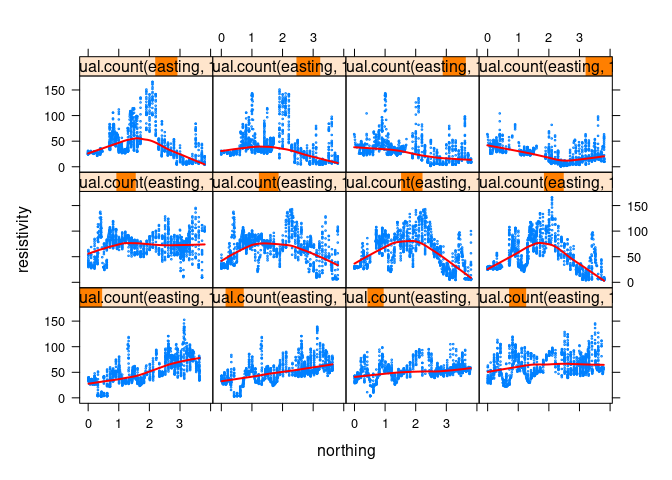
For gray points and a red smooth:
xyplot(resistivity ~ northing | equal.count(easting, 12), data = soil,
       cex = 0.2, type = c("p", "smooth"),
       col.line = "red", col = "gray", lwd = 2)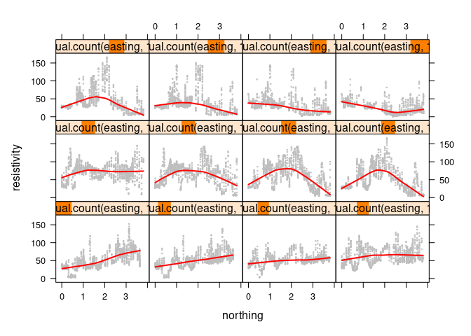
The xyplot function supports an alpha argument, but it affects both points and lines.
One option for changing only the alpha level for points is to use a panel function:
xyplot(resistivity ~ northing | equal.count(easting, 12), data = soil,
       cex = 0.2,
       panel = function(x, y, ...) {
           panel.xyplot(x, y, ...)
           panel.loess(x, y, col = "red", lwd = 2)
       })
Another option is to create a color for the points with the desired alpha level included in its encoding:
blue_w_alpha <- rgb(0, 0, 1, 0.1)
blue_w_alpha
## [1] "#0000FF1A"
This can then be used with the col argument:
xyplot(resistivity ~ northing | equal.count(easting, 12), data = soil,
       cex = 0.2, type = c("p", "smooth"),
       col.line = "red", col = blue_w_alpha, lwd = 2)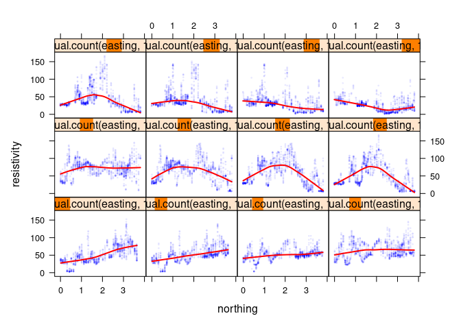
After conditioning on one of two explanatory variables it is useful to also consider conditioning on the other:
xyplot(resistivity ~ easting | equal.count(northing, 12), data = soil,
       cex = 0.2, type = c("p", "smooth"),
       col.line = "red", col = blue_w_alpha, lwd = 2)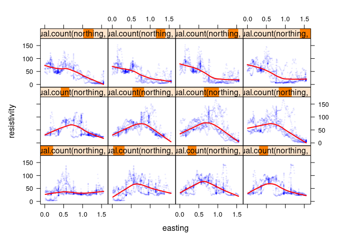
Copots using ggplot
ggplot faceting is analogous to trellis/lattice conditioning.
- The main missing feature is the possibility of overlap among group.
- Every data point has to belong to exactly one facet.
- This also makes showing a selection of narrow windows more challenging.
The basic coplot:
p <- ggplot(soil, aes(northing, resistivity))
p + geom_point() + facet_wrap(~ cut_number(easting, 6))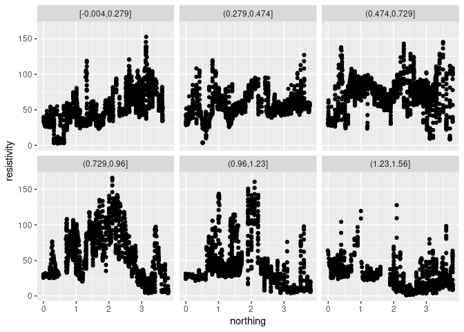
cut_numberis used to form non-overlapping groups with approximately equal numbers of observations.cut_intervalcan be used to divide the range in equal intervals.- The facet ordering is top to bottom; lattice orders bottom to top.
Using 12 facets and smaller points:
p + geom_point(size = 0.5) + facet_wrap(~ cut_number(easting, 12))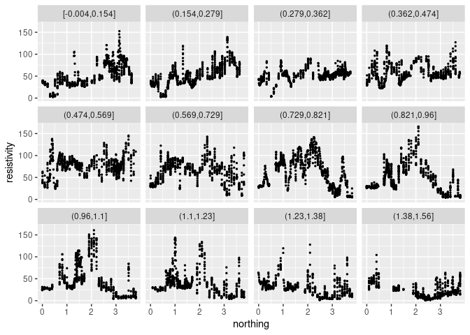
The default smoothing method is currently “loess” for less than 1000 points:
p + geom_point(size = 0.5) + geom_smooth(color = "red") +
    facet_wrap(~ cut_number(easting, 12))
## `geom_smooth()` using method = 'loess' and formula = 'y ~ x'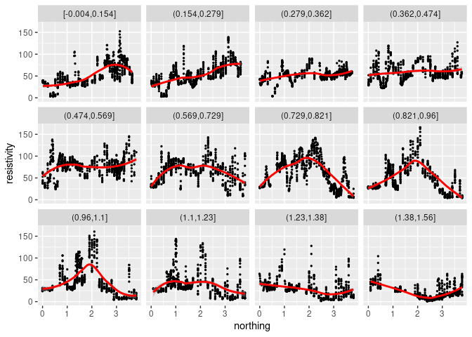
For larger data sets method = "gam" would be used:
p + geom_point(size = 0.5) + facet_wrap(~ cut_number(easting, 12)) +
    geom_smooth(method = "gam", color = "red", formula = y ~ s(x))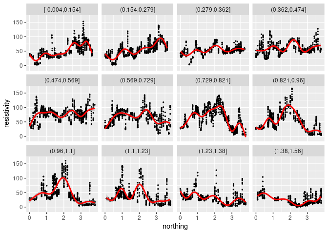
Contour Plots for Surfaces
The loess local polynomial smoother can be used to estimate a smooth signal surface as a function of the two location variables.
The estimated surface level can be computed on a grid of points using the predict method of the fit.
eastseq <- seq(.15, 1.410, by = .015)
northseq <- seq(.150, 3.645, by = .015)
soi.grid <- expand.grid(easting = eastseq, northing = northseq)
head(soi.grid)
##   easting northing
## 1   0.150     0.15
## 2   0.165     0.15
## 3   0.180     0.15
## 4   0.195     0.15
## 5   0.210     0.15
## 6   0.225     0.15
m <- loess(resistivity ~ easting * northing, span = 0.25,
           degree = 2, data = soil)
soi.fit <- predict(m, soi.grid)
Contour plots are one approach to visualizing a surface based on values on a grid.
Contour plots compute contours, or level curves, as polygons at a set of levels.
Contour plots draw the level curves, often with a level annotation.
Contour plots can also have their polygons filled in with colors representing the levels.
A lattice contour plot for the fitted surface:
asp <- diff(range(soi.grid$n)) / diff(range(soi.grid$e))
contourplot(soi.fit ~ soi.grid$easting * soi.grid$northing,
            cuts = 9, aspect = asp,
            xlab = "Easting (km)",
            ylab = "Northing (km)")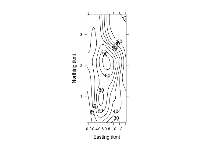
A basic contour plot in ggplot using geom_contour:
p <- ggplot(mutate(soi.grid, fit = as.numeric(soi.fit)),
            aes(x = easting, y = northing, z = fit)) +
    coord_fixed()
p + geom_contour()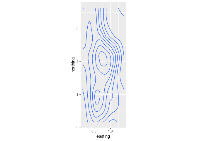
Neither
latticenorggplotseem to make it easy to fill in the contours.The base function
filled.contouris available for this:
cm.rev <- function(...) rev(cm.colors(...))
filled.contour(eastseq, northseq, soi.fit, asp = 1, color.palette = cm.rev)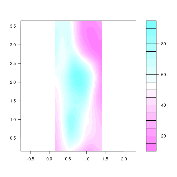
Level Plots
A level plot colors a grid spanned by two variables by the color of a third variable.
Level plots are also called image plots
The term heat map is also used, in particular with a specific color scheme. But heat map often means a more complex visualization with an image plot at its core.
Superimposing contours on a level plot is often helpful.
The lattice package provides the function levelplot.
A basic level plot:
levelplot(soi.fit ~ soi.grid$easting * soi.grid$northing,
          cuts = 9, aspect = asp,
          xlab = "Easting (km)",
          ylab = "Northing (km)")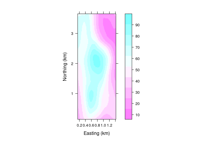
A level plot with superimposed contours:
lv <- levelplot(soi.fit ~ soi.grid$easting * soi.grid$northing,
                cuts = 9, aspect = asp, contour = TRUE,
                xlab = "Easting (km)",
                ylab = "Northing (km)")
lv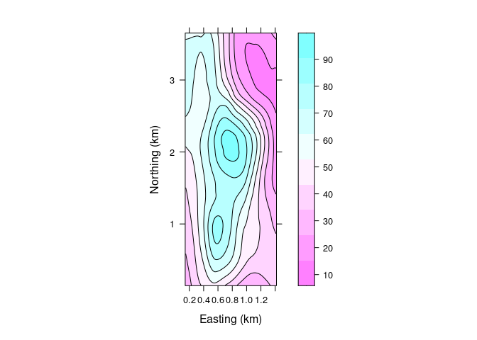
ggplot provides geom_tile that can be used for a level plot:
p + geom_tile(aes(fill = fit)) + geom_contour() +
    scale_fill_gradientn(colors = rev(cm.colors(100)))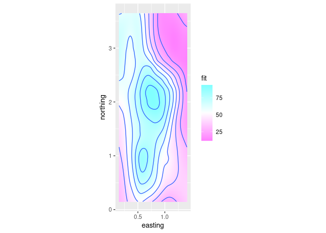
Level plots do not require computing contours, but are not not as smooth as filled contour plots.
Visually, image plots and filled contour plots are very similar for fine grids, but image plots are less smooth for coarse ones.
Lack of smoothness is less of an issue when the data values themselves are noisy.
The grid for the volcano data set is coarser and illustrates the lack of smoothness.
vd <- expand.grid(x = seq_len(nrow(volcano)), y = seq_len(ncol(volcano)))
vd$z <- as.numeric(volcano)
levelplot(z ~ x * y, data = vd, cuts = 10)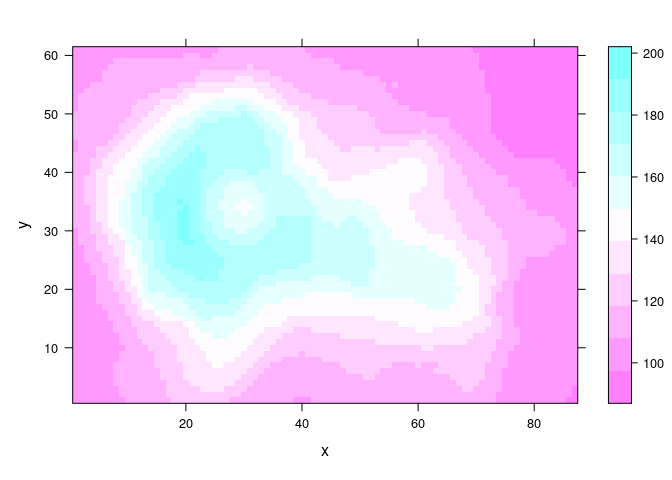
A filled.contour plot looks like this:
filled.contour(volcano, nlevels = 10, color.palette = cm.rev)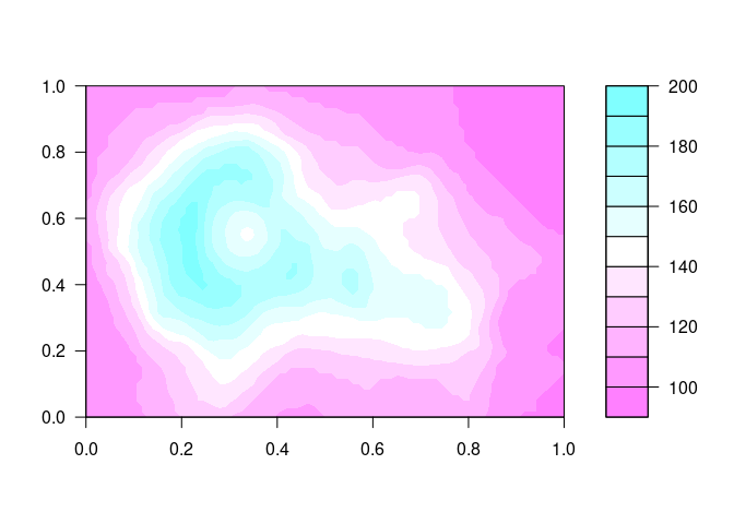
A coarse grid can be interpolated to a finer grid.
Irregularly spaced data can also be interpolated to a grid.
The
interpfunction in theakimapackage is useful for this kind of interpolation.
Wire Frame and Perspective Plots
A surface can also be visualized using a wire frame plot showing a 3D view of the surface from a particular viewpoint.
A simple wire frame plot is often sufficient.
Lighting and shading can be used to enhance the 3D effect.
A basic wire frame plot for the volcano data:
wireframe(z ~ x * y, data = vd, aspect = c(61 / 89, 0.3))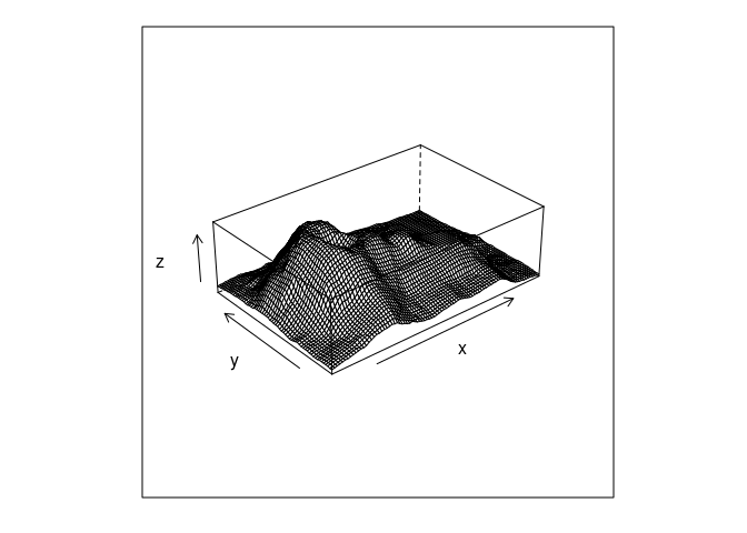
Wire frame is a bit of a misnomer since surface panels in front occlude lines behind them.
For a fine grid, as in the soil surface, the lines are too dense.
The use of shading for the surfaces can help.
wireframe(z ~ x * y, data = vd, aspect = c(61 / 89, 0.3), shade = TRUE)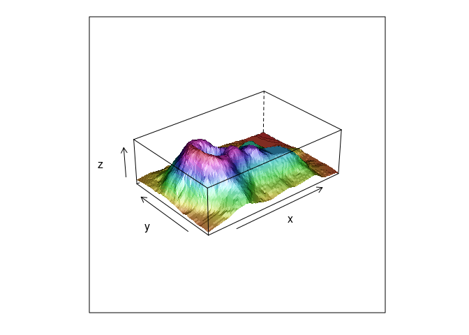
A wire frame plot with shading for the soil resistivity data:
wf <- wireframe(soi.fit ~ soi.grid$easting * soi.grid$northing,
                aspect = asp, shade = TRUE,
                xlab = "Easting (km)",
                ylab = "Northing (km)")
wf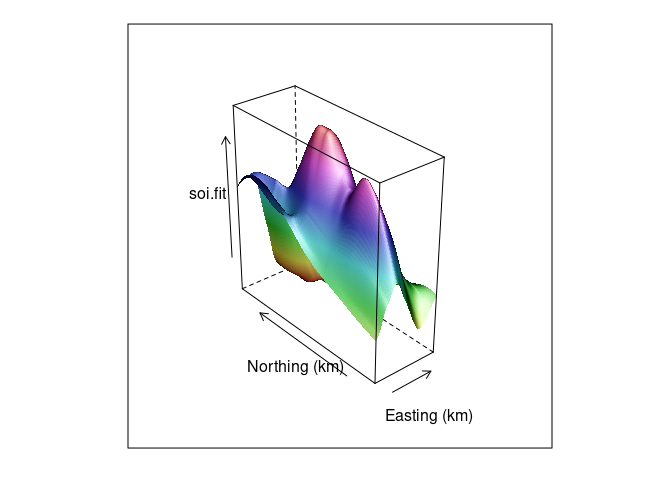
Both ways of looking at a surface are useful:
print(lv, split = c(1, 1, 2, 1), more = TRUE)
print(wf, split = c(2, 1, 2, 1))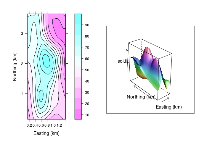
- The level plot/contour representation is useful for recognizing locations of key features.
- The wire frame view helps build a mental model of the 3D structure.
- Being able to interactively adjust the viewing position for a wire frame model greatly enhances our ability to understand the 3D structure.
Interactive 3D Plots Using OpenGL
OpenGL is a standardized framework for high performance graphics.
The
rglpackage provides an R interface to some of OpenGL’s capabilities.WebGL is a JavaScript framework for using OpenGL within a browser window.
Most desktop browsers support WebGL; some mobile browsers do as well.
In some cases support may be available but not enabled by default. You may be able to get help at https://get.webgl.org/.
knitrandrglprovide support for embedding OpenGL images in web pages.It is also possible to embed OpenGL images in PDF files, but not all PDF viewers support this.
This code run in R will open a new window containing an interactive 3D scene (but this currently fails on FastX):
library(rgl)
bg3d(color = "white")
clear3d()
par3d(mouseMode = "trackball")
surface3d(eastseq, northseq,
          soi.fit / 100, color = rep("red", length(soi.fit)))
To embed an image in an HTML, document first set the webgl hook with a code chunk like this:
knitr::knit_hooks$set(webgl = rgl::hook_webgl)
options(rgl.useNULL = TRUE)
Then a chunk with the option webgl = TRUE can produce an embedded OpenGL image:
library(rgl)
bg3d(color = "white")
clear3d()
par3d(mouseMode = "trackball")
surface3d(eastseq, northseq,
          soi.fit / 100, color = rep("red", length(soi.fit)))
A view that includes the points and uses alpha blending to make the surface translucent:
clear3d()
points3d(soil$easting, soil$northing, soil$resistivity / 100,
         col = rep("black", nrow(soil)))
surface3d(eastseq, northseq,
          soi.fit / 100, col = rep("red", length(soi.fit)),
          alpha = 0.9, front = "fill", back = "fill")
The WebGL vignette in the rgl package shows some more examples.
The embedded graphs show properly for me on most browser/OS combinations I have tried.
To include a static view of an rgl scene you can use the rgl.snapshot function.
To use the view found interactively with rgl for creating a lattice wireframe view, you can use the rglToLattice function:
wireframe(soi.fit ~ soi.grid$easting * soi.grid$northing,
          aspect = c(asp, 0.7), shade = TRUE,
          xlab = "Easting (km)",
          ylab = "Northing (km)", screen = rglToLattice())
Coplots for Surfaces
We can also use the idea of a coplot for examining a surface a few slices at a time.
Choosing 12 approximately equally spaced slices along easting:
sf <- soi.grid
sf$fit <- as.numeric(soi.fit)

sube <- eastseq[seq_len(length(eastseq)) %% 7 == 0]
sube <- eastseq[round(seq(1, length(eastseq), length.out = 12))]

ssf <- filter(sf, easting %in% sube)

xyplot(fit ~ northing | easting, data = ssf, type = "l")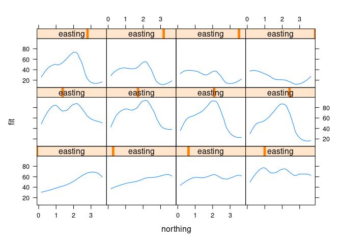
Using ggplot:
ggplot(ssf, aes(x = northing, y = fit)) + geom_line() + facet_wrap(~ easting)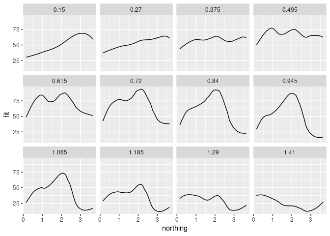
For examining a surface this way we fix one variable at a specific value.
For examining data it is also sometimes useful to choose a narrow window.
A narrow window minimizes the variation within the variable we are conditioning on.
Too narrow a window contains to few observations to see a signal.
Choosing a few narrow windows means we won’t show all the data.
Shingles like equal.count make this easy in lattice, using a negative overlap value:
xyplot(resistivity ~ northing | equal.count(easting, 6, overlap = -0.8),
       data = soil, cex = 0.2)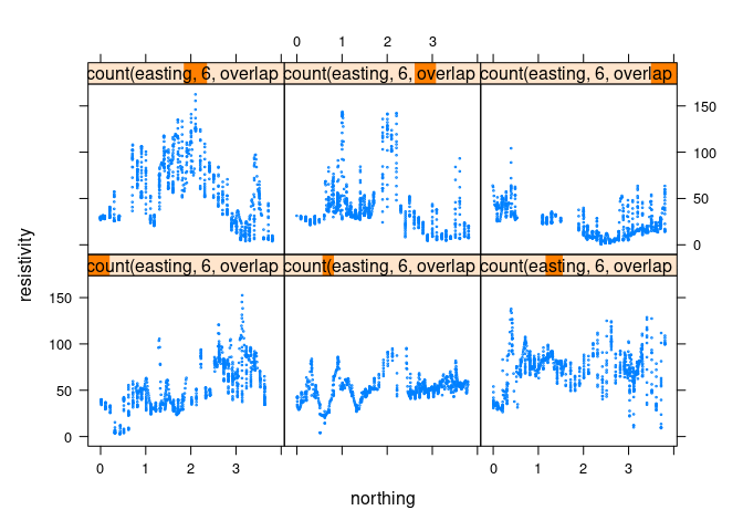
It is a bit more work in ggolot; it can be done by
- computing a set of narrow slices with a cut function
- filtering a subset of the levels:
np <- 6
ns <- 5
s <- mutate(soil, slice = cut_number(easting, np * ns))
s <- filter(s, slice %in% levels(slice)[(1 : np) * ns])
ggplot(s, aes(x = northing, y = resistivity)) +
    geom_point(size = 0.5) + facet_wrap(~ slice)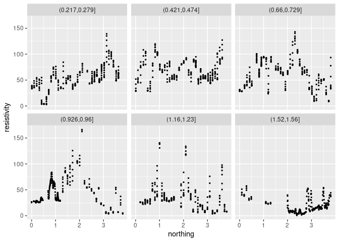
Conditioning with a Single Plot
It is possible to show conditioning in a single plot using an identity channel to distinguish the conditions.
Using lattice:
sf <- soi.grid
sf$fit <- as.numeric(soi.fit)

sube4 <- eastseq[round(seq(1, length(eastseq), length.out = 4))]

ssf4 <- filter(sf, easting %in% sube4)

xyplot(fit ~ northing, group = easting, data = ssf4,
       type = "l", auto.key = TRUE)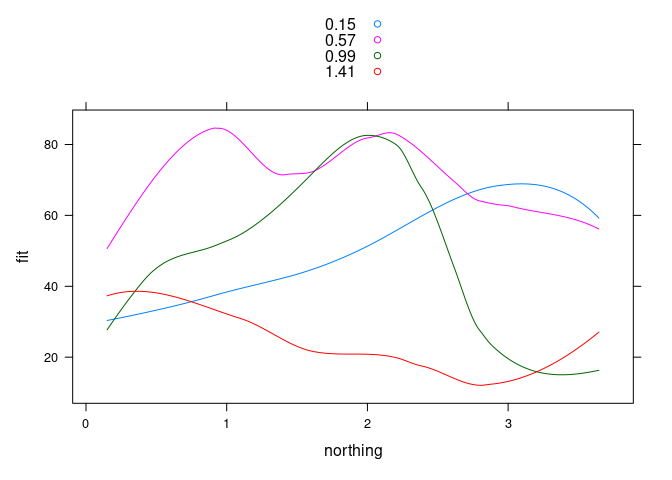
Using ggplot:
ggplot(mutate(ssf4, easting = factor(easting)),
       aes(x = northing, y = fit, color = easting, group = easting)) +
    geom_line()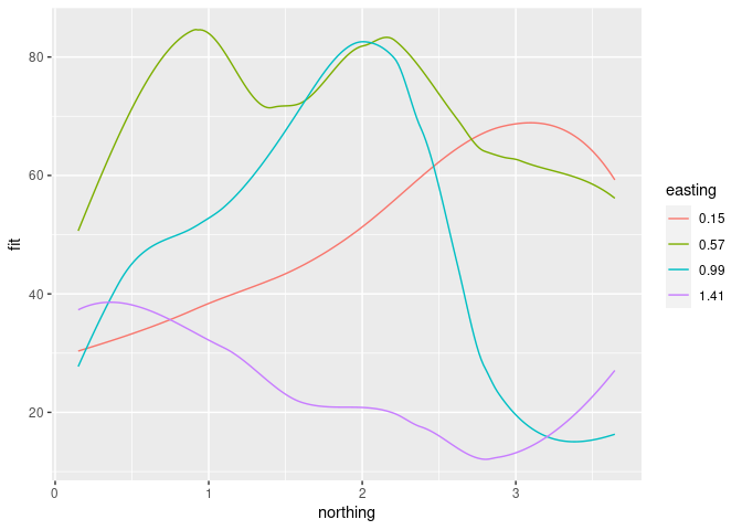
This is most useful when the effect of the conditioning variable is a level shift.
The number of different levels that can be used effectively is lower.
Over-plotting becomes an issue when used with data points.
Scatterplot Matrices
A scatterplot matrix is a useful overview that shows all pairwise scatterplots.
There are many options; a few are:
pairsin base graphics;splomin latticeggpairsinGGally.
pairs(soil[1 : 3], cex = 0.1)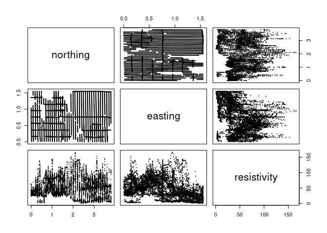
splom(soil[1 : 3], cex = 0.1)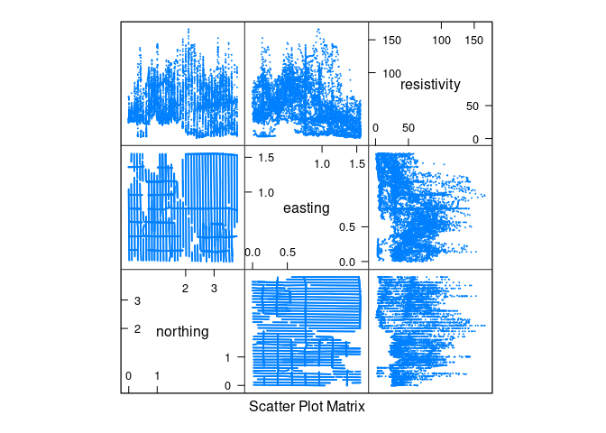
library(GGally)
## Registered S3 method overwritten by 'GGally':
##   method from
##   +.gg   ggplot2
ggpairs(soil[1 : 3], lower = list(continuous = wrap("points", size = 0.1)))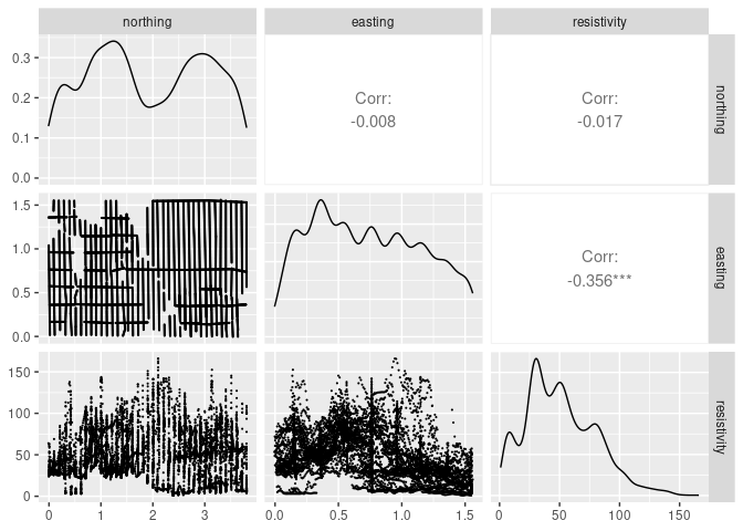
Some variations:
diagonal left-top to right-bottom or left-bottom to right-top;
how to use the panels in the two triangles;
how to use the panels on the diagonal.
Some things to look for in the panels:
clusters or separation of groups
strong relationships
outliers, rounding, clumping
Notes:
Cleveland recommends using the full version displaying both triangles of plots to facilitate visual linking.
If you do use only one triangle, and one variable is a response, then it is a good idea to arrange for that variable to be shown on the vertical axis against all other variables.
The symmetry in the plot with the diagonal running from bottom-left to top-tight as produced by
splomis simpler than the symmetry in the plot with the diagonal running from top-left t bottom-right produced bypairs.