Visualizing Three or More Numeric Variables, Continued
- Other 3D Viewing Options
- Some Calibration Experiments
- Interactive Explorations
- Example: Ethanol Data
- Example: Earth Quake Locations and Magnitudes
- Visualizing 2D and 3D Density Estimates
- Example: Environmental Data
- Medical Imaging Data
- Notes
- Two Classification Problems
- Grand and Guided Tours
- Scagnostics
- Two Sliders Using Shiny
Other 3D Viewing Options
Other options for viewing a 3D scene include:
- Anaglyph 3D using red/cyan glasses.
- Polarized 3D as currently used in many 3D movies.
- Stereograms, stereoscopy
A stereogram
- presents each eye with an image from a slightly different viewing angle;
- the brain fuses the images into a 3D view in a process called stereopsis.
This approach is or was used
- with virtual reality displays like Oculus Rift;
- in the View-Master toy;
- in aerial photography using viewers like this:

You can create your own viewer with paper or cardboard tubes, for example.
A stereo image for the soil data surface:
tp <- trellis.par.get()
trellis.par.set(theme = col.whitebg())
ocol <- trellis.par.get("axis.line")$col
oclip <- trellis.par.get("clip")$panel
trellis.par.set(list(axis.line = list(col = "transparent"),
clip = list(panel = FALSE)))
print(wireframe(soi.fit ~ soi.grid$easting * soi.grid$northing,
cuts = 9,
aspect = diff(range(soi.grid$n)) / diff(range(soi.grid$e)),
xlab = "Easting (km)",
ylab = "Northing (km)", shade = TRUE,
screen = list(z = 40, x = -70, y = 3)),
split = c(1, 1, 2, 1), more = TRUE)
print(wireframe(soi.fit ~ soi.grid$easting * soi.grid$northing,
cuts = 9,
aspect = diff(range(soi.grid$n)) / diff(range(soi.grid$e)),
xlab = "Easting (km)",
ylab = "Northing (km)", shade = TRUE,
screen = list(z = 40, x = -70, y = 0)),
split = c(2, 1, 2, 1))
trellis.par.set(list(axis.line = list(col = ocol), clip = list(panel = oclip)))
trellis.par.set(tp)Some Calibration Experiments
Simple Linear Stucture
Linear structure with normally distributed data:
n <- 1000
d1 <- data.frame(x = rnorm(n), y = rnorm(n))
d1 <- mutate(d1, z = x + y)splom(d1)
xyplot(z ~ x | equal.count(y), data = d1)
xyplot(z ~ x | equal.count(y, 12), data = d1)
xyplot(z ~ x | equal.count(y, overlap = -0.8), data = d1)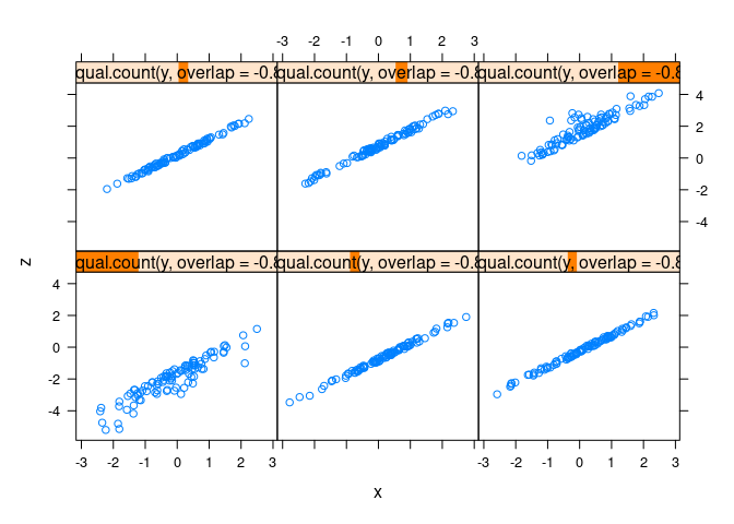
splom(d1, group = abs(x) < 0.1)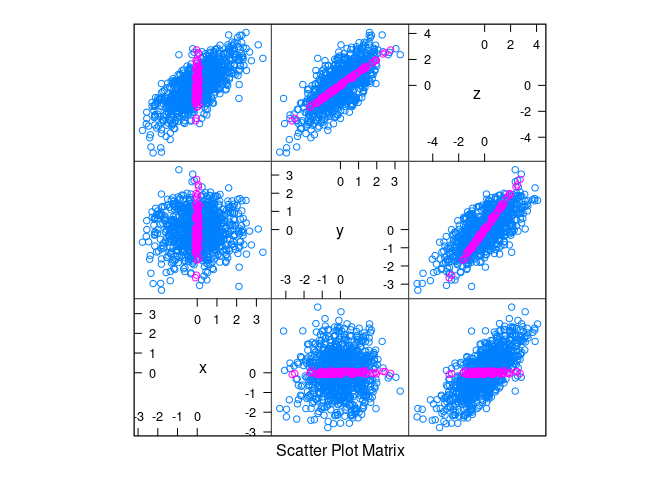
clear3d()
points3d(d1)Linear structure with uniformly distributed data:
d2 <- data.frame(x = runif(n, -1, 1), y = runif(n, -1, 1))
d2 <- mutate(d2, z = x + y)splom(d2)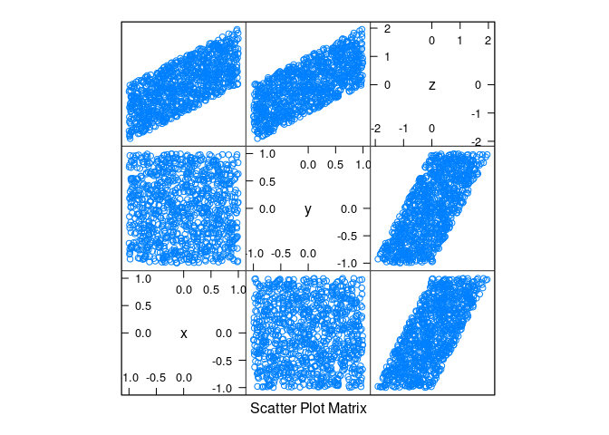
xyplot(z ~ x | equal.count(y, overlap = -0.8), data = d2)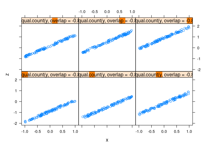
splom(d2, group = abs(x) < 0.1)
clear3d()
points3d(d2)Nonlinearity and Noise
Normal data with non-linearity and noise:
d3 <- mutate(d1, z = cos(x) + cos(y) + 0.5 * (x + y) + rnorm(x, 0, .2))splom(d3)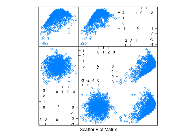
xyplot(z ~ x | equal.count(y, overlap = -0.8), data = d3)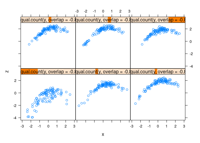
splom(d3, group = abs(x) < 0.1)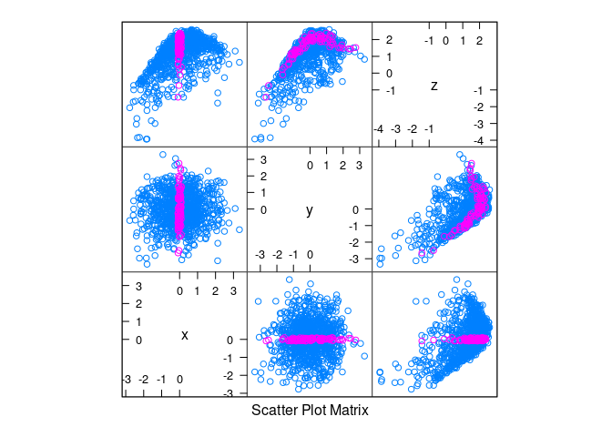
splom(d3, group = abs(x + 1) < 0.1)
Uniform data with non-linearity and noise:
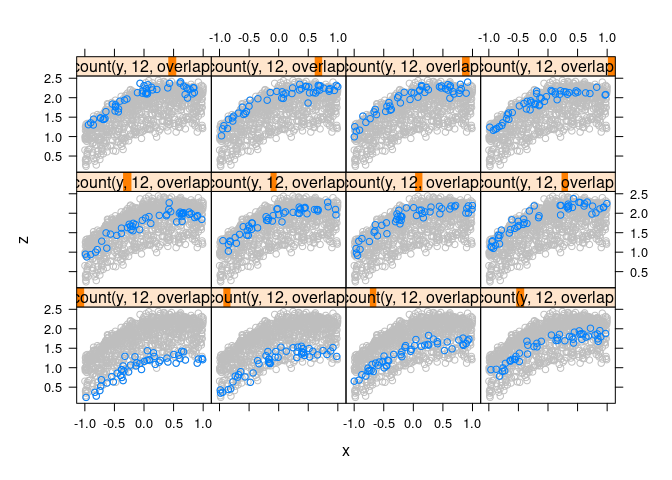
d4 <- mutate(d2, z = cos(x) + cos(y) + 0.5 * (x + y) + rnorm(x, 0, .1))xyplot(z ~ x | equal.count(y, 12, overlap = -0.8), data = d4)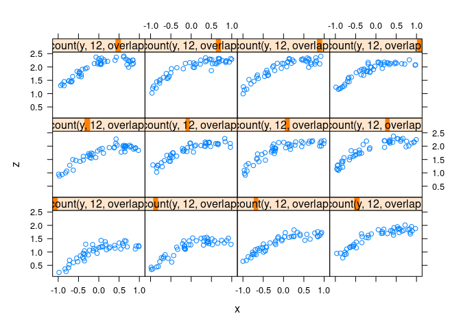
splom(d4, group = abs(x) < 0.1)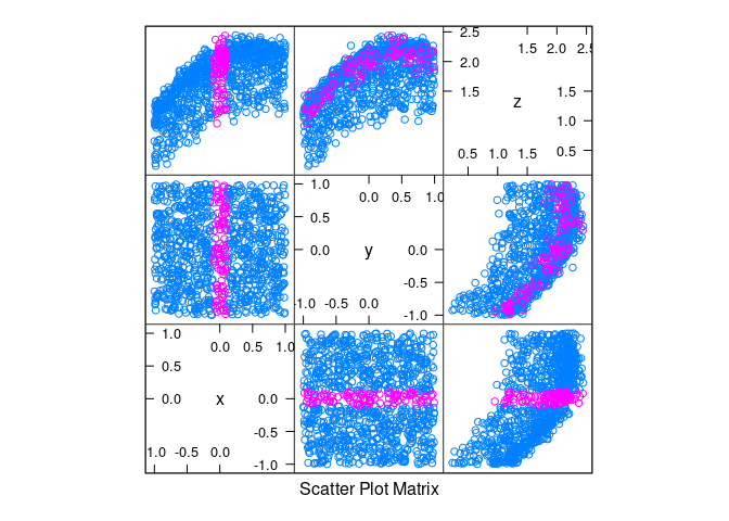
Full data in the background for context:
xyplot(z ~ x | equal.count(y, 12, overlap = -0.8), data = d4,
panel = function(x, y, ...) {
panel.xyplot(d4$x, d4$z, col = "grey")
panel.xyplot(x, y, ...)
})
clear3d()
points3d(d4)More Variables
Two-dimensional views, conditioning on two variables:
n <- 10000
d <- data.frame(x1 = rnorm(n), x2 = rnorm(n), x3 = rnorm(n))
d <- mutate(d,
x4 = as.numeric(scale(x1 + cos(x2) + sin(x3) + rnorm(n, 0, 0.1))))splom(d)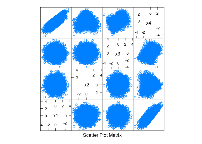
splom(~ d, data = d, group = abs(x1) < 0.1)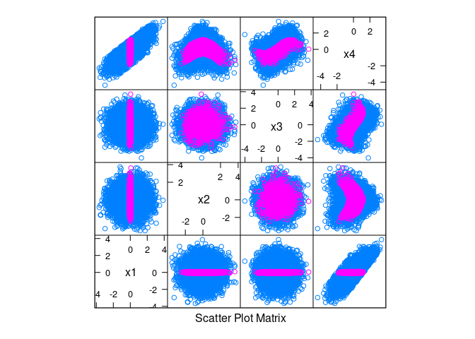
splom(~ d, data = d, group = abs(x1) < 0.1 & abs(x2) < 0.1)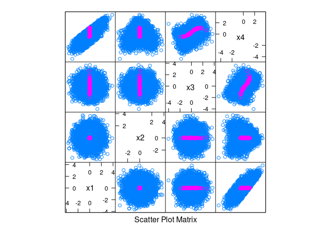
xyplot(x4 ~ x3 |
equal.count(x1, 4, overlap = -0.8) +
equal.count(x2, 4, overlap = -0.8),
data = d, asp = 1)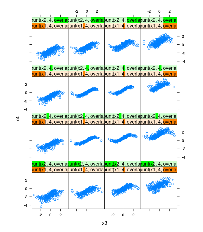
Three-dimensional views, conditioning on one variable:
dd <- filter(d, abs(x1) < 0.1)[2 : 4]clear3d()
points3d(dd)clear3d()
spheres3d(dd, radius = 0.05)clear3d()
spheres3d(dd, radius = 0.05, col = ifelse(abs(dd$x2) < 0.1, "red", "blue"))dd1 <- filter(d, abs(x1 - 1) < 0.1)[2 : 4]
dd2 <- filter(d, abs(x1 + 1) < 0.1)[2 : 4]
clear3d()
spheres3d(dd1, radius = 0.05, color = rep("red", ncol(dd1)))
spheres3d(dd2, radius = 0.05, color = rep("blue", ncol(dd2)))ddx <- mutate(d,
v = ifelse(abs(x1 - 1) < 0.1,
1,
ifelse(abs(x1 + 1) < 0.1, 2, NA)))
ddx <- filter(ddx, ! is.na(v))
cloud(x4 ~ x2 * x3, group = v, data = ddx, auto.key = TRUE)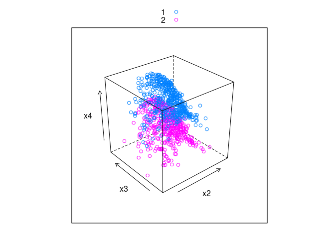
cloud(x4 ~ x2 * x3 | v, data = ddx)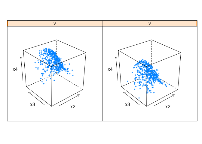
Interactive Explorations
Tk Sliders Using tkrplot
A simple animation function using the tkrplot` package:
library(tkrplot)
## Loading required package: tcltk
tkranim <- function(fun, v, lo, hi, res = 0.1, title, label) {
tt <- tktoplevel()
if (! missing(title))
tkwm.title(tt, title)
draw <- function() fun(v)
img <- tkrplot(tt, draw)
tv <- tclVar(init = v)
f <- function(...) {
vv <- as.numeric(tclvalue(tv))
if (vv != v) {
v <<- vv
tkrreplot(img)
}
}
s <- tkscale(tt, command = f, from = lo, to = hi, variable = tv,
showvalue = FALSE, resolution = res, orient = "horiz")
if (! missing(label))
tkpack(img, tklabel(tt, text = label), s)
else tkpack(img, s)
}Interactive conditioning for one of the calibration examples:
fd4 <- function(v)
print(splom(~ d4, group = abs(x - v) < 0.1, data = d4))
tkranim(fd4, 0, -1, 1, 0.05)Interactive slicing for the soil resistivity surface:
f <- function(i) {
e <- eastseq[i]
idx <- which(sf$easting == e)
r <- range(sf$fit)
print(xyplot(fit ~ northing, data = sf[idx, ],
ylim = r, type = "l", main = sprintf("Easting = %f", e)))
}
tkranim(f, 1, 1, 85, 1)Interactive conditioning for the soil resistivity data:
binwidth <- 0.1 ## bad idea to use a global variable
g <- function(i) {
e <- eastseq[i]
idx <- which(abs(soil$easting - e) <= binwidth)
ry <- range(soil$resistivity)
rx <- range(soil$northing)
print(xyplot(resistivity ~ northing, data = soil[idx, ],
xlim = rx, ylim = ry, main = sprintf("Easting = %f", e)))
}
tkranim(g, 1, 1, 85, 1)Shiny Sliders
A version of the animation function using the shiny package:
shinyAnim <- function(fun, v, lo, hi, step = NULL, label = "Frame") {
require(shiny)
shinyApp(
ui = fluidPage(
sidebarLayout(
sidebarPanel(sliderInput("n", label, lo, hi, v, step,
animate = animationOptions(100))),
mainPanel(plotOutput("plot"))
)
),
server = function(input, output, session) {
session$onSessionEnded(function() shiny::stopApp())
output$plot <- renderPlot(fun(input$n))
}
)
}shinyAnim(fd4, 0, -1, 1, 0.05)shinyAnim(f, 1, 1, 85)shinyAnim(g, 1, 1, 85, 1)Animations as Movies
To show how a plot changes with a single parameter it is possible to pre-compute the images and assemble them into a movie.
This is easy to do in Rmarkdown, but requires the ffmpeg software to be installed.
Currently, ffmpeg is not available on the CLAS Linux systems.
A simple example (Rmd).
Linking and Brushing
Linked plots and brushing were pioneered at Bell Laboratories in the early 1980s.
Some videos are available in the ASA Statistics Computing and Statistical Graphics Sections’ video library.
Trellis displays were developed by the same research group after the development of brushing.
The iplots package provides a set of basic plot that are all linked by default.
library(iplots)
with(soil, iplot(northing, resistivity))with(soil, iplot(easting, northing))The rggobi package provides another framework for linked plots and brusing within R.
library(rggobi)
ggobi(soil)Several other tools with linking/brushing support and good integration with R are under development.
- One of the furthest along seems to be
rbokeh. plotlyalso provides some support for linked brushing.
Example: Ethanol Data
The ethanol data frame in the lattice package contains data from an experiment efficiency and emissions in small one-cylinder engines.
The data frame contains 88 observations on three variables:
NOx: Concentration of nitrogen oxides (NO and NO2) in micrograms.CCompression ratio of the engine.EEquivalence ratio, a measure of the richness of the air and ethanol fuel mixture.
A scatterplot matrix:
library(lattice)
splom(ethanol)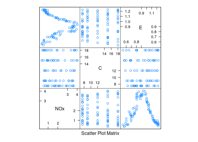
Conditional plots of NOx against E for each level of C:
xyplot(NOx ~ E | C, data = ethanol)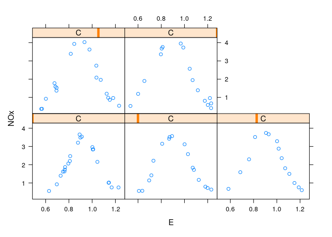
ggplot(ethanol, aes(x = E, y = NOx)) + geom_point() + facet_wrap(~ C)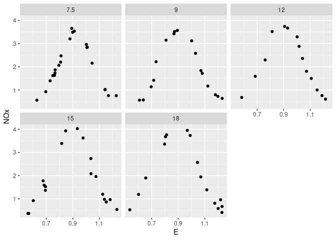
A single plot with color to separate levels of C:
xyplot(NOx ~ E, group = C, data = ethanol, auto.key = TRUE)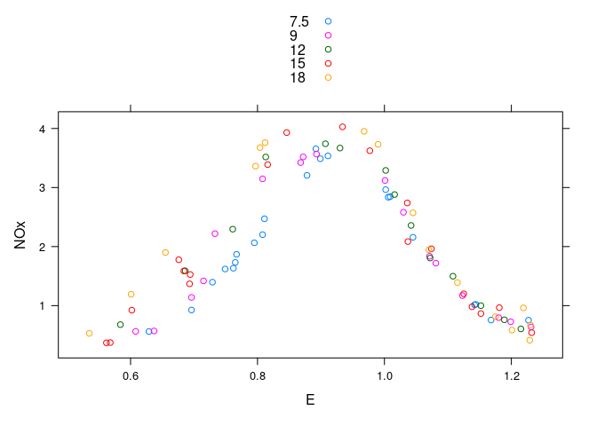
ggplot(ethanol, aes(x = E, y = NOx, color = factor(C))) + geom_point()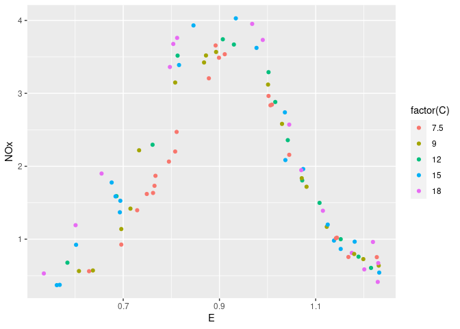
Augmented with smooths:
xyplot(NOx ~ E, group = C, type = c("p", "smooth"), data = ethanol,
auto.key = TRUE)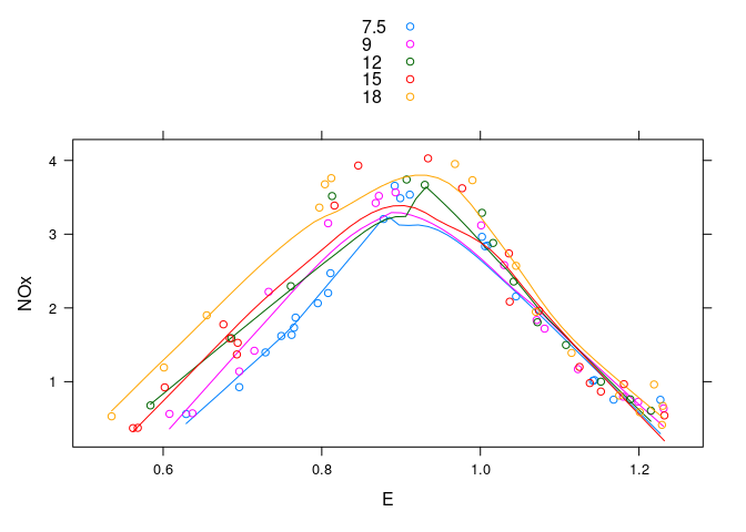
ggplot(ethanol, aes(x = E, y = NOx, color = factor(C))) +
geom_point() + geom_smooth(se = FALSE)
## `geom_smooth()` using method = 'loess' and formula = 'y ~ x'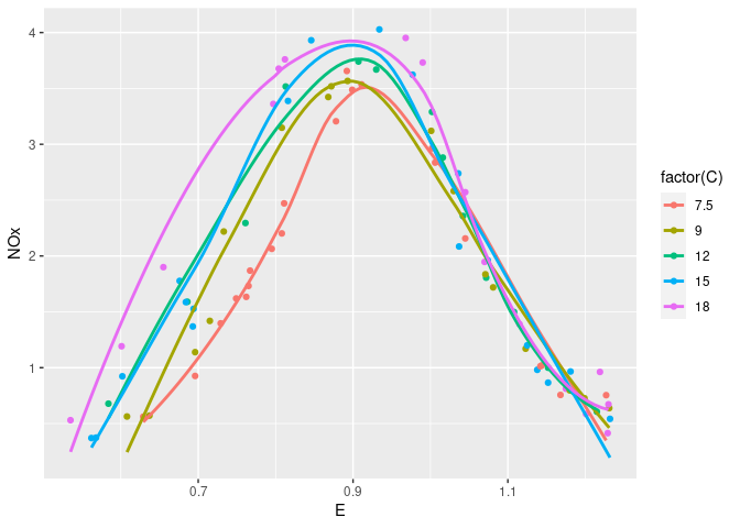
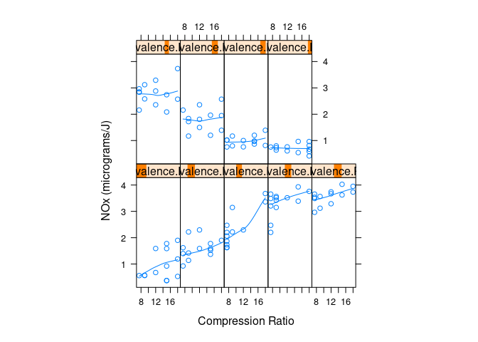
Conditional plots of NOx against C given levels of E:
with(ethanol, {
Equivalence.Ratio <- equal.count(E, number = 9, overlap = 0.25)
xyplot(NOx ~ C | Equivalence.Ratio,
panel = function(x, y) {
panel.xyplot(x, y)
panel.loess(x, y, span = 1)
},
aspect = 2.5,
layout = c(5, 2),
xlab = "Compression Ratio",
ylab = "NOx (micrograms/J)")
})
An interactive 3D view:
library(rgl)
clear3d()
with(ethanol, points3d(E, C / 5, NOx / 5,
size = 4, col = rep("black", nrow(ethanol))))Example: Earth Quake Locations and Magnitudes
The quakes data frame contains data on locations of seismic events of magnitude 4.0 or larger in a region near Fiji.
The time frame is from 1964 to perhaps 2000. More recent data is available from a number of sources on the web.
Some scatter plot matrices:
library(lattice)
splom(quakes)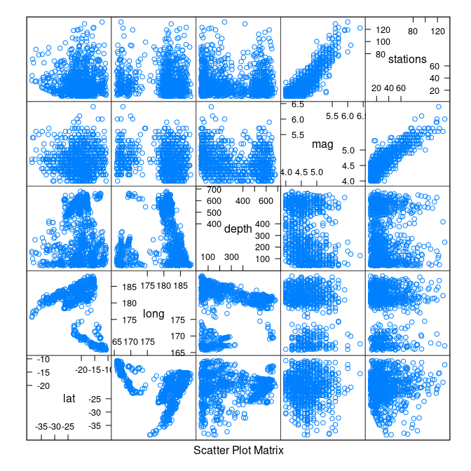
splom(quakes, cex = 0.1)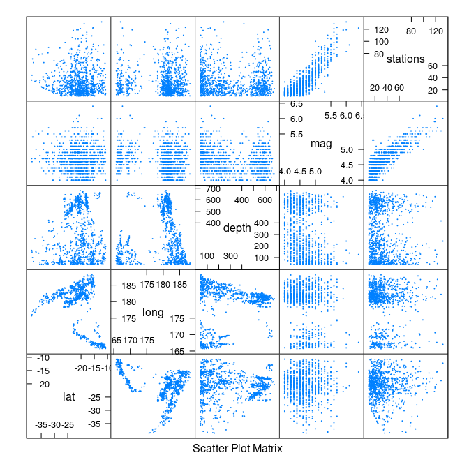
splom(quakes, alpha = 0.1)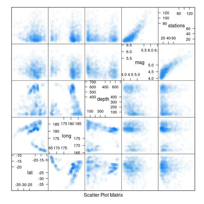
splom(quakes, panel = panel.smoothScatter)
## (loaded the KernSmooth namespace)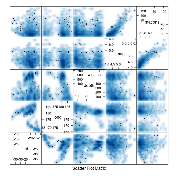
Where the quakes are located:
library(maps)
map("world2", c("Fiji", "Tonga", "New Zealand"))
with(quakes, points(long, lat, col = "red", cex = 0.1))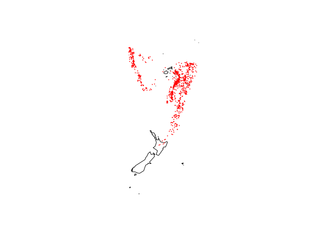
map("world2", c("Fiji", "Tonga", "New Zealand"))
with(quakes, points(long, lat, col = heat.colors(nrow(quakes))[rank(depth)],
cex = 0.1))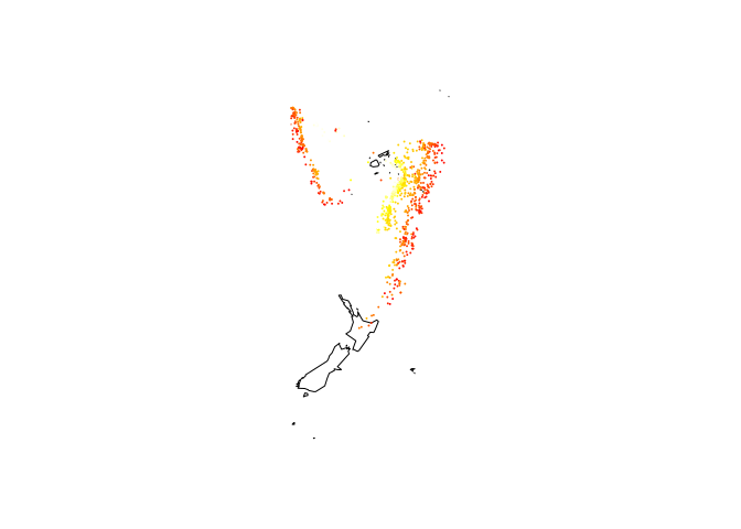
map("world2", c("Fiji", "Tonga", "New Zealand"))
with(quakes, points(long, lat, col = heat.colors(nrow(quakes))[rank(depth)]))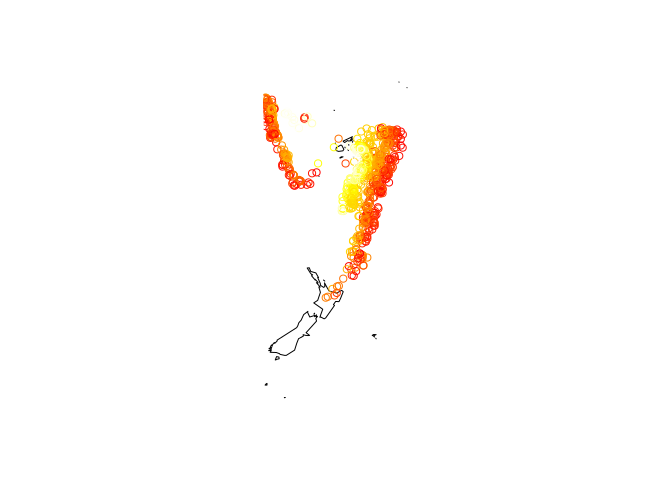
Showing depth with grouping:
quakes2 <- mutate(quakes, depth_cut = cut_number(depth, 3))
xyplot(lat ~ long, aspect = "iso", groups = depth_cut,
data = quakes2, auto.key = list(columns = 3, title = "Depth"))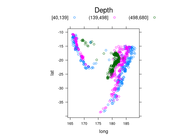
ggplot(quakes2, aes(x = long, y = lat, color = depth_cut)) +
geom_point() + theme_bw() + coord_map()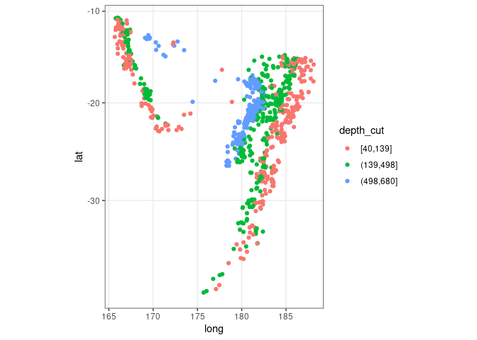
ggplot(quakes2, aes(x = long, y = lat, colour = depth_cut, size = mag)) +
geom_point() + theme_bw() + coord_map()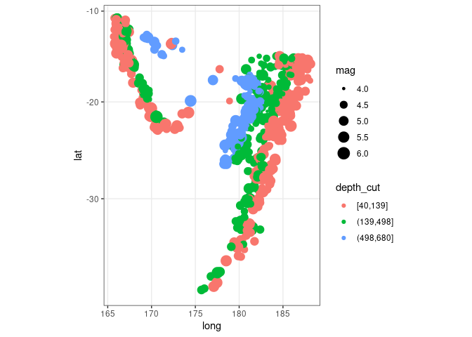
Showing depth with a trellis display:
xyplot(lat ~ long | depth_cut, aspect = "iso", data = quakes2)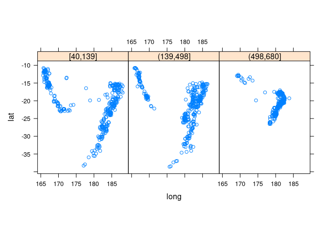
xyplot(lat ~ long | depth_cut, aspect = "iso", type = c("p", "g"),
data = quakes2, auto.key = TRUE)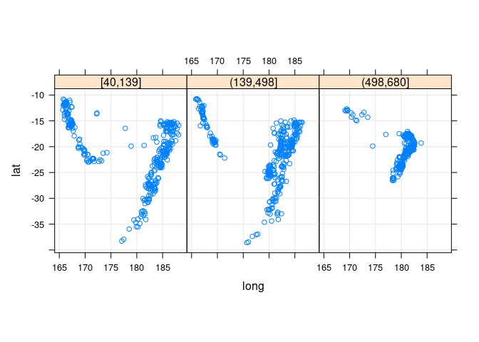
ggplot(quakes2, aes(x = long, y = lat)) +
geom_point(color = "blue") + facet_wrap(~ depth_cut, nrow = 1) +
theme_bw() + coord_map()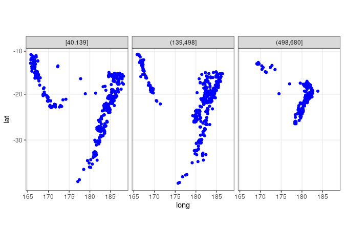
Adding the full data for background context:
xyplot(lat ~ long | cut(depth, 3), aspect = "iso", type = c("p", "g"),
panel = function(x, y, ...) {
panel.xyplot(quakes$long, quakes$lat, col = "grey")
panel.xyplot(x, y, ...)
},
data = quakes)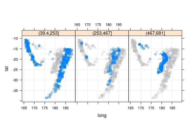
## quakes does not contain the depth_cut variable used in the facet
ggplot(quakes2, aes(x = long, y = lat)) +
geom_point(data = quakes, color = "gray") +
geom_point(color = "blue") + facet_wrap(~ depth_cut, nrow = 1) +
theme_bw() + coord_map()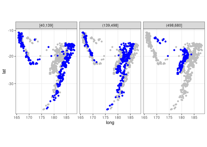
3D views of lat, long, and depth:
cloud(-depth ~ long * lat, data = quakes)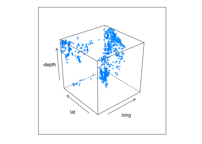
library(rgl)
bg3d(col = "black")
clear3d()
with(quakes, points3d(long, lat, -depth / 50, size = 2,
col = rep("white", nrow(quakes))))clear3d()
with(quakes, points3d(long, lat, -depth / 50, size = 2,
col = heat.colors(nrow(quakes))[rank(mag)]))Visualizing 2D and 3D Density Estimates
2D Density Estimates
We have already seen some examples of plotting 2D density contours on a scatter plot using geom_density2d.
Here is a version that explicitly creates the density estimate:
data(geyser, package = "MASS")
geyser <- mutate(geyser, duration = lag(duration))
geyser <- filter(geyser, ! is.na(duration))
plot(waiting ~ duration, data = geyser)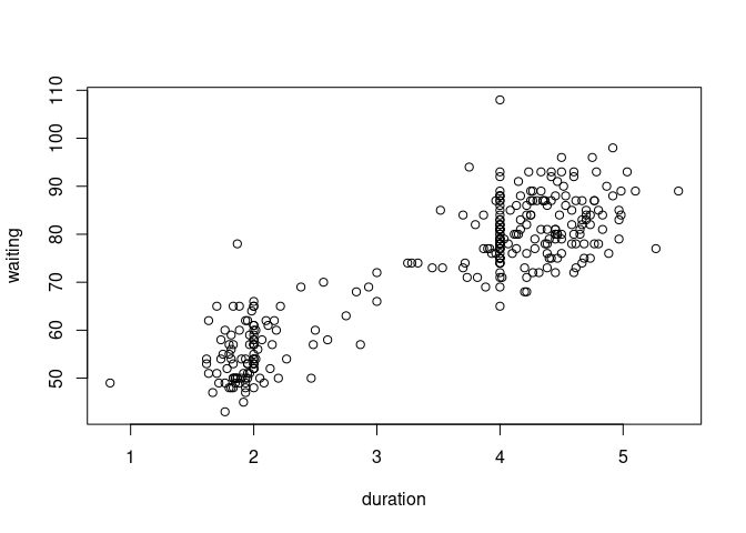
sc <- function(x) as.numeric(scale(x))
de <- with(geyser, MASS::kde2d(sc(duration), sc(waiting), n = 50, h = 0.5))
contour(de)
with(geyser, points(sc(duration), sc(waiting)))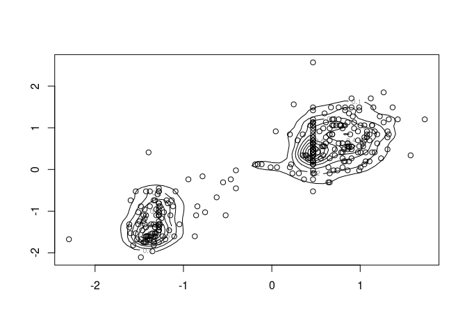
The density estimate can also be viewed with a perspective plot or an interactive 3D plot:
persp(de)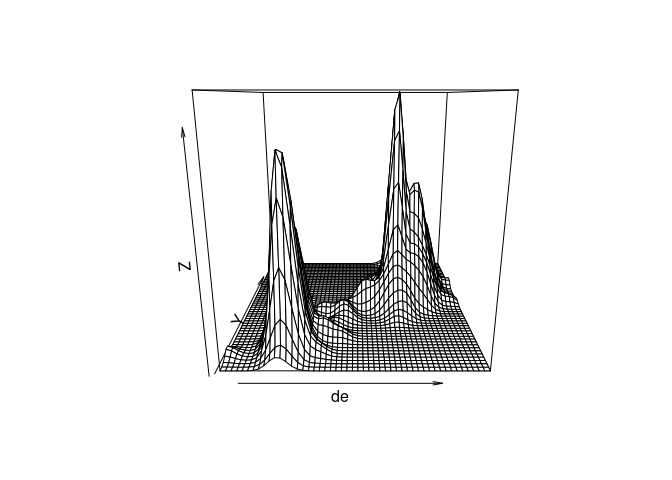
clear3d()
bg3d(col = "white")
surface3d(unique(de$x), unique(de$y), de$z, col = "red")
box3d()
axes3d()3D Density Estimates
A 3D normal mixture:
library(rgl)
library(misc3d)
x <- matrix(rnorm(9000), ncol = 3)
x[1001 : 2000, 2] <- x[1001 : 2000, 2] + 4
x[2001 : 3000, 3] <- x[2001 : 3000, 3] + 4clear3d()
bg3d(col = "white")
points3d(x = x[, 1], y = x[, 2], z = x[, 3], size = 2, color = "black")g <- expand.grid(x = seq(-4, 8.5, len = 30),
y = seq(-4, 8.5, len = 30),
z = seq(-4, 8.5, len = 30))Density estimates for two bandwidths:
d <- kde3d(x[, 1], x[, 2], x[, 3], 0.2, 30, c(-4, 8.5))$d
d2 <- kde3d(x[, 1], x[, 2], x[, 3], 0.5, 30, c(-4, 8.5))$d3D plot of data and contour for bw = 0.2:
clear3d()
xv <- seq(-4, 8.5, len = 30)
points3d(x = x[, 1], y = x[, 2], z = x[, 3], size = 2, color = "black")
contour3d(d, 20 / 3000, xv, xv, xv, color = "red", alpha = 0.5, add = TRUE)3D plot of data and a contour for bw = 0.5:
clear3d()
points3d(x = x[, 1], y = x[, 2], z = x[, 3], size = 2, color = "black")
contour3d(d2, 20 / 3000, xv, xv, xv, color = "red", alpha = 0.5, add = TRUE)3D plot of several contours for bw = 0.5:
clear3d()
contour3d(d2, c(10, 25, 40) / 3000, xv, xv, xv,
color = c("red", "green", "blue"), alpha = c(0.2, 0.5, 0.7),
add = TRUE)Density contours for the quakes data:
library(misc3d)
library(rgl)
clear3d()
bg3d(col = "white")
points3d(quakes$long / 22, quakes$lat / 28, -quakes$depth / 640, size = 2,
col = rep("black", nrow(quakes)))
box3d(col = "gray")d <- kde3d(quakes$long, quakes$lat, -quakes$depth, n = 40)
contour3d(d$d, level = exp(-12), x = d$x / 22, y = d$y / 28, z = d$z / 640,
color = "green", color2 = "gray", scale = FALSE, add = TRUE)Re-scaling depth to (approximately) match surface location scale:
clear3d()
points3d(quakes$long, quakes$lat, -quakes$depth / 110, size = 2,
col = rep("black", nrow(quakes)))
box3d(col = "gray")d <- kde3d(quakes$long, quakes$lat, -quakes$depth, n = 40)
contour3d(d$d, level = exp(-12), x = d$x, y = d$y, z = d$z / 110,
color = "green", color2 = "gray", scale = FALSE, add = TRUE)Variant with alpha blending and two contour surfaces:
clear3d()
points3d(quakes$long, quakes$lat, -quakes$depth / 110, size = 2)
box3d(col = "gray")
d <- kde3d(quakes$long, quakes$lat, -quakes$depth, n = 40)
contour3d(d$d, level = exp(c(-10, -12)), x = d$x, y = d$y, z = d$z / 110,
color = c("red", "green"), alpha = 0.1, scale = FALSE, add = TRUE)Example: Environmental Data
Daily measurements of ozone concentration, wind speed, temperature and solar radiation in New York City from May to September of 1973.
This analysis is from Cleveland’s Visualizing Data book.
A goal is to see to what degree ozone variation can be explained by radiation, temperature, and wind variation.
library(lattice)
splom(environmental, pscale = 0)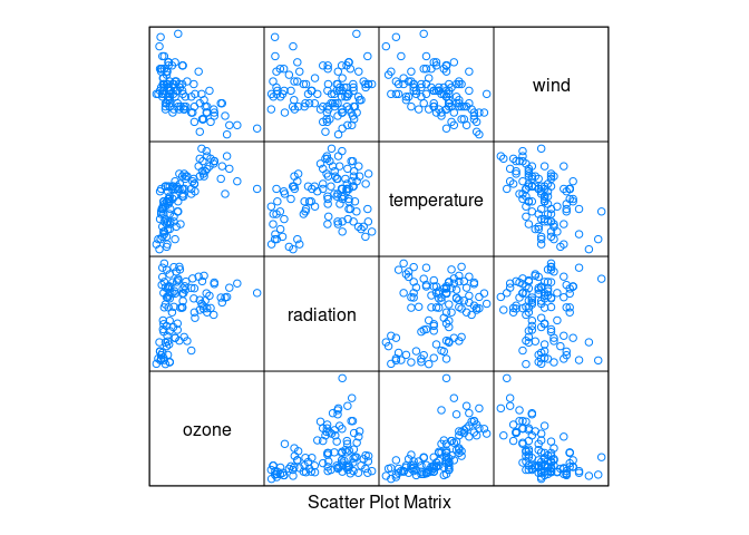
histogram(environmental$ozone)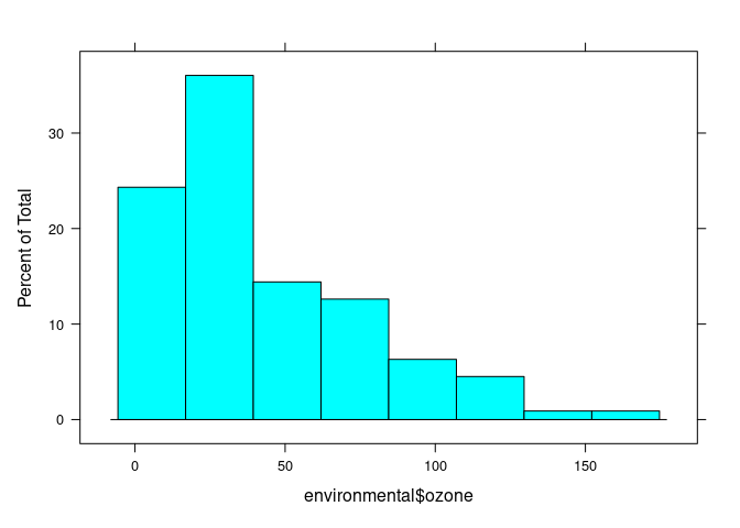
histogram(environmental$ozone ^ (1 / 3))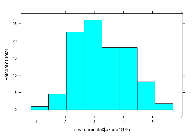
## (Cleveland uses cube root)
env <- mutate(environmental, ozone = ozone ^ (1 / 3))
splom(env)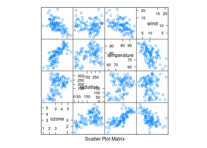
Ozone seems to increase with temperature and decrease with wind.
Some conditional plots:
xyplot(ozone ~ radiation | equal.count(temperature, 4) *
equal.count(wind, 4),
data = env, type = c("p", "g", "smooth"), asp = 1.5, col.line = "red")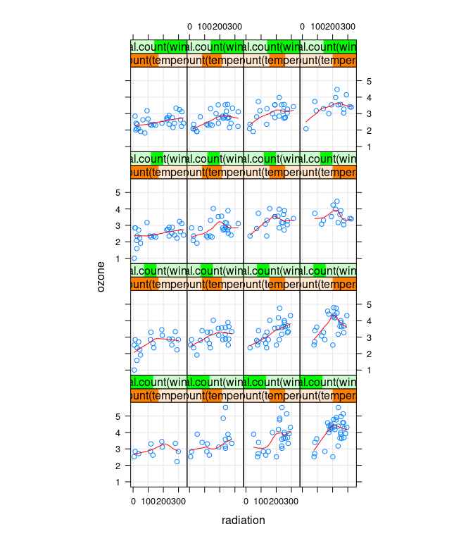
xyplot(ozone ~ temperature |
equal.count(radiation, 3, overlap = 0) *
equal.count(wind, 2, overlap = 0.2),
data = env, type = c("p", "g", "smooth"))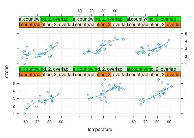
xyplot(ozone ~ temperature | equal.count(radiation, 4, overlap = 0),
group = ifelse(wind >= 10, "high", "low"),
data = env, auto.key = TRUE, type = c("p", "g", "smooth"))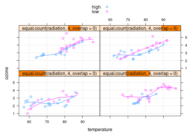
3D scatter plot with wind split in two levels, red for low wind, blue for high wind:
ne <- names(env)
wcut <- with(env, cut_number(wind, 2))
idx <- as.integer(wcut)
cols <- c("red", "blue")[idx]library(rgl)
clear3d()
points3d(scale(env[-4]), radius = 0.05, col = cols)
axes3d()
title3d(xlab = ne[1], ylab = ne[2], zlab = ne[3])Fitting a loess surface:
fit.env <- loess(ozone ~ wind * temperature * radiation,
span = 1.0, degree = 2, data = env)
scaleBy <- function(x, y) (x - mean(y)) / sd(y)Visualising the surface:
tmesh <- with(env, do.breaks(range(temperature), 50))
rmesh <- with(env, do.breaks(range(radiation), 50))
wmesh <- with(env, do.breaks(range(wind), 50))
grid <- expand.grid(temperature = tmesh, radiation = rmesh, wind = wmesh)
grid$fit <- as.numeric(predict(fit.env, newdata = grid))
gridw <- expand.grid(temperature = tmesh, radiation = rmesh, wind = 8)
fit.pred1 <- predict(fit.env, newdata = mutate(gridw, wind = 8))
fit.pred2 <- predict(fit.env, newdata = mutate(gridw, wind = 11))
gridw$fit1 <- as.numeric(fit.pred1)
gridw$fit2 <- as.numeric(fit.pred2)library(rgl)
clear3d()
with(env,
surface3d(scaleBy(unique(gridw$temperature), temperature),
scaleBy(unique(gridw$radiation), radiation),
scaleBy(gridw$fit1, ozone), col = "red"))
with(env,
surface3d(scaleBy(unique(gridw$temperature), temperature),
scaleBy(unique(gridw$radiation), radiation),
scaleBy(gridw$fit2, ozone), col = "blue"))
axes3d()
box3d()
title3d(xlab = "temp", ylab = "rad", zlab = "ozone")Conditional plots of the fit surface:
g <- with(env,
expand.grid(radiation = do.breaks(range(radiation), 50),
temperature = do.breaks(range(temperature), 3),
wind = do.breaks(range(wind), 3)))
g$fit <- as.numeric(predict(fit.env, newdata = g))
xyplot(fit ~ radiation | temperature * wind, data = g,
type = c("g", "l"), asp = 1.5)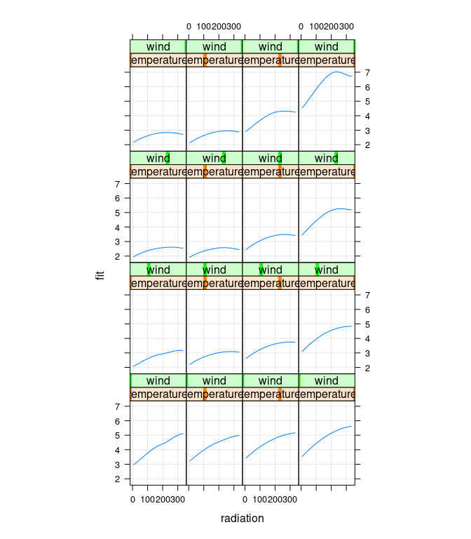
Cleveland points out that there is no data for high temperature/high wind or low temperature/low wind, to estimates in those regions are unreliable:
xyplot(wind ~ temperature, data = env)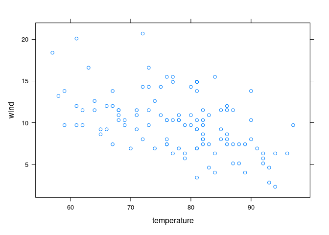
Setting the corresponding fit values to NA emphasizes the more reliable results:
## Cleveland Fig 5.9
gg <- g
gg$fit[gg$temperature > 80 & gg$wind > 20] <- NA
gg$fit[gg$temperature < 80 & gg$wind < 5] <- NA
xyplot(fit ~ radiation | temperature * wind, data = gg,
type = c("g", "l"), asp = 1.5)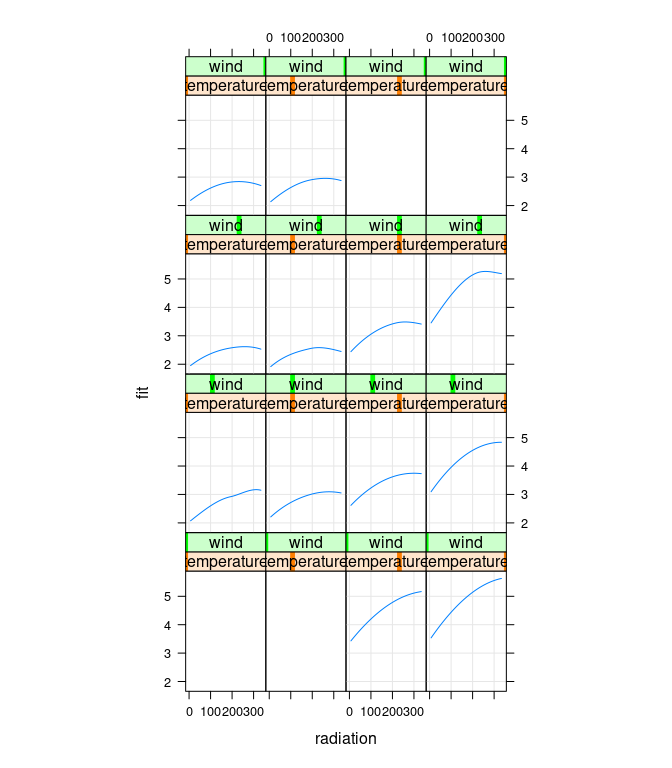
Residuals plots:
env$fit <- predict(fit.env)
env$res <- env$ozone - env$fit
xyplot(res ~ fit, data = env)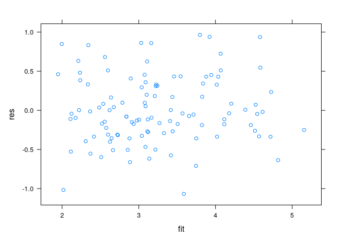
Spread-location plots:
xyplot(sqrt(abs(res)) ~ fit, data = env)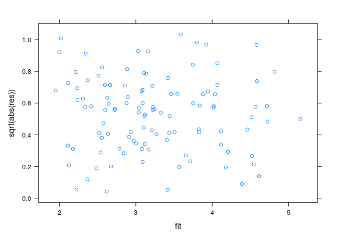
Residual and fit spread (rfs) plots
rfs(fit.env)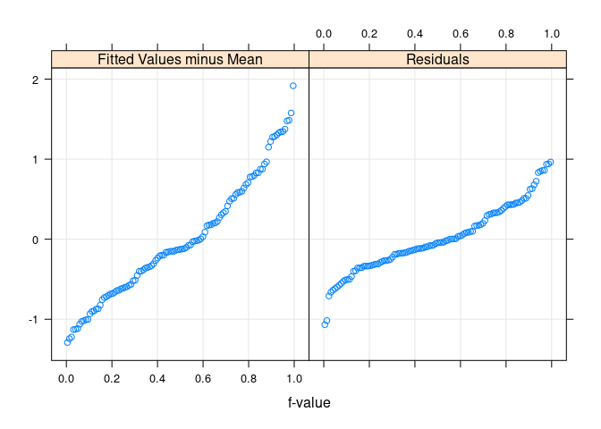
Medical Imaging Data
Medical imaging technologies, such as magnetic resonance imaging (MRI) produce a three-dimensional array of intensity values, one for each volume element, or voxel.
A common visualization allows the viewer to interactively examine image plots of the intensities for different slices through the volume.
readVol <- function(fname, dim = c(181, 217, 181)) {
f <- gzfile(fname, open = "rb")
on.exit(close(f))
b <- readBin(f, "integer", prod(dim), size = 1, signed = FALSE)
array(b, dim)
}
imgfile <-
"/group/statsoft/data/Brainweb/images/T1/t1_icbm_normal_1mm_pn3_rf20.rawb.gz"
v <- readVol(imgfile)
library(misc3d)
slices3d(v)The interactive heatmap can also be used for functions of three variables, such as a density estimate:
slices3d(d2)Notes
What to Look for in a Scatter Plot
The easiest features to see in a acatterplot:
- outliers, clusters (zero-dimensional objects)
- curves (one-dimensional objects)
Changes in point density are also perceivable, but much less easily.
Conditioning and Projection
Scatter plots show a two-dimensional projection of the data.
- Projections preserve dimension of zero and one dimensional objects.
- Two and higher dimensional objects are collapsed to two dimensions.
Zero and one dimensional objects can be occluded in a projection by higher-dimensional objects.
Conditioning can reduce dimensionality:
- conditioning on one variable reduces dimensionality by one;
- conditioning on two variables reduces dimensionality by two.
Conditioning on more than two variables is rarely practical.
Many different projections are possible. Some useful tools for exploring:
3D visualizations;
scatter plot matrices;
principal components analysis;
grand and guided tours;
scagnostics.
3D Visualizations
3D visualizations take advantage of our visual system’s ability to create a 3D mental image from a 2D rendering.
Several techniques are used to help our visual system:
motion;
depth cueing;
perspective projection.
For viewing data it is often helpful to turn off the perspective adjustment.
Most systems for 3D viewing provide a way to do this.
An illustration is provided by the randu data set of 400 triples of successive random numbers from the RANDU pseudo-random number generator. The flaw is much easier to see then the perspective adjustment is removed.
library(rgl)
clear3d()
points3d(randu, size = 5)par3d(FOV = 1) ## removes perspective distortionTwo Classification Problems
Two data sets where the objective is to identify class membership from measurements
Australian Crabs
Olive Oils
Australian Crabs
The data frame crabs in the MASS package contains measurement on crabs of a species that has been split into two based on color, orange or blue.
Preserved specimens lose their color (and possibly ability to identify sex).
Data were collected to help classify preserved specimens. It would be useful to have a fairly simple classification rule.
An initial view:
data(crabs, package = "MASS")
splom(~ crabs[4 : 8], group = paste(sex, sp),
data = crabs, auto.key = TRUE, pscale = 0)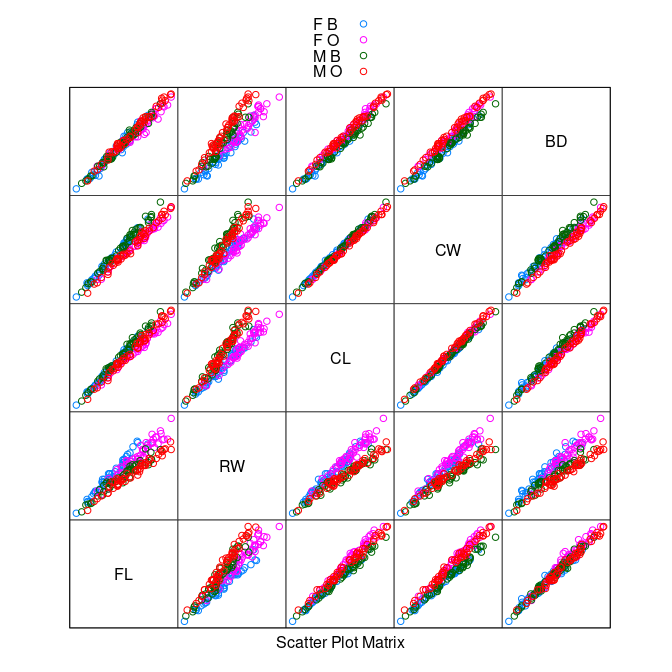
The variables are highly correlated, reflecting overall size and age.
The
RW * CLorRW * CWplots separate males and females well, at least for larger crabs.
Some possible next steps:
Consider a
logtransformation if the marginal distributions are skewed.Reduce the correlation by a linear or nonlinear transformation.
A quick look at histograms:
library(tidyr)
library(ggplot2)
ggallhists <- function(data, nb = nclass.Sturges(data[[1]])) {
ggplot(gather(data, var, val), aes(val)) +
geom_histogram(bins = nb) + xlab("") + ylab("") +
facet_wrap(~ var, scales = "free")
}
ggallhists(crabs[4 : 8])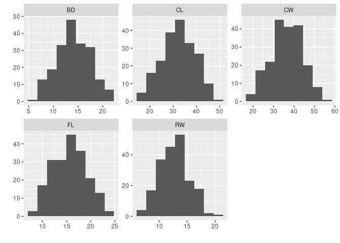
- It does not look like a
logtransformation is needed.
Principal component analysis identifies a rotation of the data that produces uncorrelated scores.
pc <- princomp(crabs[4 : 8])
splom(~ pc$scores, group = paste(sex, sp),
data = crabs, auto.key = TRUE, pscale = 0)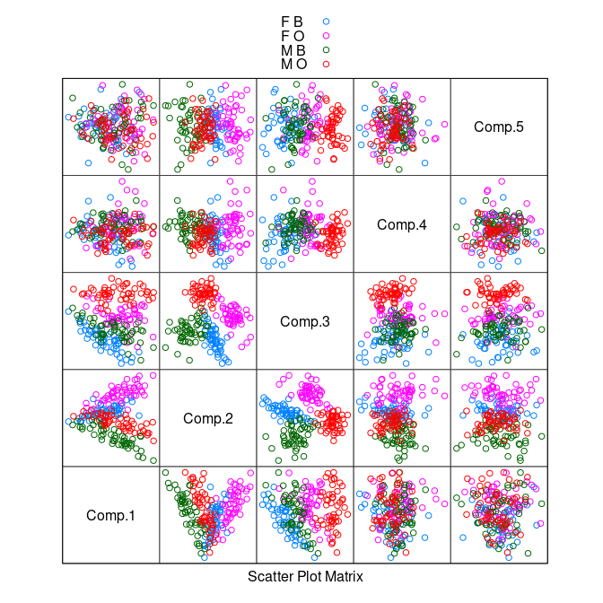
There is some separation of the classes in the plot of the second and third components.
A nonlinear transformation that scales relative to one of the variables, say
CL, may do better.
cr <- mutate(crabs,
FLCL = FL / CL, RWCL = RW / CL, CWCL = CW / CL, BDCL = BD / CL)
splom(~ cr[9 : 12], group = paste(sex, sp),
data = cr, auto.key = TRUE, pscale = 0)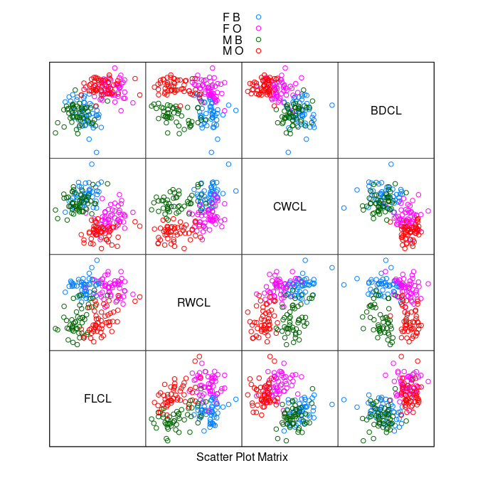
The
CWCL * BDCLplot shows good species separation by a line.Using
CWCL - BDCLwill pick out the axis of separation.
splom(~ data.frame(FLCL, RWCL, CWCL - BDCL), group = paste(sex, sp),
data = cr, auto.key = TRUE, pscale = 0)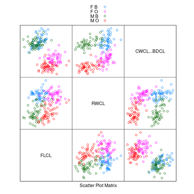
The
FLCL * (CWCL - BDCL)plot shows perfect separation.After another rotation to
FLCL - (CWCL - BDCL) = FLCL + BDCL - CWCLa simple criterion emerges.
stripplot(paste(sex, sp) ~ FLCL + BDCL - CWCL, data = cr,
jitter = TRUE, group = paste(sex, sp),
panel = function(...) {
panel.stripplot(...)
panel.abline(v = -0.23, lty = 2)
})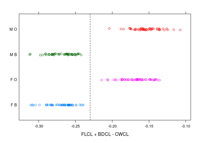
- The sexes are well separated by
RWCLfor larger crabs; less so for smaller ones
xyplot(RWCL ~ CL | sp, data = cr, group = paste(sex), auto.key = TRUE)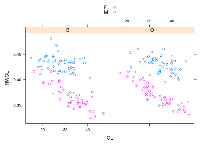
- Dividing the crabs at
CLof 30 into small and large gives a simple rule that works fairly well across species and sizes.
xyplot(RWCL ~ CL | sp, data = cr, group = paste(sex), auto.key = TRUE,
panel = function(...) {
panel.xyplot(...)
## panel.segments(c(0, 30), c(0.42, 0.39), c(30, 60), c(0.42, 0.39),
## lty = 2)
ds <- 0.42
dl <- 0.39
panel.lines(c(0, 30, 30, 60), c(ds, ds, dl, dl),
lty = 2, col = "black")
})
- Using principle component analysis on the scaled data produces a similar result based on the first two principal components.
pc <- princomp(cr[9 : 12])
splom(~ pc$scores, group = paste(sex, sp),
data = cr, auto.key = TRUE, pscale = 0)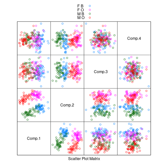
When designing a classifier it is usually a good idea to split the data into a training set and a _test set.
After building the classifier with the training data its performance can be assessed using the test data.
Olive Oils
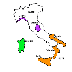
The olives data frame in the extracat package contains measurements on the proportion of 8 fatty acids (% times 100) in olive oil samples.
- Samples come from 9 areas grouped in three regions.
A goal is to see if region and perhaps area can be determined from these measurements.
This might help in discovering cheap varieties masquerading as expensive ones.
A useful approach is to first try to identify the regions and then the areas within regions.
A first look at the data:
library(lattice)
olives <- read.csv("https://stat.uiowa.edu/~luke/data/olives.csv")
splom(~ olives[3 : 10], cex = 0.1, group = Region,
data = olives, auto.key = TRUE, pscale = 0)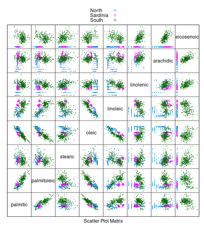
- Oils from the
Southregion have a much highereicosenoiccontent than oils from the other regions.
stripplot(Region ~ eicosenoic, data = olives, type = c("p", "g"),
jitter = TRUE, group = Region)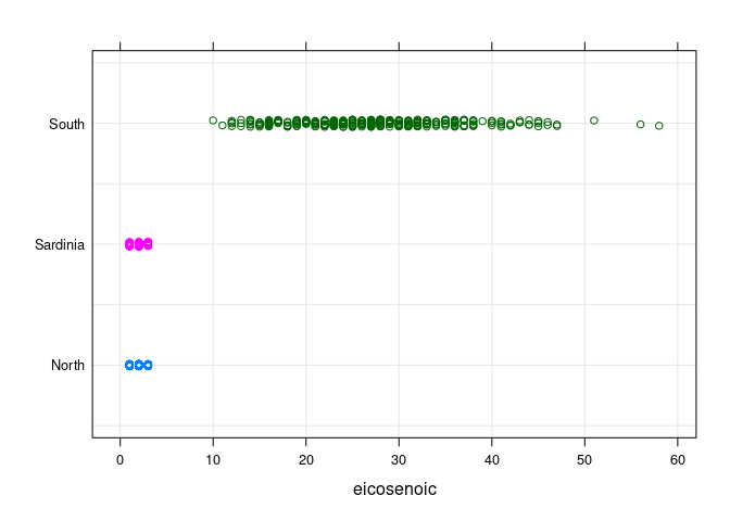
- To separate
NorthfromSardiniawe can remove theSouthsamples.
ons <- filter(olives, Region != "South")
ons <- droplevels(ons)
splom(~ ons[3 : 10], cex = 0.1, group = Region, data = ons,
auto.key = TRUE, pscale = 0)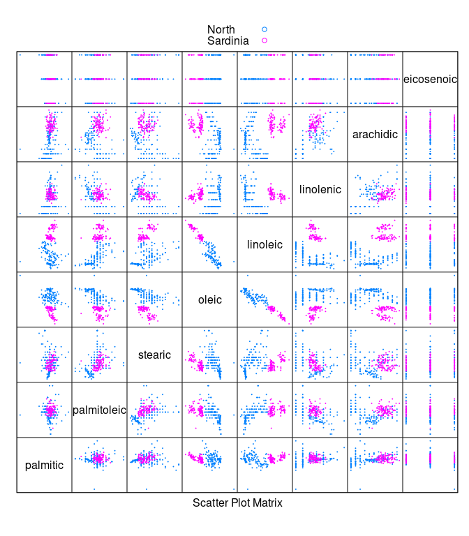
- The
arachidic * linoleicplot allows these two regions to be separated:
xyplot(arachidic ~ linoleic, group = Region, data = ons,
type = c("p", "g"), auto.key = TRUE)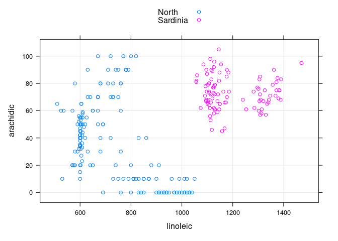
- Among the non-
Southoils the ones fromSardiniacan be identified as the ones withlinoleic > 1000andarachidic > 40.
Looking at the oils for the two areas within Sardinia:
sar <- filter(olives, Region == "Sardinia")
sar <- droplevels(sar)
splom(~ sar[3 : 10], cex = 0.1, group = Area,
data = sar, auto.key = TRUE, pscale = 0)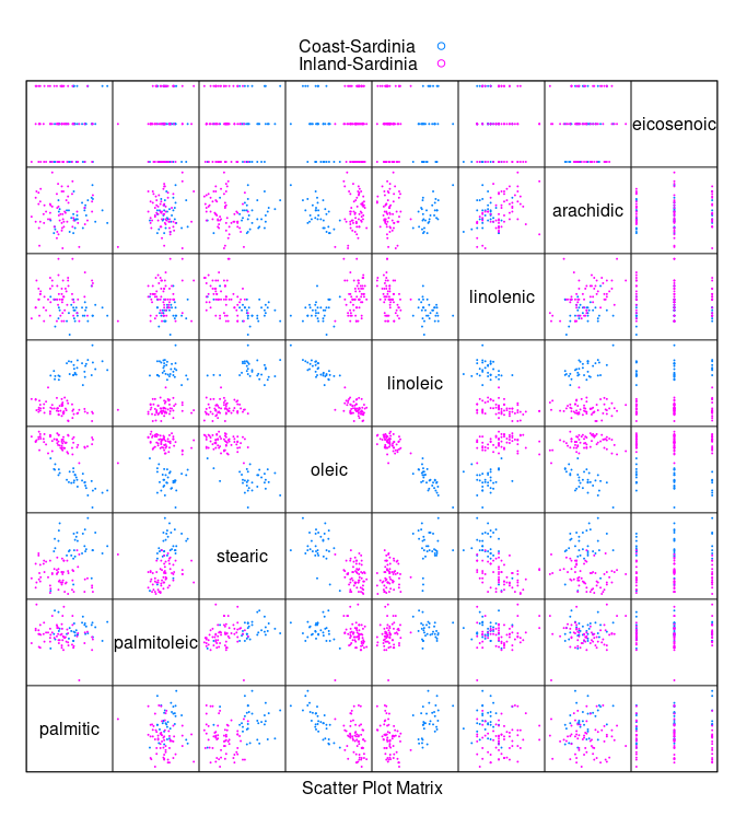
- Within
Sardiniatheoleic * linoleicplot suggests looking atoleic - linoleic
stripplot(Area ~ oleic - linoleic, data = sar, jitter = TRUE,
type = c("p", "g"))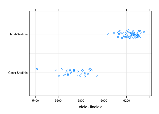
The inland oils are identified by having oleic - linoleic > 6000.
Grand and Guided Tours
An alternative approach is to use rggobi to explore the data with grand tours and guided tours.
The grand tour is a framework for animating smoothly through a sequence of randomly chosen projections.
A guided tour encourages the tour to move towards projections that are more interesting according to one of several criteria.
The
rggobiapproach is documented in
Cook, Dianne and Swayne, Deborah F. (2007), Interactive and Dynamic Graphics for Data Analysis with R and GGobi_, Springer Verlag.
To explore this approach with the scaled crabs data:
library(rggobi)
ggobi(cr)Scagnostics
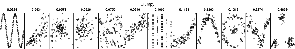
With a large number of variables it isn’t realistic to view all possible pairwise scatter plots.
This becomes even more of an issue with automated projection systems like the grand tour.
Scagnostics, or scatter plot diagnostics, are numerical summaries of interesting features in a scatter plot.
The projection pursuit indices used in the guided tour are a form of scagnostic.
One possible use is to automatically compute sacgnostics for all possible pairwise scatter plots and view the ones with high scores.
A German Wikipedia article has some graphics that illustrate the proposed diagnostics.

- Some references:
Wilkinson, Leland, Anushka Anand, and Robert L. Grossman. “Graph-theoretic scagnostics.” INFOVIS. Vol. 5. 2005.
Dang, Tuan Nhon, and Leland Wilkinson. “Scagexplorer: Exploring scatterplots by their scagnostics.” Visualization Symposium (PacificVis), 2014 IEEE Pacific. IEEE, 2014.
- An R package implementing these ideas is available.
library(scagnostics)
## Loading required package: rJava
s <- scagnostics(olives[3 : 10])
heatmap(s)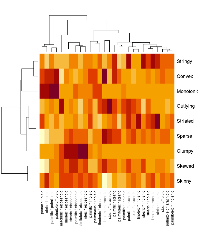
colnames(s)[max.col(s)]
## [1] "stearic * arachidic" "palmitic * eicosenoic" "oleic * eicosenoic"
## [4] "linolenic * arachidic" "oleic * linolenic" "linolenic * arachidic"
## [7] "oleic * linoleic" "palmitic * arachidic" "palmitoleic * oleic"
splom(t(unclass(s)), varname.cex = 0.7, pscale = 0)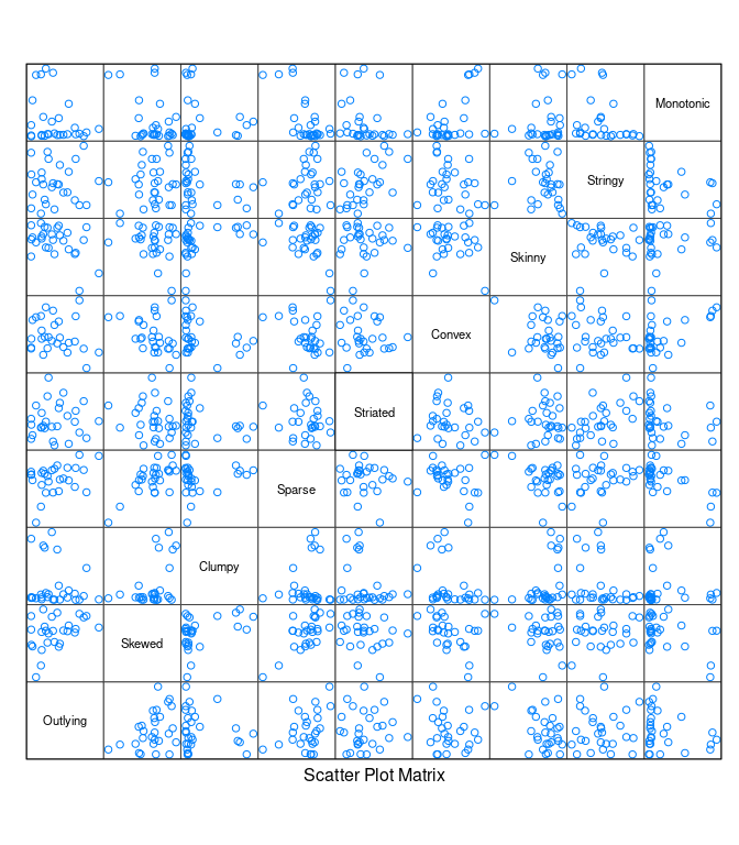
Two Sliders Using Shiny
This function creates a shiny animation using two sliders:
## two-parameter shiny
## performance is not good
shinyAnim2 <- function(fun, v, lo, hi, step = NULL, label = "Frame", fps = 4) {
require(shiny)
msecs <- 1000 / fps
shinyApp(
ui = fluidPage(
sidebarLayout(
sidebarPanel(
sliderInput("v1", label[1], lo[1], hi[1], v[1], step[1],
animate = animationOptions(msecs)),
sliderInput("v2", label[2], lo[2], hi[2], v[2], step[2],
animate = animationOptions(msecs))),
mainPanel(plotOutput("plot"))
)
),
server = function(input, output, session) {
session$onSessionEnded(function() shiny::stopApp())
output$plot <- renderPlot(fun(input$v1, input$v2))
})
}Some calibration data:
library(tidyverse)
library(shiny)
library(lattice)
library(ggplot2)
n <- 10000
d <- data.frame(x1 = runif(n, -1, 1), x2 = runif(n, -1, 1), x3 = rnorm(n))
d <- mutate(d,
x4 = as.numeric(scale(x1 + cos(x2) + sin(x3) + rnorm(n, 0, 0.1))))Animation using splom:
fd <- function(v1, v2)
splom(~ d, data = d, group = abs(x1 - v1) < 0.1 & abs(x2 - v2) < 0.1)
shinyAnim2(fd, c(0, 0), c(-1, -1), c(1, 1), c(0.05, 0.05))Using xyplot:
fd2 <- function(v1, v2)
xyplot(x4 ~ x3, group = abs(x1 - v1) < 0.1 & abs(x2 - v2) < 0.1,
data = d, pch = 19)
shinyAnim2(fd2, c(0, 0), c(-1, -1), c(1, 1), c(0.05, 0.05))Using ggplot:
fd3 <- function(v1, v2)
ggplot(d, aes(x = x3, y = x4)) + geom_point(color = "grey") +
geom_point(data = filter(d, abs(x1 - v1) < 0.1 & abs(x2 - v2) < 0.1),
color = "red")
shinyAnim2(fd3, c(0, 0), c(-1, -1), c(1, 1), c(0.05, 0.05))Rendering of ggplot and lattice graphics is slow and not ideal for animations; using base graphics helps a little:
fd4 <- function(v1, v2) {
plot(x4 ~ x3, data = d, pch = 19, col = "blue", asp = 1)
with(filter(d, abs(x1 - v1) < 0.1 & abs(x2 - v2) < 0.1),
points(x3, x4, col = "red", pch = 19))
}
shinyAnim2(fd4, c(0, 0), c(-1, -1), c(1, 1), c(0.05, 0.05))