Box Plots and Relations
Boxplots
Boxplots, or box-and-whisker plots, provide a skeletal representation of a distribution.
They are very well suited for showing distributions for multiple groups.
There are many variations of boxplots:
Most start with a box from the first to the third quartiles and divided by the median.
The simplest form then adds a whisker from the lower quartile to the minimum and from the upper quartile to the maximum.
More common is to draw the upper whisker to the largest point below the upper quartile \(+ 1.5 * IQR\), and the lower whisker analogously.
Outliers falling outside the range of the whiskers are then drawn directly:
library(gapminder)
library(ggplot2)
ggplot(gapminder) + geom_boxplot(aes(x = continent, y = gdpPercap))
There are variants that distinguish between mild outliers and extreme outliers.
A common variant is to show an approximate 95% confidence interval for the population median as a notch:
ggplot(gapminder) +
    geom_boxplot(aes(x = continent, y = gdpPercap), notch = TRUE)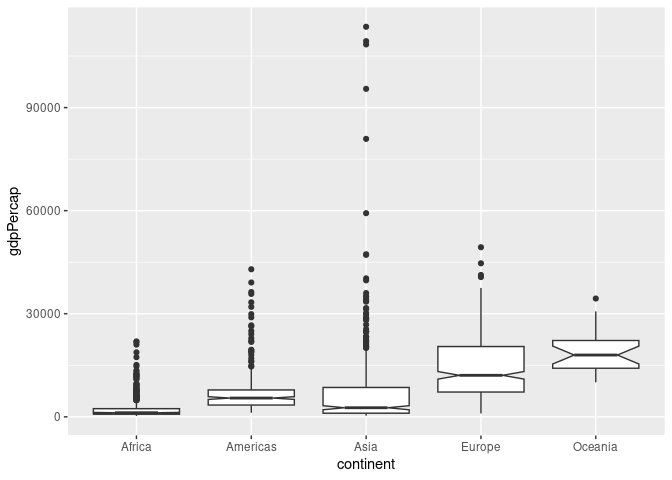
- Another variant is to use a width proportional to the square root of the sample size to reflect the strength of evidence in the data:
ggplot(gapminder) +
    geom_boxplot(aes(x = continent, y = gdpPercap),
                 notch = TRUE, varwidth = TRUE)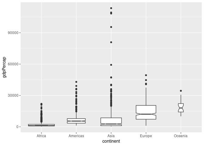
With moderate sample sizes it can be useful to super-impose the original data, perhaps with jittering and alpha blending. The outliers in the box plot can be turned off with outlier.color = NA so they are not shown twice:
p <- ggplot(gapminder) +
    geom_boxplot(aes(x = continent, y = gdpPercap),
                 notch = TRUE, varwidth = TRUE,
                 outlier.color = NA)
p + geom_point(aes(x = continent, y = gdpPercap),
               position = position_jitter(width = 0.1), alpha = 0.1)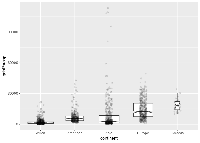
Violin Plots
A variant of the boxplot is the violin plot:
Hintze, J. L., Nelson, R. D. (1998), “Violin Plots: A Box Plot-Density Trace Synergism,” The American Statistician 52, 181-184.
The violin plot uses density estimates to show the distributions:
ggplot(gapminder) + geom_violin(aes(x = continent, y = gdpPercap))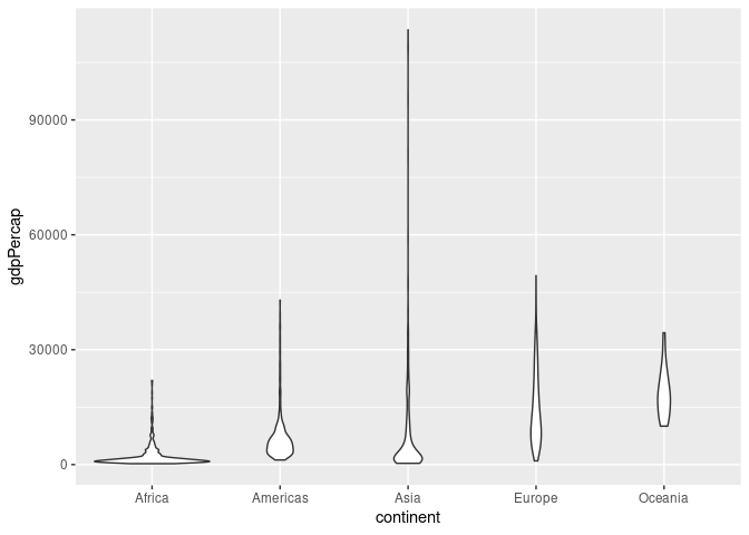
By default the “violins” are scaled to have the same area. They can also be scaled to have the same maximum height or to have areas proportional to sample sizes. This is done by adding scale = "width" or scale = "count" to the geom_violin call.
A comparison of boxplots and violin plots:
ggplot(gapminder) +
    geom_boxplot(aes(x = continent, y = gdpPercap)) +
    geom_violin(aes(x = continent, y = gdpPercap),
                fill = NA, scale = "width", linetype = 2)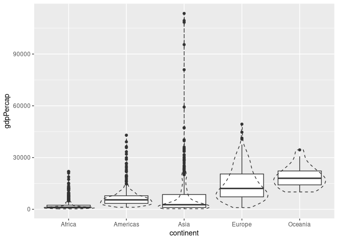
A Combination of boxplots and violin plots:
ggplot(gapminder) +
    geom_violin(aes(x = continent, y = gdpPercap), scale = "width") +
    geom_boxplot(aes(x = continent, y = gdpPercap), width = .1)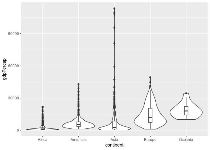
There are other variations, e.g. vase plots.
Beeswarm Plots
Beeswarm plots, also called violin scatterplots, try to show both the full data and the density of the data distribution.
The ggbeeswarm package provides one implementation with two variants:
geom_quasirandomgeom_beeswarm
The quasi_random version seems to work a bit better on many examples, e.g.
library(ggbeeswarm)
ggplot(gapminder) +
    geom_quasirandom(aes(x = continent, y = gdpPercap), size = 0.2)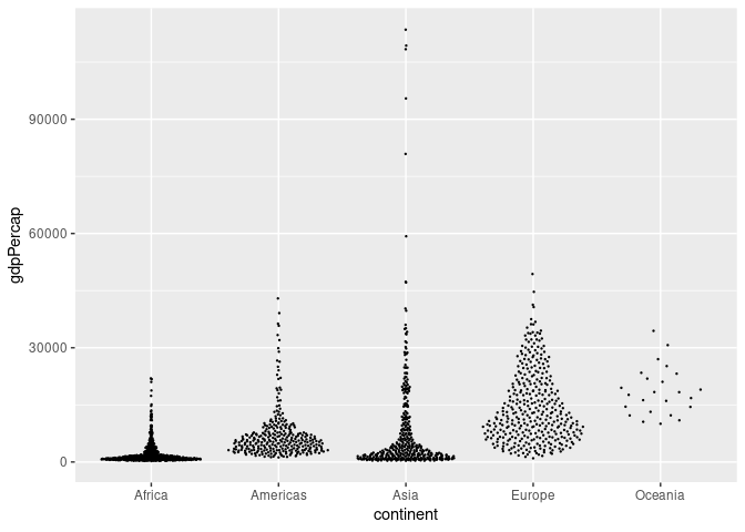
Combined with a width-scaled violin plot:
ggplot(gapminder) +
    geom_violin(aes(x = continent, y = gdpPercap), scale = "width") +
    geom_quasirandom(aes(x = continent, y = gdpPercap), color = "blue")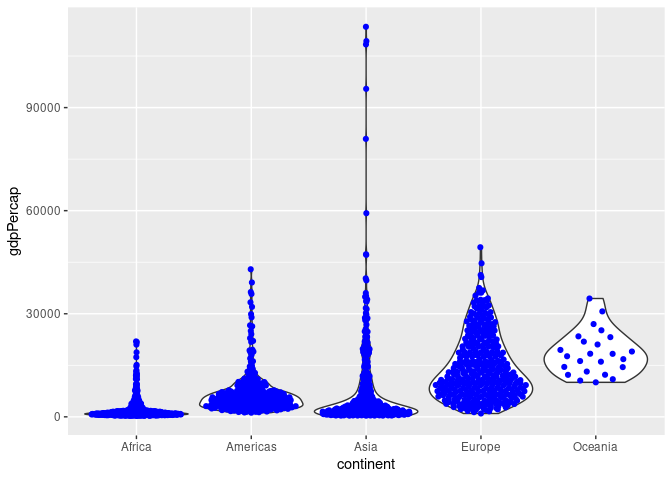
Effectiveness and Scalability
Boxplots are very simple and easy to compare.
Boxplots strongly emphasize the middle half of the data.
Boxplots may not be easy for a lay viewer to understand.
Box plots scale fairly well visually and computationally in the number of observations; over-plotting/storage of outliers becomes an issue for larger data sets
Violin plots scale well both visually and computationally in the number of observations.
library(gridExtra)
p1 <- ggplot(diamonds) + geom_boxplot(aes(x = cut, y = price))
p2 <- ggplot(diamonds) + geom_violin(aes(x = cut, y = price))
grid.arrange(p1, p2, nrow = 1)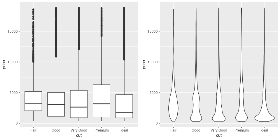
Scalability in the number of cases for beeswarm plots is more limited.
The number of groups that can be handled for comparison by these plots is in the range of a few dozen.
library(lattice)
p1 <- ggplot(barley) + geom_boxplot(aes(x = site, y = yield, fill = year))
p2 <- ggplot(barley) + geom_violin(aes(x = site, y = yield, fill = year))
grid.arrange(p1, p2, nrow = 1)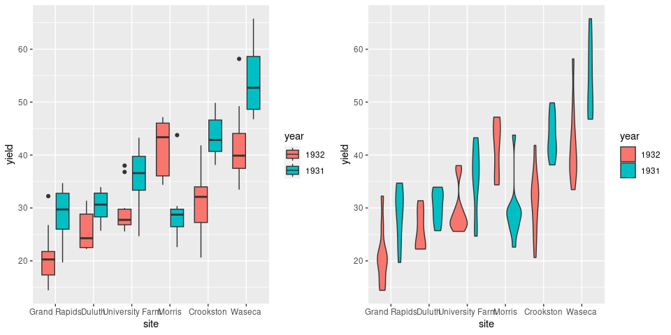
Axes can be flipped to avoid overplotting of labels:
library(lattice)
p3 <- p1 + coord_flip()
p4 <- p2 + coord_flip()
grid.arrange(p3, p4, nrow = 1)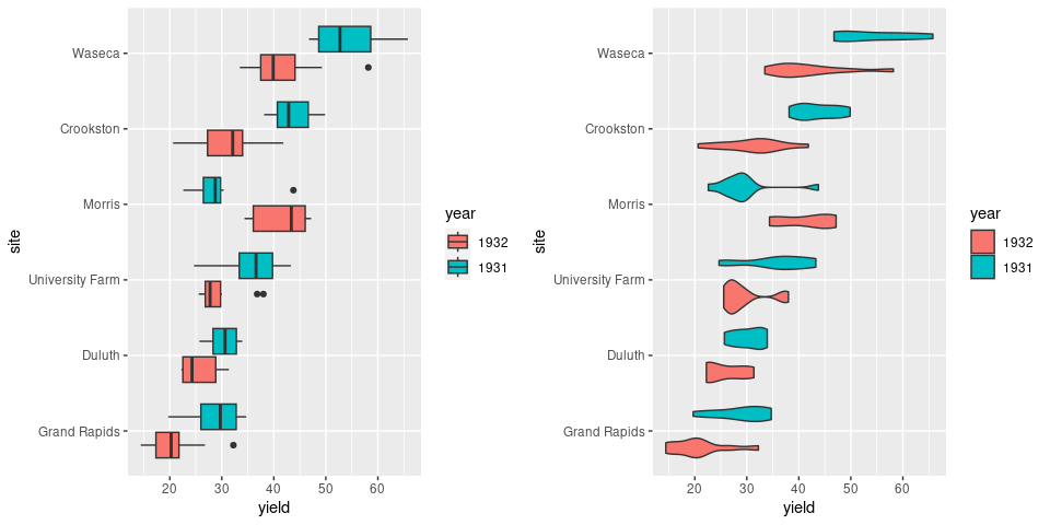
Ridgeline Plots
Ridgeline plots, also called ridge plots or joy plots, are another way to show density estimates for a number of groups that has become popular recently.
The package ggridges defines geom_density_ridges for creating these plots:
library(ggridges)
ggplot(barley) + geom_density_ridges(aes(x = yield, y = site, group = site))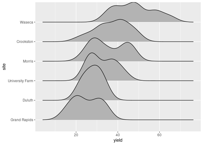
Grouping by an interaction with a categorical variable, year, produces separate density estimates for each level.
Mapping the fill aesthetic to year allows the separate densities to be identified:
ggplot(barley) +
    geom_density_ridges(aes(x = yield, y = site,
                            group = interaction(year, site),
                            fill = year))
## Picking joint bandwidth of 2.39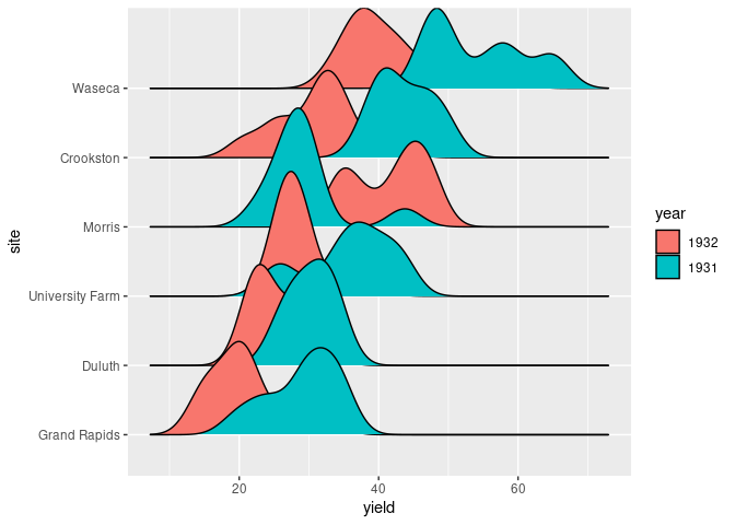
Alpha blending may sometimes help:
ggplot(barley) +
    geom_density_ridges(aes(x = yield, y = site,
                            group = interaction(year, site),
                            fill = year), alpha = 0.8)
## Picking joint bandwidth of 2.39
Adjusting the vertical scale may also help:
ggplot(barley) +
    geom_density_ridges(aes(x = yield, y = site,
                            group = interaction(year, site),
                            fill = year), scale = 0.8)
## Picking joint bandwidth of 2.39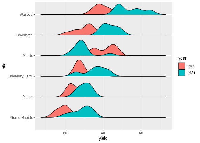
Sometimes reordering the grouping variable, year in this case, can help. The factor levels of year can be reordered to match the order of average yealds within each year by
reorder(year, yield)Using -yield produces the reverse order.
library(dplyr)
ggplot(mutate(barley, year = reorder(year, -yield))) +
    geom_density_ridges(aes(x = yield, y = site,
                            group = interaction(year, site),
                            fill = year), scale = 0.8)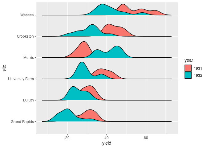
With some tuning ridgeline plots can scale well to many distributions. An example from Claus Wilke’s book:
The ggplot2movies package provides data from IMDB on a large number of movies, including their lengths, in a tibble movies:
library(ggplot2movies)
dim(movies)
## [1] 58788    24
head(movies)
## # A tibble: 6 × 24
##   title      year length budget rating votes    r1    r2    r3    r4    r5    r6
##   <chr>     <int>  <int>  <int>  <dbl> <int> <dbl> <dbl> <dbl> <dbl> <dbl> <dbl>
## 1 $          1971    121     NA    6.4   348   4.5   4.5   4.5   4.5  14.5  24.5
## 2 $1000 a …  1939     71     NA    6      20   0    14.5   4.5  24.5  14.5  14.5
## 3 $21 a Da…  1941      7     NA    8.2     5   0     0     0     0     0    24.5
## 4 $40,000    1996     70     NA    8.2     6  14.5   0     0     0     0     0
## 5 $50,000 …  1975     71     NA    3.4    17  24.5   4.5   0    14.5  14.5   4.5
## 6 $pent      2000     91     NA    4.3    45   4.5   4.5   4.5  14.5  14.5  14.5
## # ℹ 12 more variables: r7 <dbl>, r8 <dbl>, r9 <dbl>, r10 <dbl>, mpaa <chr>,
## #   Action <int>, Animation <int>, Comedy <int>, Drama <int>,
## #   Documentary <int>, Romance <int>, Short <int>
A ridgeline plot of the movie lengths for each year:
library(dplyr)
mv12 <- filter(movies, year > 1912)
ggplot(mv12, aes(x = length, y = year, group = year)) +
    geom_density_ridges(scale = 10, size = 0.25, rel_min_height = 0.03) +
    scale_x_continuous(limits = c(0, 200)) +
    scale_y_reverse(breaks = c(2000, 1980, 1960, 1940, 1920)) +
    theme_minimal()
## Warning: Removed 250 rows containing non-finite values
## (`stat_density_ridges()`).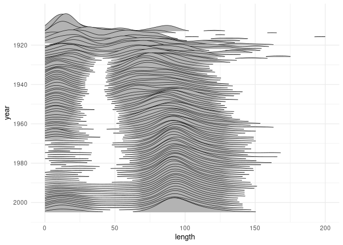
This shown that since the early 1960’s feature film lengths have stabilized to a distribution centered around 90 minutes:
Another nice example: DW-NOMINATE scores for measuring political position of members of congress over the years:
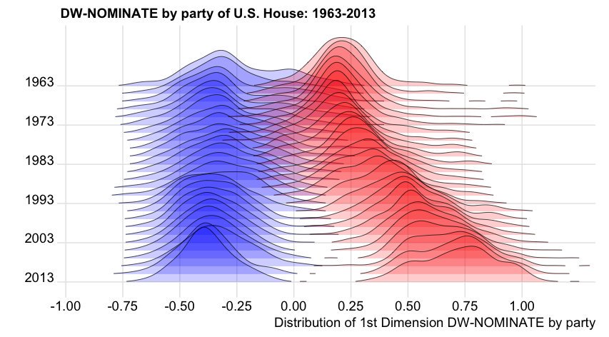
Original code by Ian McDonald; another version is provided in Claus Wilke’s book.