Some Other Topics
Some topics we did not have time to look at:
Visualizing Uncertainty: Hurricanes
All estimates from data are associated with some degree of uncertainty.
Effectively communicating that uncertainty in visualizations is challenging and an active area of research.
The cone of uncertainty: (From Cairo (2019); images from a blog post by the author.)
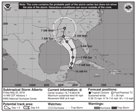
The NHC forecast cone is designed so that two-thirds of historical official forecast errors over a 5-year sample fall within the cone for a particular time point..
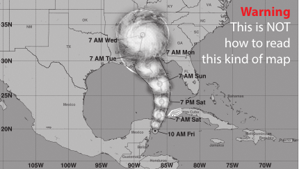
When published in the media these visualizations are routinely misinterpreted something like this:
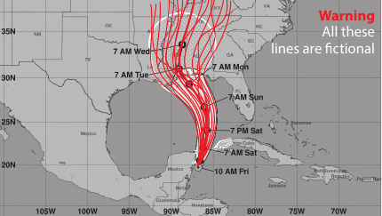
A more effective representation might be something like this, showing an ensemble of possible tracks:
An animated version may be more effective, if the presentation medium permits.
Developing better visualizations for hurricane forecasting, especially targeting the public, is an active area of research.
Visualizing Uncertainty: Chocolate Bars
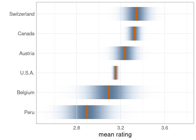
Expert ratings, on a scale from 0 to 5, for chocolate bars manufactured in several countries:
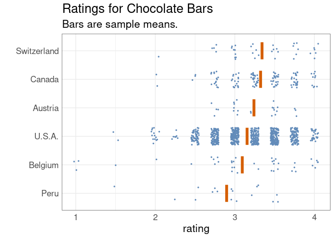
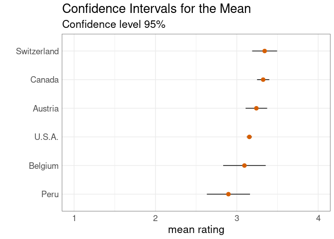
The standard deviations of the data distributions are comparable, but the lengths of confidence intervals for the mean vary because of the different sample sizes:
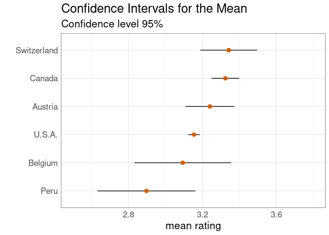
The same plot with a reduced horizontal range:
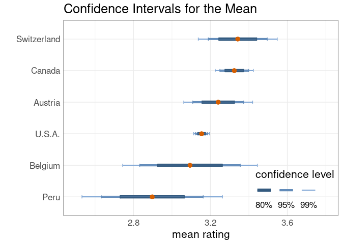
A more elaborate display with confidence intervals at several levels:
Confidence densities, or confidence distributions, as proposed in
Adrian W. Bowman. Graphics for Uncertainty. J. R. Statist. Soc. A 182:1-16, 2018. Link
One drawback of all of these methods:
The least precise measurement draws the most attention.
These examples from Wilke’s book use the ungeviz package available on GitHub.
Another package providing some tools for uncertainty visualization is ggdist package.
Visualizing Uncertainty: Old Cars
Using the very old mtcars data set to illustrate estimating a smooth relationship:
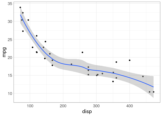
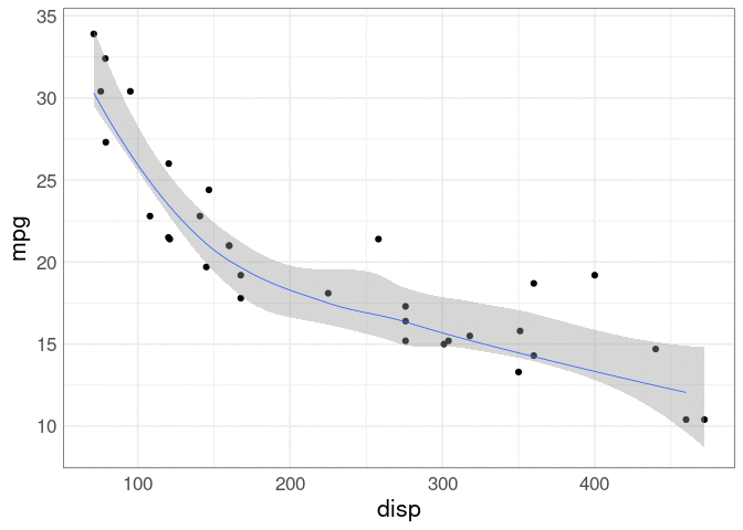
A default geom_smooth shows an estimate along with a point-wise confidence band.
This may not give the best sense of the joint uncertainty: if the curve is higher on some places it may need to be lower in others.
Showing an ensemble of curves that all are plausible can be a better choice.
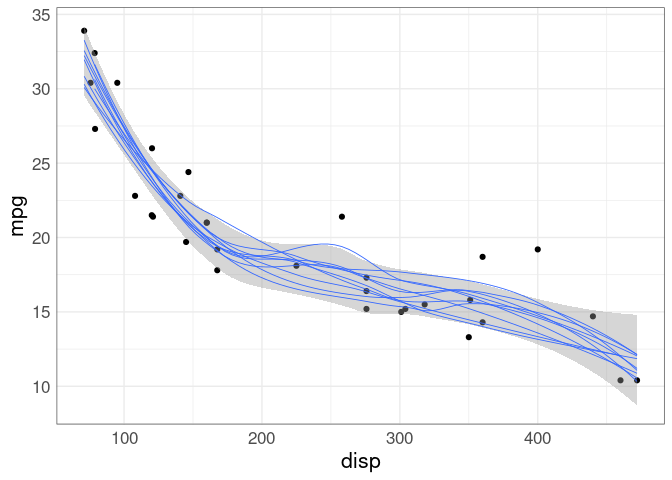
This approach was shown earlier for visualizing possible hurricane paths.
This ensemble is generated using a case-based bootstrap.
These plots are called ensemble plots (also spaghetti plots, for obvious reasons).
If animation is available, an alternative is to show the curves one at a time in an animation.
Again, a bootstrap is used to produce the estimates.
This is an example of a hypothetical outcomes plot, or HOP, as introduced in
Hullman, Jessica, Paul Resnick, and Eytan Adar. “Hypothetical outcome plots outperform error bars and violin plots for inferences about reliability of variable ordering.” PLOS ONE 10, no. 11 (2015).
Data Quality and Integrity
A visualization can accurately reflect data but still be misleading if the data are faulty.
A NY Times article from May 2021 shows a choropleth map of the estimated share of adults who would “definitely” or “probably” get the COVID-19 vaccine.
Cutoffs: 49 60 65 70 75 80 91 %
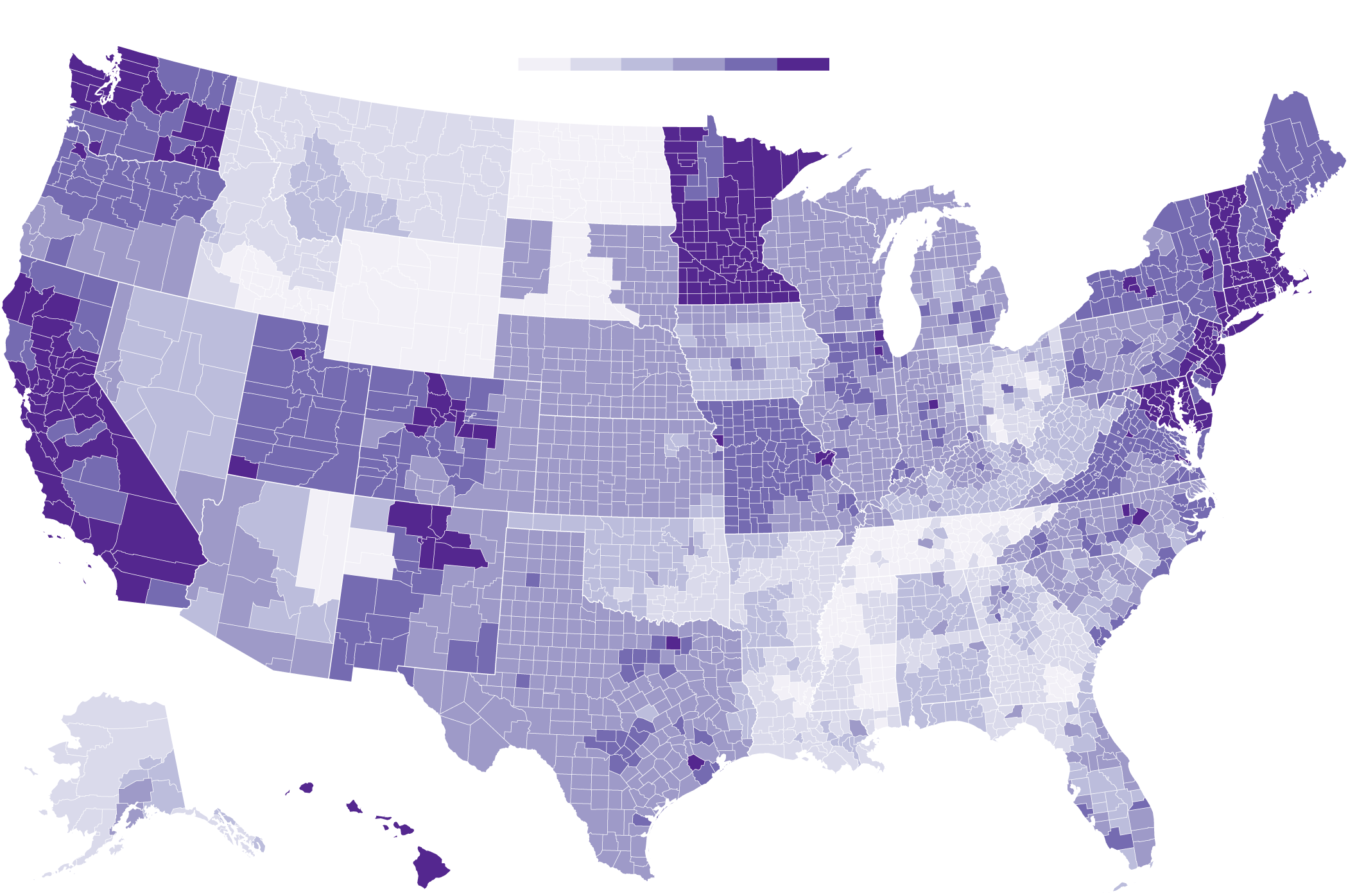
The map may accurately reflect the estimates, but the estimates have obvious problems.
The data used for the map are available here.
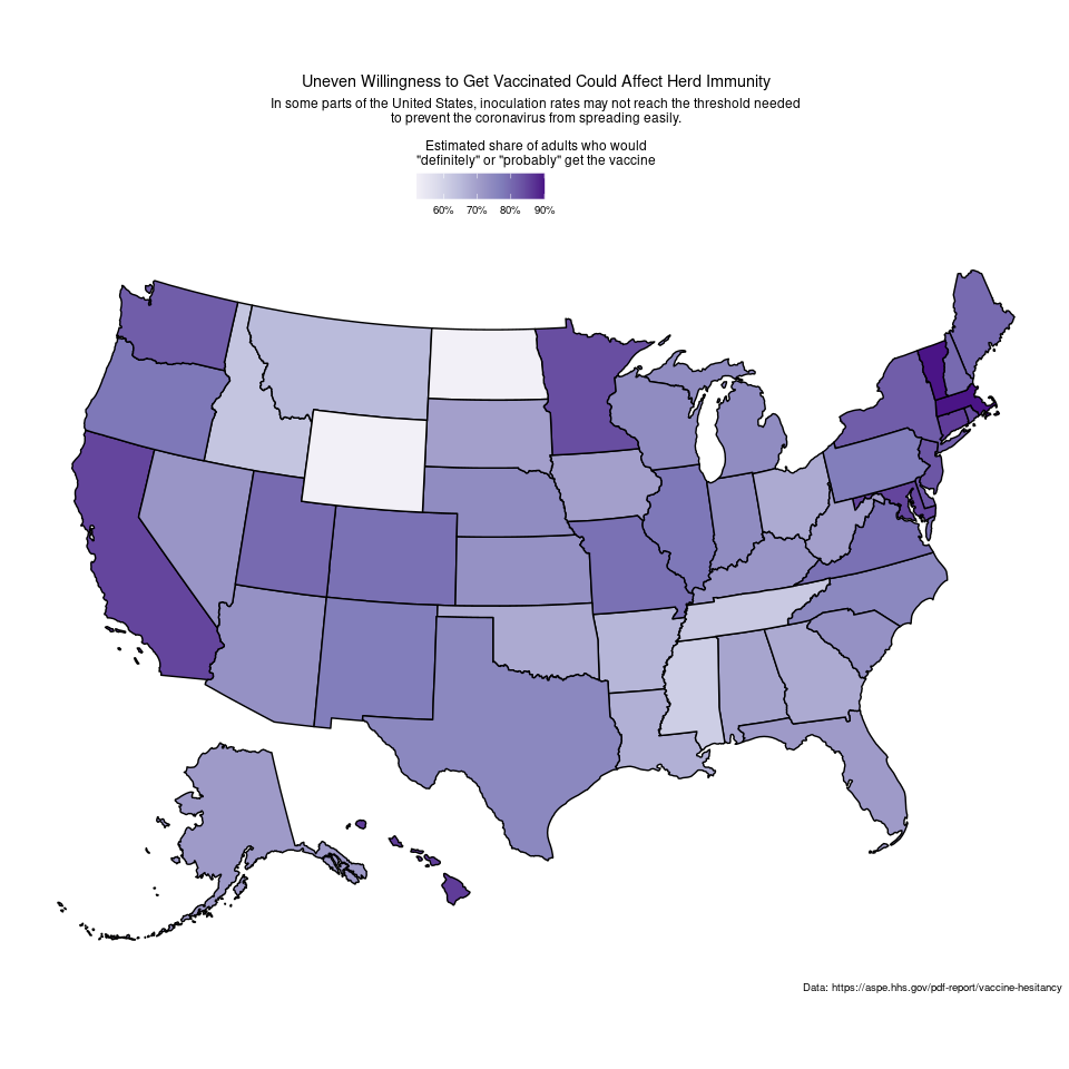
Discussions on social media suggest that the state level data may be more reasonable:
Data Science Ethics
Some issues:
Some references:
Plot Annotation, Plot Ensembles, and Dashboards
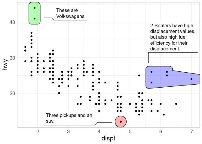
Plot annotations can create popout and help focus the viewer’s attention.
They may be increasingly important as images are shared on line without context.
Here is an examples for the mpg data:
Plot Ensembles: Coffee
It is often useful to use several graphics to present an analysis.
Collections of related graphs are sometimes called ensemble graphics.
On line presentations of analyses involving multiple visualizations and, typically, some interactive features are also called dashboards.
To aid the viewer it is usually best to design these visualizations together, with common axis choices and color mappings.
Fig 12.1 in Unwin (2015) provides a simple example:
library(ggplot2)
library(GGally)
library(gridExtra)

coffee_thm <- theme(text = element_text(size = 14))

data(coffee, package = "pgmm")
coffee <- within(coffee, Type <- ifelse(Variety == 1,
                                        "Arabica", "Robusta"))
names(coffee) <- abbreviate(names(coffee), 8)
a <- ggplot(coffee, aes(x = Type)) + geom_bar(aes(fill = Type)) +
    scale_fill_manual(values = c("grey70", "red")) +
    guides(fill = "none") + ylab("") +
    coffee_thm
b <- ggplot(coffee, aes(x = Fat, y = Caffine, colour = Type)) +
    geom_point(size = 3) +
    scale_colour_manual(values = c("grey70", "red")) +
    coffee_thm
c <- ggparcoord(coffee[order(coffee$Type), ], columns = 3 : 14,
                groupColumn = "Type", scale = "uniminmax") +
    xlab("") + ylab("") +
    theme(legend.position = "none") +
    scale_colour_manual(values = c("grey", "red")) +
    theme(axis.ticks.y = element_blank(),
          axis.text.y = element_blank()) +
    coffee_thm
grid.arrange(arrangeGrob(a, b, ncol = 2, widths = c(1, 2)),
             c, nrow = 2)
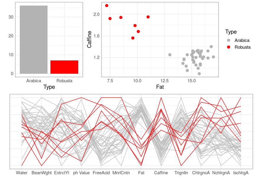
Data on the chemical composition of coffee samples collected from around the world, comprising 43 samples from 29 countries. Each sample is either of the Arabica or Robusta variety. Twelve of the thirteen chemical constituents reported in the study are given. The omitted variable is total chlorogenic acid; it is generally the sum of the chlorogenic, neochlorogenic and isochlorogenic acid values.
Streuli, H. (1973). Der heutige stand der kaffeechemie. In Association Scientifique International du Cafe, 6th International Colloquium on Coffee Chemisrty, Bogata, Columbia, pp. 61-72.
Making a Point and Telling a Story
In a report, make sure each plot has a point and makes its point.
Make sure to think about:
It is often good to make sure a figure can stand on its own without asking the reader to search the text for explanations.
Communicating with data is like telling a story, with a starting point, a journey, and an end.
Sometimes a single visualization can capture the full story.
More often, several visualizations will be needed.
Often it is good to:
start with a high level overview;
show how to look at some particular cases, e.g. with a single plot;
build up to a more complete analysis, e.g. with a multi-panel plot.
With multiple visualizations it is good make sure that:
There is a chapter of Wilke, 2019 with more advice on this.
A recent book length treatment is
Deborah Nolan and Sara Stoudt (2021) Communicating with Data, Oxford Univerity Press.
Wrapping Up
Some of the areas we covered:
Visualization
Many different types of graphs.
- Strengths, weaknesses.
- Pitfalls.
- Scalability.
- Creating these graphs in R.
Perception
- Channels and mappings; relative effectiveness.
- Using to assess, design visualizations.
- Effective use of color.
A little on interaction, animation.
Emphasis on techniques useful for exploration, scientific reporting.
Data Technologies
Reading different data formats.
Scraping data from the web.
Cleaning data.
Rearranging data for analysis.
Merging data from several sources.
Learning More
Class notes will remain available, in some form, at the class web site.
Some books to look at:
Some blogs to check out:
Keep a critical eye out for good (and not so good) uses of data visualization in the media.
LS0tCnRpdGxlOiAiRmluYWwgTm90ZXMiCm91dHB1dDoKICBodG1sX2RvY3VtZW50OgogICAgdG9jOiB5ZXMKICAgIGNvZGVfZm9sZGluZzogc2hvdwogICAgY29kZV9kb3dubG9hZDogdHJ1ZQotLS0KCmBgYHtyIHNldHVwLCBpbmNsdWRlID0gRkFMU0V9CnNvdXJjZShoZXJlOjpoZXJlKCJzZXR1cC5SIikpCm9wdGlvbnMoaHRtbHRvb2xzLmRpci52ZXJzaW9uID0gRkFMU0UpCmxpYnJhcnkoZ2dwbG90MikKa25pdHI6Om9wdHNfY2h1bmskc2V0KGNvbGxhcHNlID0gVFJVRSwgY2xhc3Muc291cmNlID0gImZvbGQtaGlkZSIsCiAgICAgICAgICAgICAgICAgICAgICBtZXNzYWdlID0gRkFMU0UsIGZpZy5hbGlnbiA9ICJjZW50ZXIiKQpsaWJyYXJ5KHRpZHl2ZXJzZSkKdGhlbWVfc2V0KHRoZW1lX21pbmltYWwoKSArCiAgICAgICAgICB0aGVtZSh0ZXh0ID0gZWxlbWVudF90ZXh0KHNpemUgPSAxNikpICsKICAgICAgICAgIHRoZW1lKHBhbmVsLmJvcmRlciA9IGVsZW1lbnRfcmVjdChjb2xvciA9ICJncmV5MzAiLCBmaWxsID0gTkEpKSkKc2V0LnNlZWQoMTIzNDUpCmBgYAoKCiMjIFNvbWUgT3RoZXIgVG9waWNzCgpTb21lIHRvcGljcyB3ZSBkaWQgbm90IGhhdmUgdGltZSB0byBsb29rIGF0OgoKKiBXb3JraW5nIHdpdGggbW9kZWxzIChbQ2hhcHRlciA2IGluIEhlYWx5LAogIDIwMThdKGh0dHBzOi8vc29jdml6LmNvL21vZGVsaW5nLmh0bWwpOyBbVGlkeSBNb2RlbGluZyB3aXRoIFJdKGh0dHBzOi8vd3d3LnRtd3Iub3JnLykpLgoKKiBbVmlzdWFsaXppbmcgbWlzc2luZwogIHZhbHVlc10oaHR0cDovL25hbmlhci5uanRpZXJuZXkuY29tL2FydGljbGVzL25hbmlhci12aXN1YWxpc2F0aW9uLmh0bWwpLgoKKiBWaXN1YWxpemluZyB1bmNlcnRhaW50eSAoW0NoYXB0ZXIgMTYgb2YgV2lsa2UsCiAgMjAxOV0oaHR0cHM6Ly9jbGF1c3dpbGtlLmNvbS9kYXRhdml6L3Zpc3VhbGl6aW5nLXVuY2VydGFpbnR5Lmh0bWwpCiAgYW5kIFtiZWxvd10oI3Zpc3VhbGl6aW5nLXVuY2VydGFpbnR5KSkKCiogUGxvdCBhbm5vdGF0aW9uLCBwbG90IGVuc2VtYmxlcywgYW5kIGRhc2hib2FyZHMuIChbUGFydCBJSSBvZiBXaWxrZSwKICAyMDE5XShodHRwczovL2NsYXVzd2lsa2UuY29tL2RhdGF2aXovcHJvcG9ydGlvbmFsLWluay5odG1sKTsKICBbQ2hhcHRlciA1IG9mIEhlYWx5LCAyMDE4XShodHRwczovL3NvY3Zpei5jby93b3JrZ2VvbXMuaHRtbCk7CiAgW2JlbG93XSgjcGxvdC1hbm5vdGF0aW9uLXBsb3QtZW5zZW1ibGVzLWFuZC1kYXNoYm9hcmRzKSkuCgoqIERhdGEgU2NpZW5jZSBFdGhpY3MgKFtiZWxvd10oI2RhdGEtc2NpZW5jZS1ldGhpY3MpKS4KCgojIyBWaXN1YWxpemluZyBVbmNlcnRhaW50eTogSHVycmljYW5lcwoKQWxsIGVzdGltYXRlcyBmcm9tIGRhdGEgYXJlIGFzc29jaWF0ZWQgd2l0aCBzb21lIGRlZ3JlZSBvZiB1bmNlcnRhaW50eS4KCkVmZmVjdGl2ZWx5IGNvbW11bmljYXRpbmcgdGhhdCB1bmNlcnRhaW50eSBpbiB2aXN1YWxpemF0aW9ucyBpcwpjaGFsbGVuZ2luZyBhbmQgYW4gYWN0aXZlIGFyZWEgb2YKW3Jlc2VhcmNoXShodHRwOi8vc3BhY2UudWNtZXJjZWQuZWR1L2NoYXB0ZXIpLgoKVGhlIF9jb25lIG9mIHVuY2VydGFpbnR5XzogKEZyb20gQ2Fpcm8gKDIwMTkpOyBpbWFnZXMgZnJvbSBhIFtibG9nCnBvc3RdKGh0dHBzOi8vd2ViLmFyY2hpdmUub3JnL3dlYi8yMDIzMTIwMjE5MjI0MS9odHRwOi8vd3d3LnRoZWZ1bmN0aW9uYWxhcnQuY29tLzIwMjAvMDEvYWxsLWdyYXBoaWNzLWZyb20taG93LWNoYXJ0cy1saWUtZnJlZWx5Lmh0bWwpCmJ5IHRoZSBhdXRob3IuKQoKPCEtLQpodHRwczovL3d3dy5kcm9wYm94LmNvbS9zaC9kMWtiMGpkcmhrYjQzajkvQUFEVEJmUnZBaC1teG1TeEJSTlpwTEpqYS81LkNIQVBURVI1P2RsPTAmcHJldmlldz1QREYxMC5Ucm9waWNhbHN0b3JtLnBkZiZzdWJmb2xkZXJfbmF2X3RyYWNraW5nPTEKLS0+CmBgYHtyLCBlY2hvID0gRkFMU0V9CmtuaXRyOjppbmNsdWRlX2dyYXBoaWNzKElNRygiUERGMTAuVHJvcGljYWxzdG9ybS5wbmciKSkKYGBgCgpUaGUgW05IQyBmb3JlY2FzdCBjb25lXShodHRwczovL3d3dy5uaGMubm9hYS5nb3YvYWJvdXRjb25lLnNodG1sKSBpcwpkZXNpZ25lZCBzbyB0aGF0IHR3by10aGlyZHMgb2YgaGlzdG9yaWNhbCBvZmZpY2lhbCBmb3JlY2FzdCBlcnJvcnMgb3ZlcgphIDUteWVhciBzYW1wbGUgZmFsbCB3aXRoaW4gdGhlIGNvbmUgZm9yIGEgcGFydGljdWxhciB0aW1lIHBvaW50Li4KCldoZW4gcHVibGlzaGVkIGluIHRoZSBtZWRpYSB0aGVzZSB2aXN1YWxpemF0aW9ucyBhcmUgcm91dGluZWx5Cm1pc2ludGVycHJldGVkIHNvbWV0aGluZyBsaWtlIHRoaXM6Cgo8IS0tCmh0dHBzOi8vd3d3LmRyb3Bib3guY29tL3NoL2Qxa2IwamRyaGtiNDNqOS9BQURUQmZSdkFoLW14bVN4QlJOWnBMSmphLzUuQ0hBUFRFUjU/ZGw9MCZwcmV2aWV3PVBERjExLlN0b3JtV1JPTkdTaXplLnBkZiZzdWJmb2xkZXJfbmF2X3RyYWNraW5nPTEKLS0+CgpgYGB7ciwgZWNobyA9IEZBTFNFfQprbml0cjo6aW5jbHVkZV9ncmFwaGljcyhJTUcoIlBERjExLlN0b3JtV1JPTkdTaXplLnBuZyIpKQpgYGAKCkEgbW9yZSBlZmZlY3RpdmUgcmVwcmVzZW50YXRpb24gbWlnaHQgYmUgc29tZXRoaW5nIGxpa2UgdGhpcywgc2hvd2luZwphbiBfZW5zZW1ibGVfIG9mIHBvc3NpYmxlIHRyYWNrczoKCjwhLS0KaHR0cHM6Ly93d3cuZHJvcGJveC5jb20vc2gvZDFrYjBqZHJoa2I0M2o5L0FBRFRCZlJ2QWgtbXhtU3hCUk5acExKamEvNS5DSEFQVEVSNT9kbD0wJnByZXZpZXc9UERGMTMuU3Rvcm1MaW5lcy5wZGYmc3ViZm9sZGVyX25hdl90cmFja2luZz0xCi0tPgoKYGBge3IsIGVjaG8gPSBGQUxTRX0Ka25pdHI6OmluY2x1ZGVfZ3JhcGhpY3MoSU1HKCJQREYxMy5TdG9ybUxpbmVzLnBuZyIpKQpgYGAKCkFuIGFuaW1hdGVkIHZlcnNpb24gbWF5IGJlIG1vcmUgZWZmZWN0aXZlLCBpZiB0aGUgcHJlc2VudGF0aW9uIG1lZGl1bQpwZXJtaXRzLgoKRGV2ZWxvcGluZyBiZXR0ZXIgdmlzdWFsaXphdGlvbnMgZm9yIGh1cnJpY2FuZSBmb3JlY2FzdGluZywgZXNwZWNpYWxseQp0YXJnZXRpbmcgdGhlIHB1YmxpYywgaXMgYW4gYWN0aXZlIGFyZWEgb2YgcmVzZWFyY2guCgoKIyMgVmlzdWFsaXppbmcgVW5jZXJ0YWludHk6IENob2NvbGF0ZSBCYXJzCgpbRXhwZXJ0IHJhdGluZ3NdKGh0dHA6Ly9mbGF2b3Jzb2ZjYWNhby5jb20pLCBvbiBhIHNjYWxlIGZyb20gMCB0byA1LApmb3IgY2hvY29sYXRlIGJhcnMgbWFudWZhY3R1cmVkIGluIHNldmVyYWwgY291bnRyaWVzOgoKYGBge3IsIGVjaG8gPSBGQUxTRX0KZGF0YShjYWNhbywgcGFja2FnZSA9ICJkdml6LnN1cHAiKQpsaWJyYXJ5KGNvbG9yc3BhY2UpCmNvdW50cmllcyA8LSBjKCJVLlMuQS4iLCAiQXVzdHJpYSIsICJCZWxnaXVtIiwgIkNhbmFkYSIsICJQZXJ1IiwgIlN3aXR6ZXJsYW5kIikKCmNvbDgwIDwtIGRlc2F0dXJhdGUoZGFya2VuKCIjMDA3MkIyIiwgLjIpLCAuMykKY29sOTUgPC0gZGVzYXR1cmF0ZShsaWdodGVuKCIjMDA3MkIyIiwgLjIpLCAuMykKY29sOTkgPC0gZGVzYXR1cmF0ZShsaWdodGVuKCIjMDA3MkIyIiwgLjQpLCAuMykKY29sUCA8LSBjb2w5NQpjb2xNIDwtICIjRDU1RTAwIgoKYzEgPC0gZmlsdGVyKGNhY2FvLCBsb2NhdGlvbiAlaW4lIGNvdW50cmllcykKYzFzdW1zIDwtIGdyb3VwX2J5KGMxLCBsb2NhdGlvbikgfD4KICAgIHN1bW1hcml6ZShtID0gbWVhbihyYXRpbmcpLAogICAgICAgICAgICAgIHMgPSBzZChyYXRpbmcpLAogICAgICAgICAgICAgIG4gPSBuKCkpIHw+CiAgICB1bmdyb3VwKCkKCmMxQ0kgPC0gbXV0YXRlKGRhdGEuZnJhbWUobGV2ZWwgPSBjKDAuOCwgMC45NSwgMC45OSkpLAogICAgICAgICAgICAgICBkZiA9IGxhcHBseShsZXZlbCwKICAgICAgICAgICAgICAgICAgICAgICAgICAgZnVuY3Rpb24obGV2KQogICAgICAgICAgICAgICAgICAgICAgICAgICAgICAgd2l0aChjMXN1bXMsIHsKICAgICAgICAgICAgICAgICAgICAgICAgICAgICAgICAgICBoIDwtIHMgKiBxdCgxIC0gKDEgLSBsZXYpIC8gMiwgbiAtIDEpIC8KICAgICAgICAgICAgICAgICAgICAgICAgICAgICAgICAgICAgICAgc3FydChuKQogICAgICAgICAgICAgICAgICAgICAgICAgICAgICAgICAgIGNiaW5kKGMxc3VtcywgZGF0YS5mcmFtZSh4bWluID0gbSAtIGgsCiAgICAgICAgICAgICAgICAgICAgICAgICAgICAgICAgICAgICAgICAgICAgICAgICAgICAgICAgICAgIHhtYXggPSBtICsgaCkpCiAgICAgICAgICAgICAgICAgICAgICAgICAgICAgICB9KSkpIHw+CiAgICB1bm5lc3QoImRmIikKCmdncGxvdChjMSwgYWVzKHJhdGluZywgcmVvcmRlcihsb2NhdGlvbiwgcmF0aW5nKSkpICsKICAgIGdlb21fcG9pbnQocG9zaXRpb24gPSBwb3NpdGlvbl9qaXR0ZXIoaGVpZ2h0ID0gMC4zLCB3aWR0aCA9IDAuMDUpLAogICAgICAgICAgICAgICBzaXplID0gMC41LCBjb2xvciA9IGNvbFApICsKICAgICMjZ2VvbV9wb2ludChhZXMobSwgbG9jYXRpb24pLCBkYXRhID0gYzFzdW1zLCBzaXplID0gMi41LCBjb2xvciA9IGNvbE0pICsKICAgIGdlb21fc2VnbWVudChhZXMoeCA9IG0sIHhlbmQgPSBtLAogICAgICAgICAgICAgICAgICAgICB5ID0gYXMuaW50ZWdlcihyZW9yZGVyKGxvY2F0aW9uLCBtKSkgLSAwLjMsCiAgICAgICAgICAgICAgICAgICAgIHllbmQgPSBhcy5pbnRlZ2VyKHJlb3JkZXIobG9jYXRpb24sIG0pKSArIDAuMyksCiAgICAgICAgICAgICAgICAgbGluZXdpZHRoID0gMiwgY29sb3IgPSBjb2xNLCBkYXRhID0gYzFzdW1zKSArCiAgICB5bGFiKCIiKSArCiAgICBnZ3RpdGxlKCJSYXRpbmdzIGZvciBDaG9jb2xhdGUgQmFycyIsICJCYXJzIGFyZSBzYW1wbGUgbWVhbnMuIikKYGBgCgpUaGUgc3RhbmRhcmQgZGV2aWF0aW9ucyBvZiB0aGUgZGF0YSBkaXN0cmlidXRpb25zIGFyZSBjb21wYXJhYmxlLCBidXQKdGhlIGxlbmd0aHMgb2YgY29uZmlkZW5jZSBpbnRlcnZhbHMgZm9yIHRoZSBtZWFuIHZhcnkgYmVjYXVzZSBvZiB0aGUKZGlmZmVyZW50IHNhbXBsZSBzaXplczoKCmBgYHtyLCBlY2hvID0gRkFMU0V9CnAgPC0gZ2dwbG90KGZpbHRlcihjMUNJLCBsZXZlbCA9PSAwLjk1KSwKICAgICAgICAgICAgYWVzKG0sIHJlb3JkZXIobG9jYXRpb24sIG0pLCB4bWluID0geG1pbiwgeG1heCA9IHhtYXgpKSArCiAgICBnZW9tX2Vycm9yYmFyaChoZWlnaHQgPSAwKSArCiAgICBnZW9tX3BvaW50KHNpemUgPSAyLjUsIGNvbG9yID0gY29sTSkgKwogICAgeWxhYigiIikgKwogICAgZ2d0aXRsZSgiQ29uZmlkZW5jZSBJbnRlcnZhbHMgZm9yIHRoZSBNZWFuIiwgIkNvbmZpZGVuY2UgbGV2ZWwgOTUlIikKCnAgKyBzY2FsZV94X2NvbnRpbnVvdXMobGltaXRzID0gYygxLCA0KSwgbmFtZSA9ICJtZWFuIHJhdGluZyIpCmBgYAoKVGhlIHNhbWUgcGxvdCB3aXRoIGEgcmVkdWNlZCBob3Jpem9udGFsIHJhbmdlOgoKYGBge3IsIGVjaG8gPSBGQUxTRX0KcCArIHNjYWxlX3hfY29udGludW91cyhsaW1pdHMgPSBjKDIuNSwgMy44KSwgbmFtZSA9ICJtZWFuIHJhdGluZyIpCmBgYAoKQSBtb3JlIGVsYWJvcmF0ZSBkaXNwbGF5IHdpdGggY29uZmlkZW5jZSBpbnRlcnZhbHMgYXQgc2V2ZXJhbCBsZXZlbHM6CgpgYGB7ciwgZWNobyA9IEZBTFNFfQojfCB3YXJuaW5nOiBmYWxzZQojIyBiYXNlZCBvbiBjb2RlIGZvciBXaWxrZSdzIEZpZy4gMTYuNwphcnJhbmdlKGMxQ0ksIGRlc2MobGV2ZWwpKSB8PgogICAgbXV0YXRlKGxldmVsID0gcGFzdGUwKDEwMCAqIGxldmVsLCAiJSIpLAogICAgICAgICAgIGxvY2F0aW9uID0gcmVvcmRlcihsb2NhdGlvbiwgbSkpIHw+CiAgICBnZ3Bsb3QoYWVzKG0sIGxvY2F0aW9uLCB4bWluID0geG1pbiwgeG1heCA9IHhtYXgpKSArCiAgICBnZW9tX2Vycm9yYmFyaChhZXMoc2l6ZSA9IGxldmVsLCBjb2xvciA9IGxldmVsKSwgaGVpZ2h0ID0gMCkgKwogICAgZ2VvbV9lcnJvcmJhcmgoYWVzKGNvbG9yID0gbGV2ZWwpLCBoZWlnaHQgPSAwLjEpICsKICAgIGdlb21fcG9pbnQoc2l6ZSA9IDIuNSwgY29sb3IgPSBjb2xNKSArCiAgICBzY2FsZV94X2NvbnRpbnVvdXMobGltaXRzID0gYygyLjUsIDMuOCksIG5hbWUgPSAibWVhbiByYXRpbmciKSArCiAgICBzY2FsZV9zaXplX21hbnVhbChuYW1lID0gImNvbmZpZGVuY2UgbGV2ZWwiLAogICAgICAgICAgICAgICAgICAgICAgdmFsdWVzID0gYyhgODAlYCA9IDIuMjUsIGA5NSVgID0gMS41LCBgOTklYCA9IDAuNzUpLAogICAgICAgICAgICAgICAgICAgICAgZ3VpZGUgPSBndWlkZV9sZWdlbmQoZGlyZWN0aW9uID0gImhvcml6b250YWwiLAogICAgICAgICAgICAgICAgICAgICAgICAgICAgICAgICAgICAgICAgICAgdGl0bGUucG9zaXRpb24gPSAidG9wIiwKICAgICAgICAgICAgICAgICAgICAgICAgICAgICAgICAgICAgICAgICAgIGxhYmVsLnBvc2l0aW9uID0gImJvdHRvbSIpKSArCiAgICBzY2FsZV9jb2xvcl9tYW51YWwobmFtZSA9ICJjb25maWRlbmNlIGxldmVsIiwKICAgICAgICAgICAgICAgICAgICAgICB2YWx1ZXMgPSBjKGA4MCVgID0gY29sODAsIGA5NSVgID0gY29sOTUsIGA5OSVgID0gY29sOTkpLAogICAgICAgICAgICAgICAgICAgICAgIGd1aWRlID0gZ3VpZGVfbGVnZW5kKGRpcmVjdGlvbiA9ICJob3Jpem9udGFsIiwKICAgICAgICAgICAgICAgICAgICAgICAgICAgICAgICAgICAgICAgICAgICB0aXRsZS5wb3NpdGlvbiA9ICJ0b3AiLAogICAgICAgICAgICAgICAgICAgICAgICAgICAgICAgICAgICAgICAgICAgIGxhYmVsLnBvc2l0aW9uID0gImJvdHRvbSIpKSArCgogICAgdGhlbWUobGVnZW5kLnBvc2l0aW9uID0gYygxLCAwLjAxKSwgbGVnZW5kLmp1c3RpZmljYXRpb24gPSBjKDEsIDApKSArCiAgICB5bGFiKCIiKSArCiAgICBnZ3RpdGxlKCJDb25maWRlbmNlIEludGVydmFscyBmb3IgdGhlIE1lYW4iKQpgYGAKCkNvbmZpZGVuY2UgZGVuc2l0aWVzLCBvciBjb25maWRlbmNlIGRpc3RyaWJ1dGlvbnMsIGFzIHByb3Bvc2VkIGluCgo+IEFkcmlhbiBXLiBCb3dtYW4uIEdyYXBoaWNzIGZvciBVbmNlcnRhaW50eS4gSi4gUi4gU3RhdGlzdC4gU29jLiBBCj4gMTgyOjEtMTYsIDIwMTguIFtMaW5rXShodHRwczovL3Jzcy5vbmxpbmVsaWJyYXJ5LndpbGV5LmNvbS9kb2kvZnVsbC8xMC4xMTExL3Jzc2EuMTIzNzkpCgpgYGB7ciwgZWNobyA9IEZBTFNFfQojIyBiYXNlZCBvbiBjb2RlIGZvciBXaWxrZSdzIEZpZy4gMTYuOSAoZSkKbGlicmFyeSh1bmdldml6KQpnZ3Bsb3QoZmlsdGVyKGMxQ0ksIGxldmVsID09IDAuOTUpLAogICAgICAgYWVzKHggPSBtLCB5ID0gcmVvcmRlcihsb2NhdGlvbiwgbSkpKSArCiAgICBzdGF0X2NvbmZpZGVuY2VfZGVuc2l0eShhZXMobW9lID0geG1heCAtIG0sIGZpbGwgPSBhZnRlcl9zdGF0KG5kZW5zaXR5KSksCiAgICAgICAgICAgICAgICAgICAgICAgICAgICBoZWlnaHQgPSAwLjcsIGNvbmZpZGVuY2UgPSAwLjk1LCBhbHBoYSA9IE5BLAogICAgICAgICAgICAgICAgICAgICAgICAgICAgbmEucm0gPSBUUlVFKSArCiAgICBnZW9tX3NlZ21lbnQoYWVzKHggPSBtLCB4ZW5kID0gbSwKICAgICAgICAgICAgICAgICAgICAgeSA9IGFzLmludGVnZXIocmVvcmRlcihsb2NhdGlvbiwgbSkpIC0gMC4zNSwKICAgICAgICAgICAgICAgICAgICAgeWVuZCA9IGFzLmludGVnZXIocmVvcmRlcihsb2NhdGlvbiwgbSkpICsgMC4zNSksCiAgICAgICAgICAgICAgICAgc2l6ZSA9IDIsIGNvbG9yID0gY29sTSkgKwogICAgc2NhbGVfZmlsbF9ncmFkaWVudChsb3cgPSAiIzgxQTdENjAwIiwgaGlnaCA9ICIjMzQ1QTdGRDAiKSArCiAgICBzY2FsZV94X2NvbnRpbnVvdXMobGltaXRzID0gYygyLjUsIDMuOCksIG5hbWUgPSAibWVhbiByYXRpbmciKSArCiAgICB5bGFiKCIiKQpgYGAKCk9uZSBkcmF3YmFjayBvZiBhbGwgb2YgdGhlc2UgbWV0aG9kczoKCj4gVGhlIGxlYXN0IHByZWNpc2UgbWVhc3VyZW1lbnQgZHJhd3MgdGhlIG1vc3QgYXR0ZW50aW9uLgoKVGhlc2UgZXhhbXBsZXMgZnJvbSBXaWxrZSdzIGJvb2sgdXNlIHRoZSBbYHVuZ2V2aXpgCnBhY2thZ2VdKGh0dHBzOi8vZ2l0aHViLmNvbS93aWxrZWxhYi91bmdldml6KSBhdmFpbGFibGUgb24gR2l0SHViLgoKQW5vdGhlciBwYWNrYWdlIHByb3ZpZGluZyBzb21lIHRvb2xzIGZvciB1bmNlcnRhaW50eSB2aXN1YWxpemF0aW9uIGlzCltgZ2dkaXN0YCBwYWNrYWdlXShodHRwczovL21qc2theS5naXRodWIuaW8vZ2dkaXN0LykuCgoKIyMgVmlzdWFsaXppbmcgVW5jZXJ0YWludHk6IE9sZCBDYXJzCgpVc2luZyB0aGUgdmVyeSBvbGQgYG10Y2Fyc2AgZGF0YSBzZXQgdG8gaWxsdXN0cmF0ZSBlc3RpbWF0aW5nIGEgc21vb3RoCnJlbGF0aW9uc2hpcDoKCmBgYHtyLCBtZXNzYWdlID0gRkFMU0UsIGVjaG8gPSBGQUxTRX0KcCA8LSBnZ3Bsb3QobXRjYXJzLCBhZXMoZGlzcCwgbXBnKSkgKwogICAgZ2VvbV9wb2ludCgpCgpwICsgZ2VvbV9zbW9vdGgoKQpgYGAKCkEgZGVmYXVsdCBgZ2VvbV9zbW9vdGhgIHNob3dzIGFuIGVzdGltYXRlIGFsb25nIHdpdGggYSBwb2ludC13aXNlCmNvbmZpZGVuY2UgYmFuZC4KClRoaXMgbWF5IG5vdCBnaXZlIHRoZSBiZXN0IHNlbnNlIG9mIHRoZSBqb2ludCB1bmNlcnRhaW50eTogaWYgdGhlIGN1cnZlCmlzIGhpZ2hlciBvbiBzb21lIHBsYWNlcyBpdCBtYXkgbmVlZCB0byBiZSBsb3dlciBpbiBvdGhlcnMuCgpTaG93aW5nIGFuIF9lbnNlbWJsZV8gb2YgY3VydmVzIHRoYXQgYWxsIGFyZSBwbGF1c2libGUgY2FuIGJlIGEgYmV0dGVyCmNob2ljZS4KCmBgYHtyLCBlY2hvID0gRkFMU0UsIG1lc3NhZ2UgPSBGQUxTRX0KbXRzIDwtIGxhcHBseShzZXFfbGVuKDEwKSwKICAgICAgICAgICAgICBmdW5jdGlvbihpKSBtdXRhdGUoc2FtcGxlX2ZyYWMobXRjYXJzLCAxLCByZXBsYWNlID0gVFJVRSksCiAgICAgICAgICAgICAgICAgICAgICAgICAgICAgICAgIHNhbXBsZSA9IGkpKSB8PgogICAgYmluZF9yb3dzKCkKCnAyIDwtIHAgKwogICAgZ2VvbV9zbW9vdGgoY29sb3IgPSBOQSkgKwogICAgZ2VvbV9zbW9vdGgoYWVzKGdyb3VwID0gc2FtcGxlKSwKICAgICAgICAgICAgICAgIHNlID0gRkFMU0UsIHNpemUgPSAwLjMsIGNvbG9yID0gIiMzMzY2RkYiLCBkYXRhID0gbXRzKQpwMgpgYGAKClRoaXMgYXBwcm9hY2ggd2FzIHNob3duIGVhcmxpZXIgZm9yIHZpc3VhbGl6aW5nIHBvc3NpYmxlIGh1cnJpY2FuZSBwYXRocy4KClRoaXMgZW5zZW1ibGUgaXMgZ2VuZXJhdGVkIHVzaW5nIGEgX2Nhc2UtYmFzZWQgYm9vdHN0cmFwXy4KClRoZXNlIHBsb3RzIGFyZSBjYWxsZWQgX2Vuc2VtYmxlIHBsb3RzXyAoYWxzbyBzcGFnaGV0dGkgcGxvdHMsIGZvcgpvYnZpb3VzIHJlYXNvbnMpLgoKSWYgYW5pbWF0aW9uIGlzIGF2YWlsYWJsZSwgYW4gYWx0ZXJuYXRpdmUgaXMgdG8gc2hvdyB0aGUgY3VydmVzIG9uZSBhdAphIHRpbWUgaW4gYW4gYW5pbWF0aW9uLgoKYGBge3IsIGNhY2hlID0gVFJVRSwgbWVzc2FnZSA9IEZBTFNFLCBlY2hvID0gRkFMU0V9CmxpYnJhcnkoZ2dhbmltYXRlKQphbmltYXRlKHAyICsKICAgICAgICB0cmFuc2l0aW9uX3N0YXRlcyhzYW1wbGUsIHRyYW5zaXRpb25fbGVuZ3RoID0gMiwgc3RhdGVfbGVuZ3RoID0gMSkpCmBgYAoKQWdhaW4sIGEgYm9vdHN0cmFwIGlzIHVzZWQgdG8gcHJvZHVjZSB0aGUgZXN0aW1hdGVzLgoKVGhpcyBpcyBhbiBleGFtcGxlIG9mIGEgX2h5cG90aGV0aWNhbCBvdXRjb21lcyBwbG90Xywgb3IgX0hPUF8sIGFzCmludHJvZHVjZWQgaW4KCj4gSHVsbG1hbiwgSmVzc2ljYSwgUGF1bCBSZXNuaWNrLCBhbmQgRXl0YW4gQWRhci4gIkh5cG90aGV0aWNhbAo+IG91dGNvbWUgcGxvdHMgb3V0cGVyZm9ybSBlcnJvciBiYXJzIGFuZCB2aW9saW4gcGxvdHMgZm9yIGluZmVyZW5jZXMKPiBhYm91dCByZWxpYWJpbGl0eSBvZiB2YXJpYWJsZSBvcmRlcmluZy4iIFBMT1MgT05FIDEwLCBuby4gMTEgKDIwMTUpLgoKCiMjIERhdGEgUXVhbGl0eSBhbmQgSW50ZWdyaXR5CgpBIHZpc3VhbGl6YXRpb24gY2FuIGFjY3VyYXRlbHkgcmVmbGVjdCBkYXRhIGJ1dCBzdGlsbCBiZSBtaXNsZWFkaW5nIGlmCnRoZSBkYXRhIGFyZSBmYXVsdHkuCgpBIFtOWSBUaW1lcwphcnRpY2xlXShodHRwczovL3d3dy5ueXRpbWVzLmNvbS8yMDIxLzA1LzAzL2hlYWx0aC9jb3ZpZC1oZXJkLWltbXVuaXR5LXZhY2NpbmUuaHRtbCkKZnJvbSBNYXkgMjAyMSBzaG93cyBhIGNob3JvcGxldGggbWFwIG9mIHRoZSBlc3RpbWF0ZWQgc2hhcmUgb2YgYWR1bHRzCndobyB3b3VsZCAiZGVmaW5pdGVseSIgb3IgInByb2JhYmx5IiBnZXQgdGhlIENPVklELTE5IHZhY2NpbmUuCgpDdXRvZmZzOiA0OSAgNjAgICA2NSAgNzAgIDc1ICA4MCAgOTEgJQoKYGBge3IsIGVjaG8gPSBGQUxTRSwgb3V0LndpZHRoID0gNTAwfQprbml0cjo6aW5jbHVkZV9ncmFwaGljcyhJTUcoIm1hcC0xMDUwLnBuZyIpKQpgYGAKClRoZSBtYXAgbWF5IGFjY3VyYXRlbHkgcmVmbGVjdCB0aGUgZXN0aW1hdGVzLCBidXQgdGhlIGVzdGltYXRlcyBoYXZlCm9idmlvdXMgcHJvYmxlbXMuCgpUaGUgZGF0YSB1c2VkIGZvciB0aGUgbWFwIGFyZSBhdmFpbGFibGUKW2hlcmVdKGh0dHBzOi8vYXNwZS5oaHMuZ292L3JlcG9ydHMvdmFjY2luZS1oZXNpdGFuY3ktY292aWQtMTktc3RhdGUtY291bnR5LWxvY2FsLWVzdGltYXRlcykuCgpEaXNjdXNzaW9ucyBvbiBzb2NpYWwgbWVkaWEgc3VnZ2VzdCB0aGF0IHRoZSBzdGF0ZSBsZXZlbCBkYXRhIG1heSBiZQptb3JlIHJlYXNvbmFibGU6Cgo8IS0tICMjIG5vbGludCBzdGFydDogbGluZV9sZW5ndGggLS0+CjwhLS0gaHR0cHM6Ly90d2l0dGVyLmNvbS9jdF9iZXJnc3Ryb20vc3RhdHVzLzEzOTA1MDkyOTgzODg2NjAyMzE/cz0xMSAtLT4KCmBgYHtyLCBlY2hvID0gRkFMU0UsIGZpZy53aWR0aCA9IDEwLCBmaWcuaGVpZ2h0ID0gMTB9CmxpYnJhcnkodGlkeXZlcnNlKQpkYXRhIDwtIHJlYWQuY3N2KCJodHRwOi8vd3d3LnN0YXQudWlvd2EuZWR1L35sdWtlL2RhdGEvVmFjY2luZUhlc2l0YW5jeS0yMDIxLTA0LTA2LmNzdiIpIHw+CiAgICBzZXROYW1lcyhjKCJmaXBzIiwgInN0YXRlIiwgIkhlc2l0YW50IiwgIlN0cm9uZ2x5SGVzaXRhbnQiKSkgfD4KICAgIG11dGF0ZShhY3Jvc3MoMzo0LCBwYXJzZV9udW1iZXIpKSB8PgogICAgbXV0YXRlKFdpbGxpbmcgPSAxMDAgLSBIZXNpdGFudCAtIFN0cm9uZ2x5SGVzaXRhbnQpCgptYXAgPC0gdXNtYXA6OnVzX21hcCgpIHw+CiAgICBtdXRhdGUoZmlwcyA9IGFzLm51bWVyaWMoZmlwcykpCgptYXBfZGF0YSA8LSBsZWZ0X2pvaW4obWFwLCBkYXRhLCAiZmlwcyIpCgpnZ3Bsb3QobWFwX2RhdGEsIGFlcyhmaWxsID0gV2lsbGluZykpICsKICAgIGdlb21fc2YoKSArCiAgICBnZ3RoZW1lczo6dGhlbWVfbWFwKCkgKwogICAgc2NhbGVfZmlsbF9kaXN0aWxsZXIocGFsZXR0ZSA9ICJQdXJwbGVzIiwKICAgICAgICAgICAgICAgICAgICAgICAgIGRpcmVjdGlvbiA9IDEsCiAgICAgICAgICAgICAgICAgICAgICAgICBsYWJlbHMgPSBzY2FsZXM6OmxhYmVsX3BlcmNlbnQoc2NhbGUgPSAxKSwKICAgICAgICAgICAgICAgICAgICAgICAgIGd1aWRlID0gZ3VpZGVfY29sb3JiYXIodGl0bGUuaGp1c3QgPSAwLjUsCiAgICAgICAgICAgICAgICAgICAgICAgICAgICAgICAgICAgICAgICAgICAgICAgIHRpdGxlLnBvc2l0aW9uID0gInRvcCIpKSArCiAgICB0aGVtZShsZWdlbmQucG9zaXRpb24gPSAidG9wIiwKICAgICAgICAgIGxlZ2VuZC5qdXN0aWZpY2F0aW9uID0gImNlbnRlciIsCiAgICAgICAgICBsZWdlbmQudGl0bGUgPSBlbGVtZW50X3RleHQoaGp1c3QgPSAwLjUpLAogICAgICAgICAgcGxvdC50aXRsZSA9IGVsZW1lbnRfdGV4dChoanVzdCA9IDAuNSksCiAgICAgICAgICBwbG90LnN1YnRpdGxlID0gZWxlbWVudF90ZXh0KGhqdXN0ID0gMC41KSkgKwogICAgbGFicyh0aXRsZSA9ICJVbmV2ZW4gV2lsbGluZ25lc3MgdG8gR2V0IFZhY2NpbmF0ZWQgQ291bGQgQWZmZWN0IEhlcmQgSW1tdW5pdHkiLAogICAgICAgICBzdWJ0aXRsZSA9ICJJbiBzb21lIHBhcnRzIG9mIHRoZSBVbml0ZWQgU3RhdGVzLCBpbm9jdWxhdGlvbiByYXRlcyBtYXkgbm90IHJlYWNoIHRoZSB0aHJlc2hvbGQgbmVlZGVkXG50byBwcmV2ZW50IHRoZSBjb3JvbmF2aXJ1cyBmcm9tIHNwcmVhZGluZyBlYXNpbHkuIiwKICAgICAgICAgY2FwdGlvbiA9ICJEYXRhOiBodHRwczovL2FzcGUuaGhzLmdvdi9wZGYtcmVwb3J0L3ZhY2NpbmUtaGVzaXRhbmN5IiwKICAgICAgICAgZmlsbCA9ICJFc3RpbWF0ZWQgc2hhcmUgb2YgYWR1bHRzIHdobyB3b3VsZFxuXCJkZWZpbml0ZWx5XCIgb3IgXCJwcm9iYWJseVwiIGdldCB0aGUgdmFjY2luZSIpCmBgYAo8IS0tICMjIG5vbGludCBlbmQgLS0+Cgo8IS0tIG5vdCBiZWluZyBhYmxlIHRvIGNlbnRlciBhIGxvbmcgbGVnZW5kIHRpbHRlIHNlZW1zIHRvIGJlIGEKY3VycmVudCBnZ3Bsb3QgYnVnIC0tPgoKPGRpdiBpZD0iZGF0YS1zY2llbmNlLWV0aGljcyI+PC9kaXY+CgojIyBEYXRhIFNjaWVuY2UgRXRoaWNzCgpTb21lIGlzc3VlczoKCiogRGF0YSBtaXNyZXByZXNlbnRhdGlvbgoKKiBEYXRhIGZhbHNpZmljYXRpb24KCiogRGF0YSBwcml2YWN5CgoqIERhdGEgc2NyYXBpbmcgYW5kIHRlcm1zIG9mIHVzZQoKKiBBbGdvcml0aG1pYyBiaWFzCgpTb21lIHJlZmVyZW5jZXM6Cgo8IS0tIGh0dHBzOi8vYXJ4aXYub3JnL2Ficy8xOTA4LjA2MTY2IC0tPgoKKiBbRGF0YSBzY2llbmNlCiAgZXRoaWNzXShodHRwczovL21kc3ItYm9vay5naXRodWIuaW8vbWRzcjJlL2NoLWV0aGljcy5odG1sKSBjaGFwdGVyCiAgaW46IEJlbmphbWluIFMuIEJhdW1lciwgRGFuaWVsIFQuIEthcGxhbiwgYW5kIE5pY2hvbGFzIEouIEhvcnRvbgogICgyMDIxKSAgCiAgW19Nb2Rlcm4gRGF0YSBTY2llbmNlIHdpdGggUiwgMm5kIGVkaXRpb25fXShodHRwczovL21kc3ItYm9vay5naXRodWIuaW8vbWRzcjJlLykuCgoqIFtEYXRhIHNjaWVuY2UgZXRoaWNzXShodHRwczovL2RhdGFzY2llbmNlYm94Lm9yZy8wMi1ldGhpY3MuaHRtbCkgc2VjdGlvbiBvZgogIHRoZSBvbmxpbmUgYm9vawogIFtEYXRhIFNjaWVuY2UgaW4gYSBCb3hdKGh0dHBzOi8vZGF0YXNjaWVuY2Vib3gub3JnL2luZGV4Lmh0bWwpCiAgYnkgTWluZSDDh2V0aW5rYXlhLVJ1bmRlbC4KCiogRGF2aWQgTWFydGVucyAoMjAyMikgW0RhdGEgU2NpZW5jZSBFdGhpY3M6IENvbmNlcHRzLCBUZWNobmlxdWVzLCBhbmQKICBDYXV0aW9uYXJ5IFRhbGVzIF0oaHR0cHM6Ly9hbXpuLnRvLzRjWXNhV3EpLCBPeGZvcmQgVW5pdmVyc2l0eSBQcmVzcwoKKiBBbGJlcnRvIENhaXJvICgyMDE5KSBfSG93IENoYXJ0cyBMaWU6IEdldHRpbmcgU21hcnRlciBhYm91dCBWaXN1YWwKICBJbmZvcm1hdGlvbl8sIFcuIFcuIE5vcnRvbiAmIENvbXBhbnkuCgo8ZGl2IGlkPSJwbG90LWFubm90YXRpb24tcGxvdC1lbnNlbWJsZXMtYW5kLWRhc2hib2FyZHMiPjwvZGl2PgoKCiMjIFBsb3QgQW5ub3RhdGlvbiwgUGxvdCBFbnNlbWJsZXMsIGFuZCBEYXNoYm9hcmRzCgpQbG90IGFubm90YXRpb25zIGNhbiBjcmVhdGUgcG9wb3V0IGFuZCBoZWxwIGZvY3VzIHRoZSB2aWV3ZXIncwphdHRlbnRpb24uCgpUaGV5IG1heSBiZSBpbmNyZWFzaW5nbHkgaW1wb3J0YW50IGFzIGltYWdlcyBhcmUgc2hhcmVkIG9uIGxpbmUKd2l0aG91dCBjb250ZXh0LgoKSGVyZSBpcyBhbiBleGFtcGxlcyBmb3IgdGhlIGBtcGdgIGRhdGE6Cgo8IS0tICMjIG5vbGludCBzdGFydDogbGluZV9sZW5ndGggLS0+CgpgYGB7ciwgZWNobyA9IEZBTFNFfQojfCB3YXJuaW5nOiBmYWxzZQpsaWJyYXJ5KGdnZm9yY2UpCmdncGxvdChtcGcsIGFlcyhkaXNwbCwgaHd5KSkgKwogICAgZ2VvbV9wb2ludCgpICsKICAgIGdlb21fbWFya19odWxsKGFlcyhmaWx0ZXIgPSBjbGFzcyA9PSAiMnNlYXRlciIpLAogICAgICAgICAgICAgICAgICAgZmlsbCA9ICJibHVlIiwKICAgICAgICAgICAgICAgICAgIGRlc2NyaXB0aW9uID0gIjItU2VhdGVycyBoYXZlIGhpZ2ggZGlzcGxhY2VtZW50IHZhbHVlcywgYnV0IGFsc28gaGlnaCBmdWVsIGVmZmljaWVuY3kgZm9yIHRoZWlyIGRpc3BsYWNlbWVudC4iKSArCiAgICBnZW9tX21hcmtfcmVjdChhZXMoZmlsdGVyID0gaHd5ID4gNDApLAogICAgICAgICAgICAgICAgICAgZmlsbCA9ICJncmVlbiIsCiAgICAgICAgICAgICAgICAgICBkZXNjcmlwdGlvbiA9ICJUaGVzZSBhcmUgVm9sa3N3YWdlbnMiKSArCiAgICBnZW9tX21hcmtfY2lyY2xlKGFlcyhmaWx0ZXIgPSBod3kgPT0gMTIpLAogICAgICAgICAgICAgICAgICAgICBmaWxsID0gInJlZCIsCiAgICAgICAgICAgICAgICAgICAgIGRlc2NyaXB0aW9uID0gIlRocmVlIHBpY2t1cHMgYW5kIGFuIHN1di4iKQpgYGAKCjwhLS0gIyMgbm9saW50IGVuZCAtLT4KCgojIyBQbG90IEVuc2VtYmxlczogQ29mZmVlCgpJdCBpcyBvZnRlbiB1c2VmdWwgdG8gdXNlIHNldmVyYWwgZ3JhcGhpY3MgdG8gcHJlc2VudCBhbiBhbmFseXNpcy4KCkNvbGxlY3Rpb25zIG9mIHJlbGF0ZWQgZ3JhcGhzIGFyZSBzb21ldGltZXMgY2FsbGVkIF9lbnNlbWJsZSBncmFwaGljc18uCgpPbiBsaW5lIHByZXNlbnRhdGlvbnMgb2YgYW5hbHlzZXMgaW52b2x2aW5nIG11bHRpcGxlIHZpc3VhbGl6YXRpb25zCmFuZCwgdHlwaWNhbGx5LCBzb21lIGludGVyYWN0aXZlIGZlYXR1cmVzIGFyZSBhbHNvIGNhbGxlZApfZGFzaGJvYXJkc18uCgpUbyBhaWQgdGhlIHZpZXdlciBpdCBpcyB1c3VhbGx5IGJlc3QgdG8gZGVzaWduIHRoZXNlIHZpc3VhbGl6YXRpb25zCnRvZ2V0aGVyLCB3aXRoIGNvbW1vbiBheGlzIGNob2ljZXMgYW5kIGNvbG9yIG1hcHBpbmdzLgoKRmlnIDEyLjEgaW4gVW53aW4gKDIwMTUpIHByb3ZpZGVzIGEgc2ltcGxlIGV4YW1wbGU6Cgo8IS0tICMjIG5vbGludCBzdGFydDogbGluZV9sZW5ndGggLS0+CmBgYHtyLCBvdXQud2lkdGg9ICI2NSUiLCBvdXQuZXh0cmE9J3N0eWxlPSJmbG9hdDpyaWdodDsgcGFkZGluZzoxMHB4Iid9CiN8IGZpZy53aWR0aDogOQojfCBmaWcuaGVpZ2h0OiA2LjUKI3wgZmlnLXJldGluYTogdHJ1ZQojfCBmaWctYWx0OiAiQSBkYXNoYm9hcmQgd2l0aCB0aHJlZSBwbG90cy4gQSBiYXIgY2hhcnQgc2hvd3MgdGhlcmUgYXJlIGFib3V0IDQgdGltZXMgYXMgbWFueSBBcmFiaWNhIHNhbXBsZXMgYWQgUnVidXN0YSBzYW1wbGVzLiBBIHNjYXR0ZXJwbG90IG9mIENhZmZlaW5lIGFnYWluc3QgRmF0IGNvbnRlbnQgc2hvd3MgY2xlYXIgc2VwYXJhdGlvbiBvZiB0aGUgdHdvIGdyb3Vwcy4gQSBwYXJhbGxlbCBjb29yZGluYXRlcyBwbG90IHNob3dzIHRoZSAxMiB2YWx1ZXMgbWVhc3VyZWQgb24gZWFjaCBncm91cC4iCgpsaWJyYXJ5KGdncGxvdDIpCmxpYnJhcnkoR0dhbGx5KQpsaWJyYXJ5KGdyaWRFeHRyYSkKCmNvZmZlZV90aG0gPC0gdGhlbWUodGV4dCA9IGVsZW1lbnRfdGV4dChzaXplID0gMTQpKQoKZGF0YShjb2ZmZWUsIHBhY2thZ2UgPSAicGdtbSIpCmNvZmZlZSA8LSB3aXRoaW4oY29mZmVlLCBUeXBlIDwtIGlmZWxzZShWYXJpZXR5ID09IDEsCiAgICAgICAgICAgICAgICAgICAgICAgICAgICAgICAgICAgICAgICAiQXJhYmljYSIsICJSb2J1c3RhIikpCm5hbWVzKGNvZmZlZSkgPC0gYWJicmV2aWF0ZShuYW1lcyhjb2ZmZWUpLCA4KQphIDwtIGdncGxvdChjb2ZmZWUsIGFlcyh4ID0gVHlwZSkpICsgZ2VvbV9iYXIoYWVzKGZpbGwgPSBUeXBlKSkgKwogICAgc2NhbGVfZmlsbF9tYW51YWwodmFsdWVzID0gYygiZ3JleTcwIiwgInJlZCIpKSArCiAgICBndWlkZXMoZmlsbCA9ICJub25lIikgKyB5bGFiKCIiKSArCiAgICBjb2ZmZWVfdGhtCmIgPC0gZ2dwbG90KGNvZmZlZSwgYWVzKHggPSBGYXQsIHkgPSBDYWZmaW5lLCBjb2xvdXIgPSBUeXBlKSkgKwogICAgZ2VvbV9wb2ludChzaXplID0gMykgKwogICAgc2NhbGVfY29sb3VyX21hbnVhbCh2YWx1ZXMgPSBjKCJncmV5NzAiLCAicmVkIikpICsKICAgIGNvZmZlZV90aG0KYyA8LSBnZ3BhcmNvb3JkKGNvZmZlZVtvcmRlcihjb2ZmZWUkVHlwZSksIF0sIGNvbHVtbnMgPSAzIDogMTQsCiAgICAgICAgICAgICAgICBncm91cENvbHVtbiA9ICJUeXBlIiwgc2NhbGUgPSAidW5pbWlubWF4IikgKwogICAgeGxhYigiIikgKyB5bGFiKCIiKSArCiAgICB0aGVtZShsZWdlbmQucG9zaXRpb24gPSAibm9uZSIpICsKICAgIHNjYWxlX2NvbG91cl9tYW51YWwodmFsdWVzID0gYygiZ3JleSIsICJyZWQiKSkgKwogICAgdGhlbWUoYXhpcy50aWNrcy55ID0gZWxlbWVudF9ibGFuaygpLAogICAgICAgICAgYXhpcy50ZXh0LnkgPSBlbGVtZW50X2JsYW5rKCkpICsKICAgIGNvZmZlZV90aG0KZ3JpZC5hcnJhbmdlKGFycmFuZ2VHcm9iKGEsIGIsIG5jb2wgPSAyLCB3aWR0aHMgPSBjKDEsIDIpKSwKICAgICAgICAgICAgIGMsIG5yb3cgPSAyKQpgYGAKPCEtLSAjIyBub2xpbnQgZW5kIC0tPgoKRGF0YSBvbiB0aGUgY2hlbWljYWwgY29tcG9zaXRpb24gb2YgY29mZmVlIHNhbXBsZXMgY29sbGVjdGVkIGZyb20KYXJvdW5kIHRoZSB3b3JsZCwgY29tcHJpc2luZyA0MyBzYW1wbGVzIGZyb20gMjkgY291bnRyaWVzLiBFYWNoIHNhbXBsZQppcyBlaXRoZXIgb2YgdGhlIEFyYWJpY2Egb3IgUm9idXN0YSB2YXJpZXR5LiBUd2VsdmUgb2YgdGhlIHRoaXJ0ZWVuCmNoZW1pY2FsIGNvbnN0aXR1ZW50cyByZXBvcnRlZCBpbiB0aGUgc3R1ZHkgYXJlIGdpdmVuLiAgVGhlIG9taXR0ZWQKdmFyaWFibGUgaXMgdG90YWwgY2hsb3JvZ2VuaWMgYWNpZDsgaXQgaXMgZ2VuZXJhbGx5IHRoZSBzdW0gb2YgdGhlCmNobG9yb2dlbmljLCBuZW9jaGxvcm9nZW5pYyBhbmQgaXNvY2hsb3JvZ2VuaWMgYWNpZCB2YWx1ZXMuCgpTdHJldWxpLCBILiAoMTk3MykuIERlciBoZXV0aWdlIHN0YW5kIGRlciBrYWZmZWVjaGVtaWUuIEluCl9Bc3NvY2lhdGlvbiBTY2llbnRpZmlxdWUgSW50ZXJuYXRpb25hbCBkdSBDYWZlLCA2dGggSW50ZXJuYXRpb25hbApDb2xsb3F1aXVtIG9uIENvZmZlZSBDaGVtaXNydHlfLCBCb2dhdGEsIENvbHVtYmlhLCBwcC4gIDYxLTcyLgoKCiMjIE1ha2luZyBhIFBvaW50IGFuZCBUZWxsaW5nIGEgU3RvcnkKCkluIGEgcmVwb3J0LCBtYWtlIHN1cmUgZWFjaCBwbG90IGhhcyBhIHBvaW50IGFuZCBtYWtlcyBpdHMgcG9pbnQuCgpNYWtlIHN1cmUgdG8gdGhpbmsgYWJvdXQ6CgoqIGF4aXMgbGFiZWxzOwoKKiB0aXRsZXMgYW5kIHN1YnRpdGxlczsKCiogY2FwdGlvbnM7CgoqIGhpZ2hsaWdodGluZyBrZXkgZmVhdHVyZXM7IDwhLS0gZ2doaWdobGlnaHQgLS0+CgoqIGFjY2Vzc2liaWxpdHkgKGUuZy4gY29sb3IgY2hvaWNlOyBhbHQtdGV4dCkuCgpJdCBpcyBvZnRlbiBnb29kIHRvIG1ha2Ugc3VyZSBhIGZpZ3VyZSBjYW4gc3RhbmQgb24gaXRzIG93bgp3aXRob3V0IGFza2luZyB0aGUgcmVhZGVyIHRvIHNlYXJjaCB0aGUgdGV4dCBmb3IgZXhwbGFuYXRpb25zLgoKQ29tbXVuaWNhdGluZyB3aXRoIGRhdGEgaXMgbGlrZSB0ZWxsaW5nIGEgc3RvcnksIHdpdGggYSBzdGFydGluZwpwb2ludCwgYSBqb3VybmV5LCBhbmQgYW4gZW5kLgoKU29tZXRpbWVzIGEgc2luZ2xlIHZpc3VhbGl6YXRpb24gY2FuIGNhcHR1cmUgdGhlIGZ1bGwgc3RvcnkuCgpNb3JlIG9mdGVuLCBzZXZlcmFsIHZpc3VhbGl6YXRpb25zIHdpbGwgYmUgbmVlZGVkLgoKT2Z0ZW4gaXQgaXMgZ29vZCB0bzoKCiogc3RhcnQgd2l0aCBhIGhpZ2ggbGV2ZWwgb3ZlcnZpZXc7CgoqIHNob3cgaG93IHRvIGxvb2sgYXQgc29tZSBwYXJ0aWN1bGFyIGNhc2VzLCBlLmcuIHdpdGggYSBzaW5nbGUgcGxvdDsKCiogYnVpbGQgdXAgdG8gYSBtb3JlIGNvbXBsZXRlIGFuYWx5c2lzLCBlLmcuIHdpdGggYSBtdWx0aS1wYW5lbCBwbG90LgoKV2l0aCBtdWx0aXBsZSB2aXN1YWxpemF0aW9ucyBpdCBpcyBnb29kIG1ha2Ugc3VyZSB0aGF0OgoKKiBlYWNoIG9uZSB3b3JrcyB3ZWxsIG9uIGl0cyBvd247CgoqIHRoZXkgd29yayB3ZWxsIHRvZ2V0aGVyIChlLmcuIHVzZSBjb25zaXN0ZW50IHN0eWxpbmcsIGNvbG9ycykuCgpUaGVyZSBpcyBhIFtjaGFwdGVyIG9mIFdpbGtlLAoyMDE5XShodHRwczovL2NsYXVzd2lsa2UuY29tL2RhdGF2aXovdGVsbGluZy1hLXN0b3J5Lmh0bWwpIHdpdGggbW9yZQphZHZpY2Ugb24gdGhpcy4KCkEgcmVjZW50IGJvb2sgbGVuZ3RoIHRyZWF0bWVudCBpcwoKPiBEZWJvcmFoIE5vbGFuIGFuZCBTYXJhIFN0b3VkdCAoMjAyMSkgX0NvbW11bmljYXRpbmcgd2l0aCBEYXRhXywKPiBPeGZvcmQgVW5pdmVyaXR5IFByZXNzLgoKCiMjIFdyYXBwaW5nIFVwCgpTb21lIG9mIHRoZSBhcmVhcyB3ZSBjb3ZlcmVkOgoKCiMjIyBWaXN1YWxpemF0aW9uCgpNYW55IGRpZmZlcmVudCB0eXBlcyBvZiBncmFwaHMuCgoqIFN0cmVuZ3Rocywgd2Vha25lc3Nlcy4KKiBQaXRmYWxscy4KKiBTY2FsYWJpbGl0eS4KKiBDcmVhdGluZyB0aGVzZSBncmFwaHMgaW4gUi4KClBlcmNlcHRpb24KCiogQ2hhbm5lbHMgYW5kIG1hcHBpbmdzOyByZWxhdGl2ZSBlZmZlY3RpdmVuZXNzLgoqIFVzaW5nIHRvIGFzc2VzcywgZGVzaWduIHZpc3VhbGl6YXRpb25zLgoqIEVmZmVjdGl2ZSB1c2Ugb2YgY29sb3IuCgpBIGxpdHRsZSBvbiBpbnRlcmFjdGlvbiwgYW5pbWF0aW9uLgoKRW1waGFzaXMgb24gdGVjaG5pcXVlcyB1c2VmdWwgZm9yIGV4cGxvcmF0aW9uLCBzY2llbnRpZmljIHJlcG9ydGluZy4KCgojIyMgRGF0YSBUZWNobm9sb2dpZXMKClJlYWRpbmcgZGlmZmVyZW50IGRhdGEgZm9ybWF0cy4KClNjcmFwaW5nIGRhdGEgZnJvbSB0aGUgd2ViLgoKQ2xlYW5pbmcgZGF0YS4KClJlYXJyYW5naW5nIGRhdGEgZm9yIGFuYWx5c2lzLgoKTWVyZ2luZyBkYXRhIGZyb20gc2V2ZXJhbCBzb3VyY2VzLgoKCiMjIyBSZXByb2R1Y2libGUgcmVzZWFyY2ggdG9vbHMKCmBybWFya2Rvd25gIGZvciBpbnRlZ3JhdGluZyBjb2RlIGFuZCByZXBvcnRpbmcuCgpWZXJzaW9uIGNvbnRyb2wsIGBnaXRgLCBgR2l0TGFiYC4KCgojIyBMZWFybmluZyBNb3JlCgpDbGFzcyBub3RlcyB3aWxsIHJlbWFpbiBhdmFpbGFibGUsIGluIHNvbWUgZm9ybSwgYXQgdGhlIGNsYXNzIHdlYiBzaXRlLgoKU29tZSBib29rcyB0byBsb29rIGF0OgoKKiBBbGJlcnRvIENhaXJvICgyMDE5KSBfSG93IENoYXJ0cyBMaWU6IEdldHRpbmcgU21hcnRlciBhYm91dCBWaXN1YWwKICBJbmZvcm1hdGlvbl8sIFcuIFcuIE5vcnRvbiAmIENvbXBhbnkuCgoqIENsYXVzIE8uIFdpbGtlICgyMDE5KSBbX0Z1bmRhbWVudGFscyBvZiBEYXRhCiAgVmlzdWFsaXphdGlvbl9dKGh0dHBzOi8vY2xhdXN3aWxrZS5jb20vZGF0YXZpei8pLCBP4oCZUmVpbGx5LAogIEluYy4gKFtCb29rIHNvdXJjZSBvbgogIEdpdEh1Yl0oaHR0cHM6Ly9naXRodWIuY29tL2NsYXVzd2lsa2UvZGF0YXZpeik7IFtzdXBwb3J0aW5nCiAgbWF0ZXJpYWxzIG9uIEdpdEh1Yl0oaHR0cHM6Ly9naXRodWIuY29tL2NsYXVzd2lsa2UvZHZpei5zdXBwKSkKCiogS2llcmFuIEhlYWx5ICgyMDE4KSBbX0RhdGEgVmlzdWFsaXphdGlvbjogQSBwcmFjdGljYWwKICBpbnRyb2R1Y3Rpb25fXShodHRwczovL3NvY3Zpei5jby8pLCBQcmluY2V0b24KCiogV2luc3RvbiBDaGFuZyAoMjAxOCkgW19SIEdyYXBoaWNzIENvb2tib29rXywgMm5kCiAgZWRpdGlvbl0oaHR0cHM6Ly9yLWdyYXBoaWNzLm9yZy8pLCBP4oCZUmVpbGx5LiAoW0Jvb2sgc291cmNlIG9uCiAgR2l0SHViXShodHRwczovL2dpdGh1Yi5jb20vd2NoL3JnY29va2Jvb2spKQoKU29tZSBibG9ncyB0byBjaGVjayBvdXQ6CgoqIFtKdW5rIENoYXJ0c10oaHR0cHM6Ly9qdW5rY2hhcnRzLnR5cGVwYWQuY29tLykKCjwhLS0KKiBbVGhlIEZ1bmN0aW9uYWwgQXJ0IEJsb2ddKGh0dHA6Ly93ZWIuYXJjaGl2ZS5vcmcvd2ViLzIwMjQwMTA2MTE1NDAxL2h0dHA6Ly93d3cudGhlZnVuY3Rpb25hbGFydC5jb20vKQotLT4KCiogW0Zsb3dpbmcgRGF0YV0oaHR0cHM6Ly9mbG93aW5nZGF0YS5jb20vKQoKS2VlcCBhIGNyaXRpY2FsIGV5ZSBvdXQgZm9yIGdvb2QgKGFuZCBub3Qgc28gZ29vZCkgdXNlcyBvZiBkYXRhCnZpc3VhbGl6YXRpb24gaW4gdGhlIG1lZGlhLgo=