Moving Beyond Two Dimensions
Paper and screens are two-dimensional.
We live in a three-dimensional world.
For visualizing three-dimensional data we can take advantage of our visual system’s ability to reconstruct three-dimensional scenes from two-dimensional images using:
perspective rendering, lighting, and shading;
motion with animation and interaction;
stereo viewing methods.
Most of us have no intuition for four and more dimensions.
Some techniques that work in three dimensions but can also be used in higher dimensions:
Higher dimensions maybe up to ten; the curse of dimensionality
The lattice package provides some facilities not easily available in ggplot so I will use lattice in a few examples.
Scatterplot Matrices
A scatterplot matrix is a useful overview that shows all pairwise scatterplots.
There are many options for creating scatterplot matrices in R; a few are:
pairs in base graphics;
splom in package lattice
ggpairs in GGally.
Some examples using the mpg data:
library(lattice)
splom(select(mpg, cty, hwy, displ),
cex = 0.5, pch = 19)
library(GGally)
ggpairs(select(mpg, cty, hwy, displ),
lower = list(continuous =
wrap("points",
size = 1)))
Some variations:
diagonal left-top to right-bottom or left-bottom to right-top;
how to use the panels in the two triangles;
how to use the panels on the diagonal.
Some things to look for in the panels:
clusters or separation of groups;
strong relationships;
outliers, rounding, clumping.
Notes:
Scatterplot matrices were popularized by Cleveland and co-workers at Bell Laboratories in the 1980s.
Cleveland recommends using the full version displaying both triangles of plots to facilitate visual linking .
If you do use only one triangle, and one variable is a response, then it is a good idea to arrange for that variable to be shown on the vertical axis against all other variables.
The symmetry in the plot with the diagonal running from bottom-left to top-tight as produced by splom is simpler than the symmetry in the plot with the diagonal running from top-left t bottom-right produced by pairs and ggpairs.
Three Data Sets
Thee useful data sets to explore:
The ethanol data frame in the lattice package.
Soil resistivity data from from Cleveland’s Visualizing Data book.
The quakes data frame in the datasets package.
Ethanol Data
The ethanol data frame in the lattice package contains data from an experiment on efficiency and emissions in small one-cylinder engines.
The data frame contains 88 observations on three variables:
NOx: Concentration of nitrogen oxides (NO and NO2) in micrograms.
C Compression ratio of the engine.
E Equivalence ratio, a measure of the richness of the air and ethanol fuel mixture.
A scatterplot matrix:
library(lattice)
splom(ethanol, ced = 0.5, pch = 19)
A goal is to understand the relationship between the pollutant NOx and the controllable variables E and C.
Soil Resistivity Data
Data from Cleveland’s Visualizing Data book contains measurements of soil resistivity of an agricultural field along a roughly rectangular grid.
A scatterplot matrix of the resistivity, northing and easting variables:
if (! file.exists("soil.dat"))
download.file("http://www.stat.uiowa.edu/~luke/data/soil.dat",
"soil.dat")
soil <- read.table("soil.dat")
splom(soil[1 : 3], cex = 0.1, pch = 19)
The data is quite noisy but there is some structure.
A goal is to understand how resistivity varies across the field.
Earth Quake Locations and Magnitudes
The quakes data frame contains data on locations of seismic events of magnitude 4.0 or larger in a region near Fiji.
The time frame is from 1964 to perhaps 2000.
More recent data is available from a number of sources on the web.
A scatter plot matrix:
library(lattice)
splom(quakes, cex = 0.1, pch = 19)
Quake locations:
md <- map_data("world2", c("Fiji", "Tonga", "New Zealand"))
ggplot(quakes, aes(long, lat)) +
geom_polygon(aes(group = group), data = md, color = "black", fill = NA) +
geom_point(size = 0.5, color = "red") +
coord_map() +
ggthemes::theme_map()
Some goals:
Grouping for Conditioning
For the ethanol data there are only a small number of distinct levels for C.
This suggests considering a plot mapping the level to color.
ggplot(ethanol,
aes(E, NOx,
color = C)) +
geom_point(size = 2)
A qualitative scheme can help distinguish the levels.
ggplot(ethanol,
aes(E, NOx,
color = ordered(C))) +
geom_point(size = 2)
Adding smooths further helps the visual grouping:
ggplot(ethanol,
aes(E, NOx,
color = ordered(C))) +
geom_point(size = 2) +
geom_smooth(se = FALSE)
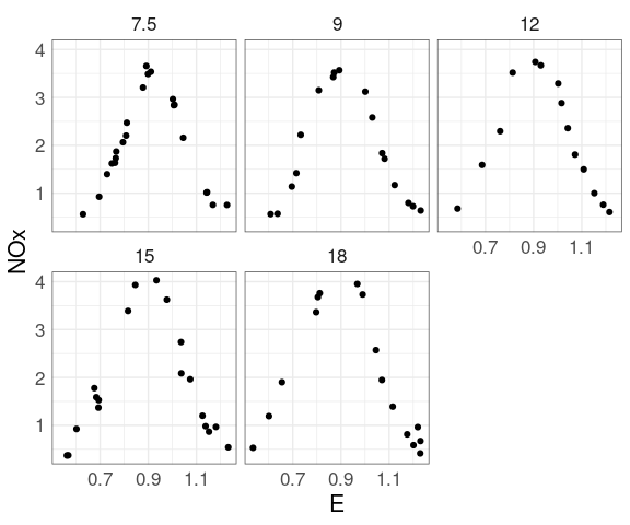
At each level of C there is a strong non-linear relation between NOx and E.
At levels of E above 1 the value of C has little effect.
For lower levels of E the NOx level increases with C.
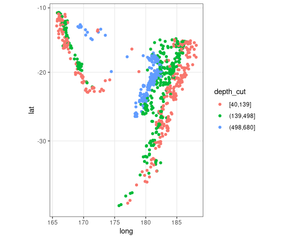
For the quakes data, breaking the depth values into thirds gives some insights:
quakes2 <-
mutate(quakes,
depth_cut = cut_number(depth, 3))
ggplot(quakes2, aes(x = long,
y = lat,
color = depth_cut)) +
geom_point() +
theme_bw() +
coord_map()
Conditioning Plots (Coplots)
One way to try to get a handle on higher dimensional data is to try to fix values of some variables and visualize the values of others in 2D.
This can be done with
A conditioning plot, or coplot :
Shows a collection of plots of two variables for different settings of one or more additional variables, the conditioning variables.
For ordered conditioning variables the plots are arranged in a way that reflects the order.
When a conditioning variable is numeric, or ordered categorical with many levels, the values of the conditioning variable are grouped into bins.
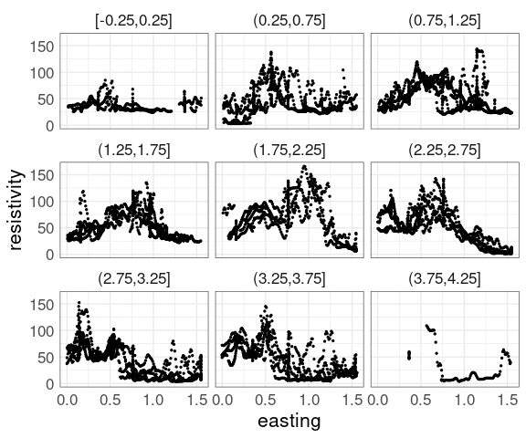
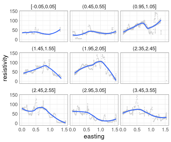
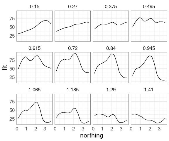
For the soil resistivity data, a coplot of resistivity against easting, conditioning on northing with bins of size 0.5:
p1 <- ggplot(soil,
aes(easting, resistivity)) +
geom_point(size = 0.5) +
facet_wrap(~ cut_width(northing,
width = 0.5,
center = 0))
p1
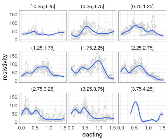
Adding a smooth is often helpful.
With a large amount of data the smooth is hard to see.
Some options:
Omit the data and only show the smooth.
Show the data in a less intense color, such as light gray.
Use a contrasting color for the smooth curves.
Show the data using alpha blending.
This uses a muted representation of the data:
p2 <- ggplot(soil,
aes(easting, resistivity)) +
geom_point(size = 0.5,
color = "lightgrey") +
facet_wrap(~ cut_width(northing,
width = 0.5,
center = 0)) +
geom_smooth()
p2
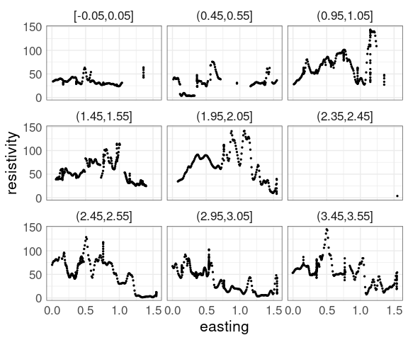
The conditioning bins are quite wide.
Using rounding and keeping only points within 0.05 of the rounded values reduces the variability:
soil_trm <-
mutate(soil,
nrnd = round(northing * 2) / 2) |>
filter(abs(northing - nrnd) < 0.05)
p1 %+% soil_trm +
facet_wrap(~ cut_width(northing,
width = 0.1,
center = 0))
p2 %+% soil_trm +
facet_wrap(~ cut_width(northing,
width = 0.1,
center = 0))
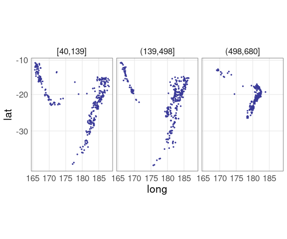
For the quakes data a plot of latitude against longitude conditioned on three depth levels:
qthm <- theme(panel.border = element_rect(color = "grey30", fill = NA))
ggplot(quakes2, aes(x = long, y = lat)) +
geom_point(color = scales::muted("blue"),
size = 0.5) +
facet_wrap(~ depth_cut,
nrow = 1) +
coord_map() +
qthm
The relative positions of the depth groups are much harder to see than in the grouped conditioning plot.
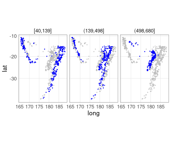
Adding the full data for background context, and using a more intense color for the panel subset, helps a lot:
## quakes does not contain the depth_cut
## variable used in the facet
ggplot(quakes2, aes(x = long, y = lat)) +
geom_point(data = quakes,
color = "gray", size = 0.5) +
geom_point(color = "blue", size = 0.5) +
facet_wrap(~ depth_cut, nrow = 1) +
coord_map() +
qthm
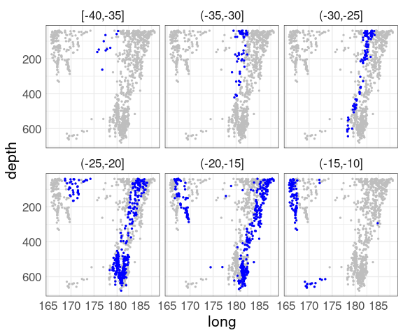
Switching latitude and depth shows another aspect:
quakes3 <-
mutate(quakes,
lat_cut = cut_width(lat,
width = 5,
boundary = 0))
ggplot(quakes3, aes(x = long, y = depth)) +
geom_point(data = quakes,
color = "gray", size = 0.5) +
geom_point(color = "blue", size = 0.5) +
scale_y_reverse() +
facet_wrap(~ lat_cut) +
qthm
Coplot for the ethanol data:
ggplot(ethanol, aes(x = E, y = NOx)) +
geom_point() +
facet_wrap(~ C)
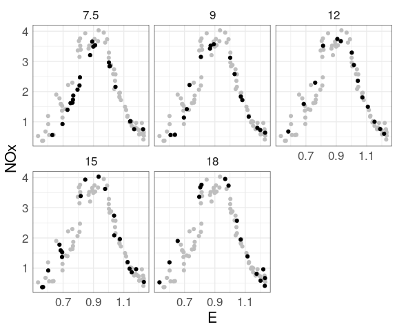
Adding muted full data for context:
ggplot(ethanol, aes(x = E, y = NOx)) +
geom_point(color = "grey",
data = mutate(ethanol, C = NULL)) +
geom_point() +
facet_wrap(~ C)
Contour and Level Plots for Surfaces
A number of methods can be used to estimate a smooth signal surface as a function of the two location variables.
One option is the loess local polynomial smoother; another is gam from package mgcv.
The estimated surface level can be computed on a grid of points using the predict method of the fit.
These estimated surfaces can be visualized using contour plots or level plots.
m <- loess(resistivity ~ easting * northing, span = 0.25,
degree = 2, data = soil)
eastseq <- seq(.15, 1.410, by = .015)
northseq <- seq(.150, 3.645, by = .015)
soi.grid <- expand.grid(easting = eastseq, northing = northseq)
soi.fit <- predict(m, soi.grid)
soi.fit.df <- mutate(soi.grid, fit = as.numeric(soi.fit))
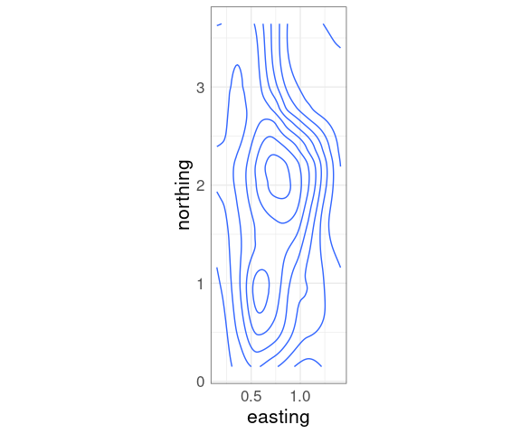
Contour Plots
Contour plots compute contours, or level curves, as polygons at a set of levels.
Contour plots draw the level curves, often with a level annotation.
Contour plots can also have their polygons filled in with colors representing the levels.
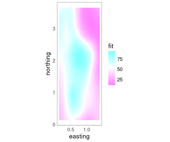
A basic contour plot of the fit soil resistivity surface in ggplot using geom_contour:
p <- ggplot(soi.fit.df,
aes(x = easting,
y = northing,
z = fit)) +
coord_fixed()
p + geom_contour()
Neither lattice nor ggplot seem to make it easy to fill in the contours.
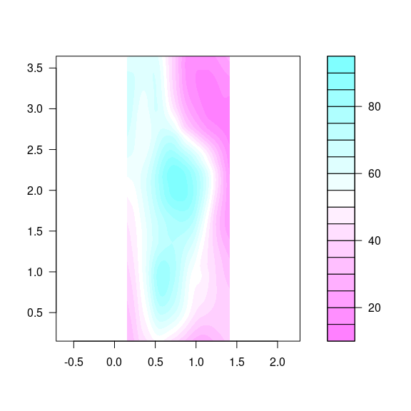
The base function filled.contour is available for this:
cm.rev <- function(...) rev(cm.colors(...))
filled.contour(eastseq, northseq, soi.fit,
asp = 1,
color.palette = cm.rev)
Level Plots
A level plot colors a grid spanned by two variables by the color of a third variable.
Level plots are also called image plots
The term heat map is also used, in particular with a specific color scheme.
But heat map often means a more complex visualization with an image plot at its core.
ggplot provides geom_tile that can be used for a level plot:
p + geom_tile(aes(fill = fit)) +
scale_fill_gradientn(
colors = rev(cm.colors(100)))
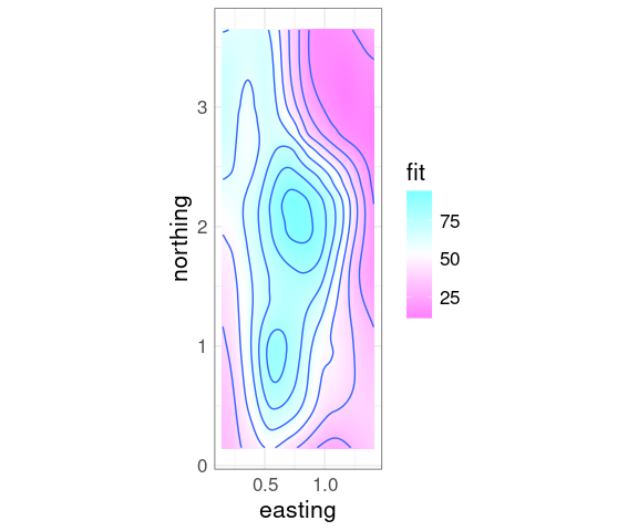
Superimposing contours on a level plot is often helpful.
p + geom_tile(aes(fill = fit)) +
geom_contour() +
scale_fill_gradientn(
colors = rev(cm.colors(100)))
Level plots do not require computing contours, but are not as smooth as filled contour plots.
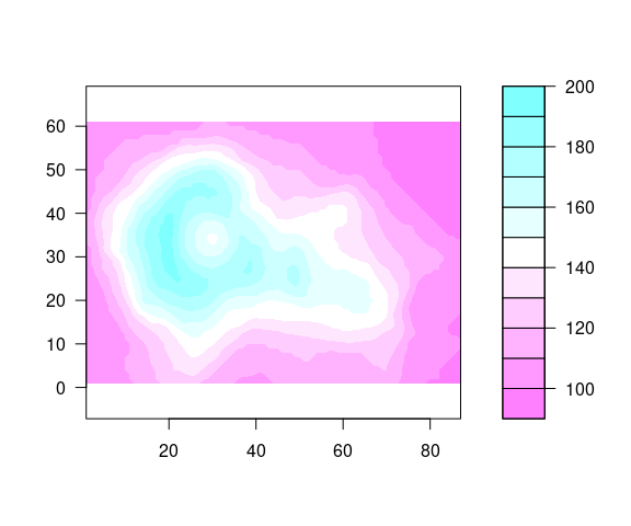
Visually, image plots and filled contour plots are very similar for fine grids, but image plots are less smooth for coarse ones.
Lack of smoothness is less of an issue when the data values themselves are noisy.
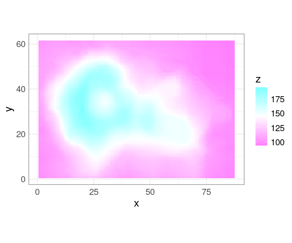
The grid for the volcano data
vd <- expand.grid(x = seq_len(nrow(volcano)), y = seq_len(ncol(volcano)))
vd$z <- as.numeric(volcano)
ggplot(vd, aes(x, y, fill = z)) +
geom_tile() +
scale_fill_gradientn(colors = rev(cm.colors(100))) +
coord_equal()
A filled.contour plot looks like this:
filled.contour(seq_len(nrow(volcano)),
seq_len(ncol(volcano)),
volcano,
nlevels = 10,
color.palette = cm.rev,
asp = 1)
A coarse grid can be interpolated to a finer grid.
Irregularly spaced data can also be interpolated to a grid.
The interp function in the akimainterp
(interp has a more permissive license.)
Three-Dimensional Views
There are several options for viewing surfaces or collections of points as three-dimensional objects:
Fixed Views
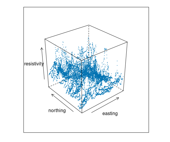
The lattice function cloud() shows a projection of a rotated point cloud in three dimensions.
For the soil resistivity data:
cloud(resistivity ~ easting * northing,
pch = 19, cex = 0.1, data = soil)
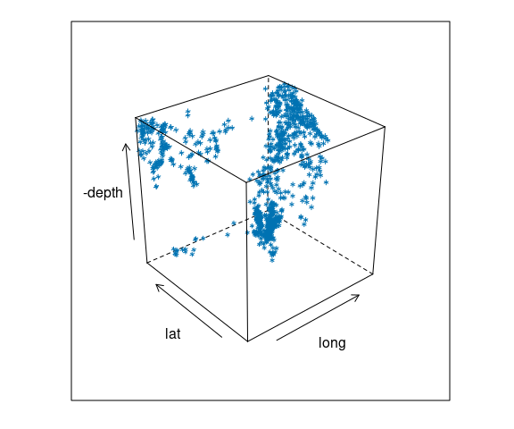
For the quakes data:
cloud(-depth ~ long * lat,
data = quakes)
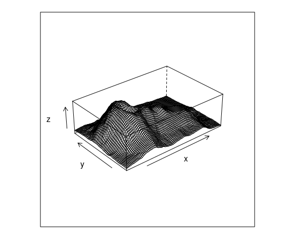
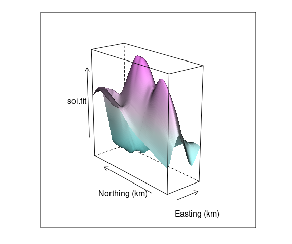
A surface can also be visualized using a wire frame plot showing a 3D view of the surface from a particular viewpoint.
A simple wire frame plot is often sufficient.
Lighting and shading can be used to enhance the 3D effect.
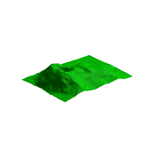
A basic wire frame plot for the volcano data:
wireframe(z ~ x * y,
data = vd,
aspect = c(61 / 89, 0.3))
Wire frame is a bit of a misnomer since surface panels in front occlude lines behind them.
For a fine grid, as in the soil surface, the lines are too dense.
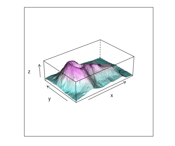
The use of shading for the surfaces can help.
wfpal <- makeShadePalette(cm.colors(10), pref = 0.2)
wireframe(z ~ x * y,
data = vd,
aspect = c(61 / 89, 0.3),
shade = TRUE,
shade.colors.palette = wfpal)
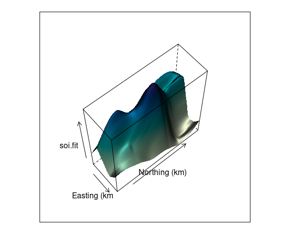
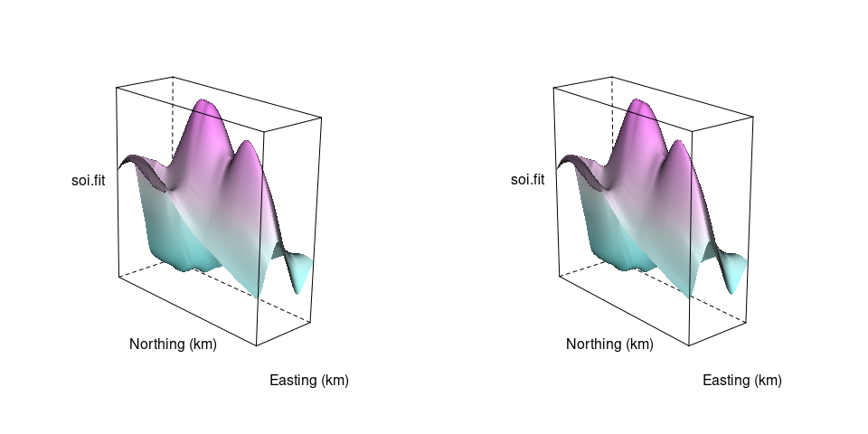
A wire frame plot with shading for the fit soil resistivity surface:
asp <- with(soi.grid,
diff(range(northing)) /
diff(range(easting)))
wf <- wireframe(
soi.fit ~
soi.grid$easting * soi.grid$northing,
aspect = asp, shade = TRUE,
screen = list(z = -50, x = -30),
xlab = "Easting (km",
ylab = "Northing (km)",
shade.colors.palette = wfpal)
wf
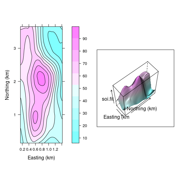
Both ways of looking at a surface are useful:
lv <-
levelplot(soi.fit ~
soi.grid$easting *
soi.grid$northing,
cuts = 9,
aspect = asp,
contour = TRUE,
xlab = "Easting (km)",
ylab = "Northing (km)",
col.regions = cm.colors)
print(lv, split = c(1, 1, 2, 1),
more = TRUE)
print(wf, split = c(2, 1, 2, 1))
The level plot/contour representation is useful for recognizing locations of key features.
The wire frame view helps build a mental model of the 3D structure.
Being able to interactively adjust the viewing position for a wire frame model greatly enhances our ability to understand the 3D structure.
Interactive 3D Plots Using OpenGL
OpenGL is a standardized framework for high performance graphics.
The rgl package provides an R interface to some of OpenGL’s capabilities.
WebGL is a JavaScript framework for using OpenGL within a browser window.
Most desktop browsers support WebGL; some mobile browsers do as well.
In some cases support may be available but not enabled by default. You may be able to get help at https://get.webgl.org/ .
knitr and rgl provide support for embedding OpenGL images in web pages.
It is also possible to embed OpenGL images in PDF files, but not all PDF viewers support this.
Start by creating the fit surface data frame.
if (! file.exists("soil.dat"))
download.file("http://www.stat.uiowa.edu/~luke/data/soil.dat",
"soil.dat")
soil <- read.table("soil.dat")
library(dplyr)
soil <- read.table("http://www.stat.uiowa.edu/~luke/data/soil.dat")
m <- loess(resistivity ~ easting * northing, span = 0.25,
degree = 2, data = soil)
eastseq <- seq(.15, 1.410, by = .015)
northseq <- seq(.150, 3.645, by = .015)
soi.grid <- expand.grid(easting = eastseq, northing = northseq)
soi.fit <- predict(m, soi.grid)
soi.fit.df <- mutate(soi.grid, fit = as.numeric(soi.fit))This code run in R will open a new window containing an interactive 3D scene (but this may not work on FastX and is not available on the RStudio server):
library(rgl)
bg3d(color = "white")
clear3d()
par3d(mouseMode = "trackball")
surface3d(eastseq, northseq,
soi.fit / 100,
color = rep("red", length(soi.fit)))This will work in the RStudio notebook server:
options(rgl.useNULL = TRUE)
library(rgl)
bg3d(color = "white")
clear3d()
par3d(mouseMode = "trackball")
surface3d(eastseq, northseq,
soi.fit / 100,
color = rep("red", length(soi.fit)))
rglwidget()To embed an image in an HTML document, first set the webgl hook with a code chunk like this:
knitr::knit_hooks$set(webgl = rgl::hook_webgl)
options(rgl.useNULL = TRUE)Then a chunk with the option
webgl = TRUEcan produce an embedded OpenGL image:
library(rgl)
bg3d(color = "white")
clear3d()
par3d(mouseMode = "trackball")
surface3d(eastseq, northseq,
soi.fit / 100,
color = rep("red", length(soi.fit)))
A view that includes the points and uses alpha blending to make the surface translucent:
library(rgl)
clear3d()
points3d(soil$easting,
soil$northing,
soil$resistivity / 100,
col = rep("black", nrow(soil)))
surface3d(eastseq, northseq,
soi.fit / 100,
col = rep("red", length(soi.fit)),
alpha = 0.9,
front = "fill",
back = "fill")
A view of the volcano surface:
library(rgl)
knitr::knit_hooks$set(webgl = rgl::hook_webgl)
options(rgl.useNULL = TRUE)
clear3d()
surface3d(x = 10 * seq_len(nrow(volcano)),
y = 10 * seq_len(ncol(volcano)),
z = 2 * volcano, color = "red")
The WebGL vignette in the rgl package shows some more examples.
The embedded graphs show properly for me on most browser/OS combinations I have tried.
To include a static view of an rgl scene you can use the rgl.snapshot function.
To use the view found interactively with rgl for creating a lattice wireframe view, you can use the rglToLattice function:
wireframe(soi.fit ~ soi.grid$easting * soi.grid$northing,
aspect = c(asp, 0.7), shade = TRUE,
xlab = "Easting (km)",
ylab = "Northing (km)", screen = rglToLattice())Ethanol data:
library(rgl)
clear3d()
with(ethanol, points3d(E, C / 5, NOx / 5,
size = 4, col = rep("black", nrow(ethanol))))
Quakes data:
library(rgl)
clear3d()
with(quakes, points3d(long, lat, -depth / 50, size = 2,
col = rep("black", nrow(quakes))))
Other Animation Technologies
Animated GIF or PNG images can be used to show a fly around of a surface.
A fly-around can also be recorded as a movie.
A movie can be paused and replayed; animated images typically cannot.
Alternatives and Variations
Interactive or animated views rely on our visual system’s ability to extract depth queues
This is called motion parallax .
When the motion stops, the 3D illusion is lost.
Other options for viewing a 3D scene that do not rquire motion:
A stereogram
This approach is or was used
You can create your own viewer with paper or cardboard tubes, for example.
A stereo image for the soil data surface:
tp <- trellis.par.get()
trellis.par.set(theme = col.whitebg())
ocol <- trellis.par.get("axis.line")$col
oclip <- trellis.par.get("clip")$panel
trellis.par.set(list(axis.line = list(col = "transparent"),
clip = list(panel = FALSE)))
print(wireframe(soi.fit ~ soi.grid$easting * soi.grid$northing,
cuts = 9,
aspect = diff(range(soi.grid$n)) / diff(range(soi.grid$e)),
xlab = "Easting (km)",
ylab = "Northing (km)", shade = TRUE,
screen = list(z = 40, x = -70, y = 3),
shade.colors.palette = wfpal),
split = c(1, 1, 2, 1), more = TRUE)
print(wireframe(soi.fit ~ soi.grid$easting * soi.grid$northing,
cuts = 9,
aspect = diff(range(soi.grid$n)) / diff(range(soi.grid$e)),
xlab = "Easting (km)",
ylab = "Northing (km)", shade = TRUE,
screen = list(z = 40, x = -70, y = 0),
shade.colors.palette = wfpal),
split = c(2, 1, 2, 1))
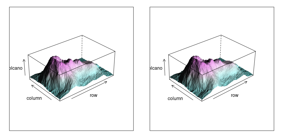
A stereo view of the volcano surface:
library(lattice)
v1 <- wireframe(volcano, shade = TRUE,
aspect = c(61 / 87, 0.4),
light.source = c(10, 0, 10),
screen = list(z = 40, x = -60, y = 0),
shade.colors.palette = wfpal)
v2 <- wireframe(volcano, shade = TRUE,
aspect = c(61 / 87, 0.4),
light.source = c(10, 0, 10),
screen = list(z = 40, x = -60, y = 3),
shade.colors.palette = wfpal)
print(v1, split = c(1, 1, 2, 1), more = TRUE)
print(v2, split = c(2, 1, 2, 1))
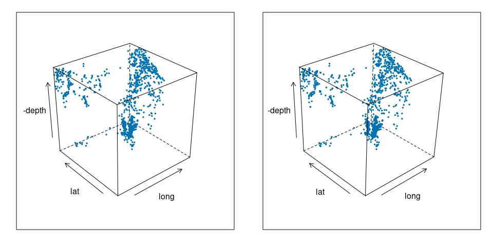
A stereo view of the quakes data:
q1 <- cloud(-depth ~ long * lat, data = quakes, pch = 19, cex = 0.3,
screen = list(z = 40, x = -60, y = 0))
q2 <- cloud(-depth ~ long * lat, data = quakes, pch = 19, cex = 0.3,
screen = list(z = 40, x = -60, y = 3))
print(q1, split = c(1, 1, 2, 1), more = TRUE)
print(q2, split = c(2, 1, 2, 1))
Coplots for Surfaces
We can also use the idea of a coplot for examining a surface a few slices at a time.
For the soil resistivity surface:
wireframe(
soi.fit ~
soi.grid$easting * soi.grid$northing,
cuts = 9,
aspect = diff(range(soi.grid$n)) /
diff(range(soi.grid$e)),
xlab = "Easting (km)",
ylab = "Northing (km)", shade = TRUE,
screen = list(z = 40, x = -70, y = 0),
shade.colors.palette = wfpal)
Choosing 12 approximately equally spaced slices along easting:
sf <- soi.grid
sf$fit <- as.numeric(soi.fit)
sube <- eastseq[seq_len(length(eastseq)) %% 7 == 0]
sube <- eastseq[round(seq(1, length(eastseq), length.out = 12))]
ssf <- filter(sf, easting %in% sube)
ggplot(ssf, aes(x = northing, y = fit)) +
geom_line() +
scale_x_reverse() +
facet_wrap(~ easting)
For examining a surface this way we fix one variable at a specific value.
For examining data it is also sometimes useful to choose a narrow window.
Conditioning with a Single Plot
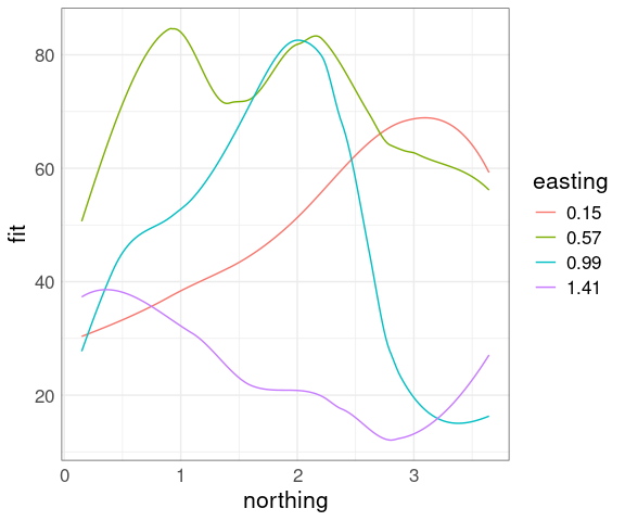
It is possible to show conditioning in a single plot using an identity channel to distinguish the conditions.
sf <- soi.grid
sf$fit <- as.numeric(soi.fit)
sube4 <- eastseq[round(seq(1, length(eastseq), length.out = 4))]
ssf4 <- filter(sf, easting %in% sube4)
ggplot(mutate(ssf4, easting = factor(easting)),
aes(x = northing, y = fit,
color = easting,
group = easting)) +
geom_line()
This is most useful when the effect of the conditioning variable is a level shift.
The number of different levels that can be used effectively is lower.
Over-plotting becomes an issue when used with data points.
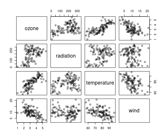
Example: Ozone Levels
From Cleveland, William S. (1993) Visualizing Data :
data(environmental, package = "lattice")Daily measurements of ozone concentration, wind speed, temperature and solar radiation in New York City from May to September of 1973.
A data frame with 111 observations on the following 4 variables.
ozone: Average ozone concentration
radiation: Solar radiation
temperature: Maximum daily emperature
wind: Average wind speed
pairs(environmental)
Cleveland suggests a cube root transformation for ozone:
env2 <- mutate(environmental, ozone = ozone ^ (1 / 3))
pairs(env2)
There is monotone marginal relationship between the transformed ozone and temperature.
It might be worth looking at this relationship for different levels of wind and radiation.
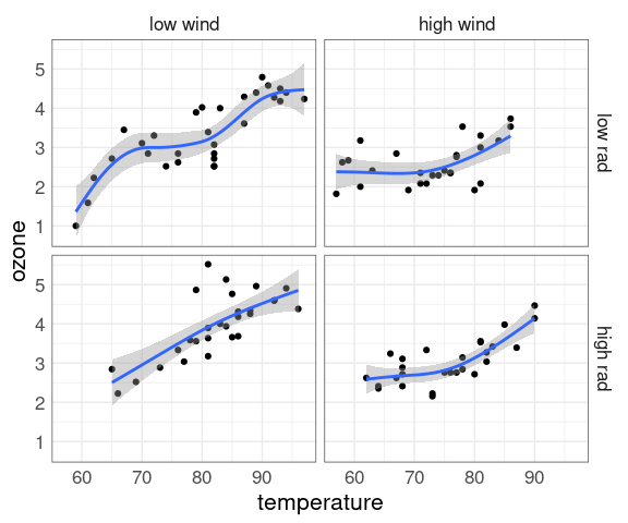
Two levels each might be a good start:
env2 <- mutate(env2,
wind_cut = cut_number(wind, 2,
labels = c("low wind", "high wind")),
rad_cut = cut_number(radiation, 2,
labels = c("low rad", "high rad")))
ggplot(env2, aes(x = temperature, y = ozone)) +
geom_point() +
geom_smooth(method = "gam") +
facet_grid(rad_cut ~ wind_cut)
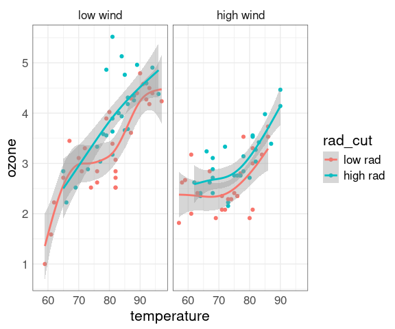
Faceting on wind:
ggplot(env2, aes(x = temperature, y = ozone, color = rad_cut)) +
geom_point() +
geom_smooth(method = "gam") +
facet_wrap(~ wind_cut)
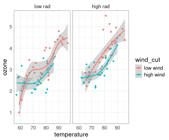
Faceting on radiation:
ggplot(env2, aes(x = temperature, y = ozone, color = wind_cut)) +
geom_point() +
geom_smooth(method = "gam") +
facet_wrap(~ rad_cut)
Fit model; red at 1st quartile of wind, green at 3rd quartile:
library(dplyr)
library(ggplot2)
data(environmental, package = "lattice")
env2 <- mutate(environmental, ozone = ozone ^ (1 / 3))
tempseq <- seq(57, 97, length.out = 20)
radseq <- seq(7, 334, length.out = 20)
fit2 <- loess(ozone ~ wind * temperature * radiation,
span = 1.0, degree = 2, data = env2)
grid1 <- expand.grid(temperature = tempseq, radiation = radseq, wind = 7.5)
grid2 <- expand.grid(temperature = tempseq, radiation = radseq, wind = 11.5)
s1 <- predict(fit2, newdata = grid1)
s2 <- predict(fit2, newdata = grid2)
library(rgl)
clear3d()
surface3d(as.numeric(scale(tempseq)), as.numeric(scale(radseq)), s1,
color = rep("red", length(s1)))
surface3d(as.numeric(scale(tempseq)), as.numeric(scale(radseq)), s2,
color = rep("green", length(s2)))
axes3d()
title3d(xlab = "temp", ylab = "rad", zlab = "ozone")
3D Density Estimates
Density estimates can be used with 3D data as well.
The density is a function of three variables, so the density surface is in 4D.
The points in 3D with a common density level form a contour surface .
The contour surface for a higher density level will be inside the surface for a lower level.
Some artificial data:
library(rgl)
library(misc3d)
x <- matrix(rnorm(9000), ncol = 3)
x[1001 : 2000, 2] <- x[1001 : 2000, 2] + 4
x[2001 : 3000, 3] <- x[2001 : 3000, 3] + 4
clear3d()
bg3d(col = "white")
points3d(x = x[, 1], y = x[, 2], z = x[, 3],
size = 2, color = "black")
3D plot of one contour surface:
g <- expand.grid(x = seq(-4, 8.5, len = 30),
y = seq(-4, 8.5, len = 30),
z = seq(-4, 8.5, len = 30))
d <- kde3d(x[, 1], x[, 2], x[, 3],
0.5, 30, c(-4, 8.5))$d
clear3d()
xv <- seq(-4, 8.5, len = 30)
contour3d(d, 20 / 3000, xv, xv, xv,
color = "red")
Adding the data:
d2 <- kde3d(x[, 1], x[, 2], x[, 3],
0.5, 30, c(-4, 8.5))$d
clear3d()
points3d(x = x[, 1], y = x[, 2], z = x[, 3],
size = 2, color = "black")
contour3d(d2, 20 / 3000, xv, xv, xv,
color = "red", alpha = 0.5,
add = TRUE)
3D plot of several contours for bw = 0.5:
clear3d()
contour3d(d2, c(10, 25, 40) / 3000, xv, xv, xv,
color = c("red", "green", "blue"),
alpha = c(0.2, 0.5, 0.7),
add = TRUE)
Density contour for the quakes data:
bg3d(col = "white")
clear3d()
d <- kde3d(quakes$long, quakes$lat, -quakes$depth, n = 40)
contour3d(d$d, level = exp(-12),
x = d$x / 22, y = d$y / 28, z = d$z / 640,
color = "green", ## color2 = "gray",
scale = FALSE, add = TRUE)
box3d(col = "gray")
Adding data and second contour:
clear3d()
points3d(quakes$long / 22, quakes$lat / 28, -quakes$depth / 640,
size = 2, col = rep("black", nrow(quakes)))
box3d(col = "gray")
d <- kde3d(quakes$long, quakes$lat, -quakes$depth, n = 40)
contour3d(d$d, level = exp(c(-10, -12)),
x = d$x / 22, y = d$y / 28, z = d$z / 640,
color = c("red", "green"), alpha = 0.1,
scale = FALSE, add = TRUE)
Parallel Coordinates Plots
The same idea as a slope graph, but usually with more variables.
Some references:
A post by Robert Kosara.
Wikipedia entry .
Paper on recognizing mathematical objects in parallel coordinate plots.
Some R implementations include parallelplot() in lattice and ggparcoord() in GGally
A parallel coordinate plot of a data set on the chemical composition of coffee samples:
library(gridExtra)
library(GGally)
data(coffee, package = "pgmm")
coffee <- mutate(coffee,
Type = ifelse(Variety == 1,
"Arabica",
"Robusta"))
ggparcoord(coffee[order(coffee$Type), ],
columns = 3 : 14,
groupColumn = "Type",
scale = "uniminmax") +
xlab("") +
ylab("") +
scale_colour_manual(
values = c("grey", "red")) +
theme(axis.ticks.y = element_blank(),
axis.text.y = element_blank(),
axis.text.x =
element_text(angle = 45,
vjust = 1,
hjust = 1),
legend.position = "top")
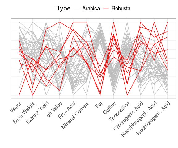
There are 43 samples from 29 countries and two varieties, Arabica or Robusta .
Examining the plot shows that the varieties are distinguished by their fat and caffeine contents:
ggplot(coffee,
aes(x = Fat,
y = Caffine,
colour = Type)) +
geom_point(size = 3) +
scale_colour_manual(
values = c("grey", "red"))
Some useful adjustments:
Interactive implementations that support these and more are available.
Australian Crabs
The data frame crabs in the MASS package contains measurement on crabs of a species that has been split into two based on color, orange or blue.
Preserved specimens lose their color (and possibly ability to identify sex).
Data were collected to help classify preserved specimens.
It would be useful to have a fairly simple classification rule.
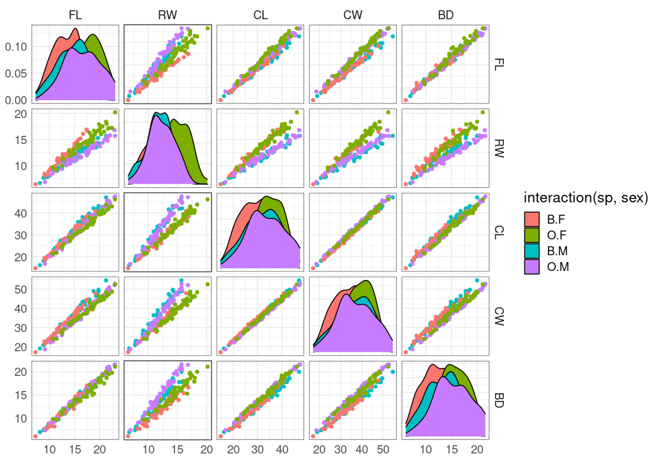
A scatterplot matrix view:
data(crabs, package = "MASS")
## splom(~ crabs[4 : 8],
## group = paste(sex, sp),
## data = crabs,
## auto.key = TRUE,
## pscale = 0)
ggpairs(crabs,
aes(color = interaction(sp, sex)),
columns = 4 : 8,
upper = list(continuous = "points"),
legend = 1)
The variables shown are:
FL frontal lobe size (mm);RW rear width (mm);CL carapace length (mm);CW carapace width (mm);BD body depth (mm).
The variables are highly correlated, reflecting overall size and age.
The RW * CL or RW * CW plots separate males and females well, at least for larger crabs.
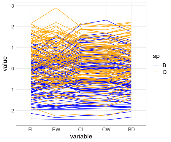
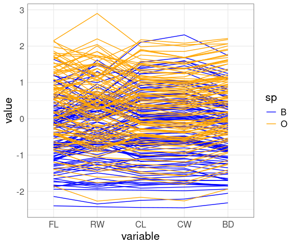
A parallel coordinates view:
ggparcoord(crabs,
columns = 4 : 8,
groupColumn = "sp") +
scale_color_manual(
values = c(B = "blue", O = "orange"))
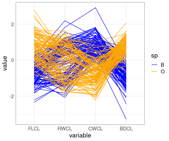
A possible next step: Reduce the correlation by a scaling by one of the variables.
cr <- mutate(crabs,
FLCL = FL / CL,
RWCL = RW / CL,
CWCL = CW / CL,
BDCL = BD / CL)## splom(~ cr[9 : 12], group = sp,
## data = cr,
## auto.key = TRUE, pscale = 0)
ggpairs(cr, aes(color = sp),
columns = 9 : 12,
upper = list(continuous = "points"),
legend = 1) +
scale_color_manual(
values = c(B = "blue", O = "orange")) +
scale_fill_manual(
values = c(B = "blue", O = "orange"))
## Warning: No shared levels found between `names(values)` of the manual scale and the
## data's colour values.
## No shared levels found between `names(values)` of the manual scale and the
## data's colour values.
## Warning: No shared levels found between `names(values)` of the manual scale and the
## data's fill values.
## No shared levels found between `names(values)` of the manual scale and the
## data's fill values.
## No shared levels found between `names(values)` of the manual scale and the
## data's fill values.
## No shared levels found between `names(values)` of the manual scale and the
## data's fill values.
## Warning: No shared levels found between `names(values)` of the manual scale and the
## data's colour values.
The CWCL * FLCL plot shows good species separation by a line.
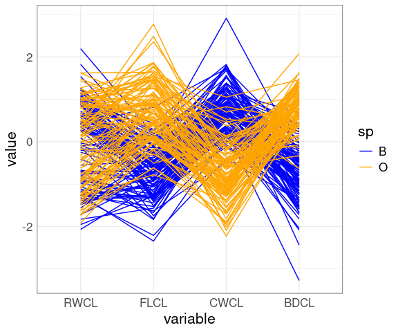
A parallel coordinates plot after scaling by CL:
ggparcoord(cr,
columns = 9 : 12,
groupColumn = "sp") +
scale_color_manual(
values = c(B = "blue", O = "orange"))
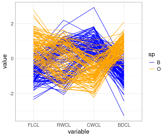
Reorder the variables:
ggparcoord(cr,
columns = c(10, 9, 11, 12),
groupColumn = "sp") +
scale_color_manual(
values = c(B = "blue", O = "orange"))
Reorder again:
ggparcoord(cr,
columns = c(10, 9, 12, 11),
groupColumn = "sp") +
scale_color_manual(
values = c(B = "blue", O = "orange"))
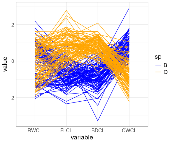
Reverse the CWCL variable:
ggparcoord(mutate(cr, CWCL = -CWCL),
columns = c(10, 9, 12, 11),
groupColumn = "sp") +
scale_color_manual(
values = c(B = "blue", O = "orange"))
The patterns for FLCL, CWLC, and BDCL for the two species differ.
Dimension Reduction by PCA
A number of methods are available for extracting a lower dimensional representation of a data set that captures most important features.
One approach is principal component analysis , or PCA .
Principal component analysis identifies a rotation of the data that produces uncorrelated scores.
Components are ordered by the amount they contribute to the overall variation in the data.
Sometimes the first few principal components capture most of the interesting variation.
The components are linear combinations of the original variables; they may not be easy to interpret.
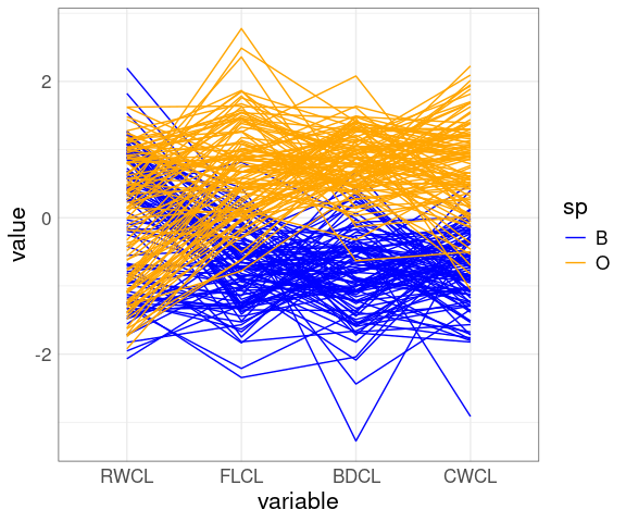
The first two principal components for the scaled crabs data:
fit <- select(cr, 9 : 12) |>
mutate(across(everything(), scale)) |>
prcomp()
cr_PC <- cbind(cr, fit$x)
p <- ggplot(cr_PC, aes(PC1, PC2, color = sp)) +
geom_point() +
scale_color_manual(values = c(O = "orange", B = "blue"))
library(ggrepel)
p + geom_segment(aes(x = 0, y = 0, xend = PC1, yend = PC2),
data = as.data.frame(fit$rotation),
color = "black",
arrow = arrow(length = unit(0.03, "npc"))) +
geom_text_repel(aes(x = PC1, y = PC2,
label = rownames(fit$rotation)),
data = as.data.frame(fit$rotation),
color = "black")
The two species are separated quite well by the first principal component alone.
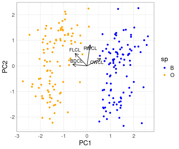
For the coffee data the first principal component also separates the varieties well:
fit <- select(coffee, 4:14) |>
mutate(across(everything(), scale)) |>
prcomp()
coffee_PC <- cbind(coffee, fit$x)
ggplot(coffee_PC, aes(x = PC1, y = PC2, color = Type)) +
geom_point(size = 3) +
scale_colour_manual(values = c("grey", "red"))
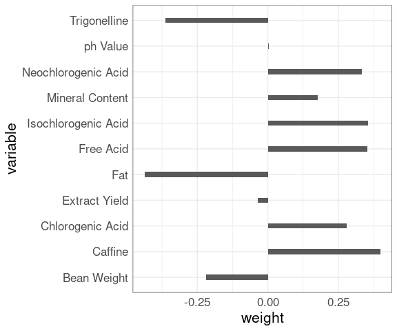
The first principal component is a weighted combination of the original variables; there is some weight, positive or negative, on almost every variable, which makes the result hard to interpret.
data.frame(variable = rownames(fit$rotation),
weight = as.vector(fit$rotation[, 1])) |>
ggplot(aes(x = weight, y = variable)) +
geom_col(width = 0.2)
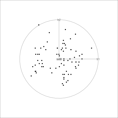
Grand Tours
The grand tour can be viewed as carrying out a sequence of rotations in high dimensional space and showing images of some of the coordinates.
This can be useful for discovering groups, outliers, and some lower-dimensional structures.
The rotations can be random or selected to optimize some criterion (guided tours).
The tourr package provides one implementation.
Good interactive interfaces do not seem to be readily available at the moment.
LS0tCnRpdGxlOiAiVmlzdWFsaXppbmcgVGhyZWUgb3IgTW9yZSBOdW1lcmljIFZhcmlhYmxlcyIKb3V0cHV0OgogIGh0bWxfZG9jdW1lbnQ6CiAgICB0b2M6IHllcwogICAgY29kZV9mb2xkaW5nOiBzaG93CiAgICBjb2RlX2Rvd25sb2FkOiB0cnVlCi0tLQoKPGxpbmsgcmVsPSJzdHlsZXNoZWV0IiBocmVmPSJzdGF0NDU4MC5jc3MiIHR5cGU9InRleHQvY3NzIiAvPgo8c3R5bGUgdHlwZT0idGV4dC9jc3MiPiAucmVtYXJrLWNvZGUgeyBmb250LXNpemU6IDg1JTsgfSA8L3N0eWxlPgo8IS0tIHRpdGxlIGJhc2VkIG9uIFdpbGtlJ3MgY2hhcHRlciAtLT4KCmBgYHtyIHNldHVwLCBpbmNsdWRlID0gRkFMU0UsIG1lc3NhZ2UgPSBGQUxTRX0Kc291cmNlKGhlcmU6OmhlcmUoInNldHVwLlIiKSkKa25pdHI6Om9wdHNfY2h1bmskc2V0KGNvbGxhcHNlID0gVFJVRSwgbWVzc2FnZSA9IEZBTFNFLAogICAgICAgICAgICAgICAgICAgICAgZmlnLmhlaWdodCA9IDUsIGZpZy53aWR0aCA9IDYsIGZpZy5hbGlnbiA9ICJjZW50ZXIiKQoKc2V0LnNlZWQoMTIzNDUpCmxpYnJhcnkoZHBseXIpCmxpYnJhcnkodGlkeXIpCmxpYnJhcnkoZ2dwbG90MikKbGlicmFyeShsYXR0aWNlKQpsaWJyYXJ5KGdyaWRFeHRyYSkKbGlicmFyeShwYXRjaHdvcmspCnNvdXJjZShoZXJlOjpoZXJlKCJkYXRhc2V0cy5SIikpCnRoZW1lX3NldCh0aGVtZV9taW5pbWFsKCkgKwogICAgICAgICAgdGhlbWUodGV4dCA9IGVsZW1lbnRfdGV4dChzaXplID0gMTYpLAogICAgICAgICAgICAgICAgcGFuZWwuYm9yZGVyID0gZWxlbWVudF9yZWN0KGNvbG9yID0gImdyZXkzMCIsIGZpbGwgPSBOQSkpKQpgYGAKCgojIyBNb3ZpbmcgQmV5b25kIFR3byBEaW1lbnNpb25zCgpQYXBlciBhbmQgc2NyZWVucyBhcmUgdHdvLWRpbWVuc2lvbmFsLgoKV2UgbGl2ZSBpbiBhIHRocmVlLWRpbWVuc2lvbmFsIHdvcmxkLgoKRm9yIHZpc3VhbGl6aW5nIHRocmVlLWRpbWVuc2lvbmFsIGRhdGEgd2UgY2FuIHRha2UgYWR2YW50YWdlIG9mIG91cgp2aXN1YWwgc3lzdGVtJ3MgYWJpbGl0eSB0byByZWNvbnN0cnVjdCB0aHJlZS1kaW1lbnNpb25hbCBzY2VuZXMgZnJvbQp0d28tZGltZW5zaW9uYWwgaW1hZ2VzIHVzaW5nOgoKKiBwZXJzcGVjdGl2ZSByZW5kZXJpbmcsIGxpZ2h0aW5nLCBhbmQgc2hhZGluZzsKCiogbW90aW9uIHdpdGggYW5pbWF0aW9uIGFuZCBpbnRlcmFjdGlvbjsKCiogc3RlcmVvIHZpZXdpbmcgbWV0aG9kcy4KCk1vc3Qgb2YgdXMgaGF2ZSBubyBpbnR1aXRpb24gZm9yIGZvdXIgYW5kIG1vcmUgZGltZW5zaW9ucy4KClNvbWUgdGVjaG5pcXVlcyB0aGF0IHdvcmsgaW4gdGhyZWUgZGltZW5zaW9ucyBidXQgY2FuIGFsc28gYmUgdXNlZCBpbgpoaWdoZXIgZGltZW5zaW9uczoKCiogX0dyb3VwaW5nXyBieSBlbmNvZGluZyBhZGRpdGlvbmFsIHZhcmlhYmxlcyBpbiBjb2xvciBvciBzaGFwZSBjaGFubmVscy4KCiogX0NvbmRpdGlvbmluZ18gYnkgdXNpbmcgc21hbGwgbXVsdGlwbGVzIGZvciBkaWZmZXJlbnQgbGV2ZWxzIG9mCiAgYWRkaXRpb25hbCB2YXJpYWJsZXMuCgpIaWdoZXIgZGltZW5zaW9ucyBtYXliZSB1cCB0byB0ZW47IHRoZSBbX2N1cnNlIG9mCmRpbWVuc2lvbmFsaXR5X10oaHR0cHM6Ly9lbi53aWtpcGVkaWEub3JnL3dpa2kvQ3Vyc2Vfb2ZfZGltZW5zaW9uYWxpdHkpCmlzIGEgbGltaXRpbmcgZmFjdG9yLgoKVGhlIGBsYXR0aWNlYCBwYWNrYWdlIHByb3ZpZGVzIHNvbWUgZmFjaWxpdGllcyBub3QgZWFzaWx5IGF2YWlsYWJsZSBpbgpgZ2dwbG90YCBzbyBJIHdpbGwgdXNlIGBsYXR0aWNlYCBpbiBhIGZldyBleGFtcGxlcy4KCgojIyBTY2F0dGVycGxvdCBNYXRyaWNlcwoKQSBfc2NhdHRlcnBsb3QgbWF0cml4XyBpcyBhIHVzZWZ1bCBvdmVydmlldyB0aGF0IHNob3dzIGFsbCBwYWlyd2lzZQpzY2F0dGVycGxvdHMuCgpUaGVyZSBhcmUgbWFueSBvcHRpb25zIGZvciBjcmVhdGluZyBzY2F0dGVycGxvdCBtYXRyaWNlcyBpbiBSOyBhIGZldyBhcmU6CgoqIGBwYWlyc2AgaW4gYmFzZSBncmFwaGljczsKCiogYHNwbG9tYCBpbiBwYWNrYWdlIGBsYXR0aWNlYAoKKiBgZ2dwYWlyc2AgaW4gYEdHYWxseWAuCgpTb21lIGV4YW1wbGVzIHVzaW5nIHRoZSBgbXBnYCBkYXRhOgoKYGBge3IsIGNsYXNzLnNvdXJjZSA9ICJmb2xkLWhpZGUifQpsaWJyYXJ5KGxhdHRpY2UpCnNwbG9tKHNlbGVjdChtcGcsIGN0eSwgaHd5LCBkaXNwbCksCiAgICAgIGNleCA9IDAuNSwgcGNoID0gMTkpCmBgYAoKYGBge3IsIGNsYXNzLnNvdXJjZSA9ICJmb2xkLWhpZGUifQpsaWJyYXJ5KEdHYWxseSkKZ2dwYWlycyhzZWxlY3QobXBnLCBjdHksIGh3eSwgZGlzcGwpLAogICAgICAgIGxvd2VyID0gbGlzdChjb250aW51b3VzID0KICAgICAgICAgICAgICAgICAgICAgICAgIHdyYXAoInBvaW50cyIsCiAgICAgICAgICAgICAgICAgICAgICAgICAgICAgIHNpemUgPSAxKSkpCmBgYAoKU29tZSB2YXJpYXRpb25zOgoKKiBkaWFnb25hbCBsZWZ0LXRvcCB0byByaWdodC1ib3R0b20gb3IgbGVmdC1ib3R0b20gdG8gcmlnaHQtdG9wOwoKKiBob3cgdG8gdXNlIHRoZSBwYW5lbHMgaW4gdGhlIHR3byB0cmlhbmdsZXM7CgoqIGhvdyB0byB1c2UgdGhlIHBhbmVscyBvbiB0aGUgZGlhZ29uYWwuCgpTb21lIHRoaW5ncyB0byBsb29rIGZvciBpbiB0aGUgcGFuZWxzOgoKKiBjbHVzdGVycyBvciBzZXBhcmF0aW9uIG9mIGdyb3VwczsKCiogc3Ryb25nIHJlbGF0aW9uc2hpcHM7CgoqIG91dGxpZXJzLCByb3VuZGluZywgY2x1bXBpbmcuCgpOb3RlczoKCiogU2NhdHRlcnBsb3QgbWF0cmljZXMgd2VyZSBwb3B1bGFyaXplZCBieSBDbGV2ZWxhbmQgYW5kIGNvLXdvcmtlcnMgYXQKICBCZWxsIExhYm9yYXRvcmllcyBpbiB0aGUgMTk4MHMuCgoqIENsZXZlbGFuZCByZWNvbW1lbmRzIHVzaW5nIHRoZSBmdWxsIHZlcnNpb24gZGlzcGxheWluZyBib3RoIHRyaWFuZ2xlcyBvZgogIHBsb3RzIHRvIGZhY2lsaXRhdGUgX3Zpc3VhbCBsaW5raW5nXy4KCiogSWYgeW91IGRvIHVzZSBvbmx5IG9uZSB0cmlhbmdsZSwgYW5kIG9uZSB2YXJpYWJsZSBpcyBhIHJlc3BvbnNlLAogIHRoZW4gaXQgaXMgYSBnb29kIGlkZWEgdG8gYXJyYW5nZSBmb3IgdGhhdCB2YXJpYWJsZSB0byBiZSBzaG93biBvbgogIHRoZSB2ZXJ0aWNhbCBheGlzIGFnYWluc3QgYWxsIG90aGVyIHZhcmlhYmxlcy4KCiogVGhlIHN5bW1ldHJ5IGluIHRoZSBwbG90IHdpdGggdGhlIGRpYWdvbmFsIHJ1bm5pbmcgZnJvbSBib3R0b20tbGVmdAogIHRvIHRvcC10aWdodCBhcyBwcm9kdWNlZCBieSBgc3Bsb21gIGlzIHNpbXBsZXIgdGhhbiB0aGUgc3ltbWV0cnkgaW4KICB0aGUgcGxvdCB3aXRoIHRoZSBkaWFnb25hbCBydW5uaW5nIGZyb20gdG9wLWxlZnQgdCBib3R0b20tcmlnaHQKICBwcm9kdWNlZCBieSBgcGFpcnNgIGFuZCBgZ2dwYWlyc2AuCgoKIyMgVGhyZWUgRGF0YSBTZXRzCgpUaGVlIHVzZWZ1bCBkYXRhIHNldHMgdG8gZXhwbG9yZToKCiogVGhlIGBldGhhbm9sYCBkYXRhIGZyYW1lIGluIHRoZSBgbGF0dGljZWAgcGFja2FnZS4KCiogU29pbCByZXNpc3Rpdml0eSBkYXRhIGZyb20gZnJvbSBDbGV2ZWxhbmQncyBfVmlzdWFsaXppbmcgRGF0YV8gYm9vay4KCiogVGhlIGBxdWFrZXNgIGRhdGEgZnJhbWUgaW4gdGhlIGBkYXRhc2V0c2AgcGFja2FnZS4KCgojIyMgRXRoYW5vbCBEYXRhCgpUaGUgYGV0aGFub2xgIGRhdGEgZnJhbWUgaW4gdGhlIGBsYXR0aWNlYCBwYWNrYWdlIGNvbnRhaW5zIGRhdGEgZnJvbQphbiBleHBlcmltZW50IG9uIGVmZmljaWVuY3kgYW5kIGVtaXNzaW9ucyBpbiBzbWFsbCBvbmUtY3lsaW5kZXIKZW5naW5lcy4KClRoZSBkYXRhIGZyYW1lIGNvbnRhaW5zIDg4IG9ic2VydmF0aW9ucyBvbiB0aHJlZSB2YXJpYWJsZXM6CgoqIGBOT3hgOiBDb25jZW50cmF0aW9uIG9mIG5pdHJvZ2VuIG94aWRlcyAoTk8gYW5kIE5PMikgaW4gbWljcm9ncmFtcy4KCiogYENgIENvbXByZXNzaW9uIHJhdGlvIG9mIHRoZSBlbmdpbmUuCgoqIGBFYCBFcXVpdmFsZW5jZSByYXRpbywgYSBtZWFzdXJlIG9mIHRoZSByaWNobmVzcyBvZiB0aGUgYWlyIGFuZAogIGV0aGFub2wgZnVlbCBtaXh0dXJlLgoKQSBzY2F0dGVycGxvdCBtYXRyaXg6CgpgYGB7ciwgY2xhc3Muc291cmNlID0gImZvbGQtaGlkZSJ9CmxpYnJhcnkobGF0dGljZSkKc3Bsb20oZXRoYW5vbCwgY2VkID0gMC41LCBwY2ggPSAxOSkKYGBgCgpBIGdvYWwgaXMgdG8gdW5kZXJzdGFuZCB0aGUgcmVsYXRpb25zaGlwIGJldHdlZW4gdGhlIHBvbGx1dGFudCBgTk94YCBhbmQgdGhlCmNvbnRyb2xsYWJsZSB2YXJpYWJsZXMgYEVgIGFuZCBgQ2AuCgoKIyMjIFNvaWwgUmVzaXN0aXZpdHkgRGF0YQoKW0RhdGFdKGh0dHBzOi8vc3RhdC51aW93YS5lZHUvfmx1a2UvZGF0YS9zb2lsLmRhdCkgZnJvbSBDbGV2ZWxhbmQncwpfVmlzdWFsaXppbmcgRGF0YV8gYm9vayBjb250YWlucyBtZWFzdXJlbWVudHMgb2Ygc29pbCByZXNpc3Rpdml0eSBvZgphbiBhZ3JpY3VsdHVyYWwgZmllbGQgYWxvbmcgYSByb3VnaGx5IHJlY3Rhbmd1bGFyIGdyaWQuCgo8IS0tClNvbWV0aGluZyBpbnRlcmVzdGluZyBpcyBnb2luZyBvbiB3aXRoIHRoZSBgdHJhY2tgIHZhcmlhYmxlLCBidXQKSSdtIG5vdCBzdXJlIHdoYXQuCi0tPgoKQSBzY2F0dGVycGxvdCBtYXRyaXggb2YgdGhlIGByZXNpc3Rpdml0eWAsIGBub3J0aGluZ2AgYW5kIGBlYXN0aW5nYAp2YXJpYWJsZXM6CgpgYGB7ciwgY2xhc3Muc291cmNlID0gImZvbGQtaGlkZSJ9CmlmICghIGZpbGUuZXhpc3RzKCJzb2lsLmRhdCIpKQogICAgZG93bmxvYWQuZmlsZSgiaHR0cDovL3d3dy5zdGF0LnVpb3dhLmVkdS9+bHVrZS9kYXRhL3NvaWwuZGF0IiwKICAgICAgICAgICAgICAgICAgInNvaWwuZGF0IikKc29pbCA8LSByZWFkLnRhYmxlKCJzb2lsLmRhdCIpCnNwbG9tKHNvaWxbMSA6IDNdLCBjZXggPSAwLjEsIHBjaCA9IDE5KQpgYGAKClRoZSBkYXRhIGlzIHF1aXRlIG5vaXN5IGJ1dCB0aGVyZSBpcyBzb21lIHN0cnVjdHVyZS4KCkEgZ29hbCBpcyB0byB1bmRlcnN0YW5kIGhvdyByZXNpc3Rpdml0eSB2YXJpZXMgYWNyb3NzIHRoZQpmaWVsZC4KCgojIyMgRWFydGggUXVha2UgTG9jYXRpb25zIGFuZCBNYWduaXR1ZGVzCgpUaGUgYHF1YWtlc2AgZGF0YSBmcmFtZSBjb250YWlucyBkYXRhIG9uIGxvY2F0aW9ucyBvZiBzZWlzbWljIGV2ZW50cwpvZiBtYWduaXR1ZGUgNC4wIG9yIGxhcmdlciBpbiBhIHJlZ2lvbiBuZWFyIEZpamkuCgpUaGUgdGltZSBmcmFtZSBpcyBmcm9tIDE5NjQgdG8gcGVyaGFwcyAyMDAwLgoKTW9yZSByZWNlbnQgZGF0YSBpcyBhdmFpbGFibGUgZnJvbSBhIG51bWJlciBvZiBzb3VyY2VzIG9uIHRoZSB3ZWIuCgpBIHNjYXR0ZXIgcGxvdCBtYXRyaXg6CgpgYGB7ciwgZmlnLmhlaWdodCA9IDcsIGZpZy5hbGlnbiA9ICJjZW50ZXIiLCBjbGFzcy5zb3VyY2UgPSAiZm9sZC1oaWRlIn0KbGlicmFyeShsYXR0aWNlKQpzcGxvbShxdWFrZXMsIGNleCA9IDAuMSwgcGNoID0gMTkpCmBgYAoKUXVha2UgbG9jYXRpb25zOgoKYGBge3IsIGNsYXNzLnNvdXJjZSA9ICJmb2xkLWhpZGUifQptZCA8LSBtYXBfZGF0YSgid29ybGQyIiwgYygiRmlqaSIsICJUb25nYSIsICJOZXcgWmVhbGFuZCIpKQpnZ3Bsb3QocXVha2VzLCBhZXMobG9uZywgbGF0KSkgKwogICAgZ2VvbV9wb2x5Z29uKGFlcyhncm91cCA9IGdyb3VwKSwgZGF0YSA9IG1kLCBjb2xvciA9ICJibGFjayIsIGZpbGwgPSBOQSkgKwogICAgZ2VvbV9wb2ludChzaXplID0gMC41LCBjb2xvciA9ICJyZWQiKSArCiAgICBjb29yZF9tYXAoKSArCiAgICBnZ3RoZW1lczo6dGhlbWVfbWFwKCkKYGBgCgpTb21lIGdvYWxzOgoKKiB1bmRlcnN0YW5kIHRoZSB0aHJlZS1kaW1lbnNpb25hbCBsb2NhdGlvbiBvZiB0aGUgcXVha2VzOwoKKiBzZWUgaWYgdGhlcmUgaXMgYW55IGFzc29jaWF0aW9uIGJldHdlZW4gbG9jYXRpb24gYW5kIG1hZ25pdHVkZS4KCgojIyBHcm91cGluZyBmb3IgQ29uZGl0aW9uaW5nCgpGb3IgdGhlIGBldGhhbm9sYCBkYXRhIHRoZXJlIGFyZSBvbmx5IGEgc21hbGwgbnVtYmVyIG9mIGRpc3RpbmN0CmxldmVscyBmb3IgYENgLgoKVGhpcyBzdWdnZXN0cyBjb25zaWRlcmluZyBhIHBsb3QgbWFwcGluZyB0aGUgbGV2ZWwgdG8gY29sb3IuCgpgYGB7ciBldGhhbm9sLWdyYWRpZW50LCBldmFsID0gRkFMU0V9CmdncGxvdChldGhhbm9sLAogICAgICAgYWVzKEUsIE5PeCwKICAgICAgICAgICBjb2xvciA9IEMpKSArCiAgICBnZW9tX3BvaW50KHNpemUgPSAyKQpgYGAKCmBgYHtyIGV0aGFub2wtZ3JhZGllbnQsIGVjaG8gPSBGQUxTRX0KYGBgCgpBIHF1YWxpdGF0aXZlIHNjaGVtZSBjYW4gaGVscCBkaXN0aW5ndWlzaCB0aGUgbGV2ZWxzLgoKYGBge3IgZXRoYW5vbC1mYWN0b3IsIGV2YWwgPSBGQUxTRX0KZ2dwbG90KGV0aGFub2wsCiAgICAgICBhZXMoRSwgTk94LAogICAgICAgICAgIGNvbG9yID0gb3JkZXJlZChDKSkpICsKICAgIGdlb21fcG9pbnQoc2l6ZSA9IDIpCmBgYAoKYGBge3IgZXRoYW5vbC1mYWN0b3IsIGVjaG8gPSBGQUxTRX0KYGBgCgpBZGRpbmcgc21vb3RocyBmdXJ0aGVyIGhlbHBzIHRoZSB2aXN1YWwgZ3JvdXBpbmc6CgpgYGB7ciBldGhhbm9sLCBldmFsID0gRkFMU0V9CmdncGxvdChldGhhbm9sLAogICAgICAgYWVzKEUsIE5PeCwKICAgICAgICAgICBjb2xvciA9IG9yZGVyZWQoQykpKSArCiAgICBnZW9tX3BvaW50KHNpemUgPSAyKSArCiAgICBnZW9tX3Ntb290aChzZSA9IEZBTFNFKQpgYGAKCmBgYHtyIGV0aGFub2wsIGVjaG8gPSBGQUxTRX0KYGBgClNvbWUgb2JzZXJ2YXRpb25zOgoKKiBBdCBlYWNoIGxldmVsIG9mIGBDYCB0aGVyZSBpcyBhIHN0cm9uZyBub24tbGluZWFyIHJlbGF0aW9uIGJldHdlZW4KICBgTk94YCBhbmQgYEVgLgoKKiBBdCBsZXZlbHMgb2YgYEVgIGFib3ZlIDEgdGhlIHZhbHVlIG9mIGBDYCBoYXMgbGl0dGxlIGVmZmVjdC4KCiogRm9yIGxvd2VyIGxldmVscyBvZiBgRWAgdGhlIGBOT3hgIGxldmVsIGluY3JlYXNlcyB3aXRoIGBDYC4KCkZvciB0aGUgYHF1YWtlc2AgZGF0YSwgYnJlYWtpbmcgdGhlIGBkZXB0aGAgdmFsdWVzIGludG8gdGhpcmRzIGdpdmVzCnNvbWUgaW5zaWdodHM6CgpgYGB7ciBxdWFrZXMtdGhpcmRzLCBldmFsID0gRkFMU0V9CnF1YWtlczIgPC0KICAgIG11dGF0ZShxdWFrZXMsCiAgICAgICAgICAgZGVwdGhfY3V0ID0gY3V0X251bWJlcihkZXB0aCwgMykpCmdncGxvdChxdWFrZXMyLCBhZXMoeCA9IGxvbmcsCiAgICAgICAgICAgICAgICAgICAgeSA9IGxhdCwKICAgICAgICAgICAgICAgICAgICBjb2xvciA9IGRlcHRoX2N1dCkpICsKICAgIGdlb21fcG9pbnQoKSArCiAgICB0aGVtZV9idygpICsKICAgIGNvb3JkX21hcCgpCmBgYAoKYGBge3IgcXVha2VzLXRoaXJkcywgZWNobyA9IEZBTFNFfQpgYGAKCgojIyBDb25kaXRpb25pbmcgUGxvdHMgKENvcGxvdHMpCgpPbmUgd2F5IHRvIHRyeSB0byBnZXQgYSBoYW5kbGUgb24gaGlnaGVyIGRpbWVuc2lvbmFsIGRhdGEgaXMgdG8gdHJ5IHRvCmZpeCB2YWx1ZXMgb2Ygc29tZSB2YXJpYWJsZXMgYW5kIHZpc3VhbGl6ZSB0aGUgdmFsdWVzIG9mIG90aGVycyBpbiAyRC4KClRoaXMgY2FuIGJlIGRvbmUgd2l0aAoKKiBpbnRlcmFjdGl2ZSB0b29sczsKCiogc21hbGwgbXVsdGlwbGVzIHdpdGggbGF0dGljZS90cmVsbGlzIGRpc3BsYXlzIG9yIGZhY2V0aW5nLgoKQSBjb25kaXRpb25pbmcgcGxvdCwgb3IgX2NvcGxvdF86CgoqIFNob3dzIGEgY29sbGVjdGlvbiBvZiBwbG90cyBvZiB0d28gdmFyaWFibGVzIGZvciBkaWZmZXJlbnQKICBzZXR0aW5ncyBvZiBvbmUgb3IgbW9yZSBhZGRpdGlvbmFsIHZhcmlhYmxlcywgdGhlIGNvbmRpdGlvbmluZwogIHZhcmlhYmxlcy4KCiogRm9yIG9yZGVyZWQgY29uZGl0aW9uaW5nIHZhcmlhYmxlcyB0aGUgcGxvdHMgYXJlIGFycmFuZ2VkIGluIGEgd2F5CiAgdGhhdCByZWZsZWN0cyB0aGUgb3JkZXIuCgoqIFdoZW4gYSBjb25kaXRpb25pbmcgdmFyaWFibGUgaXMgbnVtZXJpYywgb3Igb3JkZXJlZCBjYXRlZ29yaWNhbCB3aXRoCiAgbWFueSBsZXZlbHMsIHRoZSB2YWx1ZXMgb2YgdGhlIGNvbmRpdGlvbmluZyB2YXJpYWJsZSBhcmUgZ3JvdXBlZAogIGludG8gYmlucy4KCkZvciB0aGUgc29pbCByZXNpc3Rpdml0eSBkYXRhLCBhIGNvcGxvdCBvZiBgcmVzaXN0aXZpdHlgIGFnYWluc3QKYGVhc3RpbmdgLCBjb25kaXRpb25pbmcgb24gYG5vcnRoaW5nYCB3aXRoIGJpbnMgb2Ygc2l6ZSAwLjU6CgpgYGB7ciwgY2xhc3Muc291cmNlID0gImZvbGQtaGlkZSJ9CnAxIDwtIGdncGxvdChzb2lsLAogICAgICAgICAgICAgYWVzKGVhc3RpbmcsIHJlc2lzdGl2aXR5KSkgKwogICAgZ2VvbV9wb2ludChzaXplID0gMC41KSArCiAgICBmYWNldF93cmFwKH4gY3V0X3dpZHRoKG5vcnRoaW5nLAogICAgICAgICAgICAgICAgICAgICAgICAgICB3aWR0aCA9IDAuNSwKICAgICAgICAgICAgICAgICAgICAgICAgICAgY2VudGVyID0gMCkpCnAxCmBgYAoKQWRkaW5nIGEgc21vb3RoIGlzIG9mdGVuIGhlbHBmdWwuCgpXaXRoIGEgbGFyZ2UgYW1vdW50IG9mIGRhdGEgdGhlIHNtb290aCBpcyBoYXJkIHRvIHNlZS4KCiBTb21lIG9wdGlvbnM6CgoqIE9taXQgdGhlIGRhdGEgYW5kIG9ubHkgc2hvdyB0aGUgc21vb3RoLgoKKiBTaG93IHRoZSBkYXRhIGluIGEgbGVzcyBpbnRlbnNlIGNvbG9yLCBzdWNoIGFzIGxpZ2h0IGdyYXkuCgoqIFVzZSBhIGNvbnRyYXN0aW5nIGNvbG9yIGZvciB0aGUgc21vb3RoIGN1cnZlcy4KCiogU2hvdyB0aGUgZGF0YSB1c2luZyBhbHBoYSBibGVuZGluZy4KClRoaXMgdXNlcyBhIG11dGVkIHJlcHJlc2VudGF0aW9uIG9mIHRoZSBkYXRhOgoKYGBge3IsIGNsYXNzLnNvdXJjZSA9ICJmb2xkLWhpZGUifQpwMiA8LSBnZ3Bsb3Qoc29pbCwKICAgICAgICAgICAgIGFlcyhlYXN0aW5nLCByZXNpc3Rpdml0eSkpICsKICAgIGdlb21fcG9pbnQoc2l6ZSA9IDAuNSwKICAgICAgICAgICAgICAgY29sb3IgPSAibGlnaHRncmV5IikgKwogICAgZmFjZXRfd3JhcCh+IGN1dF93aWR0aChub3J0aGluZywKICAgICAgICAgICAgICAgICAgICAgICAgICAgd2lkdGggPSAwLjUsCiAgICAgICAgICAgICAgICAgICAgICAgICAgIGNlbnRlciA9IDApKSArCiAgICBnZW9tX3Ntb290aCgpCnAyCmBgYAoKVGhlIGNvbmRpdGlvbmluZyBiaW5zIGFyZSBxdWl0ZSB3aWRlLgoKVXNpbmcgcm91bmRpbmcgYW5kIGtlZXBpbmcgb25seSBwb2ludHMgd2l0aGluIDAuMDUgb2YgdGhlIHJvdW5kZWQKdmFsdWVzIHJlZHVjZXMgdGhlIHZhcmlhYmlsaXR5OgoKYGBge3IsIGNsYXNzLnNvdXJjZSA9ICJmb2xkLWhpZGUifQpzb2lsX3RybSA8LQogICAgbXV0YXRlKHNvaWwsCiAgICAgICAgICAgbnJuZCA9IHJvdW5kKG5vcnRoaW5nICogMikgLyAyKSB8PgogICAgZmlsdGVyKGFicyhub3J0aGluZyAtIG5ybmQpIDwgMC4wNSkKcDEgJSslIHNvaWxfdHJtICsKICAgIGZhY2V0X3dyYXAofiBjdXRfd2lkdGgobm9ydGhpbmcsCiAgICAgICAgICAgICAgICAgICAgICAgICAgIHdpZHRoID0gMC4xLAogICAgICAgICAgICAgICAgICAgICAgICAgICBjZW50ZXIgPSAwKSkKYGBgCgpgYGB7ciwgY2xhc3Muc291cmNlID0gImZvbGQtaGlkZSJ9CnAyICUrJSBzb2lsX3RybSArCiAgICBmYWNldF93cmFwKH4gY3V0X3dpZHRoKG5vcnRoaW5nLAogICAgICAgICAgICAgICAgICAgICAgICAgICB3aWR0aCA9IDAuMSwKICAgICAgICAgICAgICAgICAgICAgICAgICAgY2VudGVyID0gMCkpCmBgYAoKRm9yIHRoZSBxdWFrZXMgZGF0YSBhIHBsb3Qgb2YgbGF0aXR1ZGUgYWdhaW5zdCBsb25naXR1ZGUgY29uZGl0aW9uZWQKb24gdGhyZWUgZGVwdGggbGV2ZWxzOgoKYGBge3IsIGNsYXNzLnNvdXJjZSA9ICJmb2xkLWhpZGUifQpxdGhtIDwtIHRoZW1lKHBhbmVsLmJvcmRlciA9IGVsZW1lbnRfcmVjdChjb2xvciA9ICJncmV5MzAiLCBmaWxsID0gTkEpKQpnZ3Bsb3QocXVha2VzMiwgYWVzKHggPSBsb25nLCB5ID0gbGF0KSkgKwogICAgZ2VvbV9wb2ludChjb2xvciA9IHNjYWxlczo6bXV0ZWQoImJsdWUiKSwKICAgICAgICAgICAgICAgc2l6ZSA9IDAuNSkgKwogICAgZmFjZXRfd3JhcCh+IGRlcHRoX2N1dCwKICAgICAgICAgICAgICAgbnJvdyA9IDEpICsKICAgIGNvb3JkX21hcCgpICsKICAgIHF0aG0KYGBgCgpUaGUgcmVsYXRpdmUgcG9zaXRpb25zIG9mIHRoZSBkZXB0aCBncm91cHMgYXJlIG11Y2ggaGFyZGVyIHRvIHNlZSB0aGFuCmluIHRoZSBncm91cGVkIGNvbmRpdGlvbmluZyBwbG90LgoKQWRkaW5nIHRoZSBmdWxsIGRhdGEgZm9yIGJhY2tncm91bmQgY29udGV4dCwgYW5kIHVzaW5nIGEgbW9yZSBpbnRlbnNlCmNvbG9yIGZvciB0aGUgcGFuZWwgc3Vic2V0LCBoZWxwcyBhIGxvdDoKCmBgYHtyLCBldmFsID0gVFJVRSwgY2xhc3Muc291cmNlID0gImZvbGQtaGlkZSJ9CiMjIHF1YWtlcyBkb2VzIG5vdCBjb250YWluIHRoZSBkZXB0aF9jdXQKIyMgdmFyaWFibGUgdXNlZCBpbiB0aGUgZmFjZXQKZ2dwbG90KHF1YWtlczIsIGFlcyh4ID0gbG9uZywgeSA9IGxhdCkpICsKICAgIGdlb21fcG9pbnQoZGF0YSA9IHF1YWtlcywKICAgICAgICAgICAgICAgY29sb3IgPSAiZ3JheSIsIHNpemUgPSAwLjUpICsKICAgIGdlb21fcG9pbnQoY29sb3IgPSAiYmx1ZSIsIHNpemUgPSAwLjUpICsKICAgIGZhY2V0X3dyYXAofiBkZXB0aF9jdXQsIG5yb3cgPSAxKSArCiAgICBjb29yZF9tYXAoKSArCiAgICBxdGhtCmBgYAoKU3dpdGNoaW5nIGxhdGl0dWRlIGFuZCBkZXB0aCBzaG93cyBhbm90aGVyIGFzcGVjdDoKCmBgYHtyLCBjbGFzcy5zb3VyY2UgPSAiZm9sZC1oaWRlIn0KcXVha2VzMyA8LQogICAgbXV0YXRlKHF1YWtlcywKICAgICAgICAgICBsYXRfY3V0ID0gY3V0X3dpZHRoKGxhdCwKICAgICAgICAgICAgICAgICAgICAgICAgICAgICAgIHdpZHRoID0gNSwKICAgICAgICAgICAgICAgICAgICAgICAgICAgICAgIGJvdW5kYXJ5ID0gMCkpCmdncGxvdChxdWFrZXMzLCBhZXMoeCA9IGxvbmcsIHkgPSBkZXB0aCkpICsKICAgIGdlb21fcG9pbnQoZGF0YSA9IHF1YWtlcywKICAgICAgICAgICAgICAgY29sb3IgPSAiZ3JheSIsIHNpemUgPSAwLjUpICsKICAgIGdlb21fcG9pbnQoY29sb3IgPSAiYmx1ZSIsIHNpemUgPSAwLjUpICsKICAgIHNjYWxlX3lfcmV2ZXJzZSgpICsKICAgIGZhY2V0X3dyYXAofiBsYXRfY3V0KSArCiAgICBxdGhtCmBgYAoKQ29wbG90IGZvciB0aGUgYGV0aGFub2xgIGRhdGE6CmBgYHtyLCBjbGFzcy5zb3VyY2UgPSAiZm9sZC1oaWRlIn0KZ2dwbG90KGV0aGFub2wsIGFlcyh4ID0gRSwgeSA9IE5PeCkpICsKICAgIGdlb21fcG9pbnQoKSArCiAgICBmYWNldF93cmFwKH4gQykKYGBgCgpBZGRpbmcgbXV0ZWQgZnVsbCBkYXRhIGZvciBjb250ZXh0OgpgYGB7ciwgY2xhc3Muc291cmNlID0gImZvbGQtaGlkZSJ9CmdncGxvdChldGhhbm9sLCBhZXMoeCA9IEUsIHkgPSBOT3gpKSArCiAgICBnZW9tX3BvaW50KGNvbG9yID0gImdyZXkiLAogICAgICAgICAgICAgICBkYXRhID0gbXV0YXRlKGV0aGFub2wsIEMgPSBOVUxMKSkgKwogICAgZ2VvbV9wb2ludCgpICsKICAgIGZhY2V0X3dyYXAofiBDKQpgYGAKCgojIyBDb250b3VyIGFuZCBMZXZlbCBQbG90cyBmb3IgU3VyZmFjZXMKCkEgbnVtYmVyIG9mIG1ldGhvZHMgY2FuIGJlIHVzZWQgdG8gZXN0aW1hdGUgYSBzbW9vdGggc2lnbmFsIHN1cmZhY2UgYXMKYSBmdW5jdGlvbiBvZiB0aGUgdHdvIGxvY2F0aW9uIHZhcmlhYmxlcy4KCk9uZSBvcHRpb24gaXMgdGhlIGBsb2Vzc2AgbG9jYWwgcG9seW5vbWlhbCBzbW9vdGhlcjsgYW5vdGhlciBpcyBgZ2FtYApmcm9tIHBhY2thZ2UgYG1nY3ZgLgoKVGhlIGVzdGltYXRlZCBzdXJmYWNlIGxldmVsIGNhbiBiZSBjb21wdXRlZCBvbiBhIGdyaWQgb2YgcG9pbnRzIHVzaW5nCnRoZSBgcHJlZGljdGAgbWV0aG9kIG9mIHRoZSBmaXQuCgpUaGVzZSBlc3RpbWF0ZWQgc3VyZmFjZXMgY2FuIGJlIHZpc3VhbGl6ZWQgdXNpbmcgY29udG91ciBwbG90cyBvcgpsZXZlbCBwbG90cy4KCmBgYHtyLCBjbGFzcy5zb3VyY2UgPSAiZm9sZC1oaWRlIn0KbSA8LSBsb2VzcyhyZXNpc3Rpdml0eSB+IGVhc3RpbmcgKiBub3J0aGluZywgc3BhbiA9IDAuMjUsCiAgICAgICAgICAgZGVncmVlID0gMiwgZGF0YSA9IHNvaWwpCmVhc3RzZXEgPC0gc2VxKC4xNSwgMS40MTAsIGJ5ID0gLjAxNSkKbm9ydGhzZXEgPC0gc2VxKC4xNTAsIDMuNjQ1LCBieSA9IC4wMTUpCnNvaS5ncmlkIDwtIGV4cGFuZC5ncmlkKGVhc3RpbmcgPSBlYXN0c2VxLCBub3J0aGluZyA9IG5vcnRoc2VxKQpzb2kuZml0IDwtIHByZWRpY3QobSwgc29pLmdyaWQpCnNvaS5maXQuZGYgPC0gbXV0YXRlKHNvaS5ncmlkLCBmaXQgPSBhcy5udW1lcmljKHNvaS5maXQpKQpgYGAKCgojIyMgQ29udG91ciBQbG90cwoKX0NvbnRvdXIgcGxvdHNfIGNvbXB1dGUgY29udG91cnMsIG9yIGxldmVsIGN1cnZlcywgYXMgcG9seWdvbnMgYXQgYQpzZXQgb2YgbGV2ZWxzLgoKQ29udG91ciBwbG90cyBkcmF3IHRoZSBsZXZlbCBjdXJ2ZXMsIG9mdGVuIHdpdGggYSBsZXZlbCBhbm5vdGF0aW9uLgoKQ29udG91ciBwbG90cyBjYW4gYWxzbyBoYXZlIHRoZWlyIHBvbHlnb25zIGZpbGxlZCBpbiB3aXRoIGNvbG9ycwpyZXByZXNlbnRpbmcgdGhlIGxldmVscy4KCkEgYmFzaWMgY29udG91ciBwbG90IG9mIHRoZSBmaXQgc29pbCByZXNpc3Rpdml0eSBzdXJmYWNlIGluIGBnZ3Bsb3RgCnVzaW5nIGBnZW9tX2NvbnRvdXJgOgoKYGBge3IsIGNsYXNzLnNvdXJjZSA9ICJmb2xkLWhpZGUifQpwIDwtIGdncGxvdChzb2kuZml0LmRmLAogICAgICAgICAgICBhZXMoeCA9IGVhc3RpbmcsCiAgICAgICAgICAgICAgICB5ID0gbm9ydGhpbmcsCiAgICAgICAgICAgICAgICB6ID0gZml0KSkgKwogICAgY29vcmRfZml4ZWQoKQpwICsgZ2VvbV9jb250b3VyKCkKYGBgCgpOZWl0aGVyIGBsYXR0aWNlYCBub3IgYGdncGxvdGAgc2VlbSB0byBtYWtlIGl0IGVhc3kgdG8gZmlsbCBpbiB0aGUKY29udG91cnMuCgpUaGUgYmFzZSBmdW5jdGlvbiBgZmlsbGVkLmNvbnRvdXJgIGlzIGF2YWlsYWJsZSBmb3IgdGhpczoKCmBgYHtyLCBmaWcuYXNwID0gMSwgY2xhc3Muc291cmNlID0gImZvbGQtaGlkZSJ9CmNtLnJldiA8LSBmdW5jdGlvbiguLi4pIHJldihjbS5jb2xvcnMoLi4uKSkKZmlsbGVkLmNvbnRvdXIoZWFzdHNlcSwgbm9ydGhzZXEsIHNvaS5maXQsCiAgICAgICAgICAgICAgIGFzcCA9IDEsCiAgICAgICAgICAgICAgIGNvbG9yLnBhbGV0dGUgPSBjbS5yZXYpCmBgYAoKCiMjIyBMZXZlbCBQbG90cwoKQSBfbGV2ZWwgcGxvdF8gY29sb3JzIGEgZ3JpZCBzcGFubmVkIGJ5IHR3byB2YXJpYWJsZXMgYnkgdGhlIGNvbG9yIG9mIGEKdGhpcmQgdmFyaWFibGUuCgpMZXZlbCBwbG90cyBhcmUgYWxzbyBjYWxsZWQgX2ltYWdlIHBsb3RzXwoKVGhlIHRlcm0gX2hlYXQgbWFwXyBpcyBhbHNvIHVzZWQsIGluIHBhcnRpY3VsYXIgd2l0aCBhIHNwZWNpZmljIGNvbG9yCnNjaGVtZS4KCkJ1dCBoZWF0IG1hcCBvZnRlbiBtZWFucyBhIG1vcmUgY29tcGxleCB2aXN1YWxpemF0aW9uIHdpdGgKYW4gaW1hZ2UgcGxvdCBhdCBpdHMgY29yZS4KCmBnZ3Bsb3RgIHByb3ZpZGVzIGBnZW9tX3RpbGVgIHRoYXQgY2FuIGJlIHVzZWQgZm9yIGEgbGV2ZWwgcGxvdDoKCmBgYHtyLCBjbGFzcy5zb3VyY2UgPSAiZm9sZC1oaWRlIn0KcCArIGdlb21fdGlsZShhZXMoZmlsbCA9IGZpdCkpICsKICAgIHNjYWxlX2ZpbGxfZ3JhZGllbnRuKAogICAgICAgIGNvbG9ycyA9IHJldihjbS5jb2xvcnMoMTAwKSkpCmBgYAoKU3VwZXJpbXBvc2luZyBjb250b3VycyBvbiBhIGxldmVsIHBsb3QgaXMgb2Z0ZW4gaGVscGZ1bC4KCmBgYHtyLCBjbGFzcy5zb3VyY2UgPSAiZm9sZC1oaWRlIn0KcCArIGdlb21fdGlsZShhZXMoZmlsbCA9IGZpdCkpICsKICAgIGdlb21fY29udG91cigpICsKICAgIHNjYWxlX2ZpbGxfZ3JhZGllbnRuKAogICAgICAgIGNvbG9ycyA9IHJldihjbS5jb2xvcnMoMTAwKSkpCmBgYAoKTGV2ZWwgcGxvdHMgZG8gbm90IHJlcXVpcmUgY29tcHV0aW5nIGNvbnRvdXJzLCBidXQgYXJlIG5vdCBhcwpzbW9vdGggYXMgZmlsbGVkIGNvbnRvdXIgcGxvdHMuCgpWaXN1YWxseSwgaW1hZ2UgcGxvdHMgYW5kIGZpbGxlZCBjb250b3VyIHBsb3RzIGFyZSB2ZXJ5IHNpbWlsYXIgZm9yCmZpbmUgZ3JpZHMsIGJ1dCBpbWFnZSBwbG90cyBhcmUgbGVzcyBzbW9vdGggZm9yIGNvYXJzZSBvbmVzLgoKTGFjayBvZiBzbW9vdGhuZXNzIGlzIGxlc3Mgb2YgYW4gaXNzdWUgd2hlbiB0aGUgZGF0YSB2YWx1ZXMKdGhlbXNlbHZlcyBhcmUgbm9pc3kuCgpUaGUgZ3JpZCBmb3IgdGhlCltgdm9sY2Fub2AgZGF0YV0oaHR0cHM6Ly90ZWFyYS5nb3Z0Lm56L2VuL3Bob3RvZ3JhcGgvMzkyMC9tYXVuZ2F3aGF1LW10LWVkZW4pCnNldCBpcyBjb2Fyc2VyIGFuZCBpbGx1c3RyYXRlcyB0aGUgbGFjayBvZiBzbW9vdGhuZXNzLgoKYGBge3IsIGNsYXNzLnNvdXJjZSA9ICJmb2xkLWhpZGUifQp2ZCA8LSBleHBhbmQuZ3JpZCh4ID0gc2VxX2xlbihucm93KHZvbGNhbm8pKSwgeSA9IHNlcV9sZW4obmNvbCh2b2xjYW5vKSkpCnZkJHogPC0gYXMubnVtZXJpYyh2b2xjYW5vKQpnZ3Bsb3QodmQsIGFlcyh4LCB5LCBmaWxsID0geikpICsKICAgIGdlb21fdGlsZSgpICsKICAgIHNjYWxlX2ZpbGxfZ3JhZGllbnRuKGNvbG9ycyA9IHJldihjbS5jb2xvcnMoMTAwKSkpICsKICAgIGNvb3JkX2VxdWFsKCkKYGBgCgpBIGBmaWxsZWQuY29udG91cmAgcGxvdCBsb29rcyBsaWtlIHRoaXM6CgpgYGB7ciwgY2xhc3Muc291cmNlID0gImZvbGQtaGlkZSJ9CmZpbGxlZC5jb250b3VyKHNlcV9sZW4obnJvdyh2b2xjYW5vKSksCiAgICAgICAgICAgICAgIHNlcV9sZW4obmNvbCh2b2xjYW5vKSksCiAgICAgICAgICAgICAgIHZvbGNhbm8sCiAgICAgICAgICAgICAgIG5sZXZlbHMgPSAxMCwKICAgICAgICAgICAgICAgY29sb3IucGFsZXR0ZSA9IGNtLnJldiwKICAgICAgICAgICAgICAgYXNwID0gMSkKYGBgCgpBIGNvYXJzZSBncmlkIGNhbiBiZSBpbnRlcnBvbGF0ZWQgdG8gYSBmaW5lciBncmlkLgoKSXJyZWd1bGFybHkgc3BhY2VkIGRhdGEgY2FuIGFsc28gYmUgaW50ZXJwb2xhdGVkIHRvIGEgZ3JpZC4KClRoZSBgaW50ZXJwYCBmdW5jdGlvbiBpbiB0aGUKW2Bha2ltYWBdKGh0dHBzOi8vY3Jhbi5yLXByb2plY3Qub3JnL3BhY2thZ2U9aW50ZXJwKSBvcgpbYGludGVycGBdKGh0dHBzOi8vY3Jhbi5yLXByb2plY3Qub3JnL3BhY2thZ2U9aW50ZXJwKSBwYWNrYWdlcyBpcwp1c2VmdWwgZm9yIHRoaXMga2luZCBvZiBpbnRlcnBvbGF0aW9uLgoKKGBpbnRlcnBgIGhhcyBhIG1vcmUgcGVybWlzc2l2ZSBsaWNlbnNlLikKCgojIyBUaHJlZS1EaW1lbnNpb25hbCBWaWV3cwoKVGhlcmUgYXJlIHNldmVyYWwgb3B0aW9ucyBmb3Igdmlld2luZyBzdXJmYWNlcyBvciBjb2xsZWN0aW9ucyBvZgpwb2ludHMgYXMgdGhyZWUtZGltZW5zaW9uYWwgb2JqZWN0czoKCiogRml4ZWQgdmlld3Mgb2Ygcm90YXRlZCBwcm9qZWN0aW9ucy4KCiogQW5pbWF0ZWQgb3IgaW50ZXJhY3RpdmUgdmlld3Mgc2hvd2luZyBhIHNlcXVlbmNlIG9mIHJvdGF0ZWQgcHJvamVjdGlvbnMuCgoKIyMjIEZpeGVkIFZpZXdzCgpUaGUgYGxhdHRpY2VgIGZ1bmN0aW9uIGBjbG91ZCgpYCBzaG93cyBhIHByb2plY3Rpb24gb2YgYSByb3RhdGVkIHBvaW50CmNsb3VkIGluIHRocmVlIGRpbWVuc2lvbnMuCgpGb3IgdGhlIHNvaWwgcmVzaXN0aXZpdHkgZGF0YToKCmBgYHtyLCBjbGFzcy5zb3VyY2UgPSAiZm9sZC1oaWRlIn0KY2xvdWQocmVzaXN0aXZpdHkgfiBlYXN0aW5nICogbm9ydGhpbmcsCiAgICAgIHBjaCA9IDE5LCBjZXggPSAwLjEsIGRhdGEgPSBzb2lsKQpgYGAKCkZvciB0aGUgYHF1YWtlc2AgZGF0YToKCmBgYHtyfQpjbG91ZCgtZGVwdGggfiBsb25nICogbGF0LAogICAgICBkYXRhID0gcXVha2VzKQpgYGAKCkEgc3VyZmFjZSBjYW4gYWxzbyBiZSB2aXN1YWxpemVkIHVzaW5nIGEgX3dpcmUgZnJhbWVfIHBsb3Qgc2hvd2luZyBhCjNEIHZpZXcgb2YgdGhlIHN1cmZhY2UgZnJvbSBhIHBhcnRpY3VsYXIgdmlld3BvaW50LgoKQSBzaW1wbGUgd2lyZSBmcmFtZSBwbG90IGlzIG9mdGVuIHN1ZmZpY2llbnQuCgpMaWdodGluZyBhbmQgc2hhZGluZyBjYW4gYmUgdXNlZCB0byBlbmhhbmNlIHRoZSAzRCBlZmZlY3QuCgpBIGJhc2ljIHdpcmUgZnJhbWUgcGxvdCBmb3IgdGhlIHZvbGNhbm8gZGF0YToKCmBgYHtyLCBjbGFzcy5zb3VyY2UgPSAiZm9sZC1oaWRlIn0Kd2lyZWZyYW1lKHogfiB4ICogeSwKICAgICAgICAgIGRhdGEgPSB2ZCwKICAgICAgICAgIGFzcGVjdCA9IGMoNjEgLyA4OSwgMC4zKSkKYGBgCgpfV2lyZSBmcmFtZV8gaXMgYSBiaXQgb2YgYSBtaXNub21lciBzaW5jZSBzdXJmYWNlIHBhbmVscyBpbiBmcm9udApvY2NsdWRlIGxpbmVzIGJlaGluZCB0aGVtLgoKRm9yIGEgZmluZSBncmlkLCBhcyBpbiB0aGUgc29pbCBzdXJmYWNlLCB0aGUgbGluZXMgYXJlIHRvbyBkZW5zZS4KClRoZSB1c2Ugb2Ygc2hhZGluZyBmb3IgdGhlIHN1cmZhY2VzIGNhbiBoZWxwLgoKYGBge3IsIGNsYXNzLnNvdXJjZSA9ICJmb2xkLWhpZGUifQp3ZnBhbCA8LSBtYWtlU2hhZGVQYWxldHRlKGNtLmNvbG9ycygxMCksIHByZWYgPSAwLjIpCndpcmVmcmFtZSh6IH4geCAqIHksCiAgICAgICAgICBkYXRhID0gdmQsCiAgICAgICAgICBhc3BlY3QgPSBjKDYxIC8gODksIDAuMyksCiAgICAgICAgICBzaGFkZSA9IFRSVUUsCgkgIHNoYWRlLmNvbG9ycy5wYWxldHRlID0gd2ZwYWwpCmBgYAoKQSB3aXJlIGZyYW1lIHBsb3Qgd2l0aCBzaGFkaW5nIGZvciB0aGUgZml0IHNvaWwgcmVzaXN0aXZpdHkgc3VyZmFjZToKCmBgYHtyfQphc3AgPC0gd2l0aChzb2kuZ3JpZCwKICAgICAgICAgICAgZGlmZihyYW5nZShub3J0aGluZykpIC8KICAgICAgICAgICAgZGlmZihyYW5nZShlYXN0aW5nKSkpCndmIDwtIHdpcmVmcmFtZSgKICAgIHNvaS5maXQgfgogICAgICAgIHNvaS5ncmlkJGVhc3RpbmcgKiBzb2kuZ3JpZCRub3J0aGluZywKICAgIGFzcGVjdCA9IGFzcCwgc2hhZGUgPSBUUlVFLAogICAgc2NyZWVuID0gbGlzdCh6ID0gLTUwLCB4ID0gLTMwKSwKICAgIHhsYWIgPSAiRWFzdGluZyAoa20iLAogICAgeWxhYiA9ICJOb3J0aGluZyAoa20pIiwKICAgIHNoYWRlLmNvbG9ycy5wYWxldHRlID0gd2ZwYWwpCndmCmBgYAoKQm90aCB3YXlzIG9mIGxvb2tpbmcgYXQgYSBzdXJmYWNlIGFyZSB1c2VmdWw6CgpgYGB7ciwgZmlnLmhlaWdodCA9IDYsIGNsYXNzLnNvdXJjZSA9ICJmb2xkLWhpZGUifQpsdiA8LQogICAgbGV2ZWxwbG90KHNvaS5maXQgfgogICAgICAgICAgICAgICAgICBzb2kuZ3JpZCRlYXN0aW5nICoKICAgICAgICAgICAgICAgICAgc29pLmdyaWQkbm9ydGhpbmcsCiAgICAgICAgICAgICAgY3V0cyA9IDksCiAgICAgICAgICAgICAgYXNwZWN0ID0gYXNwLAogICAgICAgICAgICAgIGNvbnRvdXIgPSBUUlVFLAogICAgICAgICAgICAgIHhsYWIgPSAiRWFzdGluZyAoa20pIiwKICAgICAgICAgICAgICB5bGFiID0gIk5vcnRoaW5nIChrbSkiLAoJICAgICAgY29sLnJlZ2lvbnMgPSBjbS5jb2xvcnMpCnByaW50KGx2LCBzcGxpdCA9IGMoMSwgMSwgMiwgMSksCiAgICAgIG1vcmUgPSBUUlVFKQpwcmludCh3Ziwgc3BsaXQgPSBjKDIsIDEsIDIsIDEpKQpgYGAKCiogVGhlIGxldmVsIHBsb3QvY29udG91ciByZXByZXNlbnRhdGlvbiBpcyB1c2VmdWwgZm9yIHJlY29nbml6aW5nCiAgbG9jYXRpb25zIG9mIGtleSBmZWF0dXJlcy4KCiogVGhlIHdpcmUgZnJhbWUgdmlldyBoZWxwcyBidWlsZCBhIG1lbnRhbCBtb2RlbCBvZiB0aGUgM0Qgc3RydWN0dXJlLgoKKiBCZWluZyBhYmxlIHRvIGludGVyYWN0aXZlbHkgYWRqdXN0IHRoZSB2aWV3aW5nIHBvc2l0aW9uIGZvciBhIHdpcmUKICBmcmFtZSBtb2RlbCBncmVhdGx5IGVuaGFuY2VzIG91ciBhYmlsaXR5IHRvIHVuZGVyc3RhbmQgdGhlIDNECiAgc3RydWN0dXJlLgoKCiMjIyBJbnRlcmFjdGl2ZSAzRCBQbG90cyBVc2luZyBPcGVuR0wKCltPcGVuR0xdKGh0dHBzOi8vd3d3Lm9wZW5nbC5vcmcvKSBpcyBhIHN0YW5kYXJkaXplZCBmcmFtZXdvcmsgZm9yIGhpZ2gKcGVyZm9ybWFuY2UgZ3JhcGhpY3MuCgpUaGUgYHJnbGAgcGFja2FnZSBwcm92aWRlcyBhbiBSIGludGVyZmFjZSB0byBzb21lIG9mIE9wZW5HTCdzCmNhcGFiaWxpdGllcy4KCltXZWJHTF0oaHR0cHM6Ly93d3cua2hyb25vcy5vcmcvd2ViZ2wvKSBpcyBhIEphdmFTY3JpcHQgZnJhbWV3b3JrCmZvciB1c2luZyBPcGVuR0wgd2l0aGluIGEgYnJvd3NlciB3aW5kb3cuCgpNb3N0IGRlc2t0b3AgYnJvd3NlcnMgc3VwcG9ydCBXZWJHTDsgc29tZSBtb2JpbGUgYnJvd3NlcnMgZG8gYXMgd2VsbC4KCkluIHNvbWUgY2FzZXMgc3VwcG9ydCBtYXkgYmUgYXZhaWxhYmxlIGJ1dCBub3QgZW5hYmxlZCBieSBkZWZhdWx0LgpZb3UgbWF5IGJlIGFibGUgdG8gZ2V0IGhlbHAgYXQgPGh0dHBzOi8vZ2V0LndlYmdsLm9yZy8+LgoKYGtuaXRyYCBhbmQgYHJnbGAgcHJvdmlkZSBzdXBwb3J0IGZvciBlbWJlZGRpbmcgT3BlbkdMIGltYWdlcyBpbiB3ZWIKcGFnZXMuCgpJdCBpcyBhbHNvIHBvc3NpYmxlIHRvIGVtYmVkIE9wZW5HTCBpbWFnZXMgaW4gUERGIGZpbGVzLCBidXQgbm90IGFsbApQREYgdmlld2VycyBzdXBwb3J0IHRoaXMuCgpTdGFydCBieSBjcmVhdGluZyB0aGUgZml0IHN1cmZhY2UgZGF0YSBmcmFtZS4KCmBgYHtyLCBldmFsID0gRkFMU0UsIGNsYXNzLnNvdXJjZSA9ICJmb2xkLWhpZGUifQppZiAoISBmaWxlLmV4aXN0cygic29pbC5kYXQiKSkKICAgIGRvd25sb2FkLmZpbGUoImh0dHA6Ly93d3cuc3RhdC51aW93YS5lZHUvfmx1a2UvZGF0YS9zb2lsLmRhdCIsCiAgICAgICAgICAgICAgICAgICJzb2lsLmRhdCIpCnNvaWwgPC0gcmVhZC50YWJsZSgic29pbC5kYXQiKQoKbGlicmFyeShkcGx5cikKc29pbCA8LSByZWFkLnRhYmxlKCJodHRwOi8vd3d3LnN0YXQudWlvd2EuZWR1L35sdWtlL2RhdGEvc29pbC5kYXQiKQptIDwtIGxvZXNzKHJlc2lzdGl2aXR5IH4gZWFzdGluZyAqIG5vcnRoaW5nLCBzcGFuID0gMC4yNSwKICAgICAgICAgICBkZWdyZWUgPSAyLCBkYXRhID0gc29pbCkKZWFzdHNlcSA8LSBzZXEoLjE1LCAxLjQxMCwgYnkgPSAuMDE1KQpub3J0aHNlcSA8LSBzZXEoLjE1MCwgMy42NDUsIGJ5ID0gLjAxNSkKc29pLmdyaWQgPC0gZXhwYW5kLmdyaWQoZWFzdGluZyA9IGVhc3RzZXEsIG5vcnRoaW5nID0gbm9ydGhzZXEpCnNvaS5maXQgPC0gcHJlZGljdChtLCBzb2kuZ3JpZCkKc29pLmZpdC5kZiA8LSBtdXRhdGUoc29pLmdyaWQsIGZpdCA9IGFzLm51bWVyaWMoc29pLmZpdCkpCmBgYAoKVGhpcyBjb2RlIHJ1biBpbiBSIHdpbGwgb3BlbiBhIG5ldyB3aW5kb3cgY29udGFpbmluZyBhbiBpbnRlcmFjdGl2ZSAzRApzY2VuZSAoYnV0IHRoaXMgbWF5IG5vdCB3b3JrIG9uIEZhc3RYIGFuZCBpcyBub3QgYXZhaWxhYmxlIG9uIHRoZSBSU3R1ZGlvCnNlcnZlcik6CgpgYGB7ciBzb2kuZml0X3JnbCwgZXZhbCA9IEZBTFNFfQpsaWJyYXJ5KHJnbCkKYmczZChjb2xvciA9ICJ3aGl0ZSIpCmNsZWFyM2QoKQpwYXIzZChtb3VzZU1vZGUgPSAidHJhY2tiYWxsIikKc3VyZmFjZTNkKGVhc3RzZXEsIG5vcnRoc2VxLAogICAgICAgICAgc29pLmZpdCAvIDEwMCwKICAgICAgICAgIGNvbG9yID0gcmVwKCJyZWQiLCBsZW5ndGgoc29pLmZpdCkpKQpgYGAKClRoaXMgd2lsbCB3b3JrIGluIHRoZSBSU3R1ZGlvIG5vdGVib29rIHNlcnZlcjoKCjwhLS0gIyMgbm9saW50IHN0YXJ0IC0tPgpgYGB7ciwgZXZhbCA9IEZBTFNFfQpvcHRpb25zKHJnbC51c2VOVUxMID0gVFJVRSkKPDxzb2kuZml0X3JnbD4+CnJnbHdpZGdldCgpCmBgYAo8IS0tICMjIG5vbGludCBlbmQgLS0+CgpUbyBlbWJlZCBhbiBpbWFnZSBpbiBhbiBIVE1MIGRvY3VtZW50LCBmaXJzdCBzZXQgdGhlIGB3ZWJnbGAgaG9vayB3aXRoCmEgY29kZSBjaHVuayBsaWtlIHRoaXM6CgpgYGB7cn0Ka25pdHI6OmtuaXRfaG9va3Mkc2V0KHdlYmdsID0gcmdsOjpob29rX3dlYmdsKQpvcHRpb25zKHJnbC51c2VOVUxMID0gVFJVRSkKYGBgCgpUaGVuIGEgY2h1bmsgd2l0aCB0aGUgb3B0aW9uCgpgYGAKd2ViZ2wgPSBUUlVFCmBgYAoKY2FuIHByb2R1Y2UgYW4gZW1iZWRkZWQgT3BlbkdMIGltYWdlOgoKYGBge3IsIHJlZi5sYWJlbCA9ICJzb2kuZml0X3JnbCIsIHdlYmdsID0gVFJVRSwgZXZhbCA9IEZBTFNFfQpgYGAKCmBgYHtyLCByZWYubGFiZWwgPSAic29pLmZpdF9yZ2wiLCB3ZWJnbCA9IFRSVUUsIGVjaG8gPSBGQUxTRX0KYGBgCgpBIHZpZXcgdGhhdCBpbmNsdWRlcyB0aGUgcG9pbnRzIGFuZCB1c2VzIGFscGhhIGJsZW5kaW5nIHRvIG1ha2UgdGhlCnN1cmZhY2UgdHJhbnNsdWNlbnQ6CgpgYGB7ciwgZmlnLmhlaWdodCA9IDcsIGZpZy53aWR0aCA9IDgsIHdlYmdsID0gVFJVRSwgZmlnLmFsaWduID0gImNlbnRlciIsIGNsYXNzLnNvdXJjZSA9ICJmb2xkLWhpZGUifQpsaWJyYXJ5KHJnbCkKY2xlYXIzZCgpCnBvaW50czNkKHNvaWwkZWFzdGluZywKICAgICAgICAgc29pbCRub3J0aGluZywKICAgICAgICAgc29pbCRyZXNpc3Rpdml0eSAvIDEwMCwKICAgICAgICAgY29sID0gcmVwKCJibGFjayIsIG5yb3coc29pbCkpKQpzdXJmYWNlM2QoZWFzdHNlcSwgbm9ydGhzZXEsCiAgICAgICAgICBzb2kuZml0IC8gMTAwLAogICAgICAgICAgY29sID0gcmVwKCJyZWQiLCBsZW5ndGgoc29pLmZpdCkpLAogICAgICAgICAgYWxwaGEgPSAwLjksCiAgICAgICAgICBmcm9udCA9ICJmaWxsIiwKICAgICAgICAgIGJhY2sgPSAiZmlsbCIpCmBgYAoKQSB2aWV3IG9mIHRoZSBgdm9sY2Fub2Agc3VyZmFjZToKCmBgYHtyLCB3ZWJnbCA9IFRSVUV9CmxpYnJhcnkocmdsKQprbml0cjo6a25pdF9ob29rcyRzZXQod2ViZ2wgPSByZ2w6Omhvb2tfd2ViZ2wpCm9wdGlvbnMocmdsLnVzZU5VTEwgPSBUUlVFKQpjbGVhcjNkKCkKc3VyZmFjZTNkKHggPSAxMCAqIHNlcV9sZW4obnJvdyh2b2xjYW5vKSksCiAgICAgICAgICB5ID0gMTAgKiBzZXFfbGVuKG5jb2wodm9sY2FubykpLAogICAgICAgICAgeiA9IDIgKiB2b2xjYW5vLCBjb2xvciA9ICJyZWQiKQpgYGAKClRoZQpbV2ViR0wgdmlnbmV0dGVdKGh0dHBzOi8vY3Jhbi5yLXByb2plY3Qub3JnL3BhY2thZ2U9cmdsL3ZpZ25ldHRlcy9XZWJHTC5odG1sKQppbiB0aGUgYHJnbGAgcGFja2FnZSBzaG93cyBzb21lIG1vcmUgZXhhbXBsZXMuCgpUaGUgZW1iZWRkZWQgZ3JhcGhzIHNob3cgcHJvcGVybHkgZm9yIG1lIG9uIG1vc3QgYnJvd3Nlci9PUwpjb21iaW5hdGlvbnMgSSBoYXZlIHRyaWVkLgoKVG8gaW5jbHVkZSBhIHN0YXRpYyB2aWV3IG9mIGFuIHJnbCBzY2VuZSB5b3UgY2FuIHVzZSB0aGUKYHJnbC5zbmFwc2hvdGAgZnVuY3Rpb24uCgpUbyB1c2UgdGhlIHZpZXcgZm91bmQgaW50ZXJhY3RpdmVseSB3aXRoIHJnbCBmb3IgY3JlYXRpbmcgYSBgbGF0dGljZWAKYHdpcmVmcmFtZWAgdmlldywgeW91IGNhbiB1c2UgdGhlIGByZ2xUb0xhdHRpY2VgIGZ1bmN0aW9uOgoKYGBge3IsIGV2YWwgPSBGQUxTRX0Kd2lyZWZyYW1lKHNvaS5maXQgfiBzb2kuZ3JpZCRlYXN0aW5nICogc29pLmdyaWQkbm9ydGhpbmcsCiAgICAgICAgICBhc3BlY3QgPSBjKGFzcCwgMC43KSwgc2hhZGUgPSBUUlVFLAogICAgICAgICAgeGxhYiA9ICJFYXN0aW5nIChrbSkiLAogICAgICAgICAgeWxhYiA9ICJOb3J0aGluZyAoa20pIiwgc2NyZWVuID0gcmdsVG9MYXR0aWNlKCkpCmBgYAoKRXRoYW5vbCBkYXRhOgoKYGBge3IsIHdlYmdsID0gVFJVRSwgY2xhc3Muc291cmNlID0gImZvbGQtaGlkZSJ9CmxpYnJhcnkocmdsKQpjbGVhcjNkKCkKd2l0aChldGhhbm9sLCBwb2ludHMzZChFLCBDIC8gNSwgTk94IC8gNSwKICAgICAgICAgICAgICAgICAgICAgICBzaXplID0gNCwgY29sID0gcmVwKCJibGFjayIsIG5yb3coZXRoYW5vbCkpKSkKYGBgCgpRdWFrZXMgZGF0YToKCmBgYHtyLCB3ZWJnbCA9IFRSVUUsIGNsYXNzLnNvdXJjZSA9ICJmb2xkLWhpZGUifQpsaWJyYXJ5KHJnbCkKY2xlYXIzZCgpCndpdGgocXVha2VzLCBwb2ludHMzZChsb25nLCBsYXQsIC1kZXB0aCAvIDUwLCBzaXplID0gMiwKICAgICAgICAgICAgICAgICAgICAgIGNvbCA9IHJlcCgiYmxhY2siLCBucm93KHF1YWtlcykpKSkKYGBgCgoKIyMjIE90aGVyIEFuaW1hdGlvbiBUZWNobm9sb2dpZXMKCkFuaW1hdGVkIEdJRiBvciBQTkcgaW1hZ2VzIGNhbiBiZSB1c2VkIHRvIHNob3cgYSBfZmx5IGFyb3VuZF8gb2YgYQpzdXJmYWNlLgoKPCEtLSAjIyBub2xpbnQgc3RhcnQgLS0+CmBgYHtyLCBlY2hvID0gRkFMU0UsIGV2YWwgPSBGQUxTRX0KIyMgSSBjb3VsZCBub3QgZmlndXJlIG91dCBob3cgdG8gZ2V0IGVpdGhlciB3aXJlZnJhbWUgb3IgcGVyc3AgdG8gdXNlCiMjIGEgZml4ZWQgdGFyZ2V0IGJveCwgc28gYXR0ZW1wdGluZyB0byBhbmltYXRlIHdvdWxkIGFwcGVhciB0byBtb3ZlCiMjIHRoZSB2aWV3ZXIgY2xvc2VyIG9yIGZhcnRoZXIgZGVwZW5kaW5nIG9uIHRoZSByb3RhdGlvbi4gSGFja2luZyBvbmUKIyMgb2YgdGhlIG1pcmMzZCBmdW5jdGlvbnMgd2FzIHRoZSBiZXN0IG9wdGlvbiBJIGNvdWxkIGZpbmQuCmxpYnJhcnkobWlzYzNkKQpkcyA8LSBmdW5jdGlvbihzY2VuZSwgbGlnaHQgPSBjKDAsIDAsIDEpLCBzY3JlZW4gPSBsaXN0KHogPSA0MCwgeCA9IC02MCksCiAgICAgICAgICAgICAgIHNjYWxlID0gVFJVRSwgUi5tYXQgPSBkaWFnKDQpLCBwZXJzcGVjdGl2ZSA9IEZBTFNFLAogICAgICAgICAgICAgICBkaXN0YW5jZSA9IGlmIChwZXJzcGVjdGl2ZSkgMC4yIGVsc2UgMCwKICAgICAgICAgICAgICAgZmlsbCA9IFRSVUUsIHhsaW0gPSBOVUxMLCB5bGltID0gTlVMTCwgemxpbSA9IE5VTEwsCiAgICAgICAgICAgICAgIGFzcGVjdCA9IGMoMSwgMSksCiAgICAgICAgICAgICAgIGNvbC5tZXNoID0gaWYgKGZpbGwpIE5BIGVsc2UgImJsYWNrIiwgcG9seW51bSA9IDEwMCwKICAgICAgICAgICAgICAgbGlnaHRpbmcgPSBwaG9uZ0xpZ2h0aW5nLCBhZGQgPSBGQUxTRSwgZW5naW5lID0gInN0YW5kYXJkIiwKICAgICAgICAgICAgICAgY29sLmJnID0gInRyYW5zcGFyZW50IiwgZGVwdGggPSAwLCBuZXdwYWdlID0gVFJVRSwKICAgICAgICAgICAgICAgZml4Ym94KQp7CiAgICBzY2VuZSA8LSBjb2xvclNjZW5lKHNjZW5lKQogICAgc3IgPC0gc2NlbmVSYW5nZXMoc2NlbmUsIHhsaW0sIHlsaW0sIHpsaW0pCiAgICBpZiAoYWRkKQogICAgICAgIHJvdC5tYXQgPC0gUi5tYXQKICAgIGVsc2Ugcm90Lm1hdCA8LSBtYWtlVmlld1RyYW5zZm9ybShzciwgc2NhbGUsIGFzcGVjdCwgc2NyZWVuLAogICAgICAgICAgICAgICAgICAgICAgICAgICAgICAgICAgICAgIFIubWF0KQogICAgc2NlbmUgPC0gdHJhbnNmb3JtU2NlbmUoc2NlbmUsIHJvdC5tYXQpCiAgICBzY2VuZSA8LSBsaWdodFNjZW5lKHNjZW5lLCBsaWdodGluZywgbGlnaHQpCiAgICBpZiAoZGlzdGFuY2UgPiAwKSB7CiAgICAgICAgc2NlbmUgPC0gYWRkUGVyc3BlY3RpdmUoc2NlbmUsIGRpc3RhbmNlKQogICAgICAgIHJvdC5tYXQgPC0gbWFrZVBlcnNwTWF0cml4KGRpc3RhbmNlKSAlKiUgcm90Lm1hdAogICAgfQogICAgaWYgKG1pc3NpbmcoZml4Ym94KSkgewogICAgICAgIGJveCA8LSBhcy5tYXRyaXgoZXhwYW5kLmdyaWQoc3IkeGxpbSwgc3IkeWxpbSwgc3IkemxpbSkpCiAgICAgICAgYm94IDwtIHRyYW5zM2R0bzNkKGJveCwgcm90Lm1hdCkKICAgIH0KICAgIGVsc2UgewogICAgICAgIGxpbXMgPC0gZml4Ym94ICogYygtMSwgMSkKICAgICAgICBib3ggPC0gYXMubWF0cml4KGV4cGFuZC5ncmlkKGxpbXMsIGxpbXMsIGxpbXMpKQogICAgfQogICAgcmVuZGVyU2NlbmUoc2NlbmUsIGJveCwgZmlsbCwgY29sLm1lc2gsIGFkZCwgZW5naW5lLCBwb2x5bnVtLAogICAgICAgICAgICAgICAgY29sLmJnLCBkZXB0aCwgbmV3cGFnZSkKICAgIGludmlzaWJsZSh0KHJvdC5tYXQpKQp9CmVudmlyb25tZW50KGRzKSA8LSBlbnZpcm9ubWVudChkcmF3U2NlbmUpCgpmIDwtIGZ1bmN0aW9uKHopIHsKICAgIGRzKHZ0cmksIGxpZ2h0ID0gYygxLCAxLjUsIDApLCBsaXN0KHogPSB6LCB4ID0gLTYwLCB5ID0gMyksCiAgICAgICBzY2FsZSA9IEZBTFNFLCBmaXhib3ggPSAxLjIpCn0KCmxpYnJhcnkoYW5pbWF0aW9uKQphbmkub3B0aW9ucyhpbnRlcnZhbCA9IDAuMSwgbm1heCA9IDEwMCkKc2F2ZUdJRihmb3IgKGkgaW4gc2VxKDAsIDM2MCwgYnkgPSA1KSkgZihpICsgNDApKQpgYGAKPCEtLSAjIyBub2xpbnQgZW5kIC0tPgoKYGBge3IsIGVjaG8gPSBGQUxTRX0Ka25pdHI6OmluY2x1ZGVfZ3JhcGhpY3MoSU1HKCJhbmltdm9sY2Fuby5naWYiKSkKYGBgCgpBIGZseS1hcm91bmQgY2FuIGFsc28gYmUgcmVjb3JkZWQgYXMgYSBtb3ZpZS4KCjxjZW50ZXI+CiAgPHZpZGVvIHdpZHRoPSI2NDAiIGhlaWdodD0iNDgwIiBjb250cm9scz4KICAgIDxzb3VyY2Ugc3JjPSJpbWcvYW5pbXZvbGNhbm8ubXA0IiB0eXBlPSJ2aWRlby9tcDQiPgogIDwvdmlkZW8+CjwvY2VudGVyPgoKQSBtb3ZpZSBjYW4gYmUgcGF1c2VkIGFuZCByZXBsYXllZDsgYW5pbWF0ZWQgaW1hZ2VzIHR5cGljYWxseSBjYW5ub3QuCgoKIyMjIEFsdGVybmF0aXZlcyBhbmQgVmFyaWF0aW9ucwoKSW50ZXJhY3RpdmUgb3IgYW5pbWF0ZWQgdmlld3MgcmVseSBvbiBvdXIgdmlzdWFsIHN5c3RlbSdzIGFiaWxpdHkgdG8KZXh0cmFjdCBbX2RlcHRoCnF1ZXVlc19dKGh0dHBzOi8vZW4ud2lraXBlZGlhLm9yZy93aWtpL0RlcHRoX3BlcmNlcHRpb24pIGZyb20gbW90aW9uLgoKVGhpcyBpcyBjYWxsZWQgX21vdGlvbiBwYXJhbGxheF8uCgpXaGVuIHRoZSBtb3Rpb24gc3RvcHMsIHRoZSAzRCBpbGx1c2lvbiBpcyBsb3N0LgoKT3RoZXIgb3B0aW9ucyBmb3Igdmlld2luZyBhIDNEIHNjZW5lIHRoYXQgZG8gbm90IHJxdWlyZSBtb3Rpb246CgoqIFtBbmFnbHlwaCAzRF0oaHR0cHM6Ly9lbi53aWtpcGVkaWEub3JnL3dpa2kvQW5hZ2x5cGhfM0QpIHVzaW5nCiAgcmVkL2N5YW4gZ2xhc3Nlcy4KCiogW1BvbGFyaXplZCAzRF0oaHR0cHM6Ly9lbi53aWtpcGVkaWEub3JnL3dpa2kvUG9sYXJpemVkXzNEX3N5c3RlbSkgYXMKICBjdXJyZW50bHkgdXNlZCBpbiBtYW55IDNEIG1vdmllcy4KCiogW1N0ZXJlb2dyYW1zLCBzdGVyZW9zY29weV0oaHR0cHM6Ly9lbi53aWtpcGVkaWEub3JnL3dpa2kvU3RlcmVvc2NvcHkpCgpBIHN0ZXJlb2dyYW0KCiogcHJlc2VudHMgZWFjaCBleWUgd2l0aCBhbiBpbWFnZSBmcm9tIGEgc2xpZ2h0bHkgZGlmZmVyZW50IHZpZXdpbmcgYW5nbGU7CgoqIHRoZSBicmFpbiBmdXNlcyB0aGUgaW1hZ2VzIGludG8gYSAzRCB2aWV3IGluIGEgcHJvY2VzcyBjYWxsZWQKICBbX3N0ZXJlb3BzaXNfXShodHRwczovL2VuLndpa2lwZWRpYS5vcmcvd2lraS9TdGVyZW9wc2lzKS4KClRoaXMgYXBwcm9hY2ggaXMgb3Igd2FzIHVzZWQKCiogd2l0aCB2aXJ0dWFsIHJlYWxpdHkgZGlzcGxheXMgbGlrZQogIFtPY3VsdXMgUmlmdF0oaHR0cHM6Ly93d3cubWV0YS5jb20vcXVlc3QvcHJvZHVjdHMvcXVlc3QtMi8pIG9yCiAgW0FwcGxlIFZpc2lvbiBQcm9dKGh0dHBzOi8vd3d3LmFwcGxlLmNvbS9hcHBsZS12aXNpb24tcHJvLyk7CgoqIGluIHRoZSBbVmlldy1NYXN0ZXIgdG95XShodHRwczovL2VuLndpa2lwZWRpYS5vcmcvd2lraS9WaWV3LU1hc3Rlcik7CgoqIGluIGFlcmlhbCBwaG90b2dyYXBoeSB1c2luZyB2aWV3ZXJzIGxpa2UgdGhpczoKCjwhLS0gSW1hZ2U6CiJodHRwczovL3VwbG9hZC53aWtpbWVkaWEub3JnL3dpa2lwZWRpYS9jb21tb25zLzMvMzEvUG9ja2V0X3N0ZXJlb3Njb3BlLmpwZyIKLS0+CmBgYHtyLCBlY2hvID0gRkFMU0UsIG91dC53aWR0aCA9ICI4MCUifQprbml0cjo6aW5jbHVkZV9ncmFwaGljcyhJTUcoIlBvY2tldF9zdGVyZW9zY29wZS5qcGciKSkKYGBgCgpZb3UgY2FuIGNyZWF0ZSB5b3VyIG93biB2aWV3ZXIgd2l0aCBwYXBlciBvciBjYXJkYm9hcmQgdHViZXMsIGZvciBleGFtcGxlLgoKQSBzdGVyZW8gaW1hZ2UgZm9yIHRoZSBzb2lsIGRhdGEgc3VyZmFjZToKCmBgYHtyLCBtZXNzYWdlID0gRkFMU0UsIGZpZy53aWR0aCA9IDEwLCBjbGFzcy5zb3VyY2UgPSAiZm9sZC1oaWRlIn0KdHAgPC0gdHJlbGxpcy5wYXIuZ2V0KCkKdHJlbGxpcy5wYXIuc2V0KHRoZW1lID0gY29sLndoaXRlYmcoKSkKb2NvbCA8LSB0cmVsbGlzLnBhci5nZXQoImF4aXMubGluZSIpJGNvbApvY2xpcCA8LSB0cmVsbGlzLnBhci5nZXQoImNsaXAiKSRwYW5lbAp0cmVsbGlzLnBhci5zZXQobGlzdChheGlzLmxpbmUgPSBsaXN0KGNvbCA9ICJ0cmFuc3BhcmVudCIpLAogICAgICAgICAgICAgICAgICAgICBjbGlwID0gbGlzdChwYW5lbCA9IEZBTFNFKSkpCnByaW50KHdpcmVmcmFtZShzb2kuZml0IH4gc29pLmdyaWQkZWFzdGluZyAqIHNvaS5ncmlkJG5vcnRoaW5nLAogICAgICAgICAgICAgICAgY3V0cyA9IDksCiAgICAgICAgICAgICAgICBhc3BlY3QgPSBkaWZmKHJhbmdlKHNvaS5ncmlkJG4pKSAvIGRpZmYocmFuZ2Uoc29pLmdyaWQkZSkpLAogICAgICAgICAgICAgICAgeGxhYiA9ICJFYXN0aW5nIChrbSkiLAogICAgICAgICAgICAgICAgeWxhYiA9ICJOb3J0aGluZyAoa20pIiwgc2hhZGUgPSBUUlVFLAogICAgICAgICAgICAgICAgc2NyZWVuID0gbGlzdCh6ID0gNDAsIHggPSAtNzAsIHkgPSAzKSwKCQlzaGFkZS5jb2xvcnMucGFsZXR0ZSA9IHdmcGFsKSwKICAgICAgc3BsaXQgPSBjKDEsIDEsIDIsIDEpLCBtb3JlID0gVFJVRSkKCnByaW50KHdpcmVmcmFtZShzb2kuZml0IH4gc29pLmdyaWQkZWFzdGluZyAqIHNvaS5ncmlkJG5vcnRoaW5nLAogICAgICAgICAgICAgICAgY3V0cyA9IDksCiAgICAgICAgICAgICAgICBhc3BlY3QgPSBkaWZmKHJhbmdlKHNvaS5ncmlkJG4pKSAvIGRpZmYocmFuZ2Uoc29pLmdyaWQkZSkpLAogICAgICAgICAgICAgICAgeGxhYiA9ICJFYXN0aW5nIChrbSkiLAogICAgICAgICAgICAgICAgeWxhYiA9ICJOb3J0aGluZyAoa20pIiwgc2hhZGUgPSBUUlVFLAogICAgICAgICAgICAgICAgc2NyZWVuID0gbGlzdCh6ID0gNDAsIHggPSAtNzAsIHkgPSAwKSwKCQlzaGFkZS5jb2xvcnMucGFsZXR0ZSA9IHdmcGFsKSwKICAgICAgc3BsaXQgPSBjKDIsIDEsIDIsIDEpKQpgYGAKYGBge3IsIGVjaG8gPSBGQUxTRX0KdHJlbGxpcy5wYXIuc2V0KGxpc3QoYXhpcy5saW5lID0gbGlzdChjb2wgPSBvY29sKSwgY2xpcCA9IGxpc3QocGFuZWwgPSBvY2xpcCkpKQp0cmVsbGlzLnBhci5zZXQodHApCmBgYAoKQSBzdGVyZW8gdmlldyBvZiB0aGUgYHZvbGNhbm9gIHN1cmZhY2U6CgpgYGB7ciwgZmlnLndpZHRoID0gMTAsIGNsYXNzLnNvdXJjZSA9ICJmb2xkLWhpZGUifQpsaWJyYXJ5KGxhdHRpY2UpCnYxIDwtIHdpcmVmcmFtZSh2b2xjYW5vLCBzaGFkZSA9IFRSVUUsCiAgICAgICAgICAgICAgICBhc3BlY3QgPSBjKDYxIC8gODcsIDAuNCksCiAgICAgICAgICAgICAgICBsaWdodC5zb3VyY2UgPSBjKDEwLCAwLCAxMCksCiAgICAgICAgICAgICAgICBzY3JlZW4gPSBsaXN0KHogPSA0MCwgeCA9IC02MCwgeSA9IDApLAoJCXNoYWRlLmNvbG9ycy5wYWxldHRlID0gd2ZwYWwpCnYyIDwtIHdpcmVmcmFtZSh2b2xjYW5vLCBzaGFkZSA9IFRSVUUsCiAgICAgICAgICAgICAgICBhc3BlY3QgPSBjKDYxIC8gODcsIDAuNCksCiAgICAgICAgICAgICAgICBsaWdodC5zb3VyY2UgPSBjKDEwLCAwLCAxMCksCiAgICAgICAgICAgICAgICBzY3JlZW4gPSBsaXN0KHogPSA0MCwgeCA9IC02MCwgeSA9IDMpLAoJCXNoYWRlLmNvbG9ycy5wYWxldHRlID0gd2ZwYWwpCgpwcmludCh2MSwgc3BsaXQgPSBjKDEsIDEsIDIsIDEpLCBtb3JlID0gVFJVRSkKcHJpbnQodjIsIHNwbGl0ID0gYygyLCAxLCAyLCAxKSkKYGBgCgpBIHN0ZXJlbyB2aWV3IG9mIHRoZSBgcXVha2VzYCBkYXRhOgoKYGBge3IsIGZpZy53aWR0aCA9IDEwLCBjbGFzcy5zb3VyY2UgPSAiZm9sZC1oaWRlIn0KcTEgPC0gY2xvdWQoLWRlcHRoIH4gbG9uZyAqIGxhdCwgZGF0YSA9IHF1YWtlcywgcGNoID0gMTksIGNleCA9IDAuMywKICAgICAgICAgICAgc2NyZWVuID0gbGlzdCh6ID0gNDAsIHggPSAtNjAsIHkgPSAwKSkKcTIgPC0gY2xvdWQoLWRlcHRoIH4gbG9uZyAqIGxhdCwgZGF0YSA9IHF1YWtlcywgcGNoID0gMTksIGNleCA9IDAuMywKICAgICAgICAgICAgc2NyZWVuID0gbGlzdCh6ID0gNDAsIHggPSAtNjAsIHkgPSAzKSkKcHJpbnQocTEsIHNwbGl0ID0gYygxLCAxLCAyLCAxKSwgbW9yZSA9IFRSVUUpCnByaW50KHEyLCBzcGxpdCA9IGMoMiwgMSwgMiwgMSkpCmBgYAoKCiMjIENvcGxvdHMgZm9yIFN1cmZhY2VzCgpXZSBjYW4gYWxzbyB1c2UgdGhlIGlkZWEgb2YgYSBjb3Bsb3QgZm9yIGV4YW1pbmluZyBhIHN1cmZhY2UgYSBmZXcKc2xpY2VzIGF0IGEgdGltZS4KCkZvciB0aGUgc29pbCByZXNpc3Rpdml0eSBzdXJmYWNlOgoKYGBge3IsIGNsYXNzLnNvdXJjZSA9ICJmb2xkLWhpZGUifQp3aXJlZnJhbWUoCiAgICBzb2kuZml0IH4KICAgICAgICBzb2kuZ3JpZCRlYXN0aW5nICogc29pLmdyaWQkbm9ydGhpbmcsCiAgICBjdXRzID0gOSwKICAgIGFzcGVjdCA9IGRpZmYocmFuZ2Uoc29pLmdyaWQkbikpIC8KICAgICAgICBkaWZmKHJhbmdlKHNvaS5ncmlkJGUpKSwKICAgIHhsYWIgPSAiRWFzdGluZyAoa20pIiwKICAgIHlsYWIgPSAiTm9ydGhpbmcgKGttKSIsIHNoYWRlID0gVFJVRSwKICAgIHNjcmVlbiA9IGxpc3QoeiA9IDQwLCB4ID0gLTcwLCB5ID0gMCksCiAgICBzaGFkZS5jb2xvcnMucGFsZXR0ZSA9IHdmcGFsKQpgYGAKCkNob29zaW5nIDEyIGFwcHJveGltYXRlbHkgZXF1YWxseSBzcGFjZWQgc2xpY2VzIGFsb25nIGBlYXN0aW5nYDoKCjwhLS0gKioqKiBzd2l0Y2ggdG8gY29uZGl0aW9uaW5nIG9uIG5vcnRoaW5nPyBub3Qgd29ydGggaXQgZm9yIG5vdyAtLT4KCmBgYHtyLCBjbGFzcy5zb3VyY2UgPSAiZm9sZC1oaWRlIn0Kc2YgPC0gc29pLmdyaWQKc2YkZml0IDwtIGFzLm51bWVyaWMoc29pLmZpdCkKCnN1YmUgPC0gZWFzdHNlcVtzZXFfbGVuKGxlbmd0aChlYXN0c2VxKSkgJSUgNyA9PSAwXQpzdWJlIDwtIGVhc3RzZXFbcm91bmQoc2VxKDEsIGxlbmd0aChlYXN0c2VxKSwgbGVuZ3RoLm91dCA9IDEyKSldCgpzc2YgPC0gZmlsdGVyKHNmLCBlYXN0aW5nICVpbiUgc3ViZSkKCmdncGxvdChzc2YsIGFlcyh4ID0gbm9ydGhpbmcsIHkgPSBmaXQpKSArCiAgICBnZW9tX2xpbmUoKSArCiAgICBzY2FsZV94X3JldmVyc2UoKSArCiAgICBmYWNldF93cmFwKH4gZWFzdGluZykKYGBgCgpGb3IgZXhhbWluaW5nIGEgc3VyZmFjZSB0aGlzIHdheSB3ZSBmaXggb25lIHZhcmlhYmxlIGF0IGEgc3BlY2lmaWMgdmFsdWUuCgpGb3IgZXhhbWluaW5nIGRhdGEgaXQgaXMgYWxzbyBzb21ldGltZXMgdXNlZnVsIHRvIGNob29zZSBhIG5hcnJvdyB3aW5kb3cuCgoqIEEgbmFycm93IHdpbmRvdyBtaW5pbWl6ZXMgdGhlIHZhcmlhdGlvbiB3aXRoaW4gdGhlIHZhcmlhYmxlIHdlCiAgYXJlIGNvbmRpdGlvbmluZyBvbi4KCiogVG9vIG5hcnJvdyBhIHdpbmRvdyBjb250YWlucyB0byBmZXcgb2JzZXJ2YXRpb25zIHRvIHNlZSBhIHNpZ25hbC4KCgojIyBDb25kaXRpb25pbmcgd2l0aCBhIFNpbmdsZSBQbG90CgpJdCBpcyBwb3NzaWJsZSB0byBzaG93IGNvbmRpdGlvbmluZyBpbiBhIHNpbmdsZSBwbG90IHVzaW5nIGFuIGlkZW50aXR5CmNoYW5uZWwgdG8gZGlzdGluZ3Vpc2ggdGhlIGNvbmRpdGlvbnMuCgpgYGB7ciwgY2xhc3Muc291cmNlID0gImZvbGQtaGlkZSJ9CnNmIDwtIHNvaS5ncmlkCnNmJGZpdCA8LSBhcy5udW1lcmljKHNvaS5maXQpCgpzdWJlNCA8LSBlYXN0c2VxW3JvdW5kKHNlcSgxLCBsZW5ndGgoZWFzdHNlcSksIGxlbmd0aC5vdXQgPSA0KSldCgpzc2Y0IDwtIGZpbHRlcihzZiwgZWFzdGluZyAlaW4lIHN1YmU0KQoKZ2dwbG90KG11dGF0ZShzc2Y0LCBlYXN0aW5nID0gZmFjdG9yKGVhc3RpbmcpKSwKICAgICAgIGFlcyh4ID0gbm9ydGhpbmcsIHkgPSBmaXQsCiAgICAgICAgICAgY29sb3IgPSBlYXN0aW5nLAogICAgICAgICAgIGdyb3VwID0gZWFzdGluZykpICsKICAgIGdlb21fbGluZSgpCmBgYAoKVGhpcyBpcyBtb3N0IHVzZWZ1bCB3aGVuIHRoZSBlZmZlY3Qgb2YgdGhlIGNvbmRpdGlvbmluZyB2YXJpYWJsZSBpcwphIGxldmVsIHNoaWZ0LgoKVGhlIG51bWJlciBvZiBkaWZmZXJlbnQgbGV2ZWxzIHRoYXQgY2FuIGJlIHVzZWQgZWZmZWN0aXZlbHkgaXMgbG93ZXIuCgpPdmVyLXBsb3R0aW5nIGJlY29tZXMgYW4gaXNzdWUgd2hlbiB1c2VkIHdpdGggZGF0YSBwb2ludHMuCgo8IS0tICoqKiogbG9vayBpbnRvIHF1YWtlcyBhbmQgbWFnbml0dWRlcyBkb2Vzbid0IGxvb2sgd29ydGggaXQgLS0+CgoKIyMgRXhhbXBsZTogT3pvbmUgTGV2ZWxzCgpGcm9tIENsZXZlbGFuZCwgV2lsbGlhbSBTLiAoMTk5MykgX1Zpc3VhbGl6aW5nIERhdGFfOgoKYGBge3J9CmRhdGEoZW52aXJvbm1lbnRhbCwgcGFja2FnZSA9ICJsYXR0aWNlIikKYGBgCkRhaWx5IG1lYXN1cmVtZW50cyBvZiBvem9uZSBjb25jZW50cmF0aW9uLCB3aW5kIHNwZWVkLCB0ZW1wZXJhdHVyZQphbmQgc29sYXIgcmFkaWF0aW9uIGluIE5ldyBZb3JrIENpdHkgZnJvbSBNYXkgdG8gU2VwdGVtYmVyIG9mCjE5NzMuCgpBIGRhdGEgZnJhbWUgd2l0aCAxMTEgb2JzZXJ2YXRpb25zIG9uIHRoZSBmb2xsb3dpbmcgNCB2YXJpYWJsZXMuCgotIG96b25lOiBBdmVyYWdlIG96b25lIGNvbmNlbnRyYXRpb24KLSByYWRpYXRpb246IFNvbGFyIHJhZGlhdGlvbgotIHRlbXBlcmF0dXJlOiBNYXhpbXVtIGRhaWx5IGVtcGVyYXR1cmUKLSB3aW5kOiBBdmVyYWdlIHdpbmQgc3BlZWQKCmBgYHtyLCBjbGFzcy5zb3VyY2UgPSAiZm9sZC1oaWRlIn0KcGFpcnMoZW52aXJvbm1lbnRhbCkKYGBgCgpDbGV2ZWxhbmQgc3VnZ2VzdHMgYSBjdWJlIHJvb3QgdHJhbnNmb3JtYXRpb24gZm9yIGBvem9uZWA6CgpgYGB7ciwgY2xhc3Muc291cmNlID0gImZvbGQtaGlkZSJ9CmVudjIgPC0gbXV0YXRlKGVudmlyb25tZW50YWwsIG96b25lID0gb3pvbmUgXiAoMSAvIDMpKQpwYWlycyhlbnYyKQpgYGAKClRoZXJlIGlzIG1vbm90b25lIG1hcmdpbmFsIHJlbGF0aW9uc2hpcCBiZXR3ZWVuIHRoZSB0cmFuc2Zvcm1lZApgb3pvbmVgIGFuZCBgdGVtcGVyYXR1cmVgLgoKSXQgbWlnaHQgYmUgd29ydGggbG9va2luZyBhdCB0aGlzIHJlbGF0aW9uc2hpcCBmb3IgZGlmZmVyZW50IGxldmVscyBvZgpgd2luZGAgYW5kIGByYWRpYXRpb25gLgoKVHdvIGxldmVscyBlYWNoIG1pZ2h0IGJlIGEgZ29vZCBzdGFydDoKCmBgYHtyLCBjbGFzcy5zb3VyY2UgPSAiZm9sZC1oaWRlIn0KZW52MiA8LSBtdXRhdGUoZW52MiwKICAgICAgICAgICAgICAgd2luZF9jdXQgPSBjdXRfbnVtYmVyKHdpbmQsIDIsCiAgICAgICAgICAgICAgICAgICAgICAgICAgICAgICAgICAgICBsYWJlbHMgPSBjKCJsb3cgd2luZCIsICJoaWdoIHdpbmQiKSksCiAgICAgICAgICAgICAgIHJhZF9jdXQgPSBjdXRfbnVtYmVyKHJhZGlhdGlvbiwgMiwKICAgICAgICAgICAgICAgICAgICAgICAgICAgICAgICAgICAgbGFiZWxzID0gYygibG93IHJhZCIsICJoaWdoIHJhZCIpKSkKCmdncGxvdChlbnYyLCBhZXMoeCA9IHRlbXBlcmF0dXJlLCB5ID0gb3pvbmUpKSArCiAgICBnZW9tX3BvaW50KCkgKwogICAgZ2VvbV9zbW9vdGgobWV0aG9kID0gImdhbSIpICsKICAgIGZhY2V0X2dyaWQocmFkX2N1dCB+IHdpbmRfY3V0KQpgYGAKCkZhY2V0aW5nIG9uIGB3aW5kYDoKCmBgYHtyLCBjbGFzcy5zb3VyY2UgPSAiZm9sZC1oaWRlIn0KZ2dwbG90KGVudjIsIGFlcyh4ID0gdGVtcGVyYXR1cmUsIHkgPSBvem9uZSwgY29sb3IgPSByYWRfY3V0KSkgKwogICAgZ2VvbV9wb2ludCgpICsKICAgIGdlb21fc21vb3RoKG1ldGhvZCA9ICJnYW0iKSArCiAgICBmYWNldF93cmFwKH4gd2luZF9jdXQpCmBgYAoKRmFjZXRpbmcgb24gYHJhZGlhdGlvbmA6CgpgYGB7ciwgY2xhc3Muc291cmNlID0gImZvbGQtaGlkZSJ9CmdncGxvdChlbnYyLCBhZXMoeCA9IHRlbXBlcmF0dXJlLCB5ID0gb3pvbmUsIGNvbG9yID0gd2luZF9jdXQpKSArCiAgICBnZW9tX3BvaW50KCkgKwogICAgZ2VvbV9zbW9vdGgobWV0aG9kID0gImdhbSIpICsKICAgIGZhY2V0X3dyYXAofiByYWRfY3V0KQpgYGAKCkZpdCBtb2RlbDsgcmVkIGF0IDFzdCBxdWFydGlsZSBvZiB3aW5kLCBncmVlbiBhdCAzcmQgcXVhcnRpbGU6CgpgYGB7ciwgd2ViZ2wgPSBUUlVFLCBjbGFzcy5zb3VyY2UgPSAiZm9sZC1oaWRlIn0KbGlicmFyeShkcGx5cikKbGlicmFyeShnZ3Bsb3QyKQpkYXRhKGVudmlyb25tZW50YWwsIHBhY2thZ2UgPSAibGF0dGljZSIpCmVudjIgPC0gbXV0YXRlKGVudmlyb25tZW50YWwsIG96b25lID0gb3pvbmUgXiAoMSAvIDMpKQp0ZW1wc2VxIDwtIHNlcSg1NywgOTcsIGxlbmd0aC5vdXQgPSAyMCkKcmFkc2VxIDwtIHNlcSg3LCAzMzQsIGxlbmd0aC5vdXQgPSAyMCkKZml0MiA8LSBsb2Vzcyhvem9uZSB+IHdpbmQgKiB0ZW1wZXJhdHVyZSAqIHJhZGlhdGlvbiwKICAgICAgICAgICAgICBzcGFuID0gMS4wLCBkZWdyZWUgPSAyLCBkYXRhID0gZW52MikKZ3JpZDEgPC0gZXhwYW5kLmdyaWQodGVtcGVyYXR1cmUgPSB0ZW1wc2VxLCByYWRpYXRpb24gPSByYWRzZXEsIHdpbmQgPSA3LjUpCmdyaWQyIDwtIGV4cGFuZC5ncmlkKHRlbXBlcmF0dXJlID0gdGVtcHNlcSwgcmFkaWF0aW9uID0gcmFkc2VxLCB3aW5kID0gMTEuNSkKczEgPC0gcHJlZGljdChmaXQyLCBuZXdkYXRhID0gZ3JpZDEpCnMyIDwtIHByZWRpY3QoZml0MiwgbmV3ZGF0YSA9IGdyaWQyKQoKbGlicmFyeShyZ2wpCmNsZWFyM2QoKQpzdXJmYWNlM2QoYXMubnVtZXJpYyhzY2FsZSh0ZW1wc2VxKSksIGFzLm51bWVyaWMoc2NhbGUocmFkc2VxKSksIHMxLAogICAgICAgICAgY29sb3IgPSByZXAoInJlZCIsIGxlbmd0aChzMSkpKQpzdXJmYWNlM2QoYXMubnVtZXJpYyhzY2FsZSh0ZW1wc2VxKSksIGFzLm51bWVyaWMoc2NhbGUocmFkc2VxKSksIHMyLAogICAgICAgICAgY29sb3IgPSByZXAoImdyZWVuIiwgbGVuZ3RoKHMyKSkpCmF4ZXMzZCgpCnRpdGxlM2QoeGxhYiA9ICJ0ZW1wIiwgeWxhYiA9ICJyYWQiLCB6bGFiID0gIm96b25lIikKYGBgCgoKIyMgM0QgRGVuc2l0eSBFc3RpbWF0ZXMKCkRlbnNpdHkgZXN0aW1hdGVzIGNhbiBiZSB1c2VkIHdpdGggM0QgZGF0YSBhcyB3ZWxsLgoKVGhlIGRlbnNpdHkgaXMgYSBmdW5jdGlvbiBvZiB0aHJlZSB2YXJpYWJsZXMsIHNvIHRoZSBkZW5zaXR5IHN1cmZhY2UKaXMgaW4gNEQuCgpUaGUgcG9pbnRzIGluIDNEIHdpdGggYSBjb21tb24gZGVuc2l0eSBsZXZlbCBmb3JtIGEgX2NvbnRvdXIgc3VyZmFjZV8uCgpUaGUgY29udG91ciBzdXJmYWNlIGZvciBhIGhpZ2hlciBkZW5zaXR5IGxldmVsIHdpbGwgYmUgaW5zaWRlIHRoZQpzdXJmYWNlIGZvciBhIGxvd2VyIGxldmVsLgoKU29tZSBhcnRpZmljaWFsIGRhdGE6CgpgYGB7ciwgd2ViZ2wgPSBUUlVFLCBjbGFzcy5zb3VyY2UgPSAiZm9sZC1oaWRlIn0KbGlicmFyeShyZ2wpCmxpYnJhcnkobWlzYzNkKQoKeCA8LSBtYXRyaXgocm5vcm0oOTAwMCksIG5jb2wgPSAzKQp4WzEwMDEgOiAyMDAwLCAyXSA8LSB4WzEwMDEgOiAyMDAwLCAyXSArIDQKeFsyMDAxIDogMzAwMCwgM10gPC0geFsyMDAxIDogMzAwMCwgM10gKyA0CgpjbGVhcjNkKCkKYmczZChjb2wgPSAid2hpdGUiKQpwb2ludHMzZCh4ID0geFssIDFdLCB5ID0geFssIDJdLCB6ID0geFssIDNdLAogICAgICAgICBzaXplID0gMiwgY29sb3IgPSAiYmxhY2siKQpgYGAKCjNEIHBsb3Qgb2Ygb25lIGNvbnRvdXIgc3VyZmFjZToKYGBge3IsIHdlYmdsID0gVFJVRSwgY2xhc3Muc291cmNlID0gImZvbGQtaGlkZSJ9CmcgPC0gZXhwYW5kLmdyaWQoeCA9IHNlcSgtNCwgOC41LCBsZW4gPSAzMCksCiAgICAgICAgICAgICAgICAgeSA9IHNlcSgtNCwgOC41LCBsZW4gPSAzMCksCiAgICAgICAgICAgICAgICAgeiA9IHNlcSgtNCwgOC41LCBsZW4gPSAzMCkpCmQgPC0ga2RlM2QoeFssIDFdLCB4WywgMl0sIHhbLCAzXSwKICAgICAgICAgICAwLjUsIDMwLCBjKC00LCA4LjUpKSRkCgpjbGVhcjNkKCkKeHYgPC0gc2VxKC00LCA4LjUsIGxlbiA9IDMwKQpjb250b3VyM2QoZCwgMjAgLyAzMDAwLCB4diwgeHYsIHh2LAogICAgICAgICAgY29sb3IgPSAicmVkIikKYGBgCgpBZGRpbmcgdGhlIGRhdGE6CgpgYGB7ciwgd2ViZ2wgPSBUUlVFLCBjbGFzcy5zb3VyY2UgPSAiZm9sZC1oaWRlIn0KZDIgPC0ga2RlM2QoeFssIDFdLCB4WywgMl0sIHhbLCAzXSwKICAgICAgICAgICAgMC41LCAzMCwgYygtNCwgOC41KSkkZApjbGVhcjNkKCkKcG9pbnRzM2QoeCA9IHhbLCAxXSwgeSA9IHhbLCAyXSwgeiA9IHhbLCAzXSwKICAgICAgICAgc2l6ZSA9IDIsIGNvbG9yID0gImJsYWNrIikKY29udG91cjNkKGQyLCAyMCAvIDMwMDAsIHh2LCB4diwgeHYsCiAgICAgICAgICBjb2xvciA9ICJyZWQiLCBhbHBoYSA9IDAuNSwKICAgICAgICAgIGFkZCA9IFRSVUUpCmBgYAoKM0QgcGxvdCBvZiBzZXZlcmFsIGNvbnRvdXJzIGZvciBidyA9IDAuNToKCmBgYHtyLCB3ZWJnbCA9IFRSVUUsIGNsYXNzLnNvdXJjZSA9ICJmb2xkLWhpZGUifQpjbGVhcjNkKCkKY29udG91cjNkKGQyLCBjKDEwLCAyNSwgNDApIC8gMzAwMCwgeHYsIHh2LCB4diwKICAgICAgICAgIGNvbG9yID0gYygicmVkIiwgImdyZWVuIiwgImJsdWUiKSwKICAgICAgICAgIGFscGhhID0gYygwLjIsIDAuNSwgMC43KSwKICAgICAgICAgIGFkZCA9IFRSVUUpCmBgYAoKRGVuc2l0eSBjb250b3VyIGZvciB0aGUgYHF1YWtlc2AgZGF0YToKCmBgYHtyLCB3ZWJnbCA9IFRSVUUsIGNsYXNzLnNvdXJjZSA9ICJmb2xkLWhpZGUifQpiZzNkKGNvbCA9ICJ3aGl0ZSIpCmNsZWFyM2QoKQpkIDwtIGtkZTNkKHF1YWtlcyRsb25nLCBxdWFrZXMkbGF0LCAtcXVha2VzJGRlcHRoLCBuID0gNDApCmNvbnRvdXIzZChkJGQsIGxldmVsID0gZXhwKC0xMiksCiAgICAgICAgICB4ID0gZCR4IC8gMjIsIHkgPSBkJHkgLyAyOCwgeiA9IGQkeiAvIDY0MCwKICAgICAgICAgIGNvbG9yID0gImdyZWVuIiwgIyMgY29sb3IyID0gImdyYXkiLAogICAgICAgICAgc2NhbGUgPSBGQUxTRSwgYWRkID0gVFJVRSkKYm94M2QoY29sID0gImdyYXkiKQpgYGAKCkFkZGluZyBkYXRhIGFuZCBzZWNvbmQgY29udG91cjoKCmBgYHtyLCB3ZWJnbCA9IFRSVUUsIGNsYXNzLnNvdXJjZSA9ICJmb2xkLWhpZGUifQpjbGVhcjNkKCkKcG9pbnRzM2QocXVha2VzJGxvbmcgLyAyMiwgcXVha2VzJGxhdCAvIDI4LCAtcXVha2VzJGRlcHRoIC8gNjQwLAogICAgICAgICBzaXplID0gMiwgY29sID0gcmVwKCJibGFjayIsIG5yb3cocXVha2VzKSkpCmJveDNkKGNvbCA9ICJncmF5IikKZCA8LSBrZGUzZChxdWFrZXMkbG9uZywgcXVha2VzJGxhdCwgLXF1YWtlcyRkZXB0aCwgbiA9IDQwKQpjb250b3VyM2QoZCRkLCBsZXZlbCA9IGV4cChjKC0xMCwgLTEyKSksCiAgICAgICAgICB4ID0gZCR4IC8gMjIsIHkgPSBkJHkgLyAyOCwgeiA9IGQkeiAvIDY0MCwKICAgICAgICAgIGNvbG9yID0gYygicmVkIiwgImdyZWVuIiksIGFscGhhID0gMC4xLAogICAgICAgICAgc2NhbGUgPSBGQUxTRSwgYWRkID0gVFJVRSkKYGBgCgoKIyMgUGFyYWxsZWwgQ29vcmRpbmF0ZXMgUGxvdHMKClRoZSBzYW1lIGlkZWEgYXMgYSBzbG9wZSBncmFwaCwgYnV0IHVzdWFsbHkgd2l0aCBtb3JlIHZhcmlhYmxlcy4KClNvbWUgcmVmZXJlbmNlczoKCj4gQSBbcG9zdF0oaHR0cHM6Ly9lYWdlcmV5ZXMub3JnL3RlY2huaXF1ZXMvcGFyYWxsZWwtY29vcmRpbmF0ZXMpIGJ5Cj4gUm9iZXJ0IEtvc2FyYS4KCj4gW1dpa2lwZWRpYSBlbnRyeV0oaHR0cHM6Ly9lbi53aWtpcGVkaWEub3JnL3dpa2kvUGFyYWxsZWxfY29vcmRpbmF0ZXMpLgoKPiBbUGFwZXJdKGh0dHA6Ly93ZWIuYXJjaGl2ZS5vcmcvd2ViLzIwMjQwODE1MTAzMzUwL2h0dHA6Ly93d3cuaWZzLnR1d2llbi5hYy5hdC9+bWxhbnplbmJlcmdlci90ZWFjaGluZy9wcy93czA3L3N0dWZmLzAwMTQ2NDAyLnBkZikKPiBvbiByZWNvZ25pemluZyBtYXRoZW1hdGljYWwgb2JqZWN0cyBpbiBwYXJhbGxlbCBjb29yZGluYXRlIHBsb3RzLgoKU29tZSBSIGltcGxlbWVudGF0aW9ucyBpbmNsdWRlIGBwYXJhbGxlbHBsb3QoKWAgaW4gYGxhdHRpY2VgIGFuZApgZ2dwYXJjb29yZCgpYCBpbiBgR0dhbGx5YAoKQSBwYXJhbGxlbCBjb29yZGluYXRlIHBsb3Qgb2YgYSBkYXRhIHNldCBvbiB0aGUgY2hlbWljYWwgY29tcG9zaXRpb24gb2YKY29mZmVlIHNhbXBsZXM6CgpgYGB7ciwgY2xhc3Muc291cmNlID0gImZvbGQtaGlkZSJ9CmxpYnJhcnkoZ3JpZEV4dHJhKQpsaWJyYXJ5KEdHYWxseSkKCmRhdGEoY29mZmVlLCBwYWNrYWdlID0gInBnbW0iKQpjb2ZmZWUgPC0gbXV0YXRlKGNvZmZlZSwKICAgICAgICAgICAgICAgICBUeXBlID0gaWZlbHNlKFZhcmlldHkgPT0gMSwKICAgICAgICAgICAgICAgICAgICAgICAgICAgICAgICJBcmFiaWNhIiwKICAgICAgICAgICAgICAgICAgICAgICAgICAgICAgICJSb2J1c3RhIikpCmdncGFyY29vcmQoY29mZmVlW29yZGVyKGNvZmZlZSRUeXBlKSwgXSwKICAgICAgICAgICBjb2x1bW5zID0gMyA6IDE0LAogICAgICAgICAgIGdyb3VwQ29sdW1uID0gIlR5cGUiLAogICAgICAgICAgIHNjYWxlID0gInVuaW1pbm1heCIpICsKICAgIHhsYWIoIiIpICsKICAgIHlsYWIoIiIpICsKICAgIHNjYWxlX2NvbG91cl9tYW51YWwoCiAgICAgICAgdmFsdWVzID0gYygiZ3JleSIsICJyZWQiKSkgKwogICAgdGhlbWUoYXhpcy50aWNrcy55ID0gZWxlbWVudF9ibGFuaygpLAogICAgICAgICAgYXhpcy50ZXh0LnkgPSBlbGVtZW50X2JsYW5rKCksCiAgICAgICAgICBheGlzLnRleHQueCA9CiAgICAgICAgICAgICAgZWxlbWVudF90ZXh0KGFuZ2xlID0gNDUsCiAgICAgICAgICAgICAgICAgICAgICAgICAgIHZqdXN0ID0gMSwKICAgICAgICAgICAgICAgICAgICAgICAgICAgaGp1c3QgPSAxKSwKICAgICAgICAgIGxlZ2VuZC5wb3NpdGlvbiA9ICJ0b3AiKQpgYGAKClRoZXJlIGFyZSA0MyBzYW1wbGVzIGZyb20gMjkgY291bnRyaWVzIGFuZCB0d28gdmFyaWV0aWVzLCBfQXJhYmljYV8gb3IKX1JvYnVzdGFfLgoKRXhhbWluaW5nIHRoZSBwbG90IHNob3dzIHRoYXQgdGhlIHZhcmlldGllcyBhcmUgZGlzdGluZ3Vpc2hlZCBieSB0aGVpcgpmYXQgYW5kIGNhZmZlaW5lIGNvbnRlbnRzOgoKYGBge3IsIGNsYXNzLnNvdXJjZSA9ICJmb2xkLWhpZGUifQpnZ3Bsb3QoY29mZmVlLAogICAgICAgYWVzKHggPSBGYXQsCiAgICAgICAgICAgeSA9IENhZmZpbmUsCiAgICAgICAgICAgY29sb3VyID0gVHlwZSkpICsKICAgIGdlb21fcG9pbnQoc2l6ZSA9IDMpICsKICAgIHNjYWxlX2NvbG91cl9tYW51YWwoCiAgICAgICAgdmFsdWVzID0gYygiZ3JleSIsICJyZWQiKSkKYGBgCgpTb21lIHVzZWZ1bCBhZGp1c3RtZW50czoKCiogYWxwaGEgYmxlbmRpbmcgZm9yIGxhcmdlciBkYXRhIHNldHM7CgoqIHZhcnkgYXhpcyBzY2FsaW5nOwoKKiByZW9yZGVyIGF4ZXM7CgoqIHJldmVyc2UgYXhlczsKCkludGVyYWN0aXZlIGltcGxlbWVudGF0aW9ucyB0aGF0IHN1cHBvcnQgdGhlc2UgYW5kIG1vcmUgYXJlIGF2YWlsYWJsZS4KCgojIyBBdXN0cmFsaWFuIENyYWJzCgpUaGUgZGF0YSBmcmFtZSBgY3JhYnNgIGluIHRoZSBgTUFTU2AgcGFja2FnZQpjb250YWlucyBtZWFzdXJlbWVudCBvbiBjcmFicyBvZiBhIHNwZWNpZXMgdGhhdCBoYXMgYmVlbiBzcGxpdCBpbnRvCnR3byBiYXNlZCBvbiBjb2xvciwgb3JhbmdlIG9yIGJsdWUuCgpQcmVzZXJ2ZWQgc3BlY2ltZW5zIGxvc2UgdGhlaXIgY29sb3IgKGFuZCBwb3NzaWJseSBhYmlsaXR5IHRvIGlkZW50aWZ5CnNleCkuCgpEYXRhIHdlcmUgY29sbGVjdGVkIHRvIGhlbHAgY2xhc3NpZnkgcHJlc2VydmVkIHNwZWNpbWVucy4KCkl0IHdvdWxkIGJlIHVzZWZ1bCB0byBoYXZlIGEgZmFpcmx5IHNpbXBsZSBjbGFzc2lmaWNhdGlvbiBydWxlLgoKQSBzY2F0dGVycGxvdCBtYXRyaXggdmlldzoKCmBgYHtyLCBmaWcuaGVpZ2h0ID0gNywgZmlnLndpZHRoID0gMTAsIGNsYXNzLnNvdXJjZSA9ICJmb2xkLWhpZGUifQpkYXRhKGNyYWJzLCBwYWNrYWdlID0gIk1BU1MiKQojIyBzcGxvbSh+IGNyYWJzWzQgOiA4XSwKIyMgICAgICAgZ3JvdXAgPSBwYXN0ZShzZXgsIHNwKSwKIyMgICAgICAgZGF0YSA9IGNyYWJzLAojIyAgICAgICBhdXRvLmtleSA9IFRSVUUsCiMjICAgICAgIHBzY2FsZSA9IDApCmdncGFpcnMoY3JhYnMsCiAgICAgICAgYWVzKGNvbG9yID0gaW50ZXJhY3Rpb24oc3AsIHNleCkpLAogICAgICAgIGNvbHVtbnMgPSA0IDogOCwKICAgICAgICB1cHBlciA9IGxpc3QoY29udGludW91cyA9ICJwb2ludHMiKSwKICAgICAgICBsZWdlbmQgPSAxKQpgYGAKClRoZSB2YXJpYWJsZXMgc2hvd24gYXJlOgoKKiBgRkxgIGZyb250YWwgbG9iZSBzaXplIChtbSk7CiogYFJXYCByZWFyIHdpZHRoIChtbSk7CiogYENMYCBjYXJhcGFjZSBsZW5ndGggKG1tKTsKKiBgQ1dgIGNhcmFwYWNlIHdpZHRoIChtbSk7CiogYEJEYCBib2R5IGRlcHRoIChtbSkuCgpUaGUgdmFyaWFibGVzIGFyZSBoaWdobHkgY29ycmVsYXRlZCwgcmVmbGVjdGluZyBvdmVyYWxsIHNpemUgYW5kIGFnZS4KClRoZSBgUlcgKiBDTGAgb3IgYFJXICogQ1dgIHBsb3RzIHNlcGFyYXRlIG1hbGVzIGFuZCBmZW1hbGVzIHdlbGwsIGF0CmxlYXN0IGZvciBsYXJnZXIgY3JhYnMuCgpBIHBhcmFsbGVsIGNvb3JkaW5hdGVzIHZpZXc6CgpgYGB7ciwgZXZhbCA9IFRSVUUsIGNsYXNzLnNvdXJjZSA9ICJmb2xkLWhpZGUifQpnZ3BhcmNvb3JkKGNyYWJzLAogICAgICAgICAgIGNvbHVtbnMgPSA0IDogOCwKICAgICAgICAgICBncm91cENvbHVtbiA9ICJzcCIpICsKICAgIHNjYWxlX2NvbG9yX21hbnVhbCgKICAgICAgICB2YWx1ZXMgPSBjKEIgPSAiYmx1ZSIsIE8gPSAib3JhbmdlIikpCmBgYAoKQSBwb3NzaWJsZSBuZXh0IHN0ZXA6IFJlZHVjZSB0aGUgY29ycmVsYXRpb24gYnkgYSBzY2FsaW5nIGJ5IG9uZSBvZgp0aGUgdmFyaWFibGVzLgoKYGBge3J9CmNyIDwtIG11dGF0ZShjcmFicywKICAgICAgICAgICAgIEZMQ0wgPSBGTCAvIENMLAogICAgICAgICAgICAgUldDTCA9IFJXIC8gQ0wsCiAgICAgICAgICAgICBDV0NMID0gQ1cgLyBDTCwKICAgICAgICAgICAgIEJEQ0wgPSBCRCAvIENMKQpgYGAKCmBgYHtyLCBmaWcuaGVpZ2h0ID0gNywgZmlnLndpZHRoID0gMTAsIGNsYXNzLnNvdXJjZSA9ICJmb2xkLWhpZGUifQojIyBzcGxvbSh+IGNyWzkgOiAxMl0sIGdyb3VwID0gc3AsCiMjICAgICAgICBkYXRhID0gY3IsCiMjICAgICAgICBhdXRvLmtleSA9IFRSVUUsIHBzY2FsZSA9IDApCmdncGFpcnMoY3IsIGFlcyhjb2xvciA9IHNwKSwKICAgICAgICBjb2x1bW5zID0gOSA6IDEyLAogICAgICAgIHVwcGVyID0gbGlzdChjb250aW51b3VzID0gInBvaW50cyIpLAogICAgICAgIGxlZ2VuZCA9IDEpICsKICAgIHNjYWxlX2NvbG9yX21hbnVhbCgKICAgICAgICB2YWx1ZXMgPSBjKEIgPSAiYmx1ZSIsIE8gPSAib3JhbmdlIikpICsKICAgIHNjYWxlX2ZpbGxfbWFudWFsKAogICAgICAgIHZhbHVlcyA9IGMoQiA9ICJibHVlIiwgTyA9ICJvcmFuZ2UiKSkKYGBgCgpUaGUgYENXQ0wgKiBGTENMYCBwbG90IHNob3dzIGdvb2Qgc3BlY2llcyBzZXBhcmF0aW9uIGJ5IGEgbGluZS4KCkEgcGFyYWxsZWwgY29vcmRpbmF0ZXMgcGxvdCBhZnRlciBzY2FsaW5nIGJ5IGBDTGA6CgpgYGB7ciwgY2xhc3Muc291cmNlID0gImZvbGQtaGlkZSJ9CmdncGFyY29vcmQoY3IsCiAgICAgICAgICAgY29sdW1ucyA9IDkgOiAxMiwKICAgICAgICAgICBncm91cENvbHVtbiA9ICJzcCIpICsKICAgIHNjYWxlX2NvbG9yX21hbnVhbCgKICAgICAgICB2YWx1ZXMgPSBjKEIgPSAiYmx1ZSIsIE8gPSAib3JhbmdlIikpCmBgYAoKUmVvcmRlciB0aGUgdmFyaWFibGVzOgoKYGBge3J9CmdncGFyY29vcmQoY3IsCiAgICAgICAgICAgY29sdW1ucyA9IGMoMTAsIDksIDExLCAxMiksCiAgICAgICAgICAgZ3JvdXBDb2x1bW4gPSAic3AiKSArCiAgICBzY2FsZV9jb2xvcl9tYW51YWwoCiAgICAgICAgdmFsdWVzID0gYyhCID0gImJsdWUiLCBPID0gIm9yYW5nZSIpKQpgYGAKClJlb3JkZXIgYWdhaW46CgpgYGB7ciwgY2xhc3Muc291cmNlID0gImZvbGQtaGlkZSJ9CmdncGFyY29vcmQoY3IsCiAgICAgICAgICAgY29sdW1ucyA9IGMoMTAsIDksIDEyLCAxMSksCiAgICAgICAgICAgZ3JvdXBDb2x1bW4gPSAic3AiKSArCiAgICBzY2FsZV9jb2xvcl9tYW51YWwoCiAgICAgICAgdmFsdWVzID0gYyhCID0gImJsdWUiLCBPID0gIm9yYW5nZSIpKQpgYGAKClJldmVyc2UgdGhlIGBDV0NMYCB2YXJpYWJsZToKCmBgYHtyLCBjbGFzcy5zb3VyY2UgPSAiZm9sZC1oaWRlIn0KZ2dwYXJjb29yZChtdXRhdGUoY3IsIENXQ0wgPSAtQ1dDTCksCiAgICAgICAgICAgY29sdW1ucyA9IGMoMTAsIDksIDEyLCAxMSksCiAgICAgICAgICAgZ3JvdXBDb2x1bW4gPSAic3AiKSArCiAgICBzY2FsZV9jb2xvcl9tYW51YWwoCiAgICAgICAgdmFsdWVzID0gYyhCID0gImJsdWUiLCBPID0gIm9yYW5nZSIpKQpgYGAKClRoZSBwYXR0ZXJucyBmb3IgYEZMQ0xgLCBgQ1dMQ2AsIGFuZCBgQkRDTGAgZm9yIHRoZSB0d28gc3BlY2llcyBkaWZmZXIuCgoKIyMgRGltZW5zaW9uIFJlZHVjdGlvbiBieSBQQ0EKCkEgbnVtYmVyIG9mIG1ldGhvZHMgYXJlIGF2YWlsYWJsZSBmb3IgZXh0cmFjdGluZyBhIGxvd2VyIGRpbWVuc2lvbmFsCnJlcHJlc2VudGF0aW9uIG9mIGEgZGF0YSBzZXQgdGhhdCBjYXB0dXJlcyBtb3N0IGltcG9ydGFudCBmZWF0dXJlcy4KCk9uZSBhcHByb2FjaCBpcyBfcHJpbmNpcGFsIGNvbXBvbmVudCBhbmFseXNpc18sIG9yIF9QQ0FfLgoKKiBQcmluY2lwYWwgY29tcG9uZW50IGFuYWx5c2lzIGlkZW50aWZpZXMgYSByb3RhdGlvbiBvZiB0aGUgZGF0YSB0aGF0CiAgcHJvZHVjZXMgdW5jb3JyZWxhdGVkIHNjb3Jlcy4KCiogQ29tcG9uZW50cyBhcmUgb3JkZXJlZCBieSB0aGUgYW1vdW50IHRoZXkgY29udHJpYnV0ZSB0byB0aGUgb3ZlcmFsbAogIHZhcmlhdGlvbiBpbiB0aGUgZGF0YS4KCiogU29tZXRpbWVzIHRoZSBmaXJzdCBmZXcgcHJpbmNpcGFsIGNvbXBvbmVudHMgY2FwdHVyZSBtb3N0IG9mIHRoZQogIGludGVyZXN0aW5nIHZhcmlhdGlvbi4KCiogVGhlIGNvbXBvbmVudHMgYXJlIGxpbmVhciBjb21iaW5hdGlvbnMgb2YgdGhlIG9yaWdpbmFsIHZhcmlhYmxlczsKICB0aGV5IG1heSBub3QgYmUgZWFzeSB0byBpbnRlcnByZXQuCgpUaGUgZmlyc3QgdHdvIHByaW5jaXBhbCBjb21wb25lbnRzIGZvciB0aGUgc2NhbGVkIGNyYWJzIGRhdGE6CgpgYGB7ciwgY2xhc3Muc291cmNlID0gImZvbGQtaGlkZSJ9CmZpdCA8LSBzZWxlY3QoY3IsIDkgOiAxMikgfD4KICAgIG11dGF0ZShhY3Jvc3MoZXZlcnl0aGluZygpLCBzY2FsZSkpIHw+CiAgICBwcmNvbXAoKQpjcl9QQyA8LSBjYmluZChjciwgZml0JHgpCgpwIDwtIGdncGxvdChjcl9QQywgYWVzKFBDMSwgUEMyLCBjb2xvciA9IHNwKSkgKwogICAgZ2VvbV9wb2ludCgpICsKICAgIHNjYWxlX2NvbG9yX21hbnVhbCh2YWx1ZXMgPSBjKE8gPSAib3JhbmdlIiwgQiA9ICJibHVlIikpCgpsaWJyYXJ5KGdncmVwZWwpCnAgKyBnZW9tX3NlZ21lbnQoYWVzKHggPSAwLCB5ID0gMCwgeGVuZCA9IFBDMSwgeWVuZCA9IFBDMiksCiAgICAgICAgICAgICAgICAgZGF0YSA9IGFzLmRhdGEuZnJhbWUoZml0JHJvdGF0aW9uKSwKICAgICAgICAgICAgICAgICBjb2xvciA9ICJibGFjayIsCiAgICAgICAgICAgICAgICAgYXJyb3cgPSBhcnJvdyhsZW5ndGggPSB1bml0KDAuMDMsICJucGMiKSkpICsKICAgIGdlb21fdGV4dF9yZXBlbChhZXMoeCA9IFBDMSwgeSA9IFBDMiwKICAgICAgICAgICAgICAgICAgICAgICAgbGFiZWwgPSByb3duYW1lcyhmaXQkcm90YXRpb24pKSwKICAgICAgICAgICAgICAgICAgICBkYXRhID0gYXMuZGF0YS5mcmFtZShmaXQkcm90YXRpb24pLAogICAgICAgICAgICAgICAgICAgIGNvbG9yID0gImJsYWNrIikKYGBgCgpUaGUgdHdvIHNwZWNpZXMgYXJlIHNlcGFyYXRlZCBxdWl0ZSB3ZWxsIGJ5IHRoZSBmaXJzdCBwcmluY2lwYWwKY29tcG9uZW50IGFsb25lLgoKRm9yIHRoZSBjb2ZmZWUgZGF0YSB0aGUgZmlyc3QgcHJpbmNpcGFsIGNvbXBvbmVudCBhbHNvIHNlcGFyYXRlcyB0aGUKdmFyaWV0aWVzIHdlbGw6CgpgYGB7ciwgY2xhc3Muc291cmNlID0gImZvbGQtaGlkZSJ9CmZpdCA8LSBzZWxlY3QoY29mZmVlLCA0OjE0KSB8PgogICAgbXV0YXRlKGFjcm9zcyhldmVyeXRoaW5nKCksIHNjYWxlKSkgfD4KICAgIHByY29tcCgpCmNvZmZlZV9QQyA8LSBjYmluZChjb2ZmZWUsIGZpdCR4KQoKZ2dwbG90KGNvZmZlZV9QQywgYWVzKHggPSBQQzEsIHkgPSBQQzIsIGNvbG9yID0gVHlwZSkpICsKICAgIGdlb21fcG9pbnQoc2l6ZSA9IDMpICsKICAgIHNjYWxlX2NvbG91cl9tYW51YWwodmFsdWVzID0gYygiZ3JleSIsICJyZWQiKSkKYGBgCgpUaGUgZmlyc3QgcHJpbmNpcGFsIGNvbXBvbmVudCBpcyBhIHdlaWdodGVkIGNvbWJpbmF0aW9uIG9mIHRoZQpvcmlnaW5hbCB2YXJpYWJsZXM7IHRoZXJlIGlzIHNvbWUgd2VpZ2h0LCBwb3NpdGl2ZSBvciBuZWdhdGl2ZSwgb24KYWxtb3N0IGV2ZXJ5IHZhcmlhYmxlLCB3aGljaCBtYWtlcyB0aGUgcmVzdWx0IGhhcmQgdG8gaW50ZXJwcmV0LgoKYGBge3IsIGNsYXNzLnNvdXJjZSA9ICJmb2xkLWhpZGUifQpkYXRhLmZyYW1lKHZhcmlhYmxlID0gcm93bmFtZXMoZml0JHJvdGF0aW9uKSwKICAgICAgICAgICB3ZWlnaHQgPSBhcy52ZWN0b3IoZml0JHJvdGF0aW9uWywgMV0pKSB8PgogICAgZ2dwbG90KGFlcyh4ID0gd2VpZ2h0LCB5ID0gdmFyaWFibGUpKSArCiAgICBnZW9tX2NvbCh3aWR0aCA9IDAuMikKYGBgCgoKIyMgR3JhbmQgVG91cnMKCmBgYHtyLCBlY2hvID0gRkFMU0V9CmtuaXRyOjppbmNsdWRlX2dyYXBoaWNzKElNRygiZmxlYXRvdXIuZ2lmIikpCmBgYAoKVGhlIGdyYW5kIHRvdXIgY2FuIGJlIHZpZXdlZCBhcyBjYXJyeWluZyBvdXQgYSBzZXF1ZW5jZSBvZiByb3RhdGlvbnMKaW4gaGlnaCBkaW1lbnNpb25hbCBzcGFjZSBhbmQgc2hvd2luZyBpbWFnZXMgb2Ygc29tZSBvZiB0aGUKY29vcmRpbmF0ZXMuCgpUaGlzIGNhbiBiZSB1c2VmdWwgZm9yIGRpc2NvdmVyaW5nIGdyb3Vwcywgb3V0bGllcnMsIGFuZCBzb21lCmxvd2VyLWRpbWVuc2lvbmFsIHN0cnVjdHVyZXMuCgpUaGUgcm90YXRpb25zIGNhbiBiZSByYW5kb20gb3Igc2VsZWN0ZWQgdG8gb3B0aW1pemUgc29tZSBjcml0ZXJpb24KKGd1aWRlZCB0b3VycykuCgpUaGUgYHRvdXJyYCBwYWNrYWdlIHByb3ZpZGVzIG9uZSBpbXBsZW1lbnRhdGlvbi4KCkdvb2QgaW50ZXJhY3RpdmUgaW50ZXJmYWNlcyBkbyBub3Qgc2VlbSB0byBiZSByZWFkaWx5IGF2YWlsYWJsZSBhdCB0aGUKbW9tZW50LgoKCiMjIFJlYWRpbmcKCkNoYXB0ZXIgW19WaXN1YWxpemluZyBhc3NvY2lhdGlvbnMgYW1vbmcgdHdvIG9yIG1vcmUgcXVhbnRpdGF0aXZlCiAgdmFyaWFibGVzX10oaHR0cHM6Ly9jbGF1c3dpbGtlLmNvbS9kYXRhdml6L3Zpc3VhbGl6aW5nLWFzc29jaWF0aW9ucy5odG1sKQogIGluIFtfRnVuZGFtZW50YWxzIG9mIERhdGEKICBWaXN1YWxpemF0aW9uX10oaHR0cHM6Ly9jbGF1c3dpbGtlLmNvbS9kYXRhdml6LykuCgoK
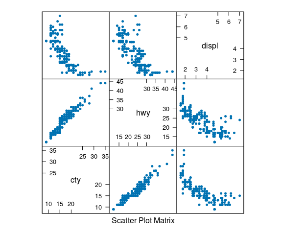
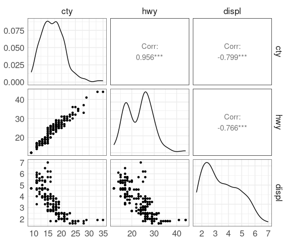
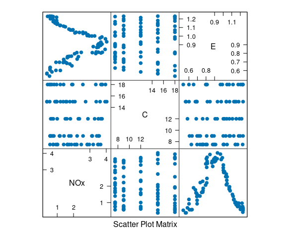
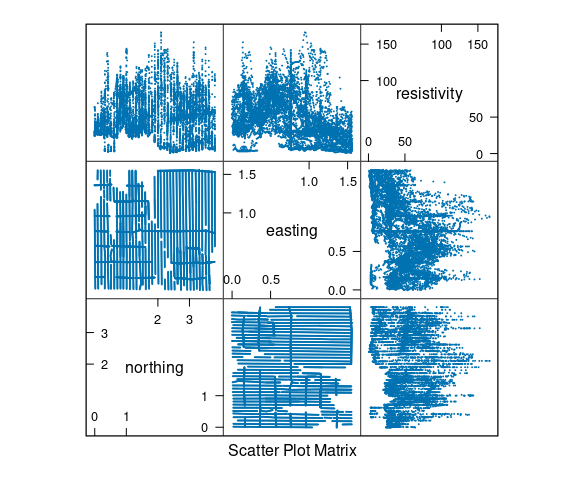
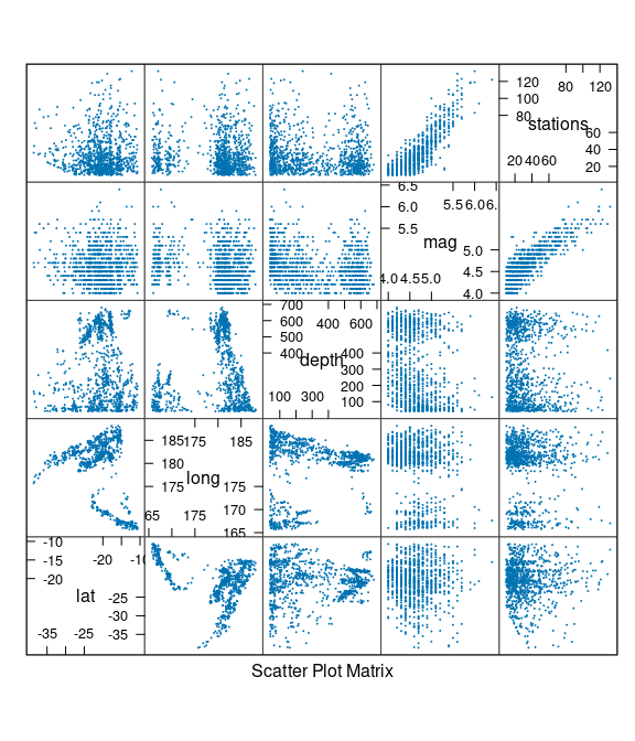
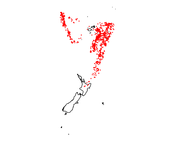
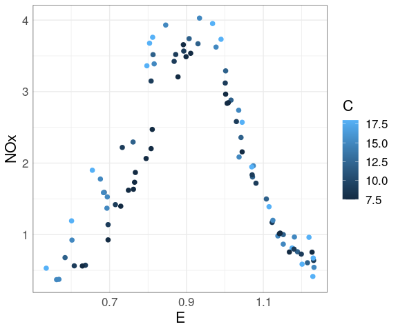
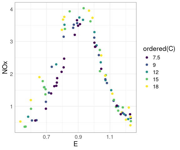
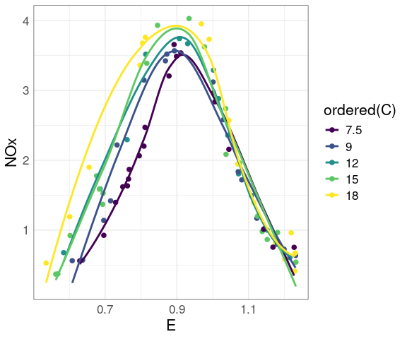 Some observations: