class: center, middle, title-slide .title[ # Perception and Visualization ] .author[ ### Luke Tierney ] .institute[ ### University of Iowa ] .date[ ### 2025-02-03 ] --- <link rel="stylesheet" href="stat4580.css" type="text/css" /> ## Some River Flow Data ``` r river <- scan("https://www.stat.uiowa.edu/~luke/data/river.dat") plot(river) ``` <img src="percep_files/figure-html/unnamed-chunk-1-1.png" style="display: block; margin: auto;" /> --- layout: true ## A Simple Model of Visual Perception --- The eyes acquire an image, which is processed through three stages of memory: -- * Iconic memory; -- * Working memory, or short-term memory; -- * Long-term memory. --- ### Iconic Memory The first processing stage of an image happens in iconic memory. -- * Images remain in iconic memory for less than a second. -- * Processing in iconic memory is massively parallel and automatic. -- * This is called _preattentive processing_. -- Preattentive processing is a fast recognition process. --- ### Working Memory Meaningful visual chunks are moved from iconic memory to short term memory. -- These chunks are used by conscious, or attentive, processing. -- Attentive processing often involves conscious comparisons or search. -- Short term memory is limited: -- * information is retained for only a few seconds; -- * only three or fours chunks can be held at a time. -- Chunks can be of varying size; a coherent pattern can form a single chunk even if it is quite large. -- If more chunks are needed or chunks are needed longer they need to be reacquired or retrieved from long term memory. --- ### Long Term Memory Long term visual memory is built up over a lifetime, though infrequently used visual chunks may become lost. -- Chunks processed repeatedly in working memory may be transferred to long term memory. -- Common patterns and contextual information can be retrieved from long term memory for attentive processing in working memory. --- ### Visual Design Implications Try to make as much use of preattentive features as possible. -- Recognize when preattentive features might mislead. -- For features that require attentive processing keep in mind that working memory is limited. --- layout: true ## Some Examples of Challenges --- ### Context Matters Which of the inner circles is larger, or are they the same size? <!-- http://junkcharts.typepad.com/junk_charts/2012/09/insufficiency-and-illusions.html --> .pull-left[ <img src="percep_files/figure-html/unnamed-chunk-2-1.png" style="display: block; margin: auto;" /> ] -- .pull-right[ <img src="percep_files/figure-html/unnamed-chunk-3-1.png" style="display: block; margin: auto;" /> ] --- Which of the lines is longer, or are they the same length? .pull-left[ <img src="percep_files/figure-html/unnamed-chunk-4-1.png" style="display: block; margin: auto;" /> ] -- .pull-left[ <img src="percep_files/figure-html/unnamed-chunk-5-1.png" style="display: block; margin: auto;" /> ] --- The sine Illusion: which of the bars are longer, or are they the same length? .hide-code[ ``` r x <- seq(0, 5 * pi, length.out = 100) w <- 0.5 plot(x, sin(x), ylim = c(-1, 1 + w), type = "n") segments(x0 = x, y0 = sin(x), y1 = sin(x) + w, lwd = 3) ``` <img src="percep_files/figure-html/unnamed-chunk-6-1.png" style="display: block; margin: auto;" /> ] <!-- http://vanseodesign.com/web-design/color-luminance/--> --- Which of the squares A and B is darker, or are they the same shade? .pull-left[ <img src="../img/chess1.png" width="440" style="display: block; margin: auto;" /> ] -- .pull-right[ <img src="../img/chess2.png" width="440" style="display: block; margin: auto;" /> ] --- name: some-optical-illusions ### Some Optical Illusions [R implementations](http://rpubs.com/kohske/R-de-illusion) of some optical illusions by Kohske Takahashi: <!-- Some also used in https://cran.r-project.org/web/packages/knitrBootstrap/vignettes/illusions.html First saw these in http://blog.revolutionanalytics.com/2012/12/create-optical-illusions-with-r.html --> Are these lines parallel? <img src="percep_files/figure-html/unnamed-chunk-9-1.png" style="display: block; margin: auto;" /> --- Again, are these lines parallel? <img src="percep_files/figure-html/unnamed-chunk-10-1.png" style="display: block; margin: auto;" /> --- [Scintillating grid illusion](https://psychology.fandom.com/wiki/Grid_illusion#Scintillating_grid_illusion): Black dots at the intersections appear and disappear; are they real? <!-- the circles need to be a little bigger than the lines --> <img src="percep_files/figure-html/unnamed-chunk-11-1.png" style="display: block; margin: auto;" /> --- [Hermann grid illusion](https://psychology.fandom.com/wiki/Grid_illusion#Hermann_grid_illusion): "Ghost-like" grey blobs at the intersections of white lines. <img src="percep_files/figure-html/unnamed-chunk-12-1.png" style="display: block; margin: auto;" /> --- Grid illusion in a cartogram: <!-- ## nolint start: line_length --> <!-- https://twitter.com/hrbrmstr/status/1281681469476413447 --> <img src="percep_files/figure-html/unnamed-chunk-13-1.png" width="60%" style="display: block; margin: auto;" /> <!-- ## nolint end --> --- A case where there are more dots than we can see at once: <!--https://twitter.com/teslaphx/status/1373436726727745537?s=11 --> <img src="../img/disappearing-dots.jpeg" width="40%" style="display: block; margin: auto;" /> --- Red from black and white: <!-- https://twitter.com/AkiyoshiKitaoka/status/1591784897282478080 --> <img src="../img/red_from_black_and_white.jpeg" width="50%" style="display: block; margin: auto;" /> --- Some illusions in pictures: .pull-left[ <!-- https://twitter.com/nxthompson/status/1357147968328118272?s=11 --> <div class="figure" style="text-align: center"> <img src="../img/man_in_snow.jpeg" alt="A man running into the snow" width="50%" /> <p class="caption">A man running into the snow</p> </div> ] -- .pull-right[ <!-- https://twitter.com/markysumm/status/1337725851799056386?s=11 --> <div class="figure" style="text-align: center"> <img src="../img/cookie-monster.jpeg" alt="Once you see Cookie Monster, you can’t unsee it" width="50%" /> <p class="caption">Once you see Cookie Monster, you can’t unsee it</p> </div> ] -- A large collection of optical illusions is available at <https://michaelbach.de/ot/index.html>. <!-- Other links to optical illusions can be found [here](https://onlinemasters.ohio.edu/masters-health-administration/health-brain-games-optical-illusions/). --> --- ### Motion .hide-code[ ``` r n <- 50 x <- 2 * (1 : n) y <- rep(2, n) lim <- c(min(x) + 0.1 * (max(x) - min(x)), max(x) - 0.1 * (max(x) - min(x))) v <- TRUE for (i in 1 : 2) { plot(x + v, y, xlim = lim) v <- ! v Sys.sleep(0.1) } ``` <img src="percep_files/figure-html/chunk-label.gif" style="display: block; margin: auto;" /> ] <!-- More motion illusions: https://twitter.com/AnneLaure_David/status/1513597990669271045 https://twitter.com/jagarikin/status/1531115731223339008 --> --- .pull-left[ <img src="../img/3dscatter_percep.gif" width="75%" style="display: block; margin: auto;" /> {{content}} ] -- Images contain no information about the direction of the rotation. {{content}} -- Your mind picks a direction. -- .pull-right[ .hide-code[ ``` r library(rgl) d <- data.frame(x = rnorm(1000), y = rnorm(1000), z = rnorm(1000)) points3d(d) par3d(FOV = 1) ## removes perspective distortion if (interactive()) play3d(spin3d(axis = c(0, 0, 1), rpm = 30), duration = 20) ``` <div id="rgl93955" style="width:432px;height:360px;" class="rglWebGL html-widget" role="img" aria-labelledby="rgl93955-aria"></div> <script type="application/json" data-for="rgl93955">{"x":{"material":{"color":"#000000","alpha":1,"lit":true,"ambient":"#000000","specular":"#FFFFFF","emission":"#000000","shininess":50,"smooth":true,"front":"filled","back":"filled","size":3,"lwd":1,"fog":true,"point_antialias":false,"line_antialias":false,"texture":null,"textype":"rgb","texmode":"modulate","texmipmap":false,"texminfilter":"linear","texmagfilter":"linear","texenvmap":false,"depth_mask":true,"depth_test":"less","isTransparent":false,"polygon_offset":[0,0],"margin":"","floating":false,"tag":"","blend":["src_alpha","one_minus_src_alpha"]},"rootSubscene":6,"objects":{"13":{"id":13,"type":"points","material":{"lit":false},"vertices":"0","colors":"1","centers":"2","ignoreExtent":false,"flags":34816},"10":{"id":10,"type":"light","vertices":[[0,0,1]],"colors":[[1,1,1,1],[1,1,1,1],[1,1,1,1]],"viewpoint":true,"finite":false},"12":{"id":12,"type":"background","material":{"lit":false,"back":"lines"},"colors":"3","centers":"4","sphere":false,"fogtype":"none","fogscale":1,"flags":32768},"6":{"id":6,"type":"subscene","par3d":{"antialias":8,"FOV":1,"ignoreExtent":false,"listeners":6,"mouseMode":{"none":"none","left":"trackball","right":"zoom","middle":"fov","wheel":"pull"},"observer":[0,0,617.0742797851562],"modelMatrix":[[1,0,0,-0.2762038707733154],[0,0.3420201539993286,0.9396926164627075,0.1885383278131485],[0,-0.9396926164627075,0.3420201539993286,-617.0299682617188],[0,0,0,1]],"projMatrix":[[114.5886535644531,0,0,0],[0,114.5886535644531,0,0],[0,0,-114.5930557250977,-70707.0390625],[0,0,-1,0]],"skipRedraw":false,"userMatrix":[[1,0,0,0],[0,0.3420201433256682,0.9396926207859085,0],[0,-0.9396926207859085,0.3420201433256682,0],[0,0,0,1]],"userProjection":[[1,0,0,0],[0,1,0,0],[0,0,1,0],[0,0,0,1]],"scale":[1,1,1],"viewport":{"x":0,"y":0,"width":1,"height":1},"zoom":1,"bbox":[-2.77832555770874,3.330733299255371,-3.334675312042236,3.289022207260132,-3.141716003417969,2.757055759429932],"windowRect":[0,0,256,256],"family":"sans","font":1,"cex":1,"useFreeType":true,"fontname":"NULL","maxClipPlanes":2147483647,"glVersion":"NA","activeSubscene":0},"embeddings":{"viewport":"replace","projection":"replace","model":"replace","mouse":"replace"},"objects":[12,13,10],"subscenes":[],"flags":35072}},"crosstalk":{"key":[],"group":[],"id":[],"options":[]},"width":432,"height":360,"buffer":{"accessors":[{"bufferView":0,"componentType":5126,"count":1000,"type":"VEC3"},{"bufferView":1,"componentType":5121,"count":1,"type":"VEC4"},{"bufferView":2,"componentType":5126,"count":1000,"type":"VEC3"},{"bufferView":3,"componentType":5121,"count":1,"type":"VEC4"},{"bufferView":4,"componentType":5121,"count":1,"type":"VEC3"}],"bufferViews":[{"buffer":0,"byteLength":12000,"byteOffset":0},{"buffer":0,"byteLength":4,"byteOffset":12000},{"buffer":0,"byteLength":12000,"byteOffset":12004},{"buffer":0,"byteLength":4,"byteOffset":24004},{"buffer":0,"byteLength":3,"byteOffset":24008}],"buffers":[{"byteLength":24011,"bytes":"kZ81P0vDoj2uwYk/a9rfvdU+W7+kkBO/yDDovvNdR7/Kn4w/cRsbPw4Kw77GI7Q/yLLov6Pc\n8r/DJBY9I04hP6H8kr33QvY/AWiNvl/zg790pKC/Y32RvrOyKz9mOZm/sFhrv7X6uL6BUL+/\nVBPuvT4Bj755gDY/rp3oPxNZJb+ehAy/78K9PtIGBL+iMMg86CwFP3Xxr7+aL9y+3SJAvxBU\ngT92JGW/WSBRPzZM6D6JfKM/VOhivx29jD7smrO9isSpvg7Kor/uJx3Ag3OPP4o9eT/ifmU/\nUPKYPtXwoz8SXUE/TZVHPw7707y5E4o+Kle6PxA03r+CgJQ/tfIkvwz3cb/FsWs+Nc3Gv+AX\n7L5LbQ5Av4HMv7o/Dz8E0V2/bw3nPz9ZVD7OeT8/fJr2vngQzT61IKS+NtEeP/KSUr2en1S/\nILQcP5MvUz/pNHo+2TQmvurK1r87GpW/7NZPPwpcbL/4Ade87JgMQIlOKL9ZuaW/7yUDQCLV\n0z+YCUM++/PQP6H7lL/9twA/1S+CPoAPYb/1z1A/CH37PvUAZj7giZS/re6lvpXUtT8vj+A+\nEL7Uv1c8AD9QVfO+GkXiPzDVkT7HhiQ9uVzTPJh3OL/BVmo/C3OQP3d+ZT+mHbE+yVcYwBpb\nt78+19K/yLaHv9SgxT50o6q9cehvP+opjr9uC7W+Wb1aP4yhmr3+Mmk/Lvm6P3+Qsb9ONX2/\nbOC0v0WnjD592yC/V0ERPxrbCz9XxT8/yUsVPxsCCr96Trm/L0Wnvz+267+jICa/vlYKv2BQ\nSr/0A44//k35P20KjL/H7SPAeYFbPb5p7T5YV2O/Jw20PsJXiTy5B5E/HsUrvxG2Nj+pZCE/\n8k+OPjXVvj6uTxe/mvAwP6mkIb/RVKy/QORSP129sL4hfAk/v0gJQAFIb75jY9k+VTQWwP/F\nGcAb4eW+pC4ZPs1MV7/4jIy+Etirv0CMBr/+QDg+RaUNPwP1dj+Nduc+54PLP5CXlT+CFS4/\nvj0Wv3u0GT2/BCC/V4vqvxKch786nDc/G11jP10TUL41/Zy+bvfLPzVjhb7XqGs/llAEP7t1\nwL+w5hPAktilv5iEmL8W5bA+lbRfPbRAHUCABIO+yN5Iv5vwtb/xenk/MVGGv47Ylb+h3kw/\nHCcVQMzbHD/tevK+2ouzP+wKAT97l3W/Sk5xP2CkCb3iRX2/qoVTP0qtiD8P/gTAHsFPv3PM\nir97a1E/0dbzPlvVED/m/lA/mLiCP8Zbjb5yuGe/0zclP6hhU7+Gnhc/uoWFPzD++j6n7DY/\nRdabvjExbb9d1rA//IgeQFsgzT8r+fi+66F4P1tjXL8Sp6w+G/3uP44ku760RyW/+gosPwB8\nz7tgD7c/Eaydvp5aGMC0+J0+nlkJPziqwj8j0I4+rypTP+ixHr9rxWk+P8J2v6PS976SJv+/\nsOZav+MYbb/WBcC/eofxP9hkkr6H0Sa/jJzIvuE8yz/Fo92/wwp7vw+6KD8IK+Q+//QvP/hn\nmj8yK6o/iEoBv4lny7xyrRG+FRgKQAmTZ7+S2Ai+VYwZvx/M5L7y4rW90M0xv3IWAD6fg84/\ntExlPqj0kj9Atjg/IP+Tv4/36D4sDYY/PkfYPpJnAUD0tiE/lZGpvz39Mb/K+Oy+aHgQPrxO\nzT8kTv++cToJv78ErT+ek+k/1Yqfvg8I4T7hnhU/mi7HP+YqyT+ehiM+n2TlvmPh3r9RLAm/\nTmqkPjL0vb+kmvs+SXadv7gjDr9uDNW/wXqpv8Tmrb9E/42/Y3ChPyNIqb1X7gS+ltyoP7lq\nt76g+fu+OmKlvdQBpb9LJBe/kU0Bv414dz/bvRK/Ap9Vvf9F174OnsE/A/0gPxU5Rz+XLQG/\nKYULQCnIEz9LWtI/8liNvRsfy74AMng/F77FPzFbx7/jpnE/VyWpP3ZkDL/eMu++DfGkPnR5\nXj4ULwPAVvbDP8TJaT+5Zd4/u6zXvvquxj+eiI8+P1SUvxtSoj9he6w/BzXsv62pQj9AIwA/\nPCOUPwzAKD8Yays/PugHwN5rJz+d2tS+kBeZvzsqxz+VnmK/WTPSPwVO1T4lZKe+NDdiPzvQ\n5TylXCQ/RF4GP69sF8DbbyS/6aKXv5LJCz8X6wK/b/gpQIBVsr1vtSC/CSKGv27fvD4d5rA/\ndmyBv1FguL95v2Y/cz4rP47Gcj8S2hK9DUcEPhCtz79XbIG//1vYvnAFtr8EGxu/LfSRv5bF\nDMBV0Fg9dpilv4tk0T1IbnI+Lj4Yv4u42b9ou42/rRrAv99y1T+xNZi/zOOBPGu9Jj90H32/\njkgKP3BBxD++BUO+qg3Gv2PJ6LtHoDW/24JZP5P3gz2D0RXAH2FlP59ttj+U5BE/AwUOPvdI\njD9gl+E8J0bPv3qd/b11SQ5AzmMMP0UvGr/fVIC/DPhHPk1OjL8BBjs+p3ZOv1Rin76otxk/\nYnbevZxXMz62nh4/E3yAvinjBz/MMIg/MYTZP4oKaD9HSdi/70ewvjWAPz3rGHe9FMyKPeI6\nPT5AFDu/vYsmv3VIAb+GboE+wav5vh2diz9wBYS+pDabPj/zPb6F89E+Csh3vipe8b6UfKu/\nyKX2vkYUIj+euK4/y+Z9v+VTi75KqWg/PrGPvnz3Sj8olVo+bQ0iP3Wdhj/lMWm/XrKevxZo\n7z7g8H8/C9XhP/jzyT8rR/O/U/zBvG+mmD83k/0+9bdMPjsUMD9UoQy/0HCsP4NiCr9FRyi/\ny8ETPRBiMT/mr3E/wBdTPylrDMD6n2q/J/HZv288dL+Hwgg+GT/2Pk+MD77/95C/fPIeQB/7\nuz7eIK++tn/NPmzLZD3ogn+/Z1dcPipM7T8KOh4/Q2nov/jinT+ZaHs+wWdpv1lIxL/J64A/\nFuNIvQhLkD2KK3e9847PvlbpHz/oq5w/WrCQP5hbZb5auLy8TMJQP6TMsz7jiQLAyoCcPVVG\n+j0BQLC/ZRS6P/ja5r9lypS+zIy/PgAxgD+2CTY/eQEvvgmAmT9pgro/BZEAv1KHtr8XXxI/\nRCQLP1W8k79Hlgo/31MBv5uUSD6RFLc/c2tJP4xi+j4a++K/ChaaPkz+9rxCs1E/a7WnP7ES\nJj7HUpa/KGZMP2cc2j0GXps//dFZP9qmlr8oaXW/VxvjvsQ2bz//D5A9qr/kvg8N2D5PGpS/\nZP1ZPNrFAL9HCQg/n9O3v8snib4kfai+KRchvxvybz/pTmu+xV15Pk9cCz1Ijvs7aniHP6P+\neD5gboS+R9NUP2Nkkj/hBSg/S3nXPeDQUz9R9LA9dPDev680sj6rhlA/6C4lPwUtw75Sews/\nlN7GPXg+rj82RqI/jiadvd2yYr88cCa/e/B9P+ooxz7Oj5A/3Pdbvznl0j6/To6/NyuQvuS8\nNT9yKVq/ZT0EQIxbqL+C7DG/vI4cvz26xL/6sV2/AZihPmxgJb9V2VQ//QgpP/34d7+OKpG/\nIXHcv1PZhb9iQhE/t50IwHE6B74tXvC+WjONPdoNDj5P94w+kSlePxIOzr+48QM9FZASwPgV\neT/LSUI/fMsZvs1Bhj9T4o4+xJ2JvnZC7b1KUHi+XkrlP58uaT+LTyY9whksPwv1A0D5NSS/\nCVNWvjHNRj+i5HW/IplHPFwPP77EJF8/8V3EP7aIAr9Yjz2/LEuePb3NNj/t5Jq+26OgPYCD\nhL/slJq/p31Hv2qK8j/IioK/no4qPtefaD3ovAbAn9iHPmOx2b9LB58/NApkPzbJhL1e+80/\nEI/vvg2mZD9vssc+1iRCP5Fjc77UrLm/1Ugkv24/Yr9Yfk+/Gq8gP0dGib6BvMc/QUp+Pp5r\ntr/gEUnAKzgzv+vBkD5qgKA+O0ERv4vLIr79dNq/bdWFvrptEL6fIgm/Yy2IvxLBxT4PpN4+\nz9fZvRid8r7nDKO+DmdFP5FIlz9M7RZAdtUvQIisWL8QWj+//OWrvYKkbL7euUM/QCcLP29f\nxb8cNhI+g7tAP53tAL7pfyC/RQVPv+A7ZD8EuLC/siSAPyptNT+CueC/t3/pPjXIrj9pv/e/\nhJW3v753Fj7NjgfACNaHvnDODD3DdwS//EokP3HqrD8UGzK/o33UvgbFur7hCGC/gU3rvtIq\nUr831zY+4+BKvxkZ5b5VQRtAA0uUv+lQjz+U9uA+4/w1P0tOVj45Noi+xkCiP6tsFT/KQui/\nMZYSvhWjL78PRk8+79gDv+Vdgr80OTW/Yc+9P5k/kb9v1GY/tX0mvs6f6r5+G4g+PdcqPV4M\nXj+Cxn29AVH3PjsBNT+8aM+8aA6Xv6xyYT7ccia/+N8pv/Jroj47Uuq+angivz3BE8BxKLe+\n2bMzv9GdQ7+Q5/Y+d6wTP7uxg74uXLE9tTwHwM77lT/XmYK/9JWFPkQ2Jb9vRwfAENWSPyIx\n5b9DaPM+D2FyPGk2ir9HCls/SZyfvh7mNj80VgA/Rcl0v5MO6L+wCxm9SmPyPmYqhj8OjUs6\nTMbBv8CUTz7ptRM+RzkoPu/6jz4c5OW+BvFev3oahD8gRw8/NPLLP+jOEkCZ0ynAaoclP3O2\ncr1XTkU9Kfm2PjOj0j4PaKQ/dLPRPTG+o7+2Uey+Sd4sv3Ne2r7wc809kNp4P9CWWT/4ho6/\nsYBBPyPJ5r9kVda8QUjbvrA0eL+s70e/xsM2v3FJ0z/+b7U/CvRCvid8Kj/g1tq+FbvMPgXk\nuD49R/8+C1R6v8PA+b6re4U+hyU8PjvVtj/ZgRTAsJ4JwBp9Z7+2JKM+vHofvxT/BcB7T8w/\n1fNDvyfzaz+anOw+97ntPsis7L9FZgI+SbQFP2V31L/KzYI9AnYgPBd/jb4eJqQ9pozhvjsU\nVL+SFxe94IiZP1iiL795WQw+UpPwvSwQi77IA84/3oEcPS81nz9qTXC/ZO+YP2ImML7B2I69\nTxuwPnH5IsC5dno6QXyovhUA0j94wyi/rN7VP3BheD/GWs6/3QVrv9hbpjwRuX2+VNSzvYCw\nKcCS2oS+Yv+oP3QUjz+idWc/ZordP3OvUb/0PHS/+WcKQLIu2j+873q+sKehvieQWT9+xHy+\ngDkTvyMYCz+vgOw+fQO0v26FZT3jhT6/niQRQCPCyj+pzwC/r1ZFvy0luL+YxVk/vbjCPpnE\nI78wR8+/PuoaPxiysT1abhs+r4SCP+AB7z5nU2K+vCvzPiqi1T46eAc/jOYLwP6eGz+MqBnA\nr+VuP6x3jz6ViTU/RmzzPvCPlr8GrdM+/dLHPnKppb8uwlU+LTI6v/sxo760Yx8/7o58Px+K\nWD8V6Xi+GEW2P7bVcT1t7EO/mS74PiBjjz5p/Ss+H8+yPtcqVr/NczI/GjFcP/NNJz+XMKg+\nMSnPPu0MZ7+jNmC9UO27PlUVAsCFTGe/HXXCvwnkqz+Mmw0/9V/GP439y70pTUI/afD/PqUH\nqb8F1Bu/h/frPnvl+j4faci+0egEQHFMDL7om0K/YISdvmFrXr3ZixU/lM5zPxYMJb9uzNk7\n0GQIP04MpzxjAgS/hK7DvY54ir4e5z8/EHkRvnPI8b4M4jA+Y22Xv6zPCMBlve8//ZkLP2tT\nxz21YO4+Hz0lwFs3wr4+eQ4//mVHP4hO3j5/7eq+RfyVPmfh7L2cmgm96pOxvapEpr+ppG0/\nq7G7v55Eub8SToA+oKWKv1dp8T3gvqm+8GOHP/uXNr/xhRe/+Hu4vqZUwb+LoaC/B4GzPhBA\nlb6nNyZAmnznPOYCZL/EU4A+YjPyPmh7L78+Ope/uU1rv+/ugr3Bstk97mvAvp4Qir7pMgq/\n8Arov1JrVcAIAVq+aMOTPiOQhj+RAFm9bCxCviFApT/r9MC+lU+SPPJ+nj9ktXo+mYImP3lp\n879O+0G8vtmePnqm4r7FK5S+uozVP7Benj9C18s/dzAsP7nWDb1Bk/i91haOvt/cXj8xz/8+\n8YcVvoferb8j8iI+hcjZP+grXD6kzt8+0lXxPrXt5T5iokY/TOoUP84rmj+leD0/VYAqPzXC\nlD8YRa2/I2ZHv1JvQz47Hrk91OeUP7EnD78yYQLAL3b7v8Sdl78uohc/XuhEP+Ja570SLZ8+\nG6AQQFy+gz9VM5k/CV30vtsFML97F8u/uxXSvSfrsr4JJX2/v8W8PiozF75GdGg/IxIJvyik\n2j4WPya/qrABPwhVvr/dcfe+pCsavlACDz+Higk/gXxnPxkXcb4OwQO/hX0PQCT6XD6DZxg/\nyfmYvzbukr1RXJ6/l0jWvuhZ07/FUnO/NFpMP9K5O7+Hb58/bBD/Plc997r62Fe//tv0PfFM\nMz9r0tm+/wG8vpUsST8fO1m/Q1CGPrApg7/5in08KIGGPlSJv74UB5m9dwckP8dfPr9lgPI+\n4TqdPq+5LL/l/CQ/srIHvVEkLb9OeWo/0/evv09Aeb8k4FS/UsIgPwm6Q789CDu+h4EMO5as\nej8CLLK/9ZmRPiZAlj+7TzU/TDqAvxL1rz9CgEE+QgIev1XzmT9slV6+igRUP+vE3DwttZI9\nZrWtvSgVNj+FdAk+nJPevmJLu739AR0+CziavyZV770uT2u/3qWCv9oZkL+Czdu+eqJ4v0/n\nkT9b1MU/ecYkvm9C676lzV8/LzOaP7ewa7+o1t89PrKIPdGcm75CD4U/v+hhvwsOiT5tTWa/\nuC6jvBnkoL/+A0G+x/GnPnzIxj93bjI/rT1uv1d/UkAJmI+/NdKQv8Ugtz/AQb8/mQmLP1GT\nsz8Mhu2+X6UDP6SyqTxTIhc/KhqWPnFtnD8h1Rg/JgoQvxC9E7+6XQRAOR1UPrxOUz/dPNi/\npDGdPz4DxD7rgT4/nCrcvsIXm7+vkHe++XuqP87ijj/opi++emVDvzxpUb/tJpA+oLydP1PF\n476F2ho/ResbP7k7WD8jzj2+/ZFSv7mFcz+aiho/7CpDvVXGXL+gehdAN8YuPvO8HD/TwcG/\nI8+cvwAV172Q/fi/f1DGPpD2QL/ff46+zzj7PiNgMcCUoK4/100PQJEFyr2fwOy+B2hkPzDO\nXL/yFJi/2YZMP7M0Qzxo0AY/l7z3P0FfaT70QdI+H9vJPgk/QT+jntA/7uwhPydEVz7w96S/\nSRvSPQJRJ7+Jtzc+mE6BP5rygD6yfnQ/lXqbPyDQ1L6G/MC/DzkAP9ihRL4S+94/5NJovzjq\nBz7dvYi/EJ8MwKRYej4Ijx4/A4ngPkwGpz8Eg7o+3cODv0vTcL+0mJA/SYw2P44fqz89ymS+\nTp6DP8//6j96hje+/BQSvxI1NL+D6N4/Yzbevvi5+r7ESaA+Pq6AP7m7XL95El0/wg2aP1e3\nLT9toHk+6oK/P8cxr7868Qw/V1sgvrHQjT+8adU+sp9vvxhtQL+/rky/8n+0Pn1hXL/URqS/\n1KGkvxjNDD9SoCs/HoiLvvSq/r5q38a+SK4gPqvylD5TPZq9fb5hv+0O3z8OLsW+kaX5vVM0\nLz49b7e/tfFavw5H1T+pmhQ/uLuAv4Wfjz4apZG/yfhpv3qSqj8dDIq+yAEFwCzmTj944ey+\nzQUQvgr0yT5E0Va/h1qmP98mmb+cHdU/zZbwvOS/g792TVQ/0CQPwCMUPsDQNw++F4cLP0VO\nGD65Q+m+EbJUP68LlL6FA78+ssL+vuy/1T511cG+79wZv9Wkn705IqQ/ZR8Dv+0QLj9YZ2s/\nzZ+hu8CcGj4Kjnw/fPXGvWKQVr+bwaG+4uXEvHOb6j/vMXG+nXICvtDZmr81UTi/Bg0HvtI6\nwT75tBvA6FDoPlUmir8RiOC+0AK0v1wiWDwE4FQ/Pf5XPhImxb3XLc+9GZlAP4wEAL+uQzi+\nXrMNPlhfjz/wfLi+KIMjPgkXOb+LDCu/8+ppPlQgHTw7Qrm+GdaUvyjrIL99lXU+58paPzUj\nAb8O3TG/++d3vkMVsL0da1A/EgYBwNMpUL46ytq+sidpvg8uQ0A1KtO+x4xlPuuPfL9unV89\nj6A8v7Ivlj87rLy+CcJYv2Rzoz7iOm8/i0TkvRb/Br/M+m6/QYqfvlxWkT7RQ84+LM21v0HQ\nMr7Edmm/U+IdwImtK78IkRo/rSz4PqfmAT+2+lo+9B5wv+2rnz/xubC/vCpVQH7Hn7+sqky/\nLdsmvtyk978XXwQ/Kb9hPn6MQ7+wWRM9Wk9gP9iqtj+yJ8K+nIgJwBnUhr5fMBO/hFxvvlAM\nFj9VrT0/nc7/v6+6gj/nZ5C/SQ2ev6u13z8DhUa/XKdYP1y9gj/0rRQ8WnE+vQlEiD2PBZ6/\nRKrOPi+Wnr6vJpu+6XdEP9h4CMAgtKK+XfpdPxwPpb4Kpc+/HZagv5teAT9LmJG/zJUhvgCH\ng7/FOHm+MScDv6yXlD/mscU/eXfTPte9LT+3tJw+GXMQP60sE7/PD6Q+dd85P/fiNz1MLTm/\nR4jUvq7rqD55hl8/znQqPT8qor4oTdk+0axlProvDT/oOKA/HFJJP41JCr8DQYg/BMPYvut/\nAz4fEWU/aS28vtpQ4z/W4ke/uS3iv9E2X7+hcVk+WvE7vofAPr+HavQ+LLpVP6L9kz8i7tg+\nxlIWv+km/j1cfqy//cW3vmm+Zj/X4Kq+400HQHSflT11GaY/qTklP+MY9L6KDVW+Z+ifvulX\nYD97OTs/xbyXP8TRzr1o8zw7xcUNP0Lc9b/LDn6/Fy1cvX2Usz9ulXY/WygIQGFGBMCdwTY/\nITZAvrEBqL7lhO89jkHKPdNBxr80jVo+RYf0P94xcj5iPrE/3IvPP7W/NL7P84s90/QFQIpg\nYz9qdgA/YDYxv8D8CcDwJsE/dGESwHDGLD+d3VQ+werTv9cboj8SGJE/X8sRP+vgtz4iHwS/\nFkTxvvkfhT9MFh+/3wYIvZI+ET+QH6E/QjbBPn/zO79c7xHAGjCUPzyRuL99mZs+9wazP/YN\ni78fGJk/kpUHQNmtgL/WxJe94zGLv1Oo27643em++6abP1HFkzy72CS8o14tP6TcKr9wje69\n1vM5vyfddz9QLga/uRrnPQYOsj+aczBAso6FPdrORr5xfJE/yXAhv+Fy+r5ooNm9ttMEP18o\nBr90RgFAxY1Nv+g2Cb+z3I8/3H4uvwZlkb+rIGC/8DcYvfUWj7+xaqm/nhWTvtDIn7/o13y+\n3FSDvzUOar9cRuS/b/2yP7axOz9gxQtAVTFWP+Nl4j/jZwi9Kuiovr/mnjyqlQ0/zegIPyAS\nrbx2SJy/Roeav6DyUr5ORL4+5fYgP7HHg78bvaQ/iH8TPwx+2b812Zm/ljyeP0UQLL+Iu4e/\n7nnzPm+Y6T9BQmo+7gjGvzlpw7+aaVQ/QDNjPbeKHD/jWcm+jRguPyHhir51dBa/aNOsv2vD\nqr+NDrY/I/x6PuobFkDFcPi+ylydvsH+nT9nHeO/tTo7Pxk1wz+Qptc+CDdOPozDFD81ark/\nxKjJv0QcF8C2Vec+ZdTAPF1gnb2FH+w+WjhNP9CxsD8MmKw/Zo8jwOe+uzpJNeY+nuMGv5Hn\nx76STyo/wwuovwAY3T41fQVAQAVNP+hFIT+kKs0+xo02P96Ry7+JsGO/yRWEPyZ9Fj8wgbQ+\ngEXXP7R7lz7z0Za/6r1nvq0UUr8+EBq/6K1KvrLksj46SDM/CZiFPzlasL92Yzs8Zivivokf\nXb9J954/EH3Rv3h8Pz8usDc/3aNYPv1Ppz8cYWq8bf7tvgB8Fr+LBBa+PpApvx4Zkb997YC9\n/SQIvj0XSL+IerS+hi2pvz6mij/DwuS8GxGdPYx26z5cVqI/hh3FvjzP+r45+GO+rYJyP/yi\nmj1BM94/aaexPEUL9j96JrG+g6Xqvpa+Aj779sC+11pqPq/cjz/rwrY/fL2yvygDnT8DXrm/\ni55sPywEhD9X9tK/R5yHPTYiiz32FYY/QYpNP8Q4f78VVXi/Vul3vcx8lb87zOy+7PG2PcVk\nGr8MKzA+r3jNPiB3Oj8AQ92/tXhjvzPUHb+fM6e9Yn65P3Zahr7Aj1m/VnFSPuYSor+vpMQ/\nDd5lvcYaZ7/EDzc/1M0jvwKZFT4ivYq/f8A3P31Rqz/jQ5g+uxiEvTi4Kj9afR4/oJsHPsRm\nIr/ohZS/aDEOPau4mj8GZFw/xjSQPpzCbj8h9c6/0lVrP/I/Kj+XqDS/9HeFv249O748WsM/\n579avnhmF79uYZS9xZPjP1NhTr/4fgs/HAC7P+/pVr4Tkqk/aKa6vgSBtL7f+S+/Ffgcv17/\n5D00GRc/fuf9PrGk6b1iPW+/roh7PrBOzz2PXru+evkCvmTWVD4ybcm/Zg6gv2d+YT6bE6I9\najLRP0wRhL/OM9C+KbZ5Pwxwqb4Jlsy+EcOKP4moor582BS/nAG4vtHPxj5jEES/jPyBvy2M\nRr8reYm/XvKqP5t0Mb7G+Bu+uEsfvl3PLEC0NHk/NzZtPzgD7T+QA56/m6VjP2aMTD//0fk+\njJkUPjxwErxFZU+/05JRv96P6L1QEvC+NlCevynR4792m20/bU0UQEM0Ir5MaR8/S8RPPS5v\njj9M67K+ZOiUPgeR9T9wZn+/WNjnvyeDzr+y1Ha/M5SSv4xYvj6BoMc/pPOjP8xmbL8s6Dy/\nHQOuv3J2E8BVRRA/uUbxP/Ojjb54T9E/Vi6vv7SLCb+CxLG/rj8LP1NGir1vOMY/xneevxqB\n079Vr1M+30XwPwtRsj8FUXq9ThC5v3mCrb4IfxXAWAwdvplEmr2yX9E9phhyv3/rM78RTdq+\njPOfPoGqqz8IUhC/rKiMPuzXcr5UDtq9qIGhvtPGoj7Eri6+1MvEvs1C2L55btQ+Xue2v5EK\nor8W3/k+i6J2P5vOrb1xQJW/yyAdPy+t/j7VLQG/K7O8vi9d1j9rOcW/PU3nv0ntYD+sOJg9\nAn+tP4fIh75UGq4/MTDkPgTmvL7yxO8+978oPuM3Qj3Gj3Q+75P1PHkXa78C3xe/vBUtvzOM\nP78sNaQ/E2qRP02PyD94EMQ8VtYKQJFHLb8LrhQ//GSLv4L40b9fFLQ8ISaNvxA7C7++Mb8/\nyLymP0rvTD8X19W/FtAxwC/TMb/da+G+ZMCuPkfwm7+cSLw+POpkvg/+8b6/C1++yIpLvkTY\nmz9nyR2/EBDRPw/cnD/EGZa/wk/vvxxRCL91TmO/pQuAvqDvzL8zqpY+C3Wvv0rfM8Ccrp8/\n88K5P4nz/D3jOEU+hNMIwC3CH76SzKQ/YccTv0grBT8mJoq/zh9yPmclZb9/NhC+GsiMP4oT\nrD9HX7k/ObAPP2Easb5dqFy/oG4TQKGH8bxmf4Y/XFYBQP15pz96CpO9BxJtve8r/T+cE+89\nEFriPgIGFMB2VXo/jtOmvxkRBT6SCYS/TEMQvbljIMCJvgxA7ptsPzffK7+LZbm/fr64vsuf\ner5KF+k+QjHvPokVUb+GIIw/CRFOviui+z4JrB2/xDivu5v65b2G1UC+53IIvxfdZz7wNBg/\nP/IDv9bvF79bYxQ+xeWtve3UKj0i4V2/qDLfPhB8fr/Cb2Y/7nl/P1ianL+pRcM/Y+OUv6uv\nrj+OQTC/hyfXPx3iCL9bSYU7m8qbP+NMET/3LXs/ZMfgvPIR3j82Dxk/d0WVvnr3dL8XQiK/\nI/54P4RjCT9CRMK+rnV1vmWcOT+ZMLS/+NZmvzpsej3qftw/pJQhv6Q6kjvO8TQ/9B/Qv1Ig\n+j7WOqS/V5EJwKpLET9+6Kg9TDUHQD2Fjb2bTZU/6cSJPvmugL39uf2+IfwEv8cIMj/+SBK/\nheWAvFiB1b/rlZS/DOIavvlbTz9nP5K/pLK0PSxXxT7zGRS/KGZHP04kMb8BMoU/LwDGPhIJ\n474WtFu/9SayPjRMsT/2f8I/KCXzv+alUj+KU/0+ZkRsvWHqFz+Mtui+407xvkW3175Yhm+/\nwH0iP/VWhbxIIGm/TPN1v9GljD+dKoO//AhOv3/5oz/mJSs/vOz9vqnfgr+mYfs+nkLWvhK1\nlL9u59Y+EK0nv1pq3r9u2Jm+TZ+yPyOC7T6oh42/IP9FQBW1+jxiqty/QU7zP0BUBD9BOGS+\nQGfKvkgo3T71aMk/IDIWv8sx8T0gT14+g2zsPrGCsT8pdDo/sRXHPWnIpz8S5yc9AxAtPwW/\ne75lk4o+ba8/vzB32T68IYS/TkWDP4HTNj5X2qE/E1Qyv1913z1Bvg2+LXmjv2y4sL4vW3e/\np0i9vQ1cjr9lzTE+sHnsP/CNED+dmza9MvxtvyvbVD7ggkq/QvGDv7pzob5CZEi/2eWov8e1\n0D/5c82+CnSsvfCeGr/mZ/6/dB5GP9slBDw/bOk+P8kjvlhlFD0tqwy9uQFdP7veXr67H9U/\nsSh4P4mRVj+nBJ6/kDcdP0MN7z/0SUM8g80fQNeQrL8PBdA/uN+TP5Xn9z8KbtG/y/vvPyjs\naD9qmcK+Q0Jzvolp77+IJoa9uNLnvupTEz6iilE+B303v/canb7anwY/mFX6PgbmvT+1zj8/\nPI5VP36Her/PoyM/egVtPydGXb9+7tm/nnJxPz5eXb8A32U/CmEPv+J6rz/AeKI/Dw0wPzIx\nQD4MqQM/6hlhPkuNMcB7kq2+nquAvyEmkzy2ojs/Hge/Pm8AyL9x/vu+F1TwPgisJz8StUG+\nrVqEPQBqFkDYTQs/y52APyFoD7+FkTO/kma/vtzf0D0/WJA+z6RvP3QMSD6FScA+LFFYP+Hp\ngz6yo5K/OdyLP4Iq9b6s47E/LRYhP20CCD6Q+vS+GsSEPwp8B7/zPQu/w+BeP/Gd4j6Z8Xs+\n1p0gv/Z/MD/AaHE83xffPrGbQ7++L6c+GCd1PvLssj2+hsg+jcigv21xtD/a9YE/ge9kPkgP\nkr8PNum+zSwBP7/U0r8ecc8/K30HQHESSMBuxcW/KkdRv4H2lz8xIWQ/jT9/vjijtr7njWk/\nKQ7tPqEqmz/pDJK959UqP+OmMb+P4ZE/Z/H5Pm2TrT9vBQO/V8qJPwLeZz/cz4S/IByTP/YL\ncb9SEKE/vKHPv0R6I7+wW6q9CiqQP66L9z6V+Aq9QiYXP049Qj9c+d0/+pY9v9Bc2j7G21W/\npEGBPqbbuD5wa4U++IqsvqpOAT/eSDW/ubJyP4u3KT+nJwg/uQwpv8hqmr+yN1m/ndwuP3P5\nnbwLx4u+wougPQej3r4yTmU/0IoIP39ehD9MfII+ciZgPx75PT7gbIc/vNUNPkaIeb/B8bO9\nKbBwP7Q06D8yTx6/vuYpv2xunr+fxL8+VKhXvzopd7+iljQ+tVEXQMb0VL+nhgTAdJsGvTi0\nMEAMegZAkoImP5zmhj6AslI/F8kyv5aZI794tu6+FQDgvlmIBL7lk8A+HRY4vxyMJ74uHT8/\nYsuMvps2nL5H9tY/Z5xlP2uMpL5KS/q8O8Yjv2ePW7/Yhze+AOubvXqJ174X0Je/CENZP3Qr\ni7/q9EO/kvcdPwJrkT921bq/rYb+vyXIfDw7ACq/OrAhP1v+Ur9RwJG+wdn4v/ltYD9oltQ+\ngGr0Pl9ptr7AeIW/bK3jP+tFoj9aLcc87UxjP8TpAz66GhO/ezSNv4cNor4C7BA+zvKavvOM\nwb/uEOi/nnNVP6Zm1T9VztE+vzUawEhI0L/7Yj6/zdCDPthMBD26Owu/iB4LwJsJnr7AnEe/\nml3WPMTR0r/DXDM/cuoSv08hU79/Ar28edyNPphTbb5rEgPAUhGHPspjtL9rvNE/hbNjP3CZ\n+r7271U/8RwIv9NEHz/Mnia+p+eTvs675L72TiM/UMAUQLCZob7R7ZE/DBlOP7d3Rb/BT7S/\nQiJTv6shKb8lY/w9my8dP04PJD44dM2/jKDKOykAQr+XZJQ7lKcBP9VnsT+ouLq+rqSEv0pc\njj7ylY4+RbkDwHUInr/ey6+/iYOXvzIvuj749vi/k5kFv4Yeiz/oWNM/CPeTv9zY3L9MQps/\n44XaPzBgpL0wfZi/T4rNvvVOcT6oX5C+wtefvSlZGT/aihE+iXEwvyey8D+6kzW+MRI0v0vI\nwj7IlXg/DptSPljq6j+mUgY/MCHXPmfDUr/h9Km/0CeIP1HirL9FagC/VUk6v0uZY79b4Rm/\nSKtfP1sRJL7UYQ5A47exv5qSk73rSac8e7yePkzDMr8r++U+kp1CPpXVLD8nkeY+bLwnvr/A\nfj9J/pW/HnQDPwyYI778brm+tmxmP963WL/87Zg+6H71PbxeRMDoWEu/8QdxP5RVnb7YmfE/\nG/cDP4EXWb97kxY/2AQOv6X3ez9M7ZM/frpFP+huPj/h11+/VFw+P0wz3zyqboQ+d/MWvx48\n+b5+Y289NlUgP+QWEz5EklI/wSzwv7OqhT611ek+0TMPPq//n79jXow/TBJ2PrG6xr+5GCY+\nHLn1PRbaH79okja+3r8AwLtqHz+T1v8/ZFC/vmuvkz2/e5c/jkZ/v8vOij6i7yxA9seQv9Xm\nnz90iwu/sjB5PLymc7+6W9o9ebLOPsY4bz/JCMC+xowKv8osmj+TH2u+puxIvx78Cz+vIpm/\n5tcjwHOO+z6rkks+lBiVPee1YD0yWVu+9w9AP+etdT88gew9rVMDvuPMMz7dj70/q8n5vult\nmD/RxOO/UaZoP6LEtr+F+ai/jB3tv2J+PcC1buQ/tcuevmzIrL789Cq/57KgvsA1+j+37V+/\ngO7APCptVj/nPIw+m3uXP7NDKL9AAow/e4YNv0Y9eT9xJgu+otcYP2woAz9glmU/AlQuP470\n7z87MyC/RvhDPFASZz8tM+Q/XcVTvjore74QgOS+NiU9P0/Wg79SqBA/L7bSvFemKj7JAqy/\nLPvlvw6sTj+qh4G/72Xov8cF+j/lzA2+M/eDvraPIj/gvq8/IL14vRhzAj2EUc+9cOt9P0ft\nwL4Uo6I/v+t3vwxjsbxglwLAz+3CPnIN8j1ojis/TKJaPqnNrD4THf28C/B3v3HZ5T/Zzio+\nAFi/P9Syij9dvCk/AiWsvlPUpr/il6K/La7ZvzcyO7+qWu8+3dy7vxXhLL/XJxDAgIpdvkJ+\nVj6nSYq/sW2TP34RYj/7a4u/xisiP4oCST0KIrU9iPuNvgQcvD+svIU/BSbfv1Xzoj+xiI2/\n8V+Cv7E0l7+h3lW/VHSevqjcmb8u0vI+3pUDv0Oa/z9jaDe/utA9v4lyL74xTLC+RM5DPnxD\nBr+YVow/uF+Vv571sj9LOcA/ZSXQv63uJT+W+ns/8BV6v1D9lL+syLE9ekkwv48JGb8svvi/\nR8vQPgD6Wr/TFb++NIqPv4BrGD6obs0/Og7Iv1MllT5EnFU8FktwPp6MAr6w7xE/3ev9v3o/\nTT+jLIa8VmB6P0BDob7qpEU/gOKmvlmKG8CBB6w/v0Fovgukrr/W+le/rjvYPof1iD5mwoK+\ngytGvvOs478dqe2+usKKviGQ0r4CUY+/h6aHvkE/KECSeI2/2qoNvwWZsj8t5Fq/L5jfvtKK\nP78YNQk9wnGmPmdi7j48XUc+qTpIv9Fwqj/4GhVAWmIFPyo3xz4o4qK/aqXxP3RSZT9if9o+\nlKXKPx02sD/Apgq+y/0Gvg3Kob8jsD+/av7Jv/LsEr41PGK/Fg1FvyWcir8tSKu9PG6Lv0dF\nPT+eswu/yc48v6fAdT5upN8+XPNmP4K8i79cu3w9euWyvk70ub+a0UC+pwUXP+4cSL/VtfU+\nhZghvixpTL/QdkU/c0FMPwHtN79AvXe/dRSLP6qQgL5RTiy/vr9VP+fPZj87Zng+wv6XvnKE\nCb/5ahy/v1ntPznZoT+rXnU+wC+mPxXkrD6xK60/kAUJv4dBYL3AORe/imNiv2Aj1j5DMIC/\nVDbuPyfbbL+Nz6q/DIuKviXACr+z7UC/kOwVPwhsr73Ci4S/D7oTv+sXp7xOEme+7FWjvs1B\nD79rVEu/58egvsUJDj+UVzA/a8oov90elz+Pvkm/gJCcvxZBeL/CROs/aqbfPZu4kr6w/iPA\nfghwvo/NWT/HmHY/0dQlPv+EL76ZnMe/hBxbv1cLAz9m9LI/kFebv4myND+1yDq/j7GKvXup\nrT9y2US/kG26P/pLZL8vrtm+ObK4v9UiJr/2l8g+KTUDvxT1ET7adZQ949Z5PrdRO7+tG6W/\ntbjWP3qbG79KiAI/AAAAAZGfNT9Lw6I9rsGJP2va373VPlu/pJATv8gw6L7zXUe/yp+MP3Eb\nGz8OCsO+xiO0P8iy6L+j3PK/wyQWPSNOIT+h/JK990L2PwFojb5f84O/dKSgv2N9kb6zsis/\nZjmZv7BYa7+1+ri+gVC/v1QT7r0+AY++eYA2P66d6D8TWSW/noQMv+/CvT7SBgS/ojDIPOgs\nBT918a+/mi/cvt0iQL8QVIE/diRlv1kgUT82TOg+iXyjP1ToYr8dvYw+7JqzvYrEqb4OyqK/\n7icdwINzjz+KPXk/4n5lP1DymD7V8KM/El1BP02VRz8O+9O8uROKPipXuj8QNN6/goCUP7Xy\nJL8M93G/xbFrPjXNxr/gF+y+S20OQL+BzL+6Pw8/BNFdv28N5z8/WVQ+znk/P3ya9r54EM0+\ntSCkvjbRHj/yklK9np9UvyC0HD+TL1M/6TR6Ptk0Jr7qyta/OxqVv+zWTz8KXGy/+AHXvOyY\nDECJTii/Wbmlv+8lA0Ai1dM/mAlDPvvz0D+h+5S//bcAP9Uvgj6AD2G/9c9QPwh9+z71AGY+\n4ImUv63upb6V1LU/L4/gPhC+1L9XPAA/UFXzvhpF4j8w1ZE+x4YkPblc0zyYdzi/wVZqPwtz\nkD93fmU/ph2xPslXGMAaW7e/PtfSv8i2h7/UoMU+dKOqvXHobz/qKY6/bgu1vlm9Wj+MoZq9\n/jJpPy75uj9/kLG/TjV9v2zgtL9Fp4w+fdsgv1dBET8a2ws/V8U/P8lLFT8bAgq/ek65vy9F\np78/tuu/oyAmv75WCr9gUEq/9AOOP/5N+T9tCoy/x+0jwHmBWz2+ae0+WFdjvycNtD7CV4k8\nuQeRPx7FK78RtjY/qWQhP/JPjj411b4+rk8Xv5rwMD+ppCG/0VSsv0DkUj9dvbC+IXwJP79I\nCUABSG++Y2PZPlU0FsD/xRnAG+HlvqQuGT7NTFe/+IyMvhLYq79AjAa//kA4PkWlDT8D9XY/\njXbnPueDyz+Ql5U/ghUuP749Fr97tBk9vwQgv1eL6r8SnIe/Opw3PxtdYz9dE1C+Nf2cvm73\nyz81Y4W+16hrP5ZQBD+7dcC/sOYTwJLYpb+YhJi/FuWwPpW0Xz20QB1AgASDvsjeSL+b8LW/\n8Xp5PzFRhr+O2JW/od5MPxwnFUDM2xw/7XryvtqLsz/sCgE/e5d1v0pOcT9gpAm94kV9v6qF\nUz9KrYg/D/4EwB7BT79zzIq/e2tRP9HW8z5b1RA/5v5QP5i4gj/GW42+crhnv9M3JT+oYVO/\nhp4XP7qFhT8w/vo+p+w2P0XWm74xMW2/XdawP/yIHkBbIM0/K/n4vuuheD9bY1y/EqesPhv9\n7j+OJLu+tEclv/oKLD8AfM+7YA+3PxGsnb6eWhjAtPidPp5ZCT84qsI/I9COPq8qUz/osR6/\na8VpPj/Cdr+j0ve+kib/v7DmWr/jGG2/1gXAv3qH8T/YZJK+h9Emv4ycyL7hPMs/xaPdv8MK\ne78Puig/CCvkPv/0Lz/4Z5o/MiuqP4hKAb+JZ8u8cq0RvhUYCkAJk2e/ktgIvlWMGb8fzOS+\n8uK1vdDNMb9yFgA+n4POP7RMZT6o9JI/QLY4PyD/k7+P9+g+LA2GPz5H2D6SZwFA9LYhP5WR\nqb89/TG/yvjsvmh4ED68Ts0/JE7/vnE6Cb+/BK0/npPpP9WKn74PCOE+4Z4VP5ouxz/mKsk/\nnoYjPp9k5b5j4d6/USwJv05qpD4y9L2/pJr7Pkl2nb+4Iw6/bgzVv8F6qb/E5q2/RP+Nv2Nw\noT8jSKm9V+4EvpbcqD+5are+oPn7vjpipb3UAaW/SyQXv5FNAb+NeHc/270SvwKfVb3/Rde+\nDp7BPwP9ID8VOUc/ly0BvymFC0ApyBM/S1rSP/JYjb0bH8u+ADJ4Pxe+xT8xW8e/46ZxP1cl\nqT92ZAy/3jLvvg3xpD50eV4+FC8DwFb2wz/EyWk/uWXeP7us1776rsY/noiPPj9UlL8bUqI/\nYXusPwc17L+tqUI/QCMAPzwjlD8MwCg/GGsrPz7oB8Deayc/ndrUvpAXmb87Ksc/lZ5iv1kz\n0j8FTtU+JWSnvjQ3Yj870OU8pVwkP0ReBj+vbBfA228kv+mil7+SyQs/F+sCv2/4KUCAVbK9\nb7Ugvwkihr9u37w+HeawP3Zsgb9RYLi/eb9mP3M+Kz+OxnI/EtoSvQ1HBD4Qrc+/V2yBv/9b\n2L5wBba/BBsbvy30kb+WxQzAVdBYPXaYpb+LZNE9SG5yPi4+GL+LuNm/aLuNv60awL/fctU/\nsTWYv8zjgTxrvSY/dB99v45ICj9wQcQ/vgVDvqoNxr9jyei7R6A1v9uCWT+T94M9g9EVwB9h\nZT+fbbY/lOQRPwMFDj73SIw/YJfhPCdGz796nf29dUkOQM5jDD9FLxq/31SAvwz4Rz5NToy/\nAQY7Pqd2Tr9UYp++qLcZP2J23r2cVzM+tp4ePxN8gL4p4wc/zDCIPzGE2T+KCmg/R0nYv+9H\nsL41gD896xh3vRTMij3iOj0+QBQ7v72LJr91SAG/hm6BPsGr+b4dnYs/cAWEvqQ2mz4/8z2+\nhfPRPgrId74qXvG+lHyrv8il9r5GFCI/nriuP8vmfb/lU4u+SqloPz6xj75890o/KJVaPm0N\nIj91nYY/5TFpv16ynr8WaO8+4PB/PwvV4T/488k/K0fzv1P8wbxvppg/N5P9PvW3TD47FDA/\nVKEMv9BwrD+DYgq/RUcov8vBEz0QYjE/5q9xP8AXUz8pawzA+p9qvyfx2b9vPHS/h8IIPhk/\n9j5PjA++//eQv3zyHkAf+7s+3iCvvrZ/zT5sy2Q96IJ/v2dXXD4qTO0/CjoeP0Np6L/44p0/\nmWh7PsFnab9ZSMS/yeuAPxbjSL0IS5A9iit3vfOOz75W6R8/6KucP1qwkD+YW2W+Wri8vEzC\nUD+kzLM+44kCwMqAnD1VRvo9AUCwv2UUuj/42ua/ZcqUvsyMvz4AMYA/tgk2P3kBL74JgJk/\naYK6PwWRAL9Sh7a/F18SP0QkCz9VvJO/R5YKP99TAb+blEg+kRS3P3NrST+MYvo+GvvivwoW\nmj5M/va8QrNRP2u1pz+xEiY+x1KWvyhmTD9nHNo9Bl6bP/3RWT/appa/KGl1v1cb477ENm8/\n/w+QPaq/5L4PDdg+TxqUv2T9WTzaxQC/RwkIP5/Tt7/LJ4m+JH2ovikXIb8b8m8/6U5rvsVd\neT5PXAs9SI77O2p4hz+j/ng+YG6EvkfTVD9jZJI/4QUoP0t51z3g0FM/UfSwPXTw3r+vNLI+\nq4ZQP+guJT8FLcO+UnsLP5Texj14Pq4/NkaiP44mnb3dsmK/PHAmv3vwfT/qKMc+zo+QP9z3\nW7855dI+v06OvzcrkL7kvDU/cilav2U9BECMW6i/guwxv7yOHL89usS/+rFdvwGYoT5sYCW/\nVdlUP/0IKT/9+He/jiqRvyFx3L9T2YW/YkIRP7edCMBxOge+LV7wvlozjT3aDQ4+T/eMPpEp\nXj8SDs6/uPEDPRWQEsD4FXk/y0lCP3zLGb7NQYY/U+KOPsSdib52Qu29SlB4vl5K5T+fLmk/\ni08mPcIZLD8L9QNA+TUkvwlTVr4xzUY/ouR1vyKZRzxcDz++xCRfP/FdxD+2iAK/WI89vyxL\nnj29zTY/7eSavtujoD2Ag4S/7JSav6d9R79qivI/yIqCv56OKj7Xn2g96LwGwJ/Yhz5jsdm/\nSwefPzQKZD82yYS9XvvNPxCP774NpmQ/b7LHPtYkQj+RY3O+1Ky5v9VIJL9uP2K/WH5Pvxqv\nID9HRom+gbzHP0FKfj6ea7a/4BFJwCs4M7/rwZA+aoCgPjtBEb+LyyK+/XTav23Vhb66bRC+\nnyIJv2MtiL8SwcU+D6TePs/X2b0YnfK+5wyjvg5nRT+RSJc/TO0WQHbVL0CIrFi/EFo/v/zl\nq72CpGy+3rlDP0AnCz9vX8W/HDYSPoO7QD+d7QC+6X8gv0UFT7/gO2Q/BLiwv7IkgD8qbTU/\ngrngv7d/6T41yK4/ab/3v4SVt7++dxY+zY4HwAjWh75wzgw9w3cEv/xKJD9x6qw/FBsyv6N9\n1L4Gxbq+4Qhgv4FN677SKlK/N9c2PuPgSr8ZGeW+VUEbQANLlL/pUI8/lPbgPuP8NT9LTlY+\nOTaIvsZAoj+rbBU/ykLovzGWEr4Voy+/D0ZPPu/YA7/lXYK/NDk1v2HPvT+ZP5G/b9RmP7V9\nJr7On+q+fhuIPj3XKj1eDF4/gsZ9vQFR9z47ATU/vGjPvGgOl7+scmE+3HImv/jfKb/ya6I+\nO1Lqvmp4Ir89wRPAcSi3vtmzM7/RnUO/kOf2PnesEz+7sYO+LlyxPbU8B8DO+5U/15mCv/SV\nhT5ENiW/b0cHwBDVkj8iMeW/Q2jzPg9hcjxpNoq/RwpbP0mcn74e5jY/NFYAP0XJdL+TDui/\nsAsZvUpj8j5mKoY/Do1LOkzGwb/AlE8+6bUTPkc5KD7v+o8+HOTlvgbxXr96GoQ/IEcPPzTy\nyz/ozhJAmdMpwGqHJT9ztnK9V05FPSn5tj4zo9I+D2ikP3Sz0T0xvqO/tlHsvkneLL9zXtq+\n8HPNPZDaeD/Qllk/+IaOv7GAQT8jyea/ZFXWvEFI276wNHi/rO9Hv8bDNr9xSdM//m+1Pwr0\nQr4nfCo/4NbavhW7zD4F5Lg+PUf/PgtUer/DwPm+q3uFPoclPD471bY/2YEUwLCeCcAafWe/\ntiSjPrx6H78U/wXAe0/MP9XzQ78n82s/mpzsPve57T7IrOy/RWYCPkm0BT9ld9S/ys2CPQJ2\nIDwXf42+HiakPaaM4b47FFS/khcXveCImT9Yoi+/eVkMPlKT8L0sEIu+yAPOP96BHD0vNZ8/\nak1wv2TvmD9iJjC+wdiOvU8bsD5x+SLAuXZ6OkF8qL4VANI/eMMov6ze1T9wYXg/xlrOv90F\na7/YW6Y8Ebl9vlTUs72AsCnAktqEvmL/qD90FI8/onVnP2aK3T9zr1G/9Dx0v/lnCkCyLto/\nvO96vrCnob4nkFk/fsR8voA5E78jGAs/r4DsPn0DtL9uhWU944U+v54kEUAjwso/qc8Av69W\nRb8tJbi/mMVZP724wj6ZxCO/MEfPvz7qGj8YsrE9Wm4bPq+Egj/gAe8+Z1Nivrwr8z4qotU+\nOngHP4zmC8D+nhs/jKgZwK/lbj+sd48+lYk1P0Zs8z7wj5a/Bq3TPv3Sxz5yqaW/LsJVPi0y\nOr/7MaO+tGMfP+6OfD8filg/Fel4vhhFtj+21XE9bexDv5ku+D4gY48+af0rPh/Psj7XKla/\nzXMyPxoxXD/zTSc/lzCoPjEpzz7tDGe/ozZgvVDtuz5VFQLAhUxnvx11wr8J5Ks/jJsNP/Vf\nxj+N/cu9KU1CP2nw/z6lB6m/BdQbv4f36z575fo+H2nIvtHoBEBxTAy+6JtCv2CEnb5ha169\n2YsVP5TOcz8WDCW/bszZO9BkCD9ODKc8YwIEv4Suw72OeIq+Huc/PxB5Eb5zyPG+DOIwPmNt\nl7+szwjAZb3vP/2ZCz9rU8c9tWDuPh89JcBbN8K+PnkOP/5lRz+ITt4+f+3qvkX8lT5n4ey9\nnJoJveqTsb2qRKa/qaRtP6uxu7+eRLm/Ek6APqClir9XafE94L6pvvBjhz/7lza/8YUXv/h7\nuL6mVMG/i6GgvweBsz4QQJW+pzcmQJp85zzmAmS/xFOAPmIz8j5oey+/PjqXv7lNa7/v7oK9\nwbLZPe5rwL6eEIq+6TIKv/AK6L9Sa1XACAFavmjDkz4jkIY/kQBZvWwsQr4hQKU/6/TAvpVP\nkjzyfp4/ZLV6PpmCJj95afO/TvtBvL7Znj56puK+xSuUvrqM1T+wXp4/QtfLP3cwLD+51g29\nQZP4vdYWjr7f3F4/Mc//PvGHFb6H3q2/I/IiPoXI2T/oK1w+pM7fPtJV8T617eU+YqJGP0zq\nFD/OK5o/pXg9P1WAKj81wpQ/GEWtvyNmR79Sb0M+Ox65PdTnlD+xJw+/MmECwC92+7/EnZe/\nLqIXP17oRD/iWue9Ei2fPhugEEBcvoM/VTOZPwld9L7bBTC/exfLv7sV0r0n67K+CSV9v7/F\nvD4qMxe+RnRoPyMSCb8opNo+Fj8mv6qwAT8IVb6/3XH3vqQrGr5QAg8/h4oJP4F8Zz8ZF3G+\nDsEDv4V9D0Ak+lw+g2cYP8n5mL827pK9UVyev5dI1r7oWdO/xVJzvzRaTD/SuTu/h2+fP2wQ\n/z5XPfe6+thXv/7b9D3xTDM/a9LZvv8BvL6VLEk/HztZv0NQhj6wKYO/+Yp9PCiBhj5Uib++\nFAeZvXcHJD/HXz6/ZYDyPuE6nT6vuSy/5fwkP7KyB71RJC2/TnlqP9P3r79PQHm/JOBUv1LC\nID8JukO/PQg7voeBDDuWrHo/Aiyyv/WZkT4mQJY/u081P0w6gL8S9a8/QoBBPkICHr9V85k/\nbJVevooEVD/rxNw8LbWSPWa1rb0oFTY/hXQJPpyT3r5iS7u9/QEdPgs4mr8mVe+9Lk9rv96l\ngr/aGZC/gs3bvnqieL9P55E/W9TFP3nGJL5vQuu+pc1fPy8zmj+3sGu/qNbfPT6yiD3RnJu+\nQg+FP7/oYb8LDok+bU1mv7guo7wZ5KC//gNBvsfxpz58yMY/d24yP609br9Xf1JACZiPvzXS\nkL/FILc/wEG/P5kJiz9Rk7M/DIbtvl+lAz+ksqk8UyIXPyoalj5xbZw/IdUYPyYKEL8QvRO/\nul0EQDkdVD68TlM/3TzYv6QxnT8+A8Q+64E+P5wq3L7CF5u/r5B3vvl7qj/O4o4/6KYvvnpl\nQ788aVG/7SaQPqC8nT9TxeO+hdoaP0XrGz+5O1g/I849vv2RUr+5hXM/mooaP+wqQ71Vxly/\noHoXQDfGLj7zvBw/08HBvyPPnL8AFde9kP34v39Qxj6Q9kC/33+Ovs84+z4jYDHAlKCuP9dN\nD0CRBcq9n8DsvgdoZD8wzly/8hSYv9mGTD+zNEM8aNAGP5e89z9BX2k+9EHSPh/byT4JP0E/\no57QP+7sIT8nRFc+8Pekv0kb0j0CUSe/ibc3PphOgT+a8oA+sn50P5V6mz8g0NS+hvzAvw85\nAD/YoUS+EvveP+TSaL846gc+3b2IvxCfDMCkWHo+CI8ePwOJ4D5MBqc/BIO6Pt3Dg79L03C/\ntJiQP0mMNj+OH6s/Pcpkvk6egz/P/+o/eoY3vvwUEr8SNTS/g+jeP2M23r74ufq+xEmgPj6u\ngD+5u1y/eRJdP8INmj9Xty0/baB5PuqCvz/HMa+/OvEMP1dbIL6x0I0/vGnVPrKfb78YbUC/\nv65Mv/J/tD59YVy/1Eakv9ShpL8YzQw/UqArPx6Ii770qv6+at/GvkiuID6r8pQ+Uz2avX2+\nYb/tDt8/Di7FvpGl+b1TNC8+PW+3v7XxWr8OR9U/qZoUP7i7gL+Fn48+GqWRv8n4ab96kqo/\nHQyKvsgBBcAs5k4/eOHsvs0FEL4K9Mk+RNFWv4dapj/fJpm/nB3VP82W8Lzkv4O/dk1UP9Ak\nD8AjFD7A0DcPvheHCz9FThg+uUPpvhGyVD+vC5S+hQO/PrLC/r7sv9U+ddXBvu/cGb/VpJ+9\nOSKkP2UfA7/tEC4/WGdrP82fobvAnBo+Co58P3z1xr1ikFa/m8GhvuLlxLxzm+o/7zFxvp1y\nAr7Q2Zq/NVE4vwYNB77SOsE++bQbwOhQ6D5VJoq/EYjgvtACtL9cIlg8BOBUPz3+Vz4SJsW9\n1y3PvRmZQD+MBAC/rkM4vl6zDT5YX48/8Hy4viiDIz4JFzm/iwwrv/PqaT5UIB08O0K5vhnW\nlL8o6yC/fZV1PufKWj81IwG/Dt0xv/vnd75DFbC9HWtQPxIGAcDTKVC+OsravrInab4PLkNA\nNSrTvseMZT7rj3y/bp1fPY+gPL+yL5Y/O6y8vgnCWL9kc6M+4jpvP4tE5L0W/wa/zPpuv0GK\nn75cVpE+0UPOPizNtb9B0DK+xHZpv1PiHcCJrSu/CJEaP60s+D6n5gE/tvpaPvQecL/tq58/\n8bmwv7wqVUB+x5+/rKpMvy3bJr7cpPe/F18EPym/YT5+jEO/sFkTPVpPYD/YqrY/sifCvpyI\nCcAZ1Ia+XzATv4Rcb75QDBY/Va09P53O/7+vuoI/52eQv0kNnr+rtd8/A4VGv1ynWD9cvYI/\n9K0UPFpxPr0JRIg9jwWev0Sqzj4vlp6+ryabvul3RD/YeAjAILSivl36XT8cD6W+CqXPvx2W\noL+bXgE/S5iRv8yVIb4Ah4O/xTh5vjEnA7+sl5Q/5rHFP3l30z7XvS0/t7ScPhlzED+tLBO/\nzw+kPnXfOT/34jc9TC05v0eI1L6u66g+eYZfP850Kj0/KqK+KE3ZPtGsZT66Lw0/6DigPxxS\nST+NSQq/A0GIPwTD2L7rfwM+HxFlP2ktvL7aUOM/1uJHv7kt4r/RNl+/oXFZPlrxO76HwD6/\nh2r0Piy6VT+i/ZM/Iu7YPsZSFr/pJv49XH6sv/3Ft75pvmY/1+CqvuNNB0B0n5U9dRmmP6k5\nJT/jGPS+ig1Vvmfon77pV2A/ezk7P8W8lz/E0c69aPM8O8XFDT9C3PW/yw5+vxctXL19lLM/\nbpV2P1soCEBhRgTAncE2PyE2QL6xAai+5YTvPY5Byj3TQca/NI1aPkWH9D/eMXI+Yj6xP9yL\nzz+1vzS+z/OLPdP0BUCKYGM/anYAP2A2Mb/A/AnA8CbBP3RhEsBwxiw/nd1UPsHq07/XG6I/\nEhiRP1/LET/r4Lc+Ih8EvxZE8b75H4U/TBYfv98GCL2SPhE/kB+hP0I2wT5/8zu/XO8RwBow\nlD88kbi/fZmbPvcGsz/2DYu/HxiZP5KVB0DZrYC/1sSXveMxi79TqNu+uN3pvvummz9RxZM8\nu9gkvKNeLT+k3Cq/cI3uvdbzOb8n3Xc/UC4Gv7ka5z0GDrI/mnMwQLKOhT3azka+cXyRP8lw\nIb/hcvq+aKDZvbbTBD9fKAa/dEYBQMWNTb/oNgm/s9yPP9x+Lr8GZZG/qyBgv/A3GL31Fo+/\nsWqpv54Vk77QyJ+/6Nd8vtxUg781Dmq/XEbkv2/9sj+2sTs/YMULQFUxVj/jZeI/42cIvSro\nqL6/5p48qpUNP83oCD8gEq28dkicv0aHmr+g8lK+TkS+PuX2ID+xx4O/G72kP4h/Ez8Mftm/\nNdmZv5Y8nj9FECy/iLuHv+558z5vmOk/QUJqPu4Ixr85acO/mmlUP0AzYz23ihw/41nJvo0Y\nLj8h4Yq+dXQWv2jTrL9rw6q/jQ62PyP8ej7qGxZAxXD4vspcnb7B/p0/Zx3jv7U6Oz8ZNcM/\nkKbXPgg3Tj6MwxQ/NWq5P8Soyb9EHBfAtlXnPmXUwDxdYJ29hR/sPlo4TT/QsbA/DJisP2aP\nI8Dnvrs6STXmPp7jBr+R58e+kk8qP8MLqL8AGN0+NX0FQEAFTT/oRSE/pCrNPsaNNj/ekcu/\nibBjv8kVhD8mfRY/MIG0PoBF1z+0e5c+89GWv+q9Z76tFFK/PhAav+itSr6y5LI+OkgzPwmY\nhT85WrC/dmM7PGYr4r6JH12/SfeePxB90b94fD8/LrA3P92jWD79T6c/HGFqvG3+7b4AfBa/\niwQWvj6QKb8eGZG/fe2Avf0kCL49F0i/iHq0voYtqb8+poo/w8LkvBsRnT2Mdus+XFaiP4Yd\nxb48z/q+Ofhjvq2Ccj/8opo9QTPeP2mnsTxFC/Y/eiaxvoOl6r6WvgI++/bAvtdaaj6v3I8/\n68K2P3y9sr8oA50/A165v4uebD8sBIQ/V/bSv0echz02Ios99hWGP0GKTT/EOH+/FVV4v1bp\nd73MfJW/O8zsvuzxtj3FZBq/DCswPq94zT4gdzo/AEPdv7V4Y78z1B2/nzOnvWJ+uT92Woa+\nwI9Zv1ZxUj7mEqK/r6TEPw3eZb3GGme/xA83P9TNI78CmRU+Ir2Kv3/ANz99Uas/40OYPrsY\nhL04uCo/Wn0eP6CbBz7EZiK/6IWUv2gxDj2ruJo/BmRcP8Y0kD6cwm4/IfXOv9JVaz/yPyo/\nl6g0v/R3hb9uPTu+PFrDP+e/Wr54Zhe/bmGUvcWT4z9TYU6/+H4LPxwAuz/v6Va+E5KpP2im\nur4EgbS+3/kvvxX4HL9e/+Q9NBkXP37n/T6xpOm9Yj1vv66Iez6wTs89j167vnr5Ar5k1lQ+\nMm3Jv2YOoL9nfmE+mxOiPWoy0T9MEYS/zjPQvim2eT8McKm+CZbMvhHDij+JqKK+fNgUv5wB\nuL7Rz8Y+YxBEv4z8gb8tjEa/K3mJv17yqj+bdDG+xvgbvrhLH75dzyxAtDR5Pzc2bT84A+0/\nkAOev5ulYz9mjEw//9H5PoyZFD48cBK8RWVPv9OSUb/ej+i9UBLwvjZQnr8p0eO/dpttP21N\nFEBDNCK+TGkfP0vETz0ub44/TOuyvmTolD4HkfU/cGZ/v1jY578ng86/stR2vzOUkr+MWL4+\ngaDHP6Tzoz/MZmy/LOg8vx0Drr9ydhPAVUUQP7lG8T/zo42+eE/RP1Yur7+0iwm/gsSxv64/\nCz9TRoq9bzjGP8Z3nr8agdO/Va9TPt9F8D8LUbI/BVF6vU4Qub95gq2+CH8VwFgMHb6ZRJq9\nsl/RPaYYcr9/6zO/EU3avozznz6Bqqs/CFIQv6yojD7s13K+VA7avaiBob7TxqI+xK4uvtTL\nxL7NQti+eW7UPl7ntr+RCqK/Ft/5Pouidj+bzq29cUCVv8sgHT8vrf4+1S0BvyuzvL4vXdY/\naznFvz1N579J7WA/rDiYPQJ/rT+HyIe+VBquPzEw5D4E5ry+8sTvPve/KD7jN0I9xo90Pu+T\n9Tx5F2u/At8Xv7wVLb8zjD+/LDWkPxNqkT9Nj8g/eBDEPFbWCkCRRy2/C64UP/xki7+C+NG/\nXxS0PCEmjb8QOwu/vjG/P8i8pj9K70w/F9fVvxbQMcAv0zG/3WvhvmTArj5H8Ju/nEi8Pjzq\nZL4P/vG+vwtfvsiKS75E2Js/Z8kdvxAQ0T8P3Jw/xBmWv8JP778cUQi/dU5jv6ULgL6g78y/\nM6qWPgt1r79K3zPAnK6fP/PCuT+J8/w94zhFPoTTCMAtwh++ksykP2HHE79IKwU/JiaKv84f\ncj5nJWW/fzYQvhrIjD+KE6w/R1+5PzmwDz9hGrG+Xahcv6BuE0Chh/G8Zn+GP1xWAUD9eac/\negqTvQcSbb3vK/0/nBPvPRBa4j4CBhTAdlV6P47Tpr8ZEQU+kgmEv0xDEL25YyDAib4MQO6b\nbD833yu/i2W5v36+uL7Ln3q+ShfpPkIx7z6JFVG/hiCMPwkRTr4rovs+Cawdv8Q4r7ub+uW9\nhtVAvudyCL8X3Wc+8DQYPz/yA7/W7xe/W2MUPsXlrb3t1Co9IuFdv6gy3z4QfH6/wm9mP+55\nfz9Ympy/qUXDP2PjlL+rr64/jkEwv4cn1z8d4gi/W0mFO5vKmz/jTBE/9y17P2TH4LzyEd4/\nNg8ZP3dFlb5693S/F0IivyP+eD+EYwk/QkTCvq51db5lnDk/mTC0v/jWZr86bHo96n7cP6SU\nIb+kOpI7zvE0P/Qf0L9SIPo+1jqkv1eRCcCqSxE/fuioPUw1B0A9hY29m02VP+nEiT75roC9\n/bn9viH8BL/HCDI//kgSv4XlgLxYgdW/65WUvwziGr75W08/Zz+Sv6SytD0sV8U+8xkUvyhm\nRz9OJDG/ATKFPy8Axj4SCeO+FrRbv/Umsj40TLE/9n/CPygl87/mpVI/ilP9PmZEbL1h6hc/\njLbovuNO8b5Ft9e+WIZvv8B9Ij/1VoW8SCBpv0zzdb/RpYw/nSqDv/wITr9/+aM/5iUrP7zs\n/b6p34K/pmH7Pp5C1r4StZS/bufWPhCtJ79aat6/btiZvk2fsj8jgu0+qIeNvyD/RUAVtfo8\nYqrcv0FO8z9AVAQ/QThkvkBnyr5IKN0+9WjJPyAyFr/LMfE9IE9ePoNs7D6xgrE/KXQ6P7EV\nxz1pyKc/EucnPQMQLT8Fv3u+ZZOKPm2vP78wd9k+vCGEv05Fgz+B0zY+V9qhPxNUMr9fdd89\nQb4Nvi15o79suLC+L1t3v6dIvb0NXI6/Zc0xPrB57D/wjRA/nZs2vTL8bb8r21Q+4IJKv0Lx\ng7+6c6G+QmRIv9nlqL/HtdA/+XPNvgp0rL3wnhq/5mf+v3QeRj/bJQQ8P2zpPj/JI75YZRQ9\nLasMvbkBXT+73l6+ux/VP7EoeD+JkVY/pwSev5A3HT9DDe8/9ElDPIPNH0DXkKy/DwXQP7jf\nkz+V5/c/Cm7Rv8v77z8o7Gg/apnCvkNCc76Jae+/iCaGvbjS577qUxM+oopRPgd9N7/3Gp2+\n2p8GP5hV+j4G5r0/tc4/PzyOVT9+h3q/z6MjP3oFbT8nRl2/fu7Zv55ycT8+Xl2/AN9lPwph\nD7/ieq8/wHiiPw8NMD8yMUA+DKkDP+oZYT5LjTHAe5Ktvp6rgL8hJpM8tqI7Px4Hvz5vAMi/\ncf77vhdU8D4IrCc/ErVBvq1ahD0AahZA2E0LP8udgD8haA+/hZEzv5Jmv77c39A9P1iQPs+k\nbz90DEg+hUnAPixRWD/h6YM+sqOSvznciz+CKvW+rOOxPy0WIT9tAgg+kPr0vhrEhD8KfAe/\n8z0Lv8PgXj/xneI+mfF7PtadIL/2fzA/wGhxPN8X3z6xm0O/vi+nPhgndT7y7LI9vobIPo3I\noL9tcbQ/2vWBP4HvZD5ID5K/Dzbpvs0sAT+/1NK/HnHPPyt9B0BxEkjAbsXFvypHUb+B9pc/\nMSFkP40/f744o7a+541pPykO7T6hKps/6QySvefVKj/jpjG/j+GRP2fx+T5tk60/bwUDv1fK\niT8C3mc/3M+EvyAckz/2C3G/UhChP7yhz79EeiO/sFuqvQoqkD+ui/c+lfgKvUImFz9OPUI/\nXPndP/qWPb/QXNo+xttVv6RBgT6m27g+cGuFPviKrL6qTgE/3kg1v7mycj+Ltyk/pycIP7kM\nKb/Iapq/sjdZv53cLj9z+Z28C8eLvsKLoD0Ho96+Mk5lP9CKCD9/XoQ/THyCPnImYD8e+T0+\n4GyHP7zVDT5GiHm/wfGzvSmwcD+0NOg/Mk8ev77mKb9sbp6/n8S/PlSoV786KXe/opY0PrVR\nF0DG9FS/p4YEwHSbBr04tDBADHoGQJKCJj+c5oY+gLJSPxfJMr+WmSO/eLbuvhUA4L5ZiAS+\n5ZPAPh0WOL8cjCe+Lh0/P2LLjL6bNpy+R/bWP2ecZT9rjKS+Skv6vDvGI79nj1u/2Ic3vgDr\nm716ide+F9CXvwhDWT90K4u/6vRDv5L3HT8Ca5E/dtW6v62G/r8lyHw8OwAqvzqwIT9b/lK/\nUcCRvsHZ+L/5bWA/aJbUPoBq9D5faba+wHiFv2yt4z/rRaI/Wi3HPO1MYz/E6QM+uhoTv3s0\njb+HDaK+AuwQPs7ymr7zjMG/7hDov55zVT+mZtU/Vc7RPr81GsBISNC/+2I+v83Qgz7YTAQ9\nujsLv4geC8CbCZ6+wJxHv5pd1jzE0dK/w1wzP3LqEr9PIVO/fwK9vHncjT6YU22+axIDwFIR\nhz7KY7S/a7zRP4WzYz9wmfq+9u9VP/EcCL/TRB8/zJ4mvqfnk77Ou+S+9k4jP1DAFECwmaG+\n0e2RPwwZTj+3d0W/wU+0v0IiU7+rISm/JWP8PZsvHT9ODyQ+OHTNv4ygyjspAEK/l2SUO5Sn\nAT/VZ7E/qLi6vq6khL9KXI4+8pWOPkW5A8B1CJ6/3suvv4mDl78yL7o++Pb4v5OZBb+GHos/\n6FjTPwj3k7/c2Ny/TEKbP+OF2j8wYKS9MH2Yv0+Kzb71TnE+qF+QvsLXn70pWRk/2ooRPolx\nML8nsvA/upM1vjESNL9LyMI+yJV4Pw6bUj5Y6uo/plIGPzAh1z5nw1K/4fSpv9AniD9R4qy/\nRWoAv1VJOr9LmWO/W+EZv0irXz9bESS+1GEOQOO3sb+akpO960mnPHu8nj5MwzK/K/vlPpKd\nQj6V1Sw/J5HmPmy8J76/wH4/Sf6Vvx50Az8MmCO+/G65vrZsZj/et1i//O2YPuh+9T28XkTA\n6FhLv/EHcT+UVZ2+2JnxPxv3Az+BF1m/e5MWP9gEDr+l93s/TO2TP366RT/obj4/4ddfv1Rc\nPj9MM988qm6EPnfzFr8ePPm+fmNvPTZVID/kFhM+RJJSP8Es8L+zqoU+tdXpPtEzDz6v/5+/\nY16MP0wSdj6xusa/uRgmPhy59T0W2h+/aJI2vt6/AMC7ah8/k9b/P2RQv75rr5M9v3uXP45G\nf7/Lzoo+ou8sQPbHkL/V5p8/dIsLv7IweTy8pnO/ulvaPXmyzj7GOG8/yQjAvsaMCr/KLJo/\nkx9rvqbsSL8e/As/ryKZv+bXI8Bzjvs+q5JLPpQYlT3ntWA9MllbvvcPQD/nrXU/PIHsPa1T\nA77jzDM+3Y+9P6vJ+b7pbZg/0cTjv1GmaD+ixLa/hfmov4wd7b9ifj3AtW7kP7XLnr5syKy+\n/PQqv+eyoL7ANfo/t+1fv4DuwDwqbVY/5zyMPpt7lz+zQyi/QAKMP3uGDb9GPXk/cSYLvqLX\nGD9sKAM/YJZlPwJULj+O9O8/OzMgv0b4QzxQEmc/LTPkP13FU746K3u+EIDkvjYlPT9P1oO/\nUqgQPy+20rxXpio+yQKsvyz75b8OrE4/qoeBv+9l6L/HBfo/5cwNvjP3g762jyI/4L6vPyC9\neL0YcwI9hFHPvXDrfT9H7cC+FKOiP7/rd78MY7G8YJcCwM/twj5yDfI9aI4rP0yiWj6pzaw+\nEx39vAvwd79x2eU/2c4qPgBYvz/Usoo/XbwpPwIlrL5T1Ka/4peivy2u2b83Mju/qlrvPt3c\nu78V4Sy/1ycQwICKXb5CflY+p0mKv7Ftkz9+EWI/+2uLv8YrIj+KAkk9CiK1PYj7jb4EHLw/\nrLyFPwUm379V86I/sYiNv/Ffgr+xNJe/od5Vv1R0nr6o3Jm/LtLyPt6VA79Dmv8/Y2g3v7rQ\nPb+Jci++MUywvkTOQz58Qwa/mFaMP7hflb+e9bI/SznAP2Ul0L+t7iU/lvp7P/AVer9Q/ZS/\nrMixPXpJML+PCRm/LL74v0fL0D4A+lq/0xW/vjSKj7+Aaxg+qG7NPzoOyL9TJZU+RJxVPBZL\ncD6ejAK+sO8RP93r/b96P00/oyyGvFZgej9AQ6G+6qRFP4Dipr5ZihvAgQesP79BaL4LpK6/\n1vpXv6472D6H9Yg+ZsKCvoMrRr7zrOO/HantvrrCir4hkNK+AlGPv4emh75BPyhAkniNv9qq\nDb8FmbI/LeRavy+Y377Sij+/GDUJPcJxpj5nYu4+PF1HPqk6SL/RcKo/+BoVQFpiBT8qN8c+\nKOKiv2ql8T90UmU/Yn/aPpSlyj8dNrA/wKYKvsv9Br4NyqG/I7A/v2r+yb/y7BK+NTxivxYN\nRb8lnIq/LUirvTxui79HRT0/nrMLv8nOPL+nwHU+bqTfPlzzZj+CvIu/XLt8PXrlsr5O9Lm/\nmtFAvqcFFz/uHEi/1bX1PoWYIb4saUy/0HZFP3NBTD8B7Te/QL13v3UUiz+qkIC+UU4sv76/\nVT/nz2Y/O2Z4PsL+l75yhAm/+Wocv79Z7T852aE/q151PsAvpj8V5Kw+sSutP5AFCb+HQWC9\nwDkXv4pjYr9gI9Y+QzCAv1Q27j8n22y/jc+qvwyLir4lwAq/s+1Av5DsFT8IbK+9wouEvw+6\nE7/rF6e8ThJnvuxVo77NQQ+/a1RLv+fHoL7FCQ4/lFcwP2vKKL/dHpc/j75Jv4CQnL8WQXi/\nwkTrP2qm3z2buJK+sP4jwH4IcL6PzVk/x5h2P9HUJT7/hC++mZzHv4QcW79XCwM/ZvSyP5BX\nm7+JsjQ/tcg6v4+xir17qa0/ctlEv5Btuj/6S2S/L67ZvjmyuL/VIia/9pfIPik1A78U9RE+\n2nWUPePWeT63UTu/rRulv7W41j96mxu/SogCPwEBAQEAAAA="}]},"context":{"shiny":false,"rmarkdown":"xaringan::moon_reader"},"vertexShader":"#line 2 1\n// File 1 is the vertex shader\n#ifdef GL_ES\n#ifdef GL_FRAGMENT_PRECISION_HIGH\nprecision highp float;\n#else\nprecision mediump float;\n#endif\n#endif\n\nattribute vec3 aPos;\nattribute vec4 aCol;\nuniform mat4 mvMatrix;\nuniform mat4 prMatrix;\nvarying vec4 vCol;\nvarying vec4 vPosition;\n\n#ifdef NEEDS_VNORMAL\nattribute vec3 aNorm;\nuniform mat4 normMatrix;\nvarying vec4 vNormal;\n#endif\n\n#if defined(HAS_TEXTURE) || defined (IS_TEXT)\nattribute vec2 aTexcoord;\nvarying vec2 vTexcoord;\n#endif\n\n#ifdef FIXED_SIZE\nuniform vec3 textScale;\n#endif\n\n#ifdef FIXED_QUADS\nattribute vec3 aOfs;\n#endif\n\n#ifdef IS_TWOSIDED\n#ifdef HAS_NORMALS\nvarying float normz;\nuniform mat4 invPrMatrix;\n#else\nattribute vec3 aPos1;\nattribute vec3 aPos2;\nvarying float normz;\n#endif\n#endif // IS_TWOSIDED\n\n#ifdef FAT_LINES\nattribute vec3 aNext;\nattribute vec2 aPoint;\nvarying vec2 vPoint;\nvarying float vLength;\nuniform float uAspect;\nuniform float uLwd;\n#endif\n\n#ifdef USE_ENVMAP\nvarying vec3 vReflection;\n#endif\n\nvoid main(void) {\n \n#ifndef IS_BRUSH\n#if defined(NCLIPPLANES) || !defined(FIXED_QUADS) || defined(HAS_FOG) || defined(USE_ENVMAP)\n vPosition = mvMatrix * vec4(aPos, 1.);\n#endif\n \n#ifndef FIXED_QUADS\n gl_Position = prMatrix * vPosition;\n#endif\n#endif // !IS_BRUSH\n \n#ifdef IS_POINTS\n gl_PointSize = POINTSIZE;\n#endif\n \n vCol = aCol;\n \n// USE_ENVMAP implies NEEDS_VNORMAL\n\n#ifdef NEEDS_VNORMAL\n vNormal = normMatrix * vec4(-aNorm, dot(aNorm, aPos));\n#endif\n\n#ifdef USE_ENVMAP\n vReflection = normalize(reflect(vPosition.xyz/vPosition.w, \n normalize(vNormal.xyz/vNormal.w)));\n#endif\n \n#ifdef IS_TWOSIDED\n#ifdef HAS_NORMALS\n /* normz should be calculated *after* projection */\n normz = (invPrMatrix*vNormal).z;\n#else\n vec4 pos1 = prMatrix*(mvMatrix*vec4(aPos1, 1.));\n pos1 = pos1/pos1.w - gl_Position/gl_Position.w;\n vec4 pos2 = prMatrix*(mvMatrix*vec4(aPos2, 1.));\n pos2 = pos2/pos2.w - gl_Position/gl_Position.w;\n normz = pos1.x*pos2.y - pos1.y*pos2.x;\n#endif\n#endif // IS_TWOSIDED\n \n#ifdef NEEDS_VNORMAL\n vNormal = vec4(normalize(vNormal.xyz), 1);\n#endif\n \n#if defined(HAS_TEXTURE) || defined(IS_TEXT)\n vTexcoord = aTexcoord;\n#endif\n \n#if defined(FIXED_SIZE) && !defined(ROTATING)\n vec4 pos = prMatrix * mvMatrix * vec4(aPos, 1.);\n pos = pos/pos.w;\n gl_Position = pos + vec4(aOfs*textScale, 0.);\n#endif\n \n#if defined(IS_SPRITES) && !defined(FIXED_SIZE)\n vec4 pos = mvMatrix * vec4(aPos, 1.);\n pos = pos/pos.w + vec4(aOfs, 0.);\n gl_Position = prMatrix*pos;\n#endif\n \n#ifdef FAT_LINES\n /* This code was inspired by Matt Deslauriers' code in \n https://mattdesl.svbtle.com/drawing-lines-is-hard */\n vec2 aspectVec = vec2(uAspect, 1.0);\n mat4 projViewModel = prMatrix * mvMatrix;\n vec4 currentProjected = projViewModel * vec4(aPos, 1.0);\n currentProjected = currentProjected/currentProjected.w;\n vec4 nextProjected = projViewModel * vec4(aNext, 1.0);\n vec2 currentScreen = currentProjected.xy * aspectVec;\n vec2 nextScreen = (nextProjected.xy / nextProjected.w) * aspectVec;\n float len = uLwd;\n vec2 dir = vec2(1.0, 0.0);\n vPoint = aPoint;\n vLength = length(nextScreen - currentScreen)/2.0;\n vLength = vLength/(vLength + len);\n if (vLength > 0.0) {\n dir = normalize(nextScreen - currentScreen);\n }\n vec2 normal = vec2(-dir.y, dir.x);\n dir.x /= uAspect;\n normal.x /= uAspect;\n vec4 offset = vec4(len*(normal*aPoint.x*aPoint.y - dir), 0.0, 0.0);\n gl_Position = currentProjected + offset;\n#endif\n \n#ifdef IS_BRUSH\n gl_Position = vec4(aPos, 1.);\n#endif\n}","fragmentShader":"#line 2 2\n// File 2 is the fragment shader\n#ifdef GL_ES\n#ifdef GL_FRAGMENT_PRECISION_HIGH\nprecision highp float;\n#else\nprecision mediump float;\n#endif\n#endif\nvarying vec4 vCol; // carries alpha\nvarying vec4 vPosition;\n#if defined(HAS_TEXTURE) || defined (IS_TEXT)\nvarying vec2 vTexcoord;\nuniform sampler2D uSampler;\n#endif\n\n#ifdef HAS_FOG\nuniform int uFogMode;\nuniform vec3 uFogColor;\nuniform vec4 uFogParms;\n#endif\n\n#if defined(IS_LIT) && !defined(FIXED_QUADS)\nvarying vec4 vNormal;\n#endif\n\n#if NCLIPPLANES > 0\nuniform vec4 vClipplane[NCLIPPLANES];\n#endif\n\n#if NLIGHTS > 0\nuniform mat4 mvMatrix;\n#endif\n\n#ifdef IS_LIT\nuniform vec3 emission;\nuniform float shininess;\n#if NLIGHTS > 0\nuniform vec3 ambient[NLIGHTS];\nuniform vec3 specular[NLIGHTS]; // light*material\nuniform vec3 diffuse[NLIGHTS];\nuniform vec3 lightDir[NLIGHTS];\nuniform bool viewpoint[NLIGHTS];\nuniform bool finite[NLIGHTS];\n#endif\n#endif // IS_LIT\n\n#ifdef IS_TWOSIDED\nuniform bool front;\nvarying float normz;\n#endif\n\n#ifdef FAT_LINES\nvarying vec2 vPoint;\nvarying float vLength;\n#endif\n\n#ifdef USE_ENVMAP\nvarying vec3 vReflection;\n#endif\n\nvoid main(void) {\n vec4 fragColor;\n#ifdef FAT_LINES\n vec2 point = vPoint;\n bool neg = point.y < 0.0;\n point.y = neg ? (point.y + vLength)/(1.0 - vLength) :\n -(point.y - vLength)/(1.0 - vLength);\n#if defined(IS_TRANSPARENT) && defined(IS_LINESTRIP)\n if (neg && length(point) <= 1.0) discard;\n#endif\n point.y = min(point.y, 0.0);\n if (length(point) > 1.0) discard;\n#endif // FAT_LINES\n \n#ifdef ROUND_POINTS\n vec2 coord = gl_PointCoord - vec2(0.5);\n if (length(coord) > 0.5) discard;\n#endif\n \n#if NCLIPPLANES > 0\n for (int i = 0; i < NCLIPPLANES; i++)\n if (dot(vPosition, vClipplane[i]) < 0.0) discard;\n#endif\n \n#ifdef FIXED_QUADS\n vec3 n = vec3(0., 0., 1.);\n#elif defined(IS_LIT)\n vec3 n = normalize(vNormal.xyz);\n#endif\n \n#ifdef IS_TWOSIDED\n if ((normz <= 0.) != front) discard;\n#endif\n\n#ifdef IS_LIT\n vec3 eye = normalize(-vPosition.xyz/vPosition.w);\n vec3 lightdir;\n vec4 colDiff;\n vec3 halfVec;\n vec4 lighteffect = vec4(emission, 0.);\n vec3 col;\n float nDotL;\n#ifdef FIXED_QUADS\n n = -faceforward(n, n, eye);\n#endif\n \n#if NLIGHTS > 0\n // Simulate two-sided lighting\n if (n.z < 0.0)\n n = -n;\n for (int i=0;i<NLIGHTS;i++) {\n colDiff = vec4(vCol.rgb * diffuse[i], vCol.a);\n lightdir = lightDir[i];\n if (!viewpoint[i]) {\n if (finite[i]) {\n lightdir = (mvMatrix * vec4(lightdir, 1.)).xyz;\n } else {\n lightdir = (mvMatrix * vec4(lightdir, 0.)).xyz;\n }\n }\n if (!finite[i]) {\n halfVec = normalize(lightdir + eye);\n } else {\n lightdir = normalize(lightdir - vPosition.xyz/vPosition.w);\n halfVec = normalize(lightdir + eye);\n }\n col = ambient[i];\n nDotL = dot(n, lightdir);\n col = col + max(nDotL, 0.) * colDiff.rgb;\n col = col + pow(max(dot(halfVec, n), 0.), shininess) * specular[i];\n lighteffect = lighteffect + vec4(col, colDiff.a);\n }\n#endif\n \n#else // not IS_LIT\n vec4 colDiff = vCol;\n vec4 lighteffect = colDiff;\n#endif\n \n#ifdef IS_TEXT\n vec4 textureColor = lighteffect*texture2D(uSampler, vTexcoord);\n#endif\n \n#ifdef HAS_TEXTURE\n\n// These calculations use the definitions from \n// https://docs.gl/gl3/glTexEnv\n\n#ifdef USE_ENVMAP\n float m = 2.0 * sqrt(dot(vReflection, vReflection) + 2.0*vReflection.z + 1.0);\n vec4 textureColor = texture2D(uSampler, vReflection.xy / m + vec2(0.5, 0.5));\n#else\n vec4 textureColor = texture2D(uSampler, vTexcoord);\n#endif\n\n#ifdef TEXTURE_rgb\n\n#if defined(TEXMODE_replace) || defined(TEXMODE_decal)\n textureColor = vec4(textureColor.rgb, lighteffect.a);\n#endif \n\n#ifdef TEXMODE_modulate\n textureColor = lighteffect*vec4(textureColor.rgb, 1.);\n#endif\n\n#ifdef TEXMODE_blend\n textureColor = vec4((1. - textureColor.rgb) * lighteffect.rgb, lighteffect.a);\n#endif\n\n#ifdef TEXMODE_add\n textureColor = vec4(lighteffect.rgb + textureColor.rgb, lighteffect.a);\n#endif\n\n#endif //TEXTURE_rgb\n \n#ifdef TEXTURE_rgba\n\n#ifdef TEXMODE_replace\n// already done\n#endif \n\n#ifdef TEXMODE_modulate\n textureColor = lighteffect*textureColor;\n#endif\n\n#ifdef TEXMODE_decal\n textureColor = vec4((1. - textureColor.a)*lighteffect.rgb) +\n textureColor.a*textureColor.rgb, \n lighteffect.a);\n#endif\n\n#ifdef TEXMODE_blend\n textureColor = vec4((1. - textureColor.rgb) * lighteffect.rgb,\n lighteffect.a*textureColor.a);\n#endif\n\n#ifdef TEXMODE_add\n textureColor = vec4(lighteffect.rgb + textureColor.rgb,\n lighteffect.a*textureColor.a);\n#endif\n \n#endif //TEXTURE_rgba\n \n#ifdef TEXTURE_alpha\n float luminance = dot(vec3(1.,1.,1.),textureColor.rgb)/3.;\n\n#if defined(TEXMODE_replace) || defined(TEXMODE_decal)\n textureColor = vec4(lighteffect.rgb, luminance);\n#endif \n\n#if defined(TEXMODE_modulate) || defined(TEXMODE_blend) || defined(TEXMODE_add)\n textureColor = vec4(lighteffect.rgb, lighteffect.a*luminance);\n#endif\n \n#endif // TEXTURE_alpha\n \n// The TEXTURE_luminance values are not from that reference \n#ifdef TEXTURE_luminance\n float luminance = dot(vec3(1.,1.,1.),textureColor.rgb)/3.;\n\n#if defined(TEXMODE_replace) || defined(TEXMODE_decal)\n textureColor = vec4(luminance, luminance, luminance, lighteffect.a);\n#endif \n\n#ifdef TEXMODE_modulate\n textureColor = vec4(luminance*lighteffect.rgb, lighteffect.a);\n#endif\n\n#ifdef TEXMODE_blend\n textureColor = vec4((1. - luminance)*lighteffect.rgb,\n lighteffect.a);\n#endif\n\n#ifdef TEXMODE_add\n textureColor = vec4(luminance + lighteffect.rgb, lighteffect.a);\n#endif\n\n#endif // TEXTURE_luminance\n \n \n#ifdef TEXTURE_luminance_alpha\n float luminance = dot(vec3(1.,1.,1.),textureColor.rgb)/3.;\n\n#if defined(TEXMODE_replace) || defined(TEXMODE_decal)\n textureColor = vec4(luminance, luminance, luminance, textureColor.a);\n#endif \n\n#ifdef TEXMODE_modulate\n textureColor = vec4(luminance*lighteffect.rgb, \n textureColor.a*lighteffect.a);\n#endif\n\n#ifdef TEXMODE_blend\n textureColor = vec4((1. - luminance)*lighteffect.rgb,\n textureColor.a*lighteffect.a);\n#endif\n\n#ifdef TEXMODE_add\n textureColor = vec4(luminance + lighteffect.rgb, \n textureColor.a*lighteffect.a);\n\n#endif\n\n#endif // TEXTURE_luminance_alpha\n \n fragColor = textureColor;\n\n#elif defined(IS_TEXT)\n if (textureColor.a < 0.1)\n discard;\n else\n fragColor = textureColor;\n#else\n fragColor = lighteffect;\n#endif // HAS_TEXTURE\n \n#ifdef HAS_FOG\n // uFogParms elements: x = near, y = far, z = fogscale, w = (1-sin(FOV/2))/(1+sin(FOV/2))\n // In Exp and Exp2: use density = density/far\n // fogF will be the proportion of fog\n // Initialize it to the linear value\n float fogF;\n if (uFogMode > 0) {\n fogF = (uFogParms.y - vPosition.z/vPosition.w)/(uFogParms.y - uFogParms.x);\n if (uFogMode > 1)\n fogF = mix(uFogParms.w, 1.0, fogF);\n fogF = fogF*uFogParms.z;\n if (uFogMode == 2)\n fogF = 1.0 - exp(-fogF);\n // Docs are wrong: use (density*c)^2, not density*c^2\n // https://gitlab.freedesktop.org/mesa/mesa/-/blob/master/src/mesa/swrast/s_fog.c#L58\n else if (uFogMode == 3)\n fogF = 1.0 - exp(-fogF*fogF);\n fogF = clamp(fogF, 0.0, 1.0);\n gl_FragColor = vec4(mix(fragColor.rgb, uFogColor, fogF), fragColor.a);\n } else gl_FragColor = fragColor;\n#else\n gl_FragColor = fragColor;\n#endif // HAS_FOG\n \n}","players":[],"webGLoptions":{"preserveDrawingBuffer":true},"fastTransparency":true},"evals":[],"jsHooks":[]}</script> ] {{content}} ] -- Interactive rotation can help. {{content}} -- Depth cueing and perspective can also help. --- .pull-left.width-30[ ### Popout and Distractors Where is the red dot: ] <img src="percep_files/figure-html/unnamed-chunk-23-1.png" width="60%" style="display: block; margin: auto;" /> --- .pull-left.width-30[ Shape only: ] <img src="percep_files/figure-html/unnamed-chunk-24-1.png" width="60%" style="display: block; margin: auto;" /> --- .pull-left.width-30[ Shapes and colors: ] <img src="percep_files/figure-html/unnamed-chunk-25-1.png" width="60%" style="display: block; margin: auto;" /> --- layout: true ## Items, Attributes, Marks, and Channels --- To evaluate or design a visualization it is useful to have some terms for the components. -- Several schools have developed different but similar sets of terms. -- Some References: * Bertin, J. (1967), _The Semiology of Graphics_. * Cleveland, W. S. (1988), _The Elements of Graphing Data_. * Cleveland, W. S. (1993), _Visualizing Data_. * Few, S. (2012), _Show Me the Numbers: Designing Tables and Graphs to Enlighten_, 2nd ed. * Munzner, T. (2014), _Visualization Analysis and Design_ * Ware, C. (2012), _Information Visualization: Perception for Design_, 3rd ed. * Wilkinson, L. (2005), _The Grammar of Graphics_, 2nd ed. --- Munzner uses the terminology of _items_, _attributes_, _links_, _marks_, and _channels_: -- * _Items_ are the basic units on which data is collected: the entities represented by the rows in a _tidy_ data frame. -- * _Attributes_ are the numerical or categorical features of the data items we want to represent; the variables in a tidy data frame. -- * _Links_ are relations among items: e.g. months within a year, or countries within a continent. -- * _Marks_ are the geometric entities used to represent items: points, lines, areas. These correspond to the simple `geom` objects in `ggplot`. -- * _Visual channels_ are features of marks that can be used to reflect values of attributes. --- Channels correspond approximately to aesthetics in `ggplot` but are more focused on the visual aspect: -- * An `x` aesthetic that is transformed to polar coordinates is a different channel than an `x` aesthetic representing a position on a standard linear scale. -- Channels are used to _encode_ attributes (_aesthetic mappings_). -- A single attribute can be encoded in several channels. -- * This makes the attribute easier to perceive. -- * But it also uses up available channels. -- Some channels are well suited to encode quantitative or ordered values; they are _quantitatively perceived_. -- Others are only suited for nominal values. --- A useful classification, adapted from Few(2012): | Type | Channel | Quantitatively Perceived? | |:---------|:------------|:--------------------------- | | Form | Length | Yes | | | Width | Yes, but limited | | | Orientation | No | | | Size | Yes, but limited | | | Shape | No | | Color | Hue | No | | | Intensity | Yes, but limited | | Position | 2D position | Yes | -- Munzner uses the terms _magnitude channels_ and _identity channels_. --- Ideally, * numeric and ordered attributes should be represented by quantitatively perceived channels; -- * unordered categorical attributes should be represented by non-quantitative channels. -- A useful principle: The most important attributes should be mapped to the most effective channels. --- layout: true ## Channel Effectiveness --- Some questions about channels: -- * What kind and how much information can a channel encode? -- * Are some channels better than others? -- * Can channels be used independently, or do they interfere? -- Some criteria for evaluating channels: -- * Accuracy: How well can a viewer decode the information in the channel? -- * Discriminability: How easily can differences between attribute levels be perceived? -- * Separability: Can channels be used independently or is there interference? -- * Popout: can a channel provide _popout_ where a difference is perceived preattentively? -- * Grouping: can a channel show perceptual grouping of items? --- ### Channel Accuracy Stevens (1957) argues that accuracy of magnitude channels can be described by a power law: $$ \text{perceived sensation} = (\text{physical intensity})^\gamma $$ -- Experiments by Stevens suggest these values for some visual channels: .pull-left[ <img src="percep_files/figure-html/unnamed-chunk-26-1.png" style="display: block; margin: auto;" /> ] -- .pull-right[ [Others have raised concerns](https://en.wikipedia.org/wiki/Stevens%27s_power_law) about the validity of these findings. ] <!-- ### Aspect Ratio ``` r river <- scan("https://www.stat.uiowa.edu/~luke/data/river.dat") plot(river) ``` **** misleading example from HW2 as slopes --> --- Another approach has used controlled experiments to assess accuracy of various channels used in visualizations: -- * William S. Cleveland and Robert McGill (1984), "Graphical Perception: Theory, Experimentation, and Application to the Development of Graphical Methods," _Journal of the American Statistical Association_ 79, 531–554. -- * William S. Cleveland and Robert McGill (1987), "Graphical Perception: The Visual Decoding of Quantitative Information on Graphical Displays of Data" _Journal of the Royal Statistical Society. Series A_, 192-229. -- * Jeffrey Heer and Michael Bostock (2010) "Crowdsourcing Graphical Perception: Using Mechanical Turk to Assess Visualization Design," _Proceedings of the SIGCHI_, 203-212. --- Munzner's ordering by accuracy: .pull-left.width-60[ <img src="../img/tmmchannels.jpeg" width="2731" style="display: block; margin: auto;" /> ] -- .pull-right.width-30[ This ordering is sometimes referred to as a _perceptual ladder_. <!-- Magnitude Channels (Ordered, Numerical) Identity Channels (Categorical) ---------- ----- Position on common scale Spatial grouping Position on unaligned scale Color hue Length (1D size) Shape Tilt, angle Area (2D size) Depth (3D position) Color luminance, saturation Curvature, volume (3D size) --> {{content}} ] -- Line width is another channel; not sure there is agreement on its accuracy, but it is not high. --- ### Discriminability Many channels, in particular identity channels, can only support a limited number of discriminable levels. -- * Line width is one of the most limited with perhaps 3 levels. -- * Using more than 5 or 6 color hues is not recommended. -- * Similarly, using more than 5 or 6 symbol shapes can create difficulties. -- If the number of levels that can be represented by a channel is smaller than the number of attribute levels then some form of meaningful aggregation is needed. --- ### Separability Some encodings can be used independently of each other; others interfere with each other to some degree. -- <!-- **** something like Munzner Fig 5.10 --> <img src="../img/TMfig5.10.jpg" width="55%" style="display: block; margin: auto;" /> -- * Vertical an horizontal position can be used independently. -- * Color (hue) and position can be used independently -- * Size and hue interfere somewhat; hue is harder to perceive on smaller objects. -- * Width and height do not function well independently; the result is perceived primarily as shape. -- * Encoding two different values in the red and green channels as a hue does not work at all. --- ### Popout Many channels support _visual popout_: having one item or a few items immediately stand out from the others. -- * Color (hue and intensity) do this well. -- * Shape and size can also be used effectively to create popout. -- Annotation can also be used to create popout. --- ### Grouping Perceptual grouping can be achieved in several ways: .pull-left[ * Using an identity channel to to represent items as a group. * Using _link marks_. * By _enclosure_. * By spatial proximity. ] .pull-right[ <img src="percep_files/figure-html/unnamed-chunk-37-1.png" style="display: block; margin: auto;" /> ] --- layout: true ## Experimental Evidence --- ### Cleveland-McGill The 1984 paper is available from [JSTOR](https://www.jstor.org/stable/2288400). -- The paper formulates a theory for ranking _Elementary Perceptual Tasks_; these correspond to channel mappings. -- Some orderings were addressed by informal experiments (obvious to the authors at least). -- Others were assessed by formal experiments with about 50 subjects. --- Experiments focused on accuracy of decoding, though this is not viewed as the primary purpose of a graph: > One must be careful not to fall into a conceptual trap of adopting > accuracy as a criterion. ... The power of a graph is its ability to > enable one to take in the quantitative information, organize it, and > see patterns and structure not readily revealed by other means of > studying the data. -- Their premise: > A graphical form that involves elementary perceptual tasks that lead > to more accurate judgments than another graphical form (with the > same quantitative information) will result in better organization > and increase the chances of a correct perception of patterns and > behavior." --- The tasks: For each setting -- * Identify which of two marked items is smaller. -- * Estimate the percentage the smaller is of the larger. -- .pull-left[ 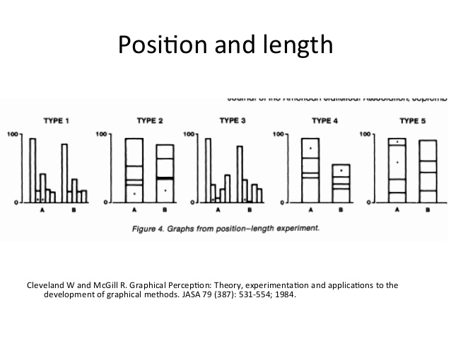 ] -- .pull-right[ 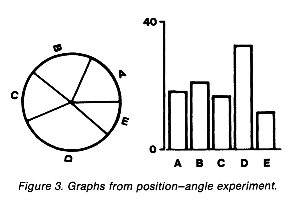 ] --- Results: .pull-left[ Percent large errors: 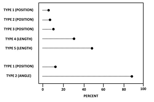 ] -- .pull-right[ Absolute error: 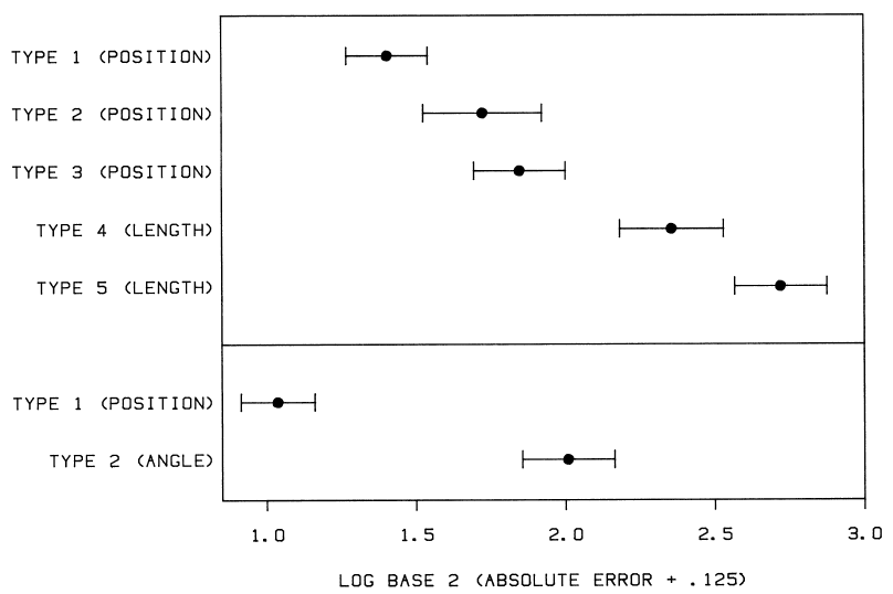 ] --- ### Heer and Bostock [Heer and Bostock (2010)](https://idl.uw.edu/papers/crowdsourcing-graphical-perception) set out to replicate the Cleveland McGill experiment using crowd sourcing via [Amazon Mechanical Turk](https://www.mturk.com/) -- They used the five position stimuli from Cleveland and McGill and some new ones:  50 subjects were recruited for each task. --- Results were consistent with Cleveland-McGill results: 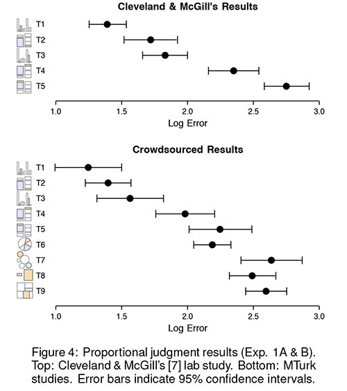 Use of Mechanical Turk was deemed a success. --- ### Pie Chart Experiments [Pie charts](https://eagereyes.org/pie-charts) are popular but somewhat controversial. -- * Pie charts are inferior for comparisons to bar charts. -- * Pie charts are quite good at representing part-whole relationships. -- * Cleveland and McGill suggested pie charts are read by angle. -- * [Kosara and Skau](https://eagereyes.org/papers/a-pair-of-pie-chart-papers) report experiments that suggest this is not the case. -- * If it were, [_donut charts_](https://datavizcatalogue.com/methods/donut_chart.html) would be even less effective, but they seem to be very comparable. -- * [Kosara's blog](https://eagereyes.org) provides a [review](https://eagereyes.org/blog/2016/an-illustrated-tour-of-the-pie-chart-study-results) of other pie chart studies. --- layout: true ## Improving Some Common Charts --- Cleveland and McGill set out to suggest improvements to some common charts. This is a selection of their examples. -- ### Dot Charts Cleveland and McGill use their perceptual ladder to argue strongly for using dot charts in place of bar charts and pie charts. --- ### Playfair's Balance of Trade plots Playfair presented a number of plots showing imports and exports between England and other nations. -- A primary goal was to show the balance of trade, the difference between exports and imports: 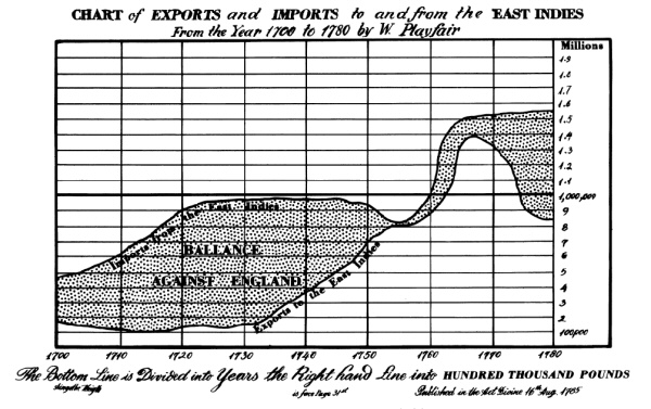 --- .pull-left[ Assessing the differences from a plot showing exports and imports as separate curves requires length judgments, which are less accurate than comparisons to a common stale. ] .pull-right[ <!-- data: https://raw.githubusercontent.com/jennybc/r-graph-catalog/master/figures/fig02-14_playfair-s-balance-of-trade-data/fig02-14_playfair-s-balance-of-trade-data.tsv --> <img src="percep_files/figure-html/unnamed-chunk-39-1.png" style="display: block; margin: auto;" /> ] --- .pull-left[ Plotting the difference makes the balance of trade much easier to assess: ] .pull-right[ <img src="percep_files/figure-html/unnamed-chunk-40-1.png" style="display: block; margin: auto;" /> ] --- .pull-left[ An _ensemble plot_ showing both views may also help. ] .pull-right[ <img src="percep_files/figure-html/unnamed-chunk-41-1.png" style="display: block; margin: auto;" /> ] --- ### Framed Unaligned Bars .pull-left[ It is difficult to compare lengths of unaligned rectangles when the lengths are close. <img src="percep_files/figure-html/unnamed-chunk-42-1.png" style="display: block; margin: auto;" /> ] -- .pull-right[ Adding a frame moves the task up the perceptual ladder to an unaligned comparison against a common scale. <img src="percep_files/figure-html/unnamed-chunk-43-1.png" style="display: block; margin: auto;" /> ] --- Comparing to a common scale is still the most effective approach: <img src="percep_files/figure-html/unnamed-chunk-44-1.png" style="display: block; margin: auto;" /> -- But this does suggest that using unaligned framed rectangles to encode a _third_ variable, with position encoding the two primary variables may be effective. --- .pull-left[ ### Framed Rectangle Maps A _choropleth map_ is a common way to depict a quantitative variable in a geographic context. Shading is quite low on the perceptual ladder. Cleveland and McGill suggest the use of framed rectangles positioned on the map as an alternative. This does not seem to have caught on so far, though you do sometimes see the use of other glyphs, such as pie charts. ] .pull-right.width-40[ <!--  --> <img src="../img/CMmap.jpg" width="90%" style="display: block; margin: auto;" /> ] --- layout: true ## Analyzing a Design --- Graph layout involves several levels: -- * Primary data representation * items, attributes * marks, channels -- * Supporting features * trend lines, reference lines, annotations * axes, legends --- A useful structure for describing the primary features: * What are the data items? * What are the attributes? * What marks are used? * What channels are used? * Which attribute is matched to channel 1 * Which attribute is matched to channel 2 * ... -- Useful questions: * Are the most important attributes mapped to the strongest channels? * Do the mappings do a good job of conveying the primary message? * If not, can the graph be improved by adjusting the mappings? --- .pull-left[ ### A Gapminder Plot One of the frames of a plot from the [GapMinder site](https://www.gapminder.org): 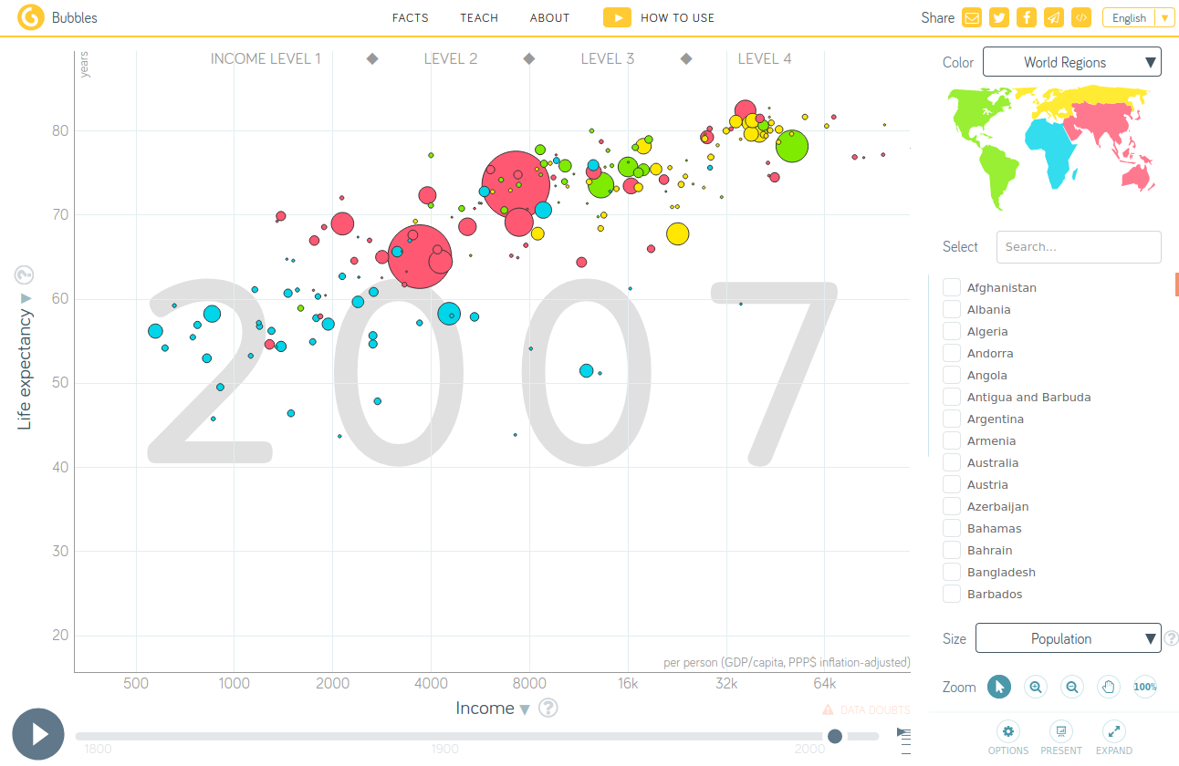 ] -- .pull-right.smaller[ * Items are countries (in a particular year) {{content}} ] -- * Attributes in the plot: * life expectancy * income per person * population * continent * country name * year {{content}} -- * Marks: points (or bubbles). {{content}} -- * Channels and mappings: * horizontal position, mapped to log income * vertical position, mapped to life expectancy * area, mapped to population * color (hue), mapped to continent * interactive: mouse-over, mapped to country name * interactive: time (or frame), mapped to year --- The basic plot can be created with `ggplot` and aesthetic mappings: .pull-left.small-code[ ``` r library(gapminder) gm2007 <- filter(gapminder, year == 2007) ggplot(gm2007) + geom_point(aes(x = gdpPercap, y = lifeExp, size = pop, color = continent)) + scale_x_log10() + ylim(c(20, 85)) ``` ] -- .pull-right[ <img src="percep_files/figure-html/gapminder-basic-1.png" style="display: block; margin: auto;" /> ] -- The data in the `gapminder` package differ somewhat from the data used by the Gapminder site, but overall the plot designs are very close. --- With some adjustments the basic plot can be brought close to the Gapminder version in appearance: .pull-left.tiny-code.width-50[ ``` r gm2007 <- filter(gapminder, year == 2007) |> arrange(desc(pop)) ## sort to avoid over-plotting ggplot(gm2007) + geom_point(aes(x = gdpPercap, y = lifeExp, size = pop, fill = continent), shape = 21) + ## to allow the using `fill` aesthetic scale_x_log10(labels = comma) + ylim(c(20, 85)) + scale_size_area(max_size = 20, labels = comma, breaks = c(0.25 * 10 ^ 9, 0.5 * 10 ^ 9, 10 ^ 9)) + scale_fill_manual(values = c(Africa = "deepskyblue", Asia = "red", Americas = "green", Europe = "gold", Oceania = "brown")) + labs(x = "Income", y = "Life expectancy") + theme(text = element_text(size = 16)) + guides(fill = guide_legend(title = "Continent", override.aes = list(size = 5), order = 1), size = guide_legend(title = "Population", label.hjust = 1, order = 2)) + theme_minimal() + theme(panel.border = element_rect(fill = NA, color = "grey20")) ``` ] .pull-right[ <img src="percep_files/figure-html/gapminder-full-1.png" style="display: block; margin: auto;" /> ] --- Some notes: -- * Using larger bubbles makes the plot more engaging. -- * Using larger bubbles makes differences in population easier to assess, but makes the strength of the relationship between life expectancy and income harder to assess. -- * Using larger bubbles also increases the risk of over-plotting. Sorting the rows so larger bubble are drawn first helps reduce the risk somewhat. -- These plots show a fairly strong marginal association between life expectancy and income. -- There does not seem to be a strong association of population with the other two variables, but these plots are not ideal for that assessment. --- .pull-left.small-code[ To judge the marginal association between life expectancy and population size we can change the channel mapping: {{content}} ] -- * map the horizontal axis to population; * map area to income. {{content}} -- ``` r ggplot(filter(gapminder, year == 2007)) + geom_point(aes(x = pop, y = lifeExp, size = gdpPercap)) + scale_x_log10() + ylim(c(20, 85)) + theme_minimal() + theme(panel.border = element_rect(fill = NA, color = "grey20")) ``` -- .pull-right[ <img src="percep_files/figure-html/gapminder-lifepop-1.png" style="display: block; margin: auto;" /> ] -- This confirms that there is very little association between life expectancy and population. -- The association between life expectancy and income is still visible, but is easier to assess when these two variables are mapped to 2D position. --- .pull-left[ ### Michelin Stars This image, from a [blog post](http://createhtml5map.com/interactive-map-blog/interactive-bubble-chart-countries-receive-the-most-michelin-stars-each-year/), shows the total number of stars for different countries: 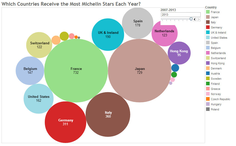 ] -- .pull-right[ * Items: Countries (in a particular year) {{content}} ] -- * Attributes: * country name * number of stars {{content}} -- * Marks: bubbles, text {{content}} -- * Channels and mappings: * bubble color, mapped to country * bubble area, mapped to number of stars * text, mapped to country name (where possible) * text, mapped to number of stars (where possible) --- <!-- separate next line --> .pull-left[ Observations: {{content}} ] -- * None of the channels are very strong. {{content}} -- * The strongest channels, 2D position, are not used. {{content}} -- * The number of colors used is too high. {{content}} -- A simple _dot plot_ would convey the distribution better. {{content}} -- A dot plot using [2017 data](michelin.dat) from an [article](https://www.telegraph.co.uk/travel/maps-and-graphics/map-michelin-star-restaurants-countries-with-the-most/) in The Telegraph: -- .pull-right[ .hide-code[ ``` r michelin <- read.table(WLNK("michelin.dat"), head = TRUE) michelin <- mutate(michelin, stars = one + 2 * two + 3 * three, country = reorder(country, stars)) ggplot(michelin, aes(x = stars, y = country)) + geom_point() + labs(x = "Stars", y = NULL) + theme_minimal() + theme(text = element_text(size = 16)) + theme(panel.border = element_rect(fill = NA, color = "grey20")) ``` <img src="percep_files/figure-html/unnamed-chunk-46-1.png" style="display: block; margin: auto;" /> ] ] --- .pull-left[ Even if a bubble plot is desired for aesthetic reasons, position could be used to * group countries by continent; * show countries on a map. {{content}} ] -- A plot like the original can be constructed by * computing locations for a set of packed spheres with specified radii; * using `geom_point` and `geom_text`. -- .pull-right.small-code.scroll-box-20[ .hide-code[ ``` r ## create randomly located packed spheres with specified areas library(packcircles) set.seed(54321) packing <- circleProgressiveLayout(michelin$stars) ## merge circle locations with starts data mcirc <- bind_cols(packing, michelin) |> mutate(country = factor(country)) ## clean out stray attributes ## compute some colors to use nr <- nrow(mcirc) pal <- colorRampPalette(RColorBrewer::brewer.pal(9, "Set1")) cols <- sample(pal(nr), nr) ## these need tuning for the screen or R markdown csize <- 45 tsize <- 2.5 ## the basic plot ## uses shape = 19 and `color` aesthetic p <- ggplot(mcirc, aes(x = x, y = y)) + geom_point(aes(size = radius ^ 2, color = country), shape = 19) + scale_size_area(max_size = csize) + geom_text(aes(label = paste(country, stars, sep = "\n")), data = filter(mcirc, stars >= 120), size = tsize) + coord_fixed() ## adjustments p + guides(size = "none") + scale_color_manual(values = cols) + xlim(with(mcirc, range(x) + c(-1, 1) * max(radius))) + ylim(with(mcirc, range(y) + c(-1, 1) * max(radius))) + theme_void() ``` <img src="percep_files/figure-html/unnamed-chunk-47-1.png" style="display: block; margin: auto;" /> ] ] --- .pull-left[ A somewhat more robust approach * creates vertex data for polygon approximations to the circles; * merges the stars data with the polygon data; * uses `geom_polygon` and `geom_text`. {{content}} ] -- This is very similar to the way simple _choropleth maps_ are created. -- .pull-right.small-code.scroll-box-20[ .hide-code[ ``` r ## compute polygon approximations to spheres mcircpoly <- circleLayoutVertices(mcirc, idcol = "country", npoints = 100) |> rename(country = id) ## merge the stars data into the polygon data sttab <- select(michelin, country, stars) mcircpoly <- left_join(mcircpoly, sttab, "country") ## create the plot ggplot(mcircpoly, aes(x = x, y = y)) + geom_polygon(aes(fill = country)) + geom_text(aes(label = paste(country, stars, sep = "\n")), data = filter(mcirc, stars >= 120), size = tsize) + coord_fixed() + scale_fill_manual(values = cols) + theme_void() ``` <img src="percep_files/figure-html/unnamed-chunk-48-1.png" style="display: block; margin: auto;" /> ] ] --- layout: true ## Aspect Ratio and Perception --- The river flow data shows how important aspect ratio can be to our ability to detect patterns: <img src="percep_files/figure-html/unnamed-chunk-49-1.png" style="display: block; margin: auto;" /> --- .pull-left[ Using a line plot the basic periodicity becomes apparent even in the first aspect ratio. .hide-code[ ``` r p2 <- p0 + geom_line() p2 + coord_fixed(ratio = 35) ``` <img src="percep_files/figure-html/unnamed-chunk-50-1.png" style="display: block; margin: auto;" /> ] ] -- .pull-right[ But the steeper increase/shallower decrease of most periods is easier to see in the second aspect ratio: .hide-code[ ``` r p2 + coord_fixed(ratio = 4) ``` <img src="percep_files/figure-html/unnamed-chunk-51-1.png" style="display: block; margin: auto;" /> ] ] --- The aspect ratio also influences interpretation of results. -- Some alternative views of (suspect) data on the number of people on government assistance over a time period: .hide-code[ ``` r library(readr) w <- read_csv(WLNK("hw2-welfare.csv")) w <- mutate(w, onAssistance = onAssistance / 10 ^ 6) w <- mutate(w, date = seq(as.Date("2009-01-01"), by = "quarter", length.out = 10)) p0 <- ggplot(w, aes(x = date, y = onAssistance)) + theme_minimal() + theme(panel.border = element_rect(fill = NA, color = "grey20")) p1 <- p0 + geom_line(aes(group = 1)) grid.arrange(p1, p1 + coord_fixed(ratio = 8), p1 + ylim(0, max(w$onAssistance)), p0 + geom_col(width = 40), ncol = 2) ``` <img src="percep_files/figure-html/unnamed-chunk-52-1.png" style="display: block; margin: auto;" /> ] --- Some notes: -- * Automated choices of axis scaling can affect the aspect ratio of the content of a plot. -- * A zero base line supports ratio comparisons. -- * The preattentive response to bar charts is always to compare ratios, so using a zero base line is important. -- * Using a non-zero base line for line plots and scatter plots encourages interval, or difference, comparisons. -- * Research on the effect of aspact ratio on perception has focused on accuracy of slope comparisons. -- * The general message is that keeping away from slopes that are too steep or too shallow is best. -- * _Banking to 45 degrees_, or choosing an aspect ratio so the slope magnitudes are distributed around 45 degrees is often recommended. -- * This also tends to be a useful "neutral ground" when political implications are involved. --- Some references: * A [blog post](https://eagereyes.org/basics/banking-45-degrees) by Robert Kosara. -- * William S. Cleveland, Marylyn E. McGill and Robert McGill (1988), "The Shape Parameter of a Two-Variable Graph", _Journal of the American Statistical Association_ ([JSTOR](http://www.jstor.org/stable/2288843?seq=1#page_scan_tab_contents)) -- * Justin Talbot, John Gerth, Pat Hanrahan (2012), "An Empirical Model of Slope Ratio Comparisons", _IEEE Trans. Visualization & Comp. Graphics (Proc. InfoVis)_ ([PDF](http://vis.stanford.edu/files/2012-SlopeComparison-InfoVis.pdf)) <!-- Check this out: http://timelyportfolio.github.io/buildingwidgets/week11/example_07.html --> <!-- More from here: http://enrico.bertini.io/teaching/ --> --- layout: true ## Ensemble Plots and Faceting --- Using multiple channels allows a single plot to show a lot of information. -- But over-plotting and interference can become problems. -- One alternative is to use several related views in a useful arrangement. -- Such arrangements are sometimes called _ensemble plots_. -- There are a number of variations; a few are introduced below. --- ### Similar Plots with Different Variables and Shared Encodings One way to show three continuous variables is with two plots that share an axis: .hide-code[ ``` r library(patchwork) pe_thm <- theme_minimal() + theme(panel.background = element_rect(color = "black", linewidth = 0.5, fill = NA)) p1 <- ggplot(gm2007, aes(x = gdpPercap, y = lifeExp, color = continent)) + geom_point() + scale_x_log10() + guides(color = "none") + pe_thm p2 <- ggplot(gm2007, aes(x = pop / 10 ^ 6, y = lifeExp, color = continent)) + geom_point() + scale_x_log10() + pe_thm + theme(axis.title.y = element_blank(), axis.text.y = element_blank(), axis.ticks.y = element_blank()) p1 + p2 ``` <img src="percep_files/figure-html/unnamed-chunk-53-1.png" style="display: block; margin: auto;" /> ] -- Life expectancy is mapped to the vertical position in both plots. -- Continent is mapped to color in both plots. -- Guides can be shared when encodings are shared. --- ### Different Plots with Shared Encodings Multiple views of the data are often helpful. -- Sharing encodings makes the relations between views easier to perceive. -- .hide-code[ ``` r p3 <- ggplot(gm2007, aes(x = pop / 10 ^ 6, y = reorder(continent, pop, FUN = sum), fill = continent)) + geom_col() + ylab(NULL) + pe_thm p1 + p3 ``` <img src="percep_files/figure-html/unnamed-chunk-54-1.png" style="display: block; margin: auto;" /> ] --- ### Small Multiples .pull-left.width-40[ _Small multiples_ refers to a collection of plots with identical structure showing different subsets of the data and organized in a useful way. {{content}} ] -- These plot collections are also called _trellis plots_, _lattice plots_, or _faceted plots_. {{content}} -- A plot of life expectancy against income per capita in 2007 faceted by continent: -- .pull-right.width-60[ .hide-code[ ``` r gd <- filter(gapminder, year %in% c(1977, 1987, 1997, 2007)) gd2007 <- filter(gapminder, year == 2007) fct_thm <- theme_minimal() + theme(panel.background = element_rect(color = "black", linewidth = 0.5, fill = NA)) ggplot(gd2007, aes(x = gdpPercap, y = lifeExp, color = continent)) + geom_point(size = 2.5) + scale_x_log10() + facet_wrap(~ continent) + fct_thm ``` <img src="percep_files/figure-html/unnamed-chunk-55-1.png" style="display: block; margin: auto;" /> ] ] --- A useful variation is to show a muted view of the full data in the background: .hide-code[ ``` r ggplot(gd2007, aes(x = gdpPercap, y = lifeExp, color = continent)) + geom_point(data = mutate(gd2007, continent = NULL), color = "grey80") + geom_point(size = 2.5) + scale_x_log10() + facet_wrap(~ continent) + fct_thm ``` <img src="percep_files/figure-html/unnamed-chunk-56-1.png" style="display: block; margin: auto;" /> ] --- .pull-left.width-40[ Data can be facetet on two variables. This plot shows the full data faceted by both continent and a set of years: ] .pull-right.width-60[ .hide-code[ ``` r ggplot(gd, aes(x = gdpPercap, y = lifeExp, color = continent)) + geom_point(size = 2.5) + scale_x_log10() + facet_grid(continent ~ year) + fct_thm ``` <img src="percep_files/figure-html/unnamed-chunk-57-1.png" style="display: block; margin: auto;" /> ] ] --- .pull-left.width-40[ Adding muted data for each year helps regonizing where each continent group fits within a year ] .pull-right.width-60[ .hide-code[ ``` r ggplot(gd, aes(x = gdpPercap, y = lifeExp, color = continent)) + geom_point(data = mutate(gd, continent = NULL), color = "grey80") + geom_point(size = 2.5) + scale_x_log10() + facet_grid(continent ~ year) + fct_thm ``` <img src="percep_files/figure-html/unnamed-chunk-58-1.png" style="display: block; margin: auto;" /> ] ] --- A [recent example]( https://www.ft.com/content/29fd9b5c-2f35-41bf-9d4c-994db4e12998) from the Financial Times: <img src="../img/FT-gender-politics.jpeg" width="70%" style="display: block; margin: auto;" /> --- layout: false ## Reading Section [_Perception and Data Visualization_](https://socviz.co/lookatdata.html#perception-and-data-visualization) in [_Data Visualization_](https://socviz.co/). Chapter [_Data visualization principles_](https://rafalab.dfci.harvard.edu/dsbook-part-1/dataviz/dataviz-principles.html) in [_Introduction to Data Science: Data Analysis and Prediction Algorithms with R_](https://rafalab.dfci.harvard.edu/dsbook-part-1/). --- ## Exercises 1) Which of the following channels are magnitude channels and which are identity channels? * a. Position on a common scale * b. Length * c. Color hue (red, green, etc.) * d. Symbol shape (dot, cross, etc.) --- 2) Consider the following visualizations of the 2017 Michelin star data: <img src="percep_files/figure-html/unnamed-chunk-61-1.png" style="display: block; margin: auto;" /> Which plot makes it easier to compare the numbers of stars for different countries? Explain your conclusion by identifying the channels used and their relative strengths. --- 3) Identify the items, attributes, marks, channels, and mappings use in the following plot: <img src="percep_files/figure-html/unnamed-chunk-62-1.png" style="display: block; margin: auto;" />
//adapted from Emi Tanaka's gist at //https://gist.github.com/emitanaka/eaa258bb8471c041797ff377704c8505