More Plots For A Numeric Variable
Grouped Bar Charts
Grouped bar charts can be used to show a quantitative variable within two classifications.
For the barley data from the lattice package the barchart function can show the average results for year within site:
gbsy <- group_by(barley, site, year)
absy <- summarise(gbsy, avg_yield = mean(yield))
## `summarise()` has grouped output by 'site'. You can override using the
## `.groups` argument.
barchart(avg_yield ~ site, group = year, data = absy, origin = 0,
         auto.key = TRUE)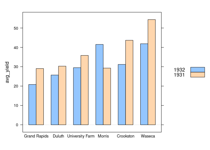
Using ggplot2 this can be done by
- assigning
siteto thexaesthetic; - assigning
yearto thefillaesrhetic; - specifying
position = "dodge":
ggplot(absy) +
    geom_col(aes(x = site, y = avg_yield, fill = year),
             position = "dodge")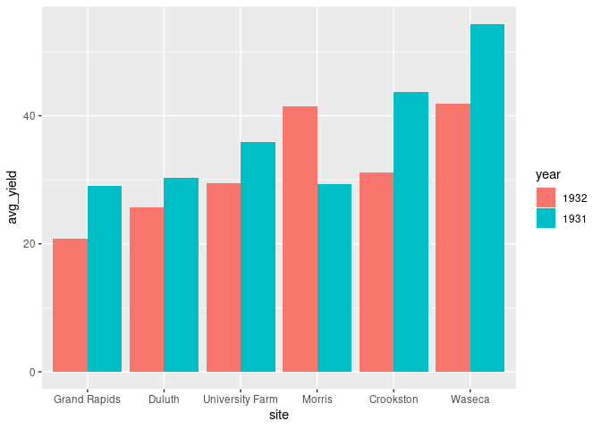
It is possible to use more than two or three classifications with a grouped bar chart but usually not a good idea.
The number of levels at the inner classification that are visually effective is limited.
Dot plots are often a better option.
The bars for the inner classification can also be placed in front of each other:
ggplot(absy) +
    geom_col(aes(x = site, y = avg_yield, fill = year),
             position = "identity")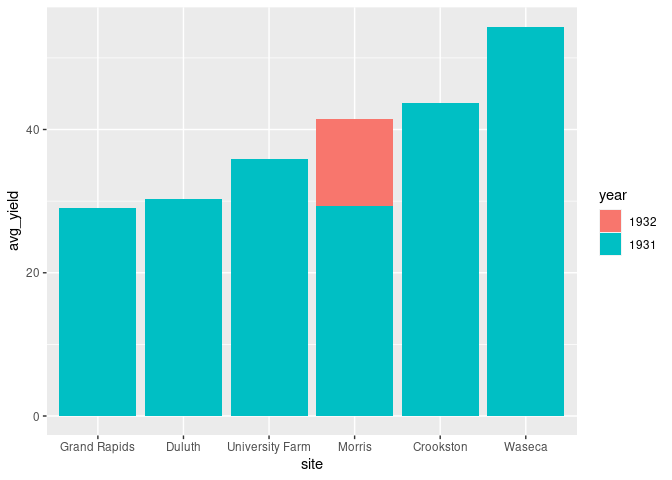
This does not work well as the taller bars cover the shorter ones.
A re-ordering of the bars is needed to make this effective.
For the
identityposition this can be achieved by arranging the rows in decreasing order ofavg_yield
ggplot(arrange(absy, desc(avg_yield))) +
    geom_col(aes(x = site, y = avg_yield, fill = year),
             position = position_identity())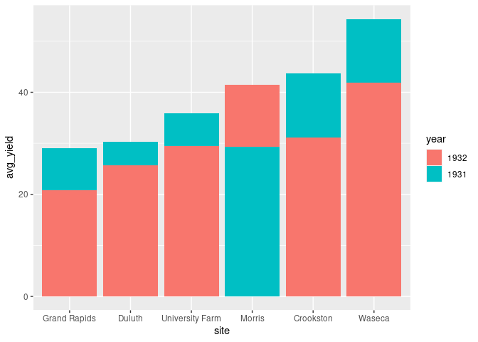
Polar Area Diagrams
A classic, though now rarely used, visualization is a polar area chart, or coxcomb diagram, as introduced by Florence Nightingale:
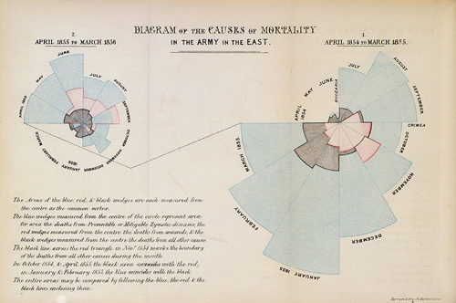
The basic plot can be viewed as a bar chart drawn in polar coordinates.
- The square root of the variable represented is used as the radius to make the areas of the wedges proportional to the magnitudes.
- Specifying
width = 1ensures that there is no gap between the bars/wedges.
gbs <- group_by(barley, site)
abs <- summarise(gbs, avg_yield = mean(yield))
ggplot(abs) +
    geom_col(aes(y = sqrt(avg_yield), x = site, fill = site),
             width = 1, color = "black") +
    coord_polar()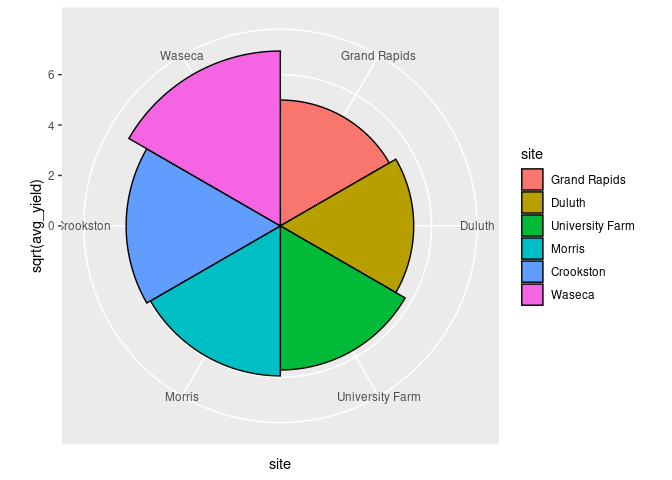
The standard coxcomb diagram for a second classification positions the wedges in front of each other.
ggplot(arrange(absy, desc(avg_yield))) +
    geom_col(aes(y = sqrt(avg_yield), x = site, fill = year),
             width = 1, color = "black",
             position = "identity") +
    coord_polar()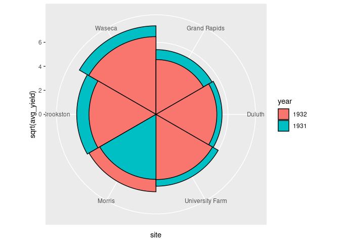
As a visualization an ordinary bar chart is generally more effective.
The only advantage of a polar representation is to reflect a periodic feature, as in the original use.
Recreating The Nightingale Visualization
The data are available as the variable Nightingale in the HistData package.
library(HistData)
head(Nightingale)
##         Date Month Year  Army Disease Wounds Other Disease.rate Wounds.rate
## 1 1854-04-01   Apr 1854  8571       1      0     5          1.4         0.0
## 2 1854-05-01   May 1854 23333      12      0     9          6.2         0.0
## 3 1854-06-01   Jun 1854 28333      11      0     6          4.7         0.0
## 4 1854-07-01   Jul 1854 28722     359      0    23        150.0         0.0
## 5 1854-08-01   Aug 1854 30246     828      1    30        328.5         0.4
## 6 1854-09-01   Sep 1854 30290     788     81    70        312.2        32.1
##   Other.rate
## 1        7.0
## 2        4.6
## 3        2.5
## 4        9.6
## 5       11.9
## 6       27.7
The data set is in wide format, so needs some tidying.
First, select only variables that might be useful.
library(dplyr)
Night <- select(Nightingale, Date, Army, Disease, Wounds, Other)
head(Night)
##         Date  Army Disease Wounds Other
## 1 1854-04-01  8571       1      0     5
## 2 1854-05-01 23333      12      0     9
## 3 1854-06-01 28333      11      0     6
## 4 1854-07-01 28722     359      0    23
## 5 1854-08-01 30246     828      1    30
## 6 1854-09-01 30290     788     81    70
Next, convert to long format with variables cause and deaths:
library(tidyr)
Night <- gather(Night, cause, deaths, 3 : 5)
head(Night)
##         Date  Army   cause deaths
## 1 1854-04-01  8571 Disease      1
## 2 1854-05-01 23333 Disease     12
## 3 1854-06-01 28333 Disease     11
## 4 1854-07-01 28722 Disease    359
## 5 1854-08-01 30246 Disease    828
## 6 1854-09-01 30290 Disease    788
Add a variable with the month of the year:
library(lubridate)
Night <- mutate(Night, Month = month(Date, label = TRUE))
head(Night)
##         Date  Army   cause deaths Month
## 1 1854-04-01  8571 Disease      1   Apr
## 2 1854-05-01 23333 Disease     12   May
## 3 1854-06-01 28333 Disease     11   Jun
## 4 1854-07-01 28722 Disease    359   Jul
## 5 1854-08-01 30246 Disease    828   Aug
## 6 1854-09-01 30290 Disease    788   Sep
Finally, add a variable to distinguish periods before and after April 1, 1855:
Night <- mutate(Night,
                period = ifelse(Date < as.Date("1855-04-01"),
                                "before", "after"))
head(Night)
##         Date  Army   cause deaths Month period
## 1 1854-04-01  8571 Disease      1   Apr before
## 2 1854-05-01 23333 Disease     12   May before
## 3 1854-06-01 28333 Disease     11   Jun before
## 4 1854-07-01 28722 Disease    359   Jul before
## 5 1854-08-01 30246 Disease    828   Aug before
## 6 1854-09-01 30290 Disease    788   Sep before
The pair of plots can now be created as
p <- ggplot(arrange(Night, desc(deaths))) +
    geom_col(aes(y = deaths, x = Month, fill = cause),
             width = 1, color = "black", position = "identity") +
    scale_y_sqrt() +
    facet_grid(. ~ period) +
    coord_polar(start = pi) +
    scale_fill_manual(values = c(Wounds = "pink",
                                 Other = "darkgray",
                                 Disease = "lightblue"))
p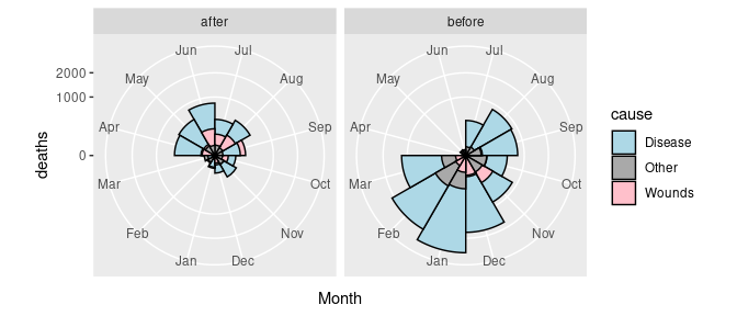
Some final theme adjustments:
p + theme(axis.title = element_blank(),
          axis.text.y = element_blank(),
          axis.ticks = element_blank(),
          panel.grid.major = element_blank(),
          panel.grid.minor = element_blank(),
          panel.border = element_blank())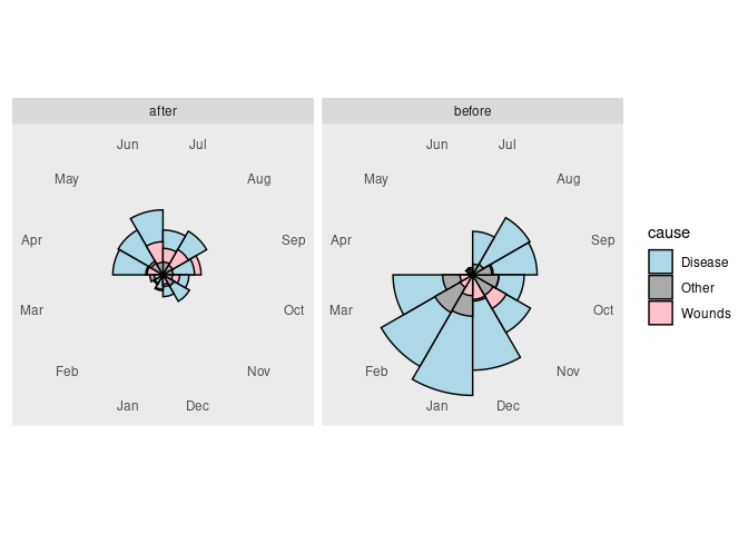
Radar Charts
A polar coordinate transformation can also be used with a line chart. This leads to a radar chart, also called a spider web chart.
Using the global surface temperature data, the data can be treated as a single time series and draw as a single line showing temerature at each month as
lgast <- arrange(lgast, Year, Month)
library(lubridate)
past_year <- year(today()) - 1
lgast_last <- filter(lgast, Year == past_year)
p <- ggplot(lgast) +
    geom_path(aes(x = Month, y = Temp, group = 1, color = Year)) +
    geom_line(aes(x = Month, y = Temp, group = Year),
              data = lgast_last, color = "red")
p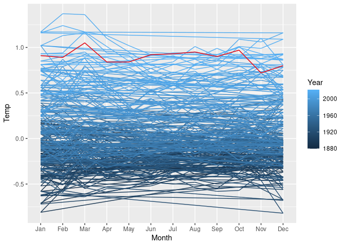
The lines connecting December back to January are rendered more naturally with a radar chart.
A slightly modified version of coord_polar is needed to make this work properly. The definition is available in at least one package, but can also be included directly:
coord_radar <- function(theta = "x", start = 0, direction = 1) {
    theta <- match.arg(theta, c("x", "y"))
    r <- if (theta == "x") "y" else "x"
    ggproto("CordRadar", CoordPolar, theta = theta, r = r, start = start,
            direction = sign(direction),
            is_linear = function(coord) TRUE)
}
The radar chart is then
p + coord_radar()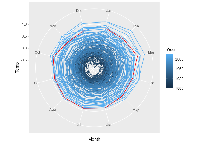
Radar charts can be useful for periodic data.
Some fields use them heavily, so using them is expected.
They do have drawbacks, as described in this blog post.
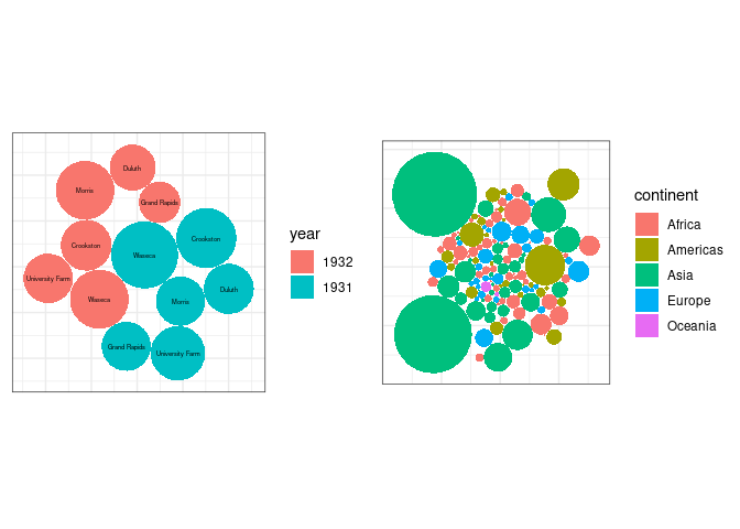
Bubble Charts
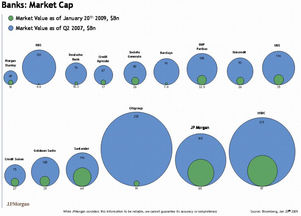
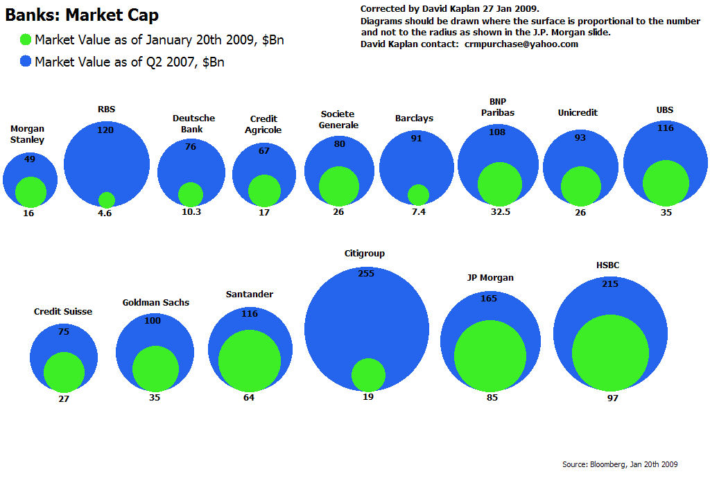
A form of chart often seen in the popular press is the bubble chart.
The bubble chart uses ares of circles to represent magnitudes.
In on-line publications further information on each of the bubble is often provided through interactions, such as a mouse-over popup.
Other charts forms are almost always better for encoding the magnitude information.
It is also easy to get the encoding wrong:
 (
(
ggplotbubble charts for the averageyieldvalues from thebarleydata and for the 2007 population sizes for the gapminder data: