Histograms and Density Plots
Feature to Look For
Some things to keep an eye out for when looking at data on a numeric variable:
skewness, multimodality
gaps, outliers
rounding, e.g. to integer values, or heaping, i.e. a few particular values occur very frequently
impossible or suspicious values
Histograms
Histogram Basics
Historams are constructed by binning the data and counting the number of observations in each bin.
The objective is usually to visualize the shape of the distribution.
The number of bins needs to be
- large enough to reveal interesting features;
- small enough not to be too noisy.
A very small bin width can be used to look for rounding or heaping.
Common choices for the vertical scale are
- bin counts, or frequencies
- counts per unit, or densities
The count scale is more intepretable for lay viewers.
The density scale is more suited for comparison to mathematical density models.
Constructing histograms with unequal bin widths is possible but rarely a good idea.
Histograms in R
There are many ways to plot histograms in R:
the
histfunction in the basegraphicspackage;truehistin packageMASS;histogramin packagelattice;geom_histogramin packageggplot2.
A histogram of eruption durations for another data set on Old Faithful eruptions, this one from package MASS:
library(MASS)
histogram(~ duration, data = geyser)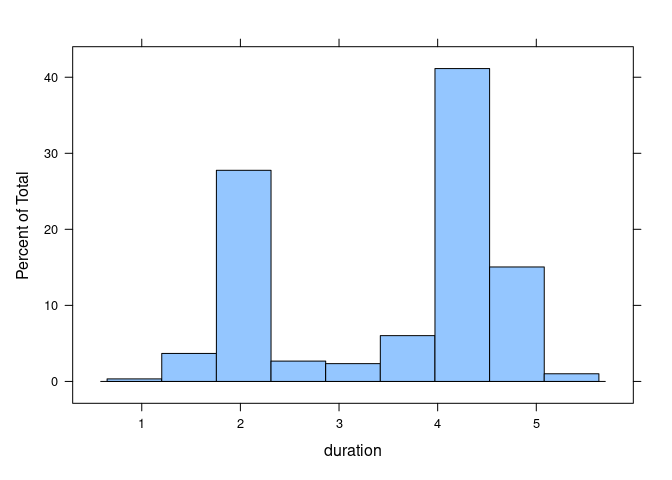
The default setting using geom_histogram are less than ideal:
ggplot(geyser) + geom_histogram(aes(x = duration))
## `stat_bin()` using `bins = 30`. Pick better value with `binwidth`.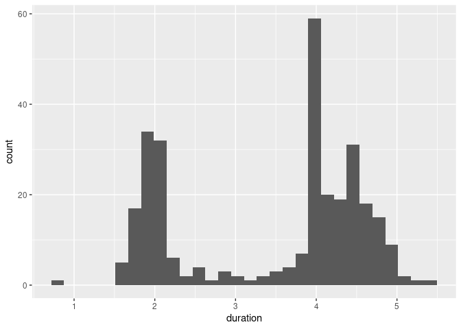
Using a binwidth of 0.5 and customized fill and color settings produces a better result:
ggplot(geyser) +
    geom_histogram(aes(x = duration),
                   binwidth = 0.5, fill = "grey", color = "black")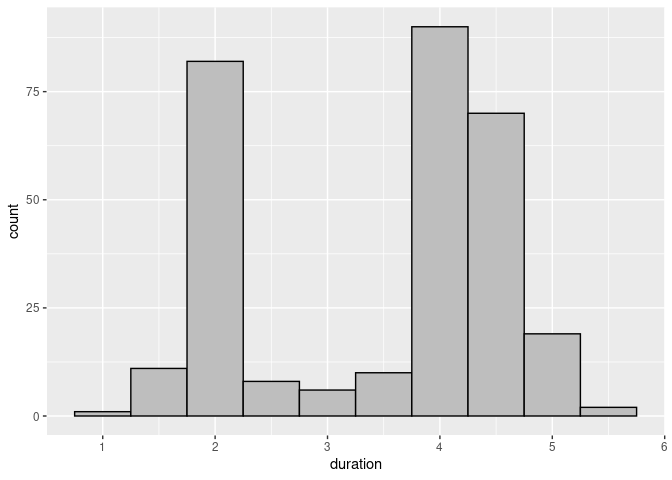
Reducing the bin width shows an interesting feature:
ggplot(geyser) +
    geom_histogram(aes(x = duration),
                   binwidth = 0.05, fill = "grey", color = "black")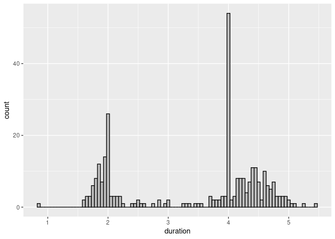
Eruptions were sometimes classified as short or long; these were coded as 2 and 4 minutes.
For many purposes this kind of heaping or rounding does not matter.
It would matter if we wanted to estimate means and standard deviation of the durations of the long eruptions.
More data and information about geysers is available at https://geysertimes.org/ and https://gosa.org/.
For exploration there is no one “correct” bin width or number of bins. It would be very useful to be able to change this parameter interactively.
Superimposing a Density
A histogram can be used to compare the data distribution to a theoretical model, such as a normal distribution.
This requires using a density scale for the vertical axis.
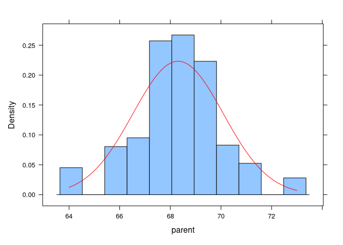
The Galton data frame in the UsingR package is one of several data sets used by Galton to study the heights of parents and their children.
Using the base graphics hist function we can compare the data distribution of parent heights to a normal distribution with mean and standard deviation corresponding to the data:
library(UsingR)
hist(Galton$parent, freq = FALSE)
x <- seq(64, 74, length.out = 100)
y <- with(Galton, dnorm(x, mean(parent), sd(parent)))
lines(x, y, col = "red")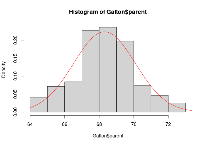
Adding a normal density curve to a ggplot histogram is similar:
- create the histogram with a density scale;
- create the curve data in a separate data frame;
- add the curve as another layer.
Create the histogram with a density scale using the computed varlable ..density..:
p <- ggplot(Galton) +
    geom_histogram(aes(x = parent, y = ..density..),
                   binwidth = 1, fill = "grey", color = "black")
p
## Warning: The dot-dot notation (`..density..`) was deprecated in ggplot2 3.4.0.
## ℹ Please use `after_stat(density)` instead.
## This warning is displayed once every 8 hours.
## Call `lifecycle::last_lifecycle_warnings()` to see where this warning was
## generated.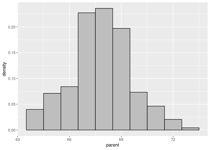
Create the curve data:
x <- seq(64, 74, length.out = 100)
df <- with(Galton, data.frame(x = x, y = dnorm(x, mean(parent), sd(parent))))
Add the curve to the base plot:
p + geom_line(data = df, aes(x = x, y = y), color = "red")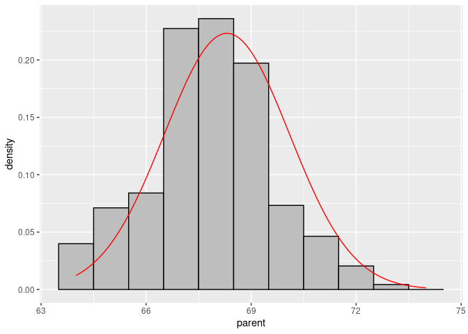
For a lattice histogram, the curve would be added in a panel function:
histogram(~ parent, data = Galton, type = "density", panel = function(x, ...) {
    panel.histogram(x, ...)
    xn <- seq(min(x), max(x), length.out = 100)
    yn <- dnorm(xn, mean(x), sd(x))
    panel.lines(xn, yn, col = "red")
})
Scalability
Histograms scale very well.
hist(diamonds$price)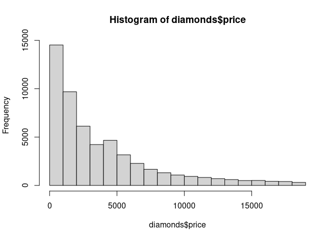
The visual performance does not deteriorate with increasing numbers of observations.
The computational effort needed is linear in the number of observations.
The amount of storage needed for an image object is linear in the number of bins.
Density Plots
Density Plot Basics
Density plots can be thought of as plots of smoothed histograms.
The smoothness is controlled by a bandwidth parameter that is analogous to the histogram binwidth.
Most density plots use a kernel density estimate, but there are other possible strategies; qualitatively the particular strategy rarely matters.
Using base graphics, a density plot of the geyser duration variable with default bandwidth:
plot(density(geyser$duration))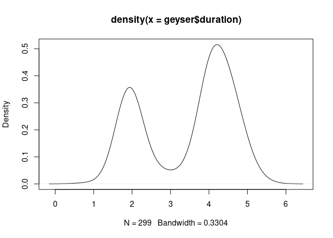
Using a smaller bandwidth shows the heaping at 2 and 4 minutes:
plot(density(geyser$duration, bw = 0.05))
For a moderate number of observations a useful addition is a jittered rug plot:
plot(density(geyser$duration, bw = 0.05))
rug(jitter(geyser$duration))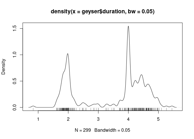
The lattice densityplot function by default adds a jittered strip plot of the data to the bottom:
densityplot(~ duration, data = geyser)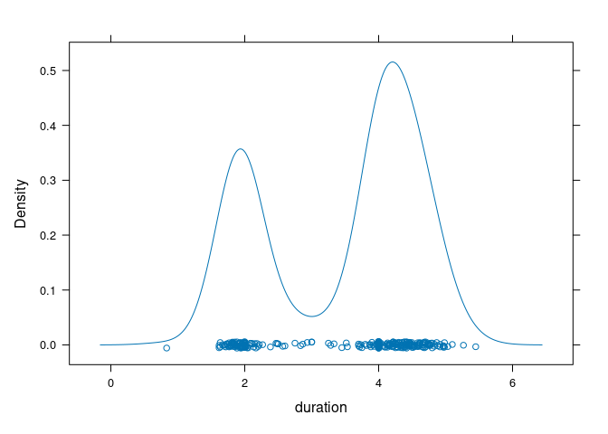
To produce a density plot with a jittered rug in ggplot:
ggplot(geyser) +
    geom_density(aes(x = duration)) +
    geom_rug(aes(x = duration, y = 0), position = position_jitter(height = 0))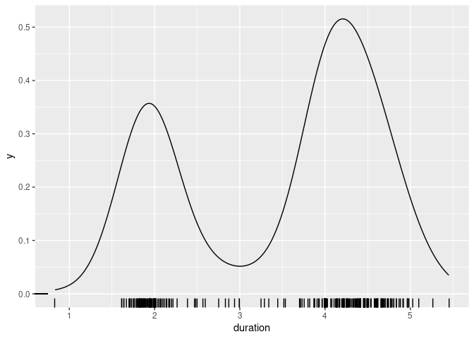
Scalability
Visual scalability is very good
plot(density(diamonds$price))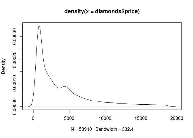
Density estimates are generally computed at a grid of points and interpolated. Defaults in R vary from 50 to 512 points.
Computational effort for a density estimate at a point is proportional to the number of observations.
Storage needed for an image is proportional to the number of point where the density is estimated.
Grouping and Faceting
Both ggplot and lattice make it easy to show multiple densities for different subgroups in a single plot.
lattice uses the group argument:
densityplot(~ yield, group = site, data = barley, auto.key = TRUE)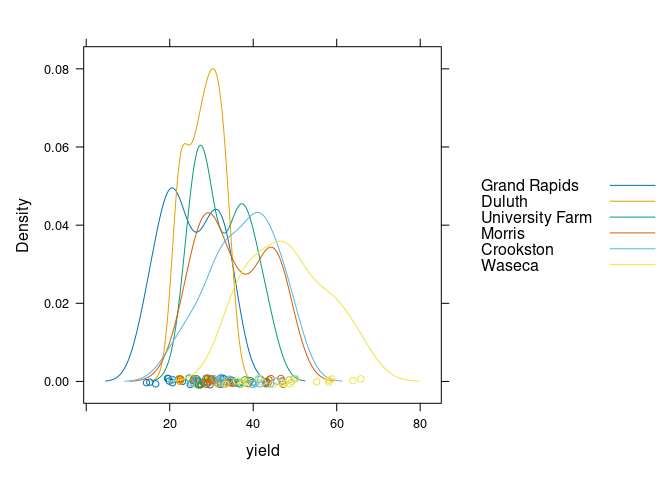
In ggplot you can map the site variable to an aesthetic, such as color:
ggplot(barley) + geom_density(aes(x = yield, color = site))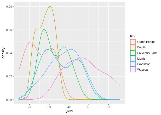
Using fill and alpha can also be useful:
ggplot(barley) + geom_density(aes(x = yield, fill = site), alpha = 0.2)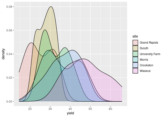
Multiple densities in a single plot works best with a smaller number of categories, say 2 or 3.
Often a more effective approach is to use the idea of small multiples, collections of charts designed to facilitate comparisons.
Lattice uses the term lattice plots or trellis plots. These plots are specified using the | operator in a formula:
densityplot(~ yield | site, data = barley)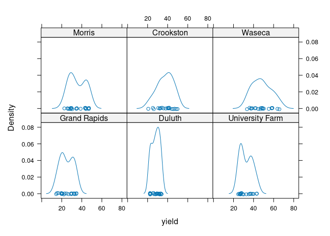
Comparison is facilitated by using common axes.
These ideas can be combined:
densityplot(~ yield | site, group = year, data = barley, auto.key = TRUE)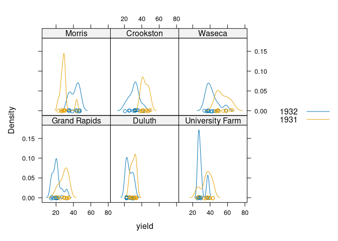
ggplot uses the notion of faceting:
ggplot(barley) + geom_density(aes(x = yield)) + facet_wrap(~ site)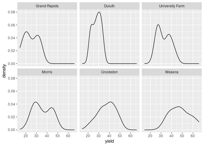
Again this can be combined with the color aesthetic:
ggplot(barley) + geom_density(aes(x = yield, color = year)) + facet_wrap(~ site)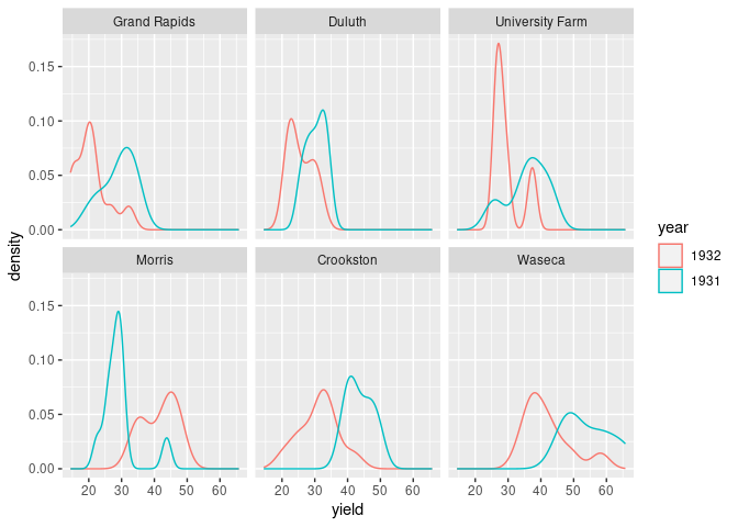
Both the lattice and ggplot versions show lower yields for 1932 than for 1931 for all sites except Morris.
Cleveland suggest this may indicate a data entry error for Morris.
A recent paper suggests there may be no error.
Interactive Bandwidth Choice
Being able to chose the bandwidth of a density plot, or the binwidth of a histogram interactively is useful for exploration.
One way to do this in R:
library(UsingR)
source("https://stat.uiowa.edu/~luke/classes/STAT7400/examples/tkdens.R")
tkdens(geyser$duration, tkrplot = TRUE)
tkdens(Galton$parent, tkrplot = TRUE)