This page is archived
class: center, middle, title-slide .title[ # Some Examples ] .author[ ### Luke Tierney ] .institute[ ### University of Iowa ] .date[ ### 2026-05-05 ] --- layout: true <link rel="stylesheet" href="stat4580.css" type="text/css" /> <style type="text/css"> .remark-code { font-size: 85%; } </style> ## Measles Heatmap --- From the [section on heatmaps](https://rafalab.dfci.harvard.edu/dsbook-part-1/dataviz/dataviz-in-practice.html#heatmaps) in [Introduction to Data Science: _Data Analysis and Prediction Algorithms with R_](https://rafalab.dfci.harvard.edu/dsbook-part-1/) showing a heatmap of cases per 10,000 people: .pull-left[ 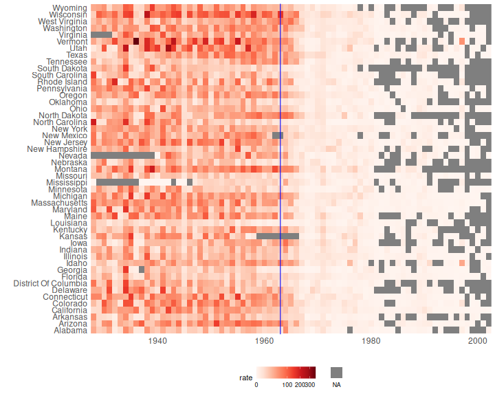<!-- --> ] .pull-right[ .hide-code.small-code.scroll-box-20[ ``` r library(RColorBrewer) library(dslabs) library(ggplot2) library(dplyr) library(ggnewscale) d <- mutate(us_contagious_diseases, rate = 10000 * (count / population) * (52 / weeks_reporting)) |> filter(! state %in% c("Alaska", "Hawaii") & disease == "Measles") hm <- function(d) ggplot(d) + geom_tile(aes(x = year, y = state, fill = rate)) + scale_x_continuous(expand = c(0, 0)) + scale_fill_gradientn(colors = brewer.pal(9, "Reds"), trans = "sqrt") + new_scale_fill() + geom_tile(data = filter(d, is.na(rate)), aes(x = year, y = state, fill = "NA")) + scale_fill_manual(values = "grey50") + geom_vline(xintercept = 1963, color = "blue") + theme_minimal() + theme(panel.grid = element_blank(), legend.position = "bottom", axis.text = element_text(size = 12)) + guides(fill = guide_legend(title = NULL, label.position = "bottom")) + labs(x = "", y = "", fill = "Cases per 10,000") hm(d) ``` {{content}} ] ] -- Many of the missing values in more recent years may well be zeros. {{content}} -- This data set covers the period 1928-2002. Have things changed since then? --- .pull-left[ More recent data is available: {{content}} ] -- - [_Our World in Data_](https://ourworldindata.org/grapher/reported-measles-case-rate-by-state-in-the-united-states?tab=tableApply) provides data through 2022. {{content}} -- - The [CDC](https://www.cdc.gov/measles/data-research/index.html#cdc_data_surveillance_section_8-previous-years) provides data for 2024-2026. {{content}} -- I was not able to find data for 2023. {{content}} -- The two data sets need to be merged. {{content}} -- The data for 2023 can be interpolated between the 2022 and 2024 values. -- .pull-right.small-code.scroll-box-20[ ``` r library(tidyr) base_url <- "https://stat.uiowa.edu/~luke/data/measles/" ## read data through 2022 d1 <- read.csv(paste0(base_url, "owd-measles-2022.csv")) |> select(state = Entity, year = Year, rate = 4) |> mutate(rate = rate / 10) ## convert to count per 10,000 ## read case count data for 2024-2026 d2 <- read.csv(paste0(base_url, "cdc-measles-states-2026.csv")) |> select(starts_with("X"), Location) ## read vax data tha includes population counts v <- read.csv(paste0(base_url, "cdc-measles-vax-2026.csv")) ## convert case counts to rates per 10,000 d3 <- left_join(d2, subset(v, School.Year=="2024-25") |> select(Location, pop = Population.Size), "Location") |> pivot_longer(1:3, values_to = "count", names_to = "year", names_prefix="X", names_transform=as.integer) |> mutate(rate = 10000 * count / pop) |> select(state = Location, year, rate) ## combine data through 2022 with 2024-2026 data d4 <- rbind(d1, filter(d3, state %in% d1$state)) ## interpolate unavailable 2023 data d5 <- filter(d4, year == 2022 | year == 2024) |> pivot_wider(names_from = "year", names_prefix = "X", values_from = "rate") |> transmute(state, year = 2023, rate = (X2022 + X2024) / 2) |> rbind(d4) ``` ] --- .pull-left[ 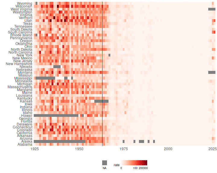<!-- --> ] -- .pull-right[ Unfortunately measles cases have become more common again. {{content}} ] -- This is also apparent in a plot of average case rates over time: 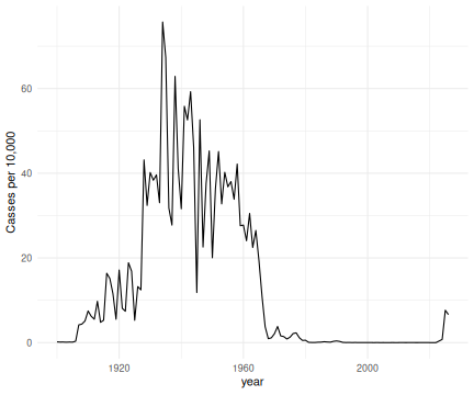<!-- --> --- layout: true ## Ridgeline Maps --- .pull-left[ A [blog post](https://flowingdata.com/2020/01/06/draw-a-ridgeline-map-showing-elevation-for-anywhere-on-earth/) shows how to create a 3D view elevations on a surface using lines. {{content}} ] -- Using the volcano data and `geom_line()`: ``` r vd0 <- list(x = seq_len(nrow(volcano)), y = seq_len(ncol(volcano)), z = volcano) vd <- broom::tidy(vd0) vd <- mutate(vd, z = 20 * (z / max(z)) + y) p0 <- ggplot(vd, aes(x, z, group = rev(y))) + geom_line() + theme_void() p0 + coord_fixed(ratio = ncol(volcano) / nrow(volcano)) ``` -- .pull-right[ 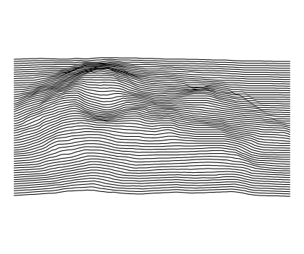<!-- --> ] --- .pull-left[ Using `geom_polygon()`: ``` r p1 <- ggplot(vd, aes(x, z, group = rev(y))) + geom_polygon(fill = "white", color = "black") + theme_void() p1 + coord_fixed(ratio = ncol(volcano) / nrow(volcano)) ``` ] .pull-right[ 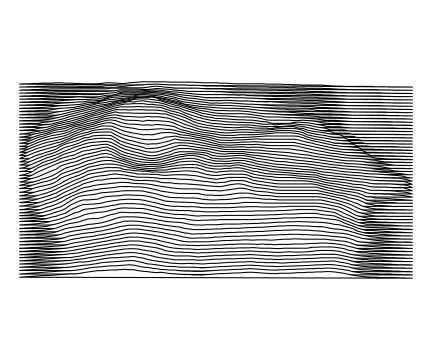<!-- --> ] --- .pull-left[ Using `geom_ribbon()`: ``` r p2 <- ggplot(vd, aes(x, ymax = z, ymin = min(z), group = rev(y))) + geom_ribbon(fill = "white", color = "black") + theme_void() p2 + coord_fixed(ratio = ncol(volcano) / nrow(volcano)) ``` ] .pull-right[ 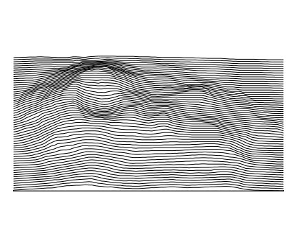<!-- --> ] --- layout: true ## Minard's Graph of Napoleon's Russia Campaign --- <!-- https://commons.wikimedia.org/wiki/File:Minard.png --> 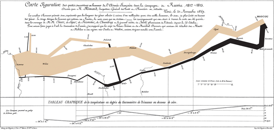 --- .pull-left.tiny-code[ The basic map (adapted from Rahlf's book): ``` r library(dplyr) library(ggplot2) library(HistData) library(ggthemes) mdata <- mutate(Minard.troops, hwidth = survivors / 1000000) grp1 <- filter(mdata, group == 1) grp2 <- filter(mdata, group == 2) grp3 <- filter(mdata, group == 3) ribbon_aes <- aes(x = long, ymin = lat - hwidth, ymax = lat + hwidth, fill = direction) mribbons <- list( geom_ribbon(ribbon_aes, data = grp2[1 : 8, ]), geom_ribbon(ribbon_aes, data = grp2[8 : 10, ]), geom_ribbon(ribbon_aes, data = grp3), geom_ribbon(ribbon_aes, data = grp1)) p <- ggplot(NULL) + mribbons + coord_map() + theme_map() + theme(legend.position = "top") p ``` ] .pull-right[ 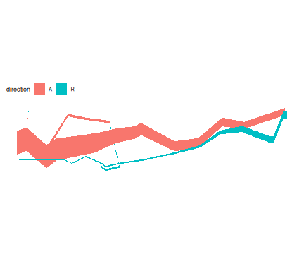<!-- --> ] --- Adjust colors and a border: ``` r p <- p + scale_fill_manual(values = c(A = "bisque2", R = "azure4")) + theme(panel.border = element_rect(fill = NA, colour = "grey20")) p ``` 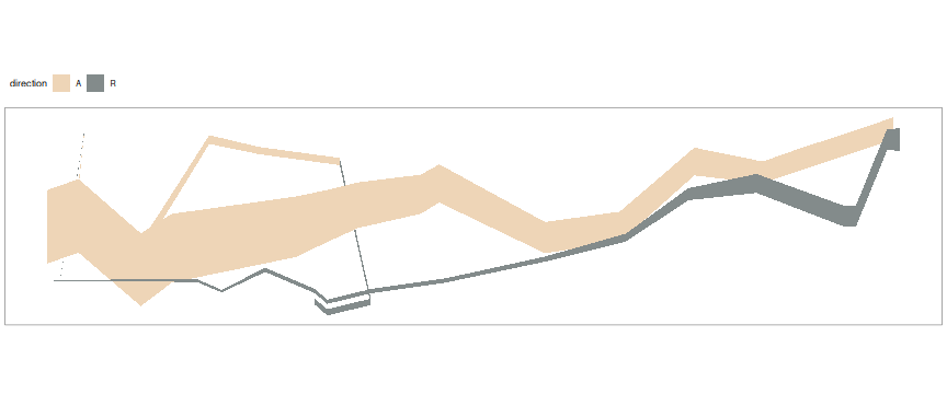<!-- --> --- Add cities: ``` r mcities <- geom_text(aes(x = long, y = lat, label = city), size = 3, family = "Times New Roman", fontface = "italic", ##"Felipa", data = Minard.cities, inherit.aes = FALSE) (p <- p + mcities) ``` 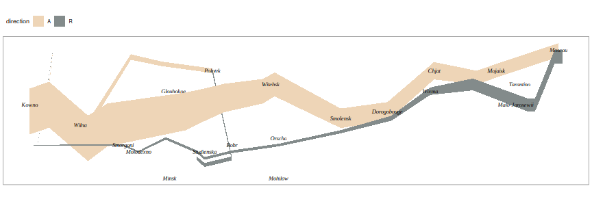<!-- --> --- Temperature graph: .small-code[ ``` r library(ggrepel) temps <- mutate(Minard.temp, temp_label = ifelse(is.na(date), temp, paste(temp, date))) p2 <- ggplot(temps, aes(x = long, y = temp)) + geom_line() + geom_text_repel(aes(x = long, y = temp, label = temp_label), fontface = "italic", family = "Times New Roman", size = 3, inherit.aes = FALSE) + coord_fixed(ratio = 0.07) + theme_minimal() p2 ``` 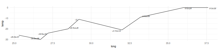<!-- --> ] --- Some adjustments: .small-code[ ``` r p2 <- p2 + scale_y_continuous(position = "right") + theme(panel.grid = element_blank(), panel.grid.major.y = element_line(color = "grey80"), axis.text.x = element_blank(), axis.ticks.x = element_blank(), axis.text.y = element_text(family = "Times New Roman", face = "italic"), axis.title = element_text(family = "Times New Roman", face = "italic"), panel.border = element_rect(fill = NA, colour = "grey20")) + labs(x = NULL, y = "Celcius") p2 ``` 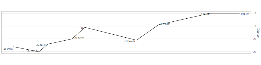<!-- --> ] --- Combining the plots: .small-code[ ``` r library(patchwork) xlims <- xlim(c(23.5, 38)) ((p + xlims) / (p2 + xlims)) & theme(plot.margin = margin(0, 0, 2, 0, "pt")) ``` 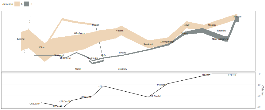<!-- --> ] --- Add rivers: .hide-code.small-code.scroll-box-20[ ``` r library(rnaturalearth) rivers10 <- ne_download(scale = 10, type = 'rivers_lake_centerlines', destdir = getwd(), category = 'physical') ## Reading 'ne_10m_rivers_lake_centerlines.zip' from naturalearth... ## Writing 'ne_10m_rivers_lake_centerlines.gpkg' to ## '/home/luke/writing/classes/uiowa/STAT4580/webpage/slides'... p1 <- ggplot(sf::st_crop(rivers10, c(xmin = 22.5, ymin = 53.5, xmax = 39, ymax = 56))) + geom_sf(linewidth = 0.1) + mribbons + mcities + scale_fill_manual(values = c(A = "bisque2", R = "azure4")) + theme_map() + theme(panel.border = element_rect(fill = NA, colour = "grey20"), legend.position = "top") ((p1 + xlims) / (p2 + xlims)) & theme(plot.margin = margin(0, 0, 2, 0, "pt")) ``` 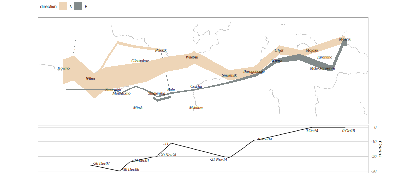<!-- --> ] --- With a (modern) base map: .hide-code.small-code.scroll-box-20[ ``` r library(ggmap) ## ℹ Google's Terms of Service: <https://mapsplatform.google.com> ## Stadia Maps' Terms of Service: <https://stadiamaps.com/terms-of-service> ## OpenStreetMap's Tile Usage Policy: <https://operations.osmfoundation.org/policies/tiles> ## ℹ Please cite ggmap if you use it! Use `citation("ggmap")` for details. keys <- as.data.frame(read.dcf(here::here("../APIKEYS"))) StadiaKey <- keys$key[match("Stadia", keys$name)] register_stadiamaps(StadiaKey, write = FALSE) basemap <- get_stadiamap(bbox = c(left = 22.5, bottom = 53.5, right = 39, top = 56), maptype = "stamen_toner_background", zoom = 7) ## ℹ © Stadia Maps © Stamen Design © OpenMapTiles © OpenStreetMap contributors. p3 <- ggmap(basemap) + mribbons + mcities + scale_fill_manual(values = c(A = "bisque2", R = "azure4")) + theme_map() + theme(panel.border = element_rect(fill = NA, colour = "grey20"), legend.position = "top", legend.justification = "left") ((p3 + xlims) / (p2 + xlims)) & theme(plot.margin = margin(0, 0, 2, 0, "pt")) ## Scale for x is already present. ## Adding another scale for x, which will replace the existing scale. ``` 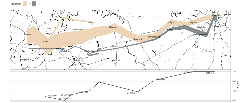<!-- --> ] --- layout: true ## Weekly US Unemployment --- State level data is available from the US Department of Labor via a [web interface](https://oui.doleta.gov/unemploy/claims.asp) or a [page](https://oui.doleta.gov/unemploy/DataDownloads.asp) for downloading CSV files. The most appropriate data is [ETA 539](https://oui.doleta.gov/unemploy/csv/ar539.csv), and the most useful variables seem to be: | Variable | Meaning | |----------|---------------------------| |`st` | State | |`rptdate` | Filed Week Ended | |`c2` | Reflecting Week Ended | |`c3` | Initial Claims | |`c8` | Continued Claims | |`c18` | Covered Employment | |`c19` | Insured Unemployment Rate | --- Read and clean the data. ``` r library(lubridate) unemp_file <- "ar539.csv" unemp_url <- "https://oui.doleta.gov/unemploy/csv/ar539.csv" if (! file.exists(unemp_file) || now() > file.mtime(unemp_file) + weeks(1)) download.file(unemp_url, unemp_file) ud <- read.csv(unemp_file) ud <- transmute(ud, state = st, weekEnded = mdy(rptdate), ReflectingWeekEnded = mdy(c2), InitialClaims = c3, ContinuedClaims = c8, CoveredEmployment = c18, InsuredUnemploymentRate = c19) ``` --- Some time series for the period from November 2019 to today: .pull-left.small-code[ ``` r filter(ud, state %in% c("IA", "IL", "WI", "MN"), ReflectingWeekEnded > "2019-11-01") |> ggplot(aes(x = ReflectingWeekEnded, y = InsuredUnemploymentRate, color = state)) + geom_line() ``` ] .pull-right[ 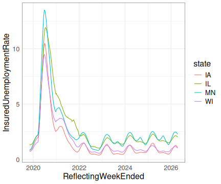<!-- --> ] --- Choropleth maps for the 6 weeks leading up to the pandemic peak: .pull-left.small-code[ ``` r options(tigris_use_cache = TRUE) states_sf <- tigris::states(resolution = "20m", progress_bar = FALSE, cb = TRUE) |> tigris::shift_geometry() start <- floor_date(ymd("2020-05-15"), "week") + 6 ud_sf <- left_join(states_sf, ud, c("STUSPS" = "state")) filter(ud_sf, weekEnded %in% (start + weeks(0 : 5))) |> rename(Rate = InsuredUnemploymentRate) |> ggplot(aes(fill = Rate)) + geom_sf() + coord_sf() + facet_wrap(~weekEnded, ncol = 2) + scale_fill_distiller(palette = "Reds", direction = 1) + theme_map() + theme(legend.position = "top") ``` ] .pull-right[ 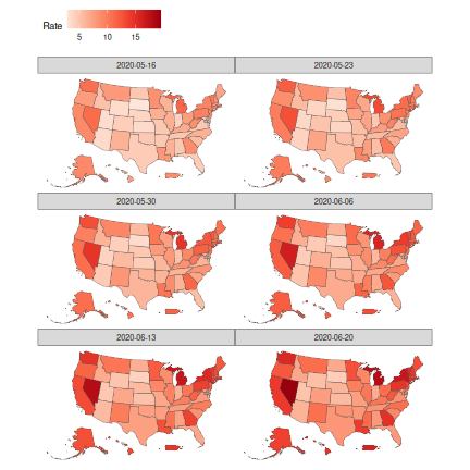<!-- --> ] --- For the June 20 period break out north-east states: .pull-left.small-code[ ``` r ud2_sf <- filter(ud_sf, weekEnded == "2020-06-20") |> rename(Rate = InsuredUnemploymentRate) NE <- c("ME", "VT", "NH", "MA", "RI", "CT") NE_sf <- filter(ud2_sf, STUSPS %in% NE) NE_sf_tr <- sf::st_transform(NE_sf, 4326) NE2_geom <- (sf::st_geometry(NE_sf_tr) - c(-71, 42.3)) * 4 + c(-50, 30) NE2_sf <- sf::st_set_crs(sf::st_set_geometry(NE_sf_tr, NE2_geom), 4326) ggplot(NULL, aes(fill = Rate)) + geom_sf(data = NE2_sf) + geom_sf(data = filter(ud2_sf, ! STUSPS %in% NE)) + geom_sf(data = mutate(NE_sf, Rate = NULL), fill = NA) + coord_sf() + scale_fill_distiller(palette = "Reds", direction = 1) + theme_map() + theme(legend.position = "top") ``` ] .pull-right[ 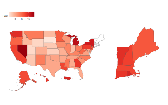<!-- --> ] --- [Sparklines](https://en.wikipedia.org/wiki/Sparkline) can be a useful way to show timeseries in a map or other plot. This example showing unemployment timeseries is motivated by [an example for covid data in France](https://datagistips.hypotheses.org/488). -- .pull-left.small-code[ ``` r states_sf <- cbind(states_sf, sf::st_coordinates(sf::st_centroid(states_sf))) start <- ymd("2019-11-01") ud3_sf <- left_join(states_sf, filter(ud, weekEnded >= start), c("STUSPS" = "state")) |> mutate(weeks = as.integer(difftime(weekEnded, start, units = "weeks"))) ggplot(states_sf) + geom_sf(color = "grey") + geom_line(aes(X + 1000 * weeks, Y + 10000 * InsuredUnemploymentRate, group = STUSPS), data = ud3_sf) + labs(title = paste("Unemployment Rates Since", start)) + ggthemes::theme_map() + theme(plot.title = element_text(size = 20)) ``` ] .pull-right[ 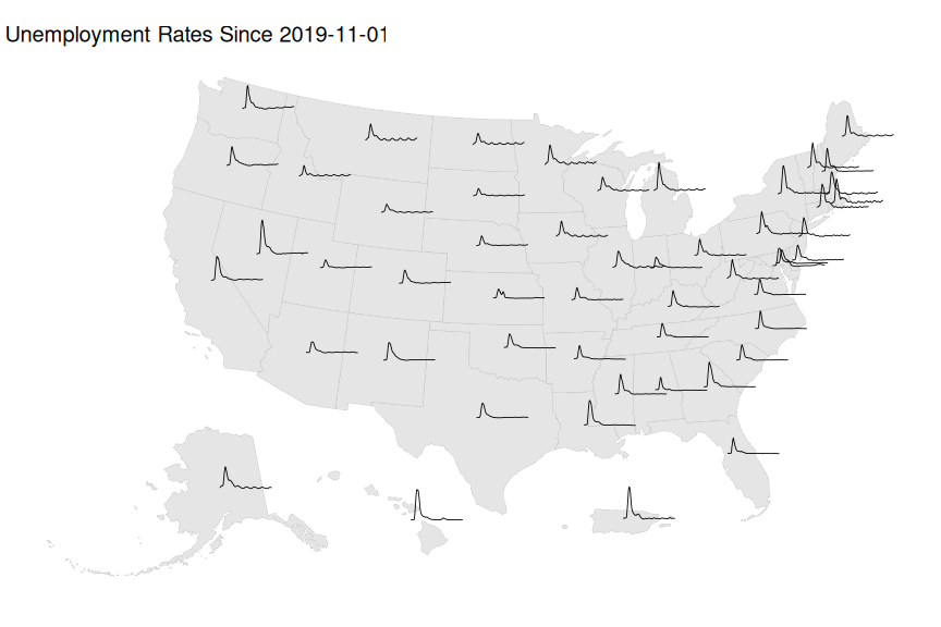<!-- --> ]
//adapted from Emi Tanaka's gist at //https://gist.github.com/emitanaka/eaa258bb8471c041797ff377704c8505