Ensamble Graphics and Dashboards
Ensemble Graphics
Data exploration usually produces many graphics.
Being able to reconstruct these form a command history or notebook is useful.
But a final report or presentation usually needs a small set of carefully chosen graphics. These can be some or all of:
Several plots of the same type of the same variables; e.g. histograms with different bin widths.
Differnent views of the same variables, e.g. density plots and box plots.
Plots of the same type of the same variables for different subgroups; small multiples, or trellis displays.
Many other variations are possible. Such collections are sometimes called ensemble graphics.
To aid in comparisons, axis ranges encoding choices (color, line type, etc.) should be coordinated.
Annotations can be used to emphasize important features.
The graphs should be organized so the most important features can be perceived pre-attentively.
Collections of graphics can be assembled and arranged within the graphics system or using the facilities of the report generation system.
Within the R graphics system you can use features of
parfor base graphics and tools fromgridExtraforgrid-based graphics.rmarkdownand LaTeX also provide ways of arranging graphics.Tools for creating poster presentations can also help with arranging collections of graphs.
Unwin’s Fig 12.1 provides an ensemble graphic for a data set on the chemical composition of coffee samples:
library(ggplot2)
library(GGally)
## Registered S3 method overwritten by 'GGally':
##   method from
##   +.gg   ggplot2

data(coffee, package = "pgmm")
coffee <- within(coffee, Type <- ifelse(Variety == 1,
                                        "Arabica", "Robusta"))
names(coffee) <- abbreviate(names(coffee), 8)
a <- ggplot(coffee, aes(x = Type)) + geom_bar(aes(fill = Type)) +
    scale_fill_manual(values = c("grey70", "red")) +
    guides(fill = FALSE) + ylab("")
## Warning: The `<scale>` argument of `guides()` cannot be `FALSE`. Use "none" instead as
## of ggplot2 3.3.4.
## This warning is displayed once every 8 hours.
## Call `lifecycle::last_lifecycle_warnings()` to see where this warning was
## generated.
b <- ggplot(coffee, aes(x = Fat, y = Caffine, colour = Type)) +
    geom_point(size = 3) +
    scale_colour_manual(values = c("grey70", "red"))
c <- ggparcoord(coffee[order(coffee$Type), ], columns = 3 : 14,
                groupColumn = "Type", scale = "uniminmax") +
    xlab("") + ylab("") +
    theme(legend.position = "none") +
    scale_colour_manual(values = c("grey", "red")) +
    theme(axis.ticks.y = element_blank(),
          axis.text.y = element_blank())
grid.arrange(arrangeGrob(a, b, ncol = 2, widths = c(1, 2)),
             c, nrow = 2)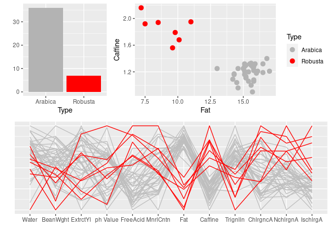
Some of the issues addressed:
consistent coloring across the plots;
removing some redundant labeling
having the red lines appear on top in the parallel coordinates plot.
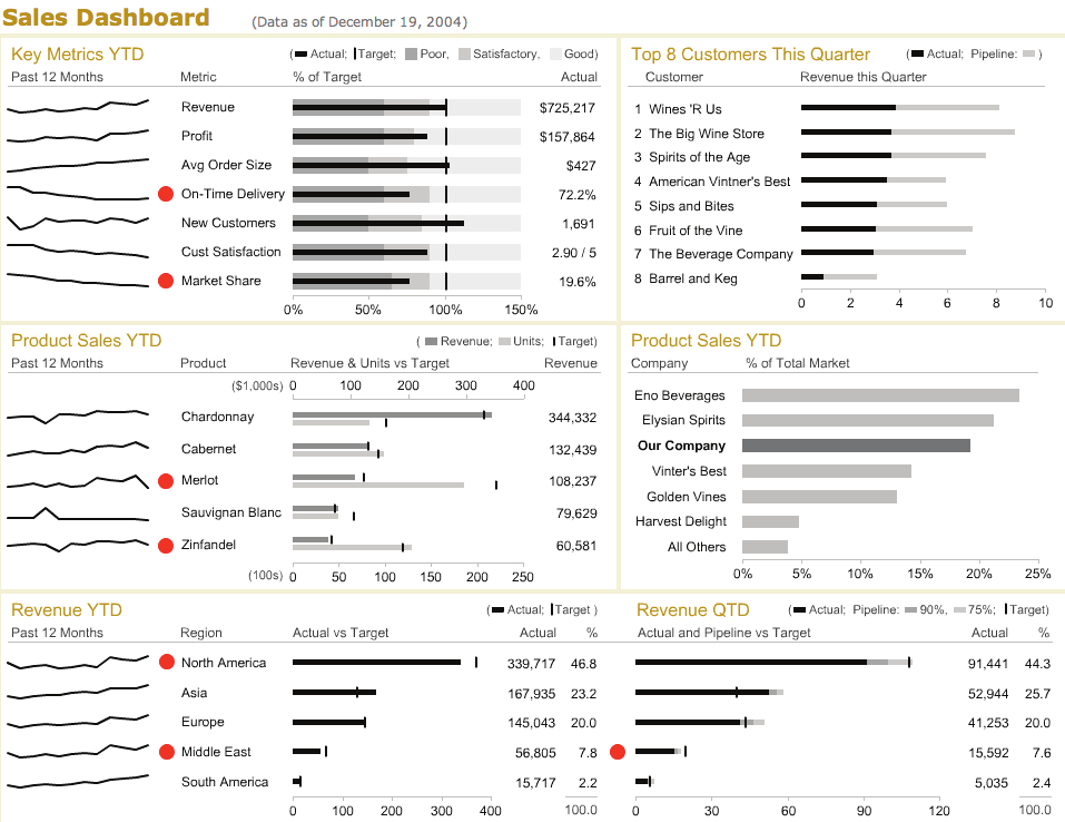
Information Dashboards
Dashboards are popular in business and arose from work on decision support systems.
Data visualizations are typically a large component of dashboards.
Some dashboards take the metaphor too far by showing dials that take up lots of space and distract.
3D pie charts and the like are also quite common.
But many are quite effective, convey a lot of information, and emphasize the key items well.
An example from a paper by Stephen Few:
Dashboards often have dynamic or interactive features:
the data displayed may be updated on a regular basis (e.g. stock trade activity, current weather conditions);
the user may be able to interactively change aspects of the visualizations.
Ben Schneiderman’s design guidelines:
- overview first;
- then zoom/filter;
- details on demand.
Jenifer Tidwell’s classification of useful interactions
- scroll and pan;
- zoom;
- open and close;
- sort and rearrange;
- search and filter.
The computational support needed for data updating and interaction will vary.
Some approaches can be handled by a browser’s JavaScript engine.
Other approaches need to communicate with a data base or a server process.
Examples
Tableau provides tools for easily creating dashboards; an example on lyme’s disease in Minnesota.
Rstudio provides the flexdashboard framework for creating dashboards with rmarkdown.
A shiny example illustrating brushing.
A
flexdashboardversion of the coffee data example.
Some Notes
Dashboards are popular but limiting.
More extensive articles, like one on power plants in the US are often more effective.
Interactive visualizations are also very popular and effective, but often interactive features are not used. Some links to discussions on this can be found here