Parallel Coordinate Plots
The same idea as a slope graph, but usually with more variables.
Some references:
- A post by Robert Kosara.
- Wikipedia entry
- Paper on recognizing mathematical objects in parallel coordinate plots.
Some R implementations:
| Function | Package |
|---|---|
parallelplot |
lattice |
ggparcoord |
GGally |
ipcp |
iplots |
ggobi |
rggobi |
parcoords |
parcoords (on GitHub; uses D3) |
Australian Crabs in Parallel Coordinates
Using the crabs data from MASS:
library(GGally)
data(crabs, package = "MASS")
ggparcoord(crabs)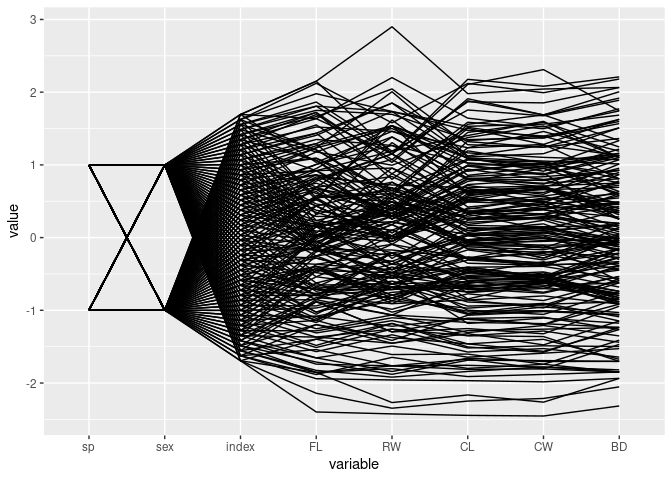
Focus only on the measurements:
ggparcoord(crabs, columns = 4:8)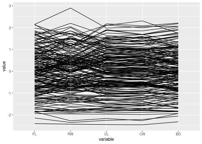
Color by sex:
ggparcoord(crabs, columns = 4:8, groupColumn = "sex")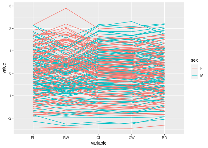
Color by sp:
ggparcoord(crabs, columns = 4:8, groupColumn = "sp")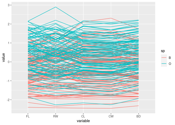
After scaling by CL:
cr <- mutate(crabs,
             FLCL = FL / CL, RWCL = RW / CL, CWCL = CW / CL, BDCL = BD / CL)
ggparcoord(cr, columns = 9:12, groupColumn = "sp")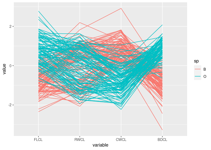
Reorder the variables:
ggparcoord(cr, columns = c(10, 9, 11, 12), groupColumn = "sp")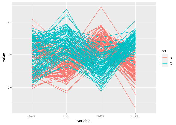
Reorder again:
ggparcoord(cr, columns = c(10, 9, 12, 11), groupColumn = "sp")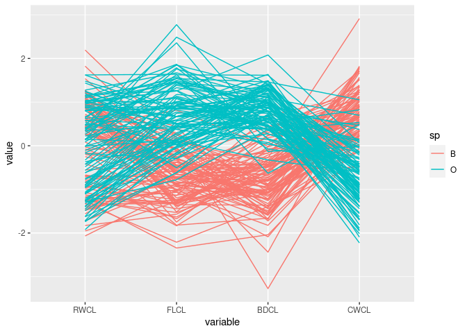
Reverse the CWCL variable:
ggparcoord(mutate(cr, CWCL = -CWCL),
           columns = c(10, 9, 12, 11), groupColumn = "sp")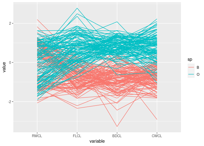
The patterns for
FLCL,CWLC, andBDCLfor the two species differ.This corresponds to the discriminator
FLCL + BDCL - CWCLfound with scatter plots
Olive Oils in Parallel Coordinates
data(olive, package = "tourr")
olive$Region <- factor(olive$region,
                       labels = c("North", "South", "Sardinia"))
ggparcoord(olive, groupColumn = "Region", columns = 3 : 8)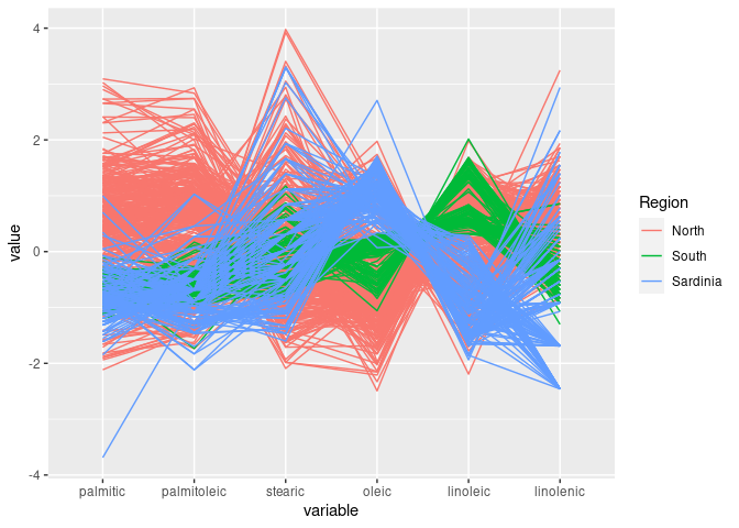
South is separated out by high values of eicosenoic
Look at the other regions:
ons <- filter(olive, Region != "South")
ons <- droplevels(ons)
ggparcoord(ons, groupColumn = "Region", columns = 3:10)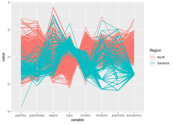
linoleic seems to allow some separation of North and Sardinia
Rearrange to place linoleic next to arachidic:
ggparcoord(ons, groupColumn = "Region", columns = c(3:7, 9, 8, 10))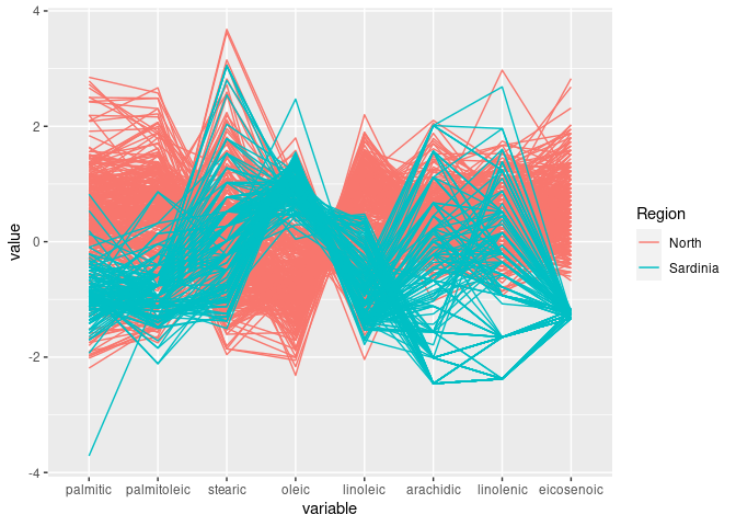
This shows the joint discriminator found with scatter plots.
Interactive Approaches
Interactive version in iplots:
library(iplots)
ipcp(cr)ipcp(cr[-(3:8)])ipcp(cr[c(1, 2, 10, 9, 12, 11)])Interactive version in rggobi:
library(rggobi)
ggobi(cr)
Interactive version using the D3 library via the parcoords package:
parcoords::parcoords(cr[c(1, 2, 9:12)], , rownames = FALSE,
                     reorder = TRUE, brushMode = "1D",
                     color = list(
                         colorScale = htmlwidgets::JS("d3.scale.category10()"),
                         colorBy = "sp"))
Some Calibration Examples
x <- rnorm(100)
d1 <- data.frame(x1 = x, x2 = rnorm(x), x3 = x)
d2 <- mutate(d1, x3 = -x)
ggparcoord(d1)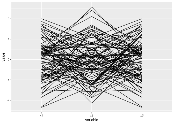
library(lattice)
parallelplot(d1)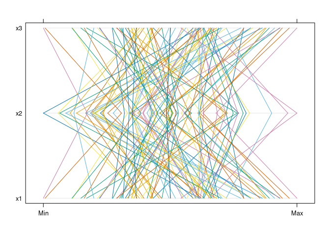
parallelplot(d1, horizontal.axis = FALSE)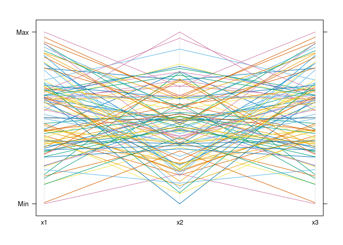
Mostly parallel lines indicate positive association:
ggparcoord(d1[c(1, 3, 2)])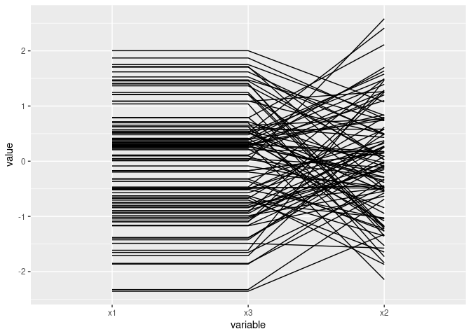
Near intersection in a point indicates negative association:
ggparcoord(d2)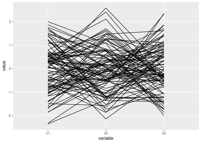
ggparcoord(d2[c(1, 3, 2)])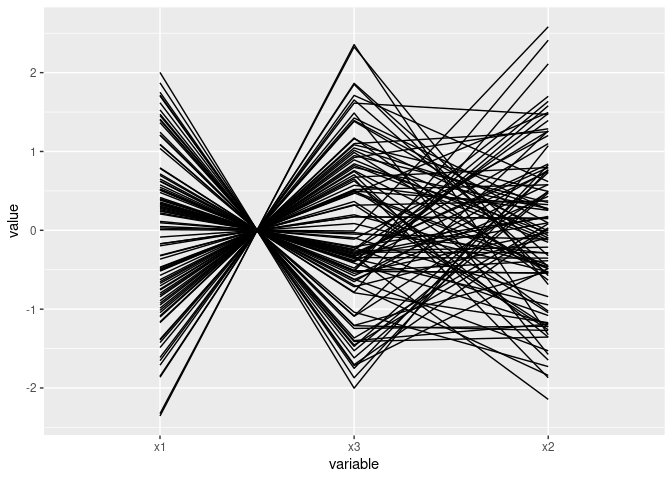
A quadratic relationship:
ggparcoord(mutate(d2, x3 = x1 ^ 2)[c(1, 3, 2)])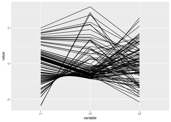
Diamonds Data
Using a sample of 5000 observations (about 10%) and parallelplot from lattice:
library(ggplot2)
ds <- diamonds[sample(nrow(diamonds), 5000), ]
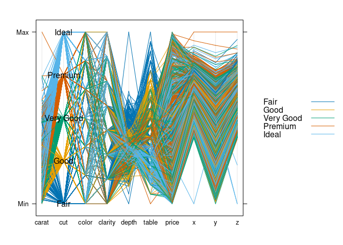
parallelplot(~ds, group = cut, data = ds, horizontal.axis = FALSE,
auto.key = TRUE)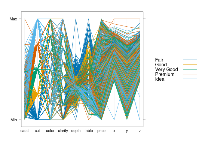
parallelplot(~ds, group = cut, data = ds, horizontal.axis = FALSE,
             auto.key = TRUE,
             panel = function(...) {
                 panel.parallel(...)
                 levs <- levels(ds$cut)
                 panel.text(2, seq(0, 1, len = length(levs)), levs)
             })
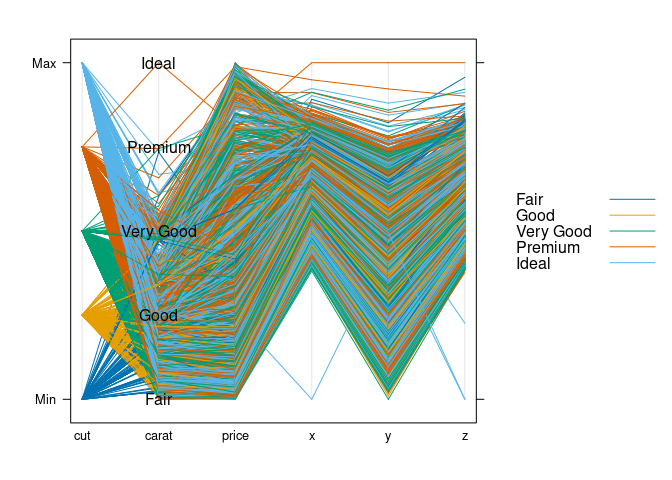
Rearrange variables:
ds1 <- select(ds, cut, carat, price, x, y, z)
parallelplot(~ds1, group = cut, data = ds1, horizontal.axis = FALSE,
             auto.key = TRUE,
             panel = function(...) {
                 panel.parallel(...)
                 levs <- levels(ds$cut)
                 panel.text(2, seq(0, 1, len = length(levs)), levs)
             })
Conditioning on cut:
dsnc <- select(ds, -cut)
parallelplot(~ dsnc | cut, data = ds, horizontal.axis = FALSE,
             scales = list(x = list(rot = 45)))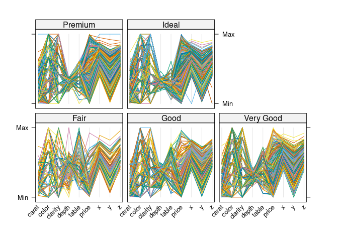
parallelplot(~dsnc | cut, data = ds, col = "black")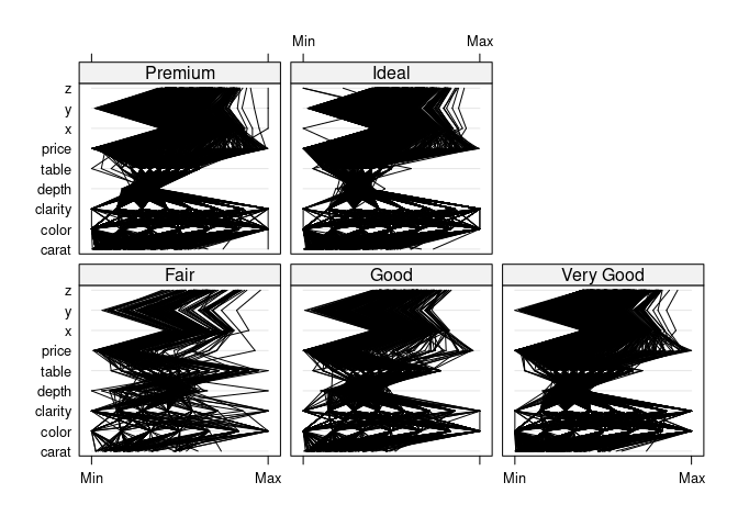
parallelplot(~dsnc | cut, data = ds, col = "black", alpha = 0.05)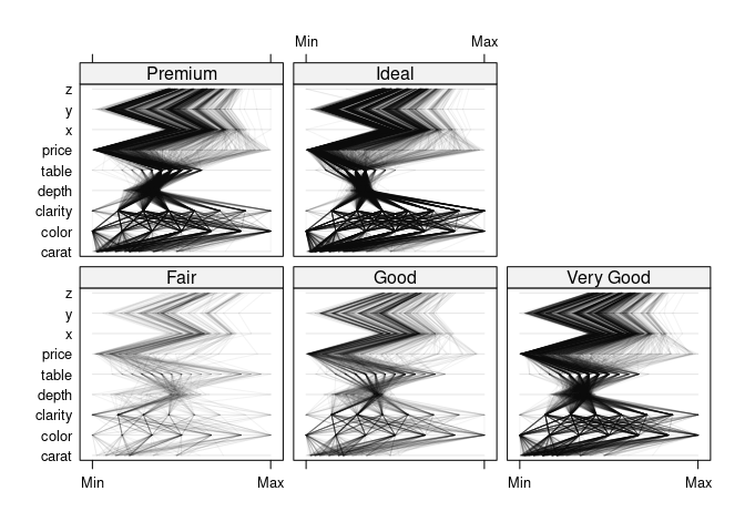
Rearrange variables:
ds1nc <- select(ds1, -cut)
parallelplot(~ ds1nc | cut, data = ds1, col = "black", alpha = 0.05)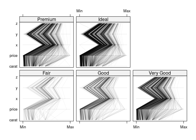
Variations using ggparcoords and a smaller sample:
ds <- diamonds[sample(nrow(diamonds), 500), ]
##ggparcoord(ds, scale = "uniminmax", groupColumn = "cut")
ggparcoord(ds, scale = "uniminmax", groupColumn = "cut", columns = c(1, 3:10))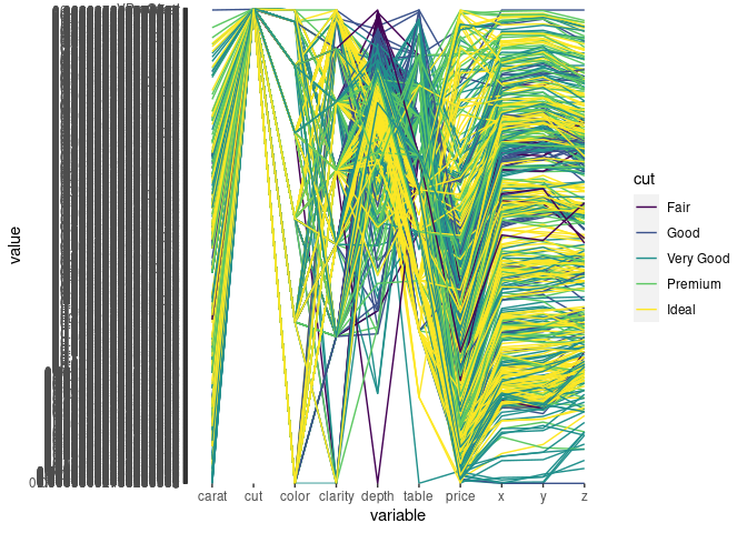
ds1 <- mutate(ds, ncut = as.numeric(cut))
ggparcoord(ds1, scale = "uniminmax", groupColumn = "cut", columns = c(1, 3:11))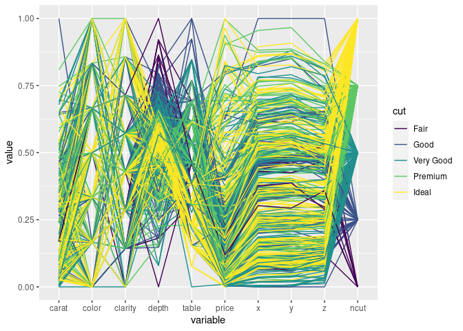
Using separate facets for the cut levels:
ggparcoord(ds, scale = "uniminmax", columns = c(1, 3:10)) +
    facet_wrap(~ ds$cut) + coord_flip()
## `geom_line()`: Each group consists of only one observation.
## ℹ Do you need to adjust the group aesthetic?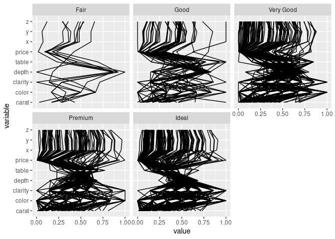
Adding box plots and violin plots:
ggparcoord(ds, scale = "uniminmax", columns = c(1, 3:10),
           alphaLines = 0.1, boxplot = TRUE) +
    facet_wrap(~ ds$cut) + coord_flip()
## `geom_line()`: Each group consists of only one observation.
## ℹ Do you need to adjust the group aesthetic?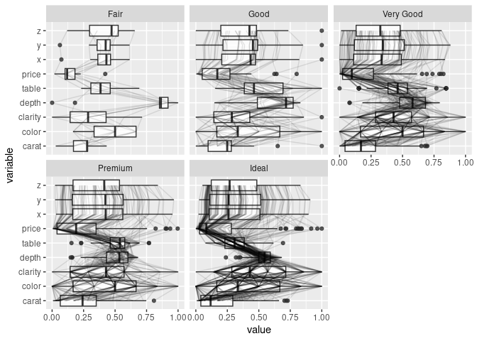
ggparcoord(ds, scale = "uniminmax", columns = c(1, 3:10), alphaLines = 0.1) +
    geom_boxplot(aes_string(group = "variable"), width = 0.3,
                 outlier.color = NA) +
    facet_wrap(~ds$cut) + coord_flip()
## Warning: `aes_string()` was deprecated in ggplot2 3.0.0.
## ℹ Please use tidy evaluation idioms with `aes()`.
## ℹ See also `vignette("ggplot2-in-packages")` for more information.
## This warning is displayed once every 8 hours.
## Call `lifecycle::last_lifecycle_warnings()` to see where this warning was
## generated.
## `geom_line()`: Each group consists of only one observation.
## ℹ Do you need to adjust the group aesthetic?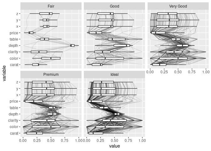
ggparcoord(ds, scale = "uniminmax", columns = c(1, 3:10), alphaLines = 0.1) +
    geom_violin(aes_string(group = "variable"), width = 0.5) +
    facet_wrap(~ds$cut) + coord_flip()
## `geom_line()`: Each group consists of only one observation.
## ℹ Do you need to adjust the group aesthetic?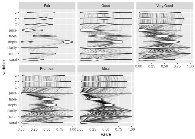
Useful Adjustments and Additions
Useful adjustments:
- vary axis scaling;
- show axis labels;
- alpha blending;
- color by category or range;
- filter/hide;
- reorder axes;
- reverse axes;
- reorder categories;
An interactive implementation should ideally support all of these.
Another useful feature is to be able to record the adjustments made.